Unlock a world of possibilities! Login now and discover the exclusive benefits awaiting you.

Analytics & AI
Forums for Qlik Analytic solutions. Ask questions, join discussions, find solutions, and access documentation and resources.
Data Integration & Quality
Forums for Qlik Data Integration solutions. Ask questions, join discussions, find solutions, and access documentation and resources
Explore Qlik Gallery
Qlik Gallery is meant to encourage Qlikkies everywhere to share their progress – from a first Qlik app – to a favorite Qlik app – and everything in-between.
Qlik Community
Get started on Qlik Community, find How-To documents, and join general non-product related discussions.
Qlik Resources
Direct links to other resources within the Qlik ecosystem. We suggest you bookmark this page.
Qlik Academic Program
Qlik gives qualified university students, educators, and researchers free Qlik software and resources to prepare students for the data-driven workplace.
Recent Blog Posts
-
ICYMI - Qlik Sense Tips and Tricks Webinar - Tapping into all your data
The following is a recording from our latest Tips and Tricks Webinar.We want to hear from you. Please leave your comments and questions in the comment... Show MoreThe following is a recording from our latest Tips and Tricks Webinar.
We want to hear from you. Please leave your comments and questions in the comments section below.
NOTE: To increase resolution or size of the video, select the YouTube logo at the bottom right of the player. You will be brought directly to YouTube where you can increase the resolution and size of the player window. Look for the 'settings' gears icon in the lower right of the player once at YouTube.

-
Dr Ghosh speaks on Competing using Analytics at Bangalore
Dr. Siddhartha Ghosh from Vidya Jyothi Institute of Technology ( VJIT), spoke at a Qlik organized event in Bangalore, themed "Discover data driven po... Show More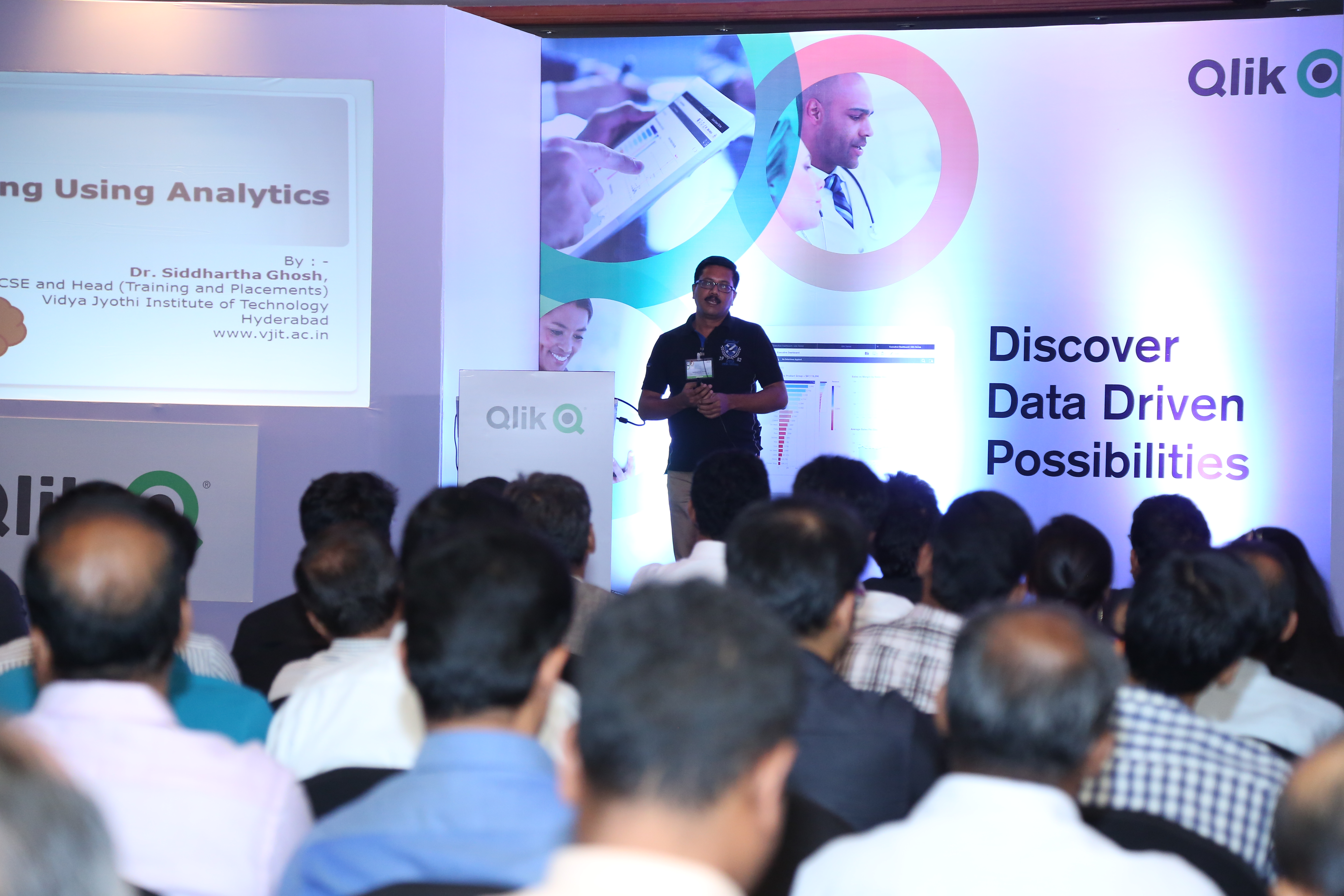
Dr. Siddhartha Ghosh from Vidya Jyothi Institute of Technology ( VJIT), spoke at a Qlik organized event in Bangalore, themed "Discover data driven possibilities" on 26th April. VJIT has partnered with The Qlik Academic Program
This event was attended by more than 100 Qlik customers and prospects. Dr. Ghosh spoke on applications of Qlik Sense for students of data analytics and administration of educational institutions covering areas such as placements, online test and results analysis.
Dr Ghosh had the following thoughts to share:
In the academic arena, Qlik Sense cloud may play a key role for :
- From traditional offline analytics to in-line embedded analytics .This has been the focus for many efforts in the past and will continue to be an important focus for analytics.
- From analyzing historical data (students data, staff data) to explain what happened to analyzing historical and real-time data from multiple systems to simulate and predict the future.
- From Structured and simple data analyzed by individuals to analysis of complex information of many types(text, video) from many system supporting a collaborative decision process that bring multiple people together top analyze, brainstorm and make decisions.
Application of data analytics in Educational Institutions:
- Use of Qlik Sense as a data analytics tool for teaching analytics for B.Tech. CSE/IT students.
- Placement Data Analysis – Details of students recruited every year from the college in different companies can be represented in single pictorial format. Details such as salary package, number of students who got selected in particular company can be represented.
- Online test results analysis – Marks scored by individual students in each consecutive tests conducted in the college can be easily shown.
- Results Data Anlysis – Marks and grades scored by individual student in every semester and over all percentage of every department can be shown. Comparison of individual department percentages can be done through combo charts. Many other hidden information comes out while using Qlik Sense for academic results.
- Faculty data – We can also analyze faculty information and data in simple way using this technology.
Job perspective:
In the field of data visualization and data analytics, there is a huge demand for resources that have created many opportunities. Qlik View is a wonderful tool and have many simple functionalities to create a perfect data model. It is a simple tool to understand and can also be implemented in a smooth way. Freshers or B.Tech. (CSE/IT) graduate students gaining knowledge of Qlik technologies is a great value edition on their biodata.
-
Avoid the Big Software Fail!
According to reports, the two most important factors in realizing the value of software are user adoption and organizational change management. Accord... Show More
According to reports, the two most important factors in realizing the value of software are user adoption and organizational change management. According to a McKinsey study, ROI of software rollouts was 35% when there was little or no organizational change management included. However, the ROI was 143% when excellent organizational change management was included in the initiative. For successful software user adoption, users must be motivated as well as have any hurdles that stand in their way removed. Below are some common hurdles that I have encountered when it comes to software adoption:
- Users either do not have access to the data they need or the data as it exists is not in the right format for them
- Users do not prioritize time to get familiar with the software
- Users do not see how the software will benefit them
- Users try to use the software and they get stuck and do not know where to go for help
- Leadership does not communicate the context and the why behind the software adoption
To read the full article written by Kevin Hanegan, Qlik Vice President of Knowledge and Learning visit

-
Qlik and Solr Search: Focusing the Lens of Unstructured Analytics
Happy Tuesday everyone!. You guys are going to love this one. In this edition of the Qlik Design Blog, our Emerging Technology Evangelist, David Freri... Show MoreHappy Tuesday everyone!. You guys are going to love this one. In this edition of the Qlik Design Blog, our Emerging Technology Evangelist, David Freriks is back discussing integration between Qlik and a powerful big data unstructured search platform called Solr. Not only does David discuss an out-of-the-box approach to this integration, he takes it to the next level and touts the power of the Qlik Platform APIs.
Solr
In case you haven’t seen it – there is a super powerful unstructured search platform used within the big data ecosystem called Solr, built on the Apache Lucene search engine library. What’s great about Solr is that it can index just about anything, text, xml, JSON, PDF, Word, Excel, including almost any kind of text based data. That means you can drop just about anything into Solr and make it searchable using the power of Lucene core which powers the Solr platform.
So, where does Qlik fit in you may ask? Well, let’s observe what a Solr query output looks like:
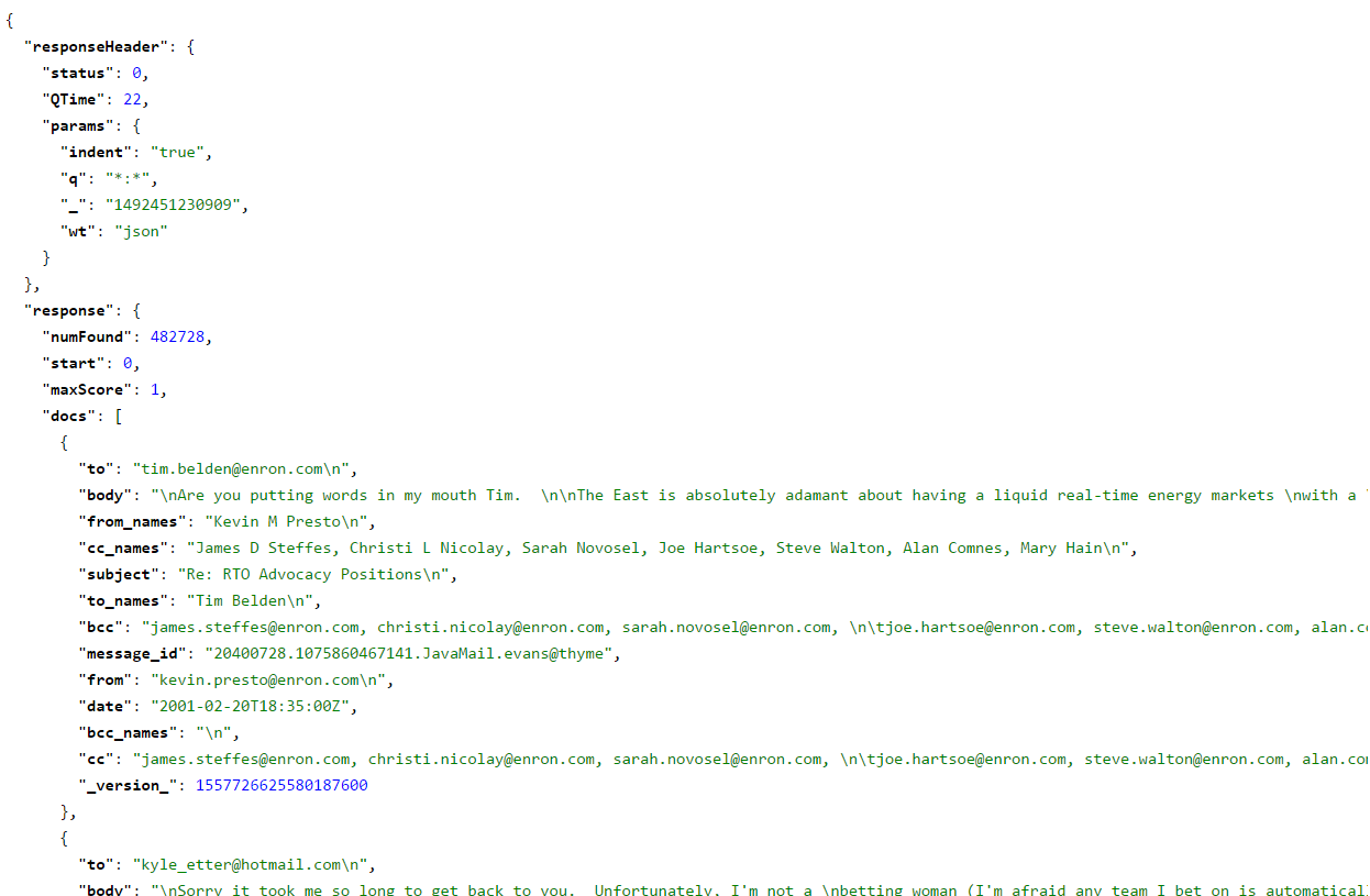
Standard Solr query output
Hmmm, not very user friendly, not to mention it was somewhat slow to execute. Here is a little bit about what we’re looking at:
- This data is the collective set of Enron emails from its infamous collapse in early 2000’s.
- We’ve loaded this data set into our Cloudera cluster and indexed it using Solr.
- Once this data was loaded and indexed we tested with a series of queries.
- A full query on someone with a lot of references such as Ken Lay can run upwards of 15 minutes to bring back every email that contains a reference to him.
Imagine 10’s or 100’s of users each waiting 10-15 minutes for a single question to be answered, it clearly dilutes the effectiveness of the engine as a business tool.
Enter Qlik
Qlik has a tremendously powerful REST connector that is perfectly suited for connecting to sources such as Solr. (A great resource created by Mike Tarallo on the Qlik REST connector can be found here: Working with the Qlik REST Connector, Pagination and Multiple JSON Schemas - check it out to understand the basics of how it works and how the response data is assembled within Qlik)
What follows is how we are using the Qlik REST Connector to connect to Solr.
Qlik In-Memory Analytics with Solr
Now that we are armed with the Qlik REST Connector, and the appropriate Solr REST API connection parameters, we can pull the entire Enron email data set into the Qlik engine via Solr. (Refer to the Apache Solr Documentation to learn more,)
 Qlik REST Connector configuration
By pulling the entire data set, and loading it into Qlik, we now ensure that all users have sub-second access to all the data down to the most granular level, and thanks to our associative search technology – all the data has been indexed and correlated in-memory. We can gain further insights by incorporating stock market data. Combining Enron’s stock performance with their emails tells an interesting story of rising email volume along with collapsing stock prices and elevating trade volumes.
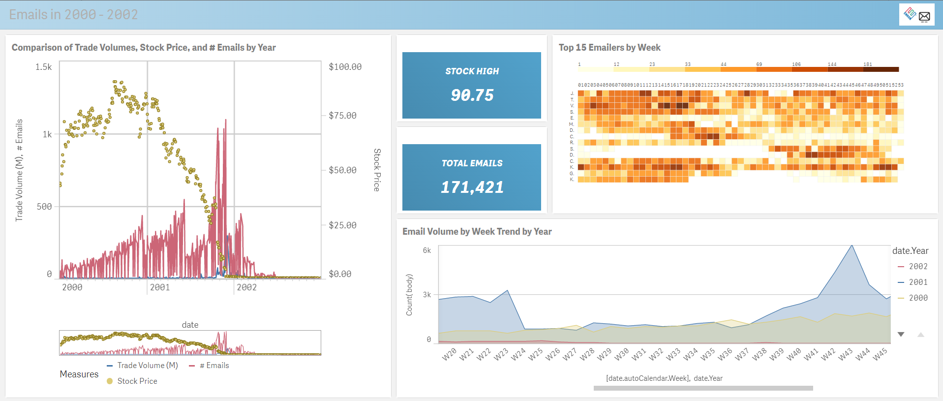
Power of Qlik Data Visualization - Enron stock performance correlated with email volume
Using a mix of visualization techniques, we can see a pretty interesting collection of data, including the famous “deleted emails” gap on the bottom right chart.
Performing some additional analysis, we can drill in on the height of the crash that also correlates with the spike in email volume, followed by a rapid drop in volume.
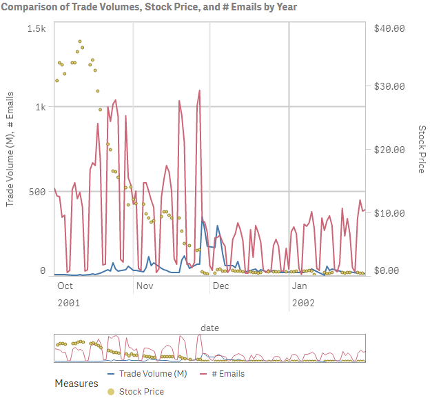 Drop in trade volume
Making a few more selections we can dive down into a specific name, or comment to filter down the result sets further.
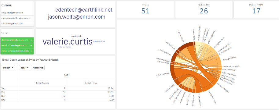 Detail and specifics - name, email address
This associative search allows us to dive down into the details of the “TO” elements of the data set and see the metrics affiliated with those names. We can also jump over to the final sheet of the Qlik Sense app and look at the individual emails body content filtered by our prior selections made in the application.
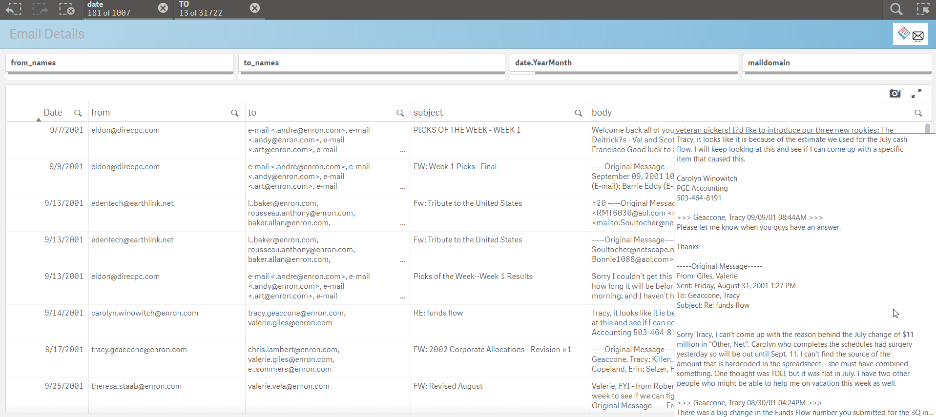
QIX API Powered Solr Search
The above approach of using Qlik in-memory to front end the Solr search engine is just one of the many ways Qlik can access unstructured data in big data systems. Let’s consider another application also using Qlik with Solr – this time with just the Qlik API’s. As a quick refresher, the Qlik engine (called QIX) is a fully API enabled engine with tremendous extensibility that allows Qlik to plug into any web based technology (like Solr). Using the awesome QlikSocial framework from the esteemed Johannes Sunden he adapted the webapp to connect to Solr on demand and build a full webapp from scratch. This is a great example of what we call Custom Analytics.
We start with a search box… And our name(s) of interest:
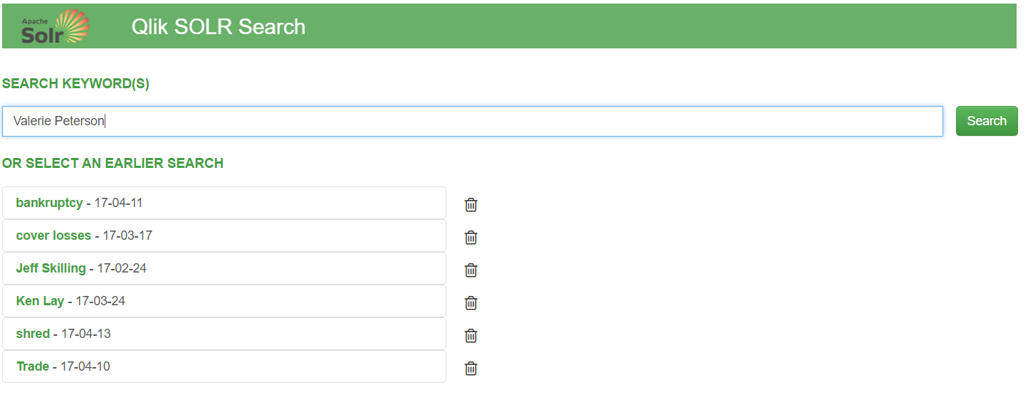
Now unlike the formatted Qlik Sense app, when a user hits the “search” bar – everything will happen dynamically on the fly using the API’s.
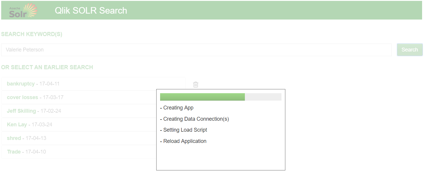
Qlik will dynamically generate a REST connection to Solr, create and load the requesting data into memory, and then build a web app around the data using bootstrap.js and angular.
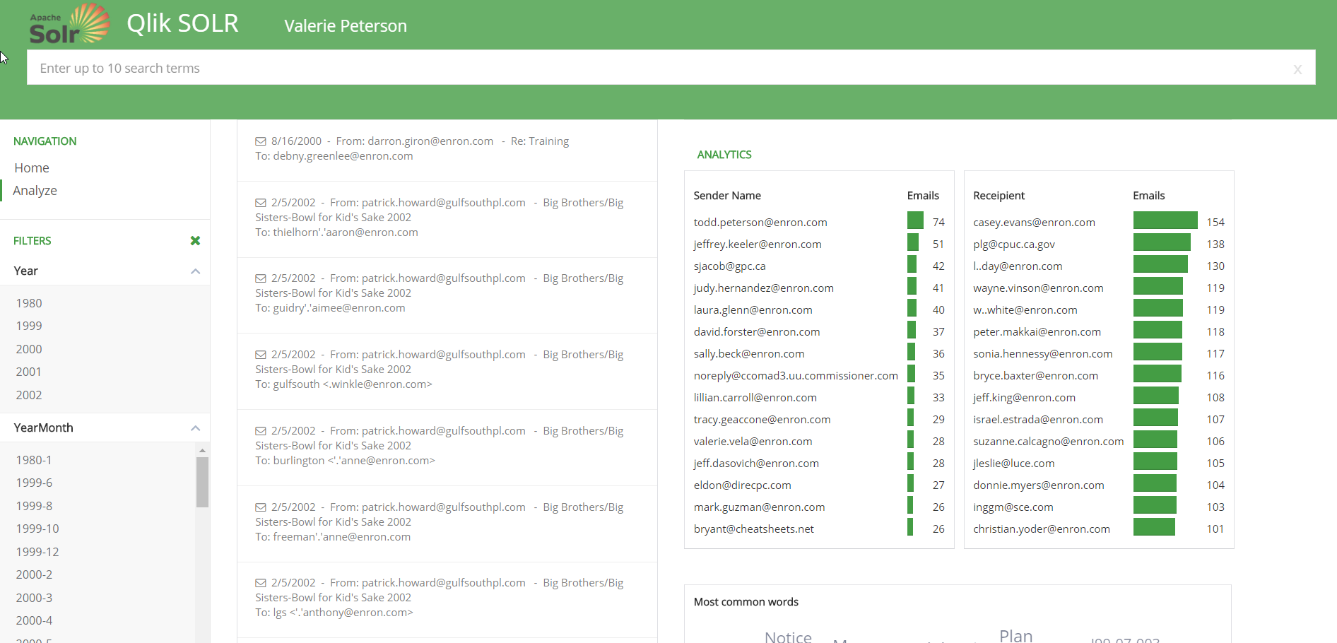
The webapp is still using the Qlik engine, so selections and the search engine are still available – but all the charts and graphics are html and d3js charts – not Qlik. We’re just powering the app and the data interactivity with the QIX engine!
Summary
Solr is an extremely powerful unstructured search engine that can benefit from the speed and structure of Qlik analytics. It can provide a focusing lens on the core Solr search technology. That data can be consumed in a number of formats including a completely structured Qlik Sense app, or as an API powered web application without any Qlik UI components.
For more information, visit our demo site at cloudera.qlik.com
Enjoy!
Regards,
David Freriks (@dlfreriks) | Twitter
Emerging Technology Evangelist
-
Welcome to the Qlik Product Innovation Blog!
The PRODUCT INNOVATION BLOG is a space where you can come to learn WHAT'S NEW across all of the products in our growing Qlik product portfolio. You c... Show MoreThe PRODUCT INNOVATION BLOG is a space where you can come to learn WHAT'S NEW across all of the products in our growing Qlik product portfolio. You can FOLLOW the entire blog or individual products (listed as authors) so that you only get notified about just those items that are most important to you.
- Qlik Sense
- Qlik Sense Cloud
- QlikView,
- Qlik Analytics Platform,
- Qlik DataMarket,
- Qlik NPrinting,
- Qlik GeoAnalytics, and
- Qlik Connectors
As we continue to grow, we hope that this makes it easier for you to stay up-to-date on all of the amazing innovations Qlik has to offer.

WHERE TO GO FROM HERE...
To ensure that you are notified regarding every update, click the 'Follow' button in the top right corner of the page. To follow an individual product, choose the product name from the Author's drop-down and then click on the 'Follow' button.

-
The University of Maryland
This week the Academic Program hosted a workshop at the University of Maryland in the United States. The university wasintroduced to Qlik by a local ... Show MoreThis week the Academic Program hosted a workshop at the University of Maryland in the United States. The university was
 introduced to Qlik by a local partner who hires students from the University with Qlik experience. The workshop was facilitated by two senior Solutions Architects who taught students about the power of Qlik and how Qlik Sense can be used in both their professional and personal lives to simplify their data!
Below is a quote from the professor expressing his gratitude
"It was very evident that Jesse and David used this knowledge in Thursday's demonstration, even down to the smallest detail of including "Terp" in product descriptions. My hat is off to Jesse and David for your great teamwork. The business example allowed us to see the power of Qlik"
-
Qlik Sense Cloud Business and the Web Connectors
Wow that's some title huh? Ooooh - "Qlik Sense Cloud Business and the Web Connectors" - sounds like the title for a fantasy adventure novel. Seriously... Show MoreWow that's some title huh? Ooooh - "Qlik Sense Cloud Business and the Web Connectors" - sounds like the title for a fantasy adventure novel. Seriously, Denise LaForgia and I are back with a Qlik Sense Cloud Business update including some new videos to briefly introduce you to some really cool and new capabilities available in Qlik Sense Cloud Business - our new Web Connectors starting with access to data for Google Analytics, Twitter and Facebook. Take it away Denise!
Thanks Mike!
As promised in my blog last month, I’m back with more exciting updates about new features in Qlik Sense Cloud Business. Following our launch of REST Connectivity, I’m excited to announce that Facebook, Twitter and Google Analytics data sources are now also available in Qlik Sense Cloud Business under our new Web Connectors package.
For business users in particular, these connectors provide an easy way to bring together and analyze multiple data sources and data sets that are critical to sales, marketing, and other business initiatives. While some tools for social and sentiment analysis might allow you to analyze data from those sources individually, the power of Qlik Sense lets you associate this data about social and digital activity with other information about your customers, sales, marketing campaigns, customer service, and more.
Here’s an overview of the type of data each connector can return:
Google Analytics
The data returned includes many of the fields you’d see in the Google Analytics dashboard, such as page views, top landing pages, most visited pages, etc. You can retrieve data on any Google Analytics-enabled website.
- Accounts: returns the accounts that the user has access to
- DataFromQueryURI; enter a query URI on this table
- DataFromTemplateQuery: returns a report from one of the available prebuilt queries
- WebProfiles: returns the profiles that the user has access to
- WebProperties: returns the web properties the user has access to
Watch Mike's brief video to get a general idea of how it works:
Community page and video download
Twitter
The content returned includes all tweets that include a hashtag or search term, and you can use Twitter query operators to pull data for more specific, detailed searches.- Mentions: returns up to 800 tweets for a Twitter screen name
- Search: returns tweets based on a search term and other parameters
- SearchAdvanced: returns tweets based on search term and other parameters and returns more columns than simple search
- UserSearch: returns information about an account based on a named user search or topic search
In this video Mike shows how simple it is to get after Twitter data:
Community page and video download
Facebook Fan Pages and Groups
The data retrieved includes textual content (posts and comments) as well as counts of likes and shares.
- Feed: returns the feed of posts (including status updates) and links published by the selected page, or by other users on the page.
- Page: returns a single page
- User Info: returns a single user - note - user identify / vanity id is used as the parameter
In the final video we close the loop on the last of the connectors by simply getting access to Facebook data:
Community page and video download
How to Get Started
While in your Qlik Sense Cloud Business workspace, you can set up your connections within your app by going into the data load editor and selecting the Create New Connection button. You’ll have to authenticate each connection using credentials from an account – your personal account, or one belonging to your business, group or organization. Once the connection is established, you can begin retrieving data.
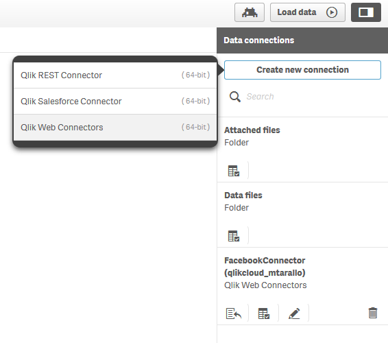
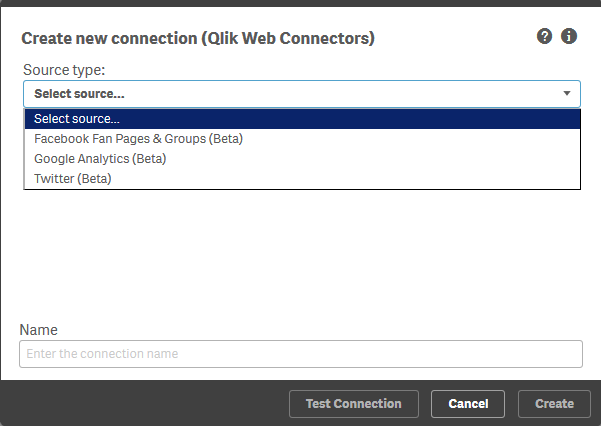
We’re rolling out additional connectors in the next few weeks, so stay tuned for additional information!
Learn more
Of course check out the videos and for more detailed information and instructions, visit these resources:
Enjoy your day!Denise LaForgia
Senior Product Marketing Manager
Qlik
Resources:
-
The Calculation Engine
In a previous blog post, I wrote about Logical Inference and Aggregations, explaining that two different evaluation steps are executed every time yo... Show MoreIn a previous blog post, I wrote about Logical Inference and Aggregations, explaining that two different evaluation steps are executed every time you click in QlikView. This post will focus on the second evaluation step – The calculation of all objects.
This is The Calculation Engine.
The Calculation Engine (sometimes called the Chart Engine) is used in all places where you have aggregations. And since you have aggregations in almost every expression, the calculation engine can be invoked from any object: Usually it is invoked when calculating the measure in a chart, but it is also used for labels, for calculated colors, for text boxes, for show conditions, and for advanced search strings.
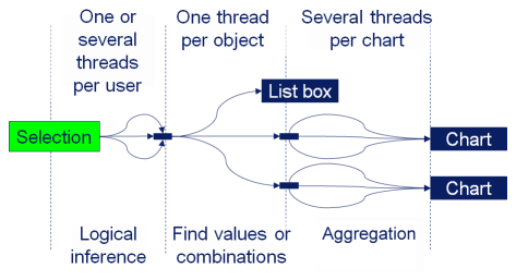
The calculation engine runs through two steps: First it finds combinations of the values of the fields used in the aggregation function, and, if necessary, builds a temporary look-up table. Then, it performs the actual aggregation using the look-up table to create all relevant combinations. If the aggregation is a measure in a chart or in an Aggr() function, the aggregation is made separately for every dimensional value, using the appropriate scopes.
- The Logical Inference
- The Calculation Engine (once for every object or aggregation)
- Find all combinations (create the necessary look-up tables)
- Aggregate
The different phases can be seen in the picture. The text “Chart” here represents any object with an aggregation, and the text “List box” represents a standard List box without aggregation.
Examples:
Sum( Amount )
In this case, the summation is made in the data table where the field Amount is found. Hence, “finding the combinations” is reduced to looking in this table.Sum( NoOfUnits * UnitCost )
In this case, there are several fields inside the aggregation function. If the fields reside in different data tables, QlikView first generates the look-up table for UnitCost using the appropriate key, e.g. ProductID. Then it generates all combinations of the relevant field values using the look-up table – basically a join – and makes the summation on the fly.Sum( NoOfUnits * UnitCost ) / Count( distinct OrderID )
The numerator is the same as before (and treated the same) but now there is an additional aggregation in the denominator. So, QlikView will need to generate a help table for this aggregation too, listing the distinct order IDs. For each dimensional value, two aggregations are made, whereupon the ratio between the two is calculated.Sum( If( IsThisYear, Amount ))
Flags are often used inside aggregation functions, and usually this is not a problem. However, be aware that QlikView will create all combinations of the two fields before summing, and that this could in odd cases cause duplication of records.The aggregation step is multi-threaded. However, finding the relevant combinations of field values is currently a single threaded operation, and may occasionally be the bottle-neck when calculating a chart. So be aware of this when you use fields from different tables in the same aggregation function. You might want to consider moving a field to the “correct” table to minimize the impact of this step.
PS. All of the above is of course true for both QlikView and Qlik Sense. Both use the same engine.
If you want to read more about QlikView internals, see also
Symbol Tables and Bit-Stuffed Pointers
Colors, states and state vectors
Logical Inference and Aggregations
It’s all Aggregations
-
The Above Function
The Above() function is a very special function. It is neither an aggregation function, nor a scalar function. Together with some other functions, e.g... Show MoreThe Above() function is a very special function. It is neither an aggregation function, nor a scalar function. Together with some other functions, e.g. Top(), Bottom() and Below(), it forms a separate group of functions: Chart inter-record functions. These functions have only one purpose: To get values from other rows within the same chart.
The basic construction is the following:
Above( Sum( Sales ) )
This will calculate the sum of sales, but for the row above.
The most common use case is when you want to compare the value of a specific row with the value of the previous row; e.g. this month’s sales compared to last month’s sales.
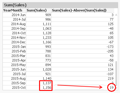
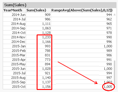
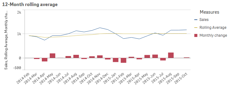
Another use case is when you want to calculate rolling averages. Then you need to use the second and third parameter; the offset and the number of cells. Below, I use
Above( Sum( Sales ), 0, 12 )
The function will return 12 rows: the value for current row and the 11 rows above. This means that you need to wrap it in a range function in order to merge all values to one value. In this case, I use RangeAvg() to calculate the average of the 12 rows.
However, both the above solutions have a flaw: They don’t take excluded values into account. For example, if April is excluded due to a selection, the previous month of May becomes March, which probably isn’t what you want.
To correct this, you need to make the chart show all months, also the excluded ones. In QlikView, you have a chart option “Show all values” that you can use. A method that works also in Qlik Sense, is to add zero to all values, also for the excluded dimensional values:
Sum( Sales ) + Sum( {1} 0 )
Make sure to “Show zero values”.
You can also use the Above() function inside an Aggr() function. Remember that the Aggr() produces a virtual table, and the Above() function can of course operate in this table instead. This opens tremendous new possibilities.
First, you can make the same calculations as above, by using
Only(Aggr(Above(Sum({1} Sales)), YearMonth))
Only(Aggr(RangeAvg(Above(Sum({1} Sales),0,12)), YearMonth))
Note the Set Analysis expression in the inner aggregation function. The {1} ensures that all values in the virtual table are calculated, so that the Above() function can fetch also the excluded ones. Using {1} is maybe too drastic – it is often better to use a Set expression that clears only some fields, e.g. {$<YearMonth=>}.
Further, you can have a virtual table that is sorted differently from the chart where the expression is displayed. For example, the expression
Aggr(Above(Sum(Sales)),Year,Month)
displays the value from the previous month from the same year. But if you change the order of the dimensions, as in
Aggr(Above(Sum(Sales)),Month,Year)
the expression will display the value from the same month from the previous year. The only difference is the order of the dimensions. The latter expression is sorted first by Month, then by Year. The result can be seen below:
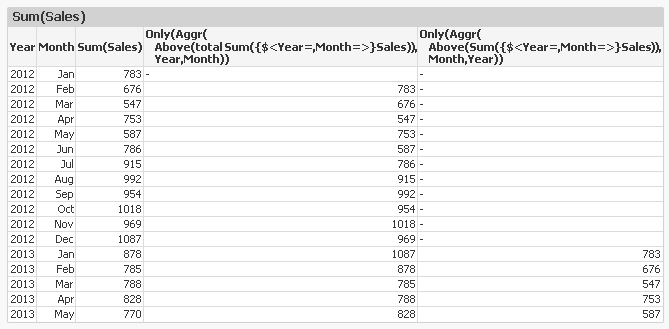
An Aggr() table is always sorted by the load order of the dimensions, one by one. This means that you can change the meaning of Above() by changing the order of the dimensions.
With this, I hope that you understand the Above() function better.
Further reading related to this topic:
-
Qlik Sense Cloud Business - REST Connector
Happy Tuesday everyone! Thanks for joining me in this week’s Qlik Community Design Blog. Today I have the pleasure of introducing our newest guest blo... Show More
Happy Tuesday everyone! Thanks for joining me in this week’s Qlik Community Design Blog. Today I have the pleasure of introducing our newest guest blogger, Denise LaForgia. Denise is a colleague of mine in the Product Marketing group and is a Senior Product Marketing Manager focused on our cloud solutions. In this week's edition she will be covering our new REST connectivity recently made available to Qlik Sense Cloud Business subscribers. On an occasional basis, Denise will share updates on our Qlik Sense Cloud solutions. Take it away Denise.Hi Everyone,
Welcome to this first installment of what I would like to refer as our Qlik Sense Cloud Update blog. I plan on bringing you all the news about the latest updates in Qlik Sense Cloud as well as some tips and tricks to help you get the most out of your Qlik Sense Cloud subscription. Occasionally, I might even ask Mike to embed a supplemental video to go along with the topic as we have done in this article. Please note that I will also provide continuous updates in the Qlik Sense Cloud Community Section along with the occasional appearance here. We have a lot of exciting features rolling-out, so stay tuned!
This week we’re excited to announce the launch of REST Connectivity in Qlik Sense Cloud Business. We know Qlik Sense Cloud Business users are eager for additional data connectivity options in order to automatically import and associate data sets from multiple sources. REST connectivity provides flexibility to a wide range of connectivity options with many of the applications you may be using in your business or project group or team.
So what is REST?
REST stands for Representational State Transfer, a modern and lightweight, secure communications protocol used to transfer data over the web. The Qlik Sense Cloud Business REST connector is designed to load data into a Qlik Sense app from a service that supports REST. It can return data in many formats such as JSON, XML, or CSV. Most web-based applications, social media channels, cloud-based CRM systems and even Google Analytics are REST-enabled, which means you can now build a connection between Qlik Sense Cloud Business and those data sources.
How does it work?
The Qlik Sense Cloud Business REST Connector can be considered a 'generic' connector, meaning it gives you the flexibility to configure a connection with any REST-enabled source you’d like to pull data from. Depending on which application you want to connect to, you can navigate to its developer area and configure that application’s settings to open up a REST connection. Visit this area in our help section to read examples on how to do that for LinkedIn, Twitter, Facebook, and Google Analytics. (included in video) Once you have the query parameters, head to the data manager or data load editor in Qlik Sense Cloud Business to complete the connection.
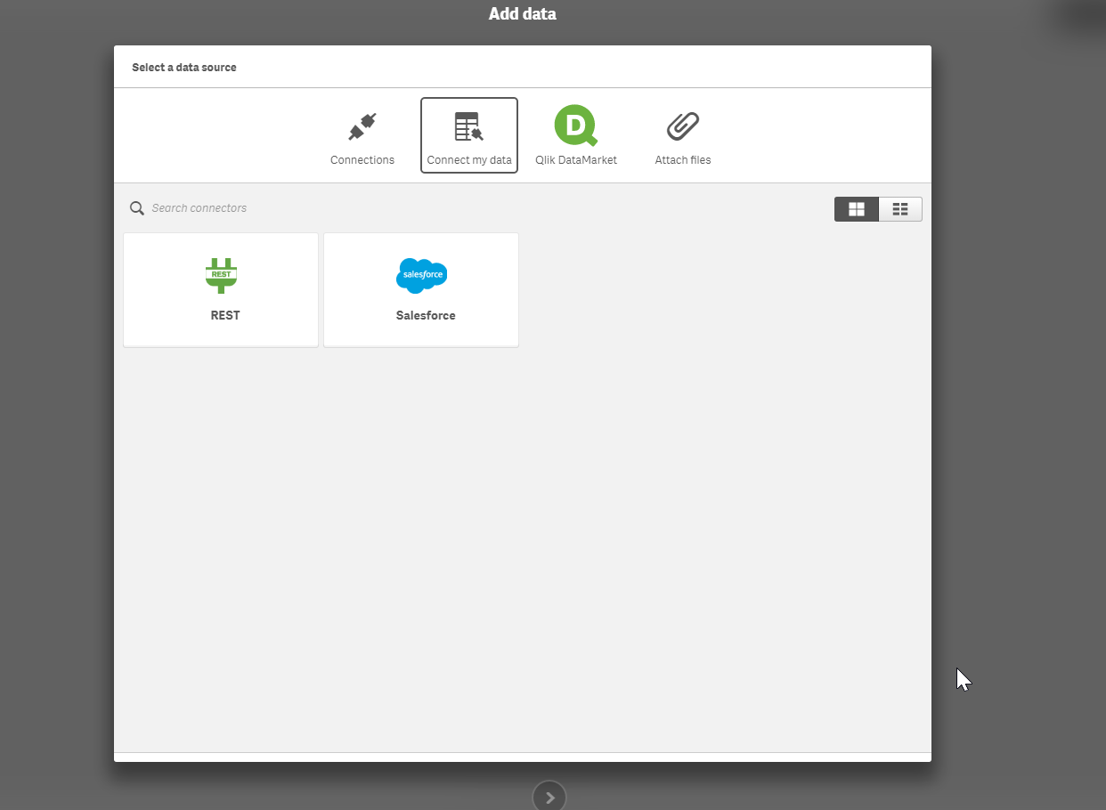
You can also use the REST Connector to load data files directly from public web files, such as DropBox, by simply entering the file’s URL in the REST Connector configurator. The Qlik Sense Cloud Business REST Connector loads the data into your app and automatically parses the information into appropriate table and field structures so that it’s easily used with your application’s data model. And, you can use the scheduled refresh feature in Qlik Sense Cloud Business to ensure your data files from the REST Connector are always up to date.
Ready to learn more - webinars, videos:
Watch Mike's video below or go to the Set Up Select Sources for REST Connectivity page for more information about how to connect to different data sources – including Facebook, Twitter, and Google Analytics - using REST. Mike will also be presenting a Tips and Trick's webinar on REST Connectivity with a LIVE Q&A on May 10th at 1PMEST - you can learn more about it and register HERE.
Regards,
Denise LaForgia
Senior Product Marketing Manager
Qlik
Introduction to the Qlik Sense Cloud Business REST Connector and JSON Schemas
Can't see the video? Download the .mp4 to play on your machine or mobile device.
Additional Qlik Sense Cloud Connectivity Resources
How-To Guides:
- Connect to a REST Data Source
- Set Up Select Sources for REST Connectivity (Facebook, Google Analytics, LinkedIn, Twitter)
- Connect to Dropbox Using REST
How-To Videos:
-
Mutiple hypercubes in an extension
Recently, I needed to make an extension that required multiple hypercubes with dimensions and measures that were able to be set by the user. The follo... Show MoreRecently, I needed to make an extension that required multiple hypercubes with dimensions and measures that were able to be set by the user. The following is the solution I came up with. It could be a bit more generalized, and there's some other things to consider such as making selections, but it's a good starting point and an interesting topic, so I wanted to share with you.
Step 1 - Add the hypercubes to initialProperties
The hypercubes need to be added to initialProperties. They can each be added within their own object in initialProperties, as below.
initialProperties: {
cube1: {
qHyperCubeDef: {
qDimensions: [],
qMeasures: [],
qInitialDataFetch: [{
qWidth: 2,
qHeight: 5000
}]
}
},
cube2: {
qHyperCubeDef: {
qDimensions: [],
qMeasures: [],
qInitialDataFetch: [{
qWidth: 2,
qHeight: 5000
}]
}
}
}
Step 2 - Add ability for user to define dimensions and measures in definition
Now, you'll need to add the ability for users to define the dimensions and measures for each cube into the properties panel.
definition: {
type: "items",
component: "accordion",
items: {
cube1props: {
label: "Cube 1",
type: "items",
items: {
dimension: {
label: "Dimension",
type: "string",
expression: "always",
expressionType: "dimension",
ref: "cube1props.dimension"
},
measure: {
label: "Measure",
type: "string",
expression: "always",
expressionType: "measure",
ref: "cube1props.measure"
},
}
},
cube2props: {
label: "Cube 2",
type: "items",
items: {
dimension: {
label: "Dimension",
type: "string",
expression: "always",
expressionType: "dimension",
ref: "cube2props.dimension"
},
measure: {
label: "Measure",
type: "string",
expression: "always",
expressionType: "measure",
ref: "cube2props.measure"
}
}
}
}
}
Step 3 - Updating the hypercube with user defined properties
This is where the interesting stuff happens. When the user updates one of the properties associated with a hypercube, we need to actually update the hypercube to reflect that. So in the extension's controller, we're going to watch for changes to the props for a cube, and then use the Backend API ApplyPatches method to update the cube.
//Set cube1
$scope.$watchCollection("layout.cube1props", function(props) {
$scope.backendApi.applyPatches([
{
"qPath": "/cube1/qHyperCubeDef/qDimensions",
"qOp": "replace",
"qValue": JSON.stringify([{qDef: {qFieldDefs: [props.dimension]}}])
},
{
"qPath": "/cube1/qHyperCubeDef/qMeasures",
"qOp": "replace",
"qValue": JSON.stringify([{qDef: {qDef: props.measure}}])
}
], false);
});
//Set cube2
$scope.$watchCollection("layout.cube2props", function(props) {
$scope.backendApi.applyPatches([
{
"qPath": "/cube2/qHyperCubeDef/qDimensions",
"qOp": "replace",
"qValue": JSON.stringify([{qDef: {qFieldDefs: [props.dimension]}}])
},
{
"qPath": "/cube2/qHyperCubeDef/qMeasures",
"qOp": "replace",
"qValue": JSON.stringify([{qDef: {qDef: props.measure}}])
}
], false);
});
That'll do it. Now the user can define a dimension and measure for each hypercube, and the hypercube will be patched accordingly. There's still some more to think about and some nice-to-have's with this approach, such as the ability to add variable numbers of dimensions and measures, allowing the user to set other properties of the hypercube, selections, and more. But, I think this pattern is a decent starting point.
Here's a link to a github repo I started around this idea, just in case you try this out and have anything cool to add.
-
Getting to Know Qlik GeoAnalytics
Hello Qlik Community! In my last blog entry Introducing Qlik GeoAnalytics - I um...well....introduced our latest product offering... Qlik GeoAnalyitcs... Show More
Hello Qlik Community!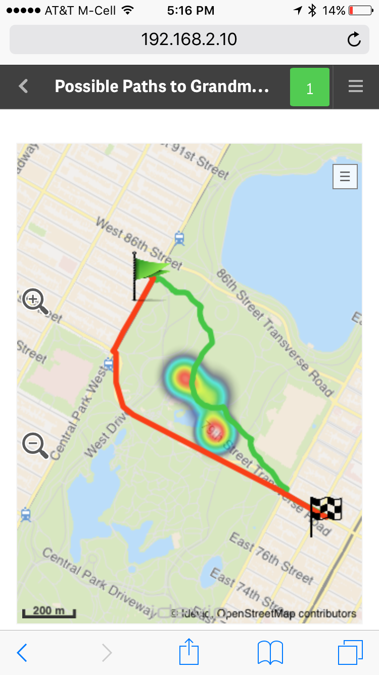 In my last blog entry Introducing Qlik GeoAnalytics - I um...well....introduced our latest product offering... Qlik GeoAnalyitcs.
  I also included a promo video showcasing its various capabilities. (In case you have not seen it, I suggest you start with that first.)
I've been working with Qlik GeoAnalytics for a few weeks now and I am really enjoying it. I'm gathering tremendous knowledge (thanks to the fantastic Idevio team who is now part of the Qlik family) and compiling it so I can share it with you so you can get started quickly. You can see some of the efforts in this new video index which provides a few primers to help you get started with Qlik GeoAnalytics for both Qlik Sense and QlikView. If you have Qlik GeoAnalytics related questions you can also start a discussion in our new section on the Qlik Sense forums: Qlik GeoAnalytics Community.
Over the next few weeks I'll be presenting other topics in a series of blogs and community posts that will help you learn more about Qlik GeoAnalytics, presenting its various capabilities. To that point, I recently discovered the Qlik GeoAnalytics Connector which can grab data from a variety of external geo-data services to return route information, distance, time and spatial relationships and associate them with your 'decision making data'. Look at this fun example using Qlik GeoAnalytics Line, Bubble (flags), and Heatmap layers to represent long and short travel routes, along with a fictional "area of concern" depicted by the heatmap. With Qlik Sense small devices mode it even fits and reacts perfectly on my iPhone too, I did not have to create a separate mobile-version of the app....."Oh, no - I don't want to take that shortcut through Central Park, there are way too many street performers along that route!!" ...but more on that later. What I love the most about Qlik GeoAnalytics, it's more than just plotting simple dots on a map, it moves Qlik beyond visualization and supports a broad range of advanced geoanalytic use cases. I hope you will see the value and benefits it has to offer and that you have as much fun with it as I.
To kick of the knowledge share, in this below video I show you how to create a very simple Area map, which can also be known as a boundary or choropleth map, that you can drill-down into.
If you cannot see the video, or you would like the sample data, you can find both here: Qlik GeoAnalytics - Creating a Drill-down Area Map
Let me know what you think and I looking forward to joining the conversation on the Qlik GeoAnalytics Community.
Regards,
Michael Tarallo (@mtarallo) | Twitter
Senior Marketing Manager
Qlik
-
Big Data and Your Smart Phone
How convenient would it be to have a smart superphone that can carry out tasks autonomously — even while offline? We’re not just talking about random ... Show More
How convenient would it be to have a smart superphone that can carry out tasks autonomously — even while offline? We’re not just talking about random tasks like updating email or displaying social alerts. We’re talking about full-blown actions like making calls, sending messages and more.
The idea sounds pretty crazy, right? Believe it or not, it may soon be a reality.
To read more visit the article published by Inside Big Data http://insidebigdata.com/2017/03/28/big-data-ai-make-phone-scary-smart/
-
Registering extensions on the fly
Did you know that you can register extensions on the fly in mashups? That's right, you can register an extension in a mashup to use in that mashup, re... Show MoreDid you know that you can register extensions on the fly in mashups? That's right, you can register an extension in a mashup to use in that mashup, regardless of whether the extension is already loaded into your Qlik Sense environment. That means you can distribute your mashup with any extensions it uses as one package, and you have total control of the extension version your mashup is using.
Doing it is pretty straightforward. You just need to load the extension code into your mashup, then register it. It'll look something like this.
require(["js/qlik"], function (qlik) { //load qlik module

  require(["path-to-my-extension/my-extension.js"], function(myExtension) { //load extension entry point
   qlik.registerExtension( 'my-extension', myExtension ); //register extension
    //do stuff with extension
  });

});
Notice that I loaded the extension entry point after loading the
qlikmodule. That's because many extensions use theqlikmodule, and if your extension loads theqlikmodule but you try to load your extension code before loading theqlikmodule in your mashup, you'll end up with errors. So better just to load the extension after theqlikmodule has been loaded in your mashup.Once the extension has been registered you can do stuff with it, like use it with the Visualization API. An interesting use case is if you are loading objects that use an extension from an app into your mashup. The version of the extension you register with the mashup will override the extension loaded into your Qlik Sense environment, which can be really useful.
You can read more about it and see a few examples here Creating extensions on the fly.
-
Get Certified, Get Ahead
Data and big data analytics are the foundation of business, and as such, data literacy and analytic skills are in high demand. Those who successfully ... Show More
Data and big data analytics are the foundation of business, and as such, data literacy and analytic skills are in high demand. Those who successfully capitalize on the vast amounts of data available to businesses are proving to be critical for today’s most successful organizations. According to the Bureau of Labor Statistics, both Database Administration and Information Research Scientist roles are projected to increase by 11% between 2014-2024. The discovery, curation, and dissemination of data by highly-trained experts creates smarter, more successful organizations.
To read the full article visit
http://global.qlik.com/us/blog/posts/kevin-hanegan/get-certified-get-ahead
-
All About Selections
The ability to make selections and see what data is associated is one of the powerful capabilities of Qlik Sense and QlikView. Selections allow users... Show MoreThe ability to make selections and see what data is associated is one of the powerful capabilities of Qlik Sense and QlikView. Selections allow users to explore the data in an app and to answer their specific questions at any given time. In this blog, I will discuss the following selection options you may find in a selection pop-up window (shown below): Clear selection, Select all, Select possible, Select alternative and Select excluded.
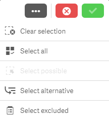
Clear selection
Let’s start with the Clear selection option. As you may expect, this will clear all selections that have been made in an app excluding locked selections. Locked selections are selections that cannot be cleared or changed. They are used when the user wants to protect a selection.
Select all
Select all will select all values in a field making them green. If there are excluded values in the field when you select all, then they will become selected excluded – these items will remain gray but they will get a check mark next to them indicating that they are also selected. In the image below, Dairy was selected in the Product Group field and Cheese was selected in the Product Sub Group field. All the other values in the Product Group field are excluded and therefore gray. Once all values are selected in the Product Group field, the excluded items stay gray but now have a check mark to indicate they are selected excluded.
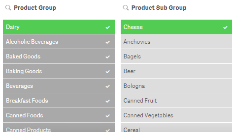
If the selection that excludes some of the values (which is Cheese in this example) is removed then they will all become selected and turn green.
Select possible
To explain the select possible selection, let’s first define possible values. Possible values are values that are not selected and not excluded by a selection. They appear with a white background. For example, all values in a filter pane will be possible if no selections have been made. In the image below, Dairy is selected in the Product Group field and the Product Sub Group has 5 possible values (the first 5 values in the list). The possible values are product sub group items that are associated with the Dairy selection.
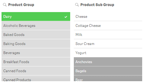
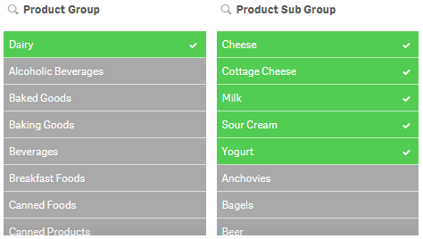
If select possible is applied to the Product Sub Group, you will get the following results:
Select alternative
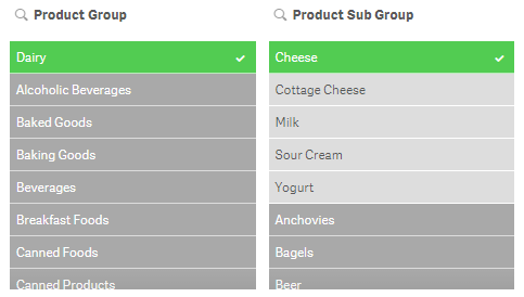
What are alternative values? Alternative values (light gray) are values that would have been possible (white) if a selection was not made in the field. We have already seen an example of that in the image below. In this example, Dairy was selected first and then Cheese was selected. Before Cheese was selected, the first five values in the Product Sub Group field were white (possible values). After Cheese was selected, Cheese became selected (green) and the other four values became alternative (light gray).
Select excluded
Select excluded will select all the non-selected values in a field. If Dairy is selected in the Product Group field, then select excluded will select all values that were excluded (gray) and will make them green and the Dairy selection will become an alternative value (light gray). If Dairy (Product Group) and Cheese (Product Sub Group) were selected and select excluded was selected in the Product Sub Group field (see image below), then the selected value Cheese becomes an alternative value (light gray), the possible values become green and selected and the excluded values become selected excluded (gray with a check mark).
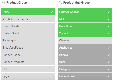
The selection options reviewed in this blog can be used not only in filter panes and the selections tool but they can also be used in charts. This gives the user the ability to drill down in the data and see what data is associated and excluded by selections. Selections are very powerful so it is important to know all your options and how you can make selections to analyze your data. The example images used in this blog are based on the data in the Consumer Goods Sales demo. Feel free to use the selection tool in the app to test out selections or log in to qlik.com so you can add your own filter panes to the demo app.
Thanks,
Jennell
-
Automatic Number Interpretation
I have in several previous blog posts written about the importance to interpret dates and numbers correctly e.g. in Why don’t my dates work?. These ... Show MoreI have in several previous blog posts written about the importance to interpret dates and numbers correctly e.g. in Why don’t my dates work?. These posts have emphasized the use of interpretation functions in the script, e.g. Date#().
But most of the time, you don’t need any interpretation functions, since there is an automatic interpretation that kicks in before that.
So, how does that work?
In most cases when QlikView encounters a string, it tries to interpret the string as a number. It happens in the script when field values are loaded; it happens when strings are used in where-clauses, or in formulae in GUI objects, or as function parameters. This is a good thing – QlikView would otherwise not be able to interpret dates or decimal numbers in these situations.
QlikView needs an interpretation algorithm since it can mix data from different sources, some typed, some not. For example, when you load a date from a text file, it is always a string: there are no data types in text files – it is all text. But when you want to link this field to date from a database, which usually is a typed field, you would run into problems unless you have a good interpretation algorithm.
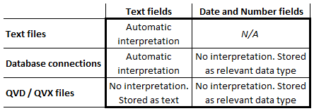
For loaded fields, QlikView uses the automatic interpretation when appropriate (See table: In a text file, all fields are text - also the ones with dates and timestamps.) QlikView does not use any automatic interpretation for QVD or QVX files, since the interpretation already is done. It was done when these files were created.
The logic for the interpretation is straightforward: QlikView compares the encountered string with the information defined in the environment variables for numbers and dates in the beginning of the script. In addition, QlikView will also test for a number with decimal point and for a date with the ISO date format.
If a match is found, the field value is stored in a dual format (see Data Types in QlikView) using the string as format. If no match is found, the field value is stored as text.
An example: A where-clause in the script:
Where Date > '2013-01-01' will make a correct comparison
The field Date is a dual that is compared to a string. QlikView automatically interprets the string on the right hand side and makes a correct numeric date comparison. QlikView does not (at this stage) interpret the content of the field on the left hand side of the comparison. The interpretation should already have been done.
A second example: The IsNum() function
IsNum('2013-01-01') will evaluate as True
IsNum('2013-01-32') will evaluate as False since the 32:nd doesn't existIn both cases, strings are used as parameters. The first will be considered a number, since it can be interpreted as a date, but the second will not.
A third example: String concatenation
Month(Year & '-' & Month & '-' & Day) will recognize correct dates and return the dual month value.
Here the fields Year, Month and Day are concatenated with delimiters to form a valid date format. Since the Month() function expects a number (a date), the automatic number interpretation kicks in before the Month() function is evaluated, and the date is recognized.
A final example: The Dual() function
Dual('Googol - A large number', '1E100') will evaluate to a very large number
Here the second parameter of Dual() is a string, but QlikView expects a number. Hence: automatic interpretation. Here, you can see that scientific notation is automatically interpreted. This sometimes causes problems, since strings – that really are strings – in some cases get interpreted as numbers. In such cases you need to wrap the field in a text function.
With this, I hope that the QlikView number handling is a little clearer.
Further reading related to this topic:
-
BiPartite Extension
One interesting Qlik Sense extension that we have successfully used, is the BiPartite one. We have used it in couple of mashups like the UK Migration ... Show MoreOne interesting Qlik Sense extension that we have successfully used, is the BiPartite one. We have used it in couple of mashups like the UK Migration http://webapps.qlik.com/telegraph/uk-migration/index.html.
I like this one since you have a visual representation of all the values, selected and not and there is a nice animation moving from one dimension value to the next.
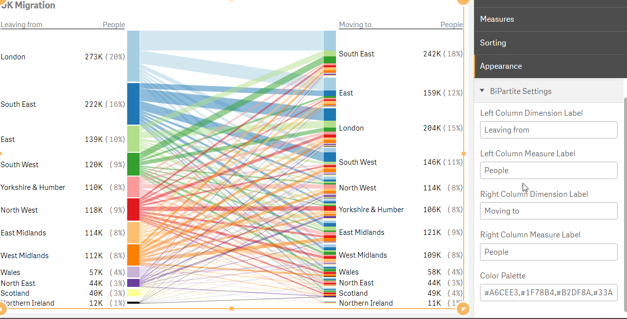
This is a responsive extension with minimum view of 320px. You add One dimension for the left column and one for the right and then one measure for the values in each column.
You can write your own labels for each column and add your custom coloring palette.
That's it! Give it a try
Branch : http://branch.qlik.com/#!/project/58b820c55efd3b8f0b6743ce
Git: https://github.com/yianni-ververis/SenseUI-BiPartite
-
Scrambling Data
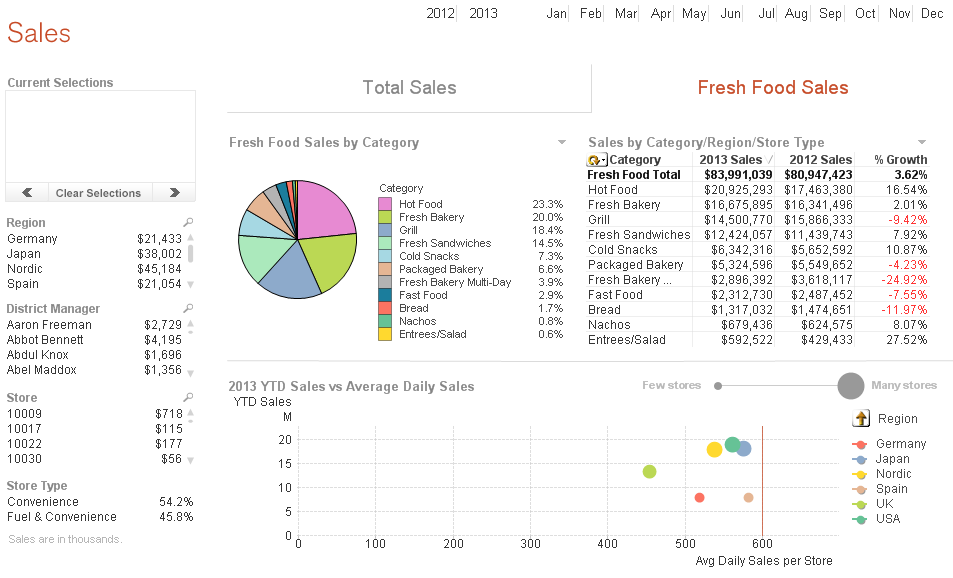
When building demos, I am often required to scramble the data. QlikView has a scrambling feature that allows selected fields to be scrambled in some ... Show MoreWhen building demos, I am often required to scramble the data. QlikView has a scrambling feature that allows selected fields to be scrambled in some random fashion. I find this to be a quick and easy way to scramble data but when I have a lot of fields to scramble, I think it can make the application difficult to follow because QlikView’s scrambled data is not readable and does not appear realistic. For example, let’s see what the sheet below looks like after it has been scrambled.
Before scrambling
After Scrambling
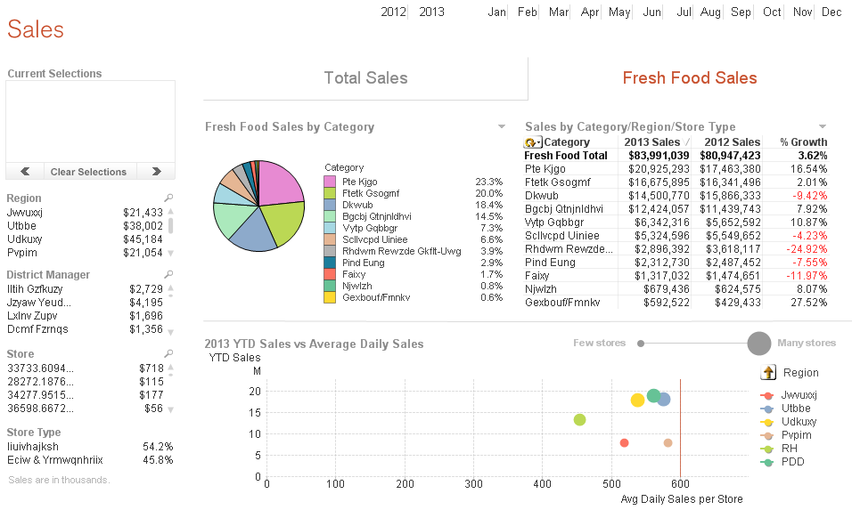
At a glance, it may be hard to comprehend what you are looking at because names do not look like names and regions do not look like regions, etc. The scrambled data is not readable so it is harder to make sense of what you are looking at.
An alternative to using QlikView’s scrambling feature is to use mapping and modifiers. I have used modifiers as seen in the example below to change numeric data in my script so that sales figures are not recognizable.
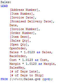
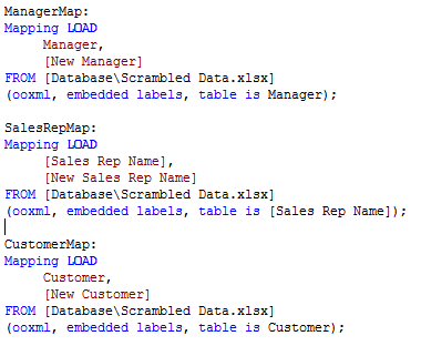
Mapping can be used to change the text data to values that are readable and realistic to the user. For instance, if I want to change the names in the Manager, Sales Rep and Customer fields I can load mapping tables that store the original name and the new name as seen below.
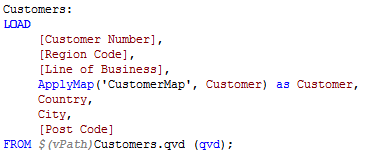
Then I can use ApplyMap() on the fields that need to be changed.
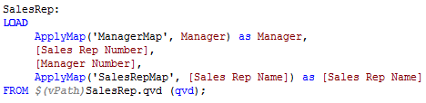
After a reload, the new “scrambled” data is being used in the visualizations. Note: If you plan to distribute the application, I recommend removing the scrambled script or creating QVDs and loading from these. You do not want the user to be able to re-engineer your scrambling and determine the original values.
Check out my technical brief on this topic for more detailed information. Have fun scrambling!
Jennell
-
Responsive Design Tips
The responsive design of Qlik Sense allows apps to be developed once and deployed anywhere. This makes the developer’s life easier but there are still... Show MoreThe responsive design of Qlik Sense allows apps to be developed once and deployed anywhere. This makes the developer’s life easier but there are still a couple of things to keep in mind when you are building your app.
Object Positioning – On a small device like a phone, Qlik Sense will redisplay the page by ordering objects in a single column. The order of displayed objects is determined by a top to bottom, left to right fashion. Meaning that the object that sits in the top left corner of the full dashboard will be displayed first, next the object to the right of the first object will be displayed. So if you are going to build out a dashboard, it makes sense to build it horizontally and not vertically.
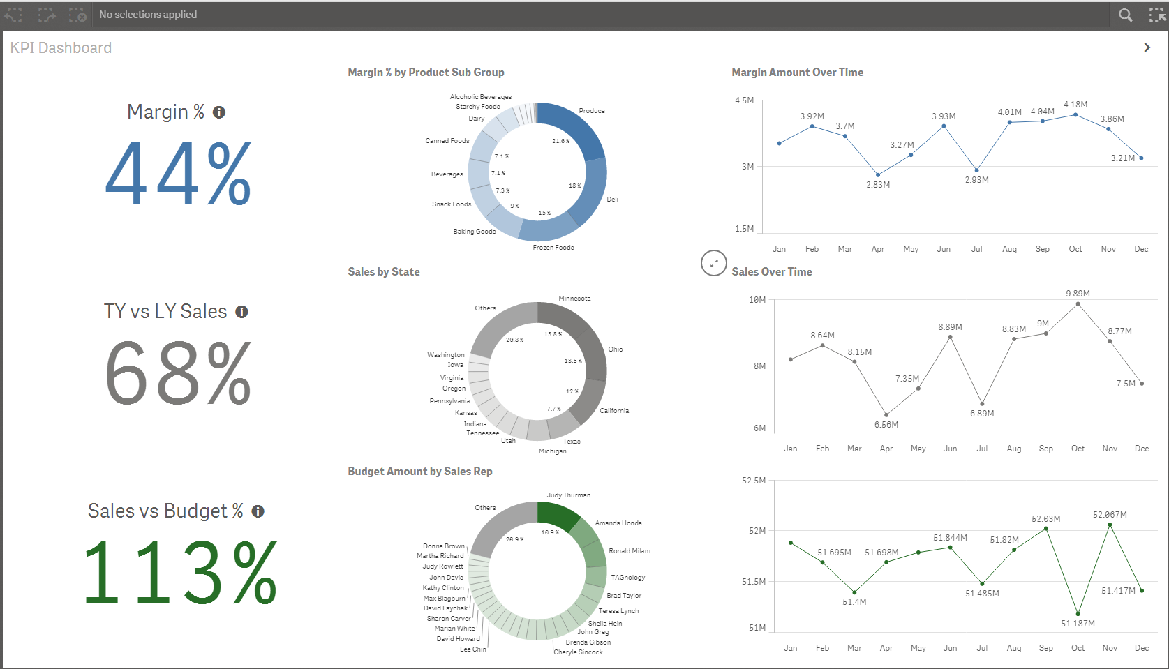
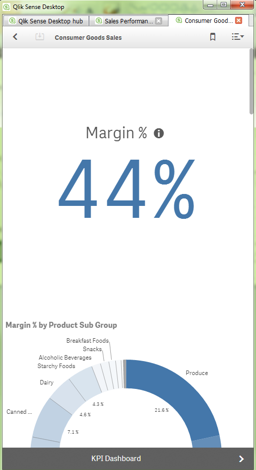
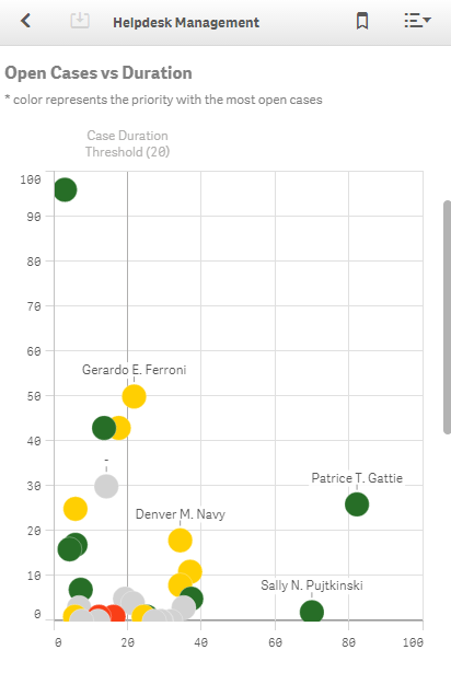
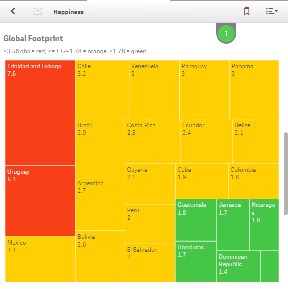
Chart Titles and Subtitles - Using chart titles and subtitles ensures that objects can be interpreted by the users who are looking at your chart as a single object.
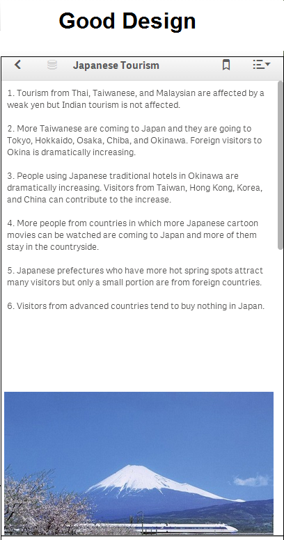
Text and Image Objects - I would recommend that you use text and image objects wisely. In small device mode, images and text can look out of place as they shift positions to accommodate the viewing area of a small device.
So if you keep small devices in mind when you are building your app, you can be sure that all users will have the best user experience possible. Happy Qliking!