Unlock a world of possibilities! Login now and discover the exclusive benefits awaiting you.

Analytics & AI
Forums for Qlik Analytic solutions. Ask questions, join discussions, find solutions, and access documentation and resources.
Data Integration & Quality
Forums for Qlik Data Integration solutions. Ask questions, join discussions, find solutions, and access documentation and resources
Explore Qlik Gallery
Qlik Gallery is meant to encourage Qlikkies everywhere to share their progress – from a first Qlik app – to a favorite Qlik app – and everything in-between.
Qlik Community
Get started on Qlik Community, find How-To documents, and join general non-product related discussions.
Qlik Resources
Direct links to other resources within the Qlik ecosystem. We suggest you bookmark this page.
Qlik Academic Program
Qlik gives qualified university students, educators, and researchers free Qlik software and resources to prepare students for the data-driven workplace.
Recent Blog Posts
-
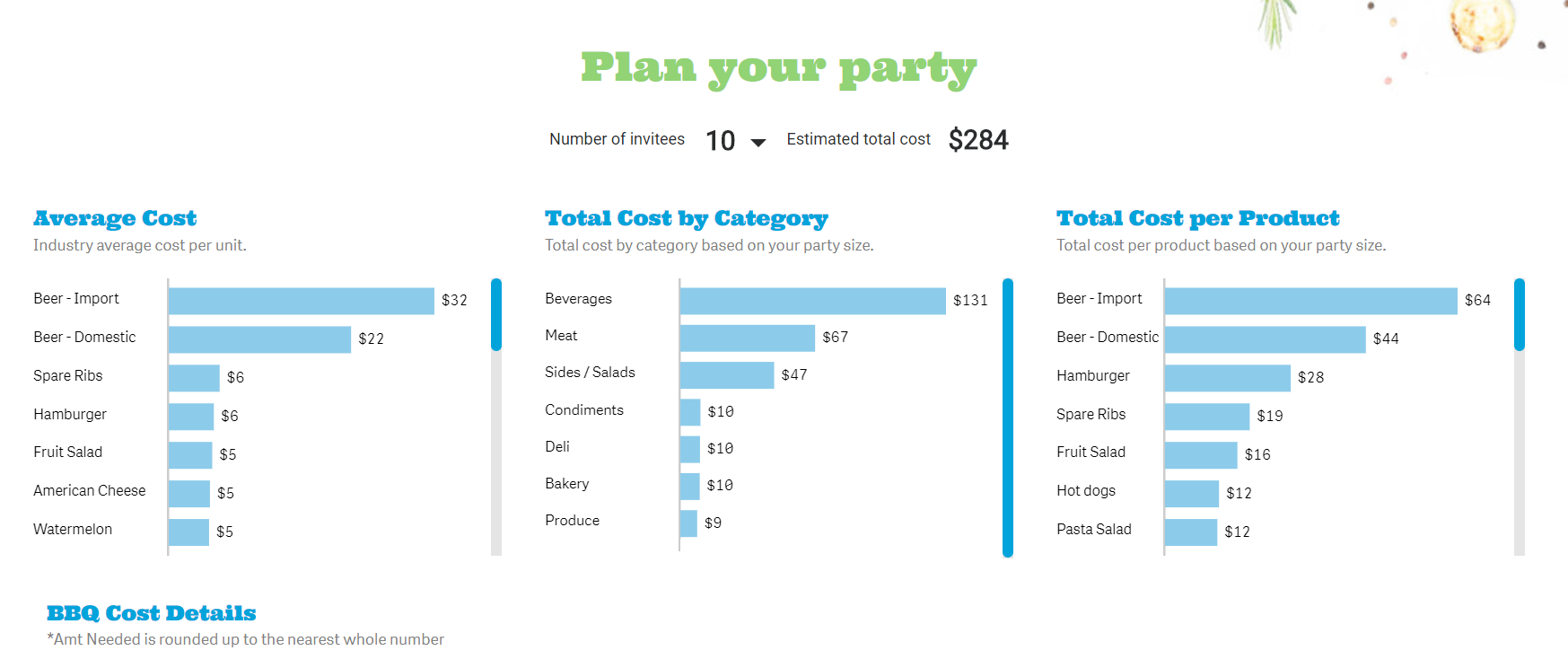
How can Qlik Sense help you plan a party?
Summer BBQQlik Sense isnt just a business user tool, it can be used for so many fun purposes! Summer time is the time for outdoor fun and catching so... Show More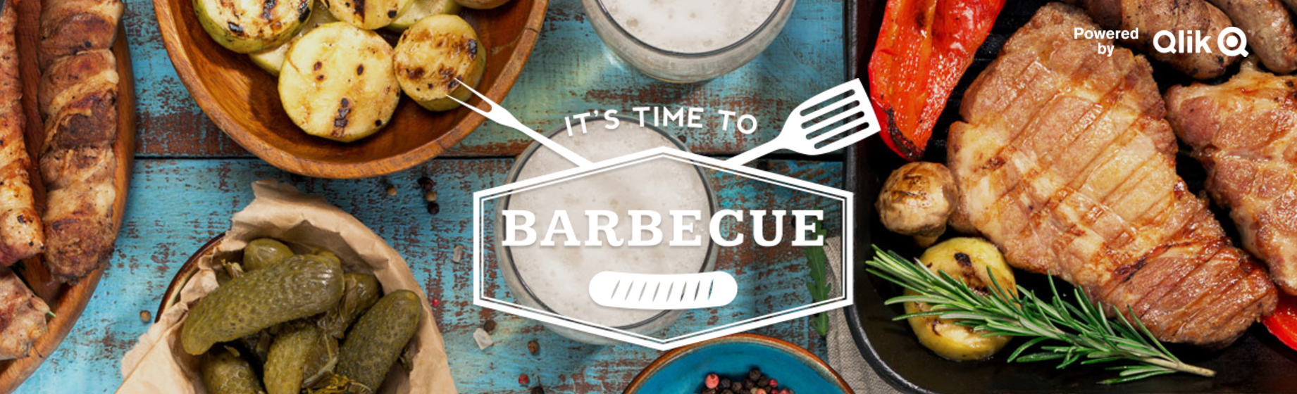
Summer BBQ
Qlik Sense isnt just a business user tool, it can be used for so many fun purposes! Summer time is the time for outdoor fun and catching some sun. Its also a big time to host a BBQ, but how much money should you plan to spend for your next party?
Visit the BBQ Qlik Sense app to help you determine how much money you need to host your party!

-
Coming Soon to Qlik NPrinting™
All products constantly evolve based on customer demand and technology Innovation and this is certainly what drives the Qlik NPrinting product team. ... Show More All products constantly evolve based on customer demand and technology Innovation and this is certainly what drives the Qlik NPrinting product team. When the first release of Qlik NPrinting (then Vizubi) was released in 2008 you would not have recognized the product as the one you know today.
 As we await the next release - scheduled for the end of June - we thought we would share what you might expect to find this time:
- Extension Support for Qlik NPrinting – The ability to include most third-party extensions in Qlik NPrinting reports.
- Metadata Reload Scheduling for Qlik NPrinting - Ability to schedule metadata reloads for Qlik NPrinting ensuring that developers always see the most recently built objects when building reports
- Various Qlik Nprinting™ API Enhancements
- User Selection State– Enhanced APIs to capture user selections and apply these to reports in Qlik NPrinting making On-Demand Reporting for Qlik Sense possible. (This capability already exists in QlikView as a plug-in.)
- Management - ability to build, modify and delete users, distribution groups and filters via the API which supports the management of users based on external systems.
- Task Execution – ability to filter and run a Qlik NPrinting report distribution to multiple users based on an external scheduler or trigger.
- Task & Connection Monitoring - Real-time task monitoring for Qlik NPrinting Administrative functionality which allows administrators to see Qlik NPrinting activity in real time.
What’s Cooking @ Qlik
This information and Qlik‘s strategy and possible future developments are subject to change and may be changed by Qlik at any time for any reason without notice. This information is provided without a warranty of any kind. The information contained here may not be copied, distributed, or otherwise shared with any third party.
Qlik NPrinting 17 was virtually a complete rewrite of the Qlik NPrinting product as the Vizubi team became more integrated into the Qlik family. As the year goes on, the feature gap between Qlik NPrinting 16 and Qlik NPrinting 17 will continue to narrow. Of course, new capabilities will surface as well.
Just a few of the items that we are evaluating over the coming months/year are:
- Ability to Promote/Demote a report in order to move it from development to production
- Additional feature parity between capabilities across QlikView and Qlik Sense
- Updated Rendering Service
The investments that we have made in Qlik NPrinting 17 over the past year position us well for the year to come and beyond. We are looking forward to this being a great year for Qlik NPrinting 17 and its users!
-
Qlik NPrinting June 2017 is now available!
The Qlik NPrinting June 2017 is now available from our Customer Download SIte. Capabilities include:Extension Support for Qlik NPrinting – The abili... Show MoreThe Qlik NPrinting June 2017 is now available from our Customer Download SIte.
Capabilities include:
- Extension Support for Qlik NPrinting – The ability to include most third-party extensions in Qlik NPrinting reports.
- Metadata Reload Scheduling for Qlik NPrinting - Ability to schedule metadata reloads for Qlik NPrinting ensuring that developers always see the most recently built objects when building reports
- Various Qlik Nprinting™ API Enhancements
- User Selection State– Enhanced APIs to capture user selections and apply these to reports in Qlik NPrinting making On-Demand Reporting for Qlik Sense possible. (This capability already exists in QlikView as a plug-in.)
- Management - ability to build, modify and delete users, distribution groups and filters via the API which supports the management of users based on external systems.
- Task Execution – ability to filter and run a Qlik NPrinting report distribution to multiple users based on an external scheduler or trigger.
- Task & Connection Monitoring - Real-time task monitoring for Qlik NPrinting Administrative functionality which allows administrators to see Qlik NPrinting activity in real time.
Other related announcements -
- Support Blog Announcement including release notes - Qlik NPrinting June 2017 is now available
- Prior announcement including active discussion with the product manager - Coming Soon to Qlik NPrinting™
-
Qonnections Keynote Now Available
It is hard to believe that more than a month has passed since we returned to the office from Qonnections, our annual partner & customer conference. ... Show MoreIt is hard to believe that more than a month has passed since we returned to the office from Qonnections, our annual partner & customer conference. The event is a lot like a family reunion and it was fantastic to see everyone as well as the level of enthusiasm and engagement.
If you weren't able to join us, you can now find the keynote from Qonnections on the event site. I wanted to also share it here because the keynote is squarely focused on the three key innovation themes that we have set for ourselves over the coming year. These themes include - Hybrid Cloud, Big Data Indexing, and Augmented Intelligence.
P.S. We have already begun planning for next year's Qonnections event. So, please feel free to share ideas about what you think would make a great event.
-
The Qlik Design Blog
The Academic Program encourages all Qlik users to follow the The Qlik Design Blog in Qlik Community. The blog is a fun and easy way to stay up to dat... Show MoreThe Academic Program encourages all Qlik users to follow the The Qlik Design Blog in Qlik Community. The blog is a fun and easy way to stay up to date with the latest Qlik best practices, application demos, news about upcoming improvements, and much more!
To get started visit https://community.qlik.com/blogs/qlikviewdesignblog and select the "Follow" button. Updates can be added to your Qlik Community news streams or emailed directly to you.

-
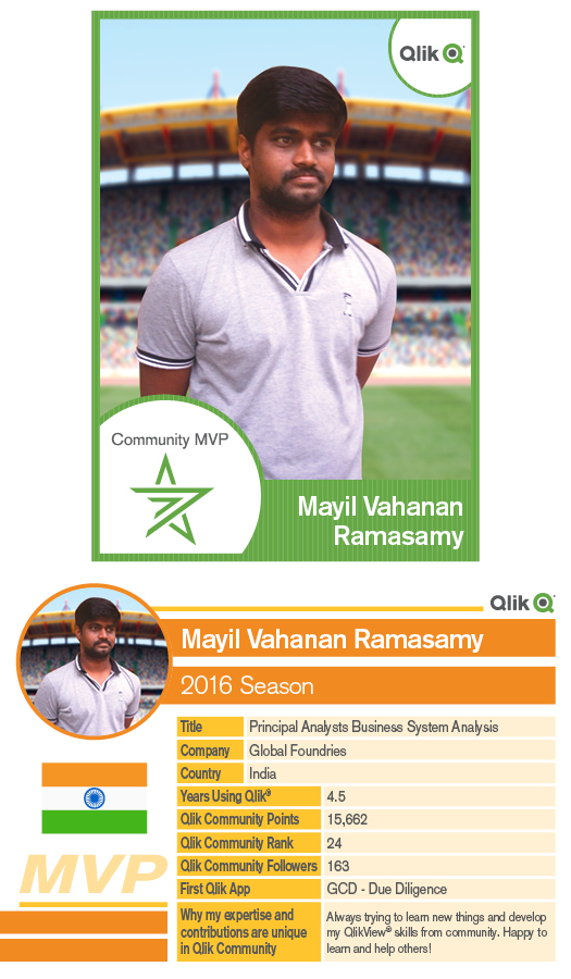
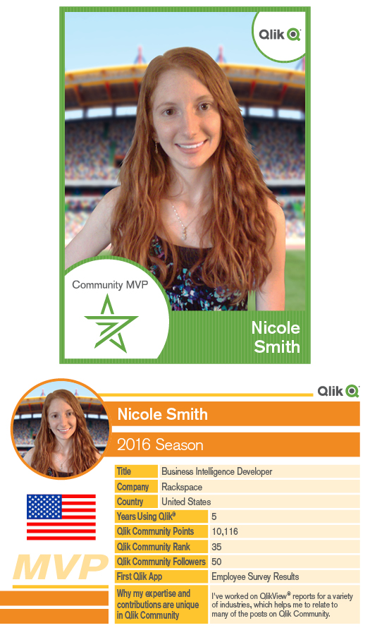
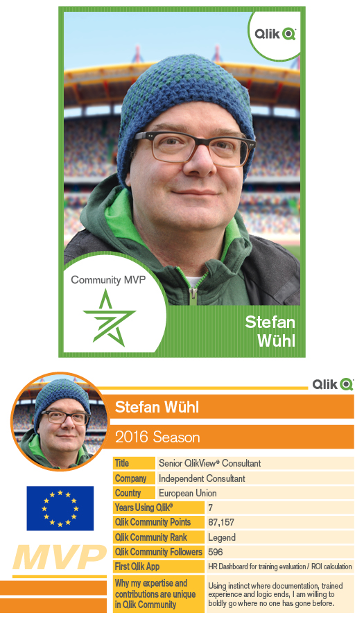
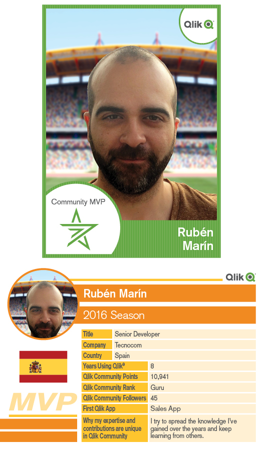
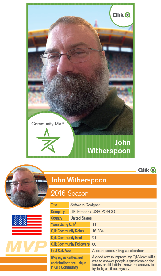
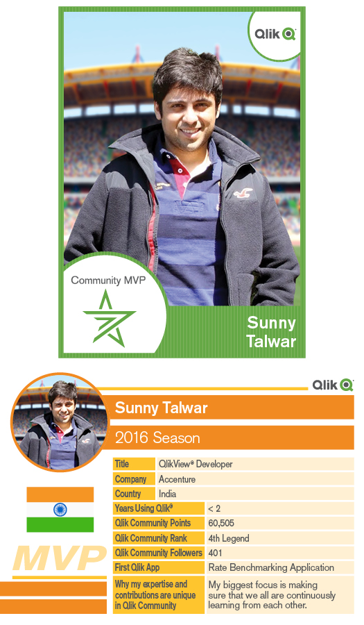
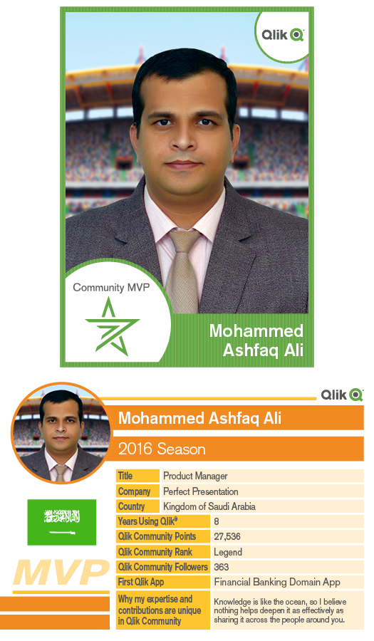
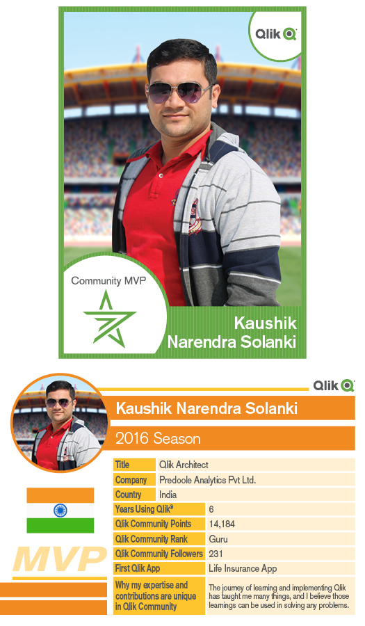
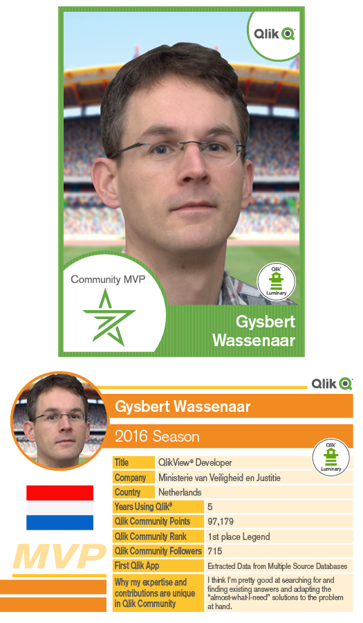
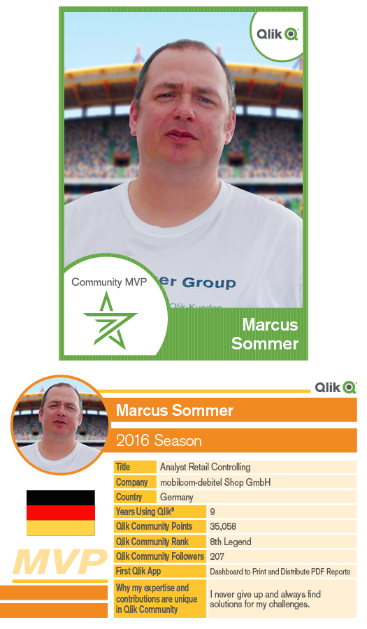
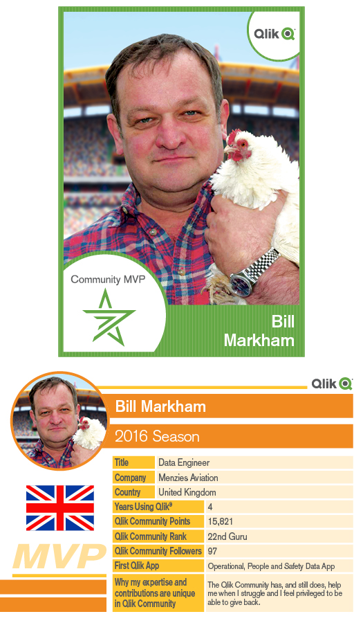
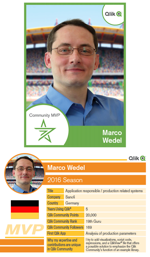
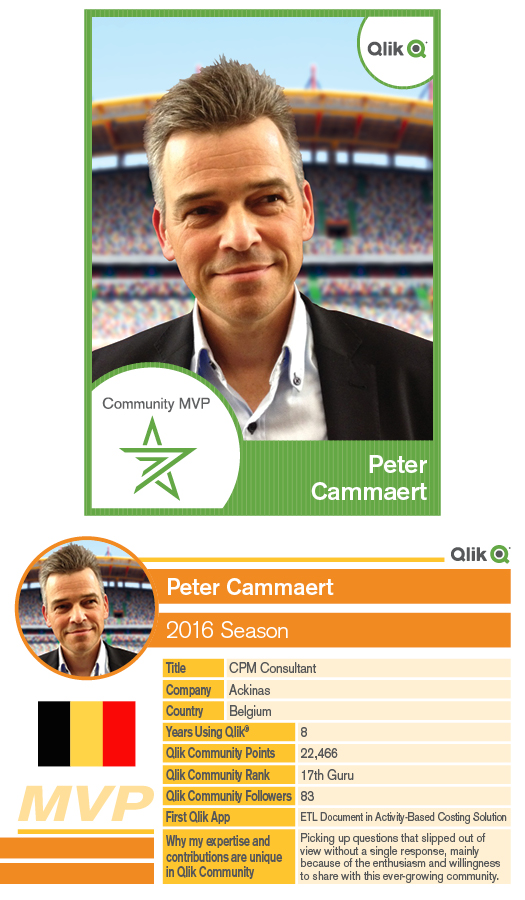
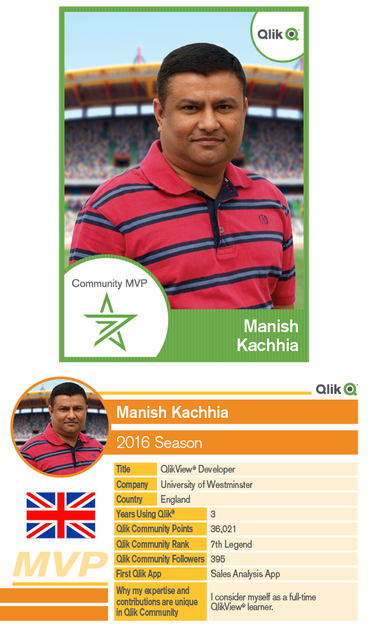
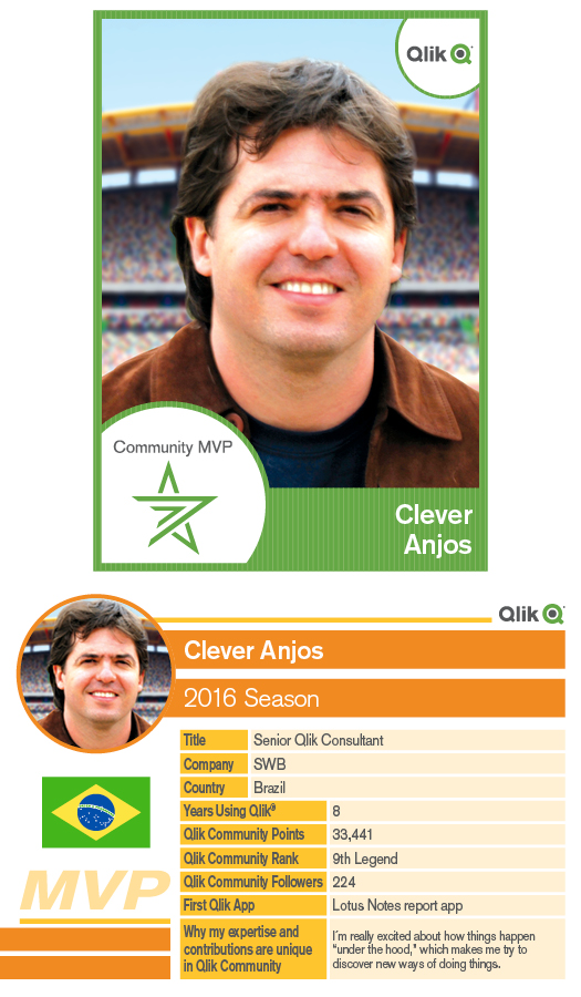
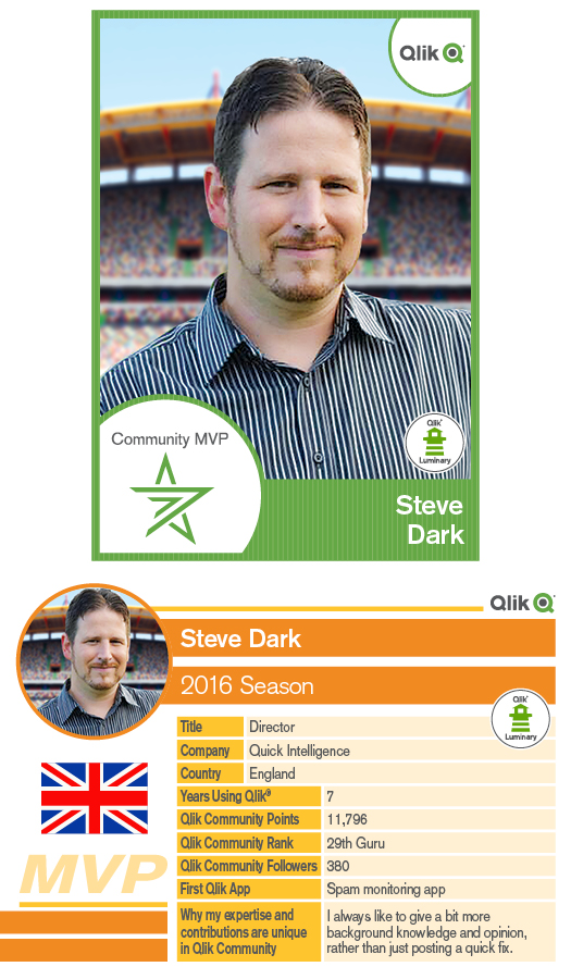
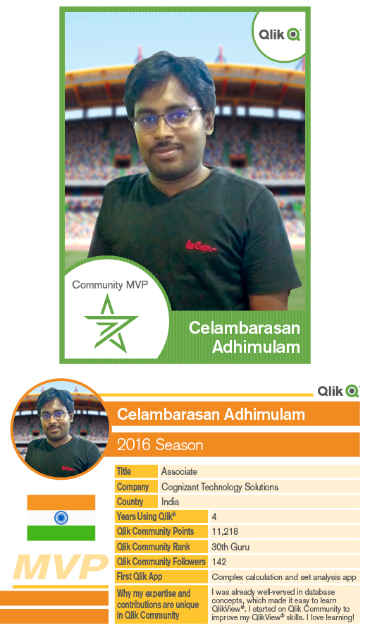
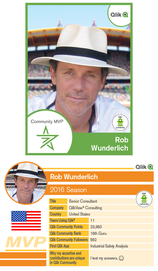
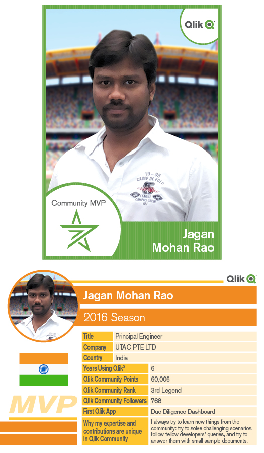
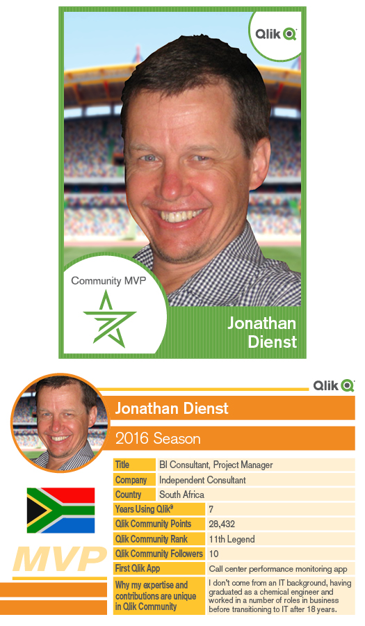
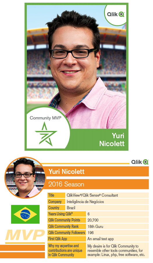
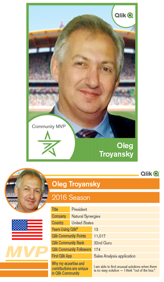
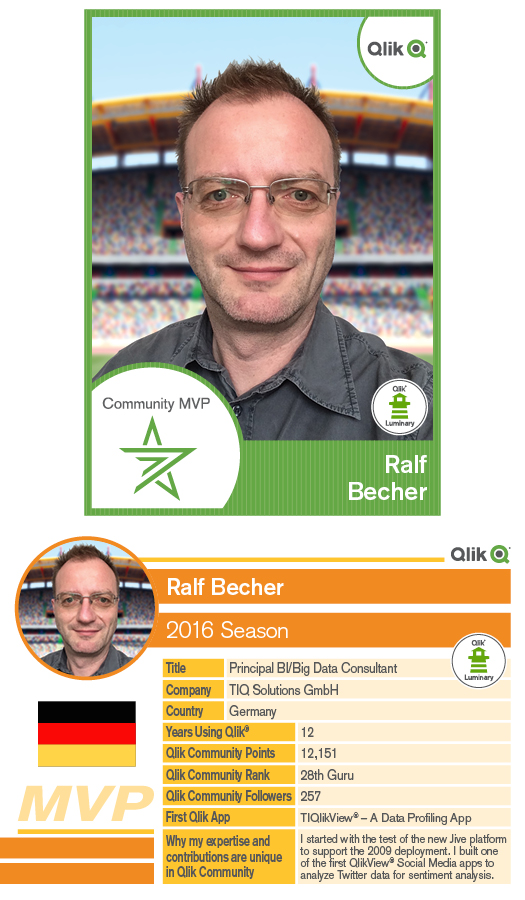
Learn more about our 2016 Qlik Community MVP members
Hello Qlik Community Members, It’s mid-year already and Qlik Community has been really active with lots of great discussions and content.We wanted to ... Show More.jpg)
Hello Qlik Community Members,
It’s mid-year already and Qlik Community has been really active with lots of great discussions and content.
We wanted to take a minute and thank our 2016 MVP members for all of their contributions. All of our 2015 members have opted to say in the program and we have added 10 additional members.
All of our MVP’s are top contributors and great assets to the community.They are the folks who always go the extra mile to help other members, give detailed responses to questions, upload examples and help set the tone in Qlik Community as a place to go for help and collaboration.
We thought it would be nice to share more details about each of our MVP members such as their first Qlik app, years working with Qlik products, country of residence and perspective on collaboration in Qlik Community.
We hope you enjoy this year’s Qlik MVP Member Trading Cards. Please take a minute to learn about each of our MVP’s and even follow some of them and their content.
Click on an MVP name to visit their Qlik Community Profile or on their MVP Trading card to see more details on their contributions.
Cheers!

-
A Cure for the Forgetting Curve
Learn software at the point of need with performance support toolsIn a previous post, Kevin Hanegan (Qliks VP of Knowledge and Learning) shared how to... Show MoreLearn software at the point of need with performance support tools

In a previous post, Kevin Hanegan (Qliks VP of Knowledge and Learning) shared how today’s software users prefer to learn as they go, rather than take training before starting to use the tool. The software industry is following suit to address the trend, with Electronic Performance Support Systems (EPSS) gaining popularity as alternatives to performance interventions that require learners to consume knowledge before a task is realized. The goal of EPSS systems is to provide whatever is necessary to generate performance and learning at the point of need, by integrating the support as much as possible into a user’s work space. This approach to performance is seen as an improvement over traditional training, which takes place before the individual must perform the task. Traditional training typically includes a delay between the learning and application of that to the job, which causes a loss that Hermann Ebbinghaus coined as the forgetting curve.
So, what do these tools look like? To learn visit http://global.qlik.com/us/blog/posts/kevin-hanegan/a-cure-for-the-forgetting-curve
-
Data Reduction – Yes, but How?
I recently wrote a blog post about authorization using Section Access and data reduction. In the example, a person was associated with a country and t... Show MoreI recently wrote a blog post about authorization using Section Access and data reduction. In the example, a person was associated with a country and this entry point in the data model determined whether a record was visible or not: Records associated with the country were visible. “Country” was the reducing field.
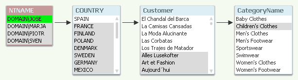
The data reduction was made using row-level security. But there are other ways of limiting access to data. This post is about how you limit access to the data:
Row-level access: You have a reducing field that determines whether a user can see a specific piece of data. If you use Country as reducing field and the user is allowed to see ‘Spain’, this will mean that only rows associated with Spain will be visible: E.g. sales transactions to customers in other countries will not be visible.
Aggregation-level access: This is similar to the above, however with the difference that all data are in principle visible but the aggregation level changes depending on country: A user that is allowed to see ‘Spain’ will see the detailed information about Spain, but only high-level aggregated information about other countries. For other countries detailed information will be hidden.
Column based access: Instead of limiting per row, you can limit per column. Here you can define that only some users are allowed to see specific fields, typically fields like Salary or Bonus.
Object based access: You can also limit access to a specific sheet, graph or pivot table depending on which user it is.
An application can use a combination of the four different methods.
Both Section Access and the loop-and-reduce in publisher use row-level access to allow one single (master) file to be used in different security scopes. It is by far the best way to limit access to data, and should be the one you normally aim for.
It is difficult to achieve aggregation-level access within one single application, so it is better to solve this problem using two applications: One with detailed data that you reduce using a reducing field, and a second unreduced with aggregated data for all countries.
The column-based access can be achieved using two applications, one that includes the sensitive fields and the other that doesn’t. It can also be achieved in one single application using the OMIT field in Section Access.
Finally, the object based access: This method has in my mind very little to do with security: If a chart is hidden for a specific user, he can still see the same data through other objects. Or even worse – if you allow collaboration, he can create an object that shows the same thing. A show condition could be convenient to use anyway, but it is a poor tool for security.
Bottom line: If you want security, you should use Section Access or the loop-and-reduce of the Publisher. You should also consider having your data in several applications. But you should not use show conditions for security purposes.
Further reading related to this topic:

-
Angularjs, Capabilities API and D3
There were times in my Qlik Demo Team projects that the objects coming from the Capabilites Api were not enough and we wanted a custom chart in our we... Show MoreThere were times in my Qlik Demo Team projects that the objects coming from the Capabilites Api were not enough and we wanted a custom chart in our website like the one we did for PGA Championship Data Visualizer
In this tutorial I will just add the D3 library (https://d3js.org/) and create a simple bar chart having loaded Angularjs and the Capabilities API. At this point, I assume you have read the first article on setting the template up with Angularjs and the Capabilities API Creating a website with Angular and the Capabilities API
We will use the same template and the same qvf.
- First, we will add d3 into bower.json
"d3": "3.5.9" - from the command line, we need to run bower install
- then, load it from js/lin/main.js L7
'd3': scriptsUrl + 'js/vendor/d3/d3.min',
and L83 add 'd3', - copy a controller and name it d3.js (controllers/d3.j)s
- make you sure you name it as 'controller.d3 in L12'
- add it to main.js
'controller.d3': scriptsUrl + 'js/controllers/d3',
and load it in L87 'controller.d3', - copy a view and name it as d3 (views/d3.html)
- Add the html holder
<div class="row">
  <div class="col-md-12">
  <div id="chart"></div>
  </div>
</div>
- in order to get the data from the qvf as a hypercube, we just add in d3.js the function, passing the dimension and measure as the default chart:
me.getData = function() {
  api.getHyperCube(['Case Owner Group'], ['Avg([Case Duration Time])'], function(data){
    me.createBarChart(data);
  });
}
- Below is the code that will generate the Bar chart with the labels. I am borrowing the code from the barchart extension that I created and can be found on Branch Qlik Branch
me.createBarChart = function (data) {
  var vars = {
  id: 'chart',
  data: data,
  height: 300,
  width: 500,
  bar: {
  height: 35,
  padding: 3,
  border: 1,
  color: '#4477AA',
  colorHover: '#77b62a',
  borderColor: '#404040'
  },
  label: {
  visible: true,
  width: 200,
  padding: 15
  },
  footer: {
  visible: true,
  height: 20
  },
  canvasHeight: null,
  template: '',
  };
  var element = $('#'+vars.id);
  vars.data = vars.data.map(function(d) {
  return {
  "dimension":d[0].qText,
  "measure":d[1].qText,
  "measureNum":d[1].qNum,
  "qElemNumber":d[0].qElemNumber,
  }
  });


  var dMax = d3.max(vars.data, function(d) { return d.measureNum; });
  vars.canvasHeight = (vars.data.length * (vars.bar.height+(vars.bar.padding*2)+3));


  vars.template = '\
  <div class="barchart" id="barchart">\
  <div class="content"></div>\
  ';
  if (vars.footer.visible) {
  vars.template += '<div class="footer"></div>';
  };
  vars.template += '</div>';


  element.html($(vars.template).width(vars.width).height(vars.height));
  if (vars.footer.visible) {
  $('#' + vars.id + ' .content').height(vars.height-vars.footer.height);
  $('#' + vars.id + ' .footer').height(vars.footer.height);
  } else {
  $('#' + vars.id + ' .content').height(vars.height);
  }


  var x = d3.scale.linear()
  .domain([0,dMax])
  .range([0, (vars.label.visible)?vars.width-vars.label.width-(vars.label.padding*2):vars.width]);


  var y = d3.scale.linear()
  .domain([0,vars.data.length])
  .range([10,vars.canvasHeight]);


  var xAxis = d3.svg.axis()
  .scale(x)
  .orient('bottom');


  var yAxis = d3.svg.axis()
  .scale(y)
  .orient('left')
  .tickSize(1)
  .tickFormat(function(d,i){
  return vars.data.dimension;
  })
  .tickValues(d3.range(vars.data.length)); //1167


  var svg = d3.select('#barchart .content')
  .append('svg')
  .attr({'width':vars.width,'height':vars.canvasHeight});

  var svgFooter = d3.select('#barchart .footer')
  .append('svg')
  .attr({'width':vars.width,'height':vars.footer.height});


  // Y Axis labels
  var y_xis = svg.append('g')
  .attr("transform", "translate("+vars.label.width+",10)")
  .attr('id','yaxis')
  .call(yAxis)
  .selectAll("text")
  .style("text-anchor", "start")
  .attr("x", "-"+vars.label.width);


  // X Axis labels
  var x_xis = svgFooter.append('g')
  .attr("transform", "translate("+((vars.label.visible)?vars.label.width:0)+",0)")
  .attr('id','xaxis')
  .call(xAxis
  .tickSize(1)
      .ticks(vars.verticalGridLines)
     );


  // Draw bars
  svg.append('g')
  .attr("transform", "translate("+((vars.label.visible)?vars.label.width:0)+",-20)") //-20
  .attr('id','bars')
  .selectAll('#barchart rect')
  .data(vars.data)
  .enter()
  .append('rect')
  .attr('height', function(d,i){ return vars.bar.height; })
  .attr({'x':0,'y':function(d,i){ return y(i)+19; }})
  .attr('style', '\
  fill: ' + vars.bar.color + '; \
  stroke-width:' + vars.bar.border + '; \
  stroke: ' + vars.bar.borderColor + ';\
  cursor: pointer;\
  ')
  .attr('width',function(d){
  return x(d.measureNum);
  })
  .on('mouseover', function(d, i){
  d3.select(this).style("fill", vars.bar.colorHover);
  })
  .on('mouseout', function(d, i){
  d3.select(this).style("fill", vars.bar.color);
  })
  .on('click', function(d, i) {
  console.log(d);
  app.obj.app.field('Case Owner Group').select([d.qElemNumber], false, false)
  });


  // Draw text
  svg.append('g')
  .attr("transform", "translate("+((vars.label.visible)?vars.label.width:0)+",-20)") //-20
  .attr('id','text')
  .selectAll('#barchart text')
  .data(vars.data)
  .enter()
  .append('text')
  .attr({'x':function(d) {
  return x(d.measure)+10;
  },'y':function(d,i){
  return y(i)+40;
  }})
  .text(function(d){ return parseInt(d.measureNum); })
  .attr("class", function(d) {
  return 'barTextOut';
  });
  }
The template with the new addition can be found at branch and on git
Branch: Qlik Branch
- First, we will add d3 into bower.json
-
Qlik GeoAnalytics: Gaining new insight into your location-based data
Late last year, a major highway in the Boston area changed to be completely electronic. Gone are the toll booth plazas and people. They’ve been repl... Show More Late last year, a major highway in the Boston area changed to be completely electronic. Gone are the toll booth plazas and people. They’ve been replaced by overhead gantries at various points along the highway that read vehicle transponders as they pass underneath. Don’t have a transponder? A camera takes a picture of your license plate and sends you the bill.
The result is a deluge of data on the 100,000+ vehicles that use the highway every day. You can now go online and see that Thursdays and Fridays are the busiest days of the week and very few people go over 75 mph. (they say they won’t use this data to issue speeding tickets. We’ll see…..).
I think this situation is typical of many organizations who are suddenly finding themselves with an abundance of geo-spatial data. But is the highway department taking full advantage of this location-based content? Are they able to not just visualize this data, but fully understand it and how it relates to other information? For example, is there a relationship between traffic volumes and rest stop usage? What effect, if any, does different weather conditions have on traffic speed? Or have their marketing campaigns had an impact on transponder usage in different parts of the state?
Enter Qlik GeoAnalytics. Just like QlikView and Qlik Sense has allowed tens of thousands of organizations to not only visualize their data but better understand it in ways they never thought possible, Qlik GeoAnalytics gives you the same power with your location-related data.
READ MORE: 2017 Dresner Report: Qik Rated #1 for Location Intelligence Capabilities
Qlik GeoAnalytics has already been used by customers in many different situations – determining the best location for a new store based on existing client information, population data and driving distances. Analyzing weather-related insurance claims vs. actual weather data to determine possible cases of fraud. Understanding foot traffic within a store by taking real-time customer tracking data (via cell phone Wi-Fi signals) and overlaying it on an image of the floor plan. There are many different industries and business functions that can take advantage of Qlik GeoAnalytics.
Interested in finding out more? Check out these demos, videos and tutorials. And be careful how fast you drive on the highway because someone may be watching you….
READ MORE: Data Visualization Foundations: Mapping Point Data | Qlik
What’s Cooking @ Qlik
This information and Qlik‘s strategy and possible future developments are subject to change and may be changed by Qlik at any time for any reason without notice. This information is provided without a warranty of any kind. The information contained here may not be copied, distributed, or otherwise shared with any third party.
Qlik GeoAnalytics joined the Qlik product portfolio just a few short months ago through the acquisition of one of our partners, Idevio. We will certainly see more from Qlik GeoAnalytics over the coming year but it is bit too early to share any specifics here. However, we are all very excited to have them as part of the family and look forward to a great year!
READ MORE: Press Release announcing Idevio acquisition
-
Leave Data Where It Is
The Big Data ‘hype’ may have died down at this point but for many of our customers big data is still a really big deal. Today, companies have a wide ... Show MoreThe Big Data ‘hype’ may have died down at this point but for many of our customers big data is still a really big deal. Today, companies have a wide range of tools at their disposal for managing and processing big data but one aspect of working with big data remains a concern – that is how to make big data accessible, relevant, and interactive to every business user. Most big data systems are great for processing big data in batch jobs or for supporting the quantitative elite but are just too slow to query in real time and work with interactively. It is true that in some cases, this pain can be reduced but at great financial cost making it difficult to deliver the full potential of your big data investments across the entire business.
Qlik On-Demand App Generation to the rescue!
Over the past few years, Qlik has worked closely with some of our largest customers to develop techniques that provide an interactive user experience from Big Data so that every user can benefit from these investments. And, the best part, this technique works just as well on Qlik Sense as it does on QlikVIew.
As a simple example, imagine a telco company that has data from every touch point between every cell-phone and every cell-tower. (That’s big data!) A customer calls the telco call-center asking for help with a connectivity issue on their phone that they experienced last Tuesday. The phone rep doesn’t really need ALL of the data in the big data store to do that analysis but they do need to be able to work interactively with the data that is relevant to the caller in real time so that they can help them.
On-Demand App Generation (ODAG) provides the ability for a user to first select a subset of data that they are interested in from a Big Data lake and then generates a detailed app with the relevant data for the user to explore interactively.
In our example, the phone rep might select the caller’s phone number and all of the cell towers within a wide radius around the area where the caller was traveling last Tuesday. Qlik On-Demand App Generation will then spawn a customized instance of the analysis app with just the data that is needed to help this customer. Since the customized version of the analysis app is now in-memory, Qlik is able to deliver a tailor made highly interactive experience. Why is this important? Because this allows the phone-rep to work with that customer in real-time solving their problem and improving customer service.
We will share more specifics about how to work with On Demand App Generation in both Qlik Sense and QlikView in the future. Stay Tuned!
Qlik On-Demand App Generation was actually introduced last June after working with a number of large customers to develop the technique. Over the past year we have worked to provide more a more integrated solution which is what you will be seeing this June.
What’s Cooking @ Qlik
This information and Qlik‘s strategy and possible future developments are subject to change and may be changed by Qlik at any time for any reason without notice. This information is provided without a warranty of any kind. The information contained here may not be copied, distributed, or otherwise shared with any third party.
ODAG is an incredible tool to have in your Big Data toolbox but there is still room for improvement. In the future, our goal is to take this a step further delivering the best of both worlds – a direct connection back to a ‘live’ big data store and a highly interactive user experience that delivers the Associative Experience.
With On-Demand App Generation, we solve the performance concerns of working with Big Data but in order to request a different ‘slice’ of the data, users need to move back to the selection app and start over. And, of course, working on the entire data lake is not possible using this model.
At Qonnections recently we were able to get a preview of just how this is expected to work in the future.
In addition to continuing to offer the On-Demand App Generation approach to Big Data, Qlik is working toward a solution currently referred to as Associative Big Data Indexing. Imagine a future with the full associative experience on top of a big data lake without moving the data. This model involves a parallel array of indexing engines optimized for Qlik style associative queries and speed.
Here is what that might look like in the future...
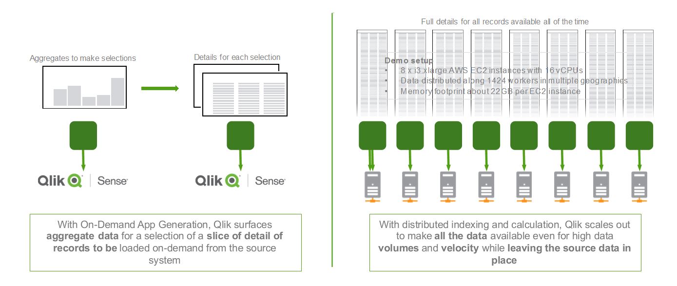
Data can remain located in the cloud, on premises, or even a combination. And, the Associative Big Data Index can be reused across multiple apps so everyone across the organization can gain the benefits and insights in your big data investments. We look forward to sharing more about On Demand App Generation and Associative Big Data Indexing in the future.
-
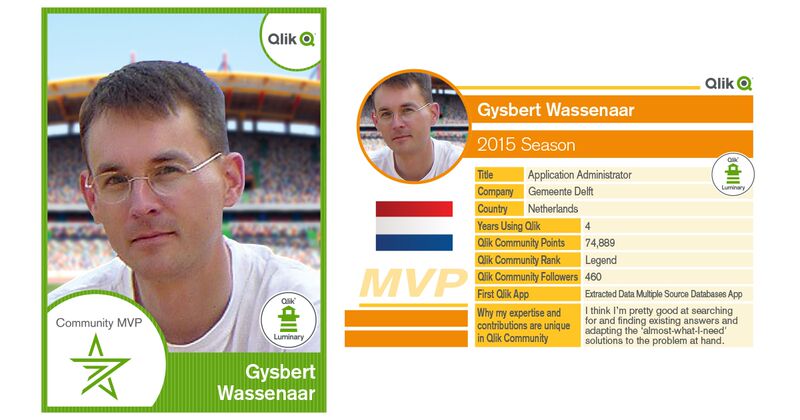
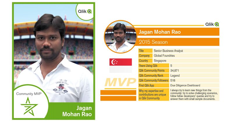
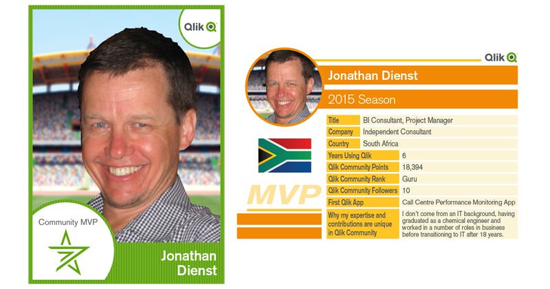
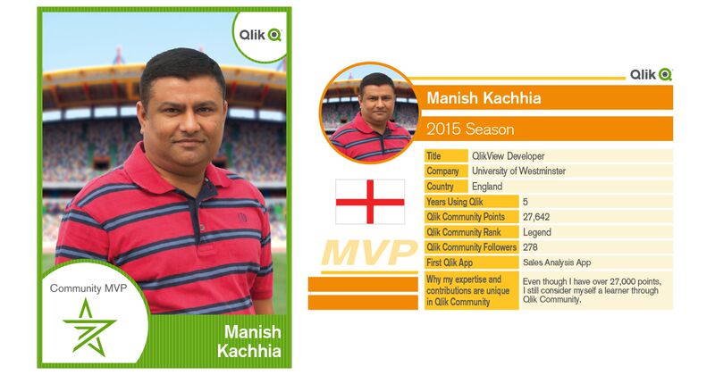
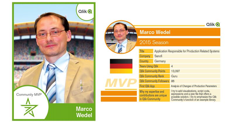
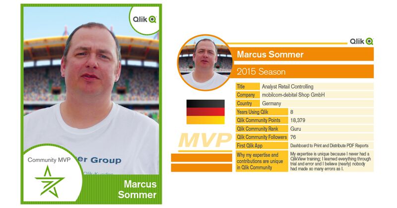
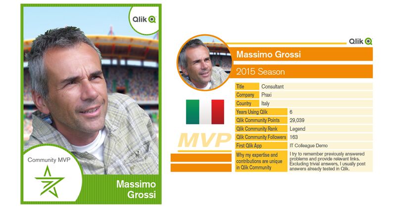
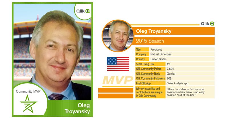
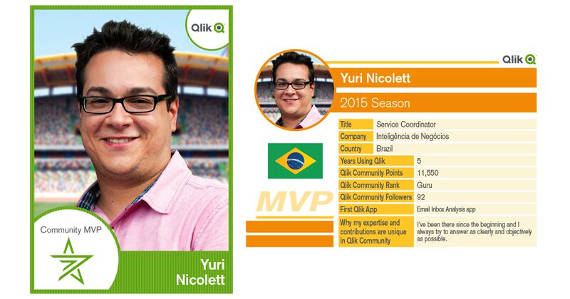
Learn more about our Qlik Community MVP Members
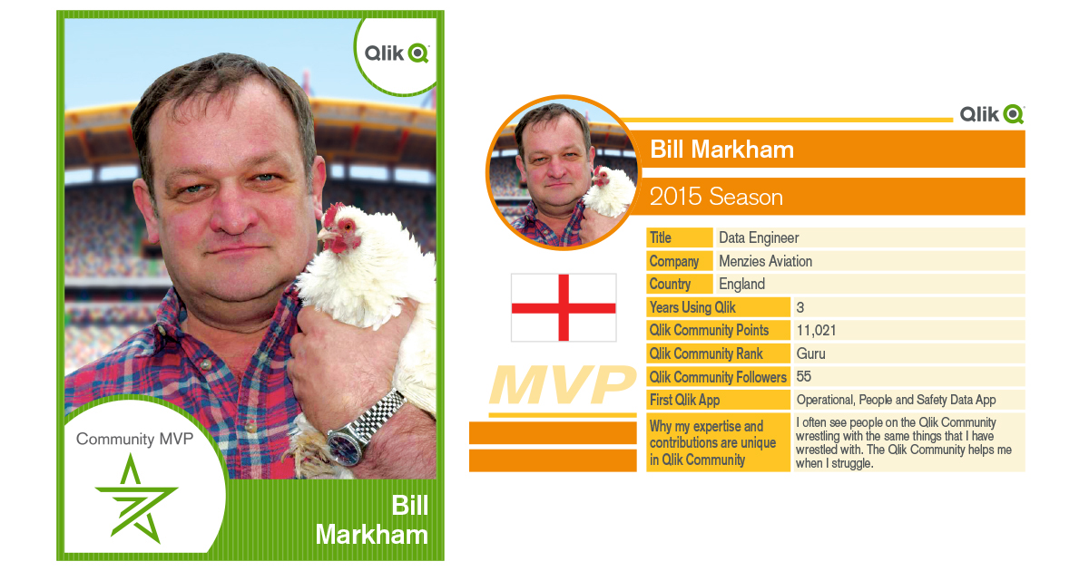
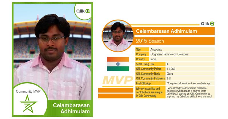
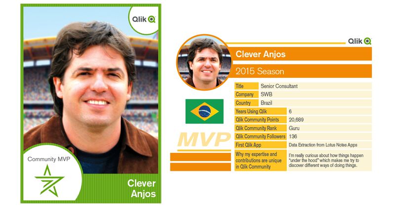
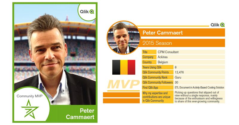
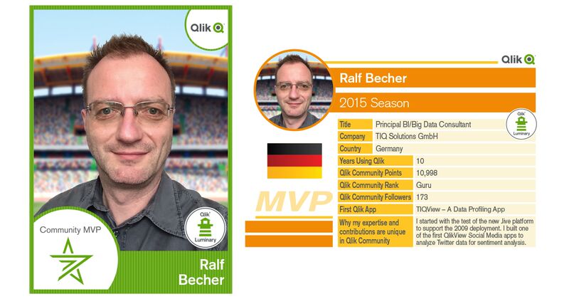
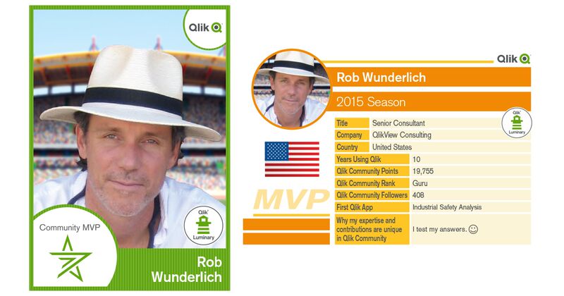
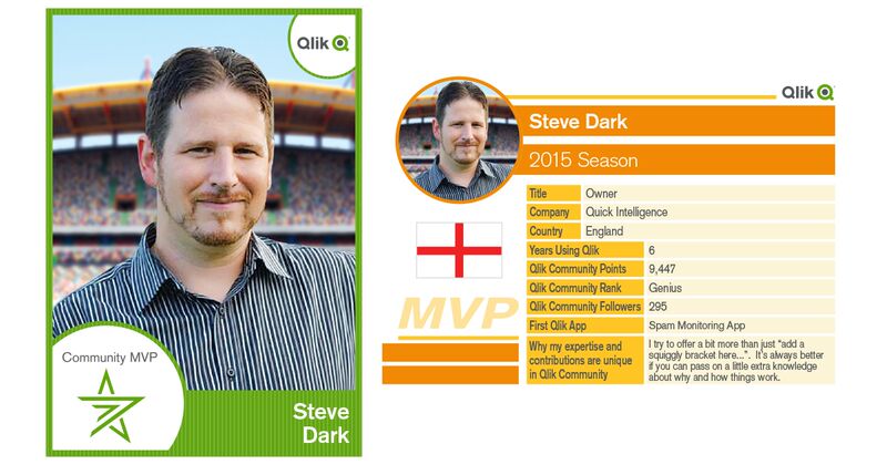
Last week we posted an announcement regarding the recently launched Qlik Community MVP program on the Qlik Blog titled: Recognizing Qlik Communities M... Show MoreLast week we posted an announcement regarding the recently launched Qlik Community MVP program on the Qlik Blog titled: Recognizing Qlik Communities Most Valued Participants. We thought it would be nice to share more details about each of our MVP members such as their first Qlik app, years working with Qlik products, country of residence and perspective on collaboration in Qlik Community.
We hope you enjoy their sports inspired Qlik MVP Member Trading Cards and links to their profiles. For those of you who are new to Qlik Community- following MVP members updates in your content feeds is a great way to see some of the communities most current discussions and content. You might also have a sense of camaraderie with those who reside in the same country as you.
Cheers!
-
From BI to AI
In the last of our three part follow-up to Qonnections, we explore the movement in the industry from BI to AI.Business Intelligence (BI) has a long tr... Show MoreIn the last of our three part follow-up to Qonnections, we explore the movement in the industry from BI to AI.
Business Intelligence (BI) has a long tradition of relying on an army of people to define, build, and maintain both quantitative and visual views into data. This army of BI experts have done (and still do) some truly amazing work but at the same time - reliance on this team can often lead to a bottle-neck slowing analytic progress. In the past few years, analysis tools have become much easier to use, of course. And, as with Qlik Sense, this opens the analytic door to a much broader range of business users.
However, business users vary greatly in their level of understanding of statistical functions and visualization methods. So, despite solving the problem of accessibility, today's results can still sometimes be mixed. Some people strongly believe that the way to solve this problem lies in a shift from BI to AI or Artificial Intelligence. In this vision of the future, the machine takes center stage and drives the path to insight. IBM Watson's success on the game show Jeopardy is an often cited example of what AI looks like: a machine standing on its own leading the way against the inferior human mind.
That is not our vision at all! At Qlik, we believe that the human mind is an incredible resource and that AI can stand for something else.....something centered on the human, not the machine.... forget Artificial Intelligence our focus is Augmented Intelligence. This isn't really a new idea. Steve Jobs understood this when he said "the computer is the most remarkable tool that we've ever come up with. It's the equivalent of a bicycle for our minds." Like a bicycle's ability to multiply a human's locomotion ability, Augmented Intelligence has the ability to super power the human intuition, visual perception, and deduction.
Here is another way to think about it for those of you that are Star Trek fans. One of the many reasons that Star Trek was such a great show was because ...although the human was still Captain, he greatly benefited from the inclusion of the purely logical Spock.
 Spock helped to mitigate some of the well known issues of human intuition such as bias, emotion, and poor memory. So will Augmented Intelligence. Instead of running the ship, like Artificial Intelligence might aspire to do, Augmented Intelligence guides and informs - enhancing the ability of the Captain (you) to boldly go where no man has before.
By NBC Television - eBayfrontback, Public Domain, https://commons.wikimedia.org/w/index.php?curid=29921556
What’s Cooking @ Qlik
This information and Qlik‘s strategy and possible future developments are subject to change and may be changed by Qlik at any time for any reason without notice. This information is provided without a warranty of any kind. The information contained here may not be copied, distributed, or otherwise shared with any third party.
The idea of Augmented Intelligence will play out in many ways. Today, you can already see this taking shape in Qlik Sense through Visual Data Prep as well as through our ability to tie into Advanced Analytics such as R and Python through Server Side Extensions. Going forward you will likely see additional integration such as an 'Insights Board' where Qlik Sense is expected to recommend visualizations and insights based on the data model auto-magically. And a little more In the future, we are expecting to see the inclusion of the Qlik Cognitive Rules Engine which will provide even further support for Augmented Intelligence.
Stay tuned.... now where did I put my tricorder?
-
Horizontal Bar Chart Extension
Last year I blogged about our Mobile Friendly Horizontal Bar Chart that we use in most of our mashups in the Qlik Demo Team.Since then, many things h... Show MoreLast year I blogged about our Mobile Friendly Horizontal Bar Chart that we use in most of our mashups in the Qlik Demo Team.
Since then, many things have changed. For a start, if you have a mashup that uses many objects, you will see the load time to be much faster since I used d3.v4 and I have added a break point on how many bars to create, You can define if you want to show all or only the first 50.
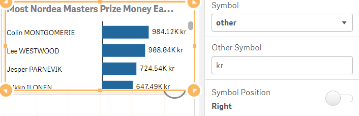
I have also changed the currency. If you select the measure to be displayed as 'auto' then extension will use the custom format. You can abbreviate the measure with their respective symbol like 'B' for billions, 'T' for trillions etc and use your custom currency symbol
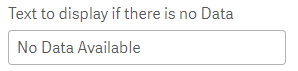
Another new feature is the custom text to display when there is no data. If you make a selection in the sheet and that produces no results then this text will be displayed.
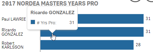
Also, the tooltip is more elegant now and different from the standard Qlik Sense one. I changed it to follow the mouse instead of always aligned center at the top of the bar
YIANNI
Files
-
FileName Function
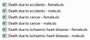
Today I thought I would share how I used a combination of string functions and the FileName function to create data for my app. I loaded several Exce... Show MoreToday I thought I would share how I used a combination of string functions and the FileName function to create data for my app. I loaded several Excel files with one Load script and generated the data I needed for my app using the filename of the files. Below is a subset of the files I was working with. I had a separate Excel file for each cause of death and each gender.
Here is the script I used to load the Excel files:

I used a Crosstable Load to load the Excel files. You can learn more about the Crosstable Load in Henric Cronström’s blog. The Excel files include the country, the year and the number of people who died from the specified cause of death. In my app, I also wanted to include gender and cause of death which was not included in the Excel file. To do this, I decided to parse the gender and cause of death from the name of the Excel file. Starting with gender, you can see in the files listed above that each filename ended with male or female. In the script below, the Filename function returned the name of the Excel file including the extension but excluding the path (e.g. Death due to accidents - female.xls). I use the SubStringCount function to determine if the filename included ‘- male’ or ‘- female.’ If it did, the function returned the number of occurrences which in this case would always be 1. If an occurrence of ‘- male’ was found, then ‘Male’ was added to the Gender field. If an occurrence of ‘- female’ was found, then ‘Female’ was added to the Gender field.

The next bit of data I wanted to extract from the filename was the cause of death (see script below). Each cause of death started at the 14th position/character so I used the Mid function to grab the text starting with the 14 character and I used the Index function to find the starting position of the hyphen so I could determine how many characters the Mid function needed to capture. To figure out how many characters the Mid function should grab, I subtracted 15 from the position returned by the Index function (where the hyphen is located). So if we look at the file named Death due to accidents - female.xls, the Mid function would start at the “a” in accidents and would grab 9 characters (the result of 25 – 14). To finish it up, I used the Capitalize function to capitalize the first letter in each word of the cause of death.

Since the files were all named and formatted the same way, I decided to minimize my script and use one Load statement to load all the files. I could do this by using an asterisk (*) in my From clause like this:

This script loaded all xls files in the folder that start with “Death due to “. Of course, I could have opted to load each file individually but why create more script to maintain.
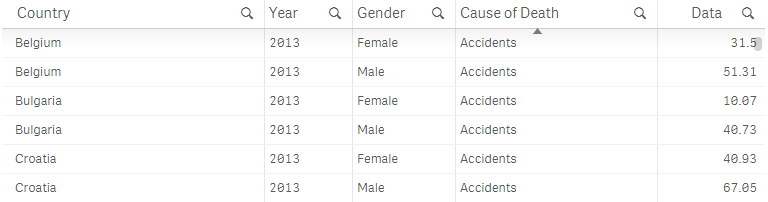
Below is a sampling of the data I ended up with after loading the Excel files. I can see the number of males and females (per 100,000 inhabitants) that died from an accident for each country in 2013.
In this blog, I reviewed a few helpful tips and functions that can be used in your script. To recap, I used the FileName function to get the name of the file that I loaded and several string functions including SubStringCount, Mid, Index and Capitalize to generate the data for two new fields: Gender and Cause of Death. I also discussed using the asterisk (*) in a single Load statement when loading multiple files that are named and formatted the same way. This approach saved me time because it provided an easy way to create the data for the Gender and Cause of Death fields and there was less script to prepare. Hopefully, you can make use of these functions in your app.
You can learn more about some of the string functions mentioned in this blog here.
Thanks,
Jennell
-
A True Hybrid Cloud Platform
Where are we today?Since the launch of Qlik Sense Cloud in 2014 we have seen rapid growth in our cloud community, which now includes over 100,000 user... Show MoreWhere are we today?
Since the launch of Qlik Sense Cloud in 2014 we have seen rapid growth in our cloud community, which now includes over 100,000 users worldwide. We continue to expand and improve our offerings and today we offer multiple different subscription levels: Qlik Sense in 60 - Introducing Qlik Sense Cloud Business - YouTube
- Qlik Sense Cloud Basic: Basic app creation and sharing for individuals; a great way to get started with Qlik Sense for free. Individual users can upgrade to Qlik Sense Cloud Plus for unlimited sharing and to accommodate more data storage and larger app sizes.
- Qlik Sense Cloud Business: Group-level governance, a collaborative work space, data connectivity, and scheduled data refreshes supporting groups, teams and small businesses.
Sign up for Cloud Basic for FREE
You can even sign up in-product for a free 14-day trial of Qlik Sense Cloud Business.
What’s New?
Qlik Sense Cloud is built to be cloud native using microservices architecture, and our cloud development team follows an agile development methodology. What this means to you is that our software is constantly updated with the newest features and UI enhancements automatically - you never have to worry about manual upgrades.
Recently we’ve focused on adding more data connectivity options in Qlik Sense Cloud Business. These options help users get more value out of Qlik’s associative engine by bringing multiple data sources together and uncovering insights across them.
Cloud Business connectivity options available now (or coming in June) include:- Salesforce
- Web Connectors: Facebook Fan Pages and Groups, Twitter, and Google Analytics (blog)
- REST Connector
- Additional connectivity to ODBC to SQL Server and Webfiles
What’s Cooking @ Qlik
This information and Qlik‘s strategy and possible future developments are subject to change and may be changed by Qlik at any time for any reason without notice. This information is provided without a warranty of any kind. The information contained here may not be copied, distributed, or otherwise shared with any third party.
Last week at Qonnections, we were able to get a sneak-peek into the future direction of Qlik’s Cloud Strategy - A True Hybrid Cloud Platform.
The reality is that we have reached the tipping point with just about as many companies choosing to deploy BI in the cloud as on-premises. But, with a true Hybrid Cloud Analytics Platform, customers will not have to choose between either on-premises or cloud deployments. They can use both together – seamlessly – and flexibly shift workloads to the cloud over time as their cloud strategies mature.
Don’t Be Fooled by Poor Imitations
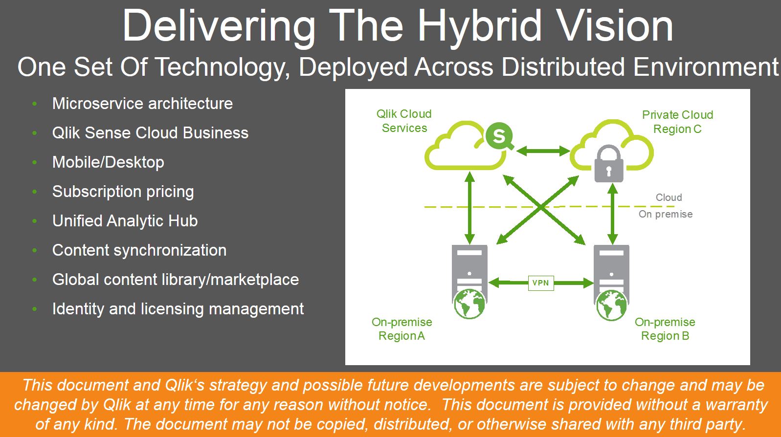
So, the big idea here is that On-Premises OR Cloud shouldn’t have to be a question....just like users shouldn’t have to choose a different experience at their desktop or on a mobile device – or online or off-line for that matter. BI Solutions shouldn’t drive your technology strategy. They should support it. And, to be truly effective, BI needs to exist at the point of decision – anywhere.
-
Qlik Platform Analytics - The Demo
First - a bit on QonnectionsLast week was my 6th Qlik Qonnections, our annual partner and user conference. As usual it was a tremendous event filled w... Show More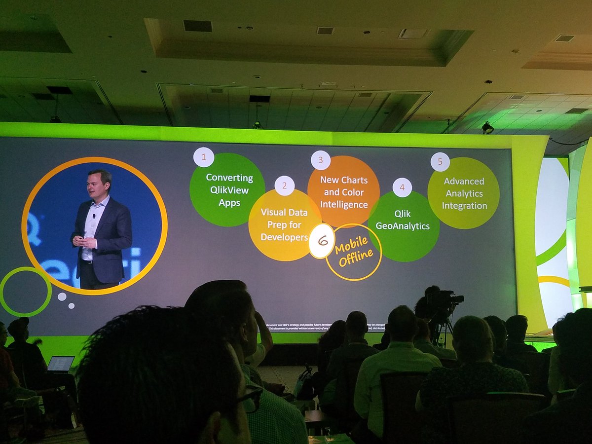
First - a bit on Qonnections
Last week was my 6th Qlik Qonnections, our annual partner and user conference. As usual it was a tremendous event filled with learning, networking and of course "fun and games"...literally this time around for those whom attended. What was in the past, a partner only event, has grown to include our valued customers for its 2nd year. Our customers, partners and analysts from all over the world came to one awesome place (Gaylord Palms in Kissimmee Florida - my home town!) to share, collaborate, communicate and witness all the great innovation each had to offer...of course including a few things from Qlik. In my humble opinion, each year Qonnections has increased in quality and content....and this one felt like the best one yet, credit goes to our amazing events team, our sponsors and of course our customers and partners! If you want to learn more about all the happenings at Qonnections 2017, I suggest you check our company blog for the daily recaps as well as Cindi Howson's latest blog on the Gartner Blog Network: Qlik Reveals More Roadmap and Vision.The Qlik Analytics Platform Demo
While at Qonnections, along with my colleague Josh Good, we had the pleasure of presenting a session that in short, basically highlights everything available in the Qlik Analytics Platform. Qlik has so much growing goodness in one box, that it's becoming almost impossible to cover everything we can do for an organization's various needs in just one meeting. So this presentation was created to quickly show what is possible and is performed using 5 "Acts" that demonstrates our core product capabilities while connecting the full breadth of analytic use cases across a fictitious organization - using one coherent story-line. We originally used this as an internal enablement-type resource, but also realized the value it contains for our customers and partners and decided to publish it.
There are 2 videos in this blog, including links out to detailed specifics on each of the use cases. The first video (3 min) is basically a short summary of the 2nd video - introducing you the main concepts, but sacrifices the detailed demonstration. The 2nd video is a longer (23 min) step by step demo flow that dives in deeper into each analytic use case. I hope you find this information useful and please note I am checking on the public availability of the demonstration app used in the videos. Once approved I will post this as an attachment to this post. I am also looking into making all the resources available on our Partner Portal.
Enjoy!
Michael Tarallo (@mtarallo) | Twitter
QlikQlik Analytics Platform Demo Highlights (short)
Qlik Analytics Platform Demo (long)
For more detailed information on the full range of Qlik Analytical use cases, please view this videos at the following links.
NOTE: To increase resolution or size of the video, select the YouTube logo at the bottom right of the player. You will be brought directly to YouTube where you can increase the resolution and size of the player window. Look for the 'settings' gears icon in the lower right of the player once at YouTube.
NOTE: Can't see the video? Download the .mp4 to play on your machine or mobile device.


-
Loading Images into QlikView
As a QlikView developer I am often asked to load images into QlikView. In some instances the images are associated to other data fields and in other i... Show MoreAs a QlikView developer I am often asked to load images into QlikView. In some instances the images are associated to other data fields and in other instances they are to be loaded in to the application to help convey a message. For example, let’s say that you need to bring in flags of countries that are to display when the corresponding country is selected and you need to display an icon that indicates whether sales for a country are above or below a predefined threshold. It sounds like an easy enough task; so how do you do it?
Well, QlikView offers the developer the Bundle function that can be added to the Load statement. Bundle Load statement allows the developer to load the image files directly into the QlikView application for portability.
The Bundle Process is a very simple scripting process. The syntax for the Bundle Load should look like this:
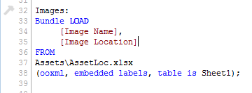
The image file should contain two fields:
- The first field is an identifier such as an index number, image name, a key field that associates the image back to other data files, etc.
- The second field should contain the path to the image.
This file contains the CountryID so that I can associate the flags with the countries

This file contains just an image name because I am just using these icons as a reference and they are not associated to any fields in other files.

Once the images are loaded into QlikView we can now reference them using the INFO() function and a standard IF Statement:

I am using the INFO() function to display the flags so whenever a Country is Selected, QlikView will know to go grab the corresponding image based on the CountryID. If we needed to, we could do the same thing with the symbols by simply adding a list box for Image Name and selecting an image from there. For this example though, I am using a standard IF Statement to display the symbol for the country sales.
Here is what it looks like when the user selects a country. The Info() function displays the image associated with CountryID =1 and because Sales were above the threshold the green square is displayed.
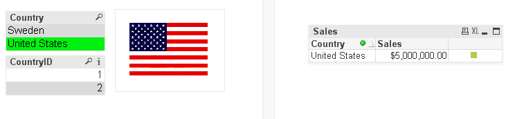
One note of caution, when images are loaded into a QlikView application using the Bundle Load statement, both the amount of RAM and the size of the application increase so consider both the size and the amount of image files before deciding to use the Bundle LOAD statement.
I wrote a technical brief that outlines these steps in more detail. You can access it here.
Happy Qliking!

-
Qonnections 2017 - It's going to be a great year!
One week ago today we opened our biggest Qonnections conference yet with over 3,200 customers, partners, analysts, press and Qlik team members. Durin... Show MoreOne week ago today we opened our biggest Qonnections conference yet with over 3,200 customers, partners, analysts, press and Qlik team members. During the opening keynote, Rick Jackson, CMO, reinforced a theme that we at Qlik continue to believe is critical to the success of our customers in the changing BI landscape.
People + Data + Ideas = Possibilities
Lars Björk, CEO, shared what we have accomplished since Qonnections 2016 - a year of Qlik Sense® and Qlik® Analytics Platform (QAP) - including going from a public to private company, investing in our innovation, and continuing our commitment to changing the world. It’s this focus that has led to recognition by Fast Company as one of the most innovative companies for social good. (This is a recognition that I am particularly proud of as an employee.)
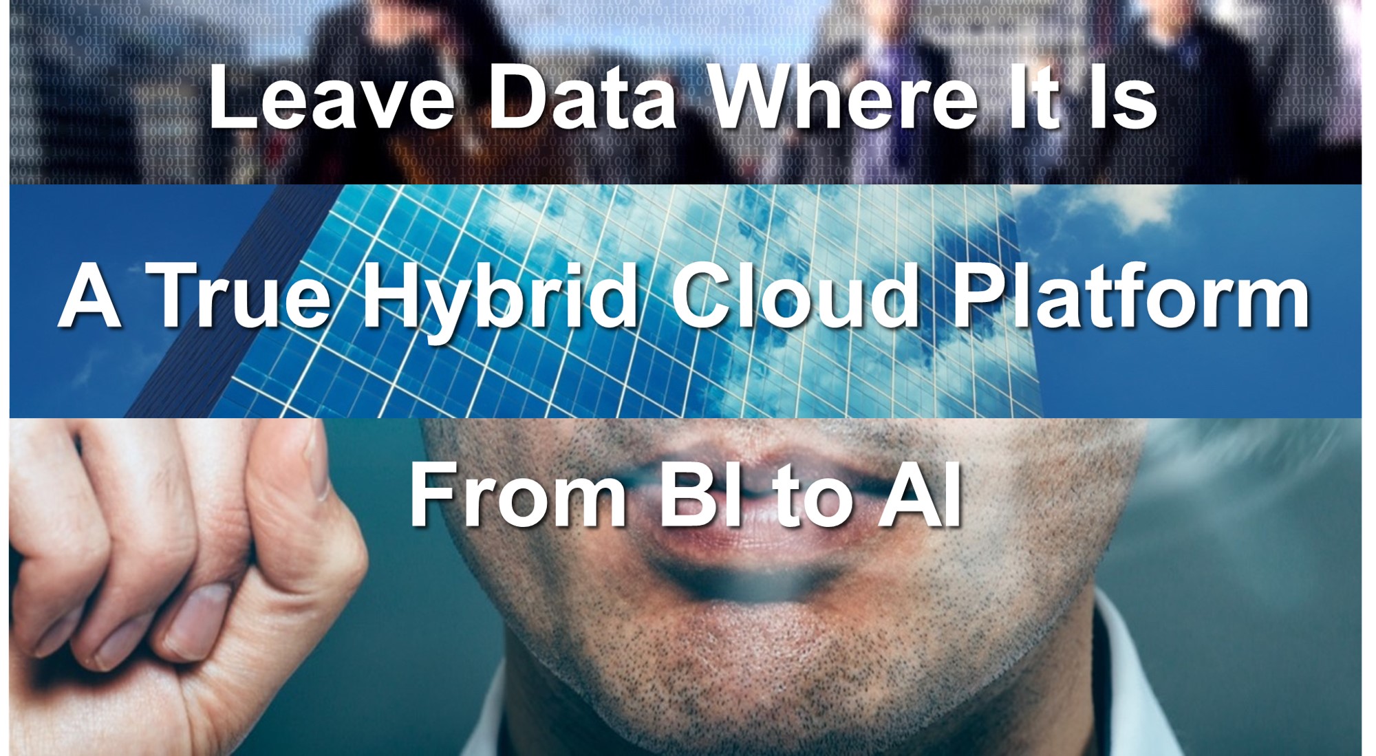
Finally, Anthony Deighton, CTO, took the stage to share the new product roadmap and demonstrate some of what Qlik is working on over the coming year. We not only got a preview of what is coming in June but also a sneak peak at what is coming beyond as well. During this product presentation, Anthony focused on three key themes.
What’s Cooking @ Qlik
This information and Qlik‘s strategy and possible future developments are subject to change and may be changed by Qlik at any time for any reason without notice. This information is provided without a warranty of any kind. The information contained here may not be copied, distributed, or otherwise shared with any third party.
- Leave Data Where It Is
- Qlik has multiple strategies for dealing with Big Data today. However, in many cases Big Data especially in the cloud needs a different strategy...one that doesn't involve moving the data into Qlik's in-memory engine. WHAT IF SOMEDAY.... we could move the engine out to the edges?
- A True Hybrid Cloud Platform
- On-Premises OR Cloud is not the question....Companies rarely choose an all or nothing approach to cloud. So, why should their BI vendor? WHAT IF SOMEDAY you could seamlessly move between on-premises or cloud or both with your apps and/or your data?
- From BI to AI
- BI stands for Business Intelligence, but what does AI stand for?....If you answered "Artificial Intelligence", you would have forgotten our vision - People + Data + Ideas = Possibilities. WHAT IF instead, it meant "Augmented Intelligence".... that is the ability to couple the intelligence of a cognitive rules engine with the experience, intuition, and know-how of your best and brightest.
I can't be certain what next week or next year will hold, but I do know Qlik has people, data, ideas and a lot of possibility. I am already looking forward to next year's Qonnections event!
- Leave Data Where It Is
-
Introducing Qlik Sense Cloud Business & AWS Marketplace
Qlik Sense Cloud BusinessQlik Sense Cloud Basic and Plus have achieved rapid adoption across a large, global network of individual users who create, m... Show MoreQlik Sense Cloud Business
Qlik Sense Cloud Basic and Plus have achieved rapid adoption across a large, global network of individual users who create, manage and share visual analytics daily among their personal networks. We wanted to extend these capabilities and the simplicity of the cloud to small and medium-sized businesses and project teams within an enterprise. We focused on delivering a business-ready, subscription-based offering that lowers the barrier to entry and provides benefit immediately with no capital costs.From the tireless efforts of Qlik's superior products team, I am pleased to announce the general availability of Qlik Sense Cloud Business. Qlik Sense Cloud Business is the next edition in our cloud portfolio that adds a new layer of governance, security and control that supports collaboration and helps operationalize analytics in the cloud.
Key features include:
- Group Level Governance
- Coauthoring Workspace
- Automated Data Refreshes
- Cloud Data Connectivity*
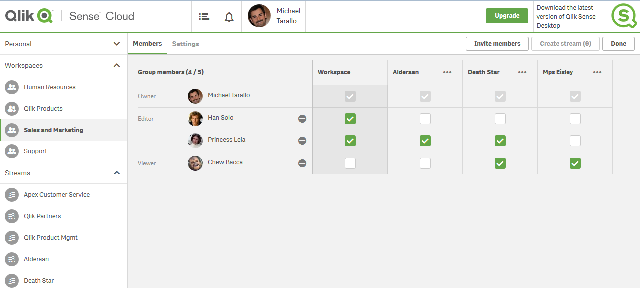
Qlik Sense Cloud Business - Member Settings
Rather than go into a lengthy text-wall describing these capabilities, features and benefits I have prepared a few videos that will help you learn more and become familiar with Qlik Sense Cloud Business.- Qlik Sense in 60 - Introducing Qlik Sense Cloud Business - YouTube
- Qlik Sense Cloud - Upgrading to Qlik Sense Cloud Business - YouTube
- Qlik Sense Cloud Business - Orientation Overview - YouTube
Qlik Sense Enterprise and the AWS Marketplace
Expanding into the cloud does not stop with just Qlik Sense Cloud Business - Qlik Sense Enterprise is also built to run in the cloud (Qlik in the Cloud). Our scalable analytics platform, which can be installed on premise or in the cloud, is now available on the Amazon AWS Marketplace. Our first available offering uses a BYOL or “Bring Your Own License” model. An existing Qlik Sense Enterprise customer can quickly spin up a server in AWS that already has Qlik Sense Enterprise installed on it. This makes it easier and faster to setup a Qlik Sense Enterprise instance for production, testing or even as a proof of concept for your data visualization platform needs. To learn more visit our dedicated Qlik Community space here.
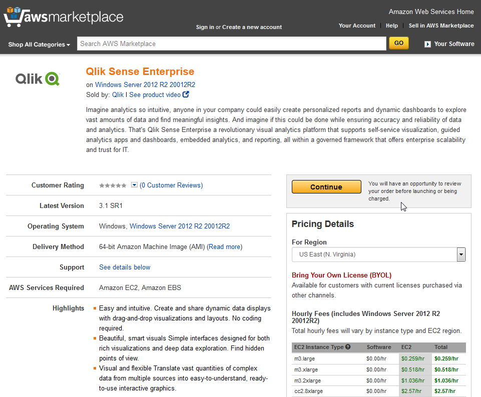
Qlik Sense Enterprise on AWS Marketplace
Regardless of the edition, Qlik Sense is powered by the patented QIX Associative Indexing Engine and provides the security, scalability, and performance of the industry-proven Qlik visual analytics platform. These latest offerings are two exciting milestones on our path of providing flexible cloud solutions to our customers. Now, whether you’re working independently; across a group or project team; or within a large business, Qlik Sense Cloud and Qlik in the Cloud are readily available to help you create, edit, and share compelling visual analytics in the cloud with confidence. If you haven’t gotten started yet, here to join Qlik Sense Cloud for free today!
*Qlik DataMarket and Salesforce.com with REST connectivity and more coming soon.
Regards,
Michael Tarallo (@mtarallo) | TwitterSenior Product Marketing Manager
Qlik