Unlock a world of possibilities! Login now and discover the exclusive benefits awaiting you.
Analytics & AI
Forums for Qlik Analytic solutions. Ask questions, join discussions, find solutions, and access documentation and resources.
Data Integration & Quality
Forums for Qlik Data Integration solutions. Ask questions, join discussions, find solutions, and access documentation and resources
Explore Qlik Gallery
Qlik Gallery is meant to encourage Qlikkies everywhere to share their progress – from a first Qlik app – to a favorite Qlik app – and everything in-between.
Qlik Community
Get started on Qlik Community, find How-To documents, and join general non-product related discussions.
Qlik Resources
Direct links to other resources within the Qlik ecosystem. We suggest you bookmark this page.
Qlik Academic Program
Qlik gives qualified university students, educators, and researchers free Qlik software and resources to prepare students for the data-driven workplace.
Recent Blog Posts
-
2022 Qlik Sense Product Certifications now open for Registration!
The 2022 Qlik Sense product certifications are now open for registration with the first exam date of December 14, 2022. Register now for the best choi... Show MoreThe 2022 Qlik Sense product certifications are now open for registration with the first exam date of December 14, 2022. Register now for the best choice of appointment times!
- The 2022 Qlik Sense Business Analyst and 2022 Qlik Sense Data Architect product exams will be platform neutral. The topics covered on these exams apply to both the client-managed and SaaS environments.
- The 2022 Qlik Sense System Administrator product exam will apply only to the client-managed environment.
- All who earn a Qlik Sense product certification will receive a digital badge through Credly.
All 2022 Qlik Sense Beta results, including digital badges for those who have earned a certification, will be released on December 14, 2022.
Go further with Qlik Sense SaaS Endorsements!
Once you earn your 2022 Qlik Sense product certification, you are eligible to sit for associated Qlik Sense SaaS endorsements. These endorsements validate your skills on capabilities specific to the Qlik Sense Cloud/SaaS environment.
- Endorsements focus on the user roles of Qlik Sense - Business Analyst, Data Architect, and Administrator.
- Qlik Sense SaaS endorsement exams are offered for free to candidates who pass a Qlik Sense product certification exam (see below).
- More details, including the topics covered on each Qlik Sense SaaS endorsement, can be found on our website.
Qlik Sense SaaS endorsement registration opens soon
Those who earn a 2022 Qlik Sense product certification are eligible to sit for the associated Qlik Sense SaaS endorsement. The table below outlines the required pre-requisites:
Qlik Sense SaaS Endorsement
Required Pre-requisite Certification
Qlik Sense SaaS Business Analyst Endorsement- 2022
Qlik Sense Business Analyst Certification - 2022
Qlik Sense SaaS Data Architect Endorsement- 2022
2022 Qlik Sense Data Architect Certification - 2022
Qlik Sense SaaS Administrator Endorsement- 2022
2022 Qlik Sense Business Analyst Certification - 2022
Visit our certifications page to register for Qlik Sense certification exams today! Questions? Reach out to certification@qlik.com.

-
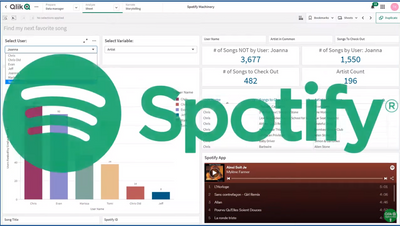
Not another Qlik Sense Spotify App - no really!
I am always learning new things. When it comes to learning about Qlik Sense, or any software for that matter I am a big proponent of using "something... Show MoreI am always learning new things. When it comes to learning about Qlik Sense, or any software for that matter I am a big proponent of using "something" (scenarios, data and examples) that has interest to me so I can relate to it better. My data and example choice is using video game data, but I digress.
As you may know, I have been working with Qlik Solution Architect @TomiKomo - Tomi Komolafe - to share his stories and examples of “things” he encounters in the field when visiting customers and prospects. (You can see some of his solutions and experiences here.)
Well this time, Tomi wanted to share something fun. Similar to how you have seen me present many aspects of the product using video game or star wars related data, I paused and asked Tomi – “What speaks to you? What are one of your passions?” – he said: “Music, my friends and I love listening to music.” After further discussion – the idea of using Spotify data arose as Tomi and friends had Spotify accounts. BUT this has been done a few times already I am sure, and this time around we didn’t just want to present the data we wanted to show how Qlik Sense analysis in conjunction with the features of the Associative Difference can help solve a particular problem Tomi was having – “What songs or other artists out there am I missing?” 😁 Is it possible that by using Qlik Sense Tomi can correlate data from his own and friend’s Spotify listening habits and find out what songs and artists he may not be listening to? – Watch this awesome video of what he discovered!Take it away Tomi!
Tomi's Outline
- My friends and I listen to Spotify
- Use Qlik’s REST API to access our Spotify statistics
- Use Qlik’s powerful Set Analysis and Associative feature to find songs I should check out
- Play these songs right from my Dashboard to see if I like them
Let's Begin
Have you ever thought to yourself, how come there’s isn’t a Qlik Spotify app that just tells me what songs I should listen to? Well, now, you are at least thinking about it and there is such an app.I should set up the scene so I don’t come across as some Qlik nut who turns every moment into a “lets see if Qlik can solve it” scenario. Some of my closest friends live in New Jersey (I’m in DC, 4 hrs away) and during the pandemic, I was only able to visit them sparingly. Every so often, we would be grilling in the backyard or working out in our make-shift gym, playing music in the communal ANKER Bluetooth speaker. Some of the songs I heard, I really liked and I would’ve never heard them in my sphere of Spotify influence. Other songs were from artists I love but I hadn’t heard that particular song.
I cornered these 5 friends to get access to their Spotify song history (No friends were hurt in the development of this app). What you will discover are the myriad of ways we can analyze this data to bubble up interesting insights and trends. Fortunately, there’s a rich amount of data in the Spotify API anyone can access.
Here are some of the cool questions I will be answering using this data in this and subsequent videos:
- Which friends are more like some other friend(s)?
Yes, I stand by the statement that our song choices say a LOT about us. - Which songs are guaranteed to be hits for me based on my friends tastes?
- This one is pretty cool - If I were an advertising company, which strategies would I use to penetrate each of our attention domains?
(Coming in another video release) - Did the pandemic have a significant effect on our song choices and which friend was affected the most?
(Coming in another video release)
Many more questions also keep bubbling up. What’s pretty cool is how some of the techniques used here can be applied to everyday business decisions. For example, which product should be paired with another product to improve margins based on supplier activity?
You should wait till the end of the video to see another cool surprise. It involves an extension that @joe_warbington , previously at Qlik, created.
Maybe I am a Qlik nut who turns everything into a Let’s see if Qlik can solve this… 😉
Regards,
@TomiKomoResources:
- Qlik Sense .QVF attached
Here's an example of something I coded to get all songs so I could play them for example:
Let vRecordNo = NoOfRows('WheneverExposed');
For i = 0 to $(vRecordNo) //this variable set in prior section

LET vSongTitle=Peek('Song Title',$(i),'TmpTable');
LET vReleaseYear=Peek('Release Year',$(i),'TmpTable');
SET vTrackName = "track:$(vSongTitle) year:$(vReleaseYear)";
Endpoints Used - Spotify REST API
- https://api.spotify.com/v1/users/{user_id} returns User artists and songs

-
REST connector: Using WITH CONNECTION
I was approached by a colleague with a simple but recurrent question, how can I use for…while loops in conjunction with the REST connector, and how ca... Show MoreI was approached by a colleague with a simple but recurrent question, how can I use for…while loops in conjunction with the REST connector, and how can we make it work with the connection library that comes with Qlik Sense.
A few months ago I shared a “hack” so we can do loops in our scripts as we do with QlikView, activating Legacy Mode will make connection library optional, please remember that there are a bunch of good reasons for not do that. “With connection” is a great solution for those of you who don’t want or just can’t activate Qlik Sense Desktop to work in Legacy Mode but still need to loop through several URLs to get complete data.
Let’s do a quick example.
We need to load data from an online data source, we have a URL to connect to the data that contains the ID of each one of the elements that we would like to load into our app.
https://www.domain.com/element?key=elementID/more_stuff
We have a list of 100 alphanumeric elementIDs and we need to make sure we load them all. Using our REST connector, we could easily connect to the online data source and extract the data, but we faced the issue of how to make to connection loop trough a series of items.
In our example we have an inline table that contains each one of the ID numbers of the elements we want to read in the REST connector, and we need to pass that parameter to the connection URL below.
LIB CONNECT TO 'REST';


ElementsToLoad:

Load * inline [

ElementID

12fa91

1sy293

h13d13

…

];


Let j=0;

for j = 0 to 99

Let vElementID = peek('ElementID', $(j), 'Teams');

RestConnectorMasterTable:

SQL SELECT

    fields

    FROM "datad")

FROM JSON (wrap on) "root" PK "__KEY_root"

WITH CONNECTION(Url "https://www.domain.com/element?key=$(vElementID)/more_stuff/");

NEXT j;


DROP TABLE RestConnectorMasterTable;

exit Script;
After the inline statement, we loop over the REST connection 100 times, one time for each row of the inline table, I know we have 100 rows so I'm hard coding that number but if you don't know how long your table is you should check that before and store it in a variable.
Lately, using "With Connection" we have access to the data source URL so we can expand my variable "vElementID" containing the necessary ID for the connection to work.
More info about "With Connection" here -> https://help.qlik.com/en-US/connectors/Subsystems/REST_connector_help/Content/Connectors_REST/Load-REST-data/Load-data.htm#WITH-CONNECTION-keyword
Arturo @arturoqv
I wish you all a great end of the year and a very successful 2019.

-
The Revolution of Machine Learning: First Qlik AutoML Course with Limited- time ...
We’re super excited to tell you about our new course: Predictive Analytics with Qlik AutoML! This course will take you into the amazing world of Machi... Show MoreWe’re super excited to tell you about our new course: Predictive Analytics with Qlik AutoML! This course will take you into the amazing world of Machine Learning, and guess what? You won’t need to write any code! Can you imagine doing predictive analysis without being a Data Scientist? This is the revolution you’ve been waiting for!
And if you’re already a Data Scientist, don’t worry, this course is for you too. It will help you automate your work, so you can focus on what matters most and save time.
In just one day, you will be able to:
- Understand what kinds of problems AutoML can solve.
- Learn key concepts about experiments.
- Create your own experiments.
- Learn about Model Optimization.
- Understand the different prediction methods, create AutoML Deployments, and handle output files.
- Create Qlik Sense visualizations to understand and use the results from AutoML predictions.
Our first session is scheduled for November 13 and it comes with some fun surprises that we’ll reveal over time! Register this week to get 30% off (use code CLASSROOM30 at checkout)
But hurry, only the first 10 people to sign up for the first course will get these exclusive bonuses.- Don’t miss out!
And this is just the beginning! Next week, we’ll reveal the second bonus, and the week after that, the third bonus. The surprises keep coming!
Book your seat now! before all the spots with bonuses are gone.
Happy Learning!
-
Use of a Silent Legend
In this blog post, I will revisit a topic that I blogged about over a decade ago, the use of a silent legend. By default, a legend is created in a vis... Show MoreIn this blog post, I will revisit a topic that I blogged about over a decade ago, the use of a silent legend. By default, a legend is created in a visualization when there are multiple dimensions and/or measures. The legend helps the user understand the visualization. Legends are helpful and without them, users may not comprehend the data in a visualization. But what do you do if have many visualizations on a sheet? Do you need a legend for each chart? Let’s look at the various ways a legend can be used and how a silent legend can reduce the clutter and give a sheet a cleaner look.
In the screen shot below, there are four visualizations at the bottom of the sheet with legends.
In this app, the legends are all the same because the visualizations are using the same asset class dimension. In this example, the legend does not need to be displayed for each visualization because it is redundant. Let’s see how this sheet will look if only one of the legends are kept on the sheet. A legend can easily be removed by toggling off Show Legend in the properties of the chart.
Here is what the sheet looks like with just one legend.
The sheet looks better with one legend versus four legends. This use of one legend for four charts, has decluttered the sheet and reduced repetitiveness. If a developer wants a legend to be displayed without expanding the chart, they need to ensure the visualization is large enough. Without the legends in the three stacked bar charts, less space is needed for the charts, thus they can be made smaller, if desired, to take up less space on the sheet. Since all the visualizations at the bottom of the sheet are using the same legend, the legend was placed with the first visualization, assuming a user is reading top to bottom, left to right.
Now, the beauty of a silent legend is that all visualization legends can be removed from a sheet. In the screenshot below, the four headings at the top of the sheet are colored based on the asset class they represent. So, Equity is green, Fixed Income is dark blue and so on.
This is an example of silent legend. The legend is implied by the asset class headings. This option looks even better and cleaner than the sheet with one legend.
The use of a silent legend is possible in this app because there are only four values for asset class. I have seen this work nicely with up to six values. Anything more may become too cumbersome and may require a legend to be used. Also, if the four visualizations at the bottom of the sheet used different dimensions, then multiple legends should be used. Legends are important and they should not be removed to add space if the chart is unreadable without it. What good is a pretty chart if you do not understand it.
Thanks,
Jennell -
September Qlik Digest
Welcome to the September Qlik Digest, where you can Qlik’s latest updates including our newest webinars, product improvements, Qlik Services, and much... Show MoreWelcome to the September Qlik Digest, where you can Qlik’s latest updates including our newest webinars, product improvements, Qlik Services, and much more!
Qlik Insider: Unlock the 80% - Using GenAI on Unstructured Data
Our new plug-and-play GenAI-powered knowledge assistant, Qlik Answers allows organizations to ask questions about their unstructured data and receive simple, human-like answers.
Watch our recent webinar on-demand to:
- See how a custom GenAI assistant can help your organization: Watch real life examples of it in action and see how it can allow you to get personalized, contextually relevant and reliable answers from your organization’s unstructured text data.
- Hear how every GenAI tool must be built on transparency and trust: Every response from Qlik Answers comes with citations, letting users trace back to the original sources.
- Discover how simple implementing a GenAI tool really can be: Qlik Answers is a plug-and-play solution, requiring no extensive technical expertise to deploy, meaning you can start using it to deliver impact immediately.
AutoML Improvements
Qlik recently made it possible to optimize model creation, streamline approval, and enable embedding.
Accelerate Your Success with Qlik Services
Supercharge your data and AI journey with the right services. Explore our customer success solutions delivered by our experts. Engage with us to customize your path and achieve your goals.
Learn more about what is available:
Customer Success Stories
Fujitsu Takes Control of Its Data to Drive Digital Transformation Globally
Japanese IT giant turns to Qlik to deliver robust and effective cloud-based data integration.
REEDS Jewelers enables easy access to data to triple digital revenues
Luxury jewelry retailer REEDS Jewelers grows digital sales and prepares for AI-based customer experience with Qlik Sense.Qlik Data Solutions Provide Foundation for Penske’s AI Capabilities
Qlik and Talend data integration and analytics products allow Penske to capture, analyze and extract high-value information from multiple systems and hundreds of thousands of vehicles.Get Discounted trainings and subscriptions
Catch up on self-paced courses in Qlik Continuous Classroom or sign up for in-classroom training with an expert instructor at discounted rates!
-
Let’s Make New Charts with Qlik Sense
Data visualization experts love their charts and their names, many make living inventing new cool ones! Check out The Data Visualisation Catalogue and... Show MoreData visualization experts love their charts and their names, many make living inventing new cool ones! Check out The Data Visualisation Catalogue and The Data Viz Project. You’ll see an almost overwhelming number of them:
Many are very similar, so what’s the point? Well, most charts have a specific purpose, so it does help to have different names to tell them apart.
But what about Qlik Sense? Many charts have dual or multiple modes. For instance, the Pie chart is also the Donut chart and the Line chart can also be an Area chart. And of course, the Bar chart, which also could be a Stacked bar chart and so forth. These variants are often found in the property panel, and they’re easy to find. I list them as standard charts too, so now I have
3435 (in my count, probably more depending on your definition of a chart type).But how about the charts that require a few more settings? Like the Chord diagram (derived from the map chart) or the Candlestick (derived from the boxplot). When I choose to count those, I end up with
53616873, but I’m sure we can create more!Here’s my list of standard charts, many of them featured in the “Visualization Showcase":
Chart
Source
From
Bar chart
Standard
Bar chart
Line chart
Standard
Line chart
Area chart
Standard
Line chart
Pie chart
Standard
Pie chart
Donut chart
Standard
Pie chart
KPI
Standard
KPI
Gauge
Standard
Gauge
Table
Standard
Table
Pivot table
Standard
Pivot table
Boxplot
Standard
Box plot
Distribution plot
Standard
Distribution plot
Histogram
Standard
Histogram
Mekko chart
Standard
Mekko chart
Combo chart
Standard
Combo chart
Map chart points
Standard
Map chart
Map chart pies
Standard
Map chart
Map chart areas
Standard
Map chart
Map chart lines
Standard
Map chart
Map chart heatmap
Standard
Map chart
Scatter plot
Standard
Scatter plot
Treemap
Standard
Treemap
Waterfall
Standard
Waterfall
Bullet chart
Standard
Bullet chart
Org chart
Visualization bundle
Org chart
Grid chart
Visualization bundle
Grid chart
Funnel chart
Visualization bundle
Funnel chart
Sankey chart
Visualization bundle
Sankey chart
Multi KPI
Visualization bundle
Multi KPI
PL Pivot
Visualization bundle
PL Pivot
Radar chart
Visualization bundle
Radar chart
Network chart
Visualization bundle
Network chart
Variance waterfall
Visualization bundle
Variance waterfall
Wordcloud
Visualization bundle
Wordcloud
Heatmap
Visualization bundle
Heatmap
Trellising
Visualization bundle
Trellis container
Below are the derived charts including links to instructions on building them:
Name
Source
How to
From
Butterfly chart
Derived Easy
Bar chart
Gantt chart
Derived Easy
Bar chart
Venn diagram
Derived Easy
Map chart
Control chart
Derived Easy
Line chart
Streamgraph
Derived Medium
Line chart
Parliament diagram
Derived Medium
Map chart
Scatter with trackline
Derived Medium
Map chart
Calendar chart
Derived Medium
Map chart
Meteogram
Derived Medium
Map chart
Bump chart
Derived Easy
Line chart
Slope graph
Derived Easy
Line chart
Timeline chart
Derived Easy
Map chart
Range chart
Derived Medium
Line chart
Spiral plot
Derived Easy
Map chart
Ridgeline chart
Derived Medium
Line chart
Chord chart
Derived Medium
Map chart
QQ plot
Derived Easy
Combo chart
Coxcomb chart
Derived Medium
Map chart
Candlestick chart
Derived Easy
Box plot
Acitivty gauge
Derived Medium
Map chart
Violin plot
Derived Easy
Line chart
Circle timeline
Derived Easy
Scatter plot
Fish eye chart
Derived Medium
Mapchart
Stacked Venn chart
Derived Medium
Mapchart
Stacked butterfly
Derived Easy
Bar chart
Kanban chart
Derived Easy
Table
Dendogram
Derived Easy
Org chart
Radial Dendogram
Derived Medium
Map chart
Proportion plot
Derived Easy
Line chart
Pictogram
Derived Easy
Text & Image
Cluster chart
Dervide Easy
Scatter plot
Time plan
Derived Easy
Table + Trellis
Cartogram
Derived Easy
Viz tips 5Map chart
Step chart
Derived Easy
Map chart
Cross chart
Derived Easy
Map chart
Deviation Icicle chart
Derived Easy
Combo chart
Stacked radial plot
Derived Easy
Map chart
Lexis chart
Derived Easy
Line chart
The Qlik community is full of cool people like Terézia Blašková, who shared how to make a QQ plot with standard Qlik Sense. Have you derived a chart in Qlik Sense? Please let us know, write about it and post a link in the comments!
Oh, and of course I haven’t even begun to talk about all the chart types people made by building extensions to Qlik Sense, but that is a different story for another time.
If you liked this and want to start make new charts in Sense, have a peak at my other posts:
- Sense Visualization tips part VI
- Sense Visualization tips 2021 part V QlikWorld
- Sense Visualization tips 2020 part IV
- Sense Visualization tips 2020 part III Qlik World
- Sense Visualization tips 2019 part II
- Sense Visualization tips 2019 part I Qonnections
Similar tips but for Qlik GeoAnalytics if you are into maps and geo:
- Qlik GeoAnalytics tips 2020 QlikWorld
- Qlik GeoAnalytics tips 2019 Qonnections
- Qlik GeoAnalytics tips 2018 Qonnections
Thanks,
Patric Nordström -
New 2024 Qlik Sense Qualification Exams now available!
After completing the Business Analyst or Data Architect courses we highly recommend taking a qualification exam in order to gain a digital badge and c... Show MoreAfter completing the Business Analyst or Data Architect courses we highly recommend taking a qualification exam in order to gain a digital badge and certificate. Members of our Academic Program have found these to be a great way to demonstrate their skills to future employers. We also have a number of educators who use these exams as a means of assessment for their students.
What is a Qualification Exam?
Qualification exams enable you to validate your fundamental level of Qlik Sense skills. The Qlik Sense Business Analyst Qualification is earned after developing an application and completing a multiple-choice exam which tests your fundamental and applied knowledge. A Qlik Sense Qualification Certificate and digital badge will be awarded with a minimum passing score of 70%.
How do I access the Qualification Exams?
You can find these courses by navigating to Learning.qlik.com Programs-->Academic Program-->Access Resources
and then by navigating to the Assessments tab from the homepage menu.
In the Assessments tab you should find the 2023 and 2024 qualification exams.
What do I receive after I pass?
After you receive a passing score, you will be awarded a certificate and digital badge for sharing on social sites. You will also receive notification from Credly platform that you have earned a digital badge. Credly allows you to manage your badges from Qlik and other professional organizations so you can easily share your badges on social media sites. You will need to simply accept the badge and click the share button or download the badge and certificate to keep for your records. You can even add their badges to your email signature!
How can I get access to these Qualifications?
You can get access by becoming a member of our Qlik Academic Program. Our Academic Program is available to accredited, degree-issuing universities all over the world and offers free access to Qlik Sense software, learning resources and qualifications. Learn more and sign up today by visiting - qlik.com/academicprogram.
-
Get ready...the new Qlik Learning is coming soon!
Qlik and Talend have joined forces to bring you the very best of both data analytics and data integration, and we’re doing the same with your learning... Show MoreQlik and Talend have joined forces to bring you the very best of both data analytics and data integration, and we’re doing the same with your learning experience. Bringing you a new learning platform that combines the best of both worlds! A single, integrated learning platform with all the training you're looking for. Available right at your fingertips, anytime... Anywhere.
Here’s what you can expect of the new Qlik Learning experience:
- Get hands on experience, expertise and certified all in one place.
- Become a Qlik expert with easy-to-follow learning journeys designed for you.
- Challenge your peers as you work your way up the leaderboard; earn trophies and badges to help further your career. Qlik Learning makes your learning experience fun!
- Launch an AI proctored certification exam, anytime, anywhere, directly from Qlik Learning!
The new Qlik Learning will be available this summer. Check out this sneak peek:
In the meantime, keep using our current platforms, Qlik Learning Portal and Talend Academy .
We’ll let you know when the new Qlik Learning is ready. And don’t worry; all your current learning data and activities will still be there.
Stay Tuned for the learning experience you have been waiting for. Happy Learning!
-
Fun with QlikSense - Bingo / Lotto / Housie
Hello,Want to share with you an Fun Game app, which i built for an small team event. hope all of you have heard about Lotto / Housie / Bingo. Yeah i b... Show MoreHello,
Want to share with you an Fun Game app, which i built for an small team event. hope all of you have heard about Lotto / Housie / Bingo. Yeah i built an app which can help you run this game. No rocket science involved it was a fun app and fun to build as well.
i was looking at several options to host this game show and i suddenly an idea struck me, why not use QlikSense and build an app to present this game !!!! and then in just matter of couple of hours i was able to build this app. Its a simple app made to
1. Draw random numbers between 0-99
2. Display these random numbers on a list and highlight them.
3. You load Lotto / Housie / Bingo tickets and identify the winners
I have used couple of extensions to ease the usage.
Link: https://developer.qlik.com/garden/56728f52d1e497241ae69836
i would like to share this app with all of you, it was a nice experience building it and this has inspired me to build another app where we can host Quiz with multiple options. i will share the details in another post !!!
Let me know your feedback on this !!!
P.S. This is my first post.... 🙂
-
Writeback extension
Writeback extensionPomerol PartnersThe Writeback Extension allows you to enter & edit data directly into your published Qlik Sense applications enabli... Show MoreWriteback extensionPomerol Partners The Writeback Extension allows you to enter & edit data directly into your published Qlik Sense applications enabling your team to manage their business processes end-to-end without having to leave the Qlik environment. Select, Edit, Writeback, Done!
Discoveries
Use cases: Sales: Enrich CRM data through commentary and insights; Model customer discounts on the fly Approve or reject sales discounts through a structured workflow Operations: Healthcare - Nurses capturing patient discharge data points Manufacturing - Production line managers entering notes on fall out and incidents. Finance & Marketing: Tracking Assumptions & Variance Analysis commentary for improved data modelling Scenario modelling for discounts, price setting and financial forecasting Scenario modelling for campaign management IT: Mapping table management directly in Qlik. Master data management directly in Qlik. The extension was forged and fire-tested within front office investment banking. It is robust & scalable, and designed for the data driven enterprise.
Impact
The writeback extension helps enterprise organizations save time, and money by: Enabling data to be written back directly into your published Qlik Sense Applications. Improving collaboration across your teams Improving the speed and efficiency of your data cycle Improving the quality and integrity of your data
Audience
Business analysts, Line of Business users analysts, managers, directors.
Data and advanced analytics
Pomerol’s database writeback extension expands the use of Qlik Sense beyond the traditional boundaries of ETL and data visualization. The Writeback Extension allows business users to collaborate in real-time inside your existing Qlik applications, saving your organization time & money and dramatically improving the integrity of your data.
-
Task Rename
The process to rename a task is Export task Rename task name in exported json. Import task Please add a rename button to the Replicate Console to ... Show MoreThe process to rename a task is
- Export task
- Rename task name in exported json.
- Import task
Please add a rename button to the Replicate Console to eliminate this manual process.
-
Covid cases in Brazil
Covid cases in BrazilCristiano ZilzThis application shows the evolution of cases over the years, mainly information from Brazil.DiscoveriesHelps peopl... Show MoreCovid cases in BrazilCristiano ZilzThis application shows the evolution of cases over the years, mainly information from Brazil.Discoveries
Helps people understand what happened during the pandemic days
Impact
Helps people understand what happened during the pandemic days
Audience
The application is open and can be used by anybody. Especially people from Brazil
Data and advanced analytics
There are some open data sources integrated into the app. That can be consulted and tested. This app incluse, also, many KPIs about risk cases in world and Brazil

-
Qlik Sense cloud editions - Space out in cloud - Protect your data connections -...
With the design work to introduce Spaces, available in Qlik Sense cloud deployments discussed in Part 1 and Part 2 of this series, today Fredrik Lautr... Show MoreWith the design work to introduce Spaces, available in Qlik Sense cloud deployments discussed in Part 1 and Part 2 of this series, today Fredrik Lautrup is back with Part 3 - sharing how his team added the ability to secure Qlik Sense data connections within the Spaces apps are created in.
With the introduction of spaces and the content life-cycle we have created a number of concepts and a way of working with content that we think a lot of our customers will be happy with. But not all customers are alike, we will always have customers that want to do more. Luckily the spaces concept with some of its more advanced space functionality allow for this flexibility to adapt to customers’ needs to work with and protect their data. If we start with the movements of apps and its relations to data, we have introduced the concept of space aware data files and data connections. This means that data files and data connections can be stored in spaces and referenced in different ways to its location. The permissions are always applying to the current user, but this might be used to build out some interesting structures.
So first let’s go through how this works in the data load editor......
Download the PDF attachment to learn more.
Want to experience Qlik Sense now - start your free trial here: https://www.qlik.com/us/trial/qlik-sense-business
-
Watch Q&A with Qlik: Qlik Talend Cloud and Qlik Cloud Data Integration
Don't miss our previous Q&A with Qlik! Pull up a chair and hear from our panel of experts to help you get the most out of your Qlik experience. WA... Show MoreDon't miss our previous Q&A with Qlik! Pull up a chair and hear from our panel of experts to help you get the most out of your Qlik experience.

-
Qlik Cloud: Introducing OAuth2 authentication for the Microsoft 365 email provid...
As of May 7, 2024, Qlik has released an often-requested feature: the ability to set up your Microsoft Office 365 email provider with OAuth 2.0 authent... Show MoreAs of May 7, 2024, Qlik has released an often-requested feature: the ability to set up your Microsoft Office 365 email provider with OAuth 2.0 authentication, ensuring secure communication between Qlik Cloud and Microsoft Office 365.
How to get started
The setup is simple. If your IT wishes to use Microsoft Office 365 as your email provider for Qlik Cloud, see Configuring a Microsoft 365 email provider using OAuth2.
What to be aware of
Before using the Microsoft 365 service connection, please familiarize yourself with Microsoft’s terms of use for a single mailbox as per Limits per app ID and mailbox combination and Storage limits across standalone plans (learn.microsoft.com).
Keep Microsoft's API limits in mind before choosing your email provider. This includes requests per minute, concurrent requests, and size restrictions. Example: a capability such as Tabular Reporting can create large files as part of its reporting job creation, which may exceed Microsoft's service limits.
See Qlik Cloud: Sending email with Microsoft 365 fails for details.
Don't hesitate to reach out if you have any questions. We always look forward to your feedback.
Thank you for choosing Qlik,
Qlik Support -
Activating the new Qlik Cloud UI
You may have noticed a new look for Qlik Cloud. Recently Cloud received an update to its UI and today we’re going to talk to you can take advantage of... Show MoreYou may have noticed a new look for Qlik Cloud. Recently Cloud received an update to its UI and today we’re going to talk to you can take advantage of Qlik Cloud’s wonderful new UI.
You may also think to yourself, “My dashboard hasn’t changed”, that is because the new UI has not been enabled on your tenant, but that can be easily done.
After logging in to your tenant, you’ll be taken to your Analytics Dashboard. In the top right-hand corner of the Analytics Dashboard, you’ll find the waffle menu. We’ll click this group of dots to open the launcher menu.
Within the launcher menu, you’ll be given a few options, depending on your credential level, it may look different than mine. From the launcher menu, we’ll Qlik ‘Management Console’. Within the Management Console, you’ll be greeted with a familiar sight if you have read my previous blogs diving into the various sections of the console, which can be found here:
In the Management Console, we’ll scroll down and select ‘Settings’.
Inside of the Setting section, we’ll find many options but we’re going to be looking for a section called ‘Feature Control’. It should be the fourth section in the settings, but again, this could vary. In the ‘Feature Control’ section, we’ll find the ‘New platform navigation’ option. We’ll turn this from off, to on using the slider to the right.
After toggling this selection, you’ll be asked to reload your page. If you have done everything correctly, you’ll notice that the waffle menu has moved to the top left-hand corner of the page. To return to the Analytics side of the Qlik Sense, click on the waffle menu, then Analytics, and then ‘Home’.
If you have done everything correctly, you’ll be greeted by Qlik Cloud’s new Analytics Dashboard! If you have any questions or run into any problems, please leave them in the comment section below.
-
分析チームを強化する:Qlik AutoML の新たな進化
本ブログは Empowering Analytics Teams: Qlik AutoML's Next Evolution の翻訳です。 今日のデータ主導のビジネス環境では、トレンドを予測し、促進要因を説明し、洞察に基づいて行動する能力は、もはや贅沢品ではなく、必要不可欠なものとなっています。しか... Show More本ブログは Empowering Analytics Teams: Qlik AutoML's Next Evolution の翻訳です。
今日のデータ主導のビジネス環境では、トレンドを予測し、促進要因を説明し、洞察に基づいて行動する能力は、もはや贅沢品ではなく、必要不可欠なものとなっています。しかし、多くの組織にとって、データから予測インテリジェンスへの道のりは依然として困難です。データサイエンスのリソースは乏しく、従来のツールは多くの場合、分析チームに不足している専門的な知識を必要とします。
Qlik は、予測分析の力はすべての人が利用できるようになるべきだと考えています。Qlik AutoML は、分析チームやビジネスアナリストが、データサイエンスの博士号を取得することなく、機械学習の可能性を最大限に活用できるように設計されています。
ギャップを埋める:過去の分析から未来の洞察へ
あまりにも長い間、ビジネスは過去に囚われ、過去のレポーティングと事後的な意思決定に制限されてきました。Qlik AutoML はそのパラダイムを変えます。Qlik の最新リリースでは、分析チームに以下を可能にする画期的な機能をご提供します。
- 主要なビジネス成果を確実に予測
- 予測の背後にある要因を説明
- 洞察に基づいて行動し、測定可能で再現性のあるビジネスインパクトを促進
どのようにこれらが可能になるかご紹介しましょう。
インテリジェントなモデル最適化: 自動化と専門知識の融合
Qlik AutoML エンジンは、データを自動的に分析し、最適なモデルを繰り返し生成します。つまり、AutoML が正確な予測モデルを構築する複雑なタスクを処理する間、チームは適切な質問に集中することができます。
主な機能強化
- 日付およびフリーテキストデータの自動特徴量エンジニアリング
- 高度な特徴相関分析
- モデルの妥当性を保証するターゲット漏れチェック
- 洗練された特徴重要度計算
- 外れ値および不均衡なターゲットをインテリジェントに処理
これらの改善により、ビジネスデータのニュアンスを捉える、より高速で正確なモデルが実現します。
組み込みアナリティクス:洞察をワンクリックで
AutoML が生成したダッシュボードは、Qlik Sense のワークフローに直接統合されました。これで、チームは簡単に以下のことができるようになります:
- 異なるモデルを比較して最適なモデルを選択
- モデルの予測と SHAP インサイトを分析し、主要なドライバーを理解
- 結果を関係者にわかりやすく伝えられるようにビジネス文脈に合わせた視覚化
この緊密な統合により、最も必要な場所・タイミングで予測的洞察を得ることができます。
MLOps とガバナンスの強化: 自信を持ってスケールする
予測分析が業務の中心になるにつれ、ML(機械学習)プロセスを運用し、管理する能力が非常に重要になります。当社の強化された MLOps 機能は、ML の洞察を反復可能でスケーラブルなビジネスプロセスに変えるための強固なフレームワークを提供します。
- きめ細かなアクセス制御ロールによる適切なデータとモデルの管理
- データセットの変更とリフレッシュのための合理化されたプロセス
- モデル展開のための強固な承認ワークフロー
- 機能ドリフトとモデルパフォーマンスの高度なモニタリング
- 長期間にわたって精度を維持するためのシームレスなモデルの再トレーニング
- 予測をビジネスワークフローに統合する自動化されたパイプライン
- 完全な透明性とコンプライアンスのためのバージョン管理と監査証跡
これらの機能により、管理と透明性を維持しながら、組織全体で予測分析の取り組みを拡大することができます。
なぜこれが重要なのか:データを行動に変える
これらの機能強化は、単なる技術的な話ではありません。Qlik AutoML により、分析チームは以下のことが可能になります。
- 過去事象の分析から、プロアクティブなデータドリブン戦略への移行
- 部門間で予測的洞察を共有し、通常データサイエンスチームが注目しない「その他の90%」のユースケースに対応
- 明確な説明とガバナンスにより、AI 主導の意思決定に対する信頼を構築
- AI イニシアチブの Time-to-Value を数ヶ月から数日に短縮
- 予測分析を既存の Qlik ワークフローにシームレスに統合
Qlik の違い: 分析チームを想定した設計
多くの AutoML ソリューションがデータサイエンティスト向けに作られているのに対し、Qlik AutoML は分析チームやビジネスアナリスト向けに作られています。Qlik は、お客様のチームの既存のスキルやビジネス知識を活用できるよう、直感的でコード不要のエクスペリエンスを実現することに注力しました。
Qlik のユニークなアプローチ
- 包括的なデータ探索のための Qlik の連想エンジンのパワー
- シームレスなワークフローのための Qlik Cloud 内でのエンドツーエンドの統合
- 信頼構築と導入促進のための説明可能性の重視
- 長期的な成功とスケーラビリティを保証する堅牢な MLOps 機能
予測、説明、行動の準備はできていますか?
ビジネスアナリティクスの未来はここにあり、それは予測です。Qlik AutoML があれば、チームは何が起こったかを理解するだけでなく、何が起こるかを予測し、決定的な行動を起こすことができます。
すべての分析チームが予測 AI のパワーを活用できる未来を一緒に作りましょう。洞察はあなたに発見されるのを待っています。
-
The Evolution of Qlik AutoML – Empowering Analytics Teams with Advanced Machine ...
Your passion for data-driven insights has always been our driving force. Since we introduced Qlik AutoML as a key component of our AI-driven analytic... Show MoreYour passion for data-driven insights has always been our driving force. Since we introduced Qlik AutoML as a key component of our AI-driven analytics strategy, your feedback and innovative use cases have shaped its evolution. Today, we're thrilled to unveil the next generation of Qlik AutoML, packed with features you've been asking for.
You told us you wanted to harness the power of machine learning without deep data science expertise, and we listened. This release is a testament to our ongoing collaboration, bringing cutting-edge capabilities directly to your fingertips.
Let's dive into the new capabilities that you'll soon be exploring:
- Intelligent Model Optimization: Remember those challenges with feature engineering and handling imbalanced datasets? AutoML now automatically tackles these for you. Here's what you can expect:
- Advanced feature engineering for dates and text
- Comprehensive correlation analysis
- Automated target leakage checks
- Intelligent handling of outliers and imbalanced data
The result? Faster, better models that capture the nuances of your unique business data.
- Embedded Analytics: You asked for tighter integration with Qlik Sense, and we delivered. Now you can:
- Compare models side-by-side directly in Qlik Sense
- Analyze predictions using SHAP (SHapley Additive exPlanations) values
- Visualize results in the context of your existing dashboards
This tight integration ensures that predictive insights are readily available in your existing analytics workflows.
- Enhanced MLOps: As many of you have scaled your predictive analytics efforts, you've stressed the need for robust MLOps features. We heard you, and now you have:
- A fully serverless lifecycle for training, deployment, and monitoring
- Granular access controls
- Automated retraining to maintain model reliability
These enhancements align with Qlik's comprehensive AI strategy, focusing on trusted data, AI-enhanced analytics, and self-service AI solutions. Qlik AutoML plays a crucial role in this vision, bridging the gap between advanced machine learning capabilities and your practical needs as analysts and business users.
Under the hood, we've incorporated state-of-the-art techniques in automated machine learning, all while keeping the interface intuitive and code-free. This means you can now build models that rival those created by data scientists, all within the governed, secure environment you trust.
We recently showcased these new capabilities at Qlik Connect, and the enthusiasm from attendees like you was overwhelming. The latest version of Qlik AutoML is now available, ready for you to explore and push the boundaries of what's possible with your data.
Looking ahead, your feedback is already shaping the future of AutoML at Qlik. In the coming months, we'll be introducing even more advanced features, including enhanced support for time series forecasting, automated anomaly detection, and deeper integration with Qlik's associative engine for even more powerful predictive insights.
As we continue to lead the way in AI-powered analytics, we invite you to experience the next evolution of Qlik AutoML and harness the power of advanced machine learning. Don't wait to turn your data into a competitive advantage – start exploring Qlik AutoML today, drive proactive decisions with measurable business impact, and join us in shaping the future of augmented analytics.
Want to Learn More? Get Started with AutoML today
- Intelligent Model Optimization: Remember those challenges with feature engineering and handling imbalanced datasets? AutoML now automatically tackles these for you. Here's what you can expect:
-
NumericalAbbreviation Variable
One of the new features in the April 2018 release of Qlik Sense was the addition of the NumericalAbbreviation variable. This variable allows users to... Show MoreOne of the new features in the April 2018 release of Qlik Sense was the addition of the NumericalAbbreviation variable. This variable allows users to specify the numeric abbreviations that are used when a numeric value has an Auto number format. This was great because by default, G is used to indicate billions and my preference is to use B. Now, I can do that by editing the NumericalAbbreviation variable in my script. If you are familiar with scripting, you know that the first few lines on the Main tab in the script are SET variable statements that indicate what abbreviations and values you would like to use to represent certain data in your app. For example, in the script below, the MonthNames variable is set to how I would like to abbreviate months in my app.

With the NumericalAbbreviation variable, I can specify how I will like the numeric abbreviation to appear. By default, it is set like this:

If you created an app using a release prior to the April 2018 release, you will not see this variable on the Main tab in your script but you can add it to your script along with the other variables statements. The easiest way to do this is to copy and paste it from Qlik Help.
In the app screenshot below, you can see the G used in the Total Gross KPI and in the Top 10 Theaters bar chart (bottom left).
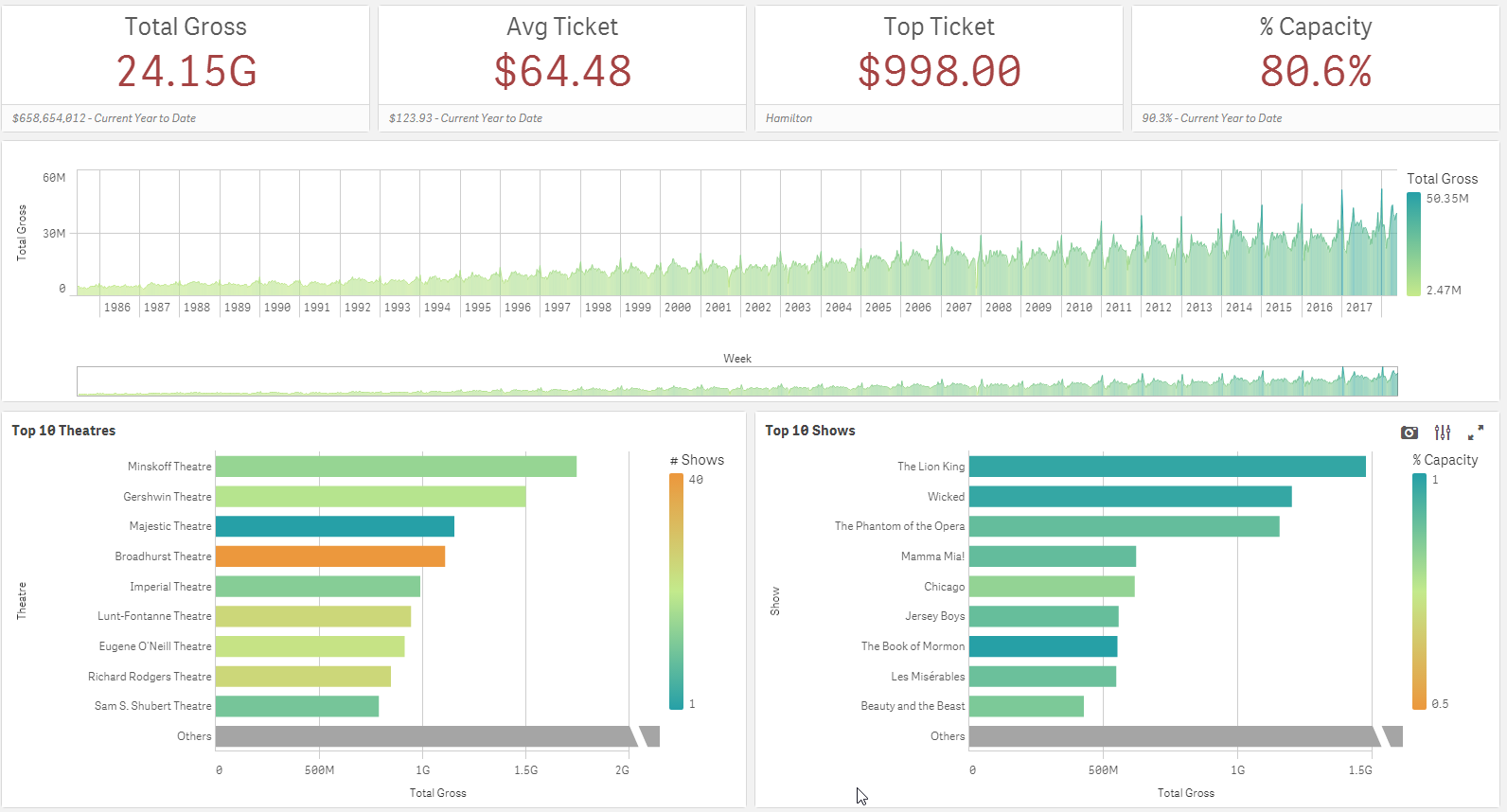
Since my preference is to use the B instead of G to show billions, I changed the NumericalAbbreviation variable to be:

Now the app looks like this:

A small, easy tweak to the script, allowed me to change the numeric abbreviation in the app. I should note that the numeric abbreviation is used only when Numbering Format is set to Auto. So, if the Numbering Format is set to something other than Auto such as Money or Number, the NumericAbbreviation variable is not used and the format that you specify in the properties of the object is used.
In this blog, I showed one example of how the NumericalAbbreviation variable can be used but it can also be used to add spacing before the abbreviation or other custom abbreviations, if you choose. This seems like a small feature but it has a large impact providing users with more flexibility and control over how the data is displayed. To learn about other new features released in April, check out Michael Tarallo’s Qlik Sense – What’s New April 2018 video.
Thanks,
Jennell