Unlock a world of possibilities! Login now and discover the exclusive benefits awaiting you.

Analytics & AI
Forums for Qlik Analytic solutions. Ask questions, join discussions, find solutions, and access documentation and resources.
Data Integration & Quality
Forums for Qlik Data Integration solutions. Ask questions, join discussions, find solutions, and access documentation and resources
Explore Qlik Gallery
Qlik Gallery is meant to encourage Qlikkies everywhere to share their progress – from a first Qlik app – to a favorite Qlik app – and everything in-between.
Qlik Community
Get started on Qlik Community, find How-To documents, and join general non-product related discussions.
Qlik Resources
Direct links to other resources within the Qlik ecosystem. We suggest you bookmark this page.
Qlik Academic Program
Qlik gives qualified university students, educators, and researchers free Qlik software and resources to prepare students for the data-driven workplace.
Recent Blog Posts
-
Qlik Digest - December 2022
WHAT’S NEW AT QLIK? New data visualization capabilities are now live in Qlik Sense SaaS. Get up to speed on the latest innovations, including applicat... Show MoreWHAT’S NEW AT QLIK?
New data visualization capabilities are now live in Qlik Sense SaaS. Get up to speed on the latest innovations, including application chaining, styling updates, the ability to add a custom tooltip to your KPI object, and more. Learn More
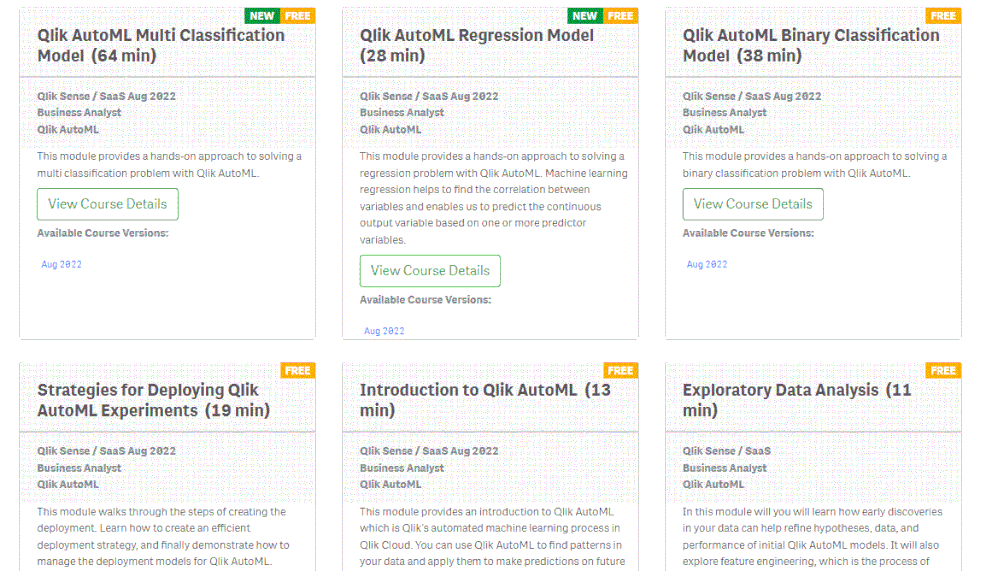
Check out the new Qlik AutoML courses added to Qlik Continuous Classroom. With these new courses you can dive into creating machine learning experiments, deploying predictions, and creating analyses. And even better news – nearly all of them are free! View Courses
Qlik Cloud Data Integration is Here. As you may have heard by now, we recently launched Qlik Cloud Data Integration. Get the low-down on Qlik's journey to this major milestone, and find out how this can benefit all our customers looking to deliver real-time data and automate transformation. Visit Blog
Apply to be a Qlik Luminary!
Are you a huge Qlik advocate who loves driving measurable impacts from data? Why not apply to be a #QlikLuminary? Luminaries gain exclusive Qlik perks and networking opportunities. But be sure to apply soon, applications close on December 16. Learn More and Apply
2023 Outlook: A Pivotal Year for Data Integration
On December 7, join Ventana Research and Qlik as they discuss pivotal architectures, approaches and innovations influencing the data integration market in 2023. Register
Join in the fun for the 2022 World Cup!
Before we head into the quarter finals there’s still time to predict your winner with Qlik’s Choose Your Champion bracket. ⚽️ Who do you think is taking home the #WC2022?
Make your predictions and share on LinkedIn
Additional Featured Content
Learn how D4C enables operational staff to access critical data insights
Get insights on your Qlik environment with the Qlik Sense monitoring applications
-
New Content: Qlik AutoML Learning Modules
AutoML (Automated machine learning) finds patterns in your data and uses them to make predictions on future data. Machine learning experiments in the ... Show MoreAutoML (Automated machine learning) finds patterns in your data and uses them to make predictions on future data. Machine learning experiments in the Qlik Cloud hub let you collaborate with other users and integrate your predictive analytics in Qlik Sense apps. In addition to making predictions, you can do an in-depth analysis of the key features that influence the predicted outcome.
We have recently added Free, Qlik AutoML learning Modules to Qlik Learning Portal. Access these modules here
Happy Learning!

-
Monte Carlo Simulation - Search of Pi Number
Monte Carlo Simulation - Search of Pi Number Mercanza SLU Qlik Sense application that attempts to derive the approximate value of the PI number ... Show MoreMonte Carlo Simulation - Search of Pi NumberMercanza SLU Qlik Sense application that attempts to derive the approximate value of the PI number based on iterations of the algorithm based on the Monte Carlo method
Discoveries
We have performed 10,000 iterations and have derived an approximate value of the PI number of 3.10, very close to the true value of 3.1415 with 98.71% accuracy.
Impact
This application has served to validate in an illustrative way that the Monte Carlo method is valid to deduce probable values of high-value output for any company.
Audience
Any person in the field of business decision or data analyst
Data and advanced analytics
This application has been created with a simple algorithm whose output is a final average value and a histogram to deduce the average range of most probable results, which can be very useful for making business decisions.

-
Get Ready for 24 Days of Visualization Tips – A Year in Review
This year, we released a wide variety of improvements, from minor capabilities that provide more flexibility and customization to more monumental addi... Show MoreThis year, we released a wide variety of improvements, from minor capabilities that provide more flexibility and customization to more monumental additions like Simplified Authoring. All the updates this year complement our associative analytics engine and enhance your analytics experience to help you derive more value from your data in the business moment.
Business intelligence and data analytics with actionable insights are essential for any organization striving to compete and win in their respective markets. Visualizations make or break the interpretation of those insights. Qlik Sense visualizations will delight your data consumers and deliver better insights faster, with more responsiveness and detail than other products focused primarily on visualization. Our extensive library of beautiful, intelligent, interactive, and responsive visuals driven by the power of our analytics engine deliver actionable insights.
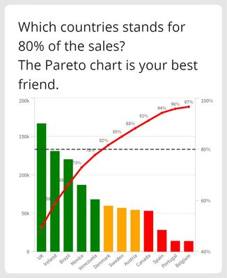
From December 1 to December 24, Christmas Eve, we will post one Qlik Sense visualization tip per day on LinkedIn. So, without further ado, the first in our series is Pareto Analysis. Commonly known as 80/20 distribution, the Pareto chart surfaces representative data that makes up 80% of the total share. This percentage can, of course, be easily adjusted.
Follow Patric Nordstrom and Nicole Tamms on LinkedIn to see the rest of Qlik’s 24 Days of Visualization Tips.
-
Reference Line Improvements
In the Qlik Sense September 2020 release, many improvements were made to reference lines. Now, a dimensional reference line can be added to a bar char... Show MoreIn the Qlik Sense September 2020 release, many improvements were made to reference lines. Now, a dimensional reference line can be added to a bar chart or a line chart and there are additional formatting options as well. In this blog, I will show 2 examples of dimensional reference lines. In the first example, I will show how text can be used to add a dimensional reference line to a discrete axis bar chart. In the second example, I will show how dimensional reference lines can be added to a continuous axis line chart.
Example 1
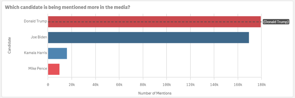
In the chart below, a dimensional reference line is used to highlight the bar for Donald Trump.
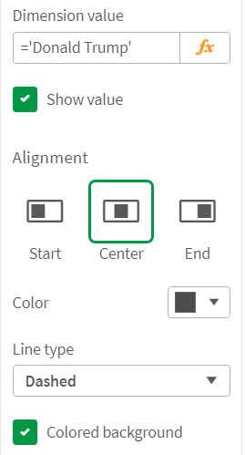
This reference line is created by setting the Dimension value to ='Donald Trump' which is simply text. In this example, the line type is set to dashed and the colored background checkbox is checked. The alignment of the chart is set to center so that the line goes through the bar versus above (start) or below (end) the bar. Some of the properties set can be seen in the image below.
Example 2
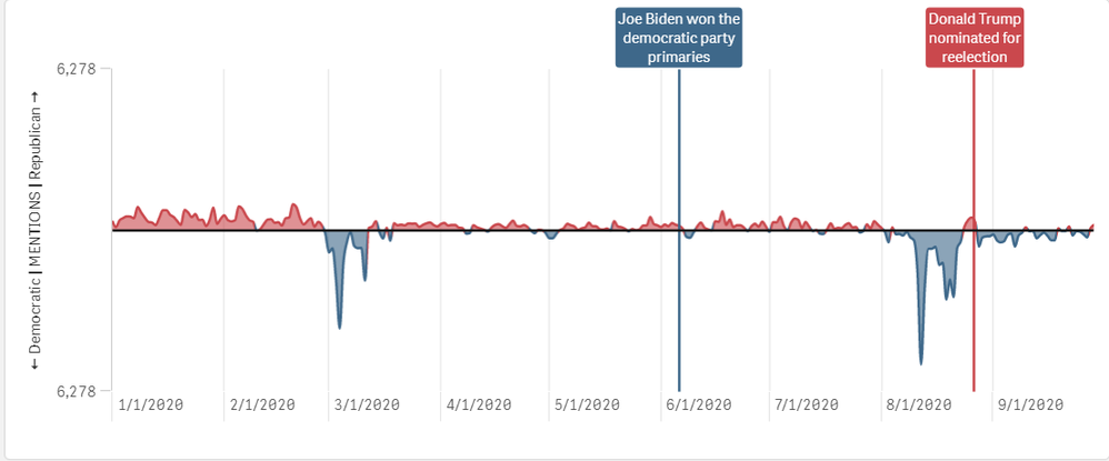
The second example of dimensional reference lines can be seen in the continuous line chart below. This line chart shows the net difference in media mentions each party receives. The red line is for Donald Trump and Mike Pence mentions and the blue line is for Joe Biden and Kamala Harris mentions. The reference lines point out key moments leading up to the 2020 presidential election so you can see if the media talk was based on a specific event. Check out the 2020 Presidential Election app to see this chart in action.
In this example, the reference lines are based on the date of the event and the labels and lines are styled to match the candidate party color. The new formatting features available in the Qlik Sense September 2020 release makes it easy to identity events for a specific party. There are other options available for dimensional reference lines. You can also set a show condition to determine when the reference line is displayed. This is what was done in the 2020 Presidential Election app – the selected key campaign event is displayed in the line chart. There is also the option to show the label and the value. The label can be hard-coded, or it can be an expression. The same is true for the reference line expression. The color of the label can be set to any color and the line type can be solid or dashed.
Learn more about reference line improvements and other new Qlik Sense enhancements in the What's New - September 2020 app and video.
Thanks,
Jennell -
New Year - New Skills & Badge as a Data Expert!
With Qlik’s Analytics Expert Program “Applied Data Analytics using Qlik Sense”, in just 15 weeks, you will be on your way to become a leader in develo... Show MoreWith Qlik’s Analytics Expert Program “Applied Data Analytics using Qlik Sense”, in just 15 weeks, you will be on your way to become a leader in developing a data-driven culture in your organization.
You will not only learn data analytics best practices but also learn how to achieve a data-informed mindset that shifts you from just looking for data and information to looking for insights and knowledge.
You will learn best practices in data analytics, data literacy and data-informed decision making that help you make the most effective use of Qlik Sense. As you complete the course, you will get a chance to earn a badge you can share on your social sites and add to your email signature.
In addition, you will obtain the knowledge to be able to take the Qlik Sense Business Analyst Qualification, Data Analytics Certification and Data Literacy Certification.
Course will run 30-Jan-23 - 12-May-23 In EMEA/AMER
27-Feb-23 - 9-Jun-23 in APAC
Register Today to save your spot for the Spring Semester
Looking for more details? Check out our Course Page to access Data Sheet, Sample course and all other details.
Happy Learning!
-
Free Webinar: Introduction to Qlik Continuous Classroom
This introductory webinar will explore the Qlik Continuous Classroom and the different ways to locate and access content. With over 300 courses, perso... Show MoreThis introductory webinar will explore the Qlik Continuous Classroom and the different ways to locate and access content. With over 300 courses, personalized learning plans and qualifications, let us help you get started and become familiar with all the Qlik Continuous Classroom has to offer!
Date: Dec 13, 2022 11:00 AM ET This time doesn't work for you? Register to receive the on-demand recording.
Host: Kristina Parks
Language: English
Session duration: 45 minutes
-
Font Styling Enhancements
Since my previous blog titled Additional Styling Options for the Bar Chart, there have been more font styling enhancements worth mentioning. The Gener... Show MoreSince my previous blog titled Additional Styling Options for the Bar Chart, there have been more font styling enhancements worth mentioning. The General styling tab is now available for the pie chart, table, and pivot table, allowing users to customize the heading, subtitle, and footnotes in their visualizations. The emphasis for the text can also be set to bold, italic or underlined. Here is another quick look at the General tab options in case you missed it in my previous blog.
Here is what a table looks like with these settings:
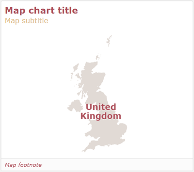
A similar enhancement was made to the map. App developers have more flexibility in styling the labels on a map, as well as the title, subtitle, and footnote. In the layer properties of the map in the Options section, labels can be toggled on. If labels are on, developer can set the label font family, label font size, and the label font color.
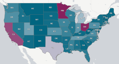
Sometimes maps can be busy, so being able to customize the labels is very helpful. In the map below, I was able to adjust the color and size of the labels to compliment the color scheme I was using, maximizing the clarity of the labels on a map with so many labels.
Here is another example of custom labels from the What’s New App – November 2022. This is a totally different look and shows how different the labels can be styled.
While these changes may seem small, they greatly impact the look and feel of an app. Developers have more options to easily customize visualizations to match their style or company brand.
Thanks,
Jennell
-
New Connectors, Homepage Content, Downloads and more!
Hello Qlik Community! The February release is LIVE! This was a massive release and a lot of work went on behind the scenes to make it happen! New Qlik... Show MoreHello Qlik Community!
The February release is LIVE!
This was a massive release and a lot of work went on behind the scenes to make it happen!
New Qlik Application Automation Connectors
Five new connectors were added to the Connectors page for Qlik Application Automation. Find support related content easily for Dynamics 365, expert.ai, GitLab, oauth2, Power BI and Tableau by clicking on the new icons.
Find the latest Blogs, Events and Ideas easily on the Homepage
You’ve always been able to see the latest discussion on the Homepage, but now you can find the latest blog entries, events and ideas all at once!
Improving the “Ask a Question” experience (one step at a time)
We removed the ability to post a question to the Search area. This was step one of improving the experience for this button. Be on the lookout for more improvements in the near future!
Fixed Blog titles when viewing on a mobile device
Blog titles were being truncated when viewing on a mobile device. We removed the dreaded ellipsis (…) and you can now view the full title!
Carousels now toggle 4 cards with a single click
Previously, if you wanted to scroll through a carousel, it was one card at time. Now clicking next, the carousel will jump to the next 4 cards. Less clicks means more time for viewing content!
And last, but certainly not least…
Qlik Downloads is now on Qlik Community!
This has been a passion project here at Qlik. Not only are we still using our own technology, we are using the latest and greatest! Even better, you only need to use one site, one login credential to enter your cases with Qlik Support, download the latest versions of our products and view the Release Notes. It is also our first venture into embedding a Qlik Sense Enterprise on SaaS app here on Community!
We are so excited to welcome the new Downloads page to Qlik Community!
You must be logged in and be a Customer or Partner to view the Qlik Downloads page. If you're having trouble accessing the page, please reach out to Customer Support.
We hope you enjoy all the latest enhancements with our February release! Please let us know if you have any questions using the comments below. We are on a freeze for March and will be back in April with some new enhancements!
Your Qlik Community Admins,
Melissa, Sue and Jamie
-
Data and healthcare
When people think about data analytics and data literacy, they often believe that these skills are only important in industries such as Banking, Manuf... Show MoreWhen people think about data analytics and data literacy, they often believe that these skills are only important in industries such as Banking, Manufacturing or Media. However, the healthcare industry is one of the biggest generators of data, contributing to 30% of the worlds data volume. Previously this was much harder to collect, but with the trend of wearables such as fitness trackers in watches and phones, more and more health data is available to to us. Many healthcare providers now implement tools such as Qlik, to help them visualize and make decisions based on this data.
In the past the healthcare industry would collect and use data to answer questions such as; what blood pressure is normal for a certain age group? at what age should someone start receiving a flu jab?. But we can now use healthcare analytics to dive even deeper into our health and to reduce cost of treatments, predict outbreaks of epidemics and avoid preventable disease. With people now living much longer lives, there are new challenges in terms of how we deliver healthcare so leveraging data to help solve these challenges is crucial.
One of the lessons learnt from the pandemic was that healthcare professionals need to be able to adapt to rapidly changing environments and leverage available data and tools, to make the right decisions. This applies to nurses in the A&E waiting rooms to consultants, to management teams making financial decisions for hospitals. Healthcare analytics is a skill all professionals can greatly benefit from. If you're a student studying on a healthcare related course, you can supplement your learning and start to upskill by signing up for the Qlik Academic Program. You can learn for free on software used by the NHS, so that you have the skills to thrive in the healthcare industry - qlik.com/academicprogram
-
Securely access data behind a firewall or VPC with Qlik Data Gateway - Direct Ac...
Can't see the video? Watch it here on the Qlik video site hereOrganizations of all levels are making significant investments to digitize and modernize... Show MoreCan't see the video? Watch it here on the Qlik video site here
Organizations of all levels are making significant investments to digitize and modernize business systems and operations to better take advantage of the cloud. But not every company can just pick up and move every single part of their business. Whether its regulatory or strict firewall policies, some operations, and data must remain behind a firewall or within a virtual private cloud (VPC).
Customers that fall into this category get stuck in the middle between wanting to adopt SaaS offerings but keeping data where it is. Luckily, Qlik has made it possible for customers of Qlik Cloud to deploy a full enterprise SaaS analytics environment with safe, secure access to data that lives and breathes behind a firewall.
Qlik Data Gateway - Direct Access provides an encrypted connection to Qlik cloud that allows Qlik Sense SaaS applications to securely access and analyze data that resides behind your organization's firewall. No matter if your protected data is on-premises or in a virtual private cloud, Direct Access provides a secure way to analyze that data in Qlik Sense SaaS.
Qlik Cloud offers enterprise-grade solutions for data ingestion into Qlik Sense SaaS with respect to governed access of internal data landscape(s) of an organization - no matter where the data resides, in the cloud or somewhere behind a firewall.
How it Works
Can't see the video? Watch it on the Qlik video site here
The Qlik Data Gateway acts as a bridge from data sources into Qlik Cloud, allowing Qlik Sense SaaS application to securely access and analyze data behind a firewall or within a VPC.
The Data Gateway is installed on a system in an organization’s network behind a firewall and allows secure encrypted connections between data sources and the Qlik Cloud tenant. The Data Gateway establishes a mutual authenticated and encrypted connection using HTPPS.
Qlik Cloud sends a query to the gateway and the gateway relays the query to the defined data source which is configured with a connector. The data is then streamed directly from the data source to Qlik Cloud – it’s important to know that the data is always in transit and never physically resides on the data gateway.
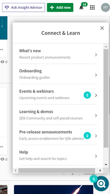
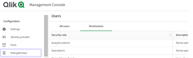
For a tour, please check out the Connect and Learn pane on the bottom right of your hub or inside of the QMC by going into the Data Gateway portal from the Configuration pane on the left.
Connect and Learn
Qlik Management Console (QMC)
Qlik Data Gateway and Direct Access makes SaaS analytics consumption possible for customers with data that must remain on-premises or within a VPC.
Qlik Cloud supports all types of data landscapes with safe solutions that accelerate cloud adoption and provide the innovation needed for our customers to pursuit their next chapter of analytics greatness.
Try Direct Access today with our demo app - here
Register for the Do More with Qlik Archive to see the Data Gateway - Direct Access and Direct Query webinar on demand, available soon.
-
Green River College
Previously I shared a webinar with one of our Educators, Danny Najera from Green River College. Danny's use case for Qlik is unique and we have had a ... Show MorePreviously I shared a webinar with one of our Educators, Danny Najera from Green River College. Danny's use case for Qlik is unique and we have had a great time hearing from him about how he and his students use Qlik and the Academic Program. Recently we sat down with Danny to put together a case study and we are thrilled to share the results! The case study focuses on his teachings and how specifically Qlik and the Academic Program have aided him on his quest to ensure that students are focusing on the data, and not struggling with the data tools.
Read the full here here and if you didn't already get a chance to watch his webinar, check it out!
Educators and students who wish to benefit from the program like Green River can apply today by visiting https://www.qlik.com/us/company/academic-program

-
Qlik アプリで「FIFA ワールドカップ 2022」をもっと楽しく!
2022年 11月 20日、4 年に一度のサッカーの祭典「FIFA ワールドカップ 2022」が開幕しました。世界 32 ヶ国を代表する選手たちが、中東カタールで世界王者を目指します。今大会を制するのはどのチームなのか?過去大会の対戦成績は?Qlik の「Choose Your Champion」ア... Show More2022年 11月 20日、4 年に一度のサッカーの祭典「FIFA ワールドカップ 2022」が開幕しました。世界 32 ヶ国を代表する選手たちが、中東カタールで世界王者を目指します。
今大会を制するのはどのチームなのか?過去大会の対戦成績は?Qlik の「Choose Your Champion」アプリでは、今大会結果のほか、過去大会の各チームや各選手のゴール数など、1930 年からの統計情報を見ることができます。また、どのチームが勝つのかを予測して、仲間と共有することもできます。ぜひアクセスして、今大会をお楽しみください!
アプリにアクセスする -
Qlik Sense Monitoring Applications for Cloud and On Premise
Can't see the video? View it on the Qlik Video Page.If you want to track usage capacity of users on your tenant, check out the Entitlement Analyzer. N... Show MoreCan't see the video? View it on the Qlik Video Page.
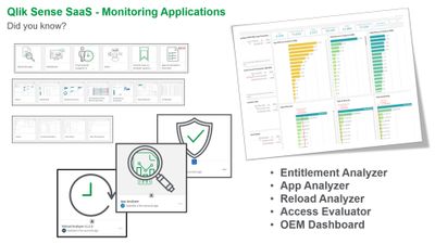
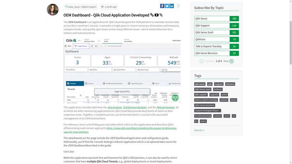
If you want to track usage capacity of users on your tenant, check out the Entitlement Analyzer. Need to optimize your Qlik Sense applications? Then perhaps the App Analyzer will help. Want more insight into your app reloads – download the Reload Analyzer. Looking to learn what users and groups have access to what space and what roles they have? Start using the Access Evaluator and finally – if you are a Qlik partner or an Enterprise that needs to centrally monitor information from multiple Qlik Cloud tenants all from a single dashboard, then check out the OEM Dashboard app. Qlik is dedicated to your success and our best and brightest have created these specific solutions to make it faster and easier to get those important insights so you don’t have to. These apps are available for you to download in the Qlik Community along with documentation.
The Qlik Sense Monitoring Applications for Cloud and On Premise

-
The most wonderful time of the year means TWO releases this month!
It’s the most wonderful time of the year! Spooky season is behind us (finally, it’s my least favorite) and the Holiday season is upon us. Thanksgiving... Show MoreIt’s the most wonderful time of the year! Spooky season is behind us (finally, it’s my least favorite) and the Holiday season is upon us. Thanksgiving is next week in the United States which means family, food and [American] football. It is, without a doubt, my favorite holiday.
All the Holiday excitement made us think we need TWO releases this month! Today, we pushed out the first round of November enhancements:
Chatbot added to more Support pages
You can now ask questions or connect to a live agent on the following pages:
Look for the blue ‘Contact Support’ button.
More Blogs! Widget
Easily access other suggested blogs with the new More Blogs! widget on the right rail.
‘Create a Post’ Button
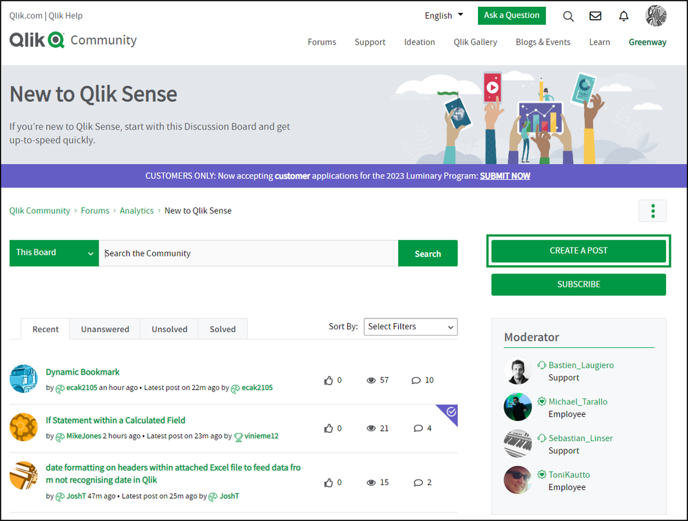
We previously updated the Post a Question button on Forums and the Job Board to Create a Post. This was inadvertently reverted, so we fixed it.
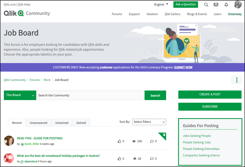
Posting Guidelines Now on Job Board
New guidelines are available on the right rail of the Job Board. Use these templates when posting on this page.
Since next week is a Holiday week, expect to see the second round on November 29th!
Your Qlik Community Admins,
Melissa, Sue, Jamie, Nicole and Emma
@Melissa_Potvin @Sue_Macaluso @Jamie_Gregory @nicole_ulloa @emmaspickerman
-
【オンデマンド配信】東亞合成(株)× Qlik 対談:Qlik でプロジェクト進捗管理を実現し、リアルタイムなデータに基づいた意思決定でビジネスを推進
大手化学メーカーの東亞合成株式会社は、2017年より Qlik を採用。SAP 等の社内各システムからデータ統合基盤へデータを集約 / 加工して集めたデータを分析するために Qlik で独自のアプリを作成し、社内プロジェクトの進捗管理・予算管理をリアルタイムに見える化することで、生産性の向上を実現し... Show More大手化学メーカーの東亞合成株式会社は、2017年より Qlik を採用。SAP 等の社内各システムからデータ統合基盤へデータを集約 / 加工して集めたデータを分析するために Qlik で独自のアプリを作成し、社内プロジェクトの進捗管理・予算管理をリアルタイムに見える化することで、生産性の向上を実現しています。今後の展望として、Qlik により「人が取るべきアクションの促進を自動化」し、データに基づき各社員が行動することで、データ駆動型プラントの実現を目指しています。
本講演では、実際に社内で活用中のアプリをご紹介いただくほか、Qlik 営業担当者との対談にて、データ活用に関する過去 / 現在 / 未来の取り組みについて詳しくお話しいただきます。※ 参加費無料。パソコン・タブレット・スマートフォンで、どこからでもご視聴いただけます。
-
Qlik Data Integration November 2022 Client-Managed Releases - now available
Qlik Replicate November 2022 Client-Managed The November 2022 release is packed with many exciting announcements. We have new endpoints, capabilities,... Show MoreQlik Replicate November 2022 Client-Managed
The November 2022 release is packed with many exciting announcements. We have new endpoints, capabilities, improvements, and optimizations.
New Endpoints and EnhancementsThe Qlik Replicate November 2022 release brings several new endpoints and enhancements, some were made available as part of an earlier Service Release (May2022 SR) and are also included in this General Availability release.
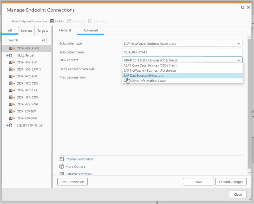
SAP New Endpoint & Optimizations supporting many ways to enable data replication from SAP with Extractors and best-in-class log-based and trigger-based CDC, in this November release we have continued to expand on the many ways you can connect with your SAP data. You will find:
- New SAP ODP endpoint as a Source - Introducing support for the SAP Operational Data Provisioning (ODP) framework that can provide a better experience than SAP Extractors and operate under an SAP Runtime license.
- SAP HANA multi-tenants
- SNC authentication
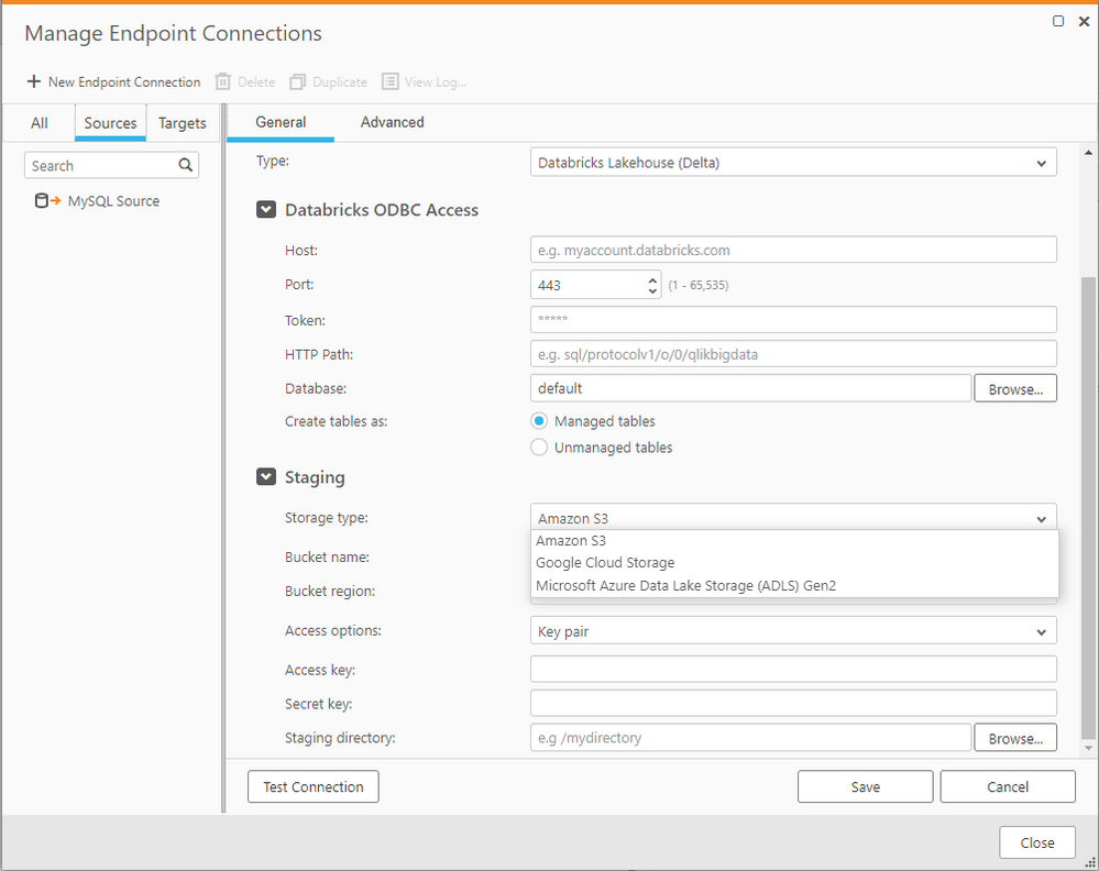
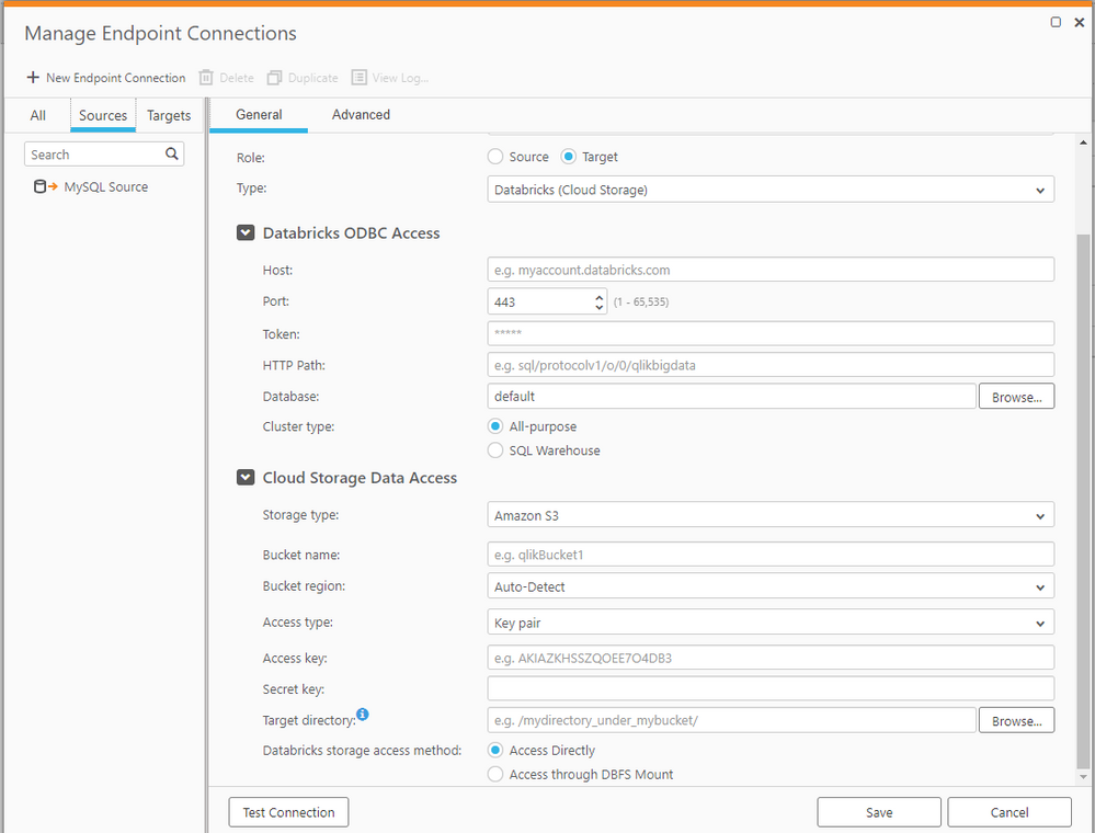
Improved Databricks Endpoints as a Target Databricks is an important strategic technical and commercial partnership for Qlik, and we continue to improve our integration with the Databricks ecosystem and the user experience by consolidating the Databricks Lakehouse (Delta) endpoints as a target, supporting Full Load, Store Changes and Apply Changes. Both endpoints now support Databricks SQL compute as a lower cost compute layer in Databricks.
- Databricks Lakehouse (Delta) as a Target - This release adds support for both managed and unmanaged tables in this endpoint. We have also added support for Databricks Lakehouse (Delta) on AWS and Google Cloud Platform (GCP). For a better user experience, we have consolidated the three Databricks endpoints (Databricks on AWS, on GCP and Azure Databricks) into this single endpoint. Note: When upgrading to this release, any existing tasks using Azure Databricks Delta endpoints will be automatically migrated to the new Databricks Lakehouse (Delta) endpoint.
- Databricks Cloud storage as a target – This endpoint is typically used with Qlik Compose to manage the data lake and historical data sets. With this release, this endpoint and Qlik Compose now support Databricks SQL Compute, along with parquet file delivery for optimized performance with Qlik Compose.
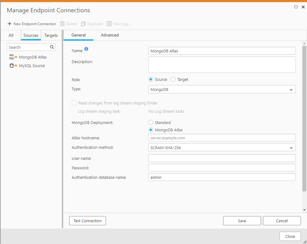
MongoDB on ATLAS as a Source The Qlik Replicate November 2022 release supports cloud-based MongoDB Atlas, as an additional option to the existing MongoDB endpoint.
MS SQL Server (CDC) as a Source This release sees support for Microsoft’s MS CDC API which has recently come out of beta. This is a new option for the existing endpoint which adds significant value by simplifying complexities for example;
- Reading the lobs directly from the CT table without the need to do lookup.
- In addition to supporting sysadmin credentials, you can now choose to work with db_owner
New :
- AWS PrivateLink added - Improved security for Amazon S3 with the support for AWS PrivateLink which will help improve secure connections for larger AWS environments. Stay tuned for support of other targets in later releases.
- Parquet file format support added for Azure Data Lake Storage Gen 2 (ADLS Gen 2) and Google cloud
The Parquet file format provides optimizations that speed query execution due to its efficient file format. Parquet is an open-source file format built to handle flat columnar storage that enables a simple “file based” raw lake for data science use cases. It’s well known for both its performant data compression and the ability to handle a wide variety of encoding types. Aligning with our multi-cloud strategy, support for Parquet now spans across the clouds, building on Parquet support for S3 added in the Qlik Replicate May 2022 release Qlik Replicate now supports the three main Hyperscalers (AWS, Azure and GCP).
- Google BigQuery enhancements -
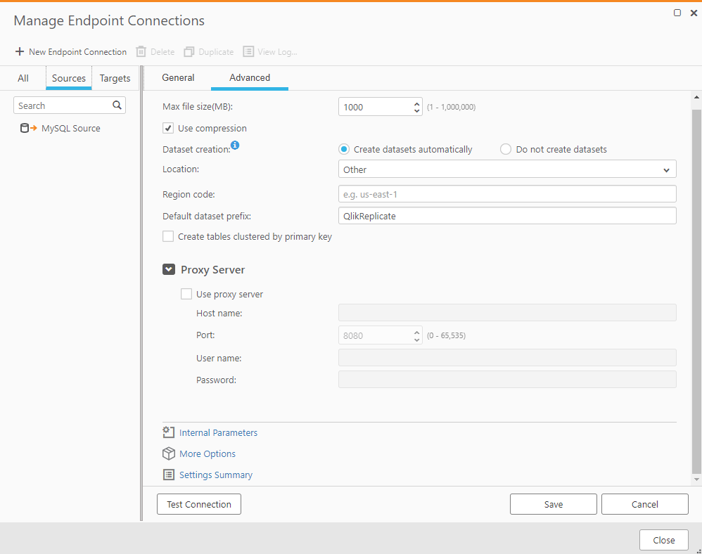
This endpoint now offers added Proxy support, Use-compression as an option and the ability to allow you to set any Google Region when selecting Google Locations. In most cases compression can usually improve performance, however in some cases performance could be degrade, when trying to compress an already compressed file, for example. Therefore, we have added an option to enable you to decide if you want Qlik Replicate to use compression or not when moving data to Google BigQuery. Google are regularly adding new Data Location Regions and if your chosen location is not available in Qlik Replicate’s built-in Location list, you can now select “Other”, and manually add the new Region code.
- Added Support for Primary Key (PK) changes
As any DBA knows making changes to the PK directly is a big “No, No!”. To ease downstream processing, and support best practices, this Qlik Replicate Engine improvement benefits Data Lake and streaming targets, e.g., Kafka, by turning updates to the PK into a delete of the old key and an insert of the new key.
Qlik Replicate is now using FIPS compliant libraries Qlik Replicate November 2022 release now includes the option to use FIPS compliant libraries over standard OpenSSL. FIPS (Federal Information Processing Standards) is a set of standards developed by the United States Federal Government for use in computer systems. By selecting this option in Qlik Replicate, fully compliant FIPS 140-2 SSL libraries will be used that meet a set of stringent security requirements that are associated with these libraries.
Qlik Compose May 2022 - Service Release (22.05)
Qlik Compose’s latest release offers exciting new capabilities, such as:
- Streamlined Audits - Qlik Compose maintains the history of all transactions in the Historical Data Store (HDS). When customers audit individual transactions that occur at sub-second frequency, they take the extra step of reviewing those changes in the landing area of a Data Warehouse instead of directly in the HDS. With the latest release, we are enhancing our data governance capabilities by adding support to view and manage all changes in the HDS resulting in streamlined audits.
- Expanded Automation – Currently, Qlik Compose administrators manage users and groups manually using the user interface. This Qlik Compose release augments administration capabilities via the command line interface. Administrators can further automate their Continuous Integration & Development (CI / CD) pipelines by creating and managing access to Qlik Compose using command line scripts.
- Lower Lakehouse Costs – Qlik Compose customers can now execute their automated workloads on Databricks SQL Warehouse and benefit from lower-cost computing on the latest 10.4 LTS Databricks Lakehouse Platform. Also, Qlik Compose can now consume parquet files landed by the November 2022 release of Qlik Replicate.
- Greater Agility – Qlik Compose generates SQL code to automate the lifecycle of data warehouses and different types of data marts. Additional run-time clauses are added to the generated SQL code in the latest release to reduce the number of statements executed when there is no data to process. This optimization of SQL statements for Data Warehouse projects greatly enhances data warehouse agility when minimal data changes occur.
- Windows Modernization - Compose is now certified to run on Windows 2022. Data Warehouse and Data Lake automation efforts can now utilize Qlik Replicate and Compose on this latest Windows version.
Qlik Catalog November 2022 Client-Managed
- Schedule data loads Qlik Catalog November 2022 removes the requirement that external tools are needed to load data on a predefined schedule. Qlik Catalog now provides the ability to define, schedule, and automatically run data loads.
- Publishing business names Previously, business names that were added to a data field could only be included when publishing to a Qlik target. We’ve now expanded this capability to allow business names to be included when publishing to any target.
- Increased performance We’ve improved the performance of incremental loads by only pulling changed data into Qlik Catalog.
- Updating metadata tags When importing metadata tags, one could previously only create new tags in Qlik Catalog. Qlik Catalog November 2022 gives you the option to alternatively update existing metadata tags during import.
We hope you enjoy using these new releases and would love to hear your feedback and success stories, especially in any improvement gains you achieve.
To learn about everything that is included in these releases be sure to check out the Release notes which are available here
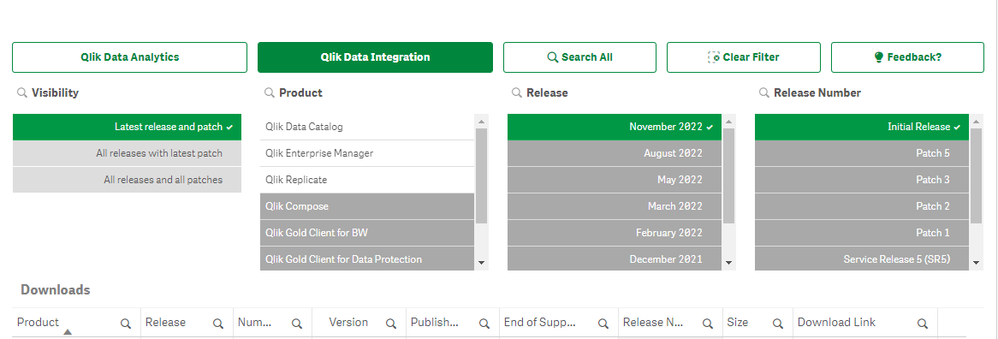
To obtain any of these releases, go to the Qlik Downloads Site in community and filter for “Qlik Data Integration”, and then select the product and the versions you would like to download.
Note: For most products, please select the version “November 2022” or in the case of Qlik Compose please select the latest Service Release (SR) version.
For additional help in using the downloads site - watch this handy video guide here:
How-to-download-Qlik-Products -
Qlik Academic Program visits the UK
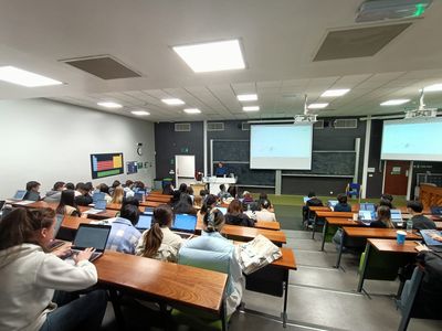
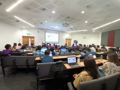
This past week I have been happy to finally get the opportunity to travel and meet some of our educators. Our Academic Program journey started last Fr... Show MoreThis past week I have been happy to finally get the opportunity to travel and meet some of our educators. Our Academic Program journey started last Friday when we visited the University of Sheffield to give a hands-on workshop to 60 students studying Digital Marketing. The majority of the students had never used Qlik before but they managed to successfully follow along with the workshop run by our Principle Solution Architect, David Sedgewick. Due to a number of updates to Qlik Sense Cloud, this was a brand new workshop and the content covered everything from data loading, to the insight adviser and master measures.
On Monday we returned to the University of Sheffield for two more sessions, this time for Supply Chain Technology in the morning and Business Intelligence in the afternoon. Our afternoon session was lead by our Solution Architect, Paul Styles, who went straight into showing the students how to get started with loading data. Throughout our Sheffield sessions, even the students who seemed unsure and asked for help, all managed to follow along and in some cases even go a step further than the workshop.
On Tuesday I attended the beautiful Greenland's Campus at Henley Business School to speak to Masters students studying Business Strategy. This is a course that is primarily studied online with a two day workshop element that invites guest presenters to speak to students about strategy and data in the work place. Our Qlik session gave students the opportunity to see all the theory they had learnt in the context of real life uses cases and an analytics tool.
From Henley I then got the train to Birmingham to speak to a class of students being taught by one of our very own Academic Program Educator Ambassadors, Nassir Ibrahim, at Birmingham City University. Nassir's students are in Semester 1 of their final year studying Business Intelligence, and they have spent the past 8 weeks building dashboards in Qlik Sense using data sets related to a car manufacturer. Two of the students proudly gave me tours of their dashboards and showed me how they added additional data and used Qlik Sense to answer business questions set by Nassir.
Throughout these university visits I have been amazed by how committed these groups of students are when it comes to expanding their skills and making themselves more employable. It's also been great to meet the passionate educators who care so much about the future of their students. If you would like to learn more about how you can support your students in getting the skills they need to succeed in the data driven world, follow this link to learn about our Academic Program - qlik.com/academicprogram.
Alternatively, if you are already an educator using our program why don't you apply to be an Educator Ambassador for 2023? Read this blog to learn more.
-
Qlik Sense November 2022 Client-Managed Release - now available
With augmented analytics, you can bring the power of your data to more people in your organization, broadening access, deepening insight, and improvi... Show MoreWith augmented analytics, you can bring the power of your data to more people in your organization, broadening access, deepening insight, and improving efficiency. Insight Advisor in Qlik Sense has been completely redesigned with UI enhancements and an always-available search box, and we have made several enhancements to chat in the hub. Our new Insight Advisor Analysis Types feature automates the creation of sophisticated analyses such as ranking, comparisons, and clustering in a few clicks. And, we’ve made a number of improvements to our visualization, connectivity, and overall platform capabilities. Read on for more details.
Below you will find supporting detail on "What's New" in this November 2022 release:
New Enhancements in Augmented Analytics:
Generate the most relevant insights through selection and search
Insight Advisor Search provides an improved Insight Advisor experience in-app, allowing users to easily auto-generate the most relevant analyses and insights from their data. A new button opens Insight Advisor, where users can select fields and generate insights without having to navigate away from their current sheet. The new Ask Insight Advisor search box is now visible at all times within dashboards, allowing users to easily generate insights using natural language processing. Auto-generated visualizations and analyses can be refined and added directly to dashboards for further exploration.
Create advanced analyses and insights in a few clicks
Insight Advisor Analysis Types is a new experience in Qlik Sense that allows users to request a certain type of analysis, such as a comparison, ranking, trending, etc., which will be generated in the best possibly way by AI. Users can choose from a variety of advanced analysis types and will be guided to select the best data and options. Analyses will then be auto generated and can be edited and added to dashboards for further exploration. With Insight Advisor Analysis, we now support multiple paths to insight – users can either use traditional natural language search or can start with an analysis type in a more directive manner, driving data literacy and insight.
Provide curated list of questions for Insight Advisor Users
Example Questions for Insight Advisor - App creators can now provide example questions for Insight Advisor within the Business Logic layer of an app. This allows them to offer sample questions that are tailored to their specific analytic content, helping users learn how to use natural language. When users ask questions, the examples will be displayed in a drop-down menu where they can be selected, modified, and submitted. And, in chat, example questions from across your apps will be offered.
Support "explore this further" for follow-up questions in Insight Advisor Chat
Insight Advisor Chat now better supports partial intent questions with the "explore this further" option, taking people directly to search-based discovery within apps for deeper analysis. Users can now ask follow-up questions to an original question, and when clicking explore this further, they will be taking into the app with selections applied for the full line of questioning, allowing them to pick up visually where they left off conversationally.
Time series breakdown as a QIX Engine function
Time-Series Decomposition Functions - Several new engine functions now allow you to decompose a time series dataset into trend and seasonality. The trend function identifies direction in the data, and the seasonality function determines seasonality with a known periodicity. The residual function identifies variation that is not associated with seasonal or trend components (i.e., noise). With these functions, you now have increased visibility into the patterns and trends in your time-series data so you can better plan future action.
New distribution functions from Cephes library
The following distribution functions from the Cephes library have been added, allowing you to perform more advanced statistical analysis of simulations. These distribution functions can be used in both the data load script and in chart expressions.
BetaDensity, BetaDist, BetaInv ,BinomDist, BinomFrequency ,BinomInv, ChiDensity, FDensity, GammaDensity, GammaDist, GammaInv, PoissonDist, PoissonFrequency, PoissonInv, TDensity
New Visualizations & Dashboards:
Custom tooltip creation for charts without dimensions
Based on customer request, the ability to create a custom tooltip for the KPI object has been added to Qlik Sense SaaS. This is the first tooltip added on a dimension-less object. The tooltip is conveniently displayed upon hovering over the object.
Add Background Layer & Properties to Agnostic Map
As part of the Nebula conversion of all charts, this will enable us to embed a map chart using Nebula.
Dynamic View Improvement
Users will now still have visibility to the chart whilst it refreshes, allowing for improved usability.
Connectivity:
MongoDB Additional Authentication
The Qlik MongoDB connector has been enhanced with new security features. Organizations can now use SCRAM-SHA-256 and LDAP authentication options when defining their MongoDB connection.
Integration of Standalone Web Connectors in Qlik Sense Enterprise on Windows
The following connectors are now available as part of the installed versions of Qlik Sense on Windows:
Facebook Insights, Google Ads, Google Calendar, Google Search Console, Outlook 365, Mailbox IMAP, Microsoft Dynamics CRM V2, OData, Qualtrics, SMTP, SurveyMonkey, and YouTube Analytics
For most use cases this means that the standalone Web Connectors are not needed, as these connectors now can be configured directly in the Qlik Sense client.
Remove of the “Disable” option for the Bulk Reader
The Bulk Reader load optimization setting was introduced in the August 2021 release, and users were given an option to either “Enable” or “Disable” this feature. This update removes the option to disable the Bulk Reader, and makes it always enabled on new connection definitions, to always ensure high-level performance when working with large datasets.
Platform:
Duplicate Tasks in QMC
Users are now able to duplicate tasks in QMC, much like they already can duplicate an app!
Client Sub-Bar for Windows
We have upgraded the Sub-Bar within Qlik Sense Enterprise Client Managed to match what is already being used in Qlik Sense SaaS. This will create an enhanced user experience for our users of both platforms, and inevitably create a much more consistent flow.
Config Files Persistence: Opt-in or Opt-out
Newly available check-box selection to allow the user to decide if they would like to enable or disable the config files persistence during an upgrade!
Allow Users to Create Custom Banners
Download Qlik Sense November 2022 here
Don't miss the next Qlik Insider, airing on November 16th - Register here
-
【オンデマンド配信】QlikWorld Tokyo オンライン
富士通・DNP が語る、データを活用した DX 推進成功例 昨今、データ活用による DX 推進は、あらゆる企業において最重要事項となっております。特に「リアルタイムデータに基づいた迅速な意思決定と行動」というアクティブインテリジェンスの考え方の重要性は、コロナ禍を経てますます高まっております。 こ... Show More富士通・DNP が語る、データを活用した DX 推進成功例
昨今、データ活用による DX 推進は、あらゆる企業において最重要事項となっております。特に「リアルタイムデータに基づいた迅速な意思決定と行動」というアクティブインテリジェンスの考え方の重要性は、コロナ禍を経てますます高まっております。
この度、アクティブインテリジェンスのためのプラットフォームを提供する Qilk は、「QlikWorld Tokyo オンライン」を開催いたします。本イベントでは、基調講演に富士通株式会社 執行役員 Executive Vice President / CIO / CDXO 補佐 福田譲様をお迎えし、同社の DX の取り組みについてお話しいただきます。また、アクティブインテリジェンスの最新動向や DNP、PayPay 銀行などのお客様の DX 推進事例をご紹介します。
※ 参加費無料。パソコン・タブレット・スマートフォンで、どこからでもご視聴いただけます。