








The first thing you should know is that almost every function in the Capability API has a substitute in enigma.js. Comparing their designs, enigma.js is more concise and simpler.
Unlock a world of possibilities! Login now and discover the exclusive benefits awaiting you.
Analytics & AI
Forums for Qlik Analytic solutions. Ask questions, join discussions, find solutions, and access documentation and resources.
Data Integration & Quality
Forums for Qlik Data Integration solutions. Ask questions, join discussions, find solutions, and access documentation and resources
Explore Qlik Gallery
Qlik Gallery is meant to encourage Qlikkies everywhere to share their progress – from a first Qlik app – to a favorite Qlik app – and everything in-between.
Qlik Community
Get started on Qlik Community, find How-To documents, and join general non-product related discussions.
Qlik Resources
Direct links to other resources within the Qlik ecosystem. We suggest you bookmark this page.
Qlik Academic Program
Qlik gives qualified university students, educators, and researchers free Qlik software and resources to prepare students for the data-driven workplace.
Recent Blog Posts
-
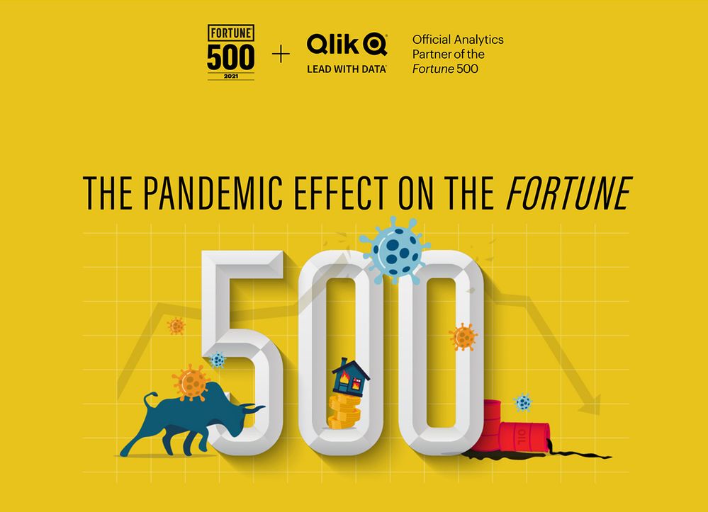
2021 Fortune 500: The pandemic effect on the Fortune 500
We did again! Qlik is the official partner of the Fortune 500 list for second year!This year the famous Fortune 500 list was, as the rest of us, impac... Show MoreWe did again! Qlik is the official partner of the Fortune 500 list for second year!
This year the famous Fortune 500 list was, as the rest of us, impacted by the effects of the economic crisis that followed the COVID-19 pandemic, and obviously so was the piece Qlik and Fortune team did together. We named it “The pandemic effect of the Fortune 500”.
We wanted to start by looking back in time and check how a crisis looks like, we wanted to see how long it takes for the economy to recover after a crisis, how many years apart are the crisis, etc.
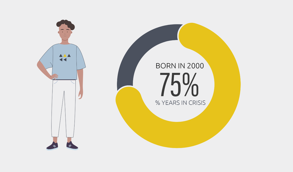
Did you know that someone born in the year 2000 have spend almost 75% of her life in an economic crisis (or recovering from one)? The numbers relax as we move back in time, but for someone born in 1955, still the 45% of his lifetime was lived during a crisis (or recovering from one).
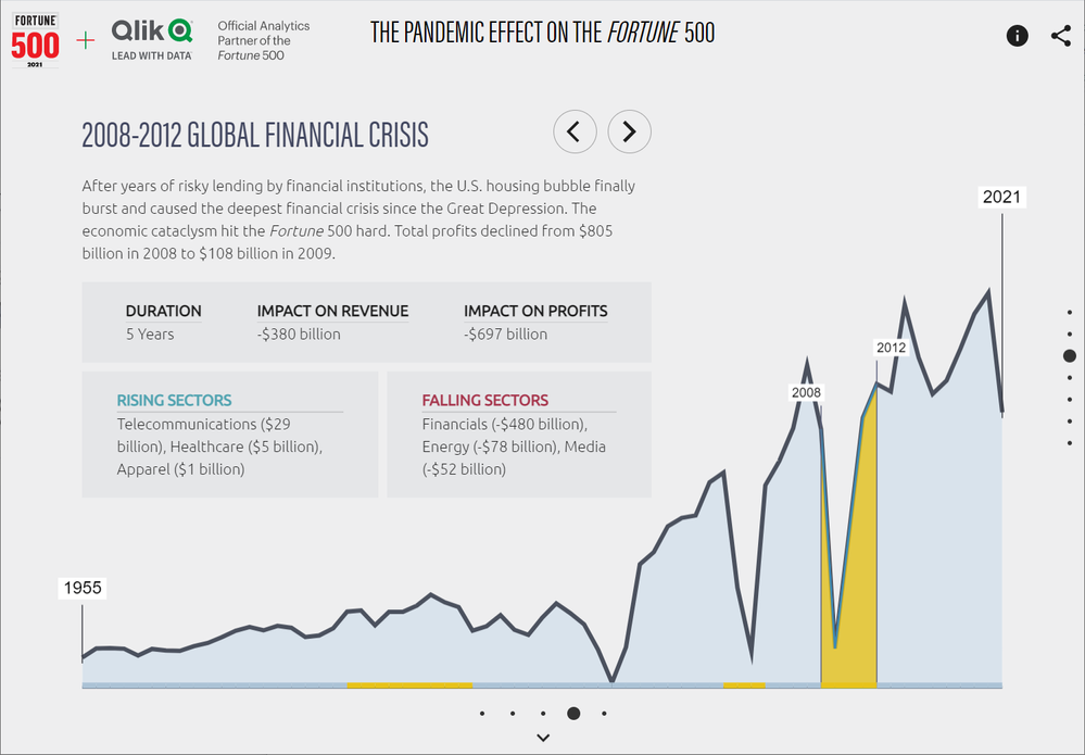
When we look at the profits of the companies that make the Fortune 500 list, we can see some acute dips in the line that shows the evolution of the indicator. For example, the 2007-2008 global financial crisis had a lasting effect on the profits in the listed companies. It took five years for the profits to reach levels pre-crisis.
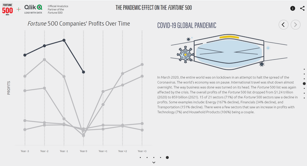
Another interesting angle is to see how similar the recent crises are as they shape the profits of the Fortune 500 list. We plotted the last 5 crises in a chart, to make the comparison useful, we picked the lower point of the trend as our reference point and we did set it up as the year 0 of the crisis, then we looked back and forward (when available).
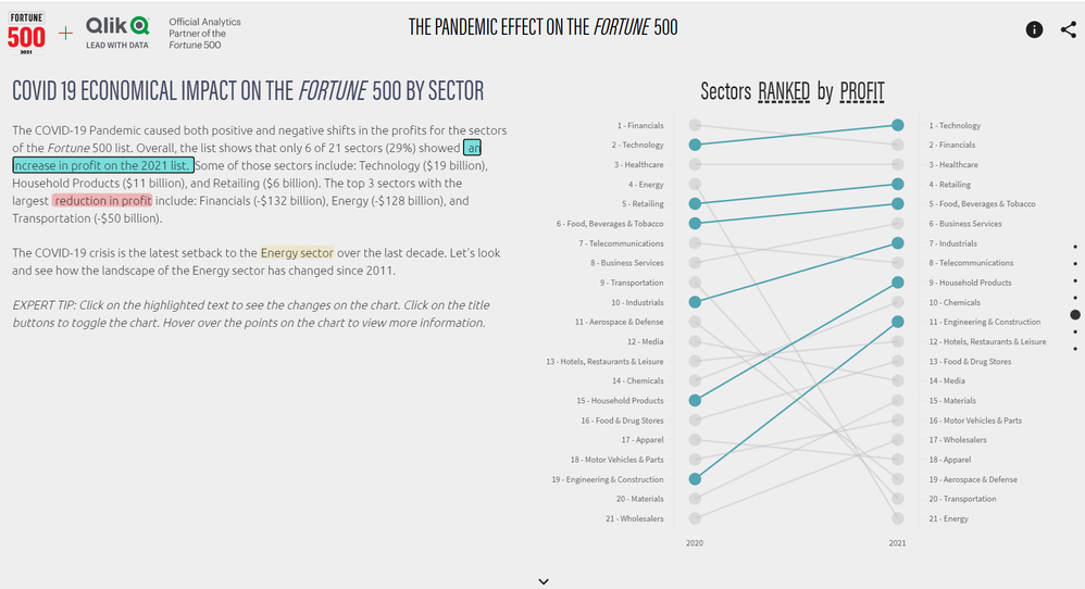
Looking at the effects of the COVID19 economical impact of the Fortune 500 list by sector, we can see that not all sectors have been impacted equally and in fact some of them show an increase in their profits and revenue during the worst of the pandemic. Healthcare, Retailing, and Technology among other sectors. The worst of the economical crisis caused by COVID19 was for the energy sector that took a hard hit on both revenue and profits.
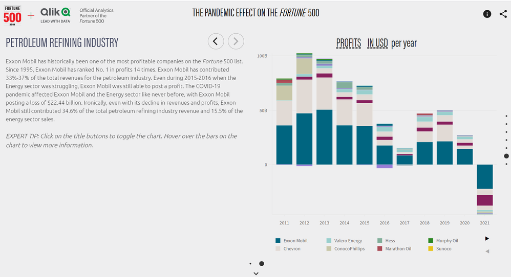
Finally, we drilled down into the Energy sector to understand better how the industries and the companies within performed last year.
Don't forget to check our collaboration with the Fortune 500 list.
I hope you like it and find it interesting.

-
Data is a competitive advantage, do you know how to use it?
Data is here, data is there, Data is everywhere! There is possibly no industry that doesn’t deal with data. Data is a competitive advantage but do you... Show MoreData is here, data is there, Data is everywhere!
There is possibly no industry that doesn’t deal with data. Data is a competitive advantage but do you know how to use it? Even when you base decisions on data, are you sure you are using the right data?
Are you sure you are asking the right questions of the data?
Are you confident in turning business questions into analytical questions?
Are you sure you are challenging any assumptions you have with the data?
Are you confident in using techniques to help mitigate any unconscious bias you may have when interpreting the data and insights.
Are you sure you have enough context from the data to ensure it is not telling you only part of the story?
To help take your firsts steps on your journey with data, Qlik is proud to launch the first-ever Analytics Expert Program “Applied Data Analytics using Qlik Sense” that covers all these topics in a cohesive fashion: data and analytic strategies, data literacy, and implementing all this using Qlik Sense. This 15-week blended course combines recorded lectures, weekly 60-minute, live instructor-led sessions, hands-on activities, and much more to guide you on your mindset shift.
Interested in learning more? Download the program information.

-
Community Enhancements (2021 - 4)
Community Members, Today marks the launch of something we believe is truly epic! Allow me to introduce you to the Qlik Greenway, a brand new page o... Show MoreCommunity Members,
Today marks the launch of something we believe is truly epic! Allow me to introduce you to the Qlik Greenway, a brand new page on Qlik Community. The page is situated on the Utility bar (top left of the homepage).
We have always believed that Qlik Community represents more than just the one URL. In fact, there are many communities here at Qlik - Qlik Nation, Qlik Meetup Network, Qlik Ambassador Program to name just a few. The Qlik Greenway serves as a pathway - built for all our members to forge connections, gain inspiration, share progress, gain recognition and go further in your Qlik journey. Whatever your aspiration and goals, we are here to support your path and your journey.Other Updates that rolled into production Tuesday, June 8, 2021:
- Release Notes - update
Search capability has been added to the product name field enabling you to find what you need faster.
Expect to see more product release notes added to this page very soon.
- Navigation updates
Updates to the top level Navigation have been made that will help with page load times. Specifically, we shifted to OOTB functionality for sitemap. - Product Icons
We are experimenting with use of product icons on Qlik Community. You can have a look at our first use of product icons visible when you click on a product label within the Support Knowledge Base page. This is a beginning; we plan to expand use of product icons in upcoming months.
- Qlik Gallery - update
Iterative updates are being made to the wildly popular Qlik Gallery page. On Spotlight Apps the Gallery image will now display to the left of the article in preview mode. If no image is provided a default image will load. We have plans to simplify and modernize the download/upload process to make it easier for you to share your apps. Stay tuned!
Reminder!
Gallery apps will gain you a new badge for your profile - AND if you share your app by July 3rd you can even earn SWAG (I know you love SWAG!) --> read this for how to get some! - New Ideation video
A new video about our ideation process, created by @Meghann_MacDonald, has been added to our Ideation landing page. If you did not get to view it during QlikWorld please do so now.
We hope you enjoy this months updates. Tell us what you think by leaving a comment.
What's Next? Much more to come on Qlik Community!
- easier access to Event information - coming soon! (target: July)
- pilot chat bot to select pages - coming soon ! (target: July)
- updates to our MVP program - coming soon! (target: August)
- log a case from Qlik Community - coming soon ! (target: August)
*target dates subject to change

- Release Notes - update
-
Don't Forget - this week - Qlik Sense Mobile - On the Next Do More with Qlik
Hi GuysBe sure to register this week to watch and learn about Qlik Sense Mobile presented by myself and special guest Qlik Product Manager @Caique_Zan... Show MoreHi Guys
Be sure to register this week to watch and learn about Qlik Sense Mobile presented by myself and special guest Qlik Product Manager @Caique_Zaniolo
Did you know that can bring your most important analytics front and center in the Qlik Sense Mobile Hub? Learn about Chart Monitoring and more on the next DO More with Qlik.
This week! June 10th at 2PM ET.

-
Cricket Wagon Wheel
The idea here is to built bespoke pictorial charts using Qlik Sense Map visualization component. inspired by Patric Nordstrom's post on building "Im... Show MoreThe idea here is to built bespoke pictorial charts using Qlik Sense Map visualization component. inspired by Patric Nordstrom's post on building "Image to Map", I wanted to explore this area of bespoke visualization building process.
Patric has demonstrated the whole process of building a pictorial visualization from transforming an image to Qlik sense visualization. in my experiment i have used some basic tools like ms-office / paint & Potrace.
all of these steps are detailed in the attached documents. it was a fun experience building this app and i have learnt a lot in the space of map, polygonizing, vectorizing, etc.
The app, i have built is a cricket wagon wheel, where an individual can analyze his scoring patterns, his strong and weak scoring areas etc. As we all know that wagon wheel as a visualization does not exist in QlikSense, i have built this visualization using image to map technique, refer to the build app and documentation below.
Again, the app is a simple app, no fancy set analysis, coding and scripting. hope you will like this concept. i believe this image to map concept will unlock a whole new potential of visualization. imagine building bespoke visualization for your needs, it can show you the data, interact and help you drill down. this will leverage the visual experience of the users and make it more user friendly.
-
Qlik Academic Program bridging the data analytics skills gap in Australia
Data analytics is one of the in-demand skills all over the world. With the influx of data, the demand for analytics trained professionals is on the ri... Show MoreData analytics is one of the in-demand skills all over the world. With the influx of data, the demand for analytics trained professionals is on the rise and the gap seems to be widening. The same holds true for Australia.
To address this issue, more and more Australian Universities are embracing data literacy and this has led to a greater interest in the Qlik Academic Program. With the free resources of this program which includes software, online training, qualifications and certifications, students and Professors have quick access to get trained and qualified at the speed of their choice.
Already, this program is seeded in Deakin University, Macquarie University, Swinburne University, University of Technology Sydney among others.
There is a demand supply gap in Australia when it comes to the data analytics skills set. For example, Western Australia is expecting to need nearly 3,000 more data science professionals in the coming decade, according to a new report from Faethm and KPMG. Commissioned by the WA Data Science Innovation Hub (WADSIH), the Data Science in Western Australia report estimates that the data science family already employs around 32,000 full-time employees in WA – a number that is only expected to increase as organisations flag the high value of data.
A recently published article in ITwire.com suggests that Australian tertiary students are increasingly aware of the importance of data literacy and the need for digital skills for the future, regardless of their major or area of specialisation. It also affirms Qlik’s commitment to arm students with data literacy skills required to succeed in the workplace.
To know about the Qlik Academic Program and its offerings, visit: qlik.com/academicprogram
-
Bridging the data literacy skills gap at universities is the responsibility of a...
I recently attended the first ever Times Higher Education Digital Universities week which bought together universities from across the UK to discuss t... Show MoreI recently attended the first ever Times Higher Education Digital Universities week which bought together universities from across the UK to discuss their digital transformation journeys. There were some excellent presentations and round tables to facilitate knowledge sharing, several of which focused on the topic of developing digital skills for both staff and students at universities. Some of the key takeaways that I got from the sessions were the importance of giving students the opportunities to learn digital skills within and beyond their specific degree program, and that projects and co-creation are a great way for students to learn these skills as opposed to traditional training.
The Qlik Academic Program aims to facilitate the development of data literacy skills at the university level by not only giving access to our business intelligence software, but also to flexible learning resources. Our Qlik specific training and the theoretical learning content that we offer in data analytics and data literacy can be embedded directly into lectures- we even have full lecture slides available in topics such as data visualisation and some educator members also choose to embed our free qualifications as part of their course assessment. Alternatively, for students who want to upskill in data analytics outside of their main university course, our training can be used for independent study. And all student member are welcome to apply to our global datathon to really hone their Qlik Sense skills through a practical project. Some universities such as Birmingham City University have opted to include the Qlik Academic Program as part of their extra and co-curricular student awards framework Graduate+ as digital skills are a key pillar.
It seems that many universities recognise the digital skills gap and that they are implementing various strategies to try to overcome this. I suspect that the universities who will be most successful are those who share the responsibility of reducing this gap across the university community. Firstly, educators need to make sure that they have the right skills along with the techniques for teaching these in the classroom and through project work. Secondly, students need to take responsibility for their own learning and knowledge development by taking advantage of the many opportunities to enhance their digital skills within and beyond their discipline. And finally, careers departments need to ensure that they understand the digital skills required in industry and that they are providing students with opportunities and incentives to work on these during their time at university. If both staff and students understanding the importance of upskilling to be prepared for the digital workplace, this should result in the most effective approach.
If you are a university student or educator and you would like to find out more about the Qlik Academic Program or to apply, please visit: qlik.com/academicprogram.
-
Transform your Capability API code to enigma.js code
There you go: This is a Qlik cloud-based sandbox. It is a repository in which every Capability API function is mapped to its corresponding enigma.js f... Show MoreThere you go: This is a Qlik cloud-based sandbox. It is a repository in which every Capability API function is mapped to its corresponding enigma.js function. The code is ready-to-use; just past them in their respective projects and you should see the result. However, I really hope you can finish this article before start trying.
Capability API program design
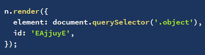
The enigma.js program design is simpler. Note that visualization parts are handled by nebula.js.
However, if you have been using the Capability API for a long time, you will probably find enigma.js surprisingly confusing. Even though the classes are named similarly, they are actually very different.
For example, the App class in the Capability API is referred to as Doc class in enigma.js. So “openApp” in the Capability API is “openDoc” in enigma.js. In enigma.js, Global class and Root class are combined even though it is still referred to as Global class. The functions’ return statement or return object is completely different too. When you try the code yourself, you may find out the similarity between these two libraries is only about 50%.
So bear in mind that even though classes in enigma.js and Capability API have similar names, look the same, they are in fact different.
If you want to transform your old extensions and mashups to enigma.js — in fact, I encourage you to do so — these are some tips to take note of.
First, you don’t need to put the main code inside this require([“js/qlik”]){} block anymore.
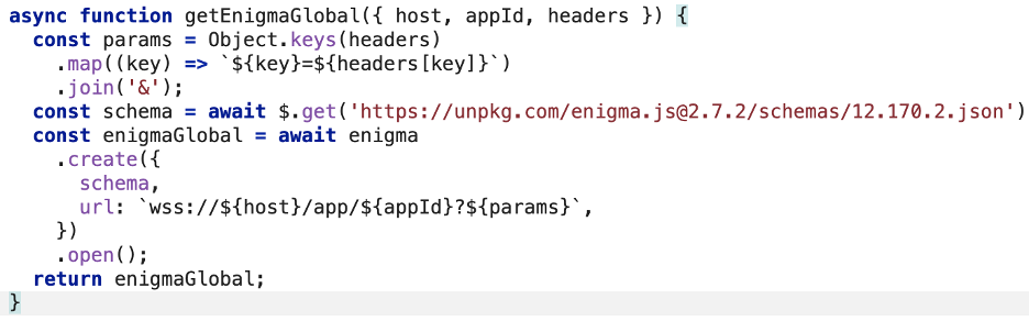
Instead, you manually connect to Qlik instance. And make all functions async.
The best documentation about enigma.js I have found is this one on qlik.dev. It doesn’t explicitly say it is for enigma.js, but from version 3.20 onwards, enigma.js functions are the same as Qlik’s QIX API.
There is no hypercube, list, chart object, and sheet object in enigma.js. All of them are referred to as “generic objects”. To access them, you need to specify their “qTypes” in the “getObject” function.
The Visualization API and theme API are not in enigma.js; they have been replaced by nebula.js.
When you are ready to try it yourself. These are the sample programs for you to try.
· Capability API to enigma.js code mapping repository
The first thing you need is a Qlik Sense SaaS tenant. If you have not done so, you can follow the instructions from this tutorial to start:
· Create a new web integration from the Management console.
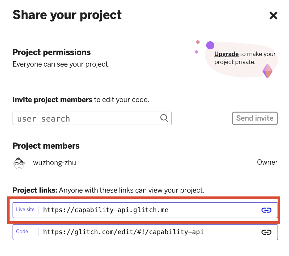
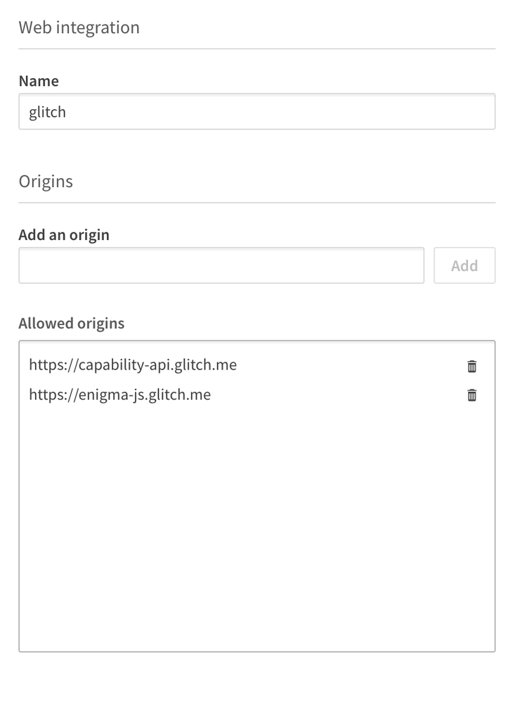
· To allow Glitch.com to access Qlik cloud, you need to add its address to the allowlist. You can find it on the share tab. For example, mine is https://capability-api.glitch.me and https://enigma-js.glitch.me.
So your web integration portal should have something like this.
· Once the web integration has been created, an ID is assigned to it. This is the qlik-web-integration-id you need later on.
· Upload an app. If you don’t have an app or data already prepared, you can download the movies dataset from the GitHub repository and upload it to the cloud. Each app on Qlik Sense SaaS has a global unique identifier (GUID), which you need later. The GUID can be extracted from the URL and is the part that follows /app. For example, if the URL is https://your-tenant.us.qlikcloud.com/sense/app/7fc4d85c-0e07-4160-90a9-c2ca4a45fd81 , then the GUID of the app is 7fc4d85c-0e07–4160–90a9-c2ca4a45fd81.
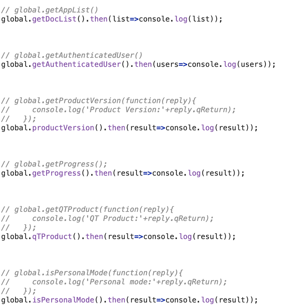
In the code mapping repository, you can find ready-to-use code snippets. The commented code is a Capability API function, Uncommented code is the relevant enigma.js function.
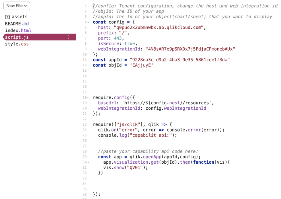
To test the code, simply paste it into the test sandbox. The sandbox for the Capability API is here. Replace the code between line 29 and line 32 to see it in action. Remember to fill in your own tenant host name and web integration ID.
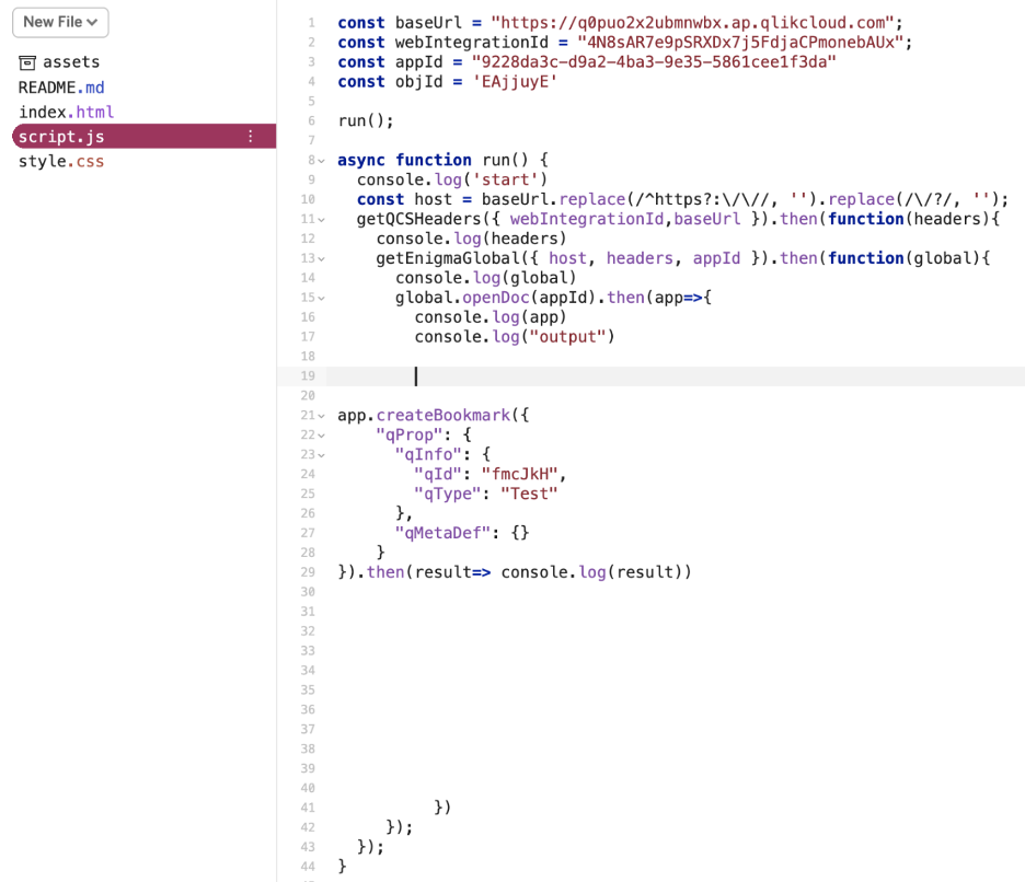
The sandbox for enigma.js is here. Replace the code between line 21 and line 29 to see the result.
And that is the end of this article. It is not easy to adapt to change. I hope this tutorial and sample codes will help you learn enigma.js.
Happy coding.
Wu

-
June 2021 - Celebrate #Pride with Qlik
June is #Pride month and to celebrate, we're sharing our favorite Pride-themed Zoom backgrounds . You can download them from this post.Happy #Pride !#... Show MoreJune is #Pride month and to celebrate, we're sharing our favorite Pride-themed Zoom backgrounds .
You can download them from this post.
Happy #Pride !
#AllofUs
-
Mashups with nebula.js
You're probably familiar with building mashups using Qlik Sense Capability APIs. The Capability APIs enable you to render visualizations from your Qli... Show MoreYou're probably familiar with building mashups using Qlik Sense Capability APIs. The Capability APIs enable you to render visualizations from your Qlik Sense apps into a web page, and even create them on the fly. It's awesome functionality, but you may also have come across some challenges. The Capability APIs load AngularJS, require.js, and jquery, amongst other things, globally, and this can sometimes cause conflicts with your existing application. But now there's a more modern way to render visualizations from your Qlik Sense apps into a web page - nebula.js.
You can check out the open source nebula.js at it's github page at https://github.com/qlik-oss/nebula.js. And there's some great tutorials on the new qlik.dev, including how to build a simple mashup using nebula.js. You should definitely go through this tutorial, it's really quick and simple and will give you an idea of just what nebula.js is about.
The tutorial goes through setting up a Qlik Sense SaaS account, which I definitely recommend, but you can also use your Qlik Sense Enterprise environment as well. Then there's a cli tool to get you setup quickly. After creating a new project with the cli, it'll walk you through connecting to an app and rendering an existing visualization. Then there's a section on rendering visualizations on the fly, as well as how to add more types of visualizations. And if you want to create custom visualizations, you can go through the build a helloworld extension using nebula.js tutorial.
Give it a try and let me know what you think in the comments!
-
nebula.js radar chart with picasso.js custom component
I I built a nebula.js radar chart extension to demonstrate creating and using custom components with picasso.js. Check it out @ https://observablehq.c... Show MoreI I built a nebula.js radar chart extension to demonstrate creating and using custom components with picasso.js. Check it out @ https://observablehq.com/@fkabinoff/nebula-js-picasso-js-radar-chart. Let's walk through it a bit.
Connecting to a Qlik app
This is the simple part.
const enigma = require('enigma.js');
const schema = require('enigma.js/schemas/12.170.2.json');
const SenseUtilities = require('enigma.js/sense-utilities');

const config = {
  host: 'sense-demo.qlik.com',
  appId: '97f72e1b-512e-4624-a2d1-f7df8b352959',
};
const url = SenseUtilities.buildUrl(config);
const session = enigma.create({ schema, url });

session.on('closed', () => {
  console.error('Qlik Sense Session ended!');
  const timeoutMessage = 'Due to inactivity, the story has been paused. Refresh to continue.';
  alert(timeoutMessage);
});

export default session.open().then((global) => global.openDoc(config.appId));
Configuring nebula.js
Now let's take a look at configuring nebula.js. All we do here is register the Qlik app with nebula.js and the (as of yet nonexistent) radar chart.
import { embed } from '@nebula.js/stardust';
import qlikAppPromise from './qlikApp';
import radarChartSn from './radar-chart-sn';

export default new Promise((resolve) => {
  (async () => {
    const qlikApp = await qlikAppPromise;
    const nebula = embed(qlikApp, {
      types: [{
        name: 'radar-chart',
        load: () => Promise.resolve(radarChartSn),
      }],
    });
    resolve(nebula);
  })();
});
Using it
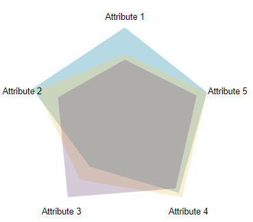
In our entrypoint index.js we just render the chart by passing the type and the fields to the nebula render function. Note here for the fields I used 2 dimensions and 1 measure. The first dimension is the ID of each entity. The second dimension is a ValueList of the five attributes that each entity has a score for, which will be the vertices of the radar chart. And the measure is the expression that takes the values from the from the ValueList dimension and returns the score for that value. If you want to see what this ValueList stuff is all about, check it out @ https://help.qlik.com/en-US/qlikview/Subsystems/Client/Content/QV_QlikView/ChartFunctions/SyntheticDimensionFunctions/valuelist.htm.
import nebulaPromise from './nebula';

(async () => {
  const nebula = await nebulaPromise;
  const viz = await nebula.render({
    element: document.querySelector('#radar'),
    type: 'radar-chart',
    fields: [
      'ID',
      { qDef: { qFieldDefs: [`=ValueList('Attribute 1', 'Attribute 2', 'Attribute 3', 'Attribute 4', 'Attribute 5')`] }},
      `=IF(ValueList('Attribute 1','Attribute 2','Attribute 3','Attribute 4','Attribute 5')='Attribute 1',Avg([Attribute 1]),IF(ValueList('Attribute 1','Attribute 2','Attribute 3','Attribute 4','Attribute 5')='Attribute 2',Avg([Attribute 2]),IF(ValueList('Attribute 1','Attribute 2','Attribute 3','Attribute 4','Attribute 5')='Attribute 3',Avg([Attribute 3]),IF(ValueList('Attribute 1','Attribute 2','Attribute 3','Attribute 4','Attribute 5')='Attribute 4',Avg([Attribute 4]),IF(ValueList('Attribute 1','Attribute 2','Attribute 3','Attribute 4','Attribute 5')='Attribute 5',Avg([Attribute 5]),0)))))`
    ],
  });
})();
The nebula.js radar chart extension with custom picasso.js component
Ok here's where the fun happens. There's a lot going on here. I left a few comments in the code, and you can read through the code here, or check it out @ https://observablehq.com/@fkabinoff/nebula-js-picasso-js-radar-chart.
const stardust = require('@nebula.js/stardust');
import picassojs from 'picasso.js';
import picassoQ from 'picasso-plugin-q';

export default function supernova() {
  // create picasso instance
  const picasso = picassojs();

  // register picassoQ plugin
  picasso.use(picassoQ);

  /*
    Since the radar chart always needs to be a square we will set the logical width and logical height
    in the nebula.js extension layout settings. We also need to reference these values to calculate
    the x and y position of the vertices.
  */
  const logicalWidth = 200;
  const logicalHeight = 200;

  /*
    maxValue is the max value that the radar chart data can be.
    totalAxes is the number of attributes.
    both of these could be dynamically calculated from the data, but I'm being lazy here.
  */
  const maxValue = 20;
  const totalAxes = 5;

  const radians = 2 * Math.PI;

  // these functions are used to calculate the x and y coordinates of the vertices
  const calcX = (value, i) => logicalWidth / 4 * (1 - (parseFloat(Math.max(value, 0)) / maxValue) * Math.sin(i * radians / totalAxes)) + logicalWidth / 4;
  const calcY = (value, i) => logicalHeight / 4 * (1 - (parseFloat(Math.max(value, 0)) / maxValue) * Math.cos(i * radians / totalAxes)) + logicalHeight / 4;

  /*
    Here's the custom picasso.js component. We'll use this below in the picasso.js chart settings to create
    both the layers and the labels.
  */
  picasso.component('radar', {
    require: ['renderer', 'resolver'],
    defaultSettings: {},
    render({ data }) {
      const { items } = this.resolver.resolve({
        data,
        settings: this.settings.settings,
      });

      // group the data into layers, with each entity ID getting a complete set of attributes
      const layers = items
        .reduce((layersObj, item) => {
          layersObj[item.data.value] = layersObj[item.data.value] || {
            items: [],
            fill: item.fill,
          };
          layersObj[item.data.value].items.push(item.data);
          return layersObj;
        }, {});

      // build the layer components
      const layerComponents = Object.values(layers)
        .reduce((layerComponentsArr, layer) => {
          const points = layer.items.map((item, i) => ({
            x: calcX(item.score.value, i),
            y: calcY(item.score.value, i),
          }));
          const d = points.reduce((dStr, point, i) => {
            if (i === 0) {
              dStr += `M${point.x},${point.y} `;
              return dStr;
            }
            if (i === points.length - 1) {
              dStr += `${point.x},${point.y}Z`;
              return dStr;
            }
            dStr += `${point.x},${point.y} `;
            return dStr;
          }, '');
          return [
            ...layerComponentsArr,
            {
              type: 'path',
              d: d,
              fill: layer.fill,
              opacity: 0.3,
            },
          ];
        }, []);

      // figure out the labels
      const labels = Object.values(layers)[0].items
        .map((item, i) => ({
          text: item.attr.label,
          x: calcX(maxValue, i),
          y: calcY(maxValue, i),
        }));

      // build the label components
      const labelComponents = Object.values(labels)
        .reduce((labelComponentsArr, label) => {
          const textSize = this.renderer.measureText({
            text: label.text,
            fontFamily: 'Arial',
            fontSize: '4px',
          });
          return [
            ...labelComponentsArr,
            {
              type: 'text',
              text: label.text,
              fontFamily: 'Arial',
              fontSize: '4px',
              x: label.x - textSize.width / 2,
              y: label.y + textSize.height / 2,
            },
          ];
        }, []);

      const components = [...layerComponents, ...labelComponents];
      return components;
    },
  });

  return {
    qae: {
      properties: {
        qHyperCubeDef: {
          qDimensions: [],
          qMeasures: [],
          qInitialDataFetch: [{ qWidth: 3, qHeight: 100 }],
          qSuppressZero: true,
          qSuppressMissing: true,
        },
        showTitles: true,
        title: '',
        subtitle: '',
        footnote: '',
      },
      data: {
        targets: [
          {
            path: '/qHyperCubeDef',
            dimensions: {
              min: 2,
              max: 2,
            },
            measures: {
              min: 1,
              max: 1,
            },
          },
        ],
      },
    },
    component() {
      const element = stardust.useElement();
      const layout = stardust.useStaleLayout();
      const rect = stardust.useRect();

      const [instance, setInstance] = stardust.useState();

      stardust.useEffect(() => {
        const p = picasso().chart({
          element,
          data: [],
          settings: {},
        });

        setInstance(p);

        return () => {
          p.destroy();
        };
      }, []);

      stardust.useEffect(() => {
        if (!instance) {
          return;
        }

        instance.update({
          data: [
            {
              type: 'q',
              key: 'qHyperCube',
              data: layout.qHyperCube,
            },
          ],
          settings: {
            strategy: {
              logicalSize: {
                width: logicalWidth,
                height: logicalHeight,
                preserveAspectRatio: true,
              }
            },
            scales: {
              color: {
                data: {
                  extract: {
                    field: 'qDimensionInfo/0',
                  },
                },
                type: 'categorical-color',
                range: ['#0B84A5', '#F6C85F', '#6F4E7C', '#9DD866', '#CA472F']
              }
            },
            components: [
              {
                type: 'radar',
                data: {
                  extract: {
                    field: 'qDimensionInfo/0',
                    props: {
                      attr: {
                        field: 'qDimensionInfo/1',
                      },
                      score: {
                        field: 'qMeasureInfo/0',
                      },
                    },
                  },
                },
                settings: {
                  fill: (d) => d.resources.scale('color')(d.datum.value),
                },
              },
            ],
          },
        });
      }, [layout, instance]);

      stardust.useEffect(() => {
        if (!instance) {
          return;
        }
        instance.update();
      }, [rect.width, rect.height, instance]);
    },
  };
}
And that's it. The full project code is attached as well, if you'd like to download it and check it out that way. Let me know if you have any comments or questions!
-
Changes coming to Data Literacy Courses
Not fluent in data? Our data literacy program can help.Data literacy in business is now as important as reading and writing. Maybe even more. But ther... Show MoreNot fluent in data? Our data literacy program can help.
Data literacy in business is now as important as reading and writing. Maybe even more. But there’s a major skills gap.
Our courses help you and your organization understand, analyze, and use data with confidence.
Effective May 31, 2021 several data literacy courses will require a Data Literacy or Full Access/Corporate subscription to access. Academic Program members will still be able to access these courses after May 31, 2021.
Several courses covering the foundations of Data Literacy will continue to be available for free on Qlik Learning Portal https://learning.qlik.com/dataliteracy
Explore Full Program here
-
Automate Workflows with Webhooks in Qlik Sense Enterprise SaaS!
What are webhooks? Webhooks are a common technique between applications to send and receive automated messages from one another. Webhooks trigger act... Show MoreWhat are webhooks?
Webhooks are a common technique between applications to send and receive automated messages from one another. Webhooks trigger actions and events helping to accelerate business processes and increase productivity in your daily workflow. They act as a foundational component for interconnectivity across applications and make automating business processes easier to implement.
With webhooks, organizations can support active intelligence by using them in the following examples:
- An application update can be designed to notify a group via Microsoft Teams.
- A data source changes and fails to reload, ping a data governance lead on Slack.
Webhooks 1.0 in Qlik Sense
The first release of webhooks supported within Qlik Sense Enterprise SaaS will be user and app events. Developers can create workflows by integrating applications like Slack, Microsoft Teams, Workato, Twilio, any SaaS platform that supports webhooks, and Blendr – Qlik’s new application automation platform!
A few examples of events for webhooks include:
- App Data Updated
- App Reload Finished
- And more!
Qlik Sense Enterprise SaaS Professional users can configure webhooks through the Management console. Check out the video below to learn more about webhooks and creating Active Intelligence anywhere!
For a detailed demonstration on using Webhooks with Qlik Sense SaaS. Check out this brief video created by Qlik's Jeff Goldberg, Product Manager of APIs and Integration:
[Read Transcripts]Click the link here to learn more about Webhooks in Qlik Sense!
Can't see the video? YouTube blocked by your region or organization? Download the attached .mp4 to view on your computer or mobile device.
-
Personalize, Narrate, Reuse: Something for Everyone in Qlik's February Product R...
Building off the momentum of last year, we are pleased to kick off this year with a powerful release delivering transformative innovations across our ... Show MoreBuilding off the momentum of last year, we are pleased to kick off this year with a powerful release delivering transformative innovations across our portfolio. Qlik’s latest release is offering even more ways to help our customers accelerate the move to the cloud and improve data pipelines to achieve active intelligence. The February 2021 release further supports how Qlik significantly advances our technology and platform innovations in several areas across Data Integration and Data Analytics.
What's New Summary
What's New Feature Demonstration
Can't see the video? YouTube blocked by your organization or region? Download the .mp4 attached to this post to watch on your computer or mobile device?
Data Analytics
Augmented Analytics:
We have made significant enhancements to our Augmented Analytics capabilities in a variety of areas. To begin, we have improved search-based analysis providing Analysis of change over time – Insight advisor will now generate multiple charts for a single analysis type, such as responding with analysis of data between two date periods through a combination of charts. Also, visual charts generated by Insight Advisor Search now have a new option to view narrative insights and interpretations of the data through natural language generation. You will also find enhancements to our conversational analytics powered by Insight Advisor, including follow-up suggestions for our users prompting further analysis and insights, along with improvements around contextual awareness when exploring data sets.
Visualizations and Advanced Authoring:
One of our focuses remains on delivering world-class visual analytics, and this release will not disappoint. We have added new visualizations to enhance the experience and consumption of dynamic information. You will find a new grid chart that provides a highly effective way of visualizing measures across two dimensions along with a new video player allowing users to embed and play videos directly within an app.
We are also very excited about the use of mater measures in expressions! This simple yet powerful enhancement allows users to dramatically improve productivity and governance around authoring. Other advanced authoring capabilities include the ability to hide or show sheets based on conditions to target specific user groups within an app to tailor the experience.
User Experience:
Customize and prioritize! Users can now customize their hub landing page, to specify the collections of data that are most relevant to them, with the ability to visually manage the order in which they appear. Along with this, we have added a standardized toolbar, providing consistent navigation, interaction, structure, and language within the cloud experience. As always, stay informed on product-related news via our in-product “connect and learn” experience.
Connectivity:
As with every release we aim to expand connectivity, and with this release, we are helping our customers modernize their SAP environment. Our SAP end-to-end solutions can help customers accelerate their data modernization and cloud initiatives as well as uncover more insights within their SAP data. We are releasing expanded SAP connectivity in Qlik Sense SaaS - delivering further value to end-to-end SAP Solutions. A new SAP BW connector within the Qlik Sense SaaS environment upgrades and merges the existing SAP InfoProviders and BEx connectors that are currently available in the Qlik Sense Enterprise Client-managed environment. We’ve also added a new connector for Amazon Athena and have enhanced SSO support to now have the option of storing credentials separately from the data connection and enforcing user specific credentials.
Data Integration
The February release also brings enhancements to our Data Integration Platform to further enable our customers in their cloud journey, such as:
- Qlik Compose multi-modal offering for both warehouse and lakes
- Live Views in Qlik Compose for Data Lakes
- New cloud certifications for Qlik Replicate supporting Postgres in Azure
Release Cadence Update:
From this point forward, we are transitioning to a continuous release cadence in SaaS, further supporting our customers’ migration to the cloud. As part of this transition, you will find a running list of capabilities delivered to SaaS with new documentation on help.qlik.com to ensure that you are aware of the latest enhancements to our cloud offering. Also, we are also moving to quarterly releases of our client-managed solutions, which will provide greater development efficiency across our data analytics and data integration platforms. Our client managed solutions will be released the second month of each quarter, look forward to the next scheduled release in May.
With this continuous release cadence, you can look forward to new features like data cataloging in SaaS, which will be released in the coming weeks. This will help our users easily profile, classify and find the right data, expediting time to value and streamlining app development and data management efforts. Read more on our new release cadence.
Your customers can now stay informed on Qlik’s product strategy and direction by visiting the new product innovation page on Qlik’s website at qlik.com/roadmap and don’t forget to sign up for the next Qlik Insider Webinar to hear about all of these enhancements and more!
For All release information, visit help.qlik.com
-
QlikView May 2021 Enhances Capabilities Available via Qlik Sense Hub
We are happy to announce the release of QlikView May 2021, which continues to support your analytics modernization journey. With this release, we’ve i... Show MoreWe are happy to announce the release of QlikView May 2021, which continues to support your analytics modernization journey. With this release, we’ve introduced more capabilities that extend your ability to work with QlikView documents on the cloud through the Qlik Sense hub.
The QlikView May 2021 release includes:
- QVF file format support between QlikView and the Qlik Sense hub on the cloud
- Section access synchronization across QlikView Client-Managed and Qlik Sense Enterprise SaaS
- Proxy support to simplify cloud deployment
- Large QlikView document uploads to the Qlik Sense hub
More information on the QlikView May 2021 release can be found on Qlik Help.
These improvements extend capabilities established in prior releases and support use of QlikView on the cloud via Qlik Sense Enterprise SaaS, facilitating progressive analytics modernization and reducing total cost of ownership. These prior QlikView releases include:
- Automate QlikView document uploads to Qlik Sense hub and use both products side-by-side
- QlikView IE plugin support for QlikView documents on Qlik Cloud Services
- Share private bookmarks with other QlikView users on Qlik Cloud Services
- "Mail bookmark as link" is supported when using QlikView documents via Qlik Sense hub
While QlikView remains critical to your analytics operations, our next-generation analytics technology in Qlik Sense Enterprise SaaS provides a more scalable and automated methodology that can dramatically lower total cost of ownership for analytics. To help accelerate your modernization efforts, the Analytics Modernization Program adds Qlik Sense for your current QlikView users for a modest uplift on your annual QlikView maintenance rate. You can fully modernize to a SaaS subscription to minimize your TCO and keep using QlikView. The Analytics Modernization Program has now been updated to include getting-started services to help you get up-to-speed on Qlik Sense more quickly.
The Analytics Modernization Program allows you to expand analytics capabilities, adding a governed self-service data analytics platform, including augmented analytics with our cognitive engine and conversational analytics, the new Qlik Sense mobile app, and more. Progressively modernize with Qlik Sense for new applications and use cases at your own pace without disrupting QlikView. And, lower total cost of ownership for analytics by automating entitlement management and governance, plus run on Qlik infrastructure with SaaS, furthering cost reduction.
Through our Active Intelligence vision, you can close the gaps between data and action. Modernization via Qlik Sense is your first step and will help ensure your organization meets evolving analytics requirements and remains competitive. Visit the Analytics Modernization Program web page for more information. You can also reach out to our Program team by e-mailing: ampquestions@qlik.com.
-
New Security Patches Available Now
Hello Qlik Users,Today we have seven Qlik Sense patches and one for Qlik Connector for use with SAP NetWeaver:February 2021 Patch 5November 2020 Patch... Show MoreHello Qlik Users,
Today we have seven Qlik Sense patches and one for Qlik Connector for use with SAP NetWeaver:
- February 2021 Patch 5
- November 2020 Patch 10
- September 2020 Patch 12
- June 2020 Patch 16
- April 2020 Patch 16
- February 2020 Patch 12
- November 2019 Patch 17
- SAP NetWeaver 7.0.7
These patches include a fix for the security vulnerability, details of which can be found in the Security Bulletin SB: Cross-site scripting (XSS) vulnerability in Qlik Sense Enterprise.
The downloads for the patches can all be found on the Qlik Download site. The release notes for SAP NetWeaver can also be found on the Qlik Download site.
Release Notes for the Qlik Sense patches can be found in the Qlik Community, on the new Release Notes page.
Please follow best practices when upgrading Qlik Sense.
The information in this post and Security Bulletin are disclosed in accordance with our published Security and Vulnerability Policy.
Kind regards,
Qlik Global Support
5/25/2021 - Update to clarify a couple of questions:
The versions listed in the Security Bulletin are the fixed versions. Versions prior to those listed are the affected versions.
If you do not use the SAP connector, you still need to apply the patch for Qlik Sense.
There is a new release that includes the security fix as well so you will most likely want to apply that patch (both do not need to be applied in that case).
-
Using the Web File Connector with a Bit of Video Game Value Analysis
In the this video edition of the Qlik Design Blog, I show you how I use the Web File connector to combine retro-video game pricing data (Sega Master S... Show MoreIn the this video edition of the Qlik Design Blog, I show you how I use the Web File connector to combine retro-video game pricing data (Sega Master System) with my own local video game collection. The Web File connector is available in all Qlik Sense products, including the free version of Qlik Sense Cloud (Basic). It is commonly known that the Web File connector is fairly simple to use, however I wanted to demonstrate its use in a fun and meaningful way as well as provide additional information that will help you understand how and when it can be used and what to look out for. Enjoy!
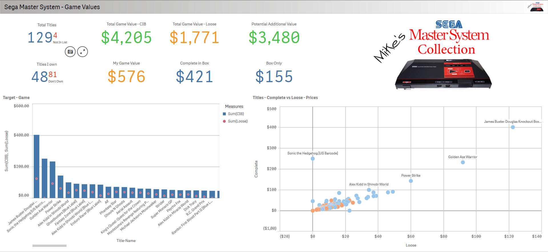
Sega Master System Value Analysis - Mike's Collection - Qlik Sense App
The video is 16 minutes long. I first show you how to simply use the Web File connector with a internet based source via HTTP:// (Current Master System Video Game Prices - GameValueNow.com) and then build a few Qlik Sense KPIs. Then I expand on possible issues you COULD run into with Web File, as well as an example using FTP://, then I conclude with a simple demonstration analyzing some of my video game value data. Analysis result: Purchasing a number of the cartridge titles separately from the cases and manuals and the combining to re-sell may prove profitable. Enjoy!
Regards,
Michael Tarallo (@mtarallo) | TwitterQlik Sense Cloud - Using Web File
Time Index:
• 0:00 - 8:30 - Intro and using the Web File connector
• 8:30 - 10:38 - Additional information to be aware of: https://youtu.be/HEcYYn1hrrk?t=8m30s
• 10:38 - 11:40 - Using FTP with inline credentials: https://youtu.be/HEcYYn1hrrk?t=10m41s
• 11:40 - 12:46 - REST connector information: https://youtu.be/HEcYYn1hrrk?t=11m40s
• 12:46 - End - Fun information / demo using finalized Video Game pricing analysis app: https://youtu.be/HEcYYn1hrrk?t=12m52s
NOTE: To increase resolution or size of the video, select the YouTube logo at the bottom right of the player. You will be brought directly to YouTube where you can increase the resolution and size of the player window. Look for the 'settings' gears icon in the lower right of the player once at YouTube.
Sample Qlik Sense app and data attached in case you wanted to play.
Web File Help document: Loading data from files ‒ Qlik SenseCan't see the video?
Download the .mp4 and watch from your computer or mobile device.
-
Data Science: The New Art
Data Science is a new and growing field, but what exactly is it?In this digital world of data, the Internet of Things, and more, there is one term whi... Show MoreData Science is a new and growing field, but what exactly is it?

In this digital world of data, the Internet of Things, and more, there is one term which seems to come up everywhere: Data Science.
Data Science has taken on a life of its own, bringing immense value to organizations when utilized correctly - but what does it mean? And how should organizations embrace it? I recently asked an industry thought leader and expert on this topic, Marie Clark of Ambient Intelligence, to help define and shed light on this curious world.
To read the full article written by Jordan Marrow (Qlik Global Head of Data Literacy) visit Data Science: The New Art | Qlik Blog

-
Datathon Winner Addresses the United Nations’ Sustainable Development Goals
Learn more about the Qlik Academic Program's Datathon winning app and its insights into plastic reduction, marine acidity, oil spillage incidents and ... Show MoreLearn more about the Qlik Academic Program's Datathon winning app and its insights into plastic reduction, marine acidity, oil spillage incidents and more!
In addition, check out Qlik's Benevity Campaign Supporting Pandemic Relief!
-
Qlik Academic Program grows in Vietnam
Vietnam is a diverse country with a rich cultural heritage. It’s a country of more than 96 million people and is a prominent country in the South East... Show MoreVietnam is a diverse country with a rich cultural heritage. It’s a country of more than 96 million people and is a prominent country in the South East Asian region.
The education landscape of Vietnam is quite large and consists of more than 400 Universities and colleges with more than 2 million students pursuing university studies. Universities are either specialized or multidisciplinary and offer bachelor, professional, master, and doctoral degrees.
Qlik Partner Aufinia has been supporting the growth of the academic program in Vietnam. With its growing list of clients, they require interns to work on client projects and since the academic program offers a complete suite of resources for students to get trained and qualified on Qlik Sense, this takes their effort on having to search for the right students, train and on board them for their projects.
So far, students and Professors from the University of Technology (UIT), Royal Melbourne Institute of Technology University ( RMIT) have registered for the Qlik Academic Program. In due course, the British University students would also be registering into the program.
This symbiotic relationship is helping students get trained on world class analytics resource of Qlik and an opportunity to work on real life projects. This is also an example of how the internal Qlik ecosystem can work together to expand the larger mission of Qlik of data literacy.
While this is only the beginning of the academic program in Vietnam, it promises to grow further.
For more information about the Qlik Academic Program, visit qlik.com/academicprogram