- Mark as New
- Bookmark
- Subscribe
- Mute
- Subscribe to RSS Feed
- Permalink
- Report Inappropriate Content
Stacked Bar Chart - Actual vs Budget
I am trying to create a stacked bar chart that compares costs between Actual and Budget for different accounts. The file attach has a chart that currently adds the two together and creates a bar that is the sum of the two. I would like to have the Budget and Actual both start at the 0 point and show the two bars with the Actual on top (or overlaying) of the Budget (with both data labels appearing).
I need to show the progress of the Actual as it approaches the Budget total.Is there a method to using Grouped bar charts that are brought together, or is stacked the way to go?
Thanks
Jeff
- « Previous Replies
-
- 1
- 2
- Next Replies »
Accepted Solutions
- Mark as New
- Bookmark
- Subscribe
- Mute
- Subscribe to RSS Feed
- Permalink
- Report Inappropriate Content
Please check if fits your needs
- Mark as New
- Bookmark
- Subscribe
- Mute
- Subscribe to RSS Feed
- Permalink
- Report Inappropriate Content
Not so sure if this is what you want
- Mark as New
- Bookmark
- Subscribe
- Mute
- Subscribe to RSS Feed
- Permalink
- Report Inappropriate Content
Hi Jeff,
Do you Want like the below screen shot? if So, Chart Properties -> Style -> SubType -> Grouped..
- Mark as New
- Bookmark
- Subscribe
- Mute
- Subscribe to RSS Feed
- Permalink
- Report Inappropriate Content
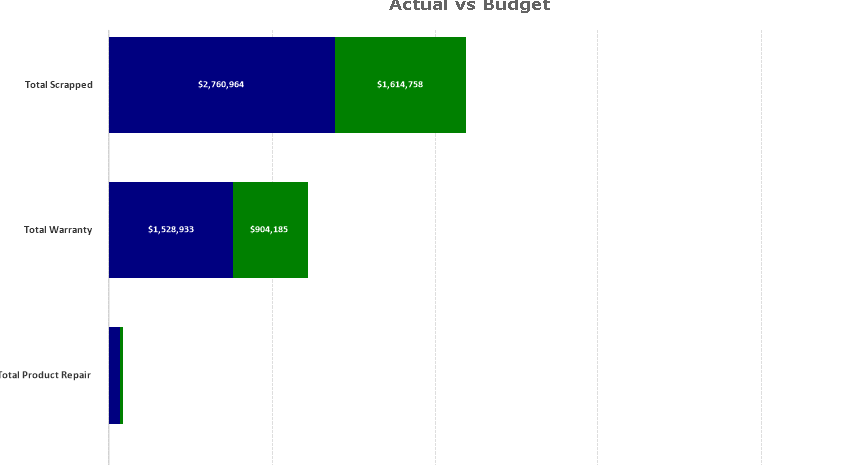
Clever:
Almost. See below (this is a mock-up).
Note that the overall total length of each bar is the Budget amount (green) and the Actual is "overlayed" over the Budget, both starting at 0. It's to show the amount spent verse what was budgeted.
Thanks.
Jeff
. 
- Mark as New
- Bookmark
- Subscribe
- Mute
- Subscribe to RSS Feed
- Permalink
- Report Inappropriate Content
Setu:
No, this is not what I wanted. I need it stacked, but not a total of Budget and Actual.
Thanks.
Jeff
- Mark as New
- Bookmark
- Subscribe
- Mute
- Subscribe to RSS Feed
- Permalink
- Report Inappropriate Content
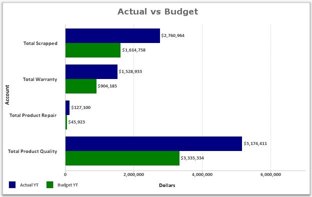
Hi Jeff, please check attached document.
- Mark as New
- Bookmark
- Subscribe
- Mute
- Subscribe to RSS Feed
- Permalink
- Report Inappropriate Content
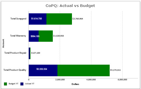
Looking in detail, Clever solution worked, just be aware than in your uploaded qvw Actual filters by 'P*_Bud_15' and Budget filters by 'P*_Act_15'.
So values are inverted.
- Mark as New
- Bookmark
- Subscribe
- Mute
- Subscribe to RSS Feed
- Permalink
- Report Inappropriate Content
Jeff
using the bar charts as grouped is really the best way to show the relationship between budget and actual
when the bars are stacked it does not relay the message as well.
Another option would be to calculate a percent of actual compared to budget and have budget be a line at zero - use a line chart to show each dimension compares to budget
- Mark as New
- Bookmark
- Subscribe
- Mute
- Subscribe to RSS Feed
- Permalink
- Report Inappropriate Content
Please check if fits your needs
- Mark as New
- Bookmark
- Subscribe
- Mute
- Subscribe to RSS Feed
- Permalink
- Report Inappropriate Content
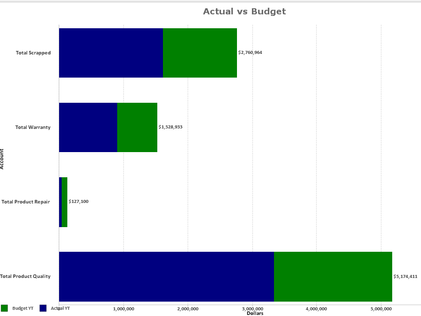
attached is a vizual example of what I was referring to
- « Previous Replies
-
- 1
- 2
- Next Replies »