Unlock a world of possibilities! Login now and discover the exclusive benefits awaiting you.
- Qlik Community
- :
- All Forums
- :
- QlikView App Dev
- :
- Re: Working with a Risk Map
- Subscribe to RSS Feed
- Mark Topic as New
- Mark Topic as Read
- Float this Topic for Current User
- Bookmark
- Subscribe
- Mute
- Printer Friendly Page
- Mark as New
- Bookmark
- Subscribe
- Mute
- Subscribe to RSS Feed
- Permalink
- Report Inappropriate Content
Working with a Risk Map
Hello everyone,
I have a requirement to build a Risk Map, and i am not sure if it is possible to build something similar in QlikView, see below:
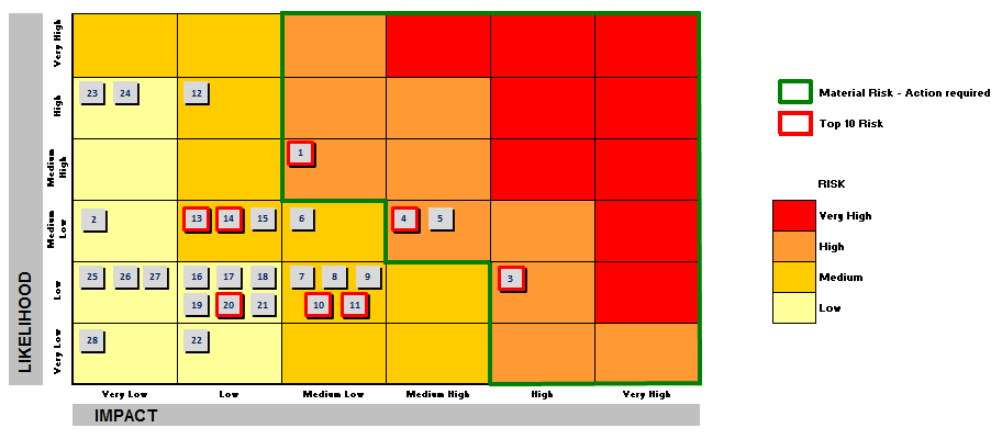
The data base is a spreadsheet and the IMPACT (X axis) is a column and the LIKELIHOOD (Y axis) is other column. I know i can use both columns as a dimension to build the chart, but i don´t know what type of chart i can use to build something similar. The yellow squares represents the low risks, orange squares represtens Medium risks, and red squares represents the High Risks.
The Numbers inside the squares represents where the Risk is qualified.
Anyone built something similar in QlikView? Tips?
Regards!!
- « Previous Replies
-
- 1
- 2
- Next Replies »
- Mark as New
- Bookmark
- Subscribe
- Mute
- Subscribe to RSS Feed
- Permalink
- Report Inappropriate Content
Thanks for your response Marco!!
Thats exactly what i need.
Have a nice weekend!
- Mark as New
- Bookmark
- Subscribe
- Mute
- Subscribe to RSS Feed
- Permalink
- Report Inappropriate Content
thanks
you too
Marco
- Mark as New
- Bookmark
- Subscribe
- Mute
- Subscribe to RSS Feed
- Permalink
- Report Inappropriate Content
dear marco,
what if i need to create the likelihood vs impact in such way??
impact at x axis, likelihood at y axis?
Rgds
Jim
- Mark as New
- Bookmark
- Subscribe
- Mute
- Subscribe to RSS Feed
- Permalink
- Report Inappropriate Content
Hi,
please open a thread and describe your additional requirements.
thanks
regards
Marco
- Mark as New
- Bookmark
- Subscribe
- Mute
- Subscribe to RSS Feed
- Permalink
- Report Inappropriate Content
- Mark as New
- Bookmark
- Subscribe
- Mute
- Subscribe to RSS Feed
- Permalink
- Report Inappropriate Content
Hi
I cant open the file.. I want to plot risk themes using heat map.
Please help
- « Previous Replies
-
- 1
- 2
- Next Replies »