Unlock a world of possibilities! Login now and discover the exclusive benefits awaiting you.
Analytics & AI
Forums for Qlik Analytic solutions. Ask questions, join discussions, find solutions, and access documentation and resources.
Data Integration & Quality
Forums for Qlik Data Integration solutions. Ask questions, join discussions, find solutions, and access documentation and resources
Explore Qlik Gallery
Qlik Gallery is meant to encourage Qlikkies everywhere to share their progress – from a first Qlik app – to a favorite Qlik app – and everything in-between.
Qlik Community
Get started on Qlik Community, find How-To documents, and join general non-product related discussions.
Qlik Resources
Direct links to other resources within the Qlik ecosystem. We suggest you bookmark this page.
Qlik Academic Program
Qlik gives qualified university students, educators, and researchers free Qlik software and resources to prepare students for the data-driven workplace.
Recent Blog Posts
-
An Introduction to the Theme API
As many of you know, custom themes shipped with Qlik Sense February 2018, and we covered how to start creating custom themes which you can check out h... Show MoreAs many of you know, custom themes shipped with Qlik Sense February 2018, and we covered how to start creating custom themes which you can check out here -How to create a custom theme in Qlik Sense. But did you know that Qlik Sense February 2018 also shipped with a new Theme API under the Capability APIs collection?
What can you do with the Theme API?
The Theme API can basically be used for two purposes, to get and to apply themes. You can view the documentation here - Theme API. Getting a theme is useful for applying styles to extensions, widgets, and mashups that are identical to the theme style. You can also apply themes to both Qlik Sense apps and independently of the theme set in the Qlik Sense app to native Qlik Sense objects created or embedded using the Visualization API (or app.getObject, if you're still using that).
You can get a theme using one of two different methods, the `get` method and the `getApplied` method. The difference is that the `get` method you call on the `qlik` object and pass a theme id to get any theme in your extensions, while the `getApplied` method you call on an instance of an `app` and it simply returns the current theme applied to that app. The `getApplied` method is particularly useful for widgets and extensions, since it allows you to style your widgets and extensions in such a way that they will match the theme the user applies to their app.
Both the `get` method and the `getApplied` method returns a promise which resolves to a `QTheme` object. The `QTheme` object currently has two methods available on it, the `getStyles` method, and the `apply` method. The `getStyles` method can be used to get a particular style by passing it a few parameters. It's an easy way to find the style you are looking for in the `QTheme` object. The `apply` method is one of the ways in which you can apply a theme to all visualizations on the page.
You can also apply a theme using the `apply` method of the Theme API without first fetching a `QTheme` object. The `apply` method of the Theme API just requires that you pass the theme id. These apply methods are particularly helpful for applying a theme to mashups and other embedded visualizations. Below is a code sample and image of the mashup with the theme applied.
require( ["js/qlik"], function ( qlik ) {
qlik.theme.apply('high-contrast-theme');
var app = qlik.openApp('Helpdesk Management.qvf', config);
app.getObject('QV03','rJFbvG');
app.getObject('QV02','xfvKMP');
app.getObject('QV01','a5e0f12c-38f5-4da9-8f3f-0e4566b28398');
} );
There's one final method to mention, and that is the `save` method. The `save` method allows you to programmatically set the theme in a Qlik Sense app. This differs from simply applying a theme, as it actually sets and saves the theme in the Qlik Sense app, and not just for the session like the apply methods do.
And that's the introduction to the Theme API.
-
Creating a Date Interval from a Single Date
Sometimes when you load data into QlikView you have validity ranges, but the range is only implied by one field – a single change date. It could be l... Show More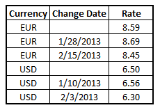
Sometimes when you load data into QlikView you have validity ranges, but the range is only implied by one field – a single change date.
It could be like in the table to the right where you have currency rates for multiple currencies: Each currency rate change is on its own row; each with a new conversion rate. Also, the table could contain rows with empty dates corresponding to the initial conversion rate, before the first change was made.
This problem is very similar to the one in a previous blog post (How to populate a sparsely populated field) but this time I will approach the problem in a different way.
Instead of inserting records and populating these with the correct field values, I will instead maintain the number of rows and create a new column “To Date”, so that the new table will become a list of intervals.
Here’s how you do it:
- Determine which time range you want to work with. The beginning of the range must be before the first date in data and the end of the range must be after the last.
- Load the source data, but change empty dates to the beginning of the range defined in the previous bullet. The change date should be loaded as “From Date”.
- Sort the table first according to Currency, then according to the “From Date” descending so that you have the latest dates on top.
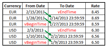 Run a second pass through data where you calculate the “To Date”. If the current record has a different currency from the previous record, then it is the first record of a new currency (but its last interval), so you should use the end of the range defined in bullet 1. If it is the same Currency, you should take the “From Date” from the previous record, subtract a small amount of time, and use this value as “To Date” in the current record.
In the QlikView script, it could look like this:
Let vBeginTime = Num('1/1/2013');
Let vEndTime = Num(Now());Tmp_Rates:
LOAD Currency, Rate,
Date(If(IsNum([Change Date]), [Change Date], $(#vBeginTime))) as FromDate
FROM Rates ;Rates:
LOAD Currency, Rate, FromDate,
Date(If(Currency=Peek(Currency),Peek(FromDate)-0.00000001, $(#vEndTime))) asToDate
Resident Tmp_Rates
Order By Currency, FromDate Desc;Drop Table Tmp_Rates;
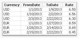
When this is done, you will have a table listing the intervals correctly. This table can then be used in a While loop to generate all dates in the intervals (See Creating Reference Dates for Intervals) or with an IntervalMatch to compare with an existing date.
In this example, I subtract 0.00000001 from the date in the previous record. This corresponds to roughly a millisecond. This means that the “To Date” will have a value of one millisecond before midnight, but formatted to show the date only. The reason I do it this way, is for the IntervalMatch to work: No point in time will belong to two intervals.
Further reading related to this topic:

-
Big Data Insights at Georgian College
This month Qlik presented at Georgian College's Big Data Insights conference which took place in Ontario, Canada. The conference hosted Qlik, Tableau... Show More
This month Qlik presented at Georgian College's Big Data Insights conference which took place in Ontario, Canada. The conference hosted Qlik, Tableau, and Power BI and provided employers the opportunity to meet with students and faculty members to build bridges, gain insight and learn more about what the students can do to elevate their analytics skills and become more marketable to prospective employers.
Qlik's Solution Architect, Abdullah Salim was onsite to educate audience members about Qlik Sense and what makes it so unique. He also shared information about the Qlik Academic Program which is a vital program to any professor or student within analytics. Georgian College was intrigued by the presentation and there are next steps to speak with the analytics department who is interested in adding Qlik to their courses.

-
Qlik Sense® Charts, from your personal Cloud to everywhere
Have you already heard about Qlik Sense Cloud?Borrowing the marketing jargon we could define Qlik Sense Cloud as a place to “create and interact with ... Show MoreHave you already heard about Qlik Sense Cloud?
Borrowing the marketing jargon we could define Qlik Sense Cloud as a place to “create and interact with Qlik Sense apps whenever the need arises. Invite others to do the same in a secure environment. Explore data deeply, reveal connections instantly and see opportunities.”
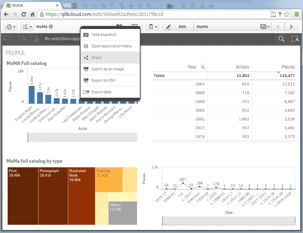
That means you can create and share an app in the Cloud, work collaboratively with up to 5 peers, editing, creating new charts, or even uploading some more data, just as you are used to with Qlik Sense. But it also means an extraordinary opportunity. Qlik Sense Charts is a chance for us to share data insights with everybody, everywhere. The way it works couldn't be more simple, let’s check it out.
- Create your own app.
If you already have an interesting app you want to share you could use it by simply uploading it into the Qlik Sense® Cloud, otherwise you can create your app from the Qlik Sense® Cloud. - Create a chart you would like to share.
Create your chart or reuse one you already created, adjust sorting, colors, and all the attributes you would like to set up prior to sharing it. - Share it!
Right click on the chart* and click on share. You will get a popup with the URL to share the chart in your favorite social network or send via email, and also an Embed URL code that will help you place it in your web publication, online magazine, blog post, etc.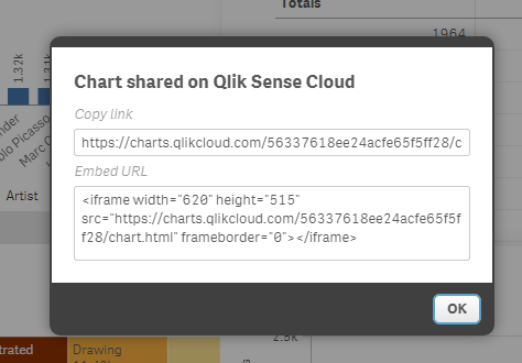
If you are curious to see how Qlik Charts looks like and you want to see the charts live please check out the following links:
Single Chart: Qlik Sense Charts: Visualizing MoMA art pieces by Artist
Embeded Chart: (Spanish language) Los puntos negros de las multas de estacionamiento: 114 millones de euros en un año | Madrid | EL MUNDO
Enjoy sharing!
AMZ
*At this point we could share Bar charts, Line charts, Combo charts, Gauges, Maps, Scatter charts, and Treemaps.

- Create your own app.
-
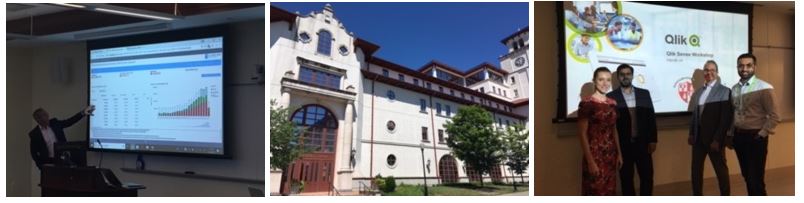
Montclair State University
Montclair State University in New Jersey joins the list of lucky universities to be part of the Qlik Academic Program! Montclair State has a signific... Show More
Montclair State University in New Jersey joins the list of lucky universities to be part of the Qlik Academic Program! Montclair State has a significant importance to us at Qlik as some of our employees are alumni and our CEO Mike Capone is a board of trustees member. Shortly after joining the program, Qlik made two visits to the campus, and with the help of our friends and Partner SDG Group, we presented to graduate students in a Data Visualization course and we hosted a training workshop to graduate and undergraduate students who are interested in visualizations and analytics. The visits were a success and many of the students have since joined the program to get access to our amazing resources such as free software, free training, and most importantly our Qualification exam which they can use to show future employers they have applied knowledge and fundamental Qlik Sense skills. We look forward to visiting again in the fall when we can share the program with even more students!
-
What's New in Qlik Sense April 2018
Hey guys - it's What's New in Qlik Sense time and I have prepared a brief video to share some of the awesome highlights in our next release Qlik Sense... Show MoreHey guys - it's What's New in Qlik Sense time and I have prepared a brief video to share some of the awesome highlights in our next release Qlik Sense April 2018.
Highlights include:
Assisted data visualization with Qlik Sense chart suggestions / recommendations
Qlik Sense recommendations make it easier to create a visualization by allowing you to simply drag and drop fields onto your sheets. Chart suggestions are created using the Cognitive Engine in Qlik, which leverages insights from the data loaded and combines them with best practices for data visualization.
NEW Grid Size control
Now with the creation of a new sheet, the application author can choose between 3 grid sizes - small, medium and large.
Maps visualizations improvements
Qlik Sense April 2018 features significant improvements to the built-in maps visualization:
- Support for multiple layers.
- Labels for point layers and area layers.
- Quick look up of countries, divisions, cities, postal code areas.
- Circle select with distance measure.
- Drill down support.
- Layer control, zoom limit and draw order.
- English or local name in the background map.
Publishing an app from the hub
In Qlik Sense April 2018 you can publish an app that you have created to any stream for which you have publish access. If you have published an app to a stream, you can move your app between the streams for which you have permission to publish.
Qlik Geocoding
A new subscription service part of the Qlik GeoAnalytics product package, that allows you to coordinate geo lookups all the way down to the street level.Also included:
Keyboard navigation support for Qlik Sense hub
To improve accessibility, Qlik Sense hub now supports keyboard navigation and shortcuts.
Linking Qlik Sense Mobile to third-party applications
Qlik Sense Mobile can now interact with third party mobile applications through a custom generated URL (deep link). The link can be embedded within the third party mobile application, with appropriate selections and filters. Clicking the link opens the app in Qlik Sense Mobile with the filters and selections that were applied during original presentation. As a result, user experience is improved and context is provided when interacting with the app.
Enable anonymous users to export data
From Qlik Sense April 2018 anonymous users can print and export data.
For a complete list of fixes and improvements check out the release notes in the Qlik Help site.
You can download it from our customer downloads site or play with it right now on http://qlikcloud.com/.
Note: Our amazing product content and media team has also produced a number of updated videos supporting this release, check them out here on the Qlik Help YouTube channel:
Qlik Sense April 2018 Playlist
Can't see the video? YouTube blocked by your region or organization? Download the attached .mp4 to play on your computer or mobile device.
Additional resources:
- Cognitive Engine, Chart Suggestions, Tips and Tricks - Qlik Sense April 2018
- Qlik Help Channel - YouTube
Regards,
Michael Tarallo (@mtarallo) | Twitter
Qlik

-
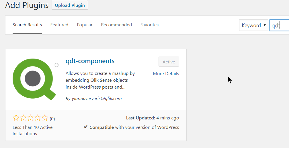
qdt-components - A Wordpress plugin
I have blogged about qdt-components in the past, on how we can use it with Angular, React, Vue and simple html in the past. Today I will focus on the ... Show MoreI have blogged about qdt-components in the past, on how we can use it with Angular, React, Vue and simple html in the past.
Today I will focus on the Wordpress version.
We can start by searching for the plugin. You can type "Qlik" or "qdt" and you will see it in the results
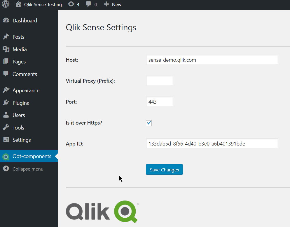
Once installed, go to the settings and add your server configuration
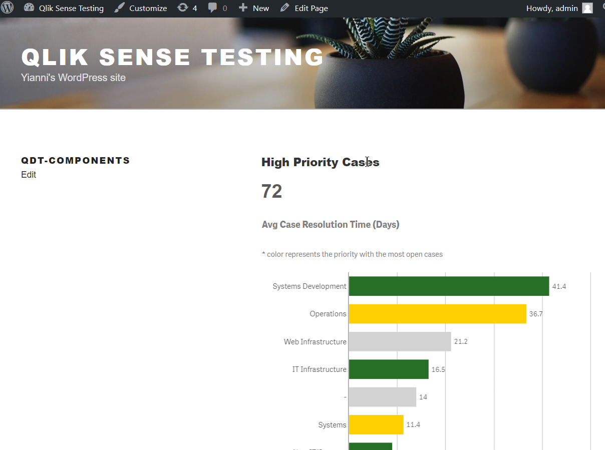
Then, you can go ahead and create your page/post and add the shortcodes. So far, the only available ones are for KPIs and embedding visualizations.
[qdt-component type="QdtKpi" expr="=Num(Count(distinct operation_id), '###,###')"]
[qdt-component type="QdtViz" id="sNMsjYL" height="400px"]
Here is how it should like at the end
Coming up: All of the features in qdt-components
React template with qdt-components
Github: https://github.com/qlik-demo-team/qdt-wordpress-plugin
Yianni
-
Use Case for ValueList Chart Function
The Demo Team recently built a mashup for the 2016 Oscars where we analyzed the nominees and award winners over the past 88 years. The design for the... Show MoreThe Demo Team recently built a mashup for the 2016 Oscars where we analyzed the nominees and award winners over the past 88 years. The design for the mashup often showed nominees and winners in the same chart as seen below where the silver bar indicated nominations and the gold bar represented wins.
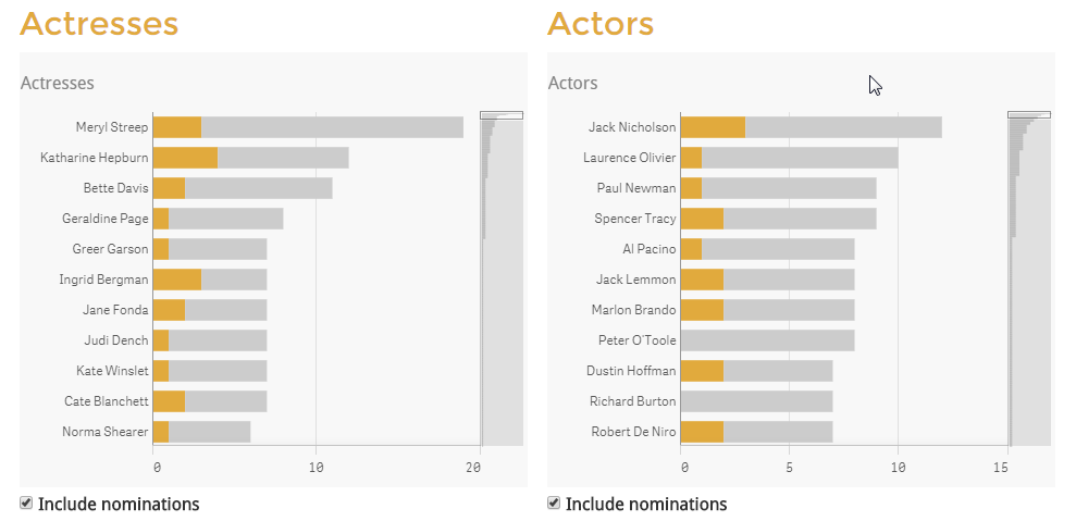
One requirement for the app was to color the number of nominations bar silver and the number of wins bar gold. In the data model, we did not have a field that we could use as the dimension to show the coloring for nominations and winner so at the suggestion of Alexander Karlsson we used the ValueList chart function. As noted in Qlik Sense Help, “ValueList() returns a set of listed values, which, when used in a calculated dimension, will form a synthetic dimension.” In the Actresses bar chart above, we created the dimension using this syntax:
ValueList('Oscars', 'Nominations')
Thus creating a synthetic dimension with two possible values: Oscars and Nominations. Then in the measure, we used an If statement to assign a measure to each list item in our ValueList dimension.
If(ValueList('Oscars', 'Nominations')='Oscars',
Count({<Actress_Win_flg={'1'} >} Distinct Film),
(Count(Distinct Film)-Count({<Actress_Win_flg={'1'} >} Distinct Film)))
If the dimension is ‘Oscars’ then we count the films where the actress won. Otherwise, we count the nominations where the actress did not win. This same logic was used to handle the coloring of the bars. We colored the bars by using this expression:
If(ValueList('Oscars', 'Nominations')='Oscars', '#e1aa3d', '#ccc')
If the dimension is Oscars showing the wins, then color the bar gold otherwise color the bar silver.
The ValueList chart function provided what we needed to treat nominations and winners as if they were a dimension providing us the flexibility to vary the measures and coloring we wanted to use on the bars in the bar chart. This solution saved us time from having to modify our data model to accommodate our design requirements. The only difference between the ValueList synthetic dimension and a normal dimension is synthetic dimensions are not affected by selections. Alexander Karlsson wrote a blog about ValueList as well as ValueLoop – check it out.
Thanks,
Jennell
-
Case study: Salesforce mashup
Another great mashup from the Demo Team! After my favorite CIO where we introduced KPIs into the navigation, salesforce is beautiful, elegant and made... Show MoreAnother great mashup from the Demo Team!
After my favorite CIO where we introduced KPIs into the navigation, salesforce is beautiful, elegant and made mostly of custom extensions!
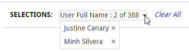
I started with the custom Selection toolbar (Angular Directive) that I introduced in the CIO dashboard. This changes based on the number of selections, if it's only one item of that dimension selected, or more than 6, it displays "Dimension: item selected". If there are more than one, but less than 6 items selected, it changes to a dropdown menu with the x button to deselect it. This is listening to selections, which means that whatever selections are made in the webpage, they will be displayed here as well.
Then, we needed Sense like filters but as drop down menus (Angular Directive). I have done this with the UN Gender Statistics site but this one is more advanced and stays open until you finish making all selections and sorts them by state. It scrolls if many items.
Another issue we were faced with, was that we created a combo chart in Sense but we needed to customize the colors to match our webpage. This lead me to create the Combo Chart extension. This not only gives you the option of changing colors but, hover states, borders, set bar widths, dot widths, has a better display of the labels etc.
In the same page, we had to display and compare two vertical bar charts. The problem is that when we placed the out-of-the-box ones, the y-axis max were different thus visually misleading. So I used the combo chart with only one measure and set the max to achieve the desired results
Moving on to the next page, we had two more issues to solve.
We needed to have a Stacked bar Chart based on the value of the measure and not the number of measures. For this, I created the SenseUI-ValueStackedbarChart. I used the same tooltips, coloring, hover states etc as I used in my other extension like my most popular one, SenseUI-BarChart.
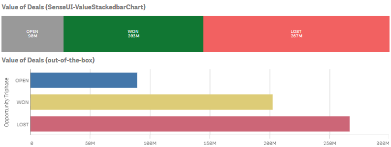
The other issue was that we needed a horizontal menu for quarters and years. For this I used an older extension, the SenseUI-Filter.
Lastly, I used my SenseUI-BarChart extension for all of the horizontal bars. I used the same bar color, border and hover color to match the rest of the website's objects.
The mashup is found at http://webapps.qlik.com/salesforce/index.html
Please note that this is a work in progress. I still have to work on the mobile version and some other UI issues
Extensions mentioned here:
For more of our work, you can go to webapps.qlik.com
Yianni
-
Data Literacy
Data literacy, according to Mike Capone, CEO of analytics software company Qlik, is to the information age what traditional literacy — reading and wri... Show More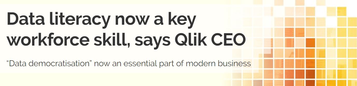
Data literacy, according to Mike Capone, CEO of analytics software company Qlik, is to the information age what traditional literacy — reading and writing — was to the industrial age: a skill essential to anyone wanting to fully participate in the workforce, and one required by all organisations for every facet of their operations.
For the full article published by Computerworld visit Data literacy now a key workforce skill, says Qlik CEO - Computerworld
Get ahead of data literacy with the Academic Program! If its been over a year since you last joined, we recommend you reapply for access to MORE amazing resources! Visit http://www.qlik.com/us/company/academic-program to apply today.
-
Age Function
In this blog I thought I would share the Age function – a function that is not new to Qlik Sense or QlikView but new to me. The Age function, which c... Show MoreIn this blog I thought I would share the Age function – a function that is not new to Qlik Sense or QlikView but new to me. The Age function, which can be used in the script or in a chart expression, returns the age or the number of “completed years” based on a given date (timestamp in the syntax below) and a birthdate (date_of_birth in the syntax below). The syntax for the Age function is as follows:
age(timestamp, date_of_birth)
Based on the timestamp value, the Age function will return the number of full years that have passed since the date_of_birth. Let’s look at a few examples. In the table below, there are 5 players along with their birthdate. In the last column, I am calculating their age using the Age function. I am using the Today() function for the first parameter – this will return the current date (7/13/2018) from the system clock. The second parameter is the birthdate (a field in the data model) for the player.
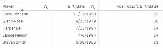
Notice that the date format for the current date and Birthdate are the same. The format of dates in an app are based on the Set DateFormat statement at the beginning of the load script unless you opt to format them differently. In this example, the DateFormat is set as follows:

If I try to calculate the age based on the expression below, it will not work because the first parameter is not formatted properly based on the DateFormat (M/D/YYYY) I am using in the app. In this case, the Age function will return null.

Age can also be calculated based on a date other than the current date. For instance, I can calculate age based on an event or the last day of the year. The Age function is a very simple function to use and can be used in various scenarios other than age to calculate the number of years that have passed since a given date.
Thanks,
Jennell
-
Qlik Supports World Youth Skills Day
Nearly 43% of the global workforce today consist of people between 15 to 24 years old, and according to U.N. data this cohort is almost three times mo... Show More
Nearly 43% of the global workforce today consist of people between 15 to 24 years old, and according to U.N. data this cohort is almost three times more likely to be unemployed than older age groups. The U.N. also notes that younger generations are increasingly exposed to lower quality jobs, labor market disparities, and longer and more insecure school to work transitions.
Although these odds seem steep, there are many avenues for this age group to become more equipped and succeed in today’s workforce. One area this group needs to consider is data literacy: in our own recent global data literacy survey, Qlik found this population group to be underprepared for the data-driven workplace. This is especially timely given World Youth Skills Day, which is focused on spreading awareness of skills gap issues and providing solutions to help prepare today’s youth for the future.
There is good news to share: in our world of analytics, contrary to some of the above data, there is ample opportunity. An article on Morning Future from earlier this year states:
According to the forecasts of the World Economic Forum, by 2020 data analysts will be in high demand in companies around the world. The LinkedIn Workforce Report maintains that, in the USA, demand for these professional figures has grown sixfold compared to five years ago, and data analysts will continue to be the most sought after profiles over the next five years. This is further confirmed by IBM, which claims that the annual demand for data scientists, data developers and data engineers will lead to 700,000 new recruitments by 2020.
Qlik has long been devoted to empowering people and impacting lives with data analytics, and youth is no exception to our commitment. The Qlik Academic Program has partnered with numerous schools and universities across the globe, enabling students to harness the power of data and analytics in their own learning environments. Over the last six years, Qlik has donated software and provided our Qlik Continuous Classroom online learning platform and qualification programs to both professors and students at universities such as Villanova, National University of Singapore, Northeastern University, British Columbia Institute of Technology, City University of Hong Kong, Central Queensland University, and many others.
To read the full blog post visit
Supporting World Youth Skills Day Through Data Literacy and Analytics Education | Qlik Blog
-
Scales of Measurement
The first category is Nominals. These are fields with discrete, qualitative values. There is no inherent quantitative difference between different val... Show MoreThe first category is Nominals. These are fields with discrete, qualitative values. There is no inherent quantitative difference between different values of a field. Examples: Product, Customer, Color, Gender, etc.
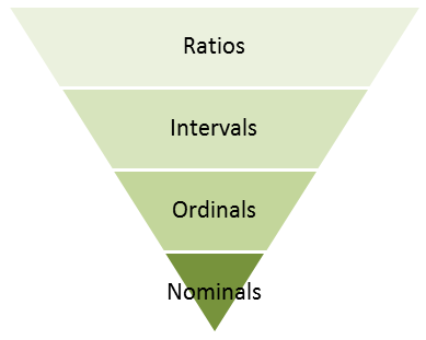
The second category is Ordinals. These fields also have discrete values but the fields differ from the Nominals in that they have an intrinsic order. Examples:
- low, medium, high
- tiny, small, medium, large, huge
- unsatisfied, neutral, satisfied
The ordinals can sometimes be numeric but should still not be thought of as numeric, since the distance between one value and the next may differ from case to case. This means that you cannot calculate an average – but you can calculate a median.
The next category is numeric: Intervals. These can be discrete or continuous. Examples: Date, Time, Longitude, Latitude, Temperature (°C or °F). What makes them different from Ordinals is that the difference between two values is well-defined: The difference between a temperature of 0 degrees and 10 degrees is the same as between 70 degrees and 80 degrees. Such fields always describe a position in time, in space or in some other dimension. I find the term “Interval” to be confusing so I think of them as Coordinates instead.
Intervals are not additive, so you cannot sum them. However, you can calculate a difference between two values and use this value for further calculations.
The last category is Ratios. The Ratio category is the most informative one. It has all properties of the Interval category, with the additional property that zero is special: it indicates the absence of the quantity. Examples: Sales amount, Weight, Length, Order quantity, etc. Further, they are often additive. Since I think the term “Ratio” is misleading, I think of them as Amounts instead.
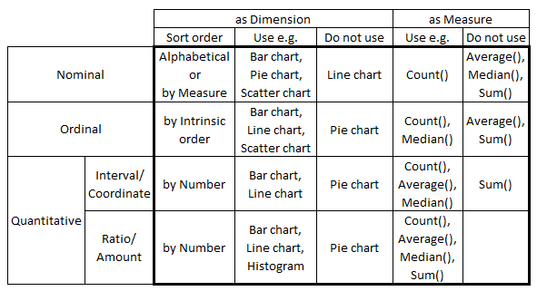
The above taxonomy was created by the psychologist S. S. Stevens in the early 1940s and is normally referred to as Scales of Measurement. Although it has been criticized from a scientific perspective, I find the classification useful since a number of rules of thumb for visualizations can be tied to this model. For instance:
- Nominals should be sorted by a measure or alphabetically. Other categories should be sorted according to the intrinsic sort order.
- Nominals should never be used as first dimension in a Line chart, since this chart type implies an intrinsic sort order.
- Pie charts should not be used, unless the dimension is a Nominal.
- Scatter charts are best if they have a Nominal or Ordinal as dimension.
- Continuous Intervals and Ratios should normally not be used as dimensions. Use Round() or Class() to make them discrete.
- Ordinals should not be used to calculate an average.
- Intervals should not be used to calculate a sum.
- The axis of a Ratio should start at zero and not be broken.
I am sure that some of you can find exceptions to the above “rules”, but as I said – they are only rules of thumb.
The bottom line is that you should think about the field categorization before you create your visualizations. Thank you Michael B for inspiration and discussions.
Further reading related to this topic:
-
Who do the Kudu that you do?
In this edition of the Qlik Design Blog, our Emerging Technology Evangelist, David Freriks is back discussing integration between Qlik and Kudu.Naviga... Show MoreIn this edition of the Qlik Design Blog, our Emerging Technology Evangelist, David Freriks is back discussing integration between Qlik and Kudu.
Navigating the analytics labyrinth with integration of Kudu, Impala, and Qlik
 Using Hadoop for Big Data analytics is nothing new, but a new entity has entered the stale file format conversation with the backing of Cloudera – you might have heard of it, it’s called Kudu.
 What is Kudu?
Let’s first take a step back and think about the dullest topic in the universe, file system storage formats. Flat files, AVRO, Parquet, ORC, etc. have been around for a while and all provide various advantages and strategies for data access optimizations in an HDFS construct. However, they all suffer from the same issue… static data that can only be appended to – unlike a real database.
So, enter Kudu – defined by Apache: “Kudu provides a combination of fast inserts/updates and efficient columnar scans to enable multiple real-time analytic workloads across a single storage layer.” Deconstructing that message – Kudu acts as a columnar database that allows real database operations that aren’t possible in HDFS file formats. It is now possible to interact with your Hadoop data where INSERTS, UPDATES, DELETES, ALTERS, etc. are now available as data operations. This means not just read/write capabilities for Hadoop , but also interactive operations without having to move to Hbase or other systems. IoT use cases, interactive applications, write-back, and traditional data warehousing are now possible without adding layer upon layer of additional technologies.
Now that we have a general understanding of what Kudu can do, how does this benefit Qlik? Kudu is fast, columnar, and designed for analytics – but with the ability to manipulate and transform the data to power new use cases.
Let’s start simple by showing how easy it is to move some data from an Impala table on Parquet into Kudu.
Starting in Hue we need to do some basic database-like work. To put data into a table, one needs to first create a table, so we’ll start there.
Kudu uses standard database syntax for the most part, but you’ll notice that Kudu is less specific and rigid about data types than your typical relational database – and that’s awesome. Not sure if your data is a varchar(20), or if it is smaller or larger? No worries, with Kudu – just declare it as a basic string.
Numerical data are basic as well, there a just few types to choose from based on the length of the number. This makes creating columns and designing a schema very, very straightforward and easy to setup. It also reduces data type problems when loading data.
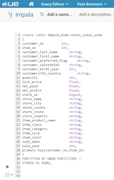
Having a general understanding of table creation, we will go ahead and create a table we are going to copy from Parquet. It’s worth noting there are some differences here versus creating a Parquet table in Hue.
• First: A Kudu table needs to have at least 1 primary key to be created.
• Second: A Kudu table needs a partition method to distribute those primary keys
Referencing the schema design guide, we are going to use a HASH partition and use the number 3 (since we have 3 worker nodes).
In summary, we have a bunch of strings, a few integers, and some floating decimals to represent prices and profit. We’ve identified our keys and specified our partitions – let’s roll!
The query runs for a second and viola – we have our new (albeit empty) table. Next, we need some data. We have an existing table that we would like to copy over into Kudu. We will run another query to move the data and make a little tweak on the keys to match our new table.
We had to cast our customer_sk and item_sk columns from string in Parquet to int in Kudu but that’s pretty easy to do as shown in the SQL here.
We run the INSERT query and now we have our data moved over into Kudu, and even better – that table is now immediately available to query using Impala!
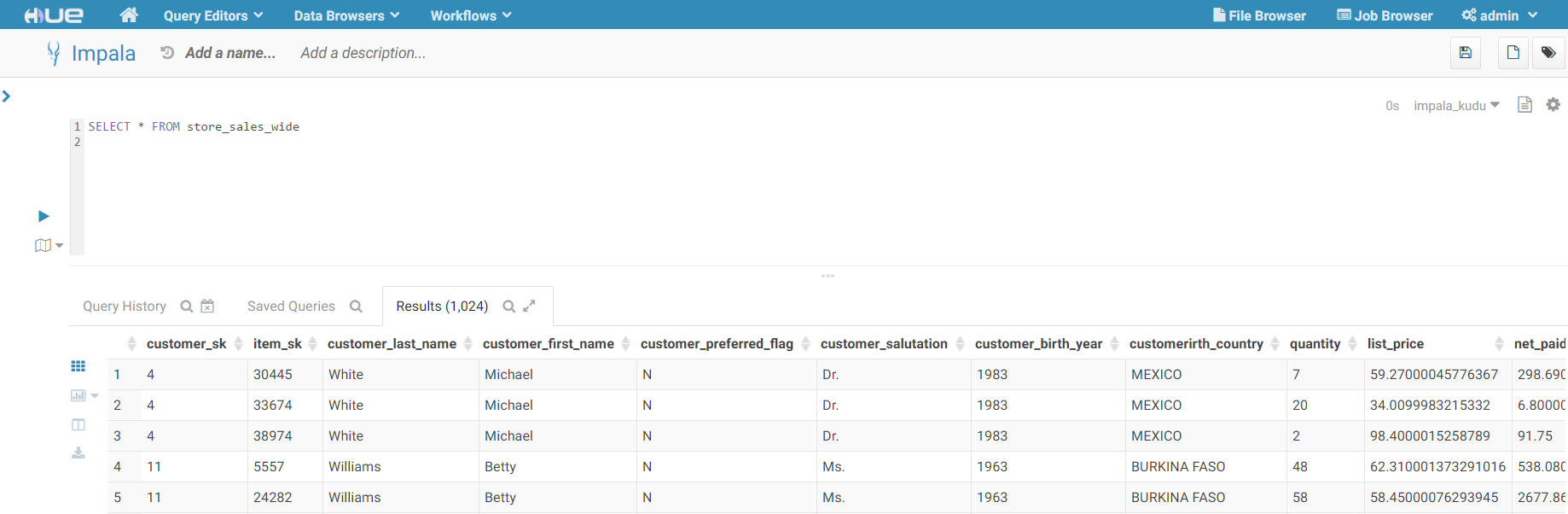
Enter Qlik
With the data loaded into Kudu and exposed via Impala – we can now connect to it with Qlik and start building visualizations.
Using the latest Cloudera Impala drivers , we start the process of building a Qlik app by connecting to our new data set.
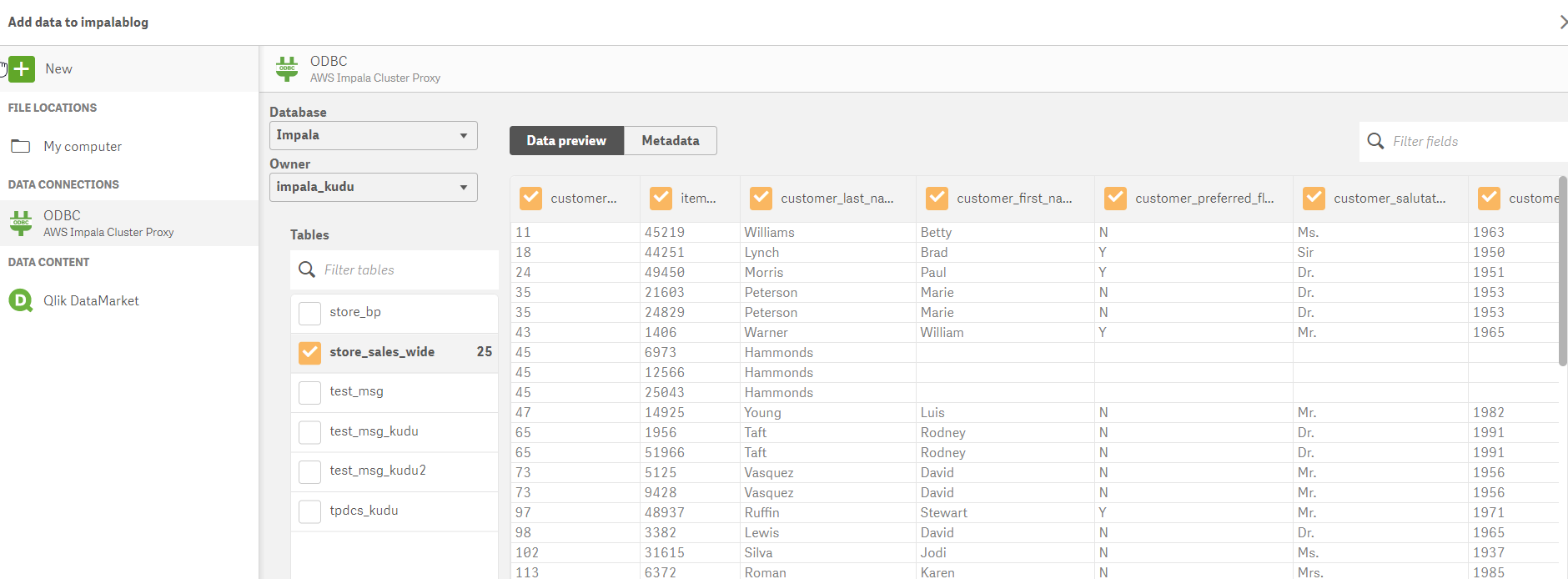
Opening Qlik Sense, we will create a new connection to our cluster and select our new table.
Once we have the table and columns selected – we can modify the load script created by the data manager to directly query Kudu (versus loading the data into memory) to take advantage of the speed and power of Impala on Kudu.(we do this using Direct Discovery - NOTE the Direct Query syntax) This change is accomplished with a slight alteration in the syntax to identify dimensions and measures.
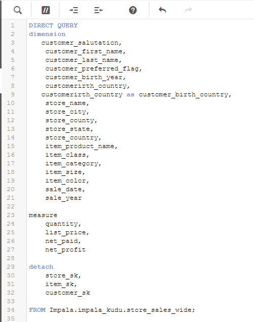
We now have live queries running against Kudu data sets through Impala.
The great part about Kudu is that we’re just getting started with the possibilities of how we can leverage the technology with Qlik. Some things we’re cooking up for the not too distant future involve write-back with Kafka and Qlik Server Side Extension integration – so stayed tuned.
Please visit cloudera.qlik.com for more demos and to see the Kudu demo in action.
Regards,
David Freriks (@dlfreriks) | Twitter
Emerging Technology Evangelist
-
Saint Joseph’s University Academic Program Scholarship Recipients
The Academic Program was thrilled to partner with Saint Joseph's University in Philadelphia, PA during the Spring 2018 semester to offer a scholarship... Show MoreThe Academic Program was thrilled to partner with Saint Joseph's University in Philadelphia, PA during the Spring 2018 semester to offer a scholarship opportunity to the students in the Business Analytics honors society! Students were selected on academic standing and in order to be awarded the scholarship, they also had to take and pass the Business Analyst Qualification exam which is now provided by the Academic Program in the Qlik Continuous Classroom.
We are excited and honored that we were able to impact the lives of these students and we commend them on going above and beyond!
Congratulations to the following recipients:

Check out the attached document to learn more about these lucky students!
-
“Advanced Authoring” capabilities in Qlik Sense!
Qlik Sense has been known for its ability to be deployed across a multitude of devices in your in your organization. This has been part of innovation ... Show MoreQlik Sense has been known for its ability to be deployed across a multitude of devices in your in your organization. This has been part of innovation through responsive design that has driven its ease of use of authoring and self-service discovery. Did you ever wish that you had more control and could increase the visualization density of your dashboards? Well, we have good news for you… !!
Feedback from our customers and partners has told us that there is a demand for Qlik Sense Applications to behave more like web pages. This need comes from continued improvements to today’s web experiences provided by several leading web platforms. Qlik’s Product Team has been thinking of solutions to allow increased real estate in sheets for more complex dashboard requirements. In Qlik Sense June 2018, we have improved sheet layout options in the following ways:
• Qlik Sense sheets can be extended vertically
• Change the grid size of a sheet with existing objects
Let's review each of these exciting enhancements…
Qlik Sense sheets are responsive, meaning that the sheet will adapt to the screen size of the user’s device, and it will not alter the development phase for the application. We are not changing that!
However, what you can do now is extend the space available to display more visualization objects. Extending the sheet is an optional setting that will allow objects to be dragged to the bottom of the screen and expand the usable space.
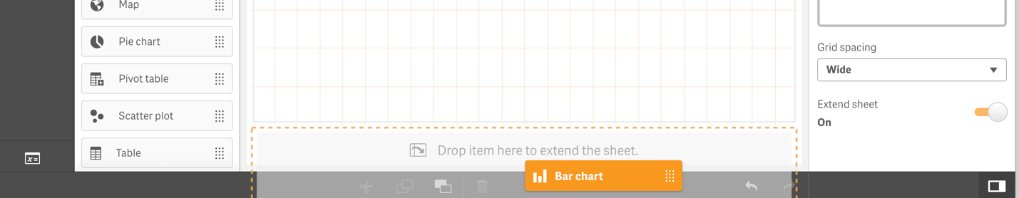
It is recommended to use this with caution as we did not add a limit of how much you can extend your sheets. Each developer, or user creating analysis in self-service mode, should evaluate what is best for the use case. To avoid breaking the user flow, we decided to keep “scrolling” inside charts as it is. Therefore, if you are creating an extended sheet, it might be a good idea to leave some "empty" space between the objects for scrolling the sheet and not into the objects.
The other improvement to sheet layout is that users can now control the grid size in the sheet space, and can change it for existing sheets. This means that you will have better control of positioning and size for the objects and areas in the sheet, which should be empty for design purposes. The objects will remain in their position, and you would only have to snap them to the new grid after making changes.
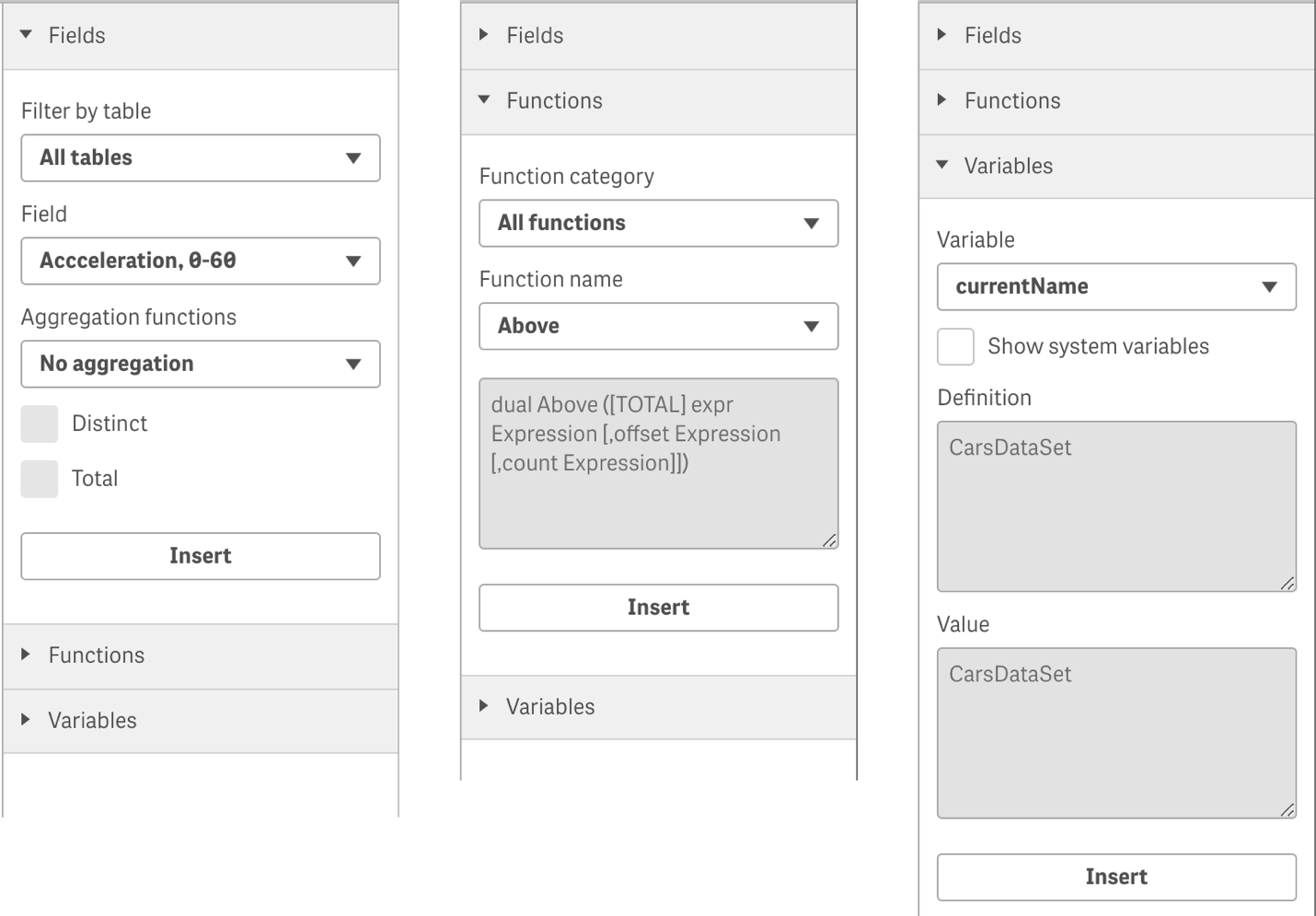
Additionally, we have good news for developers who are building complex expressions. In the June release of Qlik Sense Enterprise, we will increase the number of options available on the Expression Editor dialog; where before you only could browse through tables and fields names, and insert them into a limited list of functions. Now you can see all Qlik Sense chart functions listed and organized by categories as well as list variables available. Also, you can also check the options to insert "distinct" and "total" qualifiers to the expressions.
These new capabilities are initial deliveries for a much broader plan around Advanced Authoring. Our goal is to improve usability and enable developers to plan their application development according to the business problems they are trying to solve, while helping to target specific business user behaviors. Some of these developments need a guided analytics approach, we are calling this Advanced Authoring, and you can expect to see more improvements around this area in future releases.
Stay tuned, this is just the beginning and let us know how much you love these new capabilities. To learn more about the June release, “what’s new” Qlik Sense page! . Watch a live demo on these Advanced Authoring features here:
For those of you interested hearing from Qlik and Industry leaders on the convergence of data, data literacy and Digital Transformation, check out Qlik's Virtual Forum! Learn the latest on Qlik's advancements in Big Data, AI and Cloud and connect. Register now!
-
Custom charts with the Capability APIs
So you're interested in building custom charts in Qlik Sense mashups but don't know where to begin? Let's walk through building one.The basic flow of ... Show MoreSo you're interested in building custom charts in Qlik Sense mashups but don't know where to begin? Let's walk through building one.
The basic flow of building a custom chart goes like this -
1. Get a hypercube
2. Format data as needed
3. Draw or update chart
STEP 1 - GET A HYPERCUBE
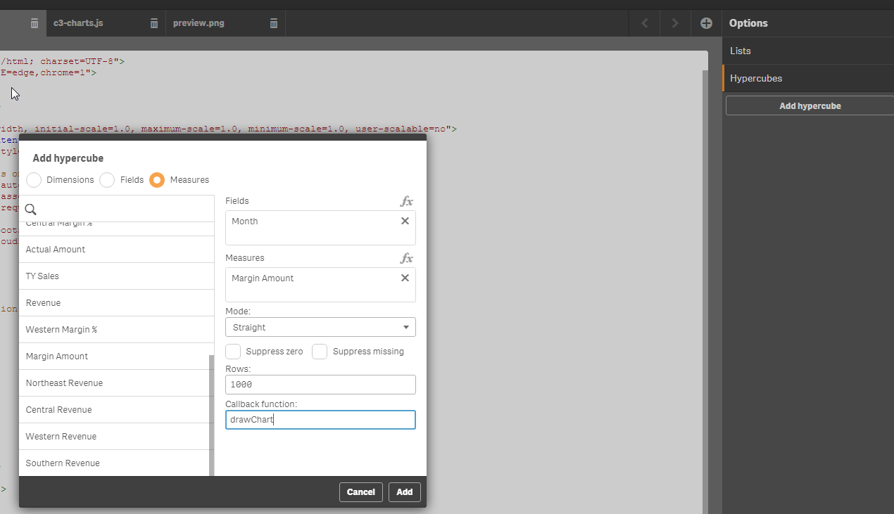
We will use the Qlik Dev Hub to make creating our hypercube easier (information on the dev hub here). Open the dev hub and create a new mashup using whichever template you'd like (I chose the grid template). Now, choose an app from the dropdown near the top left of the edit window.
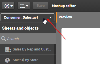
Now, let's create the hypercube. Click the 'Add hypercube' button in the top right of the editor window, and a dialog will popup. Choose the dimension(s) and measure(s) you will need to create your chart. Set the rows to the number of rows of data you would like to include in your chart, and enter a name for a callback function. Then click 'Add'.
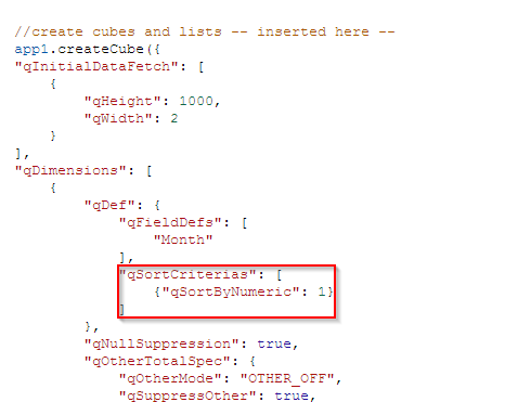
Now a method to create a hypercube, and the callback function will have been added to your .js file. I chose to add a hypercube using the 'Month' field as a dimension and the 'Margin Amount' measure as my measure, using the Consumer_Sales app. If you want to follow along with me exactly, and recreate the "Margin Amount Over Time" chart from the Consumer_Sales app, you will have to manually edit the hypercube that has been generated a tiny bit. By default, a hypercube sorts the data by the load order of the first column, usually your first dimension. In order for months to be in the correct order in the data I will get back from my hypercube, I can sort the "Month" dimension numerically. The picture below shows the code I added to my hypercube, and you can check out all the properties that can be set on a hypercube here.
STEP 2 - FORMAT DATA
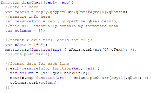
The callback function you specified while creating the hypercube will be called when the data for the hypercube is returned from the engine, and every time the data in the hypercube changes. I like to log the reply as a first step, just to make sure my data is coming through correctly, and check out what it looks like.

In the console, you can then check out the reply you get. Now, you'll want to figure out how you can format the data in the reply to use in creating your chart. Obviously, this is dependent on how you'll be creating your chart. For this example, I've chosen to use c3.js, but there's a good number of interesting and useful javascript charting libraries, any of which you can make use of.
An example of a c3.js line chart can be found here. Now that I know what my data basically needs to look like, I can format it. Below is a screenshot of the code I used to format the data.
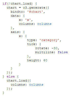
STEP 3 - DRAW OR UPDATE THE CHART
Now that I have created a hypercube, and formatted the data, I need to actually draw the chart, and handle any time the data is updated. How you accomplish this can vary wildly. For instance, you could create a chart each time the data is loaded or changed. This would look something like creating the chart and appending it to a dom element, and every time data is updated, clear the dom element and recreate the chart and append it to the dom element again. I usually prefer to only create the chart once, and then just update the chart, if possible. With c3.js, this is very easy as it has a built in method for simply updating data on an existing chart. That means the only thing I really have to worry about is to check and see if the chart exists yet, and if it does not then create the chart, and if it does then just update the data. That looks like this -
SUMMARY
We created a hypercube, and then in the callback function for the hypercube, which gets called every time the data in the hypercube loads or changes, we formatted the data into a usable format for our chart, and then either drew the chart or updated the chart based on whether it already existed. Read through again, check out the full project, attached, and also live at http://webapps.qlik.com/c3-chart-example/c3-charts.html and let me know if you have any questions.
-
Using IntervalMatch()
Hey guys, I was recently at a user group meeting and the topic of IntervalMatch() came up with regards to when and where it was best used. I liked the... Show More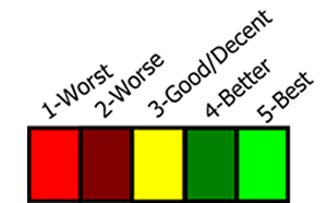
Hey guys, I was recently at a user group meeting and the topic of IntervalMatch() came up with regards to when and where it was best used. I liked the topic and subject matter that was covered, so I decided to create a quick video showing you how I used it when rating or grading some video game consoles. Note that IntervalMatch() can be used in many situations, however there may be other approaches to achieve similar results. View the Qlik Help topic here.
IntervalMatch()
IntervalMatch is a data load script prefix that creates and links a table used for matching discrete numeric values to one or more numeric intervals where there may not be any specific link or key available between the tables. This is used in situations that utilize interval scales of data such as population, date ranges, temperature, number of units, scoring etc. to name a few.
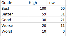
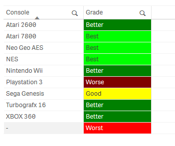
Let’s imagine I have a number of video game consoles that vary in condition. I want to assign them a rating from good to worst based on a numeric scale related to overall condition and function. I have a grading table that contains the numeric ranges for the grade as follows. Note the Grade field description and the High and Low field range values.
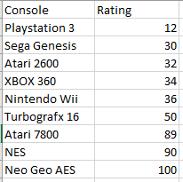
I also have a table that contains my consoles names and their individual rating numeric value.
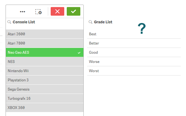
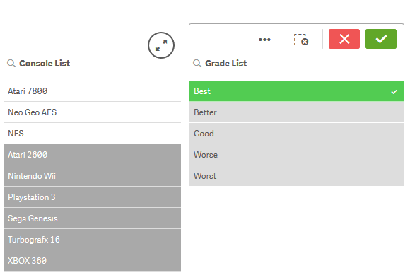
Since these two tables don’t have a common link between them, when the data is loaded and I select a value from either the console or the grade lists, I cannot see any of the relationships.
I can easily solve this using the IntervalMatch prefix which will look at the data already loaded from the grade table with the numeric intervals and match it to the Rating field in the consoles tables. IntervalMatch must come after the initial data is loaded and before the load statement as shown. (Please note that your interval field order is important, starting with the field containing the lowest interval value first.)
[Grade Ranges]:
LOAD
[Grade],
[High],
[Low]
FROM [lib://AttachedFiles/console_grades.xlsx]
(ooxml, embedded labels, table is [Grade Ranges]);


[Console Rating]:
LOAD
[Console],
[Rating]
FROM [lib://AttachedFiles/console_grades.xlsx]
(ooxml, embedded labels, table is [Console Rating]);


[interval match table]:
IntervalMatch(Rating)
Load
[Low],
[High]
Resident [Grade Ranges]
;
Upon loading the data – you can now see that the tables are now linked with this new interval table. Technically a synthetic key is created but in this situation I am told it is nothing to be concerned about. Now you can clearly see the grade of my consoles by either selecting the Grade or the Console list values or within the table visualization.
As always there usually is more than one solution to these types of problems, and perhaps some may be more optimal than others. I’d love to hear from you, so if you have another approach please share it with us.
Regards,
Mike Tarallo
Qlik
@mtarallo - TwitterCan't see the video? YouTube blocked by your region or organization? Download the attached .mp4 to view on your computer or mobile device.
-
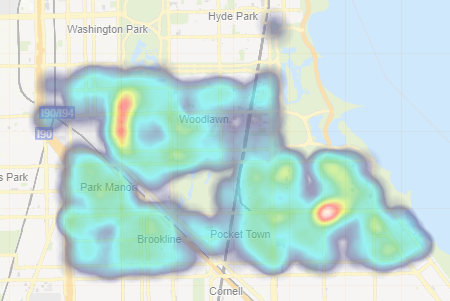
New Features in Qlik Sense Cloud - Segment Colors and Density Layer
We are pleased to share with you 2 new features available immediately in Qlik Sense Cloud:Segment Colors for Master MeasuresNew Density Map LayerTo le... Show MoreWe are pleased to share with you 2 new features available immediately in Qlik Sense Cloud:
- Segment Colors for Master Measures
- New Density Map Layer
To learn more about these new features and see them in action, check out this brief video:
Segment Colors and Density Map Layer
Segment Colors - for Master Measures
This new feature allows you to create and customize your own color segments for your measures that are defined within the Master Items library. You can define your individual segments along with its corresponding color and set a range for each by either using fixed values or percentages. Since the scheme is defined in the master measure, it is created one and then respected by every chart object and is consistent throughout in the app.
New Density Map Layer
This is a new layer available with our default map object that comes with Qlik Sense. This layer is best used with very "dense" location data, allowing you to summarized large amounts of data where your points are considered very close in proximity to one another. Depending on the number of points in a particular location the density map will reveal shapes and patterns with various colors and intensities. Indicating "dense" areas or hot spots within your data. This type of map draws your intention immediately to areas of concern or progress allowing you to make informed decisions quickly and easily.
Try them out now http://qlik.com/cloud
Can't see the video? YouTube blocked by your organization or region? No problem. Download the .mp4 to watch on your computer or mobile device.

-
20 days to go! Will your team win the 2018 World Cup?
Football season is almost over, only the Champions League winner is undecided yet, but soon the fútbol - football, soccer - aficionado’s eyes will tu... Show MoreFootball season is almost over, only the Champions League winner is undecided yet, but soon the fútbol - football, soccer - aficionado’s eyes will turn to this summer's tournament. Honestly, I can’t wait, this is the competition we all have been patiently waiting for the last four years. A long wait, especially if your team had a very disappointing tournament last time. No, it wasn’t a good 2014 World Cup for Spain.
If you are anything like me, you’d probably have already memorized each group’s teams, imagined any possible what-if scenario, and visualized your team’s captain getting that gorgeous golden trophy by July the 15th. We want to help you to take your guesses to the next level, and have a little bit of fun and competition.
Choose your Champion app will let you predict how this summer’s competition will finish, and more.
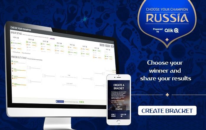
How it works
Our bracket is bit more sophisticated that most, we have created a data-driven experience. Each one of the decision points in the app has been enhanced with data, so when you pick a team to end up in the first place of a group, you can corroborate if your gut feeling matches with our data predictions. If you are doubtful about a knockout game winner simply check the stats and make an informed decision.
The process is simple, select first and second place in the groups stage, the bars next to the team names will tell you who is more likely to move to the next stage. Then in knockout round, check the gauge and the extended stats and pick the winner of each match to complete the bracket. Finally decide your tournament winner, and share it with your friends.
But there’s more
This year, we also want you to be able to track your bracket and check how do you rank among other people.
We added a simple login system using Facebook - no, we are not getting any of your personal data, not even your Facebook name nor email - and now you will be able to submit and save your bracket safely. After the tournament have started, we will provide each one of you with a score based on how many predictions you got right.
You can use the Choose Your Champion score to compete against your friends and coworkers privately and beat them all!
Enjoy and share it!
Arturo


