Unlock a world of possibilities! Login now and discover the exclusive benefits awaiting you.
Analytics & AI
Forums for Qlik Analytic solutions. Ask questions, join discussions, find solutions, and access documentation and resources.
Data Integration & Quality
Forums for Qlik Data Integration solutions. Ask questions, join discussions, find solutions, and access documentation and resources
Explore Qlik Gallery
Qlik Gallery is meant to encourage Qlikkies everywhere to share their progress – from a first Qlik app – to a favorite Qlik app – and everything in-between.
Qlik Community
Get started on Qlik Community, find How-To documents, and join general non-product related discussions.
Qlik Resources
Direct links to other resources within the Qlik ecosystem. We suggest you bookmark this page.
Qlik Academic Program
Qlik gives qualified university students, educators, and researchers free Qlik software and resources to prepare students for the data-driven workplace.
Recent Blog Posts
-
Know Your Users: Device Detection through Extensions
In a perfect world for developers and designers, their work would be approached by users on the same (or very similar) device. Ensuring a consistent ... Show MoreIn a perfect world for developers and designers, their work would be approached by users on the same (or very similar) device. Ensuring a consistent aesthetic and user experience would be simple because the developer’s experience would be the same as everyone else’s.
As we’re all well aware, unfortunately, we don’t live in a perfect world, and I’m not completely convinced that world would be all that perfect. There are hundreds of different devices, screen resolutions, and operating systems that contribute to a nearly endless combination of user experiences while traversing the web. In some ways this variety is very exciting in that it drives innovation, offers users choices, and potentially allows the user to customize their experience.
Luckily, despite this variety, the users are basically attempting to view a document or image which is a very old form of communicating information. But what if we want users only on a particular device viewing our apps differently?
For example, the Insurance Demo on the QlikView Demo site had a fairly large dashboard, and attempting to use the app on a phone would be very difficult without tiny fingers:
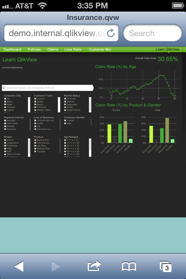
In this case, tailoring this experience toward a particular device seems unavoidable. Fortunately, device detection can be fairly simple to do on the web. There is a variable called “navigator” that is set in most browsers that can be easily examined using javascript. Navigator contains some important and useful information such as browser type, operating system, and whether or not the device identifies itself as mobile.
So how do we get that javascript into QlikView? Extensions of course! Document extensions are especially useful for performing simple javascript tasks to gather user information and pass it into QlikView by using a QlikView variable. This way, QlikView is able to take this variable and use it for whatever purpose it wants, which is much simpler than attempting to customize the page from the document extension itself.
The best part is that the extension itself couldn’t be simpler. JavaScript has already done all of the work. The deviceDetect document extension referenced below, for example, consists of four lines of JavaScript code to set a QlikView variable called “vDevice” to the browser information retrieved from “navigator”:
Qva.AddDocumentExtension('deviceDetect', function() {
var mydoc = Qv.GetCurrentDocument();
mydoc.SetVariable("vDevice", navigator.userAgent.toLowerCase());
});
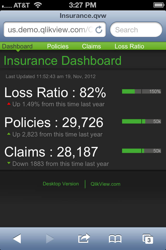
Using this extension on the Insurance Demo, a sheet customized for the iPhone could be shown, creating a much nicer view:
Click here to download the deviceDetect document extension.

-
A Tip for the Type
If you think that your typeface or font that you use does nothing more than just conveying the content of the words themselves or just add an artistic... Show MoreIf you think that your typeface or font that you use does nothing more than just conveying the content of the words themselves or just add an artistic streak to your page then, you’re wrong! Rather I must put it this way, YOU’RE WRONG!
Notice my tone of voice change when I used the uppercase letters instead of lowercase in stating ‘You’re Wrong’. The UPPERCASE Bold letters not only communicate the message boldly but do it in a strong assertive, almost authoritative manner. Typography forms a quintessential part of Graphic Design and Visual Communication. In fact, typography makes 95% of Graphic design.
The visual aspect of type has as much effect on how the content is communicated and perceived as does the verbal aspect. Visual appearance of text can communicate more than the text itself like expressing the mood, personality, gender, age or situation that is in context. It can also give visual cues about the hierarchy of the content, how to read it and which part is more important than the other. It can be perceived the same way as wearing the right clothes for the right occasion like wearing formal clothes for a job interview and wearing a casual pair of shorts for a barbecue house party.
For instance, the 2 images below use a different typeface for the tag line.


Although the one on the left side is a clean, legible and a good looking typeface, it doesn't suite the context at all. Whereas the one on the right not only suits the context but also builds the atmosphere and gives certain punch and flavor to the poster. If we put the context aside and look at both typefaces side by side there is no grounds for comparison since both have distinct personalities but if compared on a contextual level, the type used on the right immediately stands out as better suited to the image than the one on the left.
Typefaces have their own distinct personalities and it is the role of a designer to decide which typeface will suite which condition. However, certain general rules can be established depending on the typeface.
Recommendations for using typefaces
- Sans Serif fonts (Arial, Helvetica) are better to use for body text while Serif fonts (Garamond, Times New Roman) are better to use for headings and titles.
- Avoid combination of similar typefaces together like Franklin Gothic and Helvetica since types from the same family (in this case Geometric Sans) break the visual harmony as they don’t look alike but are not totally different. For typeface combinations contrasting fonts work best like Helvetica and Garamond.
- Avoid using more than 2-3 types per design.
- Create a gradation in weight to show hierarchy in text and for better visual flow.
- Use Script fonts and accent fonts sparingly only to highlight elements in a design.
- When unsure stick to traditional and popular fonts like Arial.
- Consider the tone of voice and context when choosing an appropriate font.
Google fonts are a great way to integrate some of the web fonts in QlikView. See blog post by Arturo Munoz about 8 ways to customize your QlikView applications with Google Fonts in which he talks about the step by step process of incorporating Google fonts in QlikView.
In summary, each typeface has a different personality which needs to be identified and applied to the context accordingly. And remember, apart from saying all about the design the typeface also adds the much needed aesthetic streak to the design so don’t hesitate to experiment.
postscript -
Typeface & Font – What’s the difference?
People often get confused between typeface and font and sometimes use it interchangeably. Typeface is the style of design of the letters, symbols or numbers whereas fonts are a set of printable text characters in a specific style. For example, Arial, Times New Roman, Garamond are typefaces but Arial Bold 12 points or Times New Roman Regular 9 points are fonts.
Resources
http://www.fastcodesign.com/1664719/infographic-of-the-day-why-should-you-care-about-typography

-
Design for Reflection
When designing QlikView applications we are constantly striving to create sparkling applications which comply with usability best-practices, have a gr... Show MoreWhen designing QlikView applications we are constantly striving to create sparkling applications which comply with usability best-practices, have a great look and feel and have charts that justify the purpose of showing data which can add value to the customer’s business. But a lot of times, in spite of checking off everything that we can think of in terms of creating a world class app, the customer is not convinced and app is left on the table for us to take back. Maybe then, taking design one step further is what is required to make a full impact.
Don Norman, in his book ‘Emotional Design: Why We Love (or Hate) Everyday Things’ talks about 3 levels of perception. Visceral – 1st stage - how someone perceives the visual aspect of a product, Behavioral – 2nd stage - how the product works, ease of use and ergonomics. Reflective – 3rd level – what does this product say about me. Most often times, we work on the first two aspects, usability of our apps and then making them look good but it is seldom that we think about how our apps reflect the users. Does it suite the image of the customer? Apart from showing all the value that our product brings to them, does it connect with the customer on a psychological, cultural and aesthetic level?
Reflective processing is when our desires for sophistication and to be aesthetically at par with cultural biases influences our likes and dislikes. It is a very common human trait since we live in a complex social and cultural set up. Owning products that reflect positively on our personality is a natural human instinct. For instance, preferring a coffee from Starbucks over an ordinary coffee place not just because you like the coffee but also because it reflects something about your personality and brand consciousness.

According to Norman, designing for reflection is one of the most powerful ways to build long term product-user relationships. Not only does it impacts the user’s perception but also creates a deeper psychological connection and an emotional engagement with the user.
Simple tricks like skinning the QlikView application with the customer’s brand identity can make a big impact on the customer’s perception of the app in a positive way. But influencing someone on a reflective level goes beyond aesthetic appeal. The key is to be user-centric rather than being product-centric.
Here is what some of the successful product strategists have done in order to hit the inner nerve of the customer’s brain.
- Cultural Trends - Studying cultural patterns and trends that exist within the target user group helps in identifying user expectations and preferences. This can help a lot when designing apps that customers can identify with and prefer owning.
- User pain points – Tackling the pain points of the user in the design and then branding the product in a way that orchestrates those pain points and offers solutions to help resolve those can really hit the note. This helps in creating a self-reflection of the user in the product.
In general spending some extra time and efforts to research the target audience and catering to their needs and preferences can create a product that is a reflection of the users and will stand a better chance of appealing to the user as opposed to just being a good looking robust application.
-
Custom Application Training
Custom Application Training helps to increase adoption and return on investment by delivering targeted training designed specifically on your Qlik app... Show MoreCustom Application Training helps to increase adoption and return on investment by delivering targeted training designed specifically on your Qlik application.
Custom Application Training includes:
- Targeted eLearning on your Qlik application
- Business user-focused videos and reference cards
- Launch Kit, containing communication templates and best practices to help you create a tailored training rollout plan
To learn more about the Custom Application Training, please contact your local Education Training Manager.

-
Replacing images with Geometric Shapes as visual cues
The use of icons and other visual cues has been proved as a great value asset in data visualization. Icons let people to better understand complex inf... Show MoreThe use of icons and other visual cues has been proved as a great value asset in data visualization.
Icons let people to better understand complex information. Another good thing about icons is that they let us communicate globally. An up-pointing triangle is universally understood as a representation of growth.
QlikView brings you the possibility to choose from a predesigned set of visual indicators.
A good alternative to the standard icons is the Unicode Geometric Shapes set.
“Unicode is a computing industry standard for the consistent encoding, representation and handling of text expressed in most of the world's writing systems.” (Source Wikipedia).
 Geometric Shapes is a set of visual indicators that effectively work as a text character. This means, you could use it everywhere you can write text in QlikView. Text objects, captions, cells, sheet titles, etc.
The main advantage of using Unicode Geometric shapes over images is the fact that you can control their properties, like size and color as any other text character. You could, for example, set up an expression to change the color based on an expression.
Another good example of how to take advantage of Unicode Shapes is including them as a part of number format pattern. You can predetermine how the shape will look for positive and negative values.
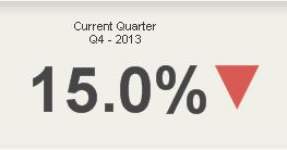
▲ #,##0.0%; ▼ #,##0.0%
Using this pattern will let you integrate an icon inside a cell like as in Change column in the table below.
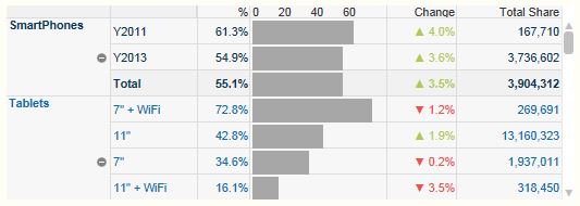
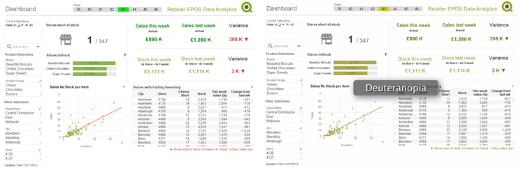
Color is, in some situations, not enough to differentiate from one state to another. Using different fills or patterns will help color blind people to identify differences.
To include any of these shapes into your next QlikView project you just need to copy the shape from here and paste it where needed.
0
1
2
3
4
5
6
7
8
9
A
B
C
D
E
F
U+25Ax
U+25Bx
U+25Cx
U+25Dx
U+25Ex
Note: Remember to test your app to make sure it renders properly on every possible browser.
Enjoy Qliking!
AMZ
Update: Here you can get a working app with some examples on how to use these shapes.

-
Performance and Scalability - New course offering!
Performance and Scalability – New Instructor-Led CourseThis technical course that gives students the information, tools, techniques and exercises to b... Show MorePerformance and Scalability – New Instructor-Led Course
This technical course that gives students the information, tools, techniques and exercises to become knowledgeable in the
planning, analyzing, designing and testing of an optimal QlikView platform.
This includes topics dealing with:
- Application design and architecture
- Hardware configurations and environment
- Usage, load testing, and analysis
-
Are you QlikView Power User?
Take a QlikView Skills Assessment today to find out if you have all the knowledge you need to effectively design, develop, administer and manage QlikV... Show MoreTake a QlikView Skills Assessment today to find out if you have all the knowledge you need to effectively design, develop, administer and manage QlikView.
-
QlikView in the Enterprise - New free self-service course!
QlikView in the Enterprise is a 45-minute, eLearning course which covers considerations for an IT department to implement QlikView as a self-service b... Show MoreQlikView in the Enterprise is a 45-minute, eLearning course which covers considerations for an IT department to implement QlikView as a self-service business discovery platform – both from an infrastructure and process point of view. It also covers the role of IT and the services available to support the implementation. Watch it now!
For all of our free eLearning courses, go to our Free Training website.
-
Q2 2014 - QlikView Technical Library module available!
The Q2 2014 QlikView Technical Library modules are now available!This quarterly release includes three videos on the following topics:Introduction to ... Show MoreThe Q2 2014 QlikView Technical Library modules are now available!
This quarterly release includes three videos on the following topics:
- Introduction to Set Analysis
- Basic Set Analysis Syntax
- More Set Analysis Syntax
For access or more information:
- Customers: View Data Sheet
- Partners: Access Videos
- Employees: Access Videos
-
Colors, States and State vectors
The color coding – Green, White, and Gray – is the hallmark of QlikView. These are the colors that convey information to the user about which field va... Show MoreThe color coding – Green, White, and Gray – is the hallmark of QlikView. These are the colors that convey information to the user about which field vales are selected, which are possible and which are not possible.
These are the states.
If you think about it for a while, you will realize that there are two different states for each field value: One is the input state; the selection that the user has made – whether the field value is selected or not; and the other is the output state: whether the field value is possible or not, given the logical inference of the selection.
Two statuses, each with two possibilities. This makes four combinations: Selected possible, Selected excluded, optional and excluded. Hence: There are not just three states – there are four.
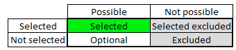
“Selected excluded?” you may ask. “How can a value be selected and excluded at the same time?”
It’s simple. It can first be selected, and then excluded by a selection in another field. An example: Let’s say that you have a sales application and you select Jan, Feb and Mar to get the sales for the first quarter. Then you make a second selection – a product that incidentally was sold just in March. This second selection will then of course exclude Jan and Feb from the possible Month values. Jan and Feb will be selected excluded.
The field states are stored in vectors; binary arrays that have the same number of bits as the symbol tables excluding NULL values; the same number of bits as the number of distinct values of a field. There is in fact also a third field state vector that keeps track of alternative field values: the field values that would be possible, had there not been a selection in the same field.
The blue color is sometimes used in QlikView to show whether a field is locked or not. But note that this is not a state – it is a flag for the entire field, and has thus nothing to do with the individual field values.
Finally, there are state vectors for the binary data tables also - vectors that keep track of which records in the data that are possible and which are excluded.
All these vectors are referred to as the state space. The vectors are updated at every selection and used every time QlikView evaluates which symbols to show in an object and which record to include in the calculation. One state space per user and alternate state is created.
This way, the state space vectors keep track of which data is relevant right now – they “remember” the user selection.
PS. All of the above is of course true for both QlikView and Qlik Sense. Both use the same engine.
If you want to read more about QlikView internals, see
Symbol Tables and Bit-Stuffed Pointers

-
3 Color utilities that makes my life easier
We have been talking a lot about color recently. Chuck showed us how to manage colors and alpha transparencies to increase visual perception in our d... Show MoreWe have been talking a lot about color recently. Chuck showed us how to manage colors and alpha transparencies to increase visual perception in our dashboards making it clear for business users to consume charts. A few days before, Apeksha shared some good tips about color usage in QlikView apps. If you are looking for more insight about color and interpretations I strongly recommend you to read Apeksha’s Technical Brief.
Choosing the right colors.
Colors are present in our apps not only in the charts but also in the backgrounds, tab row, captions, and so forth. It’s key to find a color palette that works and that lets business users consume information quickly and in an efficient way.
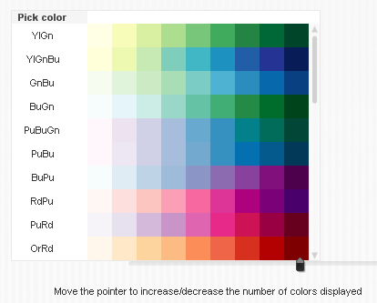
There are lots of content and good examples on the internet about color palettes; sites like kuler.adobe.com can provide you with some nice color combinations for your next project.
Some of the most popular color combinations are in colorbrewer2.org. Created by Cynthia Brewer, Mark Harrower and The Pennsylvania State University. It was originally designed for cartographers but it’s a standard in academia for any type of data visualization. (http://colorbrewer2.org/)
I created a QV app (see below) with these colors palettes to facilitate their adoption by our community. Feel free to use, improve and distribute it.
Testing your colors
As discussed earlier in this blog, around 7-8% of world’s population has some short of different color perception. To create great looking QlikView apps you should be conscious that some people out there do not see colors as you do.
To avoid that potential risk that could ruin your app, you could use one of the pre-designed color blind safe palettes and/or you could test your app using a tool that lets you emulate a color blind environment.
Color Oracle is a free color blindness simulator for Window, Mac and Linux. It takes the guesswork out of designing for color blindness by showing you, in real time, what people with common color vision impairments will see. http://www.colororacle.org/
Reading colors
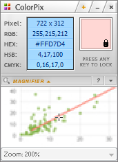 Common tasks are time consuming and when it comes to color it’s very common to find yourself trying to reuse corporative colors. It is probably safe to assume that we all have a color picker tool installed in our machines, but in case you do not... My personal favorite is ColorPix.
It’s a standard Color picker tool but it has some features I find it very useful when working with QlikView. I use ColorPix mouse accelerators a lot, that let me copy the RGB value by clicking on the displayed number, then I just need to type RGB( Ctrl+C ) into calculated base color expression box to include the color in my app.
These are 3 small utilities that make my life much easier but, what about you? Are you using any other tool to help you with your QlikView development? Share it with us in the comments!
Enjoy Qliking!
AMZ
Extra: Safe color palettes QV app
-
Human Mind and Design
Design in almost every field needs careful consideration of human behavior in order to best fit to human needs. Likewise in the digital world design n... Show MoreDesign in almost every field needs careful consideration of human behavior in order to best fit to human needs. Likewise in the digital world design needs careful consideration of human psychology and behavior. Cognitive psychology forms a big part in the study of user experience design. It helps to know how the human mind works (perception, memory & learning) in order to design interfaces that do not hamper the natural human processes and instead help in making the digital interactions as easy as possible.
It is imperative to any digital interface to apply design principals and best practices based on usability research. As such QlikView applications also need careful design consideration for them to be seamless or else small usability issues can form big hurdles.
Take for instance the information icon shown below.

What would you gather from this icon? I would think that the icon is a button to get more information and is inactive because of its grey color and very little contrast between the background and text. In most scenarios something that is inactive or non-clickable is shown to be greyed out. But in reality, this icon is active and clickable. So there is a break in the mental model due to an action that is opposite of what the user expects. These are small things to consider but they make a huge impact on the user experience.
The document User-Experience-Guidelines for QlikView shows many such examples, guidelines and best practices to be considered with respect to usability based on principles from cognitive psychology, all of which can be applied to the design of QlikView applications.
In the QlikView world, showing data the right way and making the application usable is important but enhancing the whole experience is the key to a great product. In the words of usability expert Don Norman “It is not enough that we build products that function, that are understandable and usable, we also need to build products that bring joy and excitement, pleasure and fun, and, yes, beauty to people’s lives”.
-
Color Codes
Colors are a very important and critical part of our lives. They not only give meaning to objects but also trigger feeling and emotions within us, inf... Show MoreColors are a very important and critical part of our lives. They not only give meaning to objects but also trigger feeling and emotions within us, influence perspective and affect our psychological being. The study of colors is very complex and a lot has been written and talked about the role and use of colors in various aspects of life.
As QlikView application designers, we don’t have to study in depth the meaning and theories of colors but it is of utmost importance for us to be aware of the usability norms, best practices and social and cultural implication of colors to use them in a conscious and respectful way in our designs and data visualizations. It is very easy to fall in traps of using excessive color variations or inapt color schemes since we have such a wide range to choose from which leads us to falling for temptations of using colors as per our personal likes and dislikes.
A few tips and tricks about how to use colors judiciously can not only help tremendously from falling into these traps that impair usability and deceive the user but also allows datasets to be layered in order to tell eloquent stories. The following guides can be applied to our data visualization for QlikView applications.
1. Use minimal amount of colors in your designs and data visualization. Every application has a focal point or something to highlight. Overly colorful designs can tend to hide the focal point, giving an overall vibrancy to the design and hindering the user from focusing on important points in the data.
2. Using Shades and tints of the same color while showing quantitative information instead of different hues of colors is preferable, like in the pie chart shown below.

However, it is okay to use different color in the same chart when color is used as an indicator of information as long as the colors are limited to 3-5 and color choice is such that they don’t create visual noise. The example below shows how color is used as an indicator of information.
3. Avoid pure gradient rainbow color scales to show data. Because there is no inherent order in the scale, they all appear to come from different families.
4. Keep the colorblind audience in mind when choosing color schemes. Since a large portion of our audience might be colorblind, it is unaffordable to use colors which are not colorblind safe. Color Oracle(http://colororacle.org/index.html) is a good evaluation tool for colorblindness.
5. In places where Red, Green, Yellow have to be used together, introduce other attributes such as icons so that color is not the only differentiating factor. These colors appear similar to colorblind people.

6. When using Red and green together, choose a green which is closer to blue in hue, this way tthe 2 colors can be differentiated easily by the colorblind users.


Apart from the above basic usability guidelines, there are other things to consider while choosing color schemes for designs. Choice of colors is very subjective, however, this not only because of personal preference but can also due to deep rooted cultural and social connotations associated to colors that are imbedded within us. Colors hold different meanings in each culture and we should be conscious of those meaning when presenting to a global audience or a specific country. This way misinterpretations and offensive use of colors can be avoided.
An elaborate insight on colors, their use and interpretations can be found in this Technical Brief.
-
4 Pieces of (basic) Design Advice
The Demos & Best Practices team are often asked to look at applications built by third parties and give feedback. This feedback covers technical QlikV... Show MoreThe Demos & Best Practices team are often asked to look at applications built by third parties and give feedback. This feedback covers technical QlikView recommendations as well as design & usability best practices. Being on the outside looking in our team tends to approach these apps in ways their developers usually haven't considered. Very often these apps are being built by developers who have been so focused on making sure the data is correct they haven't stopped to consider the user experience until they are almost finished.
With that in mind the following are a four pieces of design advice that we tend to give fairly often.
Boxes boxes everywhere.
Many developers leave borders, shadows, and caption backgrounds on their charts and list boxes. These are some of the first things the Demos & Best Practices team remove when we are overhauling an app. When every object is fenced in it makes the entire app look very boxy where all of the objects are their own little entities isolated from the other charts. Even if you aren't convinced by this reasoning the question we would pose is "how are these borders, shadows, etc. helping the app?"
No 3D charts … ever.
Like something out of Mommie Dearest you shouldn't use 3D charts. Ever. Aside from the fact that they are "aesthetically unappealing" they make reading the data difficult. In a 3D vertical bar chart does the bar terminate at the front/bottom of the top plane, the middle of the top plane, or the back/top of the plane? How are shadows in a line chart helping you to analyze your business? Is a 3D pie chart tilted into perspective easier to understand than a standard pie chart? There are ways to be creative and add some visual fun into your design (backgrounds, slight shadows dividing up the space of an app, a few icons, etc) but 3D charts isn't one of them.
Include a Dashboard page
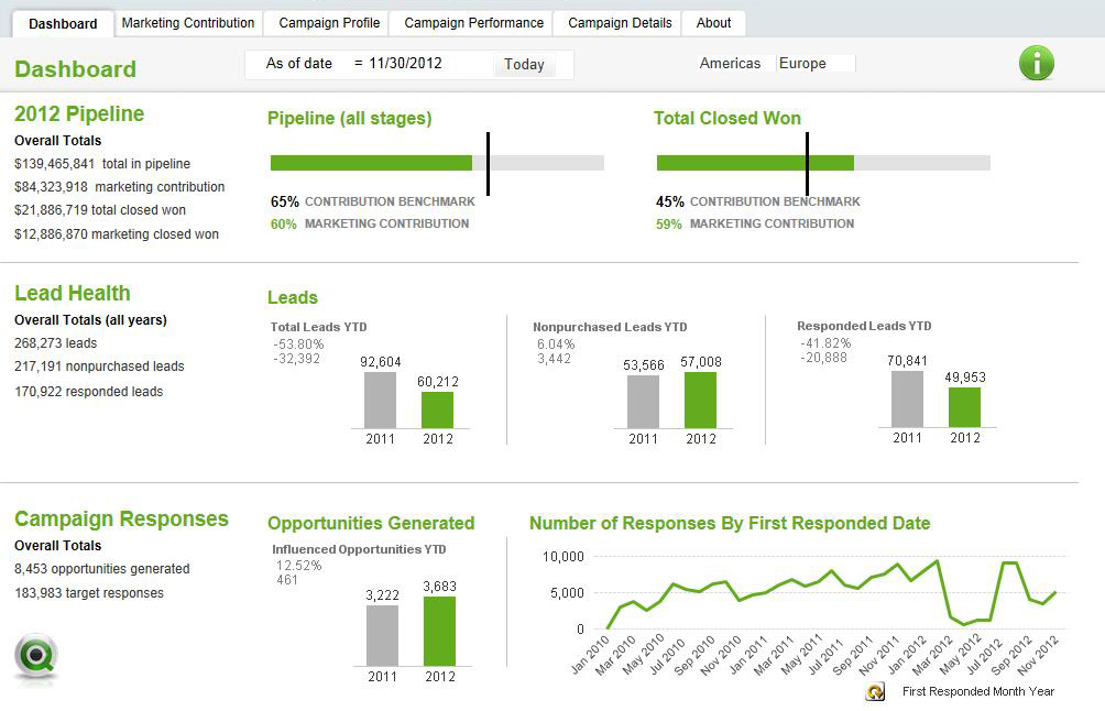
Under the pressure to develop an app that works many developers focus on creating a variety of ways to analyze the data but forget to have a page that summarizes the data. Include a Dashboard page that gives the summary of the app. If the app is about sales include the major sales figures as well as reference sales goals and whether or not those goals were met. Who were the top five sales people? Who were the lowest five? Give a list of your top selling items as well as your worst selling ones. If it is a medical application give some high level numbers about the number of patients, doctors, hospital staff and if they are up or down from this time last year/quarter/month etc. What is the average wait time to see a doctor? How many procedures have been ordered lately and what are they costing? There are unlimited possibilities of what you could include but the idea is to give your users an overall summary of the status of things before they go into a deep dive and analyze the numbers.
Be Consistent
If you have reoccurring objects that are on many pages keep them in the same location on each page. Use the same colors and font sizes for like minded labels, captions, and text. Design all of your pages to the same width. When things jump around it creates dissonance and users have to adjust and learn how to navigate each page. This process takes time & cognitive effort and is detracting from the time & effort they should be dedicating to using your application. Pick a style and stick to it.
-
Monte Carlo Methods
In some situations in Business Intelligence you need to make simulations, sometimes referred to as "Monte Carlo methods". These are algorithms that us... Show MoreIn some situations in Business Intelligence you need to make simulations, sometimes referred to as "Monte Carlo methods". These are algorithms that use repeated random number sampling to obtain approximate numerical results. In other words – using a random number as input many times, the methods calculate probabilities just like actually playing and logging your results in a real casino situation: hence the name.
These methods are used mainly to model phenomena with significant uncertainty in inputs, e.g. the calculation of risks, the prices of stock options, etc.
QlikView is very well suited for Monte Carlo simulations.
The basic idea is to generate data in the QlikView script using the random number generator Rand() in combination with a Load … Autogenerate, which generates a number of records without using an explicit input table.
To describe your simulation model properly, you need to do some programming in the QlikView script. Sometimes a lot. However, this is straightforward if you are used to writing formulae and programming code, e.g. Visual Basic scripts.
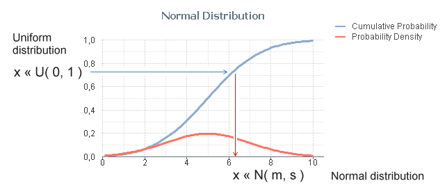
The Rand() function creates a uniformly distributed random number in the interval [0,1], which probably isn’t good enough for your needs: You most likely need to generate numbers that are distributed according to some specific probability density function. Luckily, it is in many cases not difficult to convert the result of Rand() to a random number with a different distribution.
The method used for this is called Inverse Transform Sampling: Basically, you take the cumulative probability function of the distribution, invert it, and use the Rand() function as input. See figure below.
The most common probability distributions already exist in QlikView as inverse cumulative functions; Normal T, F and Chi-squared. Additional functions can be created with some math knowledge. The following definitions can be used for the most common distributions:
- Normal distribution: NormInv( Rand(), m, s )
- Log-Normal distribution: Exp( NormInv( Rand(), m, s ))
- Student's T-distribution: TInv( Rand(), d )
- F-distribution: FInv( Rand(), d1, d2 )
- Chi-squared distribution: ChiInv( Rand(), d )
- Exponential distribution: -m * Log( Rand() )
- Cauchy distribution: Tan( Pi() * (Rand()-0.5) )
Finally, an example that shows the principles around Monte Carlo methods: You want to estimate π (pi) using a Monte Carlo method. Then you could generate an arbitrary position x,y where both x and y are between 0 and 1, and calculate the distance to the origin. The script would e.g. be:
Load *,
Sqrt(x*x + y*y) as r;
Load
Rand() as x,
Rand() as y,
RecNo() as ID
Autogenerate 1000;
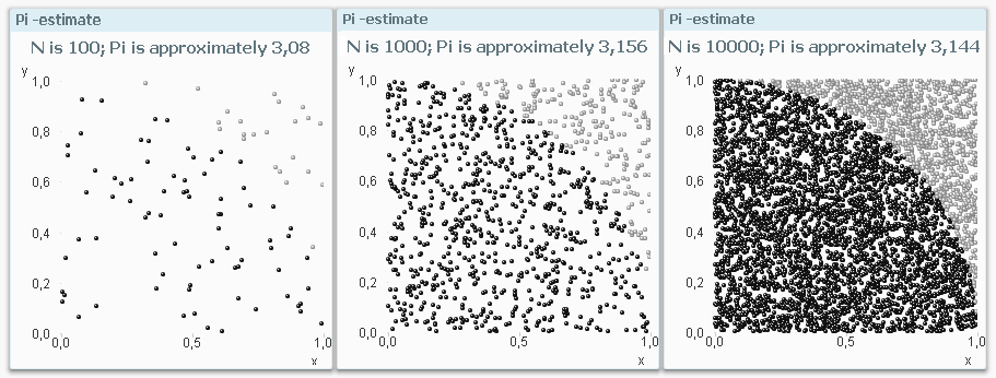
The ratio between the number of instances that are within one unit of distance from the origin and the total number of instances should be π/4. Hence π can be estimated through 4*Count( If(r<=1, ID)) / Count(ID).
Bottom line: Should you need to make Monte Carlo simulations – don’t hesitate to use QlikView. You will be able to do quite a lot.
See also the Tech Brief on how to generate data.
-
It’s Natural to Want to Be Heard! Call for Speakers for the Qlik Conference 2014...
Submit your abstract for consideration todayWe are pleased to announce that the Qlik Conference 2014 will be held from Monday, November 17 through Thu... Show MoreSubmit your abstract for consideration today
We are pleased to announce that the Qlik Conference 2014 will be held from Monday, November 17 through Thursday, November 20, 2014 at the beautiful Shingle Creek Resort in Orlando, Florida. This event will provide a wide range of options that will ensure that all attendees maximize their time and investment. The conference will include keynote speakers, Qlik subject matter expert presentations, a Partner Showcase and multiple opportunities to network and have some fun with old and new friends. It will also feature session tracks that highlight our customers’ experience, expertise and success with QlikView.
Our Call for Speakers is now open and we urge you to engage. Your peers are interested to know what you have discovered and how you are solving business problems with QlikView. We are leaving the topics up to you, but here are some ideas for your consideration:
- Use cases by industry including healthcare, life sciences, financial services, manufacturing, high tech, and retail.
- Details on how you are making business decisions leveraging data and analytics in your company
- Technical talks regarding deployment strategies, growth strategies, and application and development
- How you are creating a culture in your organization of asking questions and making decisions around data
- Industry leading dashboard design
- Communicating with your executives using data stories
- Any talk track that you think your peers will appreciate and learn from
We will be accepting submissions on a rolling basis. For best chance of selection, we encourage you to submit early. The call will close on May 16 and selection decisions will be communicated by May 23. The submission form will allow you to submit your session abstract and screenshots of sample dashboards. Special consideration will be given to those submissions that include real-world examples of QlikView in use.
Customers who are selected to speak at the Qlik Conference 2014 will receive a complimentary conference pass. Only one complimentary pass will be provided per session.
Submit your abstract today for consideration.
Questions?
For all questions on customer speaker submission, please email: Donna.Edwards@qlik.com
-
QlikView Expressor RESTful API Extension
Starting with version 3.9.1 of QlikView Expressor we released a new capability that allowed developers to extend, share and package custom functionali... Show MoreStarting with version 3.9.1 of QlikView Expressor we released a new capability that allowed developers to extend, share and package custom functionality using the QlikView Expressor Extensions SDK. The Extensions SDK is a facility that creates new QlikView Expressor artifacts such as operators, connections, schemas and more. Extensions can range from connectivity and transformation to Dataflow coordination and orchestration. Under the covers, the appropriate and desired operations would need to be coded using QlikView Expressor Datascript, but as you can see from some of the samples these can vary in degrees of complexity.
Prior to the release of the Extensions SDK - extending QlikView Expressor required Datascript within Expression Rules, Custom Read / Write Operators as well as reusable QlikView Expressor Datascript modules. This continues to work well, but is not as structured or portable. With the Extensions SDK, extensions can be packaged and shipped to other environments to be installed with the QlikView Expressor Extensions Manager; allowing easily installation and sharing of the new custom functionality without having to maintain or use any Datascript.
Attached to this post I am providing a packaged developmental extension ( that currently supports a RESTful API response in the form of JSON. The extension could be enhanced to to support other result formats such as CSV and XML.
Watch this companion video to learn how to use it and see it in action.
Note in order to use this, you should be familiar with RESTful APIs and there methods of querying and retrieving the results response/
An introduction to the QlikView Expressor Extensions SDK along with detailed information, tutorials and samples are available at the references listed below:
- QlikView Expressor RESTful API Read Extension - workspace, more samples and source code
- Introduction to the Extensions SDK
- Geocoding by IP Address using a QlikView Expressor Extension
Michael Tarallo
Senior Product Marketing Manager
QlikView and QlikView Expressor
Follow me - @mtarallo

-
Enhancing the User Experience Using Conditional Expressions - Part II
In my last blog I explained how, using conditional expressions, a developer could enhance the experience of a user. And based on some feedback, I hav... Show MoreIn my last blog I explained how, using conditional expressions, a developer could enhance the experience of a user. And based on some feedback, I have decided to continue the discussion of conditional expressions. In this blog, I want to discuss another area within QlikView where a developer can use conditional expressions to his/her advantage.
Using Conditional Expressions to Show/Hide Sheets
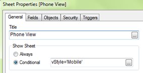
There are times when, as developers, we need to tailor the user experience based on a device (i.e. Desktop vs Mobile). In the GPS – Store Finder app on demo.qlik.com, we do just that. Based on the values of conditional expressions on the sheet properties, we can give the user a more desired experience.
The version of the app on the demo site uses a mobiledetect extension that checks to see through which device type the user is accessing the application. It then sets a variable (vStyle) to either Mobile or Desktop.
The app also uses non-traditional navigation by hiding the Tabrow.
Setting the conditional show sheet expression to only show when the variable vStyle=’Mobile’ hides the sheets designed for the Desktop and allows the user to experience the Mobile version of the app.
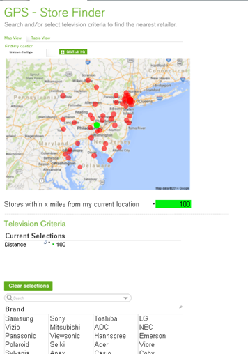
Mobile Version
This is set up to fit nicely on a mobile phone with a vertical scroll and larger fonts to assist in better navigation.
Conversely, setting the conditional show sheet expression to only show when the variable vStyle=’Desktop’ hides the sheet designed for Mobile and allows the user to experience the Desktop version of the app.
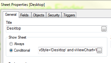
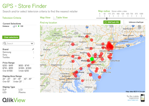
Desktop version
Designed with a more traditional approach with the list boxes on the left and the viewing area set within the 1024x768 screen resolution.
By taking advantage of the conditional expression for a sheet, we were able to customize the user experience and, in essence, create one application to handle multiple client types. Another example of the use of conditional expressions to show/hide sheets based in device is the Insurance Demo which can also be found on demo.qlik.com.

-
A Historical Odyssey: The Doctors’ Special
Already when we were selling QlikView 3, we had received a fairly advanced customer demand from pharmaceutical companies. We solved it. And here’s how... Show MoreAlready when we were selling QlikView 3, we had received a fairly advanced customer demand from pharmaceutical companies. We solved it. And here’s how we did it. But first some background:
In the pharmaceutical industry, the sales reps are not the ones that sell the products. Instead, they visit physicians and demonstrate one or several products. Days, weeks or months later, the physician prescribe the demonstrated medicine to a patient, and the actual sale takes place when the patient buys the drug at a pharmacy.
The demand on QlikView was to show pharmacy sales data, not only per physician, but also per physician visited once, twice, three times, etc. In other words, the physicians should be grouped by number of visits, and this number should be used as dimension in a QlikView chart. A nested aggregation.
For QlikView 4 we had a solution for this. Well, solution is perhaps not the right word… There was a kludgy, hidden feature with which you could use a count of a field as dimension. Internally it was called the Doctor Controls.
First you had to enable this feature in the list of hidden settings.
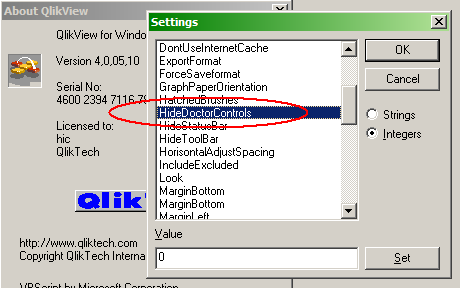
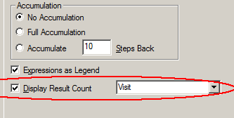
Then you could create your chart: Count(Visit) per Physician. After that, you needed to enable the “Display Result Count” in the chart:
The left graph shows graph as-is – without the “Display Result Count” enabled. It shows the distinct count of visits per physician, just as the dimension and expression of the chart are defined.
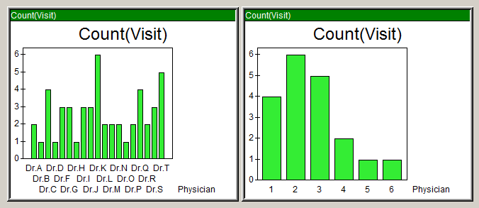
But, by turning on the “Display Result Count”, the chart transformed into the right graph: The displayed dimension was now the equivalent to an Aggr(Count(Visit),Physician) and the displayed expression was Count(Physician).
We solved a customer’s problem at the time, but this was not a good, long term solution. And it was nothing we wanted to support. Instead we wanted a general solution for nested aggregations. Six years later – after much thinking – Håkan (the Inventor) came up with the Aggr() function for QlikView 7. It is a general function for nested aggregations that made the Doctors’ Special redundant.

But like a relic from the past, the Doctor Controls setting can still today be found in the QlikView 11 list of hidden settings. It doesn’t affect anything - I hope.
Further reading on the Qlik history:
A Historical Odyssey: Quality - Learning - Interaction - Knowledge
-
“Attractive things work better”
“Attractive things work better” says usability expert Don Norman in his article Emotion & Design. I fully agree with this statement since I have seen ... Show More
“Attractive things work better” says usability expert Don Norman in his article Emotion & Design. I fully agree with this statement since I have seen and experienced myself how something that is attractive can turn on a switch inside my brain by which I tend to overlook flaws and problems and re-prioritize what I want.
I use the iPhone analogy a lot but have you ever thought why the iPhone is so popular among people? It is not only because of its colorful and seamless interface but also because of the way the body of the phone is crafted that you feel like you want own it. And why do we want to own those expensive, sleek cars that don’t give a good mileage and also aren’t very economical? Because they make us feel good and attract people around us which makes us feel even better since it reflects something about our personality.
So we all know that attractive things are certainly more preferred than not so attractive things, but why would they work better? In many of the experiments that scientist have conducted to study the human psychology, they have all found that emotion has a huge role to play in how we perceive things and how we solve problems. Positive emotions broaden the thought processes and enhance creative thinking. So how does that make something easier to use? Simple, when people feel good about something it makes it easier for them to find solutions to the problems they encounter.
Considering the theory above, QlikView applications that we design should work the same way. The more attractive they are the more the customers will like them, will like to own them, and will like to use them. And the most important of all, they will be more tolerant to minor difficulties and issues. But that certainly doesn’t imply that it is okay to ignore the usability quotient. As I quote Don Norman “True beauty in a product has to be more than skin deep, more than a façade. To be truly beautiful, wondrous, and pleasurable, the product has to fulfill a useful function, work well, and be usable and understandable.”
To hear more on this topic you can watch this video.


