Unlock a world of possibilities! Login now and discover the exclusive benefits awaiting you.
Product Innovation
By reading the Product Innovation blog, you will learn about what's new across all of the products in our growing Qlik product portfolio.
Support Updates
The Support Updates blog delivers important and useful Qlik Support information about end-of-product support, new service releases, and general support topics.
Qlik Academic Program
This blog was created for professors and students using Qlik within academia.
Community News
Hear it from your Community Managers! The Community News blog provides updates about the Qlik Community Platform and other news and important announcements.
Qlik Digest
The Qlik Digest is your essential monthly low-down of the need-to-know product updates, events, and resources from Qlik.
Qlik Learning
The Qlik Learning blog offers information about the latest updates to our courses and programs, as well as insights from the Qlik Learning team.
Recent Blog Posts
-
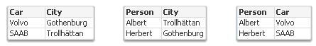
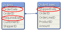
Circular References
There are two Swedish car brands, Volvo and SAAB. Or, at least, there used to be... SAAB was made in Trollhättan and Volvo was – and still is – made in Gothenburg.Two fictive friends – Albert and Herbert – live in Trollhättan and Gothenburg, respectively. Albert drives a Volvo and Herbert drives a SAAB.If the above information is stored in a tabular form, you get the following three tables:Logically, these tables form a circular reference: The fi... Show MoreThere are two Swedish car brands, Volvo and SAAB. Or, at least, there used to be... SAAB was made in Trollhättan and Volvo was – and still is – made in Gothenburg.
Two fictive friends – Albert and Herbert – live in Trollhättan and Gothenburg, respectively. Albert drives a Volvo and Herbert drives a SAAB.
If the above information is stored in a tabular form, you get the following three tables:
Logically, these tables form a circular reference: The first two tables are linked through City; the next two through Person; the last and the first through Car.
Further, the data forms an anomaly: Volvo implies Gothenburg; Gothenburg implies Herbert; and Herbert implies SAAB. Hence, Volvo implies SAAB – which doesn’t make sense. This means that you have ambiguous results from the logical inference - different results depending on whether you evaluate clockwise or counterclockwise.
If you load these tables into QlikView, the circular reference will be identified and you will get the following data model:
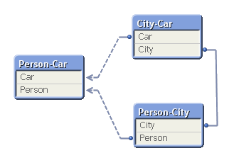
To avoid ambiguous results, QlikView marks one of the tables as “loosely coupled”, which means that the logical inference cannot propagate through this table. In the document properties you can decide which table to use as the loosely coupled table. You will get different results from the logical inference depending on which you choose.
So what did I do wrong? Why did I get a circular reference?
It is not always obvious why they occur, but when I encounter circular references I always look for fields that are used in several different roles at the same time. One obvious example is if you have a table listing external organizations and this table is used in several roles: as Customers, as Suppliers and as Shippers. If you load the table only once and link to all three foreign keys, you will most likely get a circular reference. You need to break the circular reference and the solution is of course to load the table several times, once for each role.
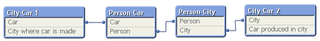
In the above data model you have a similar case. You can think of Car as “Car produced in the city” or “Car that our friend drives”. And you can think of City as “City where car is produced” or “City where our friend lives”. Again, you should break the circular reference by loading a table twice. One possible solution is the following:
In real life circular references are not as obvious as this one. I once encountered a data model with many tables where I at first could not figure out what to do, but after some analyzing, the problem boiled down to the interaction between three fields: Customers, Machines and Devices. A customer had bought one or several machines; a device could be connected to some of the machine types – but not to all; and a customer had bought some devices. Hence, the device field could have two roles: Devices that the customer actually had bought; and devices that would fit the machine that the customer had bought, i.e. devices that the customer potentially could buy. Two roles. The solution was to load the device table twice using different names.
Bottom line: Avoid circular references. But you probably already knew that…
Further reading on Qlik data modelling:

-
March Ahead: Qlik Cloud Data Integration's Latest Innovations
Buckle up, data wizards and dashboard divas! Our March release continues to deliver features so hot that it’ll melt the winter snow off your driveway. This month, we’ve focused on capabilities to enhance your data management user experience. So, let’s dive right in! -
Central Telefônica
Central TelefônicahorusIn this application, we evaluate and analyze all calls passing through the telephone exchange. Being able to analyze the entries, exits, and the time of these calls. Evaluate the distribution by state, average time per call, by extension and other visions for any differente cases.DiscoveriesWith this application it was possible to analyze the call time of each extension, consequently checking the calls that actually had com... Show MoreCentral Telefônicahorus In this application, we evaluate and analyze all calls passing through the telephone exchange. Being able to analyze the entries, exits, and the time of these calls. Evaluate the distribution by state, average time per call, by extension and other visions for any differente cases.
Discoveries
With this application it was possible to analyze the call time of each extension, consequently checking the calls that actually had communication. The number of rejected calls is a very important finding for monitoring.
Impact
The number of rejected calls is a very important finding for monitoring. Call analysis by Brazilian state
Audience
telemarketing, telephony
Data and advanced analytics
Separation of calls into Extension, Mobile and Fixed. As we have several area codes and different sizes of telephone numbers, this was a challenge.
-
New AI/ML Area in Forums!
A few more changes to the navigation including a new AI/ML area! -
Marching towards a Simplified Nav
Read more about our enhancements for February 2024. -
Welcome Priscila Papazissis-Qlik Educator Ambassador for 2024!
In this weeks blog we meet Priscila Papazissis, a new Educator Ambassador for 2024 as well as a Qlik Luminary for the second year! -
Making a Multilingual Qlik Sense App
A colleague of mine had translated two demos from the Demo Site to Japanese and wanted to know if we could post them on the Demo Site alongside the English versions. We decided that it would be best to combine the English and Japanese versions into one multilingual Qlik Sense app making it easier for us to add additional languages to the app as needed. It was an easy process and required only a few steps:Create a translation sheet with all the la... Show MoreA colleague of mine had translated two demos from the Demo Site to Japanese and wanted to know if we could post them on the Demo Site alongside the English versions. We decided that it would be best to combine the English and Japanese versions into one multilingual Qlik Sense app making it easier for us to add additional languages to the app as needed. It was an easy process and required only a few steps:
- Create a translation sheet with all the languages that will be available in the app
- Update the script to add a table of the translations and a list of the languages available in the app
- Add a Language filter pane to every sheet in the app that allows only one selected value
- Update sheet names, chart titles, subtitles and labels with an expression that will display the text in the selected language
Create Translation Sheet
To begin the process of making a demo multilingual, I created an Excel file with all the languages that are to be included in the app. Below is a snippet of the worksheet. The first column, Index, has a unique value which will be used in the charts and expressions to indicate what data should be displayed. The second and third columns are the languages to be used in the app. An additional column can be added for additional languages that need to be added to the app. In this scenario, I entered all the English text (sheet names, chart titles and subtitles, labels and text) and then using the Japanese version of the app, I entered the respective Japanese text. If I did not have the Japanese version of the app, I would have shared the Excel file with someone who could enter the Japanese translations for me. Preparing the Excel file in this format makes it easy to add additional languages to the app without having to update the QVF.
Snippet of Excel translation sheet
Update the Script
Once the translation sheet was created, it needed to be loaded into the data model. The script below is what I added to the demo.
On line 1, the HidePrefix system variable is used to hide all fields that begin with “#.” Starting on line 3, the Excel file is loaded. Once it is loaded, the vLanguage variable is set to the expression “=Minstring(#LANGUAGE).” This is an important step and we will take a closer look at this when we update the front-end. On line 13, the languages from the Excel file are loaded - users can select the language they would like to view from this list. These languages are then stored in the #LANGUAGE field which will be hidden from the user (since it starts with “#”).
Add Language Filter
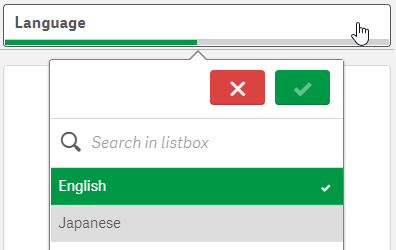
One each sheet in the app, I added a Language filter pane using the dimension #LANGUAGE that was created in the script. Once the script is reloaded with the HidePrefix variable, the #LANGUAGE field will not be visible, but you can still use it as the dimension in the Language filter pane. I needed to see the field temporarily so I commented out the HidePrefix line in the script and reloaded so I could change a setting on the field. I only want the user to be able to select one Language at a time, so I needed to check the “Always one selected value” checkbox in the Field settings of the #LANGUAGE field. (Right click on the #LANGUAGE field and select Field settings to see the window below).
Field settings dialog window
Once my settings are saved, I uncommented the HidePrefix line and reloaded the app to hide the #LANGUAGE field again. The filter pane will look like this (image below) and only one language can be selected at any given time. When a language is selected, the vLanguage variable (that was created in the script) will store the language. This variable is used later when updating the text in the UI.
Language filter pane
Update Front-End
Now the last step is to update everything in the app that should be translated. In this scenario, I updated sheet names, chart titles and subtitles, chart labels, KPI text and text on the sheets. Here is an example of how I updated the title of the Language filter pane. In the title field, I entered:
In the snippet below from the Excel translation sheet, the Index is 64 for the text “Language” which is why I used it in the expression above for the title of the Language filter pane. This expression will return either the English or Japanese translation for Language depending on the value of the variable vLanguage.
Snippet from Excel translation sheet
Another piece of information I would like to share is how I handled Text & image objects that needed to be translated. In the screenshot below, there is heading text and body text that have 2 different formats (font size and font color).
To handle this, I created two variables, one for the heading and one for the body and in the variables, I stored the translation expression.
This way, I was able to not only translate the text but format the text in a single Text & image chart two different ways.
As you can see, it is easy to make a Qlik Sense app multilingual and it is easy to update the app with additional languages as needed. Sales, Customer Experience & Churn and Supply Chain – Inventory & Product Availability are the two demos that were made multilingual. Check them out and switch between the languages to see the final results. If you are interested in doing this in QlikView, check out Chuck Bannon’s blog on this topic as well as making the data multilingual in a QlikView app.
Thanks,
Jennell
-
-
WhatsApp Automation Integration for Qlik Application Automation
WhatsApp Automation Integration for Qlik Application AutomationDataGlow ITWhatsApp is missing as a native delivery target from Qlik Application Automation. DataGlow IT have engineered a process to allow output WhatsApp as an alternative to delivery via Teams, Slack or Email. Utilising WhatsApp as a delivery target opens up multiple use cases for Customer and Consumer data delivery. Furthermore, there also exists the ability to have a configura... Show MoreWhatsApp Automation Integration for Qlik Application AutomationDataGlow ITWhatsApp is missing as a native delivery target from Qlik Application Automation. DataGlow IT have engineered a process to allow output WhatsApp as an alternative to delivery via Teams, Slack or Email. Utilising WhatsApp as a delivery target opens up multiple use cases for Customer and Consumer data delivery. Furthermore, there also exists the ability to have a configurable conversation via WhatsApp, optionally utilising further 2 way interactions with Qlik Application Automation.Discoveries
Share data from Qlik outside of the standard business delivery systems such as Teams, Slack and Email. Have conversations with your
Impact
Governed conversations, data and updates can now be shared to both Customers and Colleagues via WhatsApp, enabling them delivery and key data points from Qlik without needing Qlik licensing, or corporate comms infrastructure such as Teams or SharePoint.
Audience
Ideal for rolling out updates for Customers to WhatsApp directly from Qlik. Examples include delivering order status updates, surveys and regular KPI delivery.
Data and advanced analytics
Gather ultra-responsive feedback from clients and colleagues via a native and frequently used platform in WhatsApp.
-
Troubleshooting your Qlik Sense Installation or Upgrade
Hi everyone! This is now my second blog post! yeahhh!!!! And today I wanted to talk about a topic that is generating a lot of discussions in the Qlik Sense Deployment & Management space: Upgrades and Installations. -
Sunburst Chart Demo
Sunburst Chart Demo AnyChart Sunburst charts are greatly useful for visualizing hierarchical data. Explore their major features in this demonstration app powered by AnyChart's Sunburst Chart extension for Qlik Sense. Discoveries Discover how sunburst charts can help you. Explore multiple ways of displaying hierarchies and measures, drill-down, flexible labels, custom colors, center content, HTML tooltips, and more. Impact Experie... Show MoreSunburst Chart DemoAnyChartSunburst charts are greatly useful for visualizing hierarchical data. Explore their major features in this demonstration app powered by AnyChart's Sunburst Chart extension for Qlik Sense.Discoveries
Discover how sunburst charts can help you. Explore multiple ways of displaying hierarchies and measures, drill-down, flexible labels, custom colors, center content, HTML tooltips, and more.
Impact
Experience firsthand how an interactive sunburst chart can empower intuitive exploration of hierarchical data structures through a set of sliced concentric rings and how it can be tailored to specific needs.
Audience
Everyone looking to enable more efficient and insightful exploration of hierarchical datasets within their Qlik environment.
Data and advanced analytics
This app features sunburst visualizations powered by AnyChart's Sunburst Chart extension for Qlik Sense, using U.S. Census data for illustration.
-
Welcome back Blerim Emruli-Qlik Educator Ambassador for 2024!
This is Blerim's fourth year as a Qlik Academic Program Educator Ambassador! -

-
Canonical Date
A common situation when loading data into a Qlik document is that the data model contains several dates. For instance, in order data you often have one order date, one required date and one shipped date. This means that one single order can have multiple dates; in my example one OrderDate, one RequiredDate and several ShippedDates - if the order is split into several shipments: So, how would you link a master calendar to this? Well,... Show MoreA common situation when loading data into a Qlik document is that the data model contains several dates. For instance, in order data you often have one order date, one required date and one shipped date.
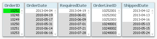
This means that one single order can have multiple dates; in my example one OrderDate, one RequiredDate and several ShippedDates - if the order is split into several shipments:
So, how would you link a master calendar to this?
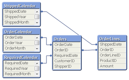
Well, the question is incorrectly posed. You should not use one single master calendar for this. You should use several. You should create three master calendars.
The reason is that the different dates are indeed different attributes, and you don’t want to treat them as the same date. By creating several master calendars, you will enable your users to make advanced selections like “orders placed in April but delivered in June”. See more on Why You sometimes should Load a Master Table several times.
Your data model will then look like this:
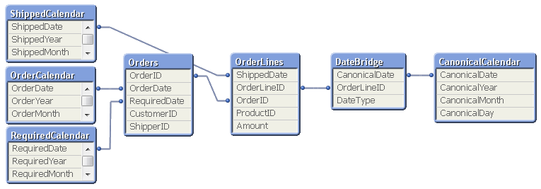
But several different master calendars will not solve all problems. You can for instance not plot ordered amount and shipped amount in the same graph using a common time axis. For this you need a date that can represent all three dates – you need a Canonical Date. This is how you create it:
First you must find a table with a grain fine enough; a table where each record only has one value of each date type associated. In my example this would be the OrderLines table, since a specific order line uniquely defines all three dates. Compare this with the Orders table, where a specific order uniquely defines OrderDate and RequiredDate, but still can have several values in ShippedDate. The Orders table does not have a grain fine enough.
This table should link to a new table – a Date bridge – that lists all possible dates for each key value, i.e. a specific OrderLineID has three different canonical dates associated with it. Finally, you create a master calendar for the canonical date field.
You may need to use ApplyMap() to create this table, e.g. using the following script:
DateBridge:
Load
OrderLineID,
Applymap('OrderID2OrderDate',OrderID,Null()) as CanonicalDate,
'Order' as DateType
Resident OrderLines;Load
OrderLineID,
Applymap('OrderID2RequiredDate',OrderID,Null()) as CanonicalDate,
'Required' as DateType
Resident OrderLines;Load
OrderLineID,
ShippedDate as CanonicalDate,
'Shipped' as DateType
Resident OrderLines;If you now want to make a chart comparing ordered and shipped amounts, all you need to do is to create it using a canonical calendar field as dimension, and two expressions that contain Set Analysis expressions:
Sum( {$<DateType={'Order'}>} Amount )
Sum( {$<DateType={'Shipped'}>} Amount )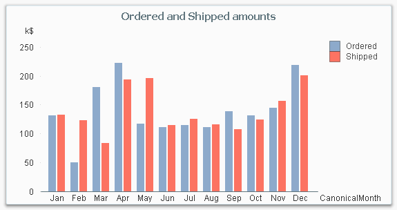
The canonical calendar fields are excellent to use as dimensions in charts, but are somewhat confusing when used for selections. For this, the fields from the standard calendars are often better.
Summary:
- Create a master calendar for each date. Use these for list boxes and selections.
- Create a canonical date with a canonical calendar. Use these fields as dimension in charts.
- Use the DateType field in a Set Expression in the charts.
A good alternative description of the same problem can be found here. Thank you, Rob, for inspiration and good discussions.
-
Special Event: Free Academic Program Webinar for Poland
Are you an Educator in Poland keen to learn about how you can get access to free Qlik software and learning resources? Join this exclusive webinar hosted by our Educator Ambassadors! -
Fiscal Year
A common situation in Business Intelligence is that an organization uses a financial year (fiscal year) different from the calendar year. Which fiscal year to use, varies between businesses and countries. [Wikipedia] But how would you solve that in QlikView?
-
Bed Invetory
Bed InvetoryGain Insights solution pvt ltdIts show the figure of bed inventory and how health care domain will workDiscoveriesWe deep drive into health domain and how the will do bed inventoryImpactIt impacts the how we done the business by the end and how we are doing our businessAudiencecount of beds Data and advanced analyticsGraphs of visualization -
Qlik Digest - February 2024
The buzz around AI continues to build. However, amongst all the noise is a definite feeling of information overload. So, it’s understandable that many data and analytics leaders remain uncertain of the technology’s real benefits and their road to adoption. -
More Reasons to Move to Qlik Cloud! Integrate with Application Automation, Gener...
Watch how I am serving our #QlikNation Community members, by not only analyzing their video suggestions BUT responding to them immediately from within this Qlik Cloud Analytics App. #mikedrop
-
Welcome Jacek Harazin - Qlik Educator Ambassador Class of 2024!
This week we welcome Jacek Harazin, one of two Educator Ambassadors from Poland, Jacek is a Lecturer in Big Data and Data Engineering at WSB Merito Universities in Poznań.