Unlock a world of possibilities! Login now and discover the exclusive benefits awaiting you.
Product Innovation
By reading the Product Innovation blog, you will learn about what's new across all of the products in our growing Qlik product portfolio.
Support Updates
The Support Updates blog delivers important and useful Qlik Support information about end-of-product support, new service releases, and general support topics.
Qlik Academic Program
This blog was created for professors and students using Qlik within academia.
Community News
Hear it from your Community Managers! The Community News blog provides updates about the Qlik Community Platform and other news and important announcements.
Qlik Digest
The Qlik Digest is your essential monthly low-down of the need-to-know product updates, events, and resources from Qlik.
Qlik Learning
The Qlik Learning blog offers information about the latest updates to our courses and programs, as well as insights from the Qlik Learning team.
Recent Blog Posts
-
Qlik Academic Program kicks off the Autumn term!
With most Universities starting the new academic year in Europe, the Academic Program has been visiting universities to deliver Qlik workshops and spread the word about our amazing resources. -
Formula 1
Formule 1 2Foqus A simple dashboard checking out the new lay-out container with a formula 1 dataset. Discoveries Lay-outcontainter, buttons, text-images Impact Just exploring the world 🙂 Audience For intern use Data and advanced analytics It's a first step to make better visual dashboards then we did before. Trying to make the world a better place with fancy dashboards. -
Dimensions and Measures
To make a chart in QlikView – or in any Business Intelligence tool, for that matter – you need to know what Dimensions and Measures are. But not all people have a clear picture of the difference between the two. So this week’s post will try to straighten out what’s what.
-
Monitoring Company Resource Consumption
Monitoring Company Resource Consumption Progesa Spa Our Qlik application serves as a powerful tool for monitoring water, energy, and heating consumption in a corporate setting. In addition to providing a detailed cost analysis, it highlights our commitment to energy efficiency and responsible resource management. Discoveries By analyzing data through the application, it is possible to identify consumption patterns that can help optimi... Show MoreMonitoring Company Resource ConsumptionProgesa Spa Our Qlik application serves as a powerful tool for monitoring water, energy, and heating consumption in a corporate setting. In addition to providing a detailed cost analysis, it highlights our commitment to energy efficiency and responsible resource management.
Discoveries
By analyzing data through the application, it is possible to identify consumption patterns that can help optimize resource allocation and reduce waste. The application can assist in evaluating the energy efficiency of business operations. Metrics and reports generated allow for identifying areas where improvements can be implemented to reduce costs and environmental impact.
Impact
By identifying and optimizing areas of energy and water consumption, the application can contribute to more efficient resource management, reducing operational costs associated with supplies. The application provides detailed data and reports that support informed decision-making regarding resource management.
Audience
Executives and operations managers can use the application to optimize resource usage, reduce operational costs, and enhance overall operational efficiency.
Data and advanced analytics
This application is crucial for a company's business as it enables daily monitoring and optimization of resource consumption, leading to cost reduction and improved sustainability practices.
-
Watch Q&A with Qlik: Qlik Replicate Best Practices!
Don't miss our previous Q&A with Qlik! Hear from our panel of experts to help you get the most out of your Qlik experience. SEE THE RECORDING HERE! Our experts held a Qlik Replicate Best Practices live webinar, answering all your questions about tips and recommendations for running Qlik Replicate implementations.
-
Welcome back Sumitra Pundlik - Qlik Educator Ambassador Class of 2024!
I feel pleased to introduce our new Educator Ambassador for 2024, Sumitra Pundlik from Marathwada Mitra Mandal College of Engineering, in the western Indian city of Pune. Sumitra has been an Educator since the last 15 years and is currently working as an Assistant Professor at Marathwada Mitra Mandal College of Engineering. Sumitra teaches various subjects related to Data Analytics such as DBMS, Advanced DBMS, Machine Learning, Big Data Analytic... Show MoreI feel pleased to introduce our new Educator Ambassador for 2024, Sumitra Pundlik from Marathwada Mitra Mandal College of Engineering, in the western Indian city of Pune. Sumitra has been an Educator since the last 15 years and is currently working as an Assistant Professor at Marathwada Mitra Mandal College of Engineering.
Sumitra teaches various subjects related to Data Analytics such as DBMS, Advanced DBMS, Machine Learning, Big Data Analytics. She has also taught R and Python Programming including different Business Intelligence and Data Analytics technologies including Qlik Sense.
Sumitra has been a member of the Qlik Academic Program since the last three years and has also successfully earned the Qlik Sense Business Analyst Qualification. After earning this qualification, she supported the learning journey of more than 400 students of different academic institutes like NMIMS,Hyderabad, VJIT Hyderabad,MIT ADT University and encouraged them to pursue Qlik Sense Business Analyst Qualifications.
According to her, “The Qlik Academic Program provides a great opportunity for students to access many online resources and different qualifications and certifications including Data Literacy, Qlik Sense Business Analyst and Qlik Sense Data Architect. The interactive material of the academic program helps students to excel in the field of data analytics”.
Further she adds, “I have been spreading awareness about the Qlik Academic Program and its benefits to other engineering colleges by conducting expert sessions via social media platforms”
Sumitra says, “Moving ahead, we are keen for internship and job opportunities for our students who have a good understanding of Qlik Sense and have earned the academic program qualifications.”
In Sumitra’s words, “Data literacy is my interest and I want to educate every data science enthusiast about the importance of data literacy.”
She feels it’s her mission to create more awareness about data analytics and encourage use of Qlik Sense. Data is the new fuel, and it is driving the current industry, she further adds.
When Sumitra is not teaching, she likes spending time with her son, Viraj. She is focusing on upskilling herself in recent trends, also taking care of her health and following a workout routine.
We are looking forward to working closely with Sumitra during her tenure as an ambassador and creating more links with Universities in Pune and rest of India.
-
Qlik Cloud Enhances Security and Compliance with IRAP & ISO
Qlik Cloud has recently strengthened its security and data privacy capabilities with two new ISO certifications, an IRAP assessment, and more! -
New Data Literacy Qualification now available!
Test you data literacy skills with our new Data Literacy Qualification, accessible to everyone with no expert level knowledge required! -
Building an advanced Visualization extension using Qlik's Nebula.js & D3.js.
In my last post, I discussed the robust capabilities of Qlik Sense(QS) APIs to build out-of-the-box visual metaphors and ways to integrate them within Qlik’s ecosystem. A natural choice for developers while building QS extensions throughout the years has been the Extension API primarily using vanilla JavaScript, jQuery and AngularJS.The Extension API consists of methods and properties used to create custom visualization extensions.Enter… Qlik Se... Show MoreIn my last post, I discussed the robust capabilities of Qlik Sense(QS) APIs to build out-of-the-box visual metaphors and ways to integrate them within Qlik’s ecosystem. A natural choice for developers while building QS extensions throughout the years has been the Extension API primarily using vanilla JavaScript, jQuery and AngularJS.
The Extension API consists of methods and properties used to create custom visualization extensions.
Enter… Qlik Sense’s Open Source Solution — Nebula.js!
Nebula.js is a collection of product and framework agnostic JavaScript libraries and APIs that helps developers integrate visualizations and mashups on top of the Qlik Associative Engine in QS Desktop, QS Enterprise on Windows, and SaaS editions of Qlik Sense. This tutorial specifically applies to the QS SaaS edition. Nebula.js offers developers an alternative to the 'Capability APIs' that have historically been used to create mashups. The tutorial will focus on developing a new visualization based on a user scenario using Nebula.js and the 3rd-party visualization library D3.js. Our target is to understand how we can leverage Nebula.js to build a QS extension object and bring in out-of-the-box visualization capabilities within the SaaS platform. This tutorial does not emphasize the D3.js programming part, but the motivation behind the visualization is discussed.
User scenario: An organization using Qlik Sense has a new requirement to develop a visual representation to understand high-dimensional mutlivariate dataset for their organization. Their dataset consists of numerical values, and they want to compare multiple features together to analyze the relationships between them. Based on these requirements, their Data Visualization Engineer presents to them the ‘Parallel Coordinate plot’.
So, what is a Parallel coordinate plot?
Parallel coordinate plots (PCP) have proved to be efficient in effectively visualizing high-dimensional multivariate datasets. In a parallel coordinate, each feature is represented as vertical bars and the values are plotted as a series of lines connected across each axis. Their advantage is that the vertical bars(features) can have their own scale, as each feature works off a different unit of measurement. PCP provides insights into specific hidden patterns in data like similarities, clusters, etc., and allows for more straightforward comparative analysis.
Based on the requirements, lets get started with building a QS extension using Nebula.js.
Prerequisites:
- Node.js(version 10 or newer)
- A terminal(for example, Git Bash on Windows or Terminal on Mac)
- An IDE of your choice, for example, VS Code.
- An existing web integration, or possibility to get one created in your tenant(this specifically applies to QS SaaS edition).
- A Qlik Sense app with data.
Step1: Use nebula.js CLI to import the necessary packages. The command scaffolds a project into the /hello folder with the following structure:
- /src
- index.js - Main entry point of this visualization
- object-properties.js - Object properties stored in the app
- data.js - Data configuration
- /test - Integration tests
- package.json
Command:npx @nebula.js/cli create hello --picasso none
Step 2: Start the development server by running:
cd hello
npm run start
The command starts a local development server and opens up http://localhost:8080 in your browser. The benefit of having the dev server with Nebula.js is that it provides an interactive way to test and edit your extension without the need to iteratively deploy in QS every time a new change is made.
Step 3: Configure the data structure.
Visualizations in QS are based on a hypercube definition(qHyperCubeDef ). Therefore, any new visual object we want to bring into the QS ecosystem needs to have the data structure defined. With Nebula.js, we have the object-properties.js file that allows defining the structure of our object.
const properties = {
  showTitles: true,
  qHyperCubeDef: {
    qInitialDataFetch: [{ qWidth: 30, qHeight: 200 }],
  }
}
We also need to set a data target in the data.js file so we refer to the right hypercube definition(important to note in case you have multiple qHyperCubeDef objects).
export default {
  targets: [
    {
      path:'/qHyperCubeDef',
    }
  ],
};
Step 4: Developing the visualization extension using Nebula.js and D3.js.
QS Nebula.js specific code:
Now that we have everything ready, we start developing our extension with the custom visualization object using the index.js file from our project.
Note that Nebula.js and its primary package @nebula.js/stardust is built on the concept of custom hooks. This might sound familiar to people working with React.js. Hooks is a concept that emphasizes reusable, composable functions rather than classical object-oriented classes and inheritance. The primary hooks that we are dependent on for developing our extension object are described below:
The method that helps us in rendering our visualization object is the component()function. The component() function is executed every time something related to the object rendering changes, for example, theme, data model, data selections, component state, etc. This function can be compared to the paint() function in the Extension API.
To render our data, we first need to access the layout through the useLayout hook and then use it in combination with the useEffect hook. The hypercube’s qDataPages[0].qMatrix contains all the data(dimension and measures) used in the QS environment, and we will need to pass this data to our D3.js-based visualization.
component() {
      const element = useElement();
      const layout = useLayout();
      useEffect(() => {
        var qMatrix = layout.qHyperCube.qDataPages[0].qMatrix;
      }
                }
To see the data values and understand the structure of the qHyperCube, it is always a good idea to do a console.log(layout). A snippet shows values specific to our use case. Every time a new dimension or measure is added to our extension object, qDataPages[0].qMatrix is updated with those values.
The required dimension values for our chart are then extracted from the hypercube using the qText property from qDataPages[0].qMatrix like below.
var data = qMatrix.map(function (d) {
          return {
            PetalLength: d[0].qText,
            PetalWidth: d[1].qText,
            SepalLength: d[2].qText,
            SepalWidth: d[3].qText,
            Species: d[4].qText,
          };
        });
Our next step is to define the width and height of the visualization object, and capture its id. We will use this id to bind it to our element object from the useLayout hook as shown below:
var width = 1000;
var height = 400;
var id = "container_" + layout.qInfo.qId;
const elem_new = `<div id=${id}></div>`;
element.innerHTML = elem_new;
Finally, we make a call to the D3.js function from within the useEffect hook.
viz(data, width, height, id);D3.js specific code:
The viz() function contains all of our D3.js code that allows us to draw a Parallel coordinate plot. First, we would need to append the SVG to the <div> that contains the id of our QS object, like below.
var svg = d3
          .select("#" + id)
          .append("svg")
          .attr("width", width + margin.left + margin.right)
          .attr("height", height + margin.top + margin.bottom)
          .append("g")
          .attr(
            "transform",
            "translate(" + margin.left + "," + margin.top + ")"
          );
We then get all of the dimensions except Species to build our x and y axes.
var dimensions = Object.keys(data[0]).filter(function (d) {
          return d != "Species";
        });

        var y = {};
        for (var i in dimensions) {
          var name_new = dimensions[i];
          y[name_new] = d3.scaleLinear().domain([0, 8]).range([height, 0]);
        }

        var x = d3.scalePoint().range([0, width]).domain(dimensions);
To draw the lines for our Parallel coordinate plot, we will need to build the path function that would take a row from our qHyperCube and return the x and y coordinates of the line.
function path(d) {
          return d3.line()(
            dimensions.map(function (p) {
              return [x(p), y[p](d[p])];
            })
          );
        }
And finally, we bind everything with our SVG like below:
svg
  .selectAll("myPath")
  .data(data)
  .enter()
  .append("path")
  .attr("class", function (d) {
    return "line " + d.Species;
  })
  .attr("d", path)
  .style("fill", "none")
  .style("stroke", function (d) {
    return color(d.Species);
  })
  .style("opacity", 0.5);
Step 5: Deploying the extension.
To build our project, we use the below command below to generates all QS readable files and puts them in a folder /hello-ext . This folder can then be compressed(.zip) and uploaded to the Extension section of SaaS console to be used within the QS environment.
npm run sense
Dashboard:
If you are just getting started with Nebula.js, https://qlik.dev is a great place to review the basics and drill-down on related functions.
This project’s source code is made available at: https://github.com/dipankarqlik/Nebula
-
The Reload Analyzer for Qlik Cloud Customers
“How can I monitor reloads across the tenant?” “How can I see what data connections and files are being used?” “How can I view reload concurrency and peak reload RAM over time?” To help answer these questions, we are happy to share with you the capabilities of our Reload Analyzer for Qlik Sense SaaS! The Reload Analyzer app provides insights on: Number of reloads by type (Scheduled, Hub, In App, API) and by user Data connections an... Show More- “How can I monitor reloads across the tenant?”
- “How can I see what data connections and files are being used?”
- “How can I view reload concurrency and peak reload RAM over time?”
To help answer these questions, we are happy to share with you the capabilities of our Reload Analyzer for Qlik Sense SaaS!
The Reload Analyzer app provides insights on:
- Number of reloads by type (Scheduled, Hub, In App, API) and by user
- Data connections and used files of each app’s most recent reload
- Reload concurrency and peak reload RAM
- Reload tasks and their respective statuses
- And much more!
(Available sheets)
The Reload Analyzer uses Qlik’s RESTful APIs to fetch all the required data and stores the history in QVD files, allowing for efficient reloads and historical analysis.
A few things to note:
- This app is provided as-is and is not supported by Qlik Support.
- It is recommended to always use the latest app.
- Information is not collected by Qlik when using this app.
The app as well as the configuration guide are available via GitHub, linked below.
- QVF: https://github.com/qlik-oss/qlik-cloud-reload-analyzer/releases/latest/download/reload-analyzer.qvf
- Release Notes: https://github.com/qlik-oss/qlik-cloud-reload-analyzer/releases/latest
- Installation Guide: https://github.com/qlik-oss/qlik-cloud-monitoring-apps/releases/latest/download/qlik-cloud-monitoring-applications-installation-guide.pdf
Any issues or enhancement requests should be opened on the Issues page within the app’s GitHub repository.
Be sure to subscribe to the Qlik Support Updates Blog by clicking the green Subscribe button to stay up-to-date with the latest Qlik Support announcements. Please give this post a like if you found it helpful!
Kind regards,
Qlik Digital Support Team
Additional Resources:
Our other monitoring apps for Qlik Cloud can be found below.
- App Analyzer
- Entitlement Analyzer
- Access Evaluator
- OEM Dashboard (for OEM Partners and multi-cloud tenants)
-
Removal of support for P12 key file with the Google BigQuery Connector in Februa...
Edited 29th of January, 15:00 CET, added information on how to migrate to use a JSON key file, as well as updated the release date for on-premise from February to May 2024.Edited 23rd of February, 15:10 CET, updated release date for Qlik Cloud release, which has been confirmed for the 6th of March 2024. Hello everyone, An upcoming update of the Qlik Sense Google BigQuery Connector will no longer support the use of a p12 file as the Key File. Thi... Show MoreEdited 29th of January, 15:00 CET, added information on how to migrate to use a JSON key file, as well as updated the release date for on-premise from February to May 2024.
Edited 23rd of February, 15:10 CET, updated release date for Qlik Cloud release, which has been confirmed for the 6th of March 2024.Hello everyone,
An upcoming update of the Qlik Sense Google BigQuery Connector will no longer support the use of a p12 file as the Key File. This is currently supported while Service Authentication is used as the OAuth mechanism. If you are using a p12 key file in the definition with this connection scenario, you will have to migrate to a JSON key file instead.
Why is this change being made?
The latest version of OpenSSL, 3.0, has deprecated p12 as a legacy function. Therefore, while the new connector version will have a new driver supporting OpenSSL 3.0, it cannot support p12 key files anymore.
How do I migrate to use a JSON key file?
The easiest way to migrate is to create a new JSON key file in the Google Console. Then, the new key file can be used in the connection definition replacing a currently used p12 file. See Google Cloud documentation for more details on how to create and delete service account keys.
When will this change take effect?
The updated Connector will be rolled out in Qlik Sense Cloud on the 6th of March, and in the May 2024 release of Qlik Sense Enterprise on Windows.
Thank you for choosing Qlik,
Qlik Support -
Showcase your Data Literacy Skills!
Ready to show off your foundational Data Literacy Skills? We’ve got you covered with the new Data Literacy Qualification Exam.
-
Marvel Hero's application - App Download Available
Marvel Hero's application - App Download Available RIC Showing the new Layout Container. Quick app - Total build time 1 hour- App Download Available Discoveries Marvel Heros Impact Amazing visuals using the new container Audience BI Developers Data and advanced analytics More a front end application -
Street Fighter 6 and Layout Container
Street Fighter 6 and Layout ContainerJOIN DATAUsing Layout Container without limits!DiscoveriesTesting Layout Container withot limits!ImpactDesign and creativityAudienceDevelopersData and advanced analyticsDesign and creativity -
Pokemon Qlik Sense
Pokemon Qlik Sense This is a Pokemon inspired application. Showcasing the new layout container Discoveries Abilities of the new layout container, Thinking outside of the box Impact Visuals make everything pop! Interaction is key Audience Bi Developers CEO CIO Marketing Business Users Data and advanced analytics This is more a visual presentation of the application -
Alternative State Use Cases
The purpose of this blog is to provide users with a few potential use cases for the ‘Alternative States’ feature within Qlik sense. For a full introduction and explanation of the feature please see Ouadie Limouni’s blog on the subject here. -
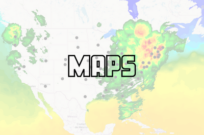
Working with Maps in Qlik Sense: Tips and Tricks
Qlik Sense Map charts are used to geographically display data related to countries, cities, states, regions, or particular geolocations (etc…). Maps offer different ways to present your data by first setting a base layer, then adding multiple layers to the map which are specific locations highlighted in multiple ways including Area, Points, Lines, Density, boundaries etc..You can add as many layers as you want. These layers are comprised of dimen... Show MoreQlik Sense Map charts are used to geographically display data related to countries, cities, states, regions, or particular geolocations (etc…). Maps offer different ways to present your data by first setting a base layer, then adding multiple layers to the map which are specific locations highlighted in multiple ways including Area, Points, Lines, Density, boundaries etc..
You can add as many layers as you want. These layers are comprised of dimensions and measures that allow to efficiently present geographical distribution of values related to locations in order to display a data story.
Types of layers:
- Point Layer: composed of bubbles or markers (you can choose a shape) positioned in specific coordinates (Lat / Long)
- Area Layer: geographic shapes sized and placed on specific areas
- Line Layer: connect two fields containing point data or a field containing geometries.
- Heatmap Layer: uses color gradient to show data density (intensity is greater at the center and declines towards the outer perimeter)
Base Maps:
Using different base maps can enhance the way data is displayed and aid in analysis. You can choose from:
- Default: Good for when using only 1 or 2 simple layers
- Pale: great for when you add multiple layers with different colors which might be difficult to read if using the default base
- Dark: good for when you color layers with bright colors, this style can also be used when it matches the rest of your dark themed dashboard.
- Satellite: gives a more realistic look to your map
- None: in this case, you can add custom background layers (covered later in this post)
Best Practices when designing Maps:
- Make your maps Simple to read:
- Be sure to use colors purposefully (stick to the default palette or use something like this https://jarrettmeyer.com/2018/08/07/viridis-color-palette)
- Use tooltips when necessary to provide more context when your layers are hovered.
- Change fonts and font colors when necessary, think about contrast between your layer coloring and the overlapping text font color.
- Think about the data you are visualizing:
- Continuous vs Discrete
- If visualizing two or more variable, it’s better to use color and size
- For instance, in a point layer showing office locations, you can color the point based on number of employees and size the bubble based on the Sum of sales made.
Advanced Uses:
Multi-Layer Maps:
When including multiple layers in map chart, it might become hard to interpret data. In that case, you can address this by controlling at what zoom levels different layers appear or have layers that appear only if other values in a drill-down dimensions are selected. This allows to create multiple levels of detail as you make selections and zoom in and out or locations of interest on the map.
- Zoom-Dependent Layer Display
Let’s create a map that relies on Zoom to reveal different layers.
- We start by creating the first layer as an Area layer to represent Countries and we color using the Sum(Sales) aggregated measure.
- We choose the Pale base type in order for the data to stand out more.
- Next, we add two new Point Layers
- First, to represent cities. We choose to color by measure using the Sum(Sales) aggregation.
- Second, to represent Customers. We choose the shape of the point layer to be a Triangle, and we color by Sum(Sales)
- Lastly, we configure the Layers to only show at certain zoom levels. We do that by changing the Layer Display “Show in zoom levels” property from Auto to Custom.
- Country Area Layer will show up until 4x zoom
- City Point Layer will show from 4x to 9x zoom
- Customer Layer will show starting at 10x zoom
The result:
- Drill-Down Layer Display
Let’s create a map that uses a drill-down dimension to display layers based on selection. Keep in mind that Drill-down dimensions should have the fields in order of highest geographical are to smallest geographical area.
- First, we create a Drill-down master dimension that contains three levels:
- Sales Region
- State
- Sales office
- Next, we add out 3 layers:
- An Area Layer for Sales Region: Choose the created Master Dimension as the dimension of the layer, and choose Sales Region.Area as the location.
- An Area Layer for the states.
- A Point layer for Sales offices.
- To enable the drill-down functionality. For each layer, navigate to Layer Options > Display. And change the “Visible drill-down levels” property from Auto to Custom and un-select the non-relevant layers, for instance:
The result:
Tip:
If you load data and it appears incorrect like below:
Head to Location, switch off Scope for location from Auto to Custom.
Change Location Type to “Administrative Area (Level 1)” in our case. Then, change Country to your location, in our example it’s ‘US’Multiple Background Layers:
To use custom base maps beyond the types mentioned above, you can add different background layers.
Let’s create a map with multiple background layers using a TMS and two WMS.
- First, we need to set the Base Map to non under Map Settings.
- Next, we add the first layer as a Background Layer and choose Format to be TMS
- We include the appropriate URL and attribution
- For the second and third layers, we use WMS server URLs, set the version and Load the WMS.
Important:
Keep in mind that when using URLs for TMS and WMS formats for background layers, these URLs that contain resource requests to external resources must have its origins allowlisted in the Content Security Policy, else the resource will not be loaded. WMS resources must have both image-src and connect-src directives allowlisted. More Info here.- Finally, we add a Point Layer.
The Result:
The QVFs for all three advanced examples can be found below. You can load them to your Qlik Cloud tenant, investigate the chart settings, and tweak the configurations to practice these concepts.
-
Demo App & Webinar
Decomposition Tree in Qlik AnyChart Ever feel overwhelmed by complex datasets, endless sheets & constant requests from business users? The solution's here: Meet the Decomposition Tree, a new rockstar chart in Qlik Sense worth a dozen! See the demo app & join the webinar on Feb 8th. Discoveries Enabling users to slice & dice metrics as they please, this game-changing visualization unlocks root cause analysis & ad-hoc exploration of com... Show MoreDecomposition Tree in QlikAnyChartEver feel overwhelmed by complex datasets, endless sheets & constant requests from business users? The solution's here: Meet the Decomposition Tree, a new rockstar chart in Qlik Sense worth a dozen! See the demo app & join the webinar on Feb 8th.Discoveries
Enabling users to slice & dice metrics as they please, this game-changing visualization unlocks root cause analysis & ad-hoc exploration of complex datasets on the spot.
Impact
Become a master at crafting smaller, yet more impactful dashboards that even non-techies can navigate intuitively. And while they explore & make decisions, just kick back, take a sip, and enjoy life.
Audience
BI Developers & Analysts; Managers & Heads of Visual Analytics & BI Solutions; Qlik Developers & Data Engineers; CIOs & IT Directors.
Data and advanced analytics
Elevate your data mastery & earn your business users' love for revolutionizing their data analysis journey!
🔗 > DOWNLOAD DEMO APP (.QVF) <
🔗 > JOIN WEBINAR: FEWER SHEETS, MORE INSIGHTS <
-
Announcing the 2024 class of Qlik Academic Program Educator Ambassadors!
The Qlik Academic Program is proud to announce our 2024 class of Educator Ambassadors. Academic Program Ambassadors are educators who champion the Qlik Academic Program at their universities and beyond, with a passion for preparing students for the data driven workplace.