Unlock a world of possibilities! Login now and discover the exclusive benefits awaiting you.
Analytics & AI
Forums for Qlik Analytic solutions. Ask questions, join discussions, find solutions, and access documentation and resources.
Data Integration & Quality
Forums for Qlik Data Integration solutions. Ask questions, join discussions, find solutions, and access documentation and resources
Explore Qlik Gallery
Qlik Gallery is meant to encourage Qlikkies everywhere to share their progress – from a first Qlik app – to a favorite Qlik app – and everything in-between.
Qlik Community
Get started on Qlik Community, find How-To documents, and join general non-product related discussions.
Qlik Resources
Direct links to other resources within the Qlik ecosystem. We suggest you bookmark this page.
Qlik Academic Program
Qlik gives qualified university students, educators, and researchers free Qlik software and resources to prepare students for the data-driven workplace.
Recent Blog Posts
-
【オンデマンド配信】ユーザー主導で実現!SAP データと DIVA データの活用
企業のビジネス活動において、データはこれまで以上に必要不可欠な資産となっています。増え続けるデータを管理・統合・分析し、データでアクションを起こす必要性が増している現在、成功している企業はどのようなデータ戦略を実行しているのか?本 Web セミナーシリーズでは、Qlik でデータからアクションを起こ... Show More企業のビジネス活動において、データはこれまで以上に必要不可欠な資産となっています。増え続けるデータを管理・統合・分析し、データでアクションを起こす必要性が増している現在、成功している企業はどのようなデータ戦略を実行しているのか?
本 Web セミナーシリーズでは、Qlik でデータからアクションを起こすデータ主導のビジネスで成功しているお客様より、課題から導入の経緯、デモンストレーション、活用例などをご紹介します。※ 参加費無料。パソコン・タブレット・スマートフォンで、どこからでもご視聴いただけます。
オンデマンド配信:
ユーザー主導で実現!SAP データと DIVA データの活用株式会社ニフコでは、2015年より BI ツールとして Qlik の利用を開始しました。SAP データを利用して、Qlik で世界各国の拠点における製造原価・販売金額の経営層向けレポートを作成。国内外の生産子会社での多品種にわたる製品ごとの原価管理の可視化を実現しています。SAP 未導入の海外子会社についても、各国通貨での限界原価管理を実施しています。
IT 部門に頼らず、財務・経理部が主体となって推進した「Qlik による SAP と DIVA データの活用の具体例」について、同社のご担当者よりアプリのデモを交えてご紹介します。 -
Qlik Digest - December 2023
Welcome to the December Qlik Digest newsletter. We have some exciting news and updates this month – 2023 Gartner® Magic Quadrant™ for Data Integration... Show MoreWelcome to the December Qlik Digest newsletter. We have some exciting news and updates this month – 2023 Gartner® Magic Quadrant™ for Data Integration Tools report is out, and we share news about upcoming webinars.
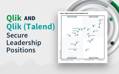
2023 Gartner Magic Quadrant is in, and so are we!
Could there be any stronger proof that Qlik and Talend were meant to work together than being recognized as a leader in Gartner’s Data Integration Magic Quadrant?
After making the list 8 years in a row, Talend has moved further along the visionary axis, while Qlik moved even further up the execution axis. The combined companies consistently scored in the top 5 across all Gartner defined use cases. See how this achievement translates into giving your data a leg up on the competition. #DoubleQlik
Webinar January 17: Data, Analytics, & AI Trends’24
Qlik Trend 2024 explores the top 10 hottest data, analytics, and AI trends, revealing what you need to know and do to stay ahead this year.
Unlock the Power of Data with Qlik Cloud
Have you had the chance to explore the transformative potential of Qlik Cloud? With offerings like advanced AI capabilities, seamless automation integration, and robust Machine Learning, this isn’t something you want to miss out on.
Check out our most recent Do More with Qlik webinar OnDemand to learn more.
Become a Qlik Insider
For the most recent product updates, tune in OnDemand to our Product Release webinar.
Here’s a small teaser: We announced the integration of Qlik Cloud with Amazon Bedrock, expanding customers’ ability to scale AI for impact.
Check out this press release outlining how.
Tips & Tricks of the Month
Are you feeling the pressure to raise your Data Analytics and Data Literacy game? This course may be the answer you are looking for. Become an analytics leader and get your digital badge in only 15 weeks. Learn more & register here.
-
New upload limits for zip files in Qlik Cloud extensions and custom themes
Hello Qlik Users, To strengthen the reliability of the Qlik platform, Qlik is introducing limits for themes and extensions uploaded to Qlik Cloud. Th... Show MoreHello Qlik Users,
To strengthen the reliability of the Qlik platform, Qlik is introducing limits for themes and extensions uploaded to Qlik Cloud. These limits will be introduced on January 24. Files which exceed these new requirements will fail to upload once the change has gone into effect.
Files uploaded before the change will continue to function as expected.
The new limits:
- Archive size: 30MB (currently: no limit) This is larger than any theme currently deployed to Qlik Cloud. We recommend making themes as small as possible to ensure they do not impact the load time in Qlik Sense.
- Max size of an individual file, uncompressed: 30MB (currently: 250MB) This is directly linked to the archive size.
- Max total size of all files in a theme or extension, uncompressed: 100MB. This value is based on the uncompressed size of items in the archive; in most cases, users will be limited based on the maximum archive size of 30 MB.
- Max number of files in archive: 500. If the theme or extension has more files than this, consider leveraging a bundler to build similar file types together.
We expect the impact to be minimal, if not non-existent, but you are recommended to verify all the themes and extensions currently being developed.
For more information, see Guardrails will be added to archive properties for Extensions and Themes APIs.
Thank you for choosing Qlik,
Qlik Support -
12 business days until 2024?!
Hello Qlik Community! Can you believe there are only 12 business days until 2024?! And some of those days are Holidays! The next few weeks are going t... Show MoreHello Qlik Community!
Can you believe there are only 12 business days until 2024?! And some of those days are Holidays! The next few weeks are going to fly by!
We’ve had a few enhancements in the Qlik Community over the past couple of months that I would like to share!
Leaderboards now on Forums
You can now see who ranks supreme for your favorite forum! Same as the homepage leaderboard, you can filter for different time periods. We encourage you to participate and share the love by giving a like to any response you deem worthy! Maybe one day your name will be at the top! 😊
You will find this component below the ‘Subscribe by Topic’ component.
Article dates move front and center (well, left aligned)
The 'Last Update', 'Updated By' and 'Created date' fields have moved from the ‘Version History’ component to underneath the title of the article.
Thank you to our Community MVPs for providing feedback on this change!
We want you to log in and participate!
If you’re not logged in, you cannot add value to the conversation! Log in to give likes to your peers, engage in conversations and ask questions. Earn badges when you engage by liking, replying, posting, and subscribing! Sue enjoys featuring rising stars in the Community so you could be next!
If you’re a customer, partner, MVP, or luminary, there are exclusive areas waiting for you! A new banner will remind you to log in so you get the most value. You’ll also see the leaderboards will prompt you to log in to view.
Let us know what you think of these enhancements in the comments below! We still have a couple more tricks up our sleeves so stay tuned. 😉
Your Community Admins,
Melissa, Sue, Jamie and Nicole
-
Introducing Qlik's intelligent AI assisted Conversational Analytics in Microsoft...
Great news! Qlik has recently introduced conversational analytics in Microsoft Teams. With our new Teams app, you can easily chat with Insight Adviso... Show MoreGreat news!
Qlik has recently introduced conversational analytics in Microsoft Teams. With our new Teams app, you can easily chat with Insight Advisor, Qlik's intelligent AI assistant, to explore data using natural language directly within Teams.
Users can now ask questions through individual or group chat, and Qlik will respond with AI-generated data visualizations and insights using data from across your Qlik apps. And because it's Microsoft Teams, you can collaborate with others in real-time, collectively making decisions using the insights generated by Qlik. Insight Advisor within Teams provides a powerful new way to help more people find the right answers, make better decisions and collaborate together where and how they work.
Look for the Qlik app in the Teams App Store to get started.
Want to know more about Qlik's Conversational Analytics in Microsoft Teams?
We have put together resources to help you get started.
Video tutorials (SaaS in 60):
Introduction to Qlik Conversational Analytics in Teams
Microsoft Teams Integration Setup - Part 1
Microsoft Teams Integration Setup - Part 2Qlik Documentation:
Accessing Insight Advisor Chat through external collaboration platforms
Exploring app content with conversational analytics in Microsoft Teams
Managing connections to external collaboration platforms
Availability of the Qlik chatbot app in Microsoft TeamsThank you for choosing Qlik,
Qlik Support -
Qlik Sense November 2023 (Client-Managed) now available!
Visualizations and dashboards New text object extension A new flexible text object is now available via the Dashboard bundle. You can now style text w... Show MoreVisualizations and dashboards
New text object extension
A new flexible text object is now available via the Dashboard bundle. You can now style text with advanced settings, add measures, and also insert tables.
AI Enhanced Insights: Updated Natural Language Insights object
The Natural Language Insights object has been updated to offer better functionality, improved insights, and native support for all Qlik Cloud features.
In addition to manually configuring the context with dimensions and measures, you can now directly select a desired chart and insights will automatically reflect it, providing an easy way to add readouts and interpretations for a visualization.
The object now fully supports the Qlik Cloud UI in multiple languages, accessibility requirements, and reporting / exporting, and has been moved to the standard charts pane.
With Natural Language Insights, you can boost data literacy by helping users better understand the most important takeaways from their visualizations and analytics, driving better decisions at all levels.
Improved font handling
The handling of fonts has been improved. You now a get a preview of the font in the drop down. Open-source fonts are bundled, so that fonts are rendered the same everywhere: on screen, in printing and in image downloads.
Old dashboards will still look the same, new fonts are only engaged if the app developer is actively going in and changing. You can use your own fonts, make a custom theme and include your font.
Line object
The new line object gives users the ability to draw simple lines on sheets to add more customization and detail to sheets. The line object can be used to separate or group content within a sheet and to create bespoke dashboards. It also includes several customization capabilities, including the ability to adjust the design, width and color of the lines.
Data window functions in engine load script
Customers can now perform complex calculations on their data tables in the Qlik load script to perform aggregation on different partitions without losing the granularity of their data.
This functionality is commonly used in SQL and with many ML data preparation use cases.
Downloading as image for straight table in Visualization bundle
Essential for usability of the new Nebula-based straight table, you can now take snapshots, download as an image, download as a PDF, monitor in the hub, and subscribe.
Styling for KPIs
More styling options are now available for the KPI Object, which include Name and Value labels. Adding flexibility and customization, options include font family, color, and style (bold, underline, italicize).
Hide or show measures in a line chart based on conditions
New line chart options have been added, allowing application developers to enable toggling across different dimensions or measures within the same chart. The ability to add a simple toggle switch using the show condition expression gives developers more control, improves customization, and saves space. Users will appreciate significant time savings with the ability to toggle across the variables associated with their line chart data.
New filter pane settings
The filter pane now has a setting to opt out confirmation, which is especially nice if in grid mode and the filter pane act as a button bar.
Qlik Insider Webinar
Considering the move to SaaS? Check out the Qlik Insider webinar on December 6th and explore the power of AI in data and analytics as we dive into the latest enhancements for the last quarter of this year. -
Assess Your Qlik Skills and Get Started with Personalized Training Recommendatio...
Become a power user by assessing your skill level and receive personalized training recommendations. All for Free! Assess Your Skills Qlik Sense As... Show MoreBecome a power user by assessing your skill level and receive personalized training recommendations. All for Free!
Qlik Sense Assessments:
Take either the Business Analyst, Data Architect or System Administrator Assessments:
Once you take the 10- 25 question assessments, you will be provided with personalized training recommendations.
Data Analytics Assessment:
Access your Data Analytics Skills.
Want your team to take the assessments?
Understand everything your team has mastered. And determine the training needed to help people harness the full power of Qlik and your data. The more skilled your team becomes, the more value your organization can extract from even the most intuitive software.
Happy Learning!

-
Qlik Sense Workshop Queen Mary University London
Queen Mary University London is a Russel Group university that is ranked 16th in the UK. At the end of November we were invited to lead a Qlik Sense w... Show MoreQueen Mary University London is a Russel Group university that is ranked 16th in the UK. At the end of November we were invited to lead a Qlik Sense workshop with Masters students studying Marketing & Digital Analytics. The aim of the course is to give students an insight into marketing and its relationship with the online data economy. The students who enroll on this course come from various different disciplines, some are already working and others are completing studies in areas such as marketing and communication. This workshop was led by Scott Wilkinson, Partner Enablement Manager and supported by Technical Trainer Piter Harb.
We had around 70 students attend the session and since we had already delivered an introductory lecture a couple of weeks previously, we could use the full time for the workshop. One of the first elements we always introduce to the students is the Insight Adviser. This demonstrates to students how they can use natural language to ask questions of their data and generate answers and visualizations. They can then add these generated visualizations to a sheet in Qlik Sense to start creating their dashboard. Once they have added all the necessary visualizations to their sheet, we introduce them to how they can use the storytelling functionality in Qlik Sense.
Once we covered the Insight Adviser we guided students through loading their own data into Qlik Sense and building visualizations from scratch. At this point we also cover the data manager so that the students can understand how to create and edit associations between tables. We then introduced the concepts of dimensions and measures and encouraged students to create their own. The students achieved a lot during the 1 and 45 minutes that we had with them, with many asking about how they could continue their learning after the session.
To learn more about the Qlik Academic Program, visit out website: Qlik.com/academicprogram
-
【オンデマンド配信】生成 AI は信頼できるのか?データは量から質の時代へ
データは量から質への転換が求められる AI ブームの真っ只中、生成 AI は新たな生産性と発展の時代へ導く要素として期待が高まっています。期待を実現に変えるには、より優れた信頼できるデータを生成する新しいモデルが必要です。2024年のデータ・分析・AI のトレンドとは?競争優位性を高めるために押さ... Show Moreデータは量から質への転換が求められる
AI ブームの真っ只中、生成 AI は新たな生産性と発展の時代へ導く要素として期待が高まっています。期待を実現に変えるには、より優れた信頼できるデータを生成する新しいモデルが必要です。2024年のデータ・分析・AI のトレンドとは?競争優位性を高めるために押さえておくべきポイントとは?
来たる 1月 17日(水)、Qlik は「 Web セミナー:生成 AI は信頼できるのか?データは量から質の時代へ」を開催します。2024年のキーワードは、「信頼」です。ビジネスに影響をもたらすデータ・分析・AI のトップ 10 トレンドを探掘りしてご紹介します。
※ 参加費無料。パソコン・タブレット・スマートフォンで、どこからでもご視聴いただけます。日本語字幕付きでお届けします。
ビジネスにおける AI の信頼性
AI は、意思決定のスピードや精度の向上に革新をもたらします。従来型 AI と生成 AI を確実に活用するために必要な準備とは?押さえておくべきポイントをご紹介します。信頼できるデータ=価値あるデータ
データを 2 度収益化するには?
まず、データで収益の増加につながる意思決定の向上が可能になります。そして、データを取引可能な商品として確立することです。 -
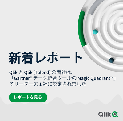
【新着レポート】Qlik と Talend の両社が データ統合分野でリーダーの 1 社に!
「2023年 Gartner® データ統合ツールの Magic Quadrant」が発表になりました。Gartner 社は 21 社のデータ統合ベンダーを評価し、Qlik と Talend の両社を データ統合分野でリーダーの 1 社に認定しました。Talend は、これで連続 8 年目になります... Show More「2023年 Gartner® データ統合ツールの Magic Quadrant」が発表になりました。
Gartner 社は 21 社のデータ統合ベンダーを評価し、Qlik と Talend の両社を
データ統合分野でリーダーの 1 社に認定しました。
Talend は、これで連続 8 年目になります。本レポートで、データ統合市場の全容とツールの簡単比較、各企業が Gartner® 社の
定める「ビジョンの完全性」と「実行能力」の基準に、どの程度適合しているのか
をご確認いただけます。- リアルタイムのデータで、より迅速に優れたインサイトを獲得:
広範なシステムから最新のデータを継続的に提供します。 - 素早くデータを提供:
データウェアハウスおよびデータレイクを自動化して、迅速なアクションを
促す、分析に適したデータを提供します。 - 信頼できるエンタープライズ対応データ:
データの取り込みから公開まで、すべてのデータを正確で安全に保ち、
カタログ化します。
- リアルタイムのデータで、より迅速に優れたインサイトを獲得:
-
Techspert Talks - Exploring Data Essentials with Qlik Cloud
Hi everyone, Want to stay a step ahead of important Qlik support issues? Then sign up for our monthly webinar series where you can get first-hand insi... Show MoreHi everyone,
Want to stay a step ahead of important Qlik support issues? Then sign up for our monthly webinar series where you can get first-hand insights from Qlik experts.The Techspert Talks session from December looked at Exploring Data Essentials with Qlik Cloud.
But wait, what is it exactly?
Techspert Talks is a free webinar held every month, where you can hear directly from Qlik Techsperts on topics that are relevant to Customers and Partners today.In this session, we cover:
- Navigating the Qlik Cloud Hub
- Leveraging Collaboration tools
- Best practices for finding insights
Click on this link to see the presentation.

-
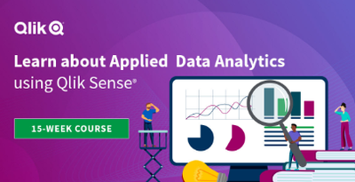
Get Your Digital Badge as a Data Expert!
New data is being created everyday as we carry on our daily activities and interact with the world. There is possibly no industry that doesn’t deal wi... Show MoreNew data is being created everyday as we carry on our daily activities and interact with the world. There is possibly no industry that doesn’t deal with data.
- The average person generates 1.7 MB of data per second.
- 97.2% of businesses are investing in big data and AI.
- The average company analyzes 37- 40% of its data.
- Around 95% of companies say their inability to understand and manage data is holding them back.
Exponential growth of data opens the door of opportunities and the competitive advantage to those who know who to use it. A data-informed mindset is essential to deliver the insights and transform organizations.
- When you base decisions on data, are you sure you are using the right data?
- Are you sure you are asking the right questions of the data?
- Are you confident in turning business questions into analytical questions?
- Are you challenging assumptions you have with the data? Are you sure you have enough context from the data to ensure it is not telling you only part of the story?
- Are you confident in using techniques to help mitigate any unconscious bias you may have when interpreting the data and insights?
With Qlik’s Analytics Expert Program “Applied Data Analytics using Qlik Sense”, you will not only learn data analytics best practices but also learn how to achieve a data-informed mindset that shifts you from just looking for data and information to looking for insights and knowledge.
You will learn best practices in data analytics, data literacy and data-informed decision making that help you make the most effective use of Qlik Sense. In just 15 weeks, you will be on your way to become a leader in developing a data-driven culture in your organization.
Learn More and Register to get started and save your spot today!
-
Qlik Sense Hub and QMC with a custom SSL certificate
If you’ve just installed Qlik Sense Enterprise, then this image probably looks familiar. Alternatively, Chrome might display The site's security cert... Show MoreIf you’ve just installed Qlik Sense Enterprise, then this image probably looks familiar. Alternatively, Chrome might display The site's security certificate is not trusted, while Firefox may report This Connection is Untrusted.
By default, Qlik Sense uses a self-signed certificate to enable HTTPS access across both the Hub (https:// YourSenseServer/hub) and the Management Console (https://YourSenseServer/qmc). But self-signed certificates cannot be validated or trusted by web browsers and tend to prompt a warning message.
That's alright though. All we need is the following:
- An additional (signed) certificate.
- A brief (5 minute) downtime of the Qlik Sense Proxy.
- And, I suppose, this blog post for the instructions.
So, let’s get started.
What is the current certificate used for?
During the initial install, the Qlik Sense Repository Service creates a set of certificates. Their purpose is to:
- Secure Service Communication and Service Authentication.
Qlik Sense uses certificates to authenticate its service across all nodes. See the Qlik Sense Online Help for details. In addition, other products (such as Qlik NPrinting) require these certificates to be establish a connection.
- HTTPS enabled access for the Hub the QMC.
Note: We will not modify, replace, or remove the originally created certificates. Doing so will break service communication.
What we’ll do instead is to add an additional one.
Certificate options, or: What type of certificate is right for me?
There are three possible types of certificates for us to use.
- A certificate purchased from and signed by a trusted CA (Certificate Authority) such as VeriSign, Thawte, Geotrust, etc.
- A certificate provided and signed by your own Enterprise CA (Certificate Authority).
- And, of course, a self-signed one. Those can be created by any number of applications, such as Microsoft IIS, but is generally only recommended for test environments. More so, it has the potential side effect of teaching users to ignore browser warnings, which we do not want.
Requirements, or: What to look out for when getting your cert.
- The certificate itself must contain a private key
- Has an up to date valid from / valid to date range
- Is signed by a valid and OS or browser configured Certificate Authority
When support gets questions, they are most often related to a certificate missing the private key. Always verify the certificate comes bundled with one when you install it.
It’ll look like this:
As far as formats and algorithms are concerned, the following are confirmed to work with Qlik Sense:
- Certificates that are x509 version 3
- Use signature algorithm sha256RSA
- Use signature hash algorithm sha256
Where to get a certificate and how to do a CSR?
The Certificate Authority you chose will have instructions for this, and if you are looking to get a self-signed one or one from your corporation's CA, then a local administrator can provide the certificate to you.
Either way, you are going to need to generate a Certificate Signing Request (CSR) to pass on to your CA. There are tools out there to get that done with, such as certreq from Microsoft (found here), and SSLhopper has a great article on that, which I often send to customers when they ask us about CSRs and how to do them.
Once you obtain the certificate, we'll move on to installing it and activating it in Qlik Sense. This will be done in three quick steps:
- Import
- Get the Thumbprint
- Provide Thumbprint to the Proxy
Importing the Certificate
As mentioned before, we are not replacing certificates. The already existing ones will not be deleted. Doing so would break service authentication between the individual Qlik Sense services and render the system… broken.
Step 1:
On the Qlik Sense node running the Qlik Sense Proxy, log on with the user running the Sense services. This is important since the certificate needs to be accessible for this account.
Step 2:
If the certificate was saved in the .pfx format, then all you need to do is double click the file. Follow the prompt to import the certificate into the Personal store.
Longer Step 2:
If you want to import it manually or verify if it was correctly installed, then we'll need to do a little more work.
- Launch the Microsoft Management Console (mmc.exe) on the Proxy node
- In the MMC, go to File > Add / Remove Snap-in...
- Select Certificates and click Add
- Select Computer account, click Next, select Local computer and click Finish
- In the MMC, go to Certificates (Local Computer)/Personal
- In the MMC, go to Actions > All Tasks > Import...
- Browse to the certificate file provided to you from your CA
- Follow the instructions on the screen to import the certificate, including the private key
- Verify the new certificate has been imported into Certificates (Local Computer) > Personal > Certificates and that it contains a private key
- Double-click the Certificate > Certification Path and confirm it shows "This certificate is OK"
Getting the Thumbprint
Well, since we are already in the MMC, let's open the freshly installed certificate again.
- Switch to the Details tab and scroll down until you find Thumbprint
- Mark the entire thing and copy it into, for example, Notepad.
Configuring the Qlik Sense ProxyAlmost done!
- Open the Qlik Sense Management Console (QMC)
- Go to Proxies
- Double click the Proxy you want to use (or select and choose Edit)
- Enable the Security options in the Properties panel on the right
- Paste the certificate Thumbprint into the SSL browser certificate thumbprint text box.
Click Apply.
The Sense Proxy will now restart. During the restart, it will be using Windows API calls to correctly bind the new certificate to its SSL ports.
Verification, or: How to prove the certificate was accepted.
In the web browser:When opening the Qlik Sense Hub or QMC, the certificate will now be displayed in the browser. This may look different depending on the web browser, but in Google Chrome you can click the padlock to the left of the URL to verify what certificate is used.
The information displayed needs to match the properties of the certificate you installed.
In the log files:
If you’d rather see what the Qlik Sense Proxy service is doing, then you can directly check up on that, too.
On the Proxy node, go to C:\ProgramData\Qlik\Sense\Log\Proxy\Trace and open the Security log file from just after the last start.
It will now print a slightly different message than before:
Security.Proxy.Qlik.Sense.Common.Security.Cryptography.LoggingDigester DOMAIN\_service Setting crypto key for log file secure signing: success
Security.Proxy.Qlik.Sense.Common.Security.Cryptography.SecretsKey DOMAIN\_service retrieving symmetric key from cert: success
Security.Proxy.Qlik.Sense.Common.Security.Cryptography.CryptoKey DOMAIN\_service setting crypto key: success
Security.Proxy.Qlik.Sense.Communication.Security.CertSetup 'CN=localhost' (08C871933A58E072FED7AD65E2DB6D5AD3EAF9FA) as SSL certificate presented to browser, which is a 3rd party SSL certificate
And that's it!
There isn't much more to it in a standard Qlik Sense Enterprise installation, but if you have more questions, then maybe a few of these articles can help:
I applied my certificate and it seems to be using it correctly, but browsers are still saying the Common Name is Invalid?
ERR_CERT_COMMON_NAME_INVALID when using 3rd party certificate
Qlik Sense keeps reverting to the default and complains it can't find a valid ssl certificate with the thumbprint.
The certificate may not have a Private key or the service account does not have access to it.
How to: Manage Certificate Private Key
The Qlik Sense Service account doesn't have admin privileges and the certificate is not accepted.
I hope that this was useful 😊 Stay tuned for an upcoming post where we’ll focus on QlikView and how to enable HTTPS for its AccessPoint, and don’t forget to subscribe to this blog for more content delivered by #QlikSupport. We’ll be watching for your comments and questions and we’ll to get back to you as soon as possible. Your feedback is always appreciated.
-
Dealing with variables in a Mashup using Nebula.js & Enigma.js (alternative to V...
Modern Embedded Analytics solutions using Qlik offers a stack of open-source libraries to build customized analytical platforms backed up with the rob... Show MoreModern Embedded Analytics solutions using Qlik offers a stack of open-source libraries to build customized analytical platforms backed up with the robustness of Qlik’s Associative Engine. These new mediums facilitates communication with the Engine and provides the flexibility to develop your own client and services or to integrate visualizations and mashups. Historically, Capability APIs have been extensively used to build mashups and perform application related operations. An alternative offering to Capability API-based operations is Nebula.js and Enigma.js.
To clarify the use of each of these libraries, let’s breakdown their functionalities in a simplistic way to help the developer community to get started with them.
In this tutorial, we are going to focus on a user scenario that involves applying both Enigma.js and Nebula.js. This way we can have a fair idea of their applications and get started with their immense capabilities.
User scenario: A company needs to build its own analytic solution while being able to leverage data from Qlik’s Associative engine and embed a couple of visualizations. The overall goal is to have some buttons in their webpage that would control the ‘dimensions’, allowing them to render the visualizations based on the buttons’ click. They have approached a similar type of situation in the native Qlik Sense using ‘variables’ and they would like the same capability in their own web solution.
Solution: Since the company has taken advantage of ‘variables’ in the native QS, a similar approach for their web solution using the two libraries would be the following:
- Create a Mashup template using Nebula.js.
- Fetch the variable and its definition from QIX using Enigma.js.
- Load and register QS objects(action-button, charts) using Nebula’s stardust package.
- Consume the fetched variable in the ‘action-button’ and render.
- Integrate all the required visualizations from QS in the mashup.
Let’s go through each of the steps in detail to understand how we can implement them -
Step 1 — Creating Mashup template: In this tutorial, the focus is not on developing mashups but to implement the user scenario. A very simple tutorial to get started with developing mashups is on the official Qlik Developer site. Link: https://qlik.dev/tutorials/build-a-simple-mashup-using-nebulajs
Using the command line interface, we create a web project that has the following structure -
/src
- configure.js - Initial configuration of nebula.js
- connect.js - Connection setup with enigma.js
- index.html - A html page template
- index.js - Connect and visualize
Step 2 — Fetch the variable using Enigma.js: Like I discussed, Enigma.js allows us to communicate with the QIX engine and enables us to perform CRUD(create, read, update, delete) operations on QS apps and their entities. Since in this case, our target is to read a variable named ‘vChangeField’ from a QS app, we first create an object with list definition like below:
 const variableListProps = {
    qInfo: {
      qId: "VariableList",
      qType: "VariableList",
    },
    qVariableListDef: {
      qType: "variable",
      qData: {
        tags: "/tags",
        name: "/",
      },
    },
  };
In order to create the list object that we have defined, we use the createSessionObject() method provided by Enigma.js. After that, the properties of the object, including dynamic properties are retrieved using the getLayout() function and passed on to a passVariable(layout) like below:
 const variableListModel = await app
    .createSessionObject(variableListProps)
    .then((model) => model);

  variableListModel.getLayout().then((layout) => {
    passVariable(layout);
  });
Now that we have the object properties in the layout, the next step is to retrieve the ‘variable’ inside our function passVariable() and use it on the ‘action-button’ that we will create for our mashup.
 function passVariable(layout) {
    const {
      qVariableList: { qItems: data },
    } = layout;
    var pass_need = data[1].qName;
 }
So, we finally have our desired variable stored in ‘pass_need’. This is all we had to do to fetch our variable using Enigma.js.
Step 3 — Load and register ‘action-button’ and other charts: Our next step is to load the QS objects, i.e., ‘action-button’ and ‘combo’ and ‘bar’ charts required as part of this use case in our mashup and, to do that we will leverage Nebula.js. So, let’s go to the template defined in the configure.js file where we can see the following:
import { embed } from '@nebula.js/stardust';

import barchart from '@nebula.js/sn-bar-chart';

const n = embed.createConfiguration({
  context: {
    theme: 'light',
    language: 'en-US',
  },
  types: [
    {
      name: 'barchart',
      load: () => Promise.resolve(barchart),
    },
  ],
});

export default n;
In this file, we have the initial configuration needed from Nebula.js perspective. First, an embedclass is imported from the ‘@nebula.js/stardust’ package and then using the Configuration object, we define the guidelines for our visualization and website. We also see that a bar-chart module is loaded from the package and then registered under types. This is what needs to be done to render our QS visualizations.
For this use case, we need three action buttons , and one bar and one combo chart in our mashup. So, let’s load and register these three visualization components as shown in the snippet below:
import { embed } from '@nebula.js/stardust';

import barchart from '@nebula.js/sn-bar-chart';

import actionButton from '@nebula.js/sn-action-button';

import combochart from '@nebula.js/sn-combo-chart';

const n = embed.createConfiguration({
  context: {
    theme: 'dark',
    language: 'en-US',
  },
  types: [
    {
      name: 'barchart',
      load: () => Promise.resolve(barchart),
    },

    {
      name: 'action-button',
      load: () => Promise.resolve(actionButton),
    },

    {
      name: 'combochart',
      load: () => Promise.resolve(combochart),
    },

  ],
});

export default n;
Step 4 — Create the action-buttons and render: In our previous step, we loaded and registered the three types of visual components we need as part of this mashup. Now, we need to use the fetched variable ‘vChangeField’ in the three action-buttons and render them. First, let’s create a new embed instance using the Enigma app in the index.js file and then render the action-buttons using the render function. This function renders a visualization into an HTMLElement.
const n = embed(app);

function passVariable(layout) {
   n.render({
      type: "action-button",
      element: document.querySelector(".object_new"),
      properties: {
        actions: [
          {
            actionType: "setVariable",
            variable: pass_need,
            value: "Decade",
          },
        ],
        style: {
          label: "By Decade",
          font: {
            size: 0.7,
            style: {
              italic: true,
            },
          },
          background: {
            color: "Grey",
          },
          border: {
            useBorder: true,
            radius: 0.25,
            width: 0.1,
            color: "Grey",
          },
          icon: {},
        },
      },
    }),
      n.render({
        type: "action-button",
        element: document.querySelector(".object_new"),
        properties: {
          actions: [
            {
              actionType: "setVariable",
              variable: pass_need,
              value: "Actor",
            },
          ],
          style: {
            label: "By Actor",
            font: {
              size: 0.7,
              style: {
                italic: true,
              },
            },
            background: {
              color: "Grey",
            },
            border: {
              useBorder: true,
              radius: 0.25,
              width: 0.1,
              color: "Grey",
            },
            icon: {},
          },
        },
      }),
      n.render({
        type: "action-button",
        element: document.querySelector(".object_new"),
        properties: {
          actions: [
            {
              actionType: "setVariable",
              variable: pass_need,
              value: "Director",
            },
          ],
          style: {
            label: "By Director",
            font: {
              size: 0.7,
              style: {
                italic: true,
              },
            },
            background: {
              color: "Grey",
            },
            border: {
              useBorder: true,
              radius: 0.25,
              width: 0.1,
              color: "Grey",
            },
            icon: {},
          },
        },
      });
}
While creating the three action-buttons, we also need to specify their properties under properties as seen above. One of the important things to consider when defining the properties for an ‘action-button’ is what action do we want this button to execute on click. This is very similar to what we do non-programmatically in the native Qlik Sense app with action buttons. For this use case, we want these buttons to set a variable when clicked. So, under actions we set the actionType: “setVariable” . The next step is to pass the variable that we have retrieved using Enigma.js. In Step 2, we stored the variable in ‘pass_need’. So, we will pass this to the variable: pass_need property. We also, set a default value for each variable using the property value: “Director”.
Step 5 — Integrate all the visualizations: Our final step is to bring all QS objects together in the mashup. We have already created and rendered the action buttons and, since we already have the combo and bar-chart in our QS app, we don’t need to create them but we will just retrieve them using their object IDs like the snippet below:
n.render({
    element: document.querySelector(".object"),
    id: "QVngr", //object ID of combo-chart
  }),
    n.render({
      element: document.querySelector(".object"),
      id: "JbtsBVB", //object ID of bar-chart
    });
}
Mashup in action:
As we can see, the rendering of the charts changes on the basis of the ‘button’ we click. The button leverages the ‘variable’ defined in our Qlik Sense application. This tutorial presents an alternative to the Variable API used inherently for performing CRUD operations with variables. It also demonstrates the usefulness of Nebula and Enigma.js frameworks for developing modern embedded analytic solutions.
The Source code for this mashup can be found here: https://github.com/dipankarqlik/Variable_Enigma
-
Netflix Top 10 Movies and Series
Netflix Top 10 Movies and Series Chris We are curious to find out how shows perform in the top 10 and how many shows actually remain ranked 1 ... Show MoreNetflix Top 10 Movies and SeriesChris We are curious to find out how shows perform in the top 10 and how many shows actually remain ranked 1 and for how long. To answer this question, we will look at the data in it's globality first. We will then analyze it by movies and by series. The dataset was collected from the Netflix official website. Netflix publishes datasets of their weekly Top 10 most watched movies and series based on their weekly hours. The dataset did not requires any cleaning. The dataset contains shows from 07/04/2021 to 12/12/2021.
Discoveries
Insights in a nutshell Although there are almost two times more movies than series in the Top 10, Series seem to be preferred by the audience. Indeed, the number of viewing in movies represents only 28% against the series. Squid Games is the show that performed the best: This series remained in rank 1 for 9 consecutives weeks and was the most viewed content throughout all categories. Most impressive, Squid Game was viewed two times more than Money Heist which sits on the second position of the top 10 most viewed contents. Red Notice remained for 3 consecutive weeks, making it the longest movie to stay rank 1 . The life span of the English language content is short lived compared to other language content shows within the Top 10. Moreover, Series remain for more weeks in the top 10 than movies. About a quarter of the total views of all the top 10 shows is represented within the top 5 series. After a movie or a series has been ranked n°1, it takes a hard drop off the charts. However, very few movies have shown it is always possible to reverse the curve at the end of their life span. Movies and series have a different dynamic: In general, we have only 1 movie at a time present in the top 10 excepted for few exceptions. Meanwhile, Series overlap each other in the top 10. We find multiple series in the top 10 in the same week.
Impact
Recommendations: Based on the dataset, we can make few recommendations: 1. Send out new adverts of Movies to watch one week after their releases through the different Netflix communication channels in order to avoid such a strong fall in the ranking and increase their optimization. 2. Release more series than movies to follow the trend. 3. Continue to release more and more foreign languages series as subscribers seem to enjoy them globally.
Audience
Netflix Marketing Team Netflix Subscribers
Data and advanced analytics
N/A
-
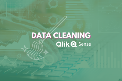
Data Cleaning in Qlik Sense
Ever found yourself stuck with a messy pile of data that seems more like a labyrinth than a pathway to clean insights? You're not alone. Today, we're ... Show MoreEver found yourself stuck with a messy pile of data that seems more like a labyrinth than a pathway to clean insights? You're not alone. Today, we're diving into the world of data cleaning in Qlik Sense to help you uncover the analytical potential hiding behind your data.
The Importance of Data Cleaning:
Imagine you're baking a cake. Would you eyeball the measurements of your ingredients? Probably not, unless you fancy a disaster cake. Just like one poorly measured cup of flour can ruin your entire recipe, a small data error can throw off your whole analysis. That's why, before you dive into the fun part—data analysis—you've got to make sure your key ingredient (data) is as clean and precise as possible.
Why Data Cleaning is More than Just a Chore:
It's not just about tidying up; it's about quality control. Skipped steps or overlooked errors can lead to inaccurate results that could misinform your business decisions.
Data Accuracy:
The accuracy of your analytics depends heavily on your data's quality. Data cleaning helps to weed out errors and inconsistencies, ensuring your insights are both trustworthy and actionable. Tools like mapping tables or functions like SubField can be invaluable in this stage.Data Consistency:
Inconsistent data formats or naming conventions can be a real roadblock. Qlik Sense offers features like the SubField function and mapping tables to help you standardize data for consistent reporting and visualization.Data Integration:
When you're integrating data from various sources, alignment is crucial. Qlik Sense provides numerous functions that help in aligning these disparate datasets into a cohesive, unified form.Enhanced Visualization and Performance:
Clean data doesn't just make your visualizations more meaningful; it also enhances the performance of your Qlik applications. Expect faster data retrieval and more efficient analysis when your data is in good shape.Data Cleaning techniques in Qlik Sense:
Duplicates removal:
Duplicate records can distort your analysis and reporting. Qlik offers built-in functions like Keep when loading tables or the DISTINCT keyword in your script to load only unique rows.Missing values:
You can address missing values by removing records or filling in gaps based on specific criteria. Functions like IsNull, IsNullCount, and NullAsValue come in handy.Data formatting:
Using the numerous string functions available in Qlik Sense, you can standardize data values to a consistent format. For example, the Upper, Lower, Date, and Num functions can be used to unify text or dates.Data manipulation:
Sometimes the data you import into Qlik Sense doesn’t exactly fit your needs. Qlik offers ways to reshape your data accordingly.
For instance inconsistent field values can often occur when pulling data from multiple tables and this inconsistency can disrupt the connections between data sets. An efficient solution to this is to use Mapping tables.Mapping Tables:
These types of tables behave differently than other tables in that they are stored in a separate area of the memory and are strictly used as mapping tables when the script is run, they are then automatically dropped.
Let’s take a look at how to do this and the different statements and functions that can be used:
- MAPPING prefix
This is used to create a mapping table. For instance:
CountryMap:
MAPPING LOAD * INLINE [
Country, NewCountry
U.S.A., US
U.S., US
United States, US
United States of America, US
];
Keep in mind that a mapping table must have two columns, the first containing the comparison values and the second contains the desired mapping values.
- ApplyMap()
The ApplyMap function is used to replace data in a field based on a previously created Mapping Table.
CountryMap:
MAPPING LOAD * INLINE [
    Country, NewCountry
    U.S.A., US
    U.S., US
    United States, US
    United States of America, US
];

Data:
LOAD
    ID,
    Name,
    ApplyMap('CountryMap', Country) as Country,
    Code
FROM [lib://DataFiles/Data.xlsx]
(ooxml, embedded labels, table is Sheet1);
The first parameter in ApplyMap is the Mapping Table name in quotes. The second parameter is the field containing the data that needs to be mapped.
You can add a third parameter to the ApplyMap function that serves as a default to handle cases when the value doesn’t match one in the Mapping Table.
For instance:
ApplyMap('CountryMap', Country, 'Rest of the world') As Countryafter mapping:
- MapSubstring()
The MapSubstring function is used to map parts of a field, this can be used as an alternative to Replace() or PurgeChar() functions.
For instance, let’s clean up these phone number values from unwanted characters:
ReplaceMap:
MAPPING LOAD * INLINE [
  char, replace
  ")", ""
  "(", ""
  "\"", ""
  "/", ""
  "-", ""
] (delimiter is ',');

TestData:
LOAD
  DataField as data,
  MapSubString('ReplaceMap', DataField) as ReplacedString
INLINE [
  DataField
  "(415)555-1234",
  "(415)543,4321",
  "“510”123-4567",
  "/925/999/4567"
] (delimiter is ',');
after cleaning:
- MAP … USING
The Map…Using statement works differently than the ApplyMap() function in that ApplyMap does mapping every time the field name is encountered, whereas Map… Using does mapping when the values is stored under the field name in the internal table.
For instance, in the following load script, the Mapping will be applied to the Country field in Data1, however it will not be applied to Country2 field in Data2 table.
That’s because Map… USING statement is only applied to the field named Country. But in Data2, the field is stored as Country2 in the internal table.
Map Country Using CountryMap;
Data1:
LOAD
    ID,
    Name,
    Country
FROM [lib://DataFiles/Data.xlsx]
(ooxml, embedded labels, table is Sheet1);

Data2:
LOAD
    ID,
    Country as Country2
FROM [lib://DataFiles/Data.xlsx]
(ooxml, embedded labels, table is Sheet1);
UNMAP;
Useful functions for data cleaning
- SubField()
Used to extract substrings from a string field that consists of two or more parts separated by a delimeter.
The arguments it takes are a Text (original string), a delimiter (character within the input text that devides the string into parts), and field_no that’s either 1 to return the first substring (left) or 2 to return the second substring (right))
SubField(text, delimiter, field_no)
For instance:
UserData: LOAD * INLINE [ UserID, FullName 1, "John,Doe" 2, "Jane,Doe" 3, "Alice,Wonderland" 4, "Bob,Builder" ]; CleanedData: LOAD UserID, SubField(FullName, ',', 1) as FirstName, SubField(FullName, ',', 2) as LastName RESIDENT UserData; Drop Table UserData;- Len()
Returns the length of the input string - Left()
Returns a string of the first (left) characters of the input string, where the number of characters is determined by the second parameter.
Left(text, count) - Right()
Similar to left, it returns a string of the last (rightmost) characters of the input string. The second parameter determines the number of characters to be returned. - Index()
The index function searches a string and returns the starting position of the nth occurrence of a provided substring.
For instance:
Index(‘qwerty’, ‘ty’) will return 5
Index(‘qwertywy’, ‘w’, 2) will return the second occurrence of ‘w’, i.e: 7
Example 1:
Using a combination of the functions above to clean up a field. Let’s take a more complex field and try to extract the first name and last name.UserData: LOAD * INLINE [ UserID, Object 1, "37642UI101John.Doe" 2, "98322UI101Jane.Doe" 3, "45432UI101Alice.Wonderland" 4, "32642UI101Bob.Builder" ]; CleanedData: LOAD UserID, SubField(Right(Object, Len(Object) - Index(Object, 'UI101') - 4), '.', 1) as FirstName, SubField(Right(Object, Len(Object) - Index(Object, 'UI101') - 4), '.', 2) as LastName RESIDENT UserData; Drop Table UserData;after cleaning:
Example 2:
Cleaning HTML in a fieldParagraphs: LOAD * INLINE [ Paragraph_ID, Paragraph 1, "<p>This is a <strong>paragraph</strong>.</p><br><p>This is another <em>paragraph</em>.</p>" ]; // Loop through each paragrpah in the Paragraphs table For vRow = 1 to NoOfRows('Paragraphs') Let vID = Peek('Paragraph_ID', vRow-1, 'Paragraphs'); // Get the ID of the next record to parse Let vtext = Peek('Paragraph', vRow-1, 'Paragraphs'); // Get the original paragraph of the next record // Loop through each paragraph in place Do While len(TextBetween(vtext, '<', '>')) > 0 vtext = Replace(vtext, '<br>', chr(10)); // Replace line breaks with carriage returns - improves legibility vtext = Replace(vtext, '<' & TextBetween(vtext, '<', '>') & '>', ''); // Find groups with <> and replace them with '' Loop; // Store the cleaned paragraphs into a temporary table Temp: Load $(vID) as Paragraph_ID, '$(vtext)' as cleanParagraph AutoGenerate 1; Next vRow; // Join the cleaned paragraphs back into the original Paragraphs table Left Join (Paragraphs) Load * Resident Temp; // Drop the temporary table Drop Table Temp;after cleaning:
I hope you found this post helpful!
Attached you can find a QVD that contains the scripts used in the post.Happy data cleaning!
- MAPPING prefix
-
Migrate an existing Visualization extension to Nebula.js framework
In the past few posts, I have discussed the modern, lightweight framework from Qlik, Nebula.js, and its usage in developing various Qlik Sense objects... Show MoreIn the past few posts, I have discussed the modern, lightweight framework from Qlik, Nebula.js, and its usage in developing various Qlik Sense objects such as — creating a new visualization chart or building Embedded analytics solutions like Mashups. Nebula.js is a collection of product and framework agnostic JavaScript libraries and APIs that helps developers easily integrate out-of-the-box capabilities on top of the Qlik Associative Engine. So, let’s assume you have an already existing extension developed using the Extension API, and you would like to migrate this extension to the Nebula.js framework. How would you do this?
The focus of this post is to understand what resources are required by a Developer to effectively migrate an existing extension developed using Extension API to the Nebula.js framework and its potential benefits.
To demonstrate the overall migration process, I will take an existing visualization extension that I have developed in the past using the Extension API. The extension is a Scatter-Pie plot that allows us to visualize each scatter plot’s bubble as a pie-chart to understand the Sales-Profit correlation for the three categories state-wise as shown below:
Let us try to recreate the exact same visualization by leveraging the novel Nebula.js framework.
Traditional Extension API-based visualizations need JavaScript code (.js), a metadata file (.qext), and stylesheets (.css). The logic of the extension is controlled using the code in the JavaScript file and so that is the entry point for your development activity. In Nebula.js, we try to segregate the various modules of the code to align it to a modular architecture, thus providing greater flexibility to the developers. Let’s deep dive into the steps required to migrate our current extension.
Step 1: Create a Nebula project structure.
The first step is to get all the files required as part of developing the extension. We can use the Nebula.js CLI like below and structure the project.
npx @nebula.js/cli create hello --picasso noneExecuting the above command, gives us the three required files.
Step 2: Starting the local development server.
One of the advantages of using the Nebula.js framework is that it comes with a local development server that allows developers to see their output as they code. To start the server, execute the following command.
cd hello
npm run start
Now, we will need to connect to Qlik’s Associative Engine using the WebSocket protocol. Once we establish a connection, we will be presented with the list of apps to test our visualization in the Developer UI.
Step 3: Configuring the data structure.
Next, we need to configure the data structure and define our hypercube as shown in the code snippet below. This is similar to what we have in our current extension (Extension API). However, all this information is saved under one single JavaScript file in the older approach.
const properties = {
showTitles: true,
qHyperCubeDef: {
qInitialDataFetch: [{ qWidth: 6, qHeight: 100 }],
},
definition: {
type: "items",
component: "accordion",
items: {
dimensions: {
uses: "dimensions",
min: 1,
max: 6,
},
measures: {
uses: "measures",
min: 2,
max: 2,
},
sorting: {
uses: "sorting",
},
settings: {
uses: "settings",
},
},
},
};
export default properties;
The only thing that we do differently here in Nebula is to add the /qHyperCubeDef as a data target in data.js like this:
export default {
  targets: [{
  	path: '/qHyperCubeDef'
  }],
};
Step 4: Import packages.
Nebula.js is built on the concept of custom hooks. If you do not know what hooks are, this tutorial will give you a high-level idea of how to leverage them in terms of Nebula. As per the Getting started with Nebula extension tutorial, we will need to import two essential packages to access the Qlik Sense object’s layout and render the data. They are useLayout and useEffect . Also, since our visualization is built using D3.js, we will need to install D3.js in our NodeJS environment and import the package for D3 using the commands below.
- Install D3 by running npm install d3 --save
- Import D3 to index.js by adding import * as d3 from d3
Now, let us understand what we did differently here in the Nebula.js framework as compared to the Extension API.
As we can see from the above comparative analysis, the primary difference is that the Extension API uses RequireJS to load resources asynchronously and has a jQuery wrapper around the HTML element. In the Nebula.js framework, we eliminate all these dependencies, thereby making it framework agnostic and faster.
Step 5: Code Logic.
Our most important goal is to develop the main functionality of the extension. Again, the whole idea here is to replicate the exact visualization developed using Extension API without investing additional time in rewriting the source code. The entry point for the extension’s code is the index.js file, and currently, it looks like below with all the necessary packages.
import { useLayout, useElement, useEffect } from "@nebula.js/stardust";
import properties from './object-properties';
import data from './data';
import * as d3 from "d3";

export default function supernova() {
  return {
    qae: {
      properties,
      data,
    },
    component() {
      const element = useElement();
      element.innerHTML = '<div>Hello!</div>'; // eslint-disable-line
    },
  };
}
Now, let’s take a look at our current extension’s JS code.
To render the visualization with an HTML element, we take advantage of the paint($element, layout) method where $element is a jQuery wrapper containing the HTML element and layout presents the data and properties for the visualization. This method is called every time the visualization is rendered. So, do we have a similar approach in the Nebula.js framework? The answer is Yes!
If we go back to our index.js file, we notice a function supernova( ) that consists of the component( ) method, which is where all the rendering takes place. To render something, we need to access the DOM element the visualization is assigned to, and to do so, we need to use the useElement method. Also, as I mentioned in Step 4, to access the QS object’s layout and bind the data, we need to use the useLayout and useEffect methods. These three methods are all we need to migrate our current code to the newer framework successfully.
After copying the current code and aligning it to Nebula’s programming standard, this is what we get.
export default function supernova() {
  return {
    qae: {
      properties,
      data,
    },
    component() {
      const element = useElement();
      const layout = useLayout();
      const selections = useSelections();
      console.log(layout)
      //getting data array from QS object layout
      useEffect(() => {
        if (layout.qSelectionInfo.qInSelections) {
          return;
        }
        var qMatrix = layout.qHyperCube.qDataPages[0].qMatrix;

        var measureLabels = layout.qHyperCube.qMeasureInfo.map(function (d) {
          return d.qFallbackTitle;
        });

        //an array that invokes each row of qMatrix from layout:
        var data = qMatrix.map(function (d) {
          return {
            Dim1: d[0].qText,
            Dim2: d[1].qText,
            Dim3: d[2].qText,
            Dim4: d[3].qText,
          };
        });
        var width = 1000;
        var height = 400;

        var id = "container_" + layout.qInfo.qId;

          const elem_new = `<div id=${id}></div>`;
          element.innerHTML = elem_new;

          viz(data, measureLabels, width, height, id);

      }, [element, layout]);
    }
  }
}
We see that most of the code lines are similar to what we had in our Extension API. The only difference lies in the way we interact with the three methods here in Nebula.js. In the end, the viz( ) method is called within the component( ) function, and that is where our D3.js code for the visualization is. Again, this is similar to what we did in the Extension API. That is all we needed to do from a code perspective.
Step 6: Build & Deploy.
The good old extensions developed using Extension API had to be bundled (zipped) together with a .qext file, a JavaScript file, and any other dependency files. Nebula.js presents a modern way of building and preparing the extension to be deployed to the Qlik Sense environment.
Firstly, since Nebula runs in a NodeJS environment, we can easily bundle everything and distribute the visualization as an NPM package using:
npm run build
Secondly, to deploy the extension to a QS environment, we use the command below, which generates all files into the folder /hello-ext that you can then use as an extension in QS.
npm run sense
Now that we know about the resources required to migrate our existing extensions to the Nebula.js framework, let’s recap the potential benefits of the new SDK.
- Nebula.js is modular and allows developers greater flexibility in programming and code maintenance.
- It comes with a local development server to visualize the output as we code.
- Modern framework with no dependency on module loaders such as RequireJS or wrappers like jQuery.
- Available as an NPM package and hence very easy to get started with.
- Faster build and deployment; visualizations can be distributed as NPM packages.
- Way forward — support, etc.
This brings an end to the post, and hopefully, this serves as an initial guide for developers and organizations planning to migrate their existing visualizations to the Nebula.js framework. For folks who want to get started with Nebula or build advanced visual representations using the SDK, here is a list of accumulated resources -
-
Connector Factory – October and November 2023 Releases
Qlik Cloud Data Integration Additional SaaS application connectors We’re continuing to expand the connectivity of Qlik Cloud Data Integration with a n... Show MoreQlik Cloud Data Integration
Additional SaaS application connectors
We’re continuing to expand the connectivity of Qlik Cloud Data Integration with a new group of connectors that just got released. These connectors will enable you to gather business data from additional applications that focus on the supply chain, ERP, CRM, and finance:
- Acumatica ERP
- GitHub
- QuickBooks
- SAP Ariba Analytical
- SAP Ariba Event Management
- SAP Ariba Operational Procurement
- SAP Ariba Operational Sourcing
- SAP Ariba Supplier Data
- SAP Ariba Supplier Risk Engagements
- SAP Cloud for Customer
- SAP Fieldglass
- SAP SuccessFactors Payroll
- Stripe
- Zoho Books
- Zoho CRM
- Zoho Expense
- Zoho Inventory
We also updated the existing Oracle OPERA connector to support change data capture.
Similar to our previous connector releases, these connectors are Generally Available (GA), covered by our standard support policies and are tagged as Preview. If you haven’t already done so, you will need to contact your local support representative to activate the feature flag that enables all recently released connectors in your tenant. The preview tag and feature flag are there because these connectors do not cover all use cases and we want to make sure you have the best experience possible.
Private connections - A private connection (sometimes called a PrivateLink) can be used to ensure your data traffic remains secure and compliant. Qlik Cloud Data Integration already supports private connections if Snowflake, Microsoft SQL Server or AWS S3 is the target of a data pipeline. We now additionally support private connections when moving data to Databricks, Microsoft Azure Synapse, Google BigQuery or AWS Redshift.
Qlik Data Integration
The recent release of Qlik Replicate November 2023 includes a number of security enhancements related to connectivity:
- Snowflake targets (on Google, AWS, or Azure) now support OAuth2 authentication
- The Kafka target now supports certificate + username and password authentication
- Amazon S3 and Amazon Redshift Targets now support IAM Roles Anywhere
- MySQL-based targets now support SSL
In addition, Qlik Replicate now supports two new target endpoints (Microsoft Fabric Synapse Data Warehouse & Confluent Cloud), a new source endpoint (Google Cloud SQL for SQL Server) and an enhanced Google BigQuery target endpoint.
You can find more details about the Qlik Replicate November 2023 release in this blog or the release notes.
Qlik Analytics Cloud
New Connectors
Amazon Bedrock – This is a platform that hosts a number of generative AI models (or LLMs), including models not just from Amazon but also leading AI startups, so you can choose which LLM is best suited for your use case. Qlik now offers the following connectors within the Amazon Bedrock platform:
- AI21 Labs
- Amazon Titan
- Anthropic
- Cohere
With these real-time analytics connectors, users can interact with apps and refine context, sending relevant subsets of data to generative AI for a variety of use-cases such as sentiment analysis, few shot learning and classification, data synthesis, summarization, and enrichment, and more. And this is only the beginning – customers can build whatever new use cases they want using generative AI in combination with our engine, and fully controlling the relationship with the third-party models.
More details on these integrations can be found here.
Integration with Microsoft Teams
We recently released a new app within Microsoft Teams which allows you to explore analytics using natural language. You can ask a question within Teams and Qlik will respond with AI-generated visualizations and insights, using data from across your Qlik apps. And because you’re in Microsoft Teams, you can easily bring others into the conversation to share and collaborate, as well as access Insight Advisor on mobile devices through the Teams app.
You can find out more about this integration in this blog.
Qlik Application Automation
We continue to add more connectors and capabilities to our no-code cloud service that streamlines workflows between SaaS applications and Qlik Cloud.
New Connector
Amazon Bedrock - enables your automation to interact with any of the text and image models from Bedrock and send the model's output to any other automation connector or use it as input for another Bedrock model.
Updated Connectors
OpenAI - A new Chat Completion block enables you to run prompts against OpenAI's powerful GPT models.
Qlik Cloud Services - blocks have been added to enable Qlik Application Automation to interact with the Qlik Business Glossary
And finally, be sure to check out the Connector Factory page on qlik.com for a complete list of which data repositories and applications are accessible by any of Qlik’s solutions (including Talend and Stitch). We will soon have connectivity to over 500 different data sources, targets, and applications!
-
Data Science among high-demand upskilling courses
In today's tough job market, landing the job you want is a challenge. Many have the same degree and some may have better scores. How can you stand you... Show MoreIn today's tough job market, landing the job you want is a challenge. Many have the same degree and some may have better scores. How can you stand you? Is there a way you can enhance your career prospects by doing something more than others?
In the competitive job market, standing out requires more than just a degree. Some cutting edge courses for upskilling for engineers to enhance their careers includes data science. To read more on this, visit:
http://timesofindia.indiatimes.com/articleshow/102936706.cms?utm_source=contentofinterest&utm_medium=text&utm_campaign=cppstIn order to enhance your data analytics skills, if you are a student or educator, for free training and certifications, visit: qlik.com/academicprogram
-
Developing for the Qlik Sense Mobile for SaaS app
Qlik Sense Mobile for SaaS was recently released to the general public and judging by what I have seen on my social media feeds, it has been well rece... Show MoreQlik Sense Mobile for SaaS was recently released to the general public and judging by what I have seen on my social media feeds, it has been well received. Having had the experience of working with the app leading up to the release, I thought it might be helpful to share some of the things that I learned about developing an app for the Mobile SaaS app.
Be conscience of the design real estate
Let’s face it, there is much more design real estate on a desktop than on a mobile device. You need to keep this at the top of mind when developing your app. Also, note that the current version of the Qlik Sense mobile app can only be viewed in portrait. With all of that in mind, when designing a sheet, most times, less is more. Only include those visualizations that are relevant to the story being told. Visualizations will be resized to meet the size of the device on which the app is consumed, so be conscience of pie charts that contain many dimensions or dimensions with small slivers of data as these can be tricky to analyze for the user. Scatter plots with data density can also be difficult for a user on a mobile device. And finally, because of the portrait only view, standard tables and pivot tables will only have the first couple of columns visible to user. To see the rest of the screen, he/she will have to scroll.
Small Screen Layout - Grid View vs List View
In the sheet properties of Qlik Sense sheets, there is a powerful property, Small screen layout, that allows you to decide how you want the visualizations to appear on mobile.
Grid View will display the sheet exactly as it is laid out on the desktop. This is good for sheets where you may want the user to be able to see the overall picture of the data.
List View will display the objects on your sheet in a horizontal card scroll view. The objects will appear one at a time and they will be sorted in the order in which they appear, starting from the top left of the sheet to the bottom right. The horizontal scroll is different from the traditional vertical scroll that you have seen in the past so it may take a little getting used to for the users.
If you prefer the vertical scroll don’t fret, from what I understand, look for the return of vertical scrolling in future editions of the Qlik Sense mobile app.
Filters
Keep this in mind, unless a field is hidden in the script, it is available to the user for filtering the data in the Available selections section. You can also, create Master Items that will also be available in the app. Current selections, bookmarks, and clear selections are also accessible through the same interface.
The Qlik Sense mobile for SaaS app is awesome. I recommend that you download it from the app store and take it for a test drive. There are so many cool things in the current version of the app, but from what I have seen, there are so many more enhancement coming in future releases that the mobile app will be a “must have” for Qlik Sense users.