Unlock a world of possibilities! Login now and discover the exclusive benefits awaiting you.
Analytics & AI
Forums for Qlik Analytic solutions. Ask questions, join discussions, find solutions, and access documentation and resources.
Data Integration & Quality
Forums for Qlik Data Integration solutions. Ask questions, join discussions, find solutions, and access documentation and resources
Explore Qlik Gallery
Qlik Gallery is meant to encourage Qlikkies everywhere to share their progress – from a first Qlik app – to a favorite Qlik app – and everything in-between.
Qlik Community
Get started on Qlik Community, find How-To documents, and join general non-product related discussions.
Qlik Resources
Direct links to other resources within the Qlik ecosystem. We suggest you bookmark this page.
Qlik Academic Program
Qlik gives qualified university students, educators, and researchers free Qlik software and resources to prepare students for the data-driven workplace.
Recent Blog Posts
-
Leveraging the power of qlik-cli
I’m always on the lookout for a tool that would make my life easier as a developer. Qlik-cli is a great asset to have in your toolbox when working wit... Show MoreI’m always on the lookout for a tool that would make my life easier as a developer. Qlik-cli is a great asset to have in your toolbox when working with Qlik Sense SaaS. As its name suggests, it is a command line interface that lets you tap into Qlik’s published APIs and take advantage of the full power and possibilities of Qlik Cloud.
Being able to perform any administrative task from the command line can be very attractive for developers or system administrators who, for one, are used to dealing with cloud platforms via a cli, but also just want to access certain tools quickly without going through the management console graphical interface especially when trying to execute tasks in bulk or automate certain workflows.
So whether you are looking to run tasks or reloads, check on those reloads, move apps between environments, manage user access, or make updates at a large scale, qlik-cli is the right tool for that.
You can check out this recent blog post for a great introduction to the qlik-cli to learn about what it is and walk through the installation process to get up and running quickly: https://community.qlik.com/t5/Qlik-Design-Blog/Using-Qlik-cli-to-automate-workflows/ba-p/1943319
How does it works:
Once you’ve installed qlik-cli on your machine, you will need to grab your API Key from the Qlik Cloud tenant and create and configure a context from the command line to authenticate to Qlik Sense SaaS.
You can always view contexts if you happen to have multiple tenants or users via the "qlik context ls" command, and switch between them using "qlik context use <context-name>"
With qlik-cli’s built-in documentation, it’s very intuitive to see see which commands and flags you can use by adding --help to any command.
For instance qlik app --help will return the following:
What are some of the things you can use qlik-cli for:
A quick and easy example to show how easy it is to perform certain tasks with qlik-cli is to create an app, add a script and reload it:
qlik app create --attributes-name cli-testapp -q
qlik app script set <path-to-script> --app <appid>
qlik reload create --appId <appid>
That’s it! Running just 3 lines is all it takes to have an app ready for use.
But what if we wanted to create 10 apps instead of one?
Easy, all we got to do is wrap that same command we used above (qlik app create —attributes-name <name>) in a shell script “for” loop.
$appIds = @()
function appExists {
	param([String] $appName)
	$result = qlik item ls --resourceType app --name $appName | ConvertFrom-Json
	return $result[0].resourceId
}

For ($i=0; i -lt 10; $i++) {
	$name = "qlik-cli-app-$i"
	$app = appExists -appName $name
  if(!$app) {
		$app = qlik app create --attributes-name $name -q | Out-String
	}
	$appIds += $app
}

return $appIds
You can view a more detailed tutorial on qlik.dev: https://qlik.dev/tutorials/creating-and-deleting-apps-in-bulk-with-qlik-cli
A good idea then is to maybe create a space and move all these apps to it with a few commands such as: “qlik space create” and “qlik app space update”
You can also do some basic task chaining by using a function that runs against a JSON object containing task name, app id and status. This process can be especially helpful when wanting to execute a reload upon the completion status of a preceding reload.
Here is a tutorial that walks you through doing just that: https://qlik.dev/tutorials/task-chaining-with-qlik-cli
Another great application of the qlik-cli for folks who are moving away from Qlik Sense Enterprise Client-Managed to Qlik Cloud, is to use it for migration. By leveraging basic PowerShell scripts and qlik-cli commands, you can facilitate and speed up a process that would otherwise be tedious. You can find more information about the whole process here . Take a look at the PowerShell scripts (download and extract the “Qlik Cloud migration tools” zip file) to see qlik-cli commands in action for inspiration.
I hope this post helped you get a sense of how powerful yet simple qlik-cli can be when it’s used alongside shell scripting to access and unlock the full potential of Qlik Cloud APIs.
-
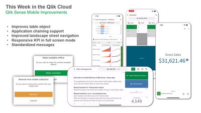
Qlik Sense Mobile - Enhanced Decisions on the Go
With this release, we have made numerous improvements that enhance usability and insights on the go. We have significantly improved the mobile table ... Show MoreWith this release, we have made numerous improvements that enhance usability and insights on the go. We have significantly improved the mobile table object, with better rendering and performance, while continuing to support mini charts, images, totals, search, and adding features such as row counts, expand/transpose rows, and the ability to copy cells. We’ve revamped our landscape mode sheet navigation, adding a quick and easy way for users to switch between sheets using native gestures. We now support application chaining on mobile, allowing users to persist filters across multiple apps. And we’ve made additional improvements such as the presentation of the KPI object in full-screen mode and the standardization of our warning messages.
Mobile analytics are a critical factor in realizing the true value of your overall analytics, allowing more people to access data and make informed decisions in all types of situations. With this release, we continue to demonstrate our ongoing commitment to bring best-in-class mobile capabilities to our customers – delivering the unique power of our associative engine to drive insight at the point of decision.
If you haven’t tried Qlik Sense Mobile yet, we encourage you to do so. It can be found on the Apple and Android app stores.
-
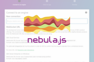
Using Nebula.js to build a visualization extension for Qlik Sense: Stream Chart
In order to go beyond the default charts and custom object bundles that ship with Qlik Sense, you need to develop custom visualization extensions whic... Show MoreIn order to go beyond the default charts and custom object bundles that ship with Qlik Sense, you need to develop custom visualization extensions which will allow you to extend the capabilities of Qlik Sense using standard web technologies. In this post, we will cover how to leverage Qlik’s open source solution, Nebula.js, a collection of JavaScript libraries and APIs that make this task easy!
Once the visualization is developed using Nebula.js, you can then bring it to Qlik Sense to be used in your Apps.
- Pre-requisites and project creation
First things first, let’s make sure you have all you need to get started.
- Access to a terminal (we will need this to run nebula.js CLI commands)
- Node.js installed in your computer (v10 or higher)
- A text editor (VS code or similar)
- Web Integration ID (you can get this from the Management Console under “Web” on your Qlik Cloud Tenant. Make sure to put http://localhost:8000 in the Allowed Origins)
Once you have the pre-requisites covered. Fire up your terminal and write the following command.
npx @nebula.js/cli create streamchart --picasso minimalThis command uses Nebula.js CLI, a handy command line program that let’s us bootstrap our project easily.
Notice that we added the –picasso flag after the project name with option minimal. This will add the necessary files to our project for Picasso.js, Qlik’s open source charting library that we will use to build the chart.
Speaking of the chart, we are going to build a Stream Chart in this post to visualize Yearly sales by month.
Once the cli command is finished running and the project is successfully created, change your directory into it using “cd streamchart” and then run it using “yarn run start”. Then open the folder in your text editor.
Below is the folder structure of the project. All the work is done under src.
Notice that the package.json file has the scripts we will be using to develop and build the project as well a script to generate the Qlik Sense ready files for the extension. It also lists all the libraries needed in our project, including Picasso.js, Nebula.js/stardust.
/src
- index.js - Main entry point of the visualization
- object-properties.js - Object properties stored in the app
- pic-definition.js – Picasso components definition
- data.js - Data configuration
- The Development Server
After running the “yarn run start” command, the project will open in your browser at localhost:8000. This is the Local Development Server that we will use to test the visualization extension as we develop it.First step is to connect to the Qlik Engine. To do this, you need to plug in the Websocket URL in the following format:
wss://yourtenant.us.qlikcloud.com?qlik-web-integration-id=yourwebintegrationidAfter we enter the WebSocket URL, we’re prompted to pick our Qlik Sense App that contains our data. Once the app picked, we move to the main edit screen of the local development server.
The center section is where our visualization is rendered, and the right sidebar allows us to build up our qHyperCubeDef by selecting Dimensions and Measures.
Remember: edits to the src/index.js that are related to the output, will lead to an auto refresh of the visualization allowing you see live changes in the center section
- Configuring the Data Structure
In previous posts, I have covered details about building HyperCubes and configuring qHyperCubeDef, if you’re new to the concept, don’t hesitate to go through those posts first.
PT 1 and PT2For the purposes of our Stream Chart visualization, we will rely on the automatic generation of the qHyperCubeDef once we choose our Dimensions and Measure on the right side bar.
But if you wanted to make further changes to it, click on the Gear icon on the top-left of the center section to open the qHyperCubeDef object edit popup.
- Adding the Picasso.js components definition
So far, nothing is rendered on the Dev Server UI. So, let’s go ahead and configure the Picasso.js Definition to create the necessary components.
Under pic-definition.js, enter the following code:
export default function ({
  layout, // eslint-disable-line no-unused-vars
  context, // eslint-disable-line no-unused-vars
}) {
  return {
    collections: [{
      key: 'stacked',
      data: {
        extract: {
          field: 'qDimensionInfo/0',
          props: {
            line: { field: 'qDimensionInfo/1' },
            end: { field: 'qMeasureInfo/0' },
          },
        },
        stack: {
          stackKey: (d) => d.value,
          value: (d) => d.end.value,
          offset: 'silhouette',
          order: 'insideout',
        },
      },
    }],
    scales: {
      y: {
        data: {
          collection: {
            key: 'stacked',
          },
        },
        invert: false,
        expand: 0.5,
      },
      t: {
        data: {
          extract: {
            field: 'qDimensionInfo/0',
          },
        },
        padding: 0.5,
      },
      l: {
        data: {
          extract: {
            field: 'qMeasureInfo/0',
          },
        },
      },
      color: {
        data: {
          extract: {
            field: 'qDimensionInfo/1',
          },
        },
        type: 'color',
      },
    },
    components: [
      {
        type: 'axis',
        dock: 'bottom',
        scale: 't',
      },
      {
        type: 'axis',
        dock: 'left',
        scale: 'l',
      },
      {
        key: 'lines',
        type: 'line',
        data: {
          collection: 'stacked',
        },
        settings: {
          coordinates: {
            major: { scale: 't' },
            minor0: { scale: 'y', ref: 'start' },
            minor: { scale: 'y', ref: 'end' },
            layerId: { ref: 'line' },
          },
          layers: {
            curve: 'monotone',
            line: {
              show: false,
            },
            area: {
              fill: { scale: 'color', ref: 'line' },
              opacity: 1,
            },
          },
        },
      },
      {
        type: 'legend-cat',
        scale: 'color',
        key: 'legend',
        dock: 'top',
        settings: {
          title: {
            show: false,
          },
          layout: {
            size: 2,
          },
        },
      },
    ],
  };
}
Notice that the object contains:
- Collections: to stack our data
- Scales
- Components:
- Bottom axis
- Left axis
- Lines component
- Legend
For more information about how to build charts with Picasso.js, visit https://qlik.dev/libraries-and-tools/picassojs and check out some of the previous blog posts.
Go back to the Dev Server UI on the browser, and you should see the chart displayed.
- Package the Visualization Extension, and upload to Qlik Sense
So far, we’ve been working on our local dev environment. We need to generate the necessary files to build the project.
In your terminal run: “yarn run build”. This will generate a “dist” folder containing our extension’s bundled files. You can use this to distribute the extension as an npm package.
However, in order to use this visualization extension in Qlik Sense, we need additional files. Run “yarn run sense” which will create a new folder called “streamchart-ext”.
Make sure to Zip this file in order to get it ready to be uploaded into your Qlik Cloud tenant.
And there you go; you now have a visualization extension that you can use in your Qlik Sense apps!
The full code is on github: https://github.com/ouadie-limouni/qlik-nebula-stream-chart-viz-extension
- Pre-requisites and project creation
-
More visualization extensions for Nebula.js
Nebula.js and its ecosystem with extensions is growing and is growing fast. In the past, I have covered some of the available charts like bar-chart, f... Show MoreNebula.js and its ecosystem with extensions is growing and is growing fast. In the past, I have covered some of the available charts like bar-chart, funnel-chart, line-chart, mekko-chart, pie-chart, sankey-chart and a simple table.
Today I will go over some of the latest editions, a simple Filter, based on a field, a KPI object and a Combo chart.Let's start with the Nebula.js configuration and the connection to our Qlik Sense server.
The code is in observablehq, for framework specific, check links at the end of this blog post.nebula = require("@nebula.js/stardust") n = { const { embed } = nebula; const config = { host: 'qlik-sense.your-server.com', appId: 'xxxxxxxx-xxxx-xxxx-xxxx-xxxxxxxxxxxx’, } const enigmaApp = await enigma .create({ schema, url: `wss://${config.host}/app/${config.appId}`, }) .open(); const app = await enigmaApp.openDoc(config.appId); const n = await embed(app, { context: { theme: 'light', language: 'en-US', constraints: { active: false, passive: false, select: false, }, }, types: [ // We will add the charts later on ], }); return n; }Ok we have Nebula.js configured and a Websocket connection to the engine. We start with a simple Filter. All you have to do is get the Field Name from Qlik Sense and then add the following code into your js page. All of these examples are using the default Helpdesk app.
const field = await n.field('Case Owner Group');
field.mount(filterElement, { title: 'Department' } );
And here is the rendered object
Filter
Live example: https://observablehq.com/@yianni-ververis/nebula-js-filter
Ok, we’ve got the simple filter, lets see how to get a KPI object.
In the previous example add the sn-kpi and then render it
nebula = require("@nebula.js/stardust")
kpi = require("@nebula.js/sn-kpi")
…
types: [
      {
        name: 'kpi',
        load: () => Promise.resolve(kpi),
      }
],
…
  n.render({
    element: kpiElement1,
    type: 'kpi',
    fields: ["=Count( {$<Priority={'High'}, Status -={'Closed'} >} Distinct %CaseId )"],
  });
This is what we get
KPI
Live Example: https://observablehq.com/@yianni-ververis/nebula-js-kpi?collection=@yianni-ververis/nebula
That was easy, right?
Now let’s get into a more complicated one, the Combo Chart.In the previous example add the sn-combo-chart and then render it but with a hyperCube this time so we have more fine control over the labels, type bar/line etc.
nebula = require("@nebula.js/stardust")
comboChart = require("@nebula.js/sn-combo-chart")
…
types: [
      {
        name: 'comboChart',
        load: () => Promise.resolve(comboChart),
      }
],
…

  n.render({
    element: chartElement,
      type: 'comboChart',
      properties: {
        qHyperCubeDef: {
          qDimensions: [
            {
              qDef: {
                qFieldDefs: ['Date.autoCalendar.Date'],
                qFieldLabels: ['Date']
              },
              qNullSuppression: true,
            },
          ],
          qMeasures: [
            {
              qDef: {
                qDef: 'Sum([Number of New Cases])',
                series: { type: "bar", axis: 0 },
                qLabel: 'New Cases',
                // autoSort: false
              },
              qSortBy: { qSortByNumeric: -1 },
            },
            {
              qDef: {
                qDef: 'Sum([Number of Closed Cases])',
                series: { type: "line", axis: 1 },
                qLabel: 'Closed Cases',
              },
              qSortBy: { qSortByNumeric: -1 },
            },
          ],
          qInitialDataFetch: [{ qWidth: 3, qHeight: 1000 }],
          qAlwaysFullyExpanded: true,
          qSuppressMissing: true,
          qSuppressZero: true,
        },
        scrollStartPos: 1,
        showTitles: true,
        title: 'Combo-chart',
        subtitle: 'Sample supernova combochart',
        footnote: 'Sample supernova combochart',
      },
});
And this is the rendered object
Combo chart
So, what if we want to change this to a stacked bar chart and the x-axis labels underneath? We specify the "type" to be "bar" on the second measure and the "dock" to "near"
...
     series: { type: "bar", axis: 1 },
...
  dock: 'near',
...
and we should see this
Stacked barchart
Live example: https://observablehq.com/@yianni-ververis/nebula-js-combo-chart?collection=@yianni-ververis/nebula
That's it for today! Make sure you check out my previous articles with different framework implementations and some visualizations
https://community.qlik.com/t5/Qlik-Design-Blog/Using-Nebula-js-with-React-js-or-in-Simple-html-pages/ba-p/1744410https://community.qlik.com/t5/Qlik-Design-Blog/Using-Nebula-js-with-Angular-or-Svelte/ba-p/1764361
https://community.qlik.com/t5/Qlik-Design-Blog/Sn-table-Nebula-js-latest-extension/ba-p/1780153
Described extensions in the above blogs with live examples
Selections
Selections
Barchart
https://observablehq.com/@yianni-ververis/nebula-js-barchart?collection=@yianni-ververis/nebulaFunnel chart
https://observablehq.com/@yianni-ververis/nebula-js-funnel-chart?collection=@yianni-ververis/nebulaLine chart
https://observablehq.com/@yianni-ververis/nebula-js-line-chart?collection=@yianni-ververis/nebulaMekko chart
https://observablehq.com/@yianni-ververis/nebula-js-mekko-chart?collection=@yianni-ververis/nebulaPie chart
https://observablehq.com/@yianni-ververis/nebula-js-pie-chart?collection=@yianni-ververis/nebulaSankey Chart
https://observablehq.com/@yianni-ververis/nebula-js-sankey-chart?collection=@yianni-ververis/nebulaTable
https://observablehq.com/@yianni-ververis/nebula-js-table?collection=@yianni-ververis/nebulaSpecific Framework templates:
React: https://github.com/yianni-ververis/nebula-react
Angular: https://github.com/yianni-ververis/nebula-angular
Svelte: https://github.com/yianni-ververis/nebula-svelteComing up, Grid chart and Bullet chart.
/Yianni
-
Bar Charts and Digestible Data
At Qlik, we love data, but data is only useful if it is able to be used. Thankfully Qlik offers a variety of chart solutions so you can visualize your... Show MoreAt Qlik, we love data, but data is only useful if it is able to be used. Thankfully Qlik offers a variety of chart solutions so you can visualize your data in the most useful way. Today we start a series focused around charts. We’ll learn what these charts do, and touch on how you can use these charts to best visualize your data.
The first type of chart we’ll be highlighting is the bar chart. Bar charts are a commonly used chart that visualizes amounts as bars. The taller or longer the bar, the larger the amount being represented. Though less common, bar charts can also be used to show negative values across the Y axis of the chart. Two examples of a bar charts can be found below, one displaying a positive value, the other negative.
Now that we know what bar charts do, we can focus on why and what circumstance we should use bar charts to visualize our data. For context, the data we’ll be using is based around sales numbers. These numbers involve sales price, amount sold, the cost of the product and so on. In the example above, our data is based around the master item ‘Margin’. This master item was created by taking the sales price of a product and subtracting the cost of the product to the seller, thus creating a ‘Margin’ or the amount that the seller would make from selling this product after the cost.
Why would we use a bar chart to showcase this data, why not a different type of chart? Below are the same two charts converted into line and pie charts.
As you can see, the reason to use a bar chart for this data instead of a line or pie chart is clarity. The line chart interprets the data as being over a period, connecting the data into one line. Our data is not connected to each other, instead they are individual products. The pie chart again thinks of the data as part of a whole, showing the portion of the whole represented by each item, in the case of the negative product the chart cannot be created as you cannot visualize a negative portion of something. This information would not be useful to the user.
So how can bar charts be used in a real-world scenario? In this instance, the user could want to know what his top five positive margin items are. The user could then use this information to stock more of this product, to push the selling of this product, and ultimately make more money per sell. Likewise, the user may want to see which products are costing him money when sold, thus providing a use case for the negative margins. A negative margin would indicate that the user is losing money every time an item is sold.
Ultimately, bar charts are a great tool to visualize data as individual pieces in relation to one another. The key thought when it comes to bar charts is ‘comparison’, as in, how do these values compare to one another. Hopefully this short blog has begun turning the wheels in your mind with how you can use Qlik and bar charts to visualize your data.
Thank you for giving this blog a read. I would like to make this an ongoing series where we cover different types of charts available at Qlik. If this is something you’d like to see more of, please leave a like on this entry, and comment which chart type you’d like to learn more about.
-
QLIK Master CONSOLLE 2.0
#QLIK #master CONSOLLE 2.0 QLik360 di Valerio Fatatis Here's how to centralize all the main information to monitor and govern in a departme... Show More#QLIK #master CONSOLLE 2.0
QLik360 di Valerio FatatisHere's how to centralize all the main information to monitor and govern in a departmental BI platform based on Qlik technology (Sense & NPrinting)
Discoveries
There need is to STANDARDIZE ed INDUSTRIALIZE every single module and component introduced in the many realizations, so as to CAPITALIZE and be able to SHARE every single technical, operational and functional aspect we apply this METHODOLOGY in NEW installations e PRE-EXISTING In both the immediate benefit is to UNIFORM what is prepared in order to be able to guarantee STABILITY', SECURITY, EXTENDABILITY and GOVERNANCE of the platform.
Impact
STABILITY', SECURITY, EXTENDABILITY and GOVERNANCE
Audience
INTEGRATION of the different PROJECT PHASES STANDARDIZATION OF FUNCTIONALITIES CONFIGURABLE AND MONITORED ETL METADATA AS MAIN FOCUS THERE GOVERNANCE of INFORMATION USER INTERFACE STANDARD / CROSS APPS FUNCTIONAL USER EXPERIENCE SHEET OF ANALYSIS BASED ON AD HOC TEMPLATES OTHERS ENHANCEMENT
Data and advanced analytics
Support strategic in the adoption and implementation of advanced Business intelligence systems departmental, aimed at the various departments present in the company, for specific objectives (Sales, Finance, Purchasing Human Resources, Legal, Marketing and Digital Sales, Itc) Definition of rules for the governance of BI farms (Qlik Sense, Qlik View and Nprinting Analyses, Deployment development in departmental BI projects with an "Enterprice" connotation Training (IT Business) for Analyst, Developers Administrators UI / UX Front End designer

-
New Client Managed Trial Downloads app + more!
Hello Qlik Community! Only 24 days left in 2022. Where has the year gone? We have a few enhancements for the first of two releases for December (I kno... Show MoreHello Qlik Community!
Only 24 days left in 2022. Where has the year gone?
We have a few enhancements for the first of two releases for December (I know, I know, I said that last month).
Client Managed Trial Downloads App
The Client Managed Trial Downloads App is another partnership with Customer First R&D. The app shares the initial release + latest patch of Qlik products and is open to all registered users within Qlik Community.
Please note: a Qlik software license is required to trial a product. Please work with your existing Account Manager or Contact Sales if you do not have one.
You must be logged in to view this page. For access issues, please reach out to Qlik Support.
Resources and Events on Download pages
A list of resources has been added to both Download pages (Product Downloads and Client Managed Trial Downloads) that include instructions on using the page, troubleshooting, Release Notes, and more!
New Subscription Badges
Calling all subscribers! You can now receive badges for subscribing to different pages within Qlik Community.
New Application Automation Connectors
We have new connectors available on the Connectors page, including:
- Qlik Reporting
- Zenput
- Alation Cloud Catalog
- Oracle Eloqua
- FTP
- Google Sheets
- Inphinity
- Demo CRM
- Demo Webshop
- Amazon Redshift
- Amazon Sagemaker
- SFTP
Check back next week for a few more enhancements that are going live!
Your Qlik Community Admins,
Melissa, Sue, Jamie, Nicole and Emma
@Melissa_Potvin @Sue_Macaluso @Jamie_Gregory @nicole_ulloa @emmaspickerman
-
New Content: Qlik Cloud End-to-End
In the digital economy, real-time agility is essential. The faster an organization can respond to events as they evolve, the better it can compete. To... Show MoreIn the digital economy, real-time agility is essential. The faster an organization can respond to events as they evolve, the better it can compete. To make that leap, organizations need to be armed with continuously up-to-date, real-time information and the ability to trigger informed action at the most important moment. This is where Qlik Cloud come in for rescue.
Want to get started with Qlik Cloud Platform? Are you wondering how you can
- Recall opportunities active intelligence offers for more streamlined data integration
- Relate SaaS data analytics capabilities to current and desired organizational outcomes
- Approach the data lifecycle with new perspectives that can better address organizational needs
- Improve organizational outcomes
This video will help you gain a new perspective on the data lifecycle and recognize the value of data and analytics solutions in improving organizational outcomes.
Access Qlik Cloud End-to-End video. Learn how Qlik can streamline data integration, transform data into analytics ready, and deliver real-time data and analytics, enabling your team to share key insights that drive organizational value.
Happy Learning!

-
【オンデマンド配信】危機への対応:2023年トップ10 BI / データトレンド
今こそ、パワーとデータの移行に対応する テクノロジーの分離・「プライバシー債務」・ベテラン労働者不足・ベンチャーキャピタル資金の縮小。世界のテクノロジーリーダーの 10 人中 7 人が、パンデミック後の混乱が競争力の維持に必要なテクノロジーへの投資価格の上昇を引き起こすと懸念しています。こうした状... Show More今こそ、パワーとデータの移行に対応する
テクノロジーの分離・「プライバシー債務」・ベテラン労働者不足・ベンチャーキャピタル資金の縮小。世界のテクノロジーリーダーの 10 人中 7 人が、パンデミック後の混乱が競争力の維持に必要なテクノロジーへの投資価格の上昇を引き起こすと懸念しています。こうした状況下での BI / データに関する動向とは?先手を打つために、把握しておくべきこととは?
「危機への対応:2023年トップ 10 BI / データトレンド」では、2 つの主な考えを基に、今後の企業に影響すると思われるトレンド 10 箇条をご紹介します。ぜひ、オンデマンドでご視聴ください。
※ 参加費無料。パソコン・タブレット・スマートフォンで、どこからでもご視聴いただけます。日本語字幕付きでお届けします。
-
Register for Qlik Learning Events even easier Now!
Qlik Learning Portal Calendar has been updated with a new, easy to use events calendar. Enhancements include new filtering capabilities and a redesign... Show MoreQlik Learning Portal Calendar has been updated with a new, easy to use events calendar. Enhancements include new filtering capabilities and a redesign of the interface for usability enhancements.
To access Calendar Log into Qlik Learning Portal → Select Continuous Classroom → Go Further → Live Webinars from top navigation:
On Live Webinars Page, click on Access Webinar Schedule on the bottom of the page:
Check out the new filtering capabilities, to find events you are looking for easier. You can filter by Time Period, Region, Price, User Role and Category:
With the Free Introduction to Continuous Classroom Webinar, get an introduction of all that the Qlik Continuous Classroom has to offer. With over 300 courses and tutorials to choose from, live instructor webinars, and 1:1 instructor course support, ensure sure you are making the most from your Qlik Continuous Classroom subscription.
As a part of a Qlik Continuous Classroom subscription, enjoy the benefit of access to Live Instructor Webinars delivered on a regular basis on a variety of advanced topics above and beyond content offered in our self-paced learning. If you are unable to attend a particular session, be sure to register to receive the on-demand recording.
Register for an event today. Attend live or watch on your time on-demand!
-
Qlik Digest - December 2022
WHAT’S NEW AT QLIK? New data visualization capabilities are now live in Qlik Sense SaaS. Get up to speed on the latest innovations, including applicat... Show MoreWHAT’S NEW AT QLIK?
New data visualization capabilities are now live in Qlik Sense SaaS. Get up to speed on the latest innovations, including application chaining, styling updates, the ability to add a custom tooltip to your KPI object, and more. Learn More
Check out the new Qlik AutoML courses added to Qlik Continuous Classroom. With these new courses you can dive into creating machine learning experiments, deploying predictions, and creating analyses. And even better news – nearly all of them are free! View Courses
Qlik Cloud Data Integration is Here. As you may have heard by now, we recently launched Qlik Cloud Data Integration. Get the low-down on Qlik's journey to this major milestone, and find out how this can benefit all our customers looking to deliver real-time data and automate transformation. Visit Blog
Apply to be a Qlik Luminary!
Are you a huge Qlik advocate who loves driving measurable impacts from data? Why not apply to be a #QlikLuminary? Luminaries gain exclusive Qlik perks and networking opportunities. But be sure to apply soon, applications close on December 16. Learn More and Apply
2023 Outlook: A Pivotal Year for Data Integration
On December 7, join Ventana Research and Qlik as they discuss pivotal architectures, approaches and innovations influencing the data integration market in 2023. Register
Join in the fun for the 2022 World Cup!
Before we head into the quarter finals there’s still time to predict your winner with Qlik’s Choose Your Champion bracket. ⚽️ Who do you think is taking home the #WC2022?
Make your predictions and share on LinkedIn
Additional Featured Content
Learn how D4C enables operational staff to access critical data insights
Get insights on your Qlik environment with the Qlik Sense monitoring applications
-
New Content: Qlik AutoML Learning Modules
AutoML (Automated machine learning) finds patterns in your data and uses them to make predictions on future data. Machine learning experiments in the ... Show MoreAutoML (Automated machine learning) finds patterns in your data and uses them to make predictions on future data. Machine learning experiments in the Qlik Cloud hub let you collaborate with other users and integrate your predictive analytics in Qlik Sense apps. In addition to making predictions, you can do an in-depth analysis of the key features that influence the predicted outcome.
We have recently added Free, Qlik AutoML learning Modules to Qlik Learning Portal. Access these modules here
Happy Learning!
-
Monte Carlo Simulation - Search of Pi Number
Monte Carlo Simulation - Search of Pi Number Mercanza SLU Qlik Sense application that attempts to derive the approximate value of the PI number ... Show MoreMonte Carlo Simulation - Search of Pi NumberMercanza SLU Qlik Sense application that attempts to derive the approximate value of the PI number based on iterations of the algorithm based on the Monte Carlo method
Discoveries
We have performed 10,000 iterations and have derived an approximate value of the PI number of 3.10, very close to the true value of 3.1415 with 98.71% accuracy.
Impact
This application has served to validate in an illustrative way that the Monte Carlo method is valid to deduce probable values of high-value output for any company.
Audience
Any person in the field of business decision or data analyst
Data and advanced analytics
This application has been created with a simple algorithm whose output is a final average value and a histogram to deduce the average range of most probable results, which can be very useful for making business decisions.

-
Get Ready for 24 Days of Visualization Tips – A Year in Review
This year, we released a wide variety of improvements, from minor capabilities that provide more flexibility and customization to more monumental addi... Show MoreThis year, we released a wide variety of improvements, from minor capabilities that provide more flexibility and customization to more monumental additions like Simplified Authoring. All the updates this year complement our associative analytics engine and enhance your analytics experience to help you derive more value from your data in the business moment.
Business intelligence and data analytics with actionable insights are essential for any organization striving to compete and win in their respective markets. Visualizations make or break the interpretation of those insights. Qlik Sense visualizations will delight your data consumers and deliver better insights faster, with more responsiveness and detail than other products focused primarily on visualization. Our extensive library of beautiful, intelligent, interactive, and responsive visuals driven by the power of our analytics engine deliver actionable insights.
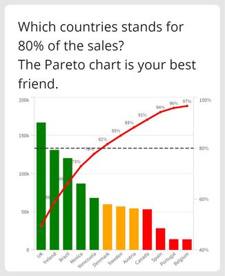
From December 1 to December 24, Christmas Eve, we will post one Qlik Sense visualization tip per day on LinkedIn. So, without further ado, the first in our series is Pareto Analysis. Commonly known as 80/20 distribution, the Pareto chart surfaces representative data that makes up 80% of the total share. This percentage can, of course, be easily adjusted.
Follow Patric Nordstrom and Nicole Tamms on LinkedIn to see the rest of Qlik’s 24 Days of Visualization Tips.
-
Reference Line Improvements
In the Qlik Sense September 2020 release, many improvements were made to reference lines. Now, a dimensional reference line can be added to a bar char... Show MoreIn the Qlik Sense September 2020 release, many improvements were made to reference lines. Now, a dimensional reference line can be added to a bar chart or a line chart and there are additional formatting options as well. In this blog, I will show 2 examples of dimensional reference lines. In the first example, I will show how text can be used to add a dimensional reference line to a discrete axis bar chart. In the second example, I will show how dimensional reference lines can be added to a continuous axis line chart.
Example 1
In the chart below, a dimensional reference line is used to highlight the bar for Donald Trump.
This reference line is created by setting the Dimension value to ='Donald Trump' which is simply text. In this example, the line type is set to dashed and the colored background checkbox is checked. The alignment of the chart is set to center so that the line goes through the bar versus above (start) or below (end) the bar. Some of the properties set can be seen in the image below.
Example 2
The second example of dimensional reference lines can be seen in the continuous line chart below. This line chart shows the net difference in media mentions each party receives. The red line is for Donald Trump and Mike Pence mentions and the blue line is for Joe Biden and Kamala Harris mentions. The reference lines point out key moments leading up to the 2020 presidential election so you can see if the media talk was based on a specific event. Check out the 2020 Presidential Election app to see this chart in action.
In this example, the reference lines are based on the date of the event and the labels and lines are styled to match the candidate party color. The new formatting features available in the Qlik Sense September 2020 release makes it easy to identity events for a specific party. There are other options available for dimensional reference lines. You can also set a show condition to determine when the reference line is displayed. This is what was done in the 2020 Presidential Election app – the selected key campaign event is displayed in the line chart. There is also the option to show the label and the value. The label can be hard-coded, or it can be an expression. The same is true for the reference line expression. The color of the label can be set to any color and the line type can be solid or dashed.
Learn more about reference line improvements and other new Qlik Sense enhancements in the What's New - September 2020 app and video.
Thanks,
Jennell -
New Year - New Skills & Badge as a Data Expert!
With Qlik’s Analytics Expert Program “Applied Data Analytics using Qlik Sense”, in just 15 weeks, you will be on your way to become a leader in develo... Show MoreWith Qlik’s Analytics Expert Program “Applied Data Analytics using Qlik Sense”, in just 15 weeks, you will be on your way to become a leader in developing a data-driven culture in your organization.
You will not only learn data analytics best practices but also learn how to achieve a data-informed mindset that shifts you from just looking for data and information to looking for insights and knowledge.
You will learn best practices in data analytics, data literacy and data-informed decision making that help you make the most effective use of Qlik Sense. As you complete the course, you will get a chance to earn a badge you can share on your social sites and add to your email signature.
In addition, you will obtain the knowledge to be able to take the Qlik Sense Business Analyst Qualification, Data Analytics Certification and Data Literacy Certification.
Course will run 30-Jan-23 - 12-May-23 In EMEA/AMER
27-Feb-23 - 9-Jun-23 in APAC
Register Today to save your spot for the Spring Semester
Looking for more details? Check out our Course Page to access Data Sheet, Sample course and all other details.
Happy Learning!
-
Free Webinar: Introduction to Qlik Continuous Classroom
This introductory webinar will explore the Qlik Continuous Classroom and the different ways to locate and access content. With over 300 courses, perso... Show MoreThis introductory webinar will explore the Qlik Continuous Classroom and the different ways to locate and access content. With over 300 courses, personalized learning plans and qualifications, let us help you get started and become familiar with all the Qlik Continuous Classroom has to offer!
Date: Dec 13, 2022 11:00 AM ET This time doesn't work for you? Register to receive the on-demand recording.
Host: Kristina Parks
Language: English
Session duration: 45 minutes
-
Font Styling Enhancements
Since my previous blog titled Additional Styling Options for the Bar Chart, there have been more font styling enhancements worth mentioning. The Gener... Show MoreSince my previous blog titled Additional Styling Options for the Bar Chart, there have been more font styling enhancements worth mentioning. The General styling tab is now available for the pie chart, table, and pivot table, allowing users to customize the heading, subtitle, and footnotes in their visualizations. The emphasis for the text can also be set to bold, italic or underlined. Here is another quick look at the General tab options in case you missed it in my previous blog.
Here is what a table looks like with these settings:
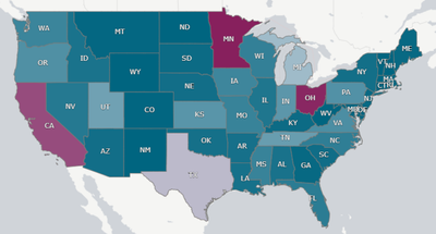
A similar enhancement was made to the map. App developers have more flexibility in styling the labels on a map, as well as the title, subtitle, and footnote. In the layer properties of the map in the Options section, labels can be toggled on. If labels are on, developer can set the label font family, label font size, and the label font color.
Sometimes maps can be busy, so being able to customize the labels is very helpful. In the map below, I was able to adjust the color and size of the labels to compliment the color scheme I was using, maximizing the clarity of the labels on a map with so many labels.
Here is another example of custom labels from the What’s New App – November 2022. This is a totally different look and shows how different the labels can be styled.
While these changes may seem small, they greatly impact the look and feel of an app. Developers have more options to easily customize visualizations to match their style or company brand.
Thanks,
Jennell
-
New Connectors, Homepage Content, Downloads and more!
Hello Qlik Community! The February release is LIVE! This was a massive release and a lot of work went on behind the scenes to make it happen! New Qlik... Show MoreHello Qlik Community!
The February release is LIVE!
This was a massive release and a lot of work went on behind the scenes to make it happen!
New Qlik Application Automation Connectors
Five new connectors were added to the Connectors page for Qlik Application Automation. Find support related content easily for Dynamics 365, expert.ai, GitLab, oauth2, Power BI and Tableau by clicking on the new icons.
Find the latest Blogs, Events and Ideas easily on the Homepage
You’ve always been able to see the latest discussion on the Homepage, but now you can find the latest blog entries, events and ideas all at once!
Improving the “Ask a Question” experience (one step at a time)
We removed the ability to post a question to the Search area. This was step one of improving the experience for this button. Be on the lookout for more improvements in the near future!
Fixed Blog titles when viewing on a mobile device
Blog titles were being truncated when viewing on a mobile device. We removed the dreaded ellipsis (…) and you can now view the full title!
Carousels now toggle 4 cards with a single click
Previously, if you wanted to scroll through a carousel, it was one card at time. Now clicking next, the carousel will jump to the next 4 cards. Less clicks means more time for viewing content!
And last, but certainly not least…
Qlik Downloads is now on Qlik Community!
This has been a passion project here at Qlik. Not only are we still using our own technology, we are using the latest and greatest! Even better, you only need to use one site, one login credential to enter your cases with Qlik Support, download the latest versions of our products and view the Release Notes. It is also our first venture into embedding a Qlik Sense Enterprise on SaaS app here on Community!
We are so excited to welcome the new Downloads page to Qlik Community!
You must be logged in and be a Customer or Partner to view the Qlik Downloads page. If you're having trouble accessing the page, please reach out to Customer Support.
We hope you enjoy all the latest enhancements with our February release! Please let us know if you have any questions using the comments below. We are on a freeze for March and will be back in April with some new enhancements!
Your Qlik Community Admins,
Melissa, Sue and Jamie
-
Data and healthcare
When people think about data analytics and data literacy, they often believe that these skills are only important in industries such as Banking, Manuf... Show MoreWhen people think about data analytics and data literacy, they often believe that these skills are only important in industries such as Banking, Manufacturing or Media. However, the healthcare industry is one of the biggest generators of data, contributing to 30% of the worlds data volume. Previously this was much harder to collect, but with the trend of wearables such as fitness trackers in watches and phones, more and more health data is available to to us. Many healthcare providers now implement tools such as Qlik, to help them visualize and make decisions based on this data.
In the past the healthcare industry would collect and use data to answer questions such as; what blood pressure is normal for a certain age group? at what age should someone start receiving a flu jab?. But we can now use healthcare analytics to dive even deeper into our health and to reduce cost of treatments, predict outbreaks of epidemics and avoid preventable disease. With people now living much longer lives, there are new challenges in terms of how we deliver healthcare so leveraging data to help solve these challenges is crucial.
One of the lessons learnt from the pandemic was that healthcare professionals need to be able to adapt to rapidly changing environments and leverage available data and tools, to make the right decisions. This applies to nurses in the A&E waiting rooms to consultants, to management teams making financial decisions for hospitals. Healthcare analytics is a skill all professionals can greatly benefit from. If you're a student studying on a healthcare related course, you can supplement your learning and start to upskill by signing up for the Qlik Academic Program. You can learn for free on software used by the NHS, so that you have the skills to thrive in the healthcare industry - qlik.com/academicprogram