Unlock a world of possibilities! Login now and discover the exclusive benefits awaiting you.
Analytics & AI
Forums for Qlik Analytic solutions. Ask questions, join discussions, find solutions, and access documentation and resources.
Data Integration & Quality
Forums for Qlik Data Integration solutions. Ask questions, join discussions, find solutions, and access documentation and resources
Explore Qlik Gallery
Qlik Gallery is meant to encourage Qlikkies everywhere to share their progress – from a first Qlik app – to a favorite Qlik app – and everything in-between.
Qlik Community
Get started on Qlik Community, find How-To documents, and join general non-product related discussions.
Qlik Resources
Direct links to other resources within the Qlik ecosystem. We suggest you bookmark this page.
Qlik Academic Program
Qlik gives qualified university students, educators, and researchers free Qlik software and resources to prepare students for the data-driven workplace.
Recent Blog Posts
-
Master's students master Qlik!
Over the course of the next few weeks, I will be finishing delivering a course of lectures to the University of Sheffield. We have three groups of stu... Show MoreOver the course of the next few weeks, I will be finishing delivering a course of lectures to the University of Sheffield. We have three groups of students:
Master’s students studying Management Practices
Undergraduates studying Digital Marketing
Undergraduates studying a Supply Chain Technology module
This shows you just how diverse of a range of students we have who can benefit from the Qlik Academic Program. So far, with the help of our fantastic Solution Architects, we have completed our Lecture and Workshop for our master’s students. We had around 36 in attendance and during their three-hour workshop with our Solution Architects, Marius Popa and Andrew Dinning, they built their first Qlik Sense app! This cohort of students included those who have just finished their undergraduate degrees and have now begun their masters, and some who are already in management positions in their organizations. It was an interactive group who used the time to question and interrogate the information given to them by the Solution Architects and the data they saw in their Qlik sense app. This is an important part of being data literate, not just reading data but also arguing with and questioning what you see. The fact the students got so involved was beneficial to their learning, it also challenged us to demonstrate the wonders of Qlik and show off all the features we believe set it apart from other products on the market. Such as its ability to reconcile data from different sources.
We have also completed the first guest lecture for the students completing their undergraduate degree in Digital Marketing. Next up we have a workshop with all 240 of the students in which Marius and Andrew with take them through building their first app. This will be a blend of students attending both virtually and in person, on top of that it is our biggest UK Academic Program lecture to date! But we enjoy the challenge and are especially excited for this one. Stay tuned for the blog on this session!
Want to learn more about the Qlik Academic Program? For more information or to apply visit qlik.com/academicprogram
-
Introducing Qlik Forts - the only hybrid sevice that brings analytics to your da...
What is Qlik Forts? Qlik Forts are provided as virtual appliances that can run on-premises or on cloud platforms including AWS, Azure, and Google Clou... Show MoreWhat is Qlik Forts?
Qlik Forts are provided as virtual appliances that can run on-premises or on cloud platforms including AWS, Azure, and Google Cloud Platform. This new hybrid service is included in Qlik Sense SaaS and is easily deployed from the Qlik Cloud management console. The complexity of managing the Fort is handled by Qlik and like any SaaS service, Qlik ensures that Forts are always up to date with the latest updates. A service built into each Fort checks with Qlik regularly to pick up updates and apply them in the background. You simply have to manage your data center and can stay focused on what matters most – your data!
How do Forts work?
Forts are designed to support enterprise data governance, security, and privacy needs. Forts are hosted on a private network and apps, data within those apps, and credentials used to access data connections are never sent to Qlik-hosted services and never need to travel over the public internet.
When registering a Fort with a Qlik Sense tenant, an administrator assigns one or more spaces to the Fort. Any content created in those spaces is created in the Fort. When a user selects an app in a space designated to a Fort, it triggers a browser redirect on the client. Therefore, it is possible for the Fort to sit inside a customer’s private network, and users need to be on the private network to access apps located in Forts. Your data stays wherever it must reside.
What’s the user experience?
It’s all Qlik Sense! Regardless of where Forts are deployed, users have a single set of credentials and a single point of entry to their data and insights, whether data is in a Fort, in Qlik Cloud, or a mix of both. Qlik Forts ensures a seamless hybrid analytics experience so access to data and insights can easily scale across your organization, to users all over the world. Users of any skill level can focus exclusively on analytics and insights without managing orchestration between environments.
Ready to learn more? Mike Tarallo walks you through how quick and easy it is to deploy a Fort and bring Qlik’s analytics services to wherever your data must reside.- Qlik Forts Technical Overview:
https://www.youtube.com/watch?v=A6pMzf3gvwA
Join Mike Tarallo and Denise LaForgia on November 10th for a live deep-dive discussion and technical overview of Qlik Forts - REGISTER HERE!
- Qlik Forts Technical Overview:
-
Power Generation in India (CEA)
Power Generation in India AnyChart — Extensions for QS Run a quick visual analysis of power generation from thermal, nuclear, and hydro energy s... Show MorePower Generation in IndiaAnyChart — Extensions for QS Run a quick visual analysis of power generation from thermal, nuclear, and hydro energy sources in India over the last few years — based on data delivered by the country’s Central Electricity Authority (CEA) through the National Power Portal. Track quarterly changes in the amount of electricity produced, overall or by type. Locate the increments and decrements that have the biggest effect nationwide and in individual regions.
Discoveries
Some of the discoveries from using this app include:
* Electricity generation and its quarterly change, by source: thermal, nuclear, and hydro.
* Detailed breakdown by region.
* Difference between Q3 2019 and Q3 2020Impact
Gives insight into how the volume of power produced was changing quarter by quarter before it reached the final figure, making it easy to identify how each period contributed to longer-term shifts and which energy sources were the biggest factors driving the corresponding trends.
Audience
Energy and climate researchers and analysts in companies and organizations. All who want to analyze the cumulative effect of sequentially introduced values in Qlik Sense — the app features a good example of an Advanced Waterfall chart and is publicly available among AnyChart demo apps for Qlik Sense.
Data and advanced analytics
The dataset is derived from reports on daily power generation in India provided by the Central Electricity Authority of India (CEA), which are publicly available online at the National Power Portal.
-
Become a Master in Data Literacy
Data Literacy is undoubtedly a term that we have all heard a lot recently. We hear a lot about the importance of it to organizations, and the gap tha... Show MoreData Literacy is undoubtedly a term that we have all heard a lot recently. We hear a lot about the importance of it to organizations, and the gap that exists with data literate employees at those organizations. One of the main reasons that gap still exists is because there are misunderstandings and misconceptions about what data literacy really is. These misunderstandings lead organizations to invest in technology, and it may also lead them to educate some of their employees on various aspects of working with data, but very few put in practice the upskilling and education that their employees really need to increase their data literacy.
Our Chief Learning Officer (CLO) Kevin Hanegan explains what it takes to become a master at data literacy specific to your role. For the full article by Kevin, visit:
https://www.linkedin.com/pulse/interested-becoming-master-data-literacy-heres-how-start-hanegan/

-
School Facilities Projects (NYCSCA)
NYC School Constructions AnyChart — Extensions for QS Investigate the timeline of all school facility development projects managed by the NYC S... Show MoreNYC School ConstructionsAnyChart — Extensions for QSInvestigate the timeline of all school facility development projects managed by the NYC School Construction Authority (NYCSCA) that are currently ongoing or completed in the last two decades, in a transparent start-to-finish overview. Inspect budget performance across the phases and spot cost overruns and savings in an instant. Compare the original schedule projections with the actual time spans to promptly discover shortcomings & delays.
Discoveries
Some of the discoveries from using this app include:
* Schedule of each school facility development project all over New York City.
* Budget performance.
* Planned vs actual timelines for each phase.Impact
Delivers a visual overview of all projects' schedules, communicating how long an activity should take and its current planned vs actual and budget performance to support informed, time and cost-aware decisions on prioritization, allocation of resources, and other aspects of project management.
Audience
Authorities delivering school construction project management supervision and audit. All who want to build and analyze project plans and schedules in Qlik Sense — the app features a good example of a Project Gantt chart and is publicly available among AnyChart demo apps for Qlik Sense.
Data and advanced analytics
The dataset is derived from a report on capital school facilities projects managed by the New York City School Construction Authority (NYCSCA), which is publicly available online.
-
Pennsylvania State University Tech Talk
This month I had the pleasure of returning back to Pennsylvania State University in person! Joined by my colleague Chris Reiter, we conducted a techn... Show MoreThis month I had the pleasure of returning back to Pennsylvania State University in person! Joined by my colleague Chris Reiter, we conducted a technical talk which consisted of a Qlik Sense workshop and presentation about the Academic Program. Students attended both in person and virtually, from all over the globe. The Penn State Great Valley campus is a special campus for graduate students and those who have a particular interest in analytics. In the past several years, its been our pleasure to create a partnership in which Qlik can provide students with the opportunity to learn Qlik Sense and build their data literacy skill sets.
If you are interested in the Qlik Academic Program, visit us and apply qlik.com/academicprogram today for software, training, certificate opportunities', and more, all at NO COST!

-
Community Enhancements (2021 - 7)
Hello Members, Many exciting updates happening in our Qlik Community! To say we've been busy is the understatement of the year. That being said, I ... Show MoreHello Members, Many exciting updates happening in our Qlik Community! To say we've been busy is the understatement of the year. That being said, I would like to acknowledge both @Jamie_Gregory and @Sue_Macaluso on my team who have been working around the clock to help members navigate all the change these past few weeks.
We hope that you read the recent blog article announcing our Qlik Community MVP class! Congratulations and thank you for all that you do - you are leaders by example and set the tone for our Community. Learn more about the program and check out our new page.
On October 4 we had our biggest update to the Qlik Community since we re-platformed back in 2018! The Qlik Support Case Portal has moved into the Community together with a new chatbot. Head on over to the Support Updates Blog to learn about this change which impacts all customers and partners. The FAQ can answer most questions.
A few things to know about the chat bot:
- The chat bot is visible on Community Support pages only. We may expand to other locations in the future.
- The chat bot is trained to help with issues related to accounts, log in, downloads, and licensing.
Read:- "We've officially moved! Support Case Portal comes to Qlik Community"
- "Archived Cases Now Available Read Only"
- "Revving up the Chat Bot Engine"
📢 Be sure to join us in a live Q&A tomorrow to ask questions about the new case portal and chat bot.
Other Community Enhancements:
New Qlik Gallery Wizard
It just became easier to upload an app to the Qlik Gallery thanks to our new Gallery 'wizard' which will walk you step-by-step thru the process. No more downloading and uploading of files. Once you hit submit on the wizard it will automatically create a post.
Event Information Now in Groups
We want to make it easy for you to stay informed and participating in events is one way to do that. A few months ago we added event content to the right navigation in all product forums. This month, we have added event content within all groups. Note: Depending on the event, you may be asked to register after you RSVP.New Page for Qlik Application Automation / Connectors
Visit a new page housed within the Qlik Application Automation forum to learn more about the rapidly growing library of Connectors.When you click on a Connector it will lead you to knowledge articles. The library of Connectors and articles will evolve over time. Watch the attached short video clip to see how it works. ⬇️
A Refresh to (2) Support Programs
Two of our very popular support programs just received a name refresh.
- Talk to Experts Tuesday renamed to "Q&A with Qlik"
A live Question and Answer chat where you can also meet Qlik Support and Product Teams - Techspert Thursday renamed to "Techspert Talks"
A free webinar to facilitate knowledge sharing plus includes recordings from prior events.
We hope that you enjoy the many Qlik Community updates. As always, we are here for you and welcome feedback and ideas. You can comment directly on this blog or you can also start a new discussion in the Community Corner.

-
Archived Support Cases Available Read-Only
To our valued Qlik Users, On Monday, October 4, Qlik moved our Support Portal to Qlik Community so that customers can self-serve, seek help from ... Show MoreTo our valued Qlik Users,
On Monday, October 4, Qlik moved our Support Portal to Qlik Community so that customers can self-serve, seek help from peers, and engage Qlik Support all in one place.
As part of this change, customers were no longer able to view historical cases.
We have heard your feedback and are restoring access to case history prior to Oct. 4, effective immediately. To access your organization’s archived cases, please follow this link.
For further announcements on Case Portal enhancements, updates will be posted in our Qlik Community Support page. We are committed to elevating your Qlik Support experience and encourage you to take advantage of our newly aligned resources. If you have any questions or issues, please contact Qlik Support by visiting our Qlik Community Support page.
As always, thank you for choosing Qlik,
-
Animate Charts using Nebula.js, Picasso.js, and D3.js Interpolation
Understanding d3-interpolateThe d3-interpolate module offers a way to compute intermediate values between two given values. The main interpolation met... Show MoreUnderstanding d3-interpolate
The d3-interpolate module offers a way to compute intermediate values between two given values. The main interpolation method "d3.interpolate" takes two values as parameters (d3.interpolate(a, b)), and depending on the inferred type (numbers, colors, arrays, objects etc...), it routes them through the appropriate function that will create the relevant interpolator. This interpolator implementation is based on the type of the end value b.
For instance, if two strings representing CSS colors are passed to d3.interpolate, it will call the color interpolation method:
let color = d3.interpolate("blue", "red");
color(1) // will return #FF0000 the hex equivalent of red
color(0.5) // will return #800080, an purple-ish color that represents the mid color between blue and red
The same goes for interpolating between numbers, or even numbers inside strings. Take the following code for example where CSS transforms are interpolated, allowing us to make basic animations:
let transform = d3.interpolate("translate(0,0) rotate(0)", "translate(500, 50) rotate(90)");
transform(0.5) // returns translate(250, 25) rotate(45)
Animating a Picasso.js chart
Going back to our mashup, let's implement d3 interpolation within our nebula.js code, the goal is to animate a line chart in order to simulate a drawing effect of the line from left to right.
If you are not very familiar with how to build a chart using nebula.js and picasso.js, you can check out the official docs, this blog post, or this one which will walk you through all the building blocks to get up and running.
First things first, import the functions we need from their respective d3 modules, including the ease function, timer, and the interpolate function.
import { easeSinIn as ease } from 'd3-ease';
import { timer } from 'd3-timer';
import { interpolate } from 'd3-interpolate';
We then declare our transition variable and a way to reset it.
// Define transition & stopTransition function
let transition = null;

const stopTransition = () => {
  if (transition) {
    transition.stop();
    transition = null;
  }
};
Now for the fun part, we schedule a new timer to invoke the callback that includes our Picasso.js chart instance update function repeatedly until stopped.
The interpolate function takes an old and a new value and then a time argument from 0 to 1 and returns the right x and y coordinates which in our example results in the line animating.
      useEffect(() => {
        if (!instance) {
          return;
        }

        // reset transition
        if (transition) {
          stopTransition();
        }

        // Set duration
        const duration = 5000;

        // Run timer
        transition = timer((elapsed) => {
          // Set t
          const t = Math.min(1, ease(elapsed / duration));

          instance.update({
            data: [
              {
                type: 'q',
                key: 'qHyperCube',
                data: layout.qHyperCube,
              },
            ],
            settings: {
              scales: {
                x: {
                  data: {
                    extract: {
                      field: 'qDimensionInfo/0',
                    },
                  },
                },
                y: {
                  data: { field: 'qMeasureInfo/0' },
                  invert: true,
                  expand: 0.1,
                },
              },
              components: [
                {
                  key: 'lines',
                  type: 'line',
                  data: {
                    extract: {
                      field: 'qDimensionInfo/0',
                      props: {
                        y: { field: 'qMeasureInfo/0' },
                      },
                    },
                  },
                  settings: {
                    coordinates: {
                      major: {
                        scale: 'x',
                        fn: (d) => {
                          const { items } = d.data;
                          const start = Math.max(0, d.datum.value - 1);
                          const end = d.datum.value;
                          const time = Math.min(1, (t - d.datum.value / items.length) * items.length);
                          return time < 0
                            ? null
                            : interpolate(d.resources.scale('x')(start), d.resources.scale('x')(end))(time);
                        },
                      },
                      minor: {
                        scale: 'y',
                        fn: (d) => {
                          const { items } = d.data;
                          const start = items.find((item) => item.value === Math.max(0, d.datum.value - 1)).y.value;
                          const end = items.find((item) => item.value === d.datum.value).y.value;
                          const time = Math.min(1, (t - d.datum.value / items.length) * items.length);
                          return time < 0
                            ? null
                            : interpolate(d.resources.scale('y')(start), d.resources.scale('y')(end))(time);
                        },
                      },
                    },
                  },
                },
              ],
            },
          });

          if (t === 1) {
            stopTransition();
          }
        });
      }, [layout, instance]);
That's all! Below is how the final result looks like. Keep in mind that this concept can be extended to be used with other Picasso.js components to achieve the animations you need, for instance interpolating the size of point components in bubble charts or box components in bar charts.
Please find the full code on Github for reference.
-
Let's Dissect the Qlik Engine API - Part 4: Hypercubes
My friend, Øystein Kolsrud - Software Architect at Qlik, is back with part 4 of the Qlik Engine API fundamentals: HypercubesPrevious articles: Part 1:... Show MoreMy friend, Øystein Kolsrud - Software Architect at Qlik, is back with part 4 of the Qlik Engine API fundamentals: Hypercubes
Previous articles:
- Part 1: Let's Dissect the Qlik Engine API - Part 1: RPC Basics
- Part 2: Let's Dissect the Qlik Engine API - Part 2: Handles
- Part 3: Let's Dissect the Qlik Engine API - Part 3: Generic Objects
IntroductionThe topic of this post is the concept of "hypercubes", which can sound rather intimidating at first, but which is simply a very flexible and convenient way of extracting data from Qlik Sense.
Background
We have in previous posts seen some basic examples of how to perform evaluations in Qlik Sense. It is theoretically possible to use the approach described in Part 3 (where a generic object is used to group evaluations) to extract any information we want from the system. In fact, it would be possible to rely solely on the "Evaluate" method described in Part 2 along with selections to produce any imaginable set of data. But the obvious downside to this approach is performance. A visualizations would typically have to call that method an enormous amount of times, maybe even millions, in order to fully display a chart. Doing so is of course not feasible, and this is where the hypercube comes into play.
The term "hypercube" is a concept taken from mathematics and is a geometric concept denoting a cube of a generic number of dimensions. The good old cube as we know it is a hypercube of 3 dimensions. The square is a hypercube of 2 dimensions. But in mathematical terms, there is no reason why it would not be possible to express higher order cubes, using any number of dimensions. For more reading on this (and some fancy animations), Wikipedia provides a good starting point:
https://en.wikipedia.org/wiki/Hypercube
But that's all I'll say about mathematics for now. In Qlik Sense, a hypercube is simply an interface for defining a set of data to extract. And as far as this post goes, it is sufficient to simply think of a hypercube as a table.
Defining a hypercube
I will start with an extension of the example used in the previous post where we used the "StringExpression" construct to evaluate the sum of sales. In that example we created a generic object with the following set of properties:
{
  "qInfo": {
    "qId": "81bac84a-cb6a-48ac-8139-298b6e4913c5",
    "qType": "myKpi"
  },
  "myProp0": { "qStringExpression": "=Sum(Sales)" }
  "myProp1": { "qStringExpression": "=Sum(Sales)/Count(Month)" },
}
The resulting object gave us an interface for performing computations, and we could use selections together with "GetLayout" to evaluate the sum of sales for a particular employee. This approach would be fine for a simple KPI, but for a more complex visualization we would typically like to do something more interesting like for instance listing the sales for all employees at once. In that case, what we need is to be able to construct a table with the employee as one column and the expressions to evaluate as the other columns. That way we could tell the engine to fill in the cells of the table and extract all the information in one go. This is exactly the purpose of a hypercube.
To use a hypercube, we need to add a definition of our hypercube to the properties of a generic object. And just like an evaluation can be added by using the reserved "qStringExpression" property, a hypercube can be added using the reserved property "qHyperCubeDef". The hypercube is, as I have already mentioned, a very flexible tool which means that there is a huge amount of settings available for it. I will only cover a very small portion of what you can do with hypercubes in this blog series, but you will find the full definition of the structure for defining them here:
The two most important settings for a hypercube are "qDimensions" and "qMeasures". These are the properties that define the dimensions that the hypercube should consider, along with the measures that should be computed based on the values of those dimensions. In our case we will have one dimension (the field "SalesRep") and two measures (the sum of sales, and sum of sales per month) which means our call to "CreateSessionObject" will like like this:
{
  "jsonrpc": "2.0",
  "id": 17,
  "method": "CreateSessionObject",
  "handle": 1,
  "params": [
    {
      "qInfo": { "qType": "myCube" },
      "qHyperCubeDef": {
        "qDimensions":
          [ { "qDef": { "qFieldDefs": [ "SalesRep"  ] } } ],
        "qMeasures":
          [ { "qDef": { "qDef": "Sum(Sales)" } },
            { "qDef": { "qDef": "Sum(Sales)/Count(Month)" } }
          ]
      }
    }
  ]
}
The engine replies with the following message giving us a handle for interacting with the new object:
{
  "jsonrpc": "2.0",
  "id": 17,
  "result": {
    "qReturn": {
      "qType": "GenericObject",
      "qHandle": 4,
      "qGenericType": "myCube",
      "qGenericId": "3cb898dc-b7dc-44ed-ba83-c27fae5d0658"
    }
  },
  "change": [ 4 ]
}
Getting data
Now that we have an object containing a valid hypercube definition, we can extract data from it using the method "GetHyperCubeData":
This method takes two arguments, of which the first is a path to where in the properties structure of the object the hypercube is defined. In our case the definition is found at the root level, so our path will be "/qHyperCubeDef" just like the example in the reference documentation. The second argument contains a definition for what data to retrieve from the cube. This is defined as a set of pages each defining a rectangle of the data of the table defined by the hypercube. The definition of the "NxPage" structure can be found here:
https://help.qlik.com/en-US/sense-developer/November2020/APIs/EngineAPI/definitions-NxPage.html
In my very simple example, the table contains three columns (one for the dimension and two for the expressions) and only two rows as my data contains only two sales reps. So to get all data for this hypercube, I will use a page starting at the top left corner, with width set to 3 and height set to at least 2 (I somewhat arbitrarily choose 20 in this case):
{
{
  "jsonrpc": "2.0",
  "id": 21,
  "method": "GetHyperCubeData",
  "handle": 4,
  "params": [
    "/qHyperCubeDef",
    [ { "qLeft": 0,
        "qTop": 0,
        "qWidth": 3,
        "qHeight": 20
      }
    ]
  ]
}
The response I get is, as the reference documentation states, an array of instances of the structure "NxDataPage":
https://help.qlik.com/en-US/sense-developer/November2020/APIs/EngineAPI/definitions-NxDataPage.html
The full response to the call to "GetHyperCubeData" does in our case look like this:
{
  "jsonrpc": "2.0",
  "id": 20,
  "result": {
    "qDataPages": [
      {
        "qMatrix": [
          [ { "qText": "Amalia Craig", "qNum": "NaN",
              "qElemNumber": 0, "qState": "O"
            },
            { "qText": "261142", "qNum": 261142,
              "qElemNumber": 0, "qState": "L"
            },
            { "qText": "2720.2291666667", "qNum": 2720.2291666666665,
              "qElemNumber": 0, "qState": "L"
            }
          ],
          [ { "qText": "Amanda Honda", "qNum": "NaN",
              "qElemNumber": 1, "qState": "O"
            },
            { "qText": "253689", "qNum": 253689,
              "qElemNumber": 0, "qState": "L"
            },
            {
              "qText": "2698.8191489362", "qNum": 2698.81914893617,
              "qElemNumber": 0, "qState": "L"
            }
          ]
        ],
        "qTails": [ { "qUp": 0, "qDown": 0 } ],
        "qArea": { "qLeft": 0, "qTop": 0, "qWidth": 3, "qHeight": 2 }
      }
    ]
  }
}
The most important part of the returned data is what we find in the property "qMatrix". That is where all the data is found. The matrix consists of an array of rows (two in this case), and each row contains an array of cells. The cells contain values in the same order as the dimensions and measures are defined for the hypercube, so cell position number 0 contains the dimension value and position 1 and 2 contain the measures computed for that dimension.
More to learn
I will stop here for now, but I'll come back to hypercubes in later posts as this is a very important concept in Qlik Sense. Pretty much every visualization will be based on an object containing a hypercube definition of some form. In fact, some visualizations will contain multiple hypercubes. An example of this is the map visualization which contains one hypercube for each map layer. Another example is the box plot visualization which contains one main hypercube which is based on the dimensions and measures the user defines, and a set of auxiliary hypercubes constructed under the hood that are derived from the main hypercube but used to compute the whiskers and outliers.

-
Commonly asked questions about the Qlik Academic Program
During my interactions with the student community, some common questions are posed by them. I will try to pen them in my blog along with the answers.Q... Show MoreDuring my interactions with the student community, some common questions are posed by them. I will try to pen them in my blog along with the answers.
Q.1. Is the academic program completely free?
Answer: Yes, the Qlik Academic Program is free for students and professors from accredited universities and institutions. All the resources which includes the Qlik Sense Business software, online training, qualifications, certifications etc. are free.
Q.2 How does one get access to the academic program?
Answer: If you are a student, you need to visit qlik.com/academicprogram and fill in your personal information along with a scanned copy of your student id which could be a id card, fees paid receipt etc. We need to ensure you are a current student and so your current batch dates should be reflected in the id. If you are professor, simply sign up using your official email id.Q.3 Are there any fees for the exams and qualifications/certifications?
Answer: As mentioned above, all the resources of the program are free including exams and qualifications/certification. We do not charge for any of the program resources.
Q.4 What is the criteria to get qualified certified? Any other important points to remember while attempting the exam?
Answer: One has three attempts to secure 70% marks of more within 3 attempts. Therefore, please ensure you are adequately prepared to attempt the exams. You must ensure that you have a continuous internet connection for about 3 hours because in case, there is a break, you will lose an attempt for your exam.
Q.5. Which learning pathways are offered under the academic program?
Answer: Students and Professors get access to four pathways which lead to qualifications/certifications and they are Business Analyst, Data Architect, Data Literacy and Data Analytics. You can pursue any or all of these once you have program access. Each of these pathways contain videos, quizzes, take away documents to support your learning experience plus these are all self paced which means you can learn at your own convenience.
Q.6. For questions during the learning process how do we get our queries answered?
Answer: The academic program offers several platforms to get your questions answered while you are learning. There is Qlik Community which has discussion topics and this could be a good way to start. There are also search options within the learning portal where you could search your query. One could also write in to academicprogram@qlik.com in case answer to questions are not found.
Q.7 What career opportunities are available for those who learn from the academic program?
Answer: Qlik has a customer base of more than 50,000 and a partner ecosystem of more than 1700 in around the world. All these are potential recruiters since they use Qlik technologies. Various research surveys have indicated that the data analytics industry is on an upswing due to increased levels of digitization, therefore, opportunities for jobs and internships are ample.
-
Spring Semester starts January 17!
With Qlik’s “Applied Data Analytics using Qlik Sense” Course, you will not only learn data analytics best practices but also learn how to achieve a d... Show MoreWith Qlik’s “Applied Data Analytics using Qlik Sense” Course, you will not only learn data analytics best practices but also learn how to achieve a data-informed mindset that shifts you from just looking for data and information to looking for insights and knowledge.
You will learn best practices in data analytics, data literacy and data-informed decision making that help you make the most effective use of Qlik Sense. In just 15 weeks, you will be on your way to become a leader in developing a data-driven culture in your organization.
The course is designed to help you apply skills and knowledge learned as you get your job done and advance your professional development. You will be prepared to take Qlik Sense Business Analyst Qualification, Data Analytics and Data Literacy Certifications.
Learn More and Register to get started today!
-
Do you have what it takes to be a Qlik Academic Program Educator Ambassador?
The Qlik Academic Program provides educators, students and researchers from accredited universities with free Qlik software and learning resources to ... Show MoreThe Qlik Academic Program provides educators, students and researchers from accredited universities with free Qlik software and learning resources to educate and train the next generation of experts leading with data. Our Educator Ambassador Program aims to shine a spotlight on our most active educator members. Our ambassadors will champion our vision to make more students data literate and to prepare them for the data-driven workplace.
Are you a current educator member who is:
- Passionate about the Qlik Academic Program and the resources provided to students and educators?
- Passionate about educating students to be prepared for the data-driven workforce and to secure jobs?
- An active promotor of the Qlik Academic Program to academic peers as well as students?
- Willing to share your experience of the Qlik Academic Program at (virtual) events, in forums, on social media and in the press?
- A contributor to blogs, forums, university publications, professional journals, papers, or other materials that promote the Qlik Academic Program?
If you answered YES to one or more of the above, then we encourage you to apply to the Educator Ambassador Program!
All current educator members are eligible to apply. If you have not already signed up for the Qlik Academic Program you can do so at qlik.com/academicprogram and then visit us to meet our current 2021 Educator Ambassadors.
Application deadline: November 30, 2021. The selected ambassadors will be announced in early 2022.
Benefits:
If you are selected as a Qlik Academic Program Educator Ambassador, you will receive a host of benefits including:
- Insight: Exclusive webinars with Qlik leaders, covering the latest trends in analytics and other industry topics
- Credibility: A digital badge to certify ambassador status and a featured online profile
- Exposure: Outreach opportunities to showcase your experience with the Qlik Academic Program via Qlik marketing channels or speaking engagements
- Perks: Discounts on Qlik events and other exclusive rewards
- Community: Collaborate with other educators across various fields and geographies
- Opportunity: Potential to advance your career including meeting university requirements for scholarly contribution beyond the classroom
-
Reload Logs Reader v 1.0
Hey guys - today I would like to introduce you to our latest guest blogger, Andrea Danielato. Andrea has been with Qlik for 10 years and is a Senior ... Show MoreHey guys - today I would like to introduce you to our latest guest blogger, Andrea Danielato. Andrea has been with Qlik for 10 years and is a Senior Consultant. He has worked on customer projects acting as a developer, a project manager and an advisor for Qlik solutions. He has helped customers optimize app performance, define and implement best practices and infrastructure governance. He is heavily involved with teaching our valued partners how to deliver the best Qlik applications. On a personal note, Andrea likes to watch movies and loves to practice DIY. Please welcome me in joining Andrea to the guest blogger program - where today he will provide you with a solution to read RELOAD LOGS (attached).
Take it away Andrea!Andrea:
Hello Qlik Community! You will be pleased to know that I have developed a solution for developers, that helps with access to Qlik Sense app reload logs for debugging purposes.
In an enterprise environment, it may be common where IT will not provide access to the file structure / folders where the logs are stored, so developers have to ask to get the logs from IT which can be terribly slow and frustrating.
To solve this I have developed a simple ODAG solution that can help on this topic.
I attach a document with a short manual of the solution including installation and a short vide that demonstrates the functionality of the solution.
Let me know what you think!
-
Introducing the New Academic Program Lead for EMEA!
Hi Academic Program enthusiasts,I’m Holly Johnson and I’m the new Academic Program Representative for EMEA. I’m so excited to have joined Qlik and the... Show MoreHi Academic Program enthusiasts,
I’m Holly Johnson and I’m the new Academic Program Representative for EMEA. I’m so excited to have joined Qlik and the Academic Program team. This is an initiative that I could have benefited from when I was at university so giving students the chance to upskill in ways I couldn’t, means a lot to me. I’m happy to have found a role here that encompasses my enthusiasm for education and learning. Everyone has been so welcoming since I joined, both colleagues and educators, and I already feel like I’m part of the Qlik family.
It's only my fourth week but I’ve already helped to deliver a lecture for the University of Lund in Sweden. Qlik originated in Lund, so it was lovely that my first guest lecture was delivered to students living in the place where it all started. We had around 37 MBA student attendees and this was followed by two hands on workshops in which we got the students building their first Qlik Sense app. The students were engaged and asked lots of questions. Our Senior QA engineer based in Lund, Matt Thornington, ran a great workshop and finished by showing the students an app he built that tracked the movement of hurricanes since 1850. This really got the students interested in the kind of projects you can pursue using Qlik Sense, and just how creative and curious you can be with the product.
Last Friday I also delivered two short lectures to some students in the Netherlands, and in the coming months I have many more. For the most part these will all be delivered virtually, but I’m hoping it won’t be long until I can start meeting my students and educators face to face!
If you are a university student or educator, you can join our Qlik Academic Program for free. You will receive full year access to Qlik Sense software, training and qualifications as well as access to our live webinar series. For more information or to apply visit qlik.com/academicprogram
-
picasso.js shapesAt() function
If you want to add custom interactions that depend on what shapes the user is interacting with in picasso.js, you're going to want to use the shapesAt... Show MoreIf you want to add custom interactions that depend on what shapes the user is interacting with in picasso.js, you're going to want to use the shapesAt() function for two reasons. First, while you can try to use the shape that is the target of the event when rendering in SVG with picasso.js, that won't work if you're rendering with Canvas in picasso.js since the event target will just be the Canvas element. And second, shapes in some charts, such as a scatter plot, may overlap, so simply using the shape that is the target of the event is not enough if you want the interaction to include all of the shapes the user is interacting with. With the shapesAt() function, whether rendering in SVG or Canvas, you can get all of the shapes at the point of the user interaction.
Let's take a look at one use case and how to use it. Imagine that we have a scatter plot and when the user clicks, we want to select all items at the point of the cursor. We want the selection to apply to Qlik Sense, but we want the chart to having a brushing effect, so we'll use set analysis so that all of the rows return regardless of the selection state in Qlik Sense, but we'll change the opacity based on the selection.
The setup for the hypercube, which we'll create with nebula.js, looks like this.
nebula.render({
  element: document.querySelector('#container'),
  type: 'scatter-plot',
  fields: [
    'Product Sub Group Desc',
    '=Sum({<[Product Sub Group Desc]=>} [Sales Margin Amount])/Sum({<[Product Sub Group Desc]=>} [Sales Amount])',
    '=Sum({<[Product Sub Group Desc]=, [Year]={"2020"}>} [Sales Amount])',
  ],
});
Notice the set analysis in the measures that ignores the selections in the dimension of the chart, so that when we apply selections in Qlik Sense to the dimension of the chart, every row in the hypercube still returns.
Next let's take a look at the entire picasso.js definition.
scatterPlotSn = {
  const picasso = picassojs();
  picasso.use(picassoQ);
  return {
    qae: {
      properties: {
        qHyperCubeDef: {
          qDimensions: [],
          qMeasures: [],
          qInitialDataFetch: [{ qWidth: 3, qHeight: 100 }],
          qSuppressZero: true,
          qSuppressMissing: true,
        },
        showTitles: true,
        title: '',
        subtitle: '',
        footnote: '',
      },
      data: {
        targets: [
          {
            path: '/qHyperCubeDef',
            dimensions: {
              min: 1,
              max: 1,
            },
            measures: {
              min: 2,
              max: 2,
            },
          },
        ],
      },
    },
    component() {
      const element = stardust.useElement();
      const layout = stardust.useStaleLayout();
      const rect = stardust.useRect();
      const model = stardust.useModel();

      const [instance, setInstance] = stardust.useState();

      stardust.useEffect(() => {
        const p = picasso().chart({
          element,
          data: [],
          settings: {},
        });

        setInstance(p);

        return () => {
          p.destroy();
        };
      }, []);

      stardust.useEffect(() => {
        if (!instance) {
          return;
        }

        const selected = layout.qHyperCube.qDataPages[0].qMatrix.filter((row) => row[0].qState === 'S').map((row) => row[0].qElemNumber);

        instance.update({
          data: [
            {
              type: 'q',
              key: 'qHyperCube',
              data: layout.qHyperCube,
            },
          ],
          settings: {
            scales: {
              x: {
                data: {
                  extract: {
                    field: 'qMeasureInfo/0',
                  },
                },
              },
              y: {
                data: {
                  extract: {
                    field: 'qMeasureInfo/1',
                  },
                },
                invert: true,
              }
            },
            components: [
              {
                type: 'point',
                data: {
                  extract: {
                    field: 'qDimensionInfo/0',
                    props: {
                      x: { field: 'qMeasureInfo/0' },
                      y: { field: 'qMeasureInfo/1' },
                    },
                  },
                },
                settings: {
                  x: { scale: 'x' },
                  y: { scale: 'y' },
                  shape: 'circle',
                  size: 1,
                  opacity: (d) => selected.length === 0 || selected.includes(d.datum.value) ? 1 : 0.25,
                },
              },
            ],
            interactions: [
              {
                type: 'native',
                events: {
                  click(e) {
                    const chartBounds = element.getBoundingClientRect();
                    const cx = e.clientX - chartBounds.left;
                    const cy = e.clientY - chartBounds.top;
                    const shapes = this.chart.shapesAt({ x: cx, y: cy });
                    const values = shapes.map((shape) => shape.data.value);
                    model.selectHyperCubeValues('/qHyperCubeDef', 0, values, true);
                  },
                },
              },
            ],
          },
        });
      }, [layout, instance]);

      stardust.useEffect(() => {
        if (!instance) {
          return;
        }
        instance.update();
      }, [rect.width, rect.height, instance]);
    },
  };
}
There's a lot of code there, but if you're familiar with building custom picasso.js charts, much of it will be very familiar. If you've never built a custom picasso.js chart, you may want to check out https://community.qlik.com/t5/Qlik-Design-Blog/Picasso-js-What-separates-it-from-other-visualization-libraries/ba-p/1829951.
So let's take a closer look at the part that is the topic of the blog post, the shapesAt() function. The shapesAt() function in this example is used in the 'click' interaction.
click(e) {
  const chartBounds = element.getBoundingClientRect();
  const cx = e.clientX - chartBounds.left;
  const cy = e.clientY - chartBounds.top;
  const shapes = this.chart.shapesAt({ x: cx, y: cy });
  const values = shapes.map((shape) => shape.data.value);
  model.selectHyperCubeValues('/qHyperCubeDef', 0, values, true);
}
The shapesAt() function is called from the chart instance, and in this case, we're simply checking for the shapes at the exact x and y. There are more advanced ways to use it, including detecting only certain shapes, or using an area instead of a point to detect shapes, and you can check out the docs for more information at https://qlik.dev/apis/javascript/picassojs#%23%2Fdefinitions%2FChart%2Fentries%2FshapesAt.
The big thing I want to point out here so you can avoid the struggle I had first using the shapesAt() function is how the x and y coordinates are calculated. You must adjust for where the chart is located in the viewport. So the clientX and clientY values from the event give you the x and y coordinates of where the click happened in the viewport, then you can adjust for the area outside of the chart using the left and top from element.getBoundingClientRect().
You can check out all of this code at https://observablehq.com/@fkabinoff/picasso-js-shapesat. Let me know if this post inspires you, and what else you'd like to know about picasso.js!
-
ESTADITICAS INEGI IEMS
ESTAS CON LAS ESTADISTICAS DEL IEMS (PREPA 1) SOLICITADAS POR INEGI EN 2014 -
Add context and drive discussion with Collaborative Notes in Qlik Sense
We have now released Collaborative Notes, a new feature in Qlik Sense that creates a collaborative canvas for users, allowing them to add narrative an... Show MoreWe have now released Collaborative Notes, a new feature in Qlik Sense that creates a collaborative canvas for users, allowing them to add narrative and context to analytics and create discussions to interact with others around data. This allows more people to work together to leverage not just what the data says, but also the critical human context and perspective around it.
Click here to view transript
Users can take snapshots of analytics and add text commentary to capture human perspectives around analytics. They can tag and invite others to discussions, conducting both real-time (synchronous) and offline (asynchronous) communication. Notes can be stored within apps and also added to collections within the hub, serving as a record of discussion and joint decision-making for your organization. And of course, at any time users can jump directly back into live analytics apps, in-context, for further analysis.
With Notes, Qlik Sense further supports team decisions with the critical business context needed for the best outcomes. Stay tuned as we continue to add exciting new Active BI features to our platform, helping our customers maximize the value of their data and people.
Resources:
- Can't see the video? Download .mp4 attached to this post
- Collaborative Notes: How to video on Qlik Help YouTube Channel
- Collaborative Notes Documentation
- Do More with Qlik Webinar Registration
-
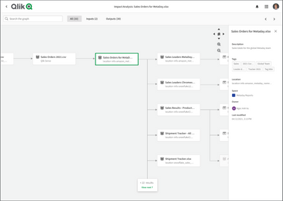
Understand the origin of your dataset with Impact Analysis
Users access Impact Analysis from the hub via a dataset or an application. As this simple example shows, users will then visually see the relationshi... Show MoreUsers access Impact Analysis from the hub via a dataset or an application. As this simple example shows, users will then visually see the relationship of all datasets and applications (or processors) for the selected item. The user can then navigate through the graph, changing focus to get more details on a particular node. Note that Impact Analysis includes any data source related to an application, not just the data sources currently being managed within the Qlik Cloud hub.
Impact Analysis is just the initial release of lineage-related capabilities that will soon become available in QSE SaaS. You may recall that we recently announced the acquisition of NodeGraph, a fully customizable metadata management solution that comprises interactive data lineage at the field level. This will accelerate our delivery of lineage-related capabilities in the future.
For more details on this new capability, check out this demo:
-
Inphinity - HR Team Management
You can download the HR Team Management application for FREE: Inphinity Universe.If you are looking for a quick walk-through, here it is: https://you... Show MoreYou can download the HR Team Management application for FREE: Inphinity Universe.
If you are looking for a quick walk-through, here it is: https://youtu.be/eT3QtmbQU5k.
If you'd like to know more, let us know.
Enjoy!
Maria (Sandorova) Oreska