Unlock a world of possibilities! Login now and discover the exclusive benefits awaiting you.

Analytics & AI
Forums for Qlik Analytic solutions. Ask questions, join discussions, find solutions, and access documentation and resources.
Data Integration & Quality
Forums for Qlik Data Integration solutions. Ask questions, join discussions, find solutions, and access documentation and resources
Explore Qlik Gallery
Qlik Gallery is meant to encourage Qlikkies everywhere to share their progress – from a first Qlik app – to a favorite Qlik app – and everything in-between.
Qlik Community
Get started on Qlik Community, find How-To documents, and join general non-product related discussions.
Qlik Resources
Direct links to other resources within the Qlik ecosystem. We suggest you bookmark this page.
Qlik Academic Program
Qlik gives qualified university students, educators, and researchers free Qlik software and resources to prepare students for the data-driven workplace.
Recent Blog Posts
-
Dual & Exists – Useful Functions
I find that the Dual and Exists functions are useful functions that I often use in my script. The Dual function allows me to represent a string field... Show MoreI find that the Dual and Exists functions are useful functions that I often use in my script. The Dual function allows me to represent a string field numerically, making it ideal for sorting purposes. The Exists function, used in conjunction with the Where clause, allows me to only load related data into my data model.
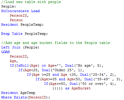
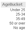
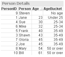
The Dual function can be used in the script and chart expressions. I tend to use it in the script when I need the ability to sort a string field numerically. For example, in the script snippet below, I created age buckets and I want to be able to sort them in a list box and a chart so I used the Dual function to give each bucket a numeric value.
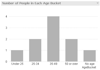
By using the Dual function, I am able to sort the AgeBucket list box and the AgeBucket dimension in my chart numerically.
The Exists function is used to determine whether a “specific field value exists in a specified field of the data loaded so far.” I often use this with the Where clause to load data only when the specified data has already been loaded in the data model. For example, in the script below the Age and AgeBucket fields are loaded only if the PersonID has already been loaded in the data model.
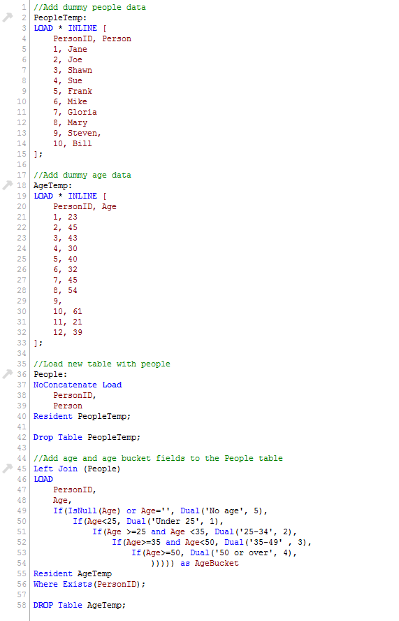
Notice in the AgeTemp table that there are ages listed for PersonID 11 and 12 but since those IDs were not loaded in the data model (in the People table), they are excluded by the Where Exists(PersonID) clause. The table below shows the data that was loaded.
I often blog about functions used in QlikView but I find the Dual and Exists to be two functions that I use often so that I can present data in a desired sort order and can keep my data model free of unassociated data. If you would like to learn more or see an example application, check out my technical brief.
Thanks,
Jennell
-
2017 College Basketball Championship
Check out the Qlik Sense mashup to pick your bracket and analyze team and player stats!http://collegebasketball.qlik.com/
-
Counter Aggregation Functions
Today I am going to blog about five Counter Aggregation Functions that can be used in Qlik Sense and QlikView in both charts expressions and the scrip... Show MoreToday I am going to blog about five Counter Aggregation Functions that can be used in Qlik Sense and QlikView in both charts expressions and the script.
- Count()
- MissingCount()
- NullCount()
- NumericCount()
- TextCount()
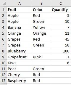
Before taking a closer look at how we can use each of these functions, let’s first look at the data set I will use for the examples. Below is the Excel data I will load. It is a simple list of fruits, their color and quantity.
1. Count()
The Count function is probably one of the most common functions that can be used. In a chart, Count() aggregates the number of values in each chart dimension. In the script, Count() returns the number of values aggregated in the expression as defined by a group by clause.
Expression for a chart: Count(Distinct Fruit)
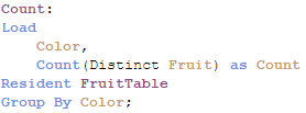
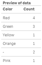
In the script below, Count() will return color and the number of fruits that have that color.
2. MissingCount()
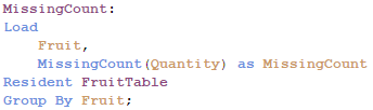
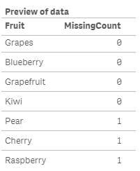
In a chart, the MissingCount() function will aggregate the number of missing values in each chart dimension. In the script, it will return the number of missing values aggregated in the expression, as defined by the group by clause.
Expression for a chart: MissingCount(Quantity)
In the script below, MissingCount() will return 1 if the Quantity field is missing a value.
3. NullCount()
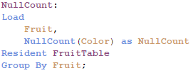
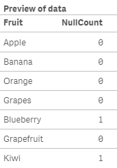
NullCount() will return the number of null values in each chart dimension in a chart. In the script, NullCount() returns the number of null values aggregated in the expression, as defined by a group by clause.
Expression for a chart: NullCount(Color)
In the script below, NullCount() returns 1 if the Color field is null.
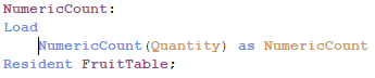
4. NumericCount()
In a chart, NumericCount() aggregates the number of numeric values by each chart dimension and in the script, NumericCount() returns the number of numeric values found in the expression, as defined by a group by clause.
Expression for a chart: NumericCount(Quantity)
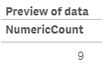
In the script below, the total Quantity fields that have numeric data is returned.
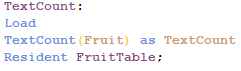
5. TextCount()
In a chart, TextCount() aggregates the number of non-numeric values by each chart dimension and in the script, TexCount() returns the number of non-numeric values found in the expression, as defined by a group by clause.
Expression for a chart: TextCount(Color)
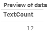
In the script below, TextCount() will return the total number of text values in the Fruit field.
Here is a table with all these functions used in a chart:
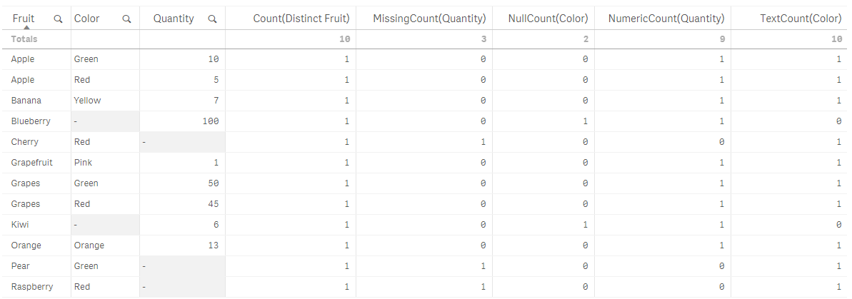
While I have not used all of the counter aggregation functions in my work with QlikView and Qlik Sense, I think they can be valuable when auditing and checking the health of your data. They can highlight gaps in the data that should not be there and point out data type issues in the data. I would be interested in hearing how you use these functions in your apps.
Thanks,
Jennell
-
Higher Education: You’re Not Keeping Up
What does student debt, a workforce talent squeeze, & disruptive innovation have in common? We live in a time where the business world is rapidly chan... Show More
What does student debt, a workforce talent squeeze, & disruptive innovation have in common?
We live in a time where the business world is rapidly changing. The knowledge-driven and information-centered economy is forcing businesses to innovate and come up with new business models and capabilities. These technological and disruptive innovations are happening all over the business world, resulting in the ability to detect these changes and adapt to seize market opportunity being crucial to the success of a company. At the same time, higher education has yet to follow the technological disruptions and globalization to change how they educate students to prepare them for today’s workplace.
To read more visit Higher Education: You’re Not Keeping Up | Qlik
-
Field Functions
There are several field functions that can be used in Qlik Sense and QlikView charts to return information about a field and/or selections in an app. ... Show MoreThere are several field functions that can be used in Qlik Sense and QlikView charts to return information about a field and/or selections in an app. They are:
- GetSelectedCount
- GetAlternativeCount
- GetPossibleCount
- GetExcludedCount
- GetCurrentSelections
- GetFieldSelections
In this blog, let’s take a look at how each of these functions can be used in your chart expressions.
GetSelectedCount
getselectedcount(field_name [, include_excluded])
This function returns the number of selected (green) values in a field.
The GetSelectedCount of the Product Group field below will return 3 for the 3 selected (green) items.
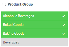
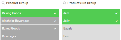
If the optional include_excluded parameter is set to True(), the returned count will include selected values which are currently being excluded by selections in other fields. If it is False() or omitted, then these values will not be included in the count. In the image below, the selection of Jam and Jelly in the Product Sub Group field has excluded Alcoholic Beverages and Baked Goods so they are now gray instead of green. The GetSelectedCount function for the Product Group will now return 1. If the include_excluded parameter is set to True(), then it will return 3, counting the excluded selections.
GetSelectedCount([Product Group]) = 1
GetSelectedCount([Product Group], True()) = 3
GetAlternativeCount
getalternativecount(field_name)
This function returns the number of alternative (light gray) values in a field.
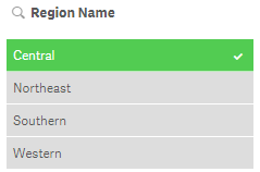
The GetAlternativeCount of the Region Name field below will return 3 for the light gray items in the field.
GetPossibleCount
getpossiblecount(field_name)
This function returns the number of possible values in the field. If the field includes selections, then the selected items (green) are counted. Otherwise associated (white) values are counted.
In the image below, the GetPossibleCount function for the Product Sub Group field will return 3 for the 3 associated (white) items in the list.
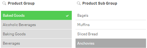
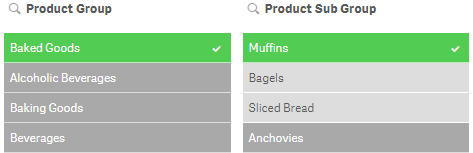
If I were to select Muffins in the Product Sub Group field (see image below), then the GetPossibleCount function will return 1 for the selected item.
GetExcludedCount
getexcludedcount(field_name)
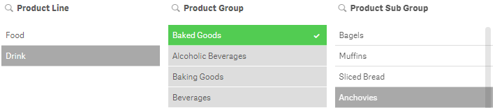
This function returns the number of excluded (dark gray) values in the field.
In the image below, GetExcludedCount of the Product Line field would return 1 for Drink which is dark gray.
GetCurrentSelections
getcurrentselections([record_sep [,tag_sep [,value_sep [,max_values]]]])
Unlike the other functions we have looked at so far, this function returns a string containing the current selections in an app. The optional tag_sep parameter allows you to select the separator between the field name tag and the field values. The default is a colon (:). The optional value_sep parameter allows you to select the separator between the field values. The default is a comma (,). The optional max_values parameter allows you to set the maximum number of field values that can be individually listed. The default is 6 and anything more than that is shown as 'x of y values'.
In the image below the GetCurrentSelections function will return the following:
Product Group: Beverages
Product Line: Drink
Product Sub Group: Juice, Soda

GetFieldSelections
getfieldselections(field_name [, value_sep [, max_values]])
This function also returns a string with the current selections for a field. The optional value_sep parameter allows you to select the separator between the field values. The default is a comma (,). The optional max_values parameter allows you to set the maximum number of field values that can be individually listed. The default is 6 and anything more than that is shown as 'x of y values'.
In the Product Sub Group filter pane above, Juice, Soda will be returned by the GetFieldSelections for the Product Sub Group field.
Field functions provide valuable information about selections in a field that can be used in an app to display information or help determine if another action needs to take place. For instance, if more than one field value is selected, do something. Try using a field function next time you are building an app to see how they work.
Thanks,
Jennell
-
Qliks Facebook Connector- Coke vs Pepsi
The age old question has always been, are you a Coke or Pepsi fan? Have you ever wondered what company really is more popular? Qlik Sense can fina... Show More
The age old question has always been, are you a Coke or Pepsi fan? Have you ever wondered what company really is more popular? Qlik Sense can finally help you solve the mystery! Using Qlik Web Connectors, Qlik was able to extract publically available data from Facebook to make this fun, interactive dashboard.
- Fun fact- The winner received 64 million more likes on their page!
To find out who won, visit Qlik Demos
-
Qlik geospatial and visual analytics
Qlik GeoAnalytics not only extends Qlik’s current mapping capabilities but also moves its offerings beyond geo-visualization with support for a broa... Show MoreQlik GeoAnalytics not only extends Qlik’s current mapping capabilities but also moves its offerings beyond geo-visualization with support for a broader range of advanced geoanalytic use cases. Users can now easily add maps to their apps with automatic geo-data lookup to reveal spatial information and then overlay it with different visualizations.
You can drill down into information dense maps that contain millions of points, and with a local or cloud-based service, analyze geo-data in combination with non-geo data for use cases such as determining potential store locations, understanding customer distribution of sales by postal code, or calculating supply chain delivery times.
With Qlik GeoAnalytics - along with our unique associative engine, you can uncover hidden relationships between geo data and non-geo data in addition to providing powerful map visualizations for Qlik. This allows you to:
- Make better location-related decisions. Many important organizational decisions such as site selection, resource allocations, or delivery times depend on location information. Maps provide visual context that help you make the correct, informed decisions.
- Improve understanding. Quickly show cartographic information to gain insight into patterns not easily interpreted through tables or charts.
- Increase productivity. Anyone can now easily add rich, interactive geo visualizations to their Qlik apps since Qlik GeoAnalytics instantly supplements location data such as cities and countries with the necessary geo information
-
What's to come in 2017
In 2016 the Academic Program program opened up to both professors and students, allowing us to reach hundreds of students around the world. The prog... Show More
In 2016 the Academic Program program opened up to both professors and students, allowing us to reach hundreds of students around the world. The program also proudly announced the launch of its first Data Visualization course within the Data Analytics Curriculum for professors and FREE subscriptions to training for one year to every professor and student that is accepted into the program!
As a result of these new offerings, the program gained over 700 new members since July!
To build upon this success, the team is hard at work creating the following additions to the curriculum:
- A second course is coming soon! Our second course will focus on Data Analytics and will again include slide decks, lecture notes, activities, apps and data, and more!
- Adding to the Data Visualization course. The team is also updating the Data Visualization course by turning each lesson in the slide deck into mini videos for faster, easier consumption. As a professor you can choose to use both the slide deck and the videos, or skip right to the videos!
- Offering a business case for students. The business case will present students with a real world scenario in which they will need to use Qlik Sense to analyze data and determine how best to approach the scenario. This will show students how Qlik Sense can be used once they graduate and begin their careers.
To receive these teaching materials or access to free training visit The Qlik Academic Program and fill out a student or professor application today!
-
AND-Mode
Have you ever wished the QlikView list box used a logical AND instead of a logical OR when you made selections? Well, AND-Mode is a hidden QlikView g... Show MoreHave you ever wished the QlikView list box used a logical AND instead of a logical OR when you made selections? Well, AND-Mode is a hidden QlikView gem that allows a list box to be changed from the default logical OR to a logical AND. By default, if one or more items are selected from a list box, the other fields will display data that is associated with any of the selections. When using AND-Mode, the other fields will display data associated with all the selections.
In order to add AND-Mode functionality to your QlikView application, you need to:
- First, include a table in the data model that stores the field that will be used in the AND-Mode list box. The records in this table must be distinct and the table can only have two fields, one of which is a key field and the other which is the field used in the AND-Mode list box. Here is an example of what this data model may look like:
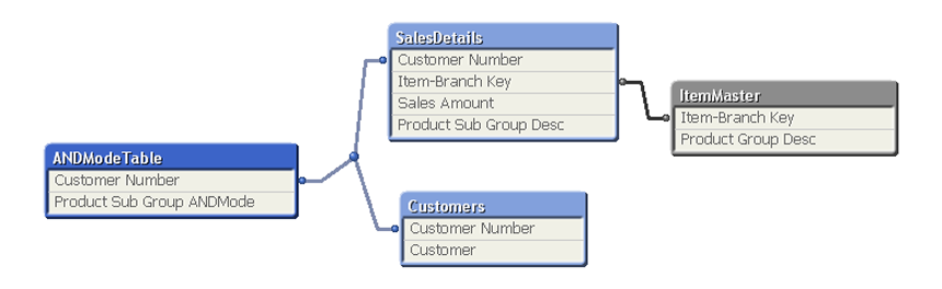
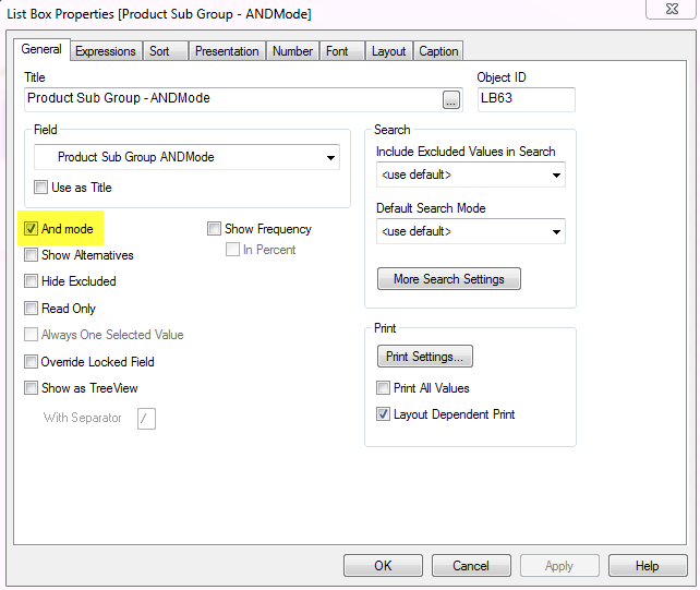
- Second, in the user interface, add a list box and check the And mode checkbox on the General tab of the Properties window to enable the AND-Mode functionality.
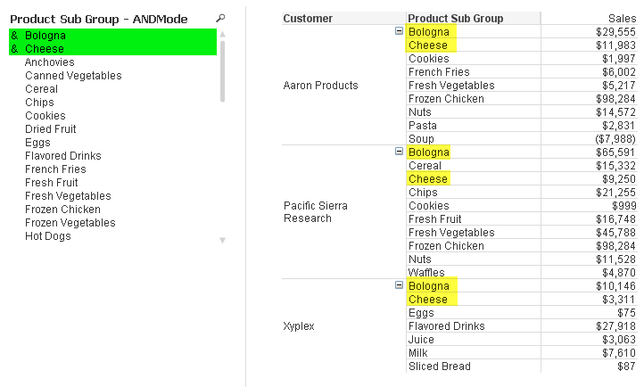
Now the list box will use AND logic versus OR logic. In the screenshot below, I can use the AND-Mode list box to view customers who purchased both Bologna and Cheese. Notice the amperstand (&) in front of the selected values indicating that we are using AND-Mode.
You can go one step further with the AND-Mode functionality and make NOT selections. For instance, I can see which customers purchased Bologna and Cheese and not Sliced Bread by also selecting Sliced Bread from the AND-Mode list box. To make a NOT selection, you need to click and hold the selection a moment until it turns red as seen in the image below.
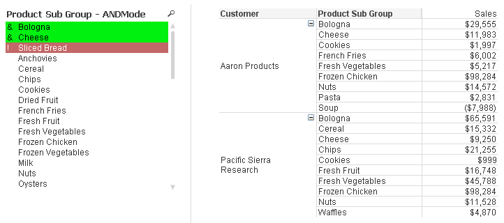
Now I can see customers who purchased Bologna and Cheese but did not purchase Sliced Bread. AND-Mode is quite powerful and can be added to any list box as long as the data model criteria are met.
Check out this technical brief for step-by-step details of how to implement AND-Mode functionality into your QlikView application.
Jennell
-
When should the Aggr() function NOT be used?
Last week Adam wrote a post about the Aggr() function and a Technical Brief about how to use it (Explaining the Aggr function). If you haven’t read it... Show MoreLast week Adam wrote a post about the Aggr() function and a Technical Brief about how to use it (Explaining the Aggr function). If you haven’t read it, I strongly recommend that you do. It is an excellent paper describing a function that can be used for nested aggregations - complex calculations where you need to make a second aggregation based on the result of a first aggregation.
However, I have noticed in the discussion forum that Aggr() often is used when it isn’t necessary. And since you get a performance penalty when you use the function, today’s post is about discouraging you from using it when you don't need to.
So, when should you not use it?
1. Standard Aggregations
Standard, non-nested aggregations, e.g. “=Sum(Sales)” or “=Count(distinct OrderID)” can be used almost anywhere in QlikView, in charts, in text boxes and as labels in any object. They will work directly as they are. Here you do not need any Aggr() function.
If you want to calculate the aggregation several times, e.g. once per customer, just use the aggregation function in a chart and use Customer as dimension. Nothing else.
This seems obvious, but I have on multiple occasions seen developers use the Aggr() function in such situations. Totally unnecessary - and it will just increase response times.
Bottom line: You should not use Aggr() for standard non-nested aggregations.
2. Calculation of a subtotal within the same chart
In some cases you need to use a subtotal from the same chart in your calculation. Then you should use the total qualifier inside your Sum() function (or other aggregation function). It will perform the given calculation disregarding one or several dimensions of the chart. It will however respect the selection.
For instance, the sales in percent can be calculated using
Sum( Sales ) / Sum( total Sales )
This expression will return the sum of sales for each possible dimensional value, as a fraction of all possible sales. In other words; "Sum( total Sales )" disregards all dimensions of the chart.
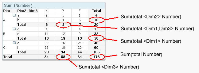
Bottom line: You should not use Aggr() for calculating subtotals that you can calculate with the total qualifier.
3. Calculation of an Average
If you can avoid the Aggr() function by writing your expression smarter, you should. One specific case is a standard average.
For example, say that you want to calculate the average order value. This is a nested aggregation: First you need to sum the sales value per order (an order can have several order lines), and then you need to average over the resulting set of sales values per order. In other words: You can calculate it using:
Avg( Aggr( Sum( Sales ), OrderID ) )
But since it is a linear calculation, you can also calculate the same number just by dividing with the number of orders:
Sum( Sales ) / Count( distinct OrderID )
… which in most cases is evaluated faster. Also, the latter expression is easier to understand for the person responsible for the application maintenance.
Bottom line: You should usually not use Aggr() for calculating an average that is a ratio of two separate aggregations.
4. Static aggregations
Sometimes you want to classify a dimensional value (customers, products, suppliers, etc.) using static aggregations, e.g. “Customers that only placed one order” or “Customers that bought goods at a total value higher than X”. “Static” meaning that you do not want the classification to change as you make a selection.
In such a case, the aggregation should not be made in the UI, but rather when creating the data model and stored as a separate field.
Bottom line: Aggregations for classification of dimensional values should often be made by creating an attribute field in the script using a “Group By”.

-
Using Qlik Sense to Analyze Insurance Claims Data
In this week's design blog I have the pleasure of introducing our newest guest blogger, Simon Kirby. Simon is a Director of SI Industry Solutions with... Show More
In this week's design blog I have the pleasure of introducing our newest guest blogger, Simon Kirby. Simon is a Director of SI Industry Solutions with our Financial Services group out of the UK and has prepared an introduction and video that shows you how Qlik Sense can be used to analyze car insurance claims data.Insurance Whiplash Fraud
It was recently announced in the UK that car insurance premiums are at their highest ever levels (The Actuary Magazine) and one of the key factors for this is an increase in whiplash injury claims. In addition to legitimate whiplash injury claims, insurance companies are struggling to cope with an increasing trend in fraudulent whiplash claims. These claims occur when a third party deliberately creates an accident by causing another car to crash into the back of them. They then feign a whiplash injury and receive thousands in compensation. It’s been discovered that these people repeat these accidents regularly and effectively earn a living from scamming the insurance industry.
How Qlik Sense can help
A key weapon for insurers in identifying these fraud perpetrators is the analysis of data. Insurers need to be able to search for associations in data between similar types of claims, in similar locations, including something unique like a mobile phone number. These associations between the data can lead to a significant increase in identifying the groups of people that commit these types of fraud. This is exactly where Qlik Sense can play an important role in this activity. The QIX Associative engine, at the heart of Qlik Sense, is designed to make the discovery of these associations easy and intuitive. Together with the ability to quickly create drag and drop visualizations, Qlik Sense can help Insurance Fraud Analysts identify trends, patterns and examples of fraudulent Whiplash claims. (view more about Qlik's Associative Model: Qlik Snippets - The Qlik Associative Model - YouTube and Qlik's Associative Model - Part I - YouTube)
See and try it for yourself
The next step for insurers would be to combine the power of Qlik Sense with their fraud detection models. The result would be a Qlik Sense visualization embedded into the claims system that showed the claims handler the real-time results of the fraud model at the time of the Notification of Loss. This would allow the insurer to push suspicious claims to a dedicated fraud management team for further investigation which could potentially save the company millions.
If you would like to see how Qlik Sense can be used to identify claims fraud, take a look at our video on YouTube and the attached Qlik Sense app. For more details on this app, please visit this link available on the Qlik Financial Services Community site: Insurance Claims App
Regards,
Simon Kirby
Director, SI Industry Solutions - Financial Services
Qlik
NOTE: To increase resolution or size of the video, select the YouTube logo at the bottom right of the player. You will be brought directly to YouTube where you can increase the resolution and size of the player window. Look for the 'settings' gears icon in the lower right of the player once at YouTube.
Can't see the video, YouTube blocked? Download the attached .mp4.
If using Qlik Sense Desktop please copy .qvf file to your C:\Users\<user profile>\Documents\Qlik\Sense\Apps and refresh Qlik Sense Desktop with F5. If using Qlik Sense Enterprise Server please import .qvf into your apps using the QMC - Qlik Management Console.

-
How to create a “clear selections” HTML button for your next mashup project
I recently wrote about How to embed a Qlik Sense chart on your website using the single configurator tool that comes with Sense. Single Configurator i... Show MoreI recently wrote about How to embed a Qlik Sense chart on your website using the single configurator tool that comes with Sense. Single Configurator is a fantastic tool to share charts and it also helps a lot when it comes to create super-simple iframe mashups.
On that post, Cristina Messana asked the following:
How can I create a button to clear selections? I'm trying to embed objects from an app but I can't embed clear selections.
That’s a fair question, Single Configurator will let us to share or embed a chart or an entire sheet. We can choose to include the selections bar into our chart which will get us the clear selections button and much more, it's a great option but sometimes we just need a simple button to help users to undo a selection in a single chart mashup.
How to create an HTML button to Clear Selections, step by step guide:
1 Open Qlik Sense Desktop, open your browser and type in: http://localhost:4848/workbench
If you don’t know what Workbench is for, please check this blog post.
2 Create a new Mashup, name it and pick a default template. “Basic Mashup Template with Absolute Positioning”. Click on the new created mashup and edit it.
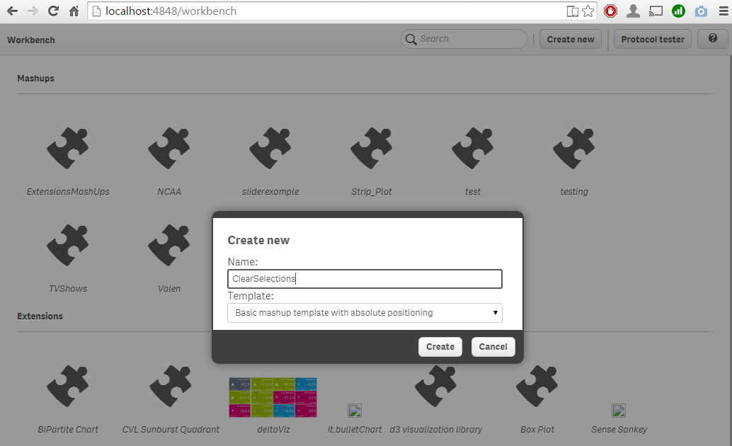
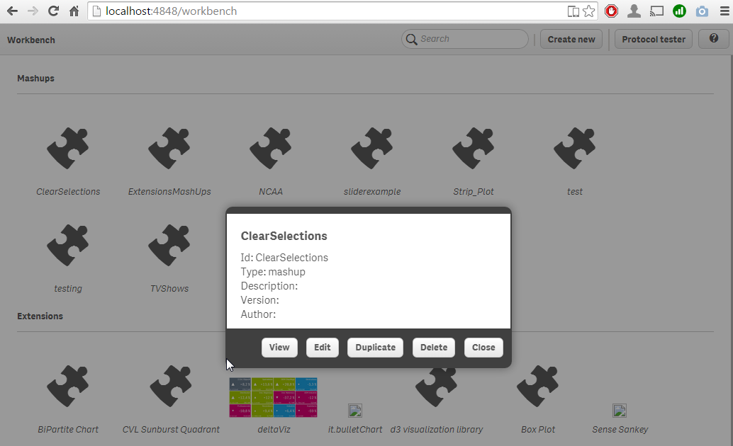
3 Select one apps from the drop down list on the left hand side of the screen.
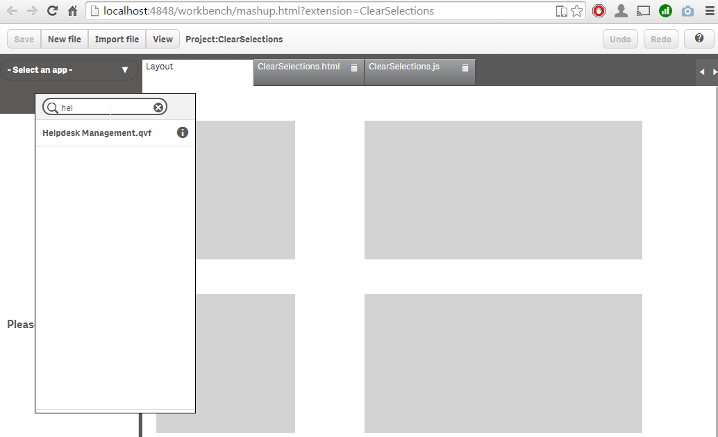
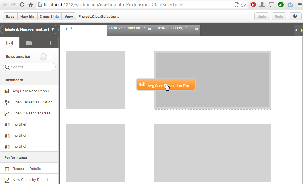
4 Drag and drop one of the charts into one of the six gray placeholders.
5 Go to the HTML tab and add the html code for the button to one of the empty placeholders so your button gets properly situated in the page. In the example I'm adding the button to the first placeholder QV01
<div id="QV01" style="position: absolute; top: 50px; left: 20px; width: 200px; height: 200px;" class="qvplaceholder">
  <button class="clear_selections" href="#">Clear Selections</button>
</div>
Please note that it’s important to add a class or an ID to the button.
6 Add the following code to the js file at the line 28:
$('.clear_selections').on('click',function(){
    app.clearAll();
})
We are targeting all the elements in the HTML file that have a class called clear_selections, our button belongs to that class so on click it will execute the API method clearAll(). Please check Qlik Sense Developers Help site for complete API reference.
7 Click on View button on the Workbench top bar to open a new browser tab and check the generated site.
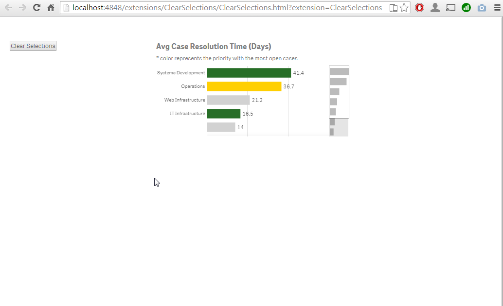
You should be able to get the source files at: C:\Users\YOURUSER\Documents\Qlik\Sense\Extensions
Now is the time for you to create your own mashup project, toy with the CSS properties, add HTML headers, text paragraphs and more Qlik Sense objects to compose a complete data web site.
Enjoy!

-
Binary Statement
Have you ever used a Binary statement in your script or done a “binary load” as folks familiar with Qlik scripting may say? The Binary statement can ... Show MoreHave you ever used a Binary statement in your script or done a “binary load” as folks familiar with Qlik scripting may say? The Binary statement can be used in both QlikView and Qlik Sense scripts to load data from another QlikView document or Qlik Sense app. When using QlikView, the Binary statement can only be used to load another QlikView document. When using Qlik Sense, the Binary statement can be used to load another Qlik Sense app or a QlikView 11.2 or earlier document. Note that you cannot use a Binary statement in a QlikView script to load a Qlik Sense app. The Binary statement will load not only the data but the section access data as well. It does not load variables or any layout information such as charts, sheets or stories from the app or document.
The Binary statement is helpful when you want to use the data model from an existing app or document in a new app or document. Instead of copying the app/document and then deleting the sheets, stories, etc., you can create a new app/document and load just the data using the Binary statement. Then you have a fresh slate to build out the sheets and visualizations. Chuck Bannon wrote a blog on ways you can extract data from a document which you may find useful. In his blog, he uses the Binary statement to get the data from another document and then he stores the data into QVDs. I personally prefer the second option he discusses that uses a for loop to create the QVDs. Storing the data into QVDs is useful if you need to manipulate the data when loading it.
There is one thing you must remember to do when using the Binary statement in order for it to work – you must make the Binary statement the first statement in the script. This means adding it before the Set statements. The syntax varies for QlikView and Qlik Sense so let’s take a look at both.
In QlikView, either statement below can be used. In the first example, the MyApp document will need to be in the working directory otherwise the absolute file path will need to be included as seen in the second example.


In Qlik Sense, you will need to create a folder connection to the app you would like the use. In the example below Demo Apps is the folder connection I created to access the MyApp QVF.

Simple, right? The Binary statement when loaded as the first statement in the script will load the data from another QlikView document or Qlik Sense app providing you with the same data model as the original app and a clean slate to build out your visualizations. Good luck scripting!
Jennell
-
Most Important BI Trends in 2017
Data discovery, self-service BI and master data/data quality management are currently the top business intelligence trends. While self-service BI and ... Show MoreData discovery, self-service BI and master data/data quality management are currently the top business intelligence trends. While self-service BI and data discovery increased moderately in importance, master data and data quality management decreased slightly.
Self-service BI has been on organizations’ wish lists for a long time as IT departments struggle to satisfy steadily growing demand from end-users for faster changes and new developments to meet their BI needs. Enabling the business user community through ‘self-service BI’ is a good idea. Data discovery and visualization, as well as predictive analytics, are among the typical functions users want to consume in a self-service mode. However, an agreed data and tool governance framework is paramount to avoid losing control over data.
End-users recognize the need for data quality and master data management and initiatives in this area are often announced with a fanfare before quickly moving down the list of priorities for a variety of reasons. But at least organizations seem to be aware that the best-looking dashboard is worth nothing if there are flaws in the data it is based on. Business intelligence will not work without comprehensive data integration and data quality initiatives, but these have to be backed up with the right level of attention, resources and funding.
Source: Top Business Intelligence Trends 2017 | What 2,800 BI Professionals Think
-
Making QlikView Part of the Story: Embedding Objects into Web Pages
More and more, blog posts, news articles, and various other online media are incorporating data visualization. A well placed chart or graph can drive... Show MoreMore and more, blog posts, news articles, and various other online media are incorporating data visualization. A well placed chart or graph can drive home the point of the story being told. While print has been doing this for a long time, unique to the web experience is the arrival of interactive visualizations which allow users to explore and experience the data in a new way.
Not to be left out, there are several options for easily embedding QlikView into websites. While integrating QlikView into the web can be tricky (cross domain scripting, security concerns, etc.) there are some terrific posts on the web by Stefan Walther and Alexander Karlsson (amongst others) describing various ways a person can add some slight code to embed objects into a web page.
Using these same principles, I’ve also developed a tool which should make things as easy as possible for web novices to get QlikView visualizations into their site. Once this tool is implemented, a blog writer who is desperate for some visual aids on their post
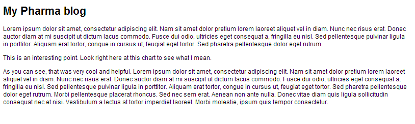
could go to their QlikView app
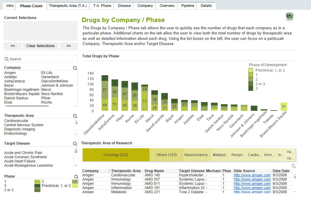
use the tool in an app to add QliKView objects to a staging area where they arrange them how they want
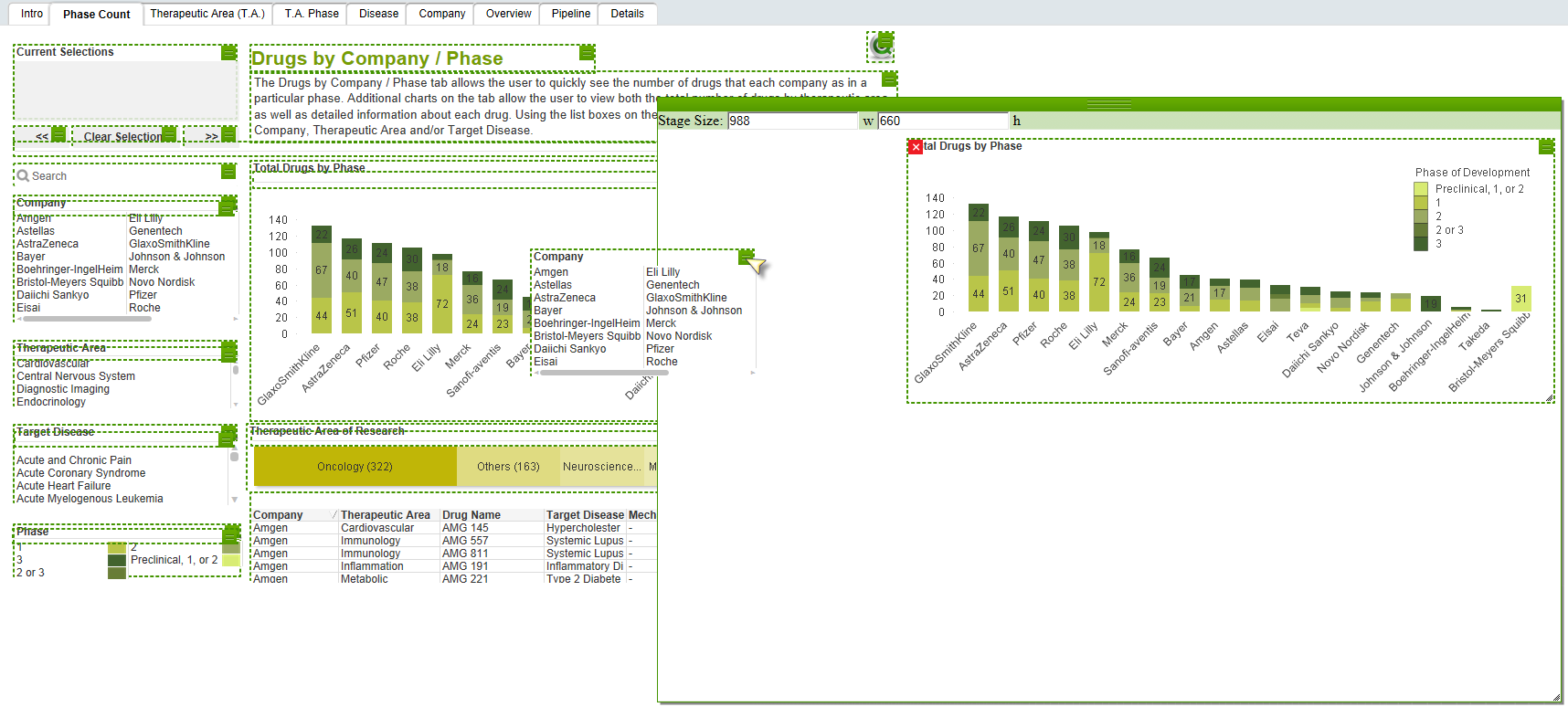
click the “export” button to get the iframe code
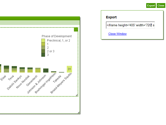
paste the iframe code into the html

and check out the new visualization on your site
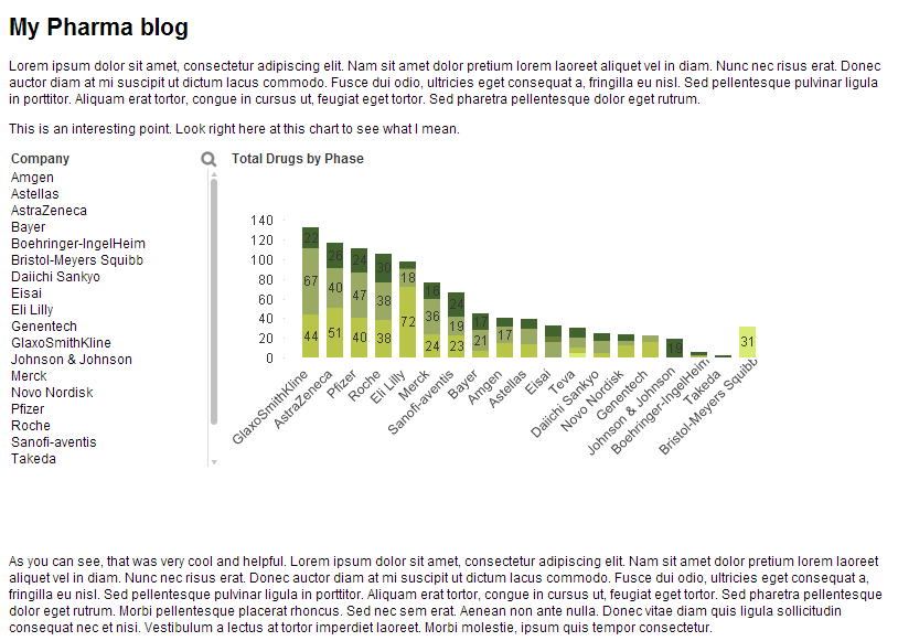
This is very simple for the blogger, and by using iFrames, we are able to avoid cross domain scripting issues and also allow the objects within the frame to communicate with each other, making them interactive.
This solution is an example of how several different types of customizations can be used to create a helpful tool. Click here to download the solution and documentation. To see embedding in action, visit the Image Gallery on the demo site. The “Pinterest-style” image gallery is embedded into the site using these same techniques.

-
Qlik Explorer for Developers
Qlik Explorer for Developers (QEfD) is a tool that will let you to explore Qlik Sense content and obtain some valuable info. You can connect to a Qlik... Show MoreQlik Explorer for Developers (QEfD) is a tool that will let you to explore Qlik Sense content and obtain some valuable info. You can connect to a Qlik Sense server and drag and drop code snippets and IDs into whichever IDE you are using to build mashups or similar solutions.
You can learn more about QEfD here:
Qlik Explorer for Developers is here!
I mainly use QEfD for two tasks, to obtain objects ID so I can inject them into my webpage, and eventually to poke around object properties.
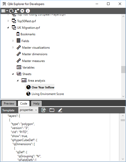
To copy an object ID I just connect it to my server (you can also try it with your localhost:4848 or just try out the default connection to PlayGround) and then QEfD will show me a tree-list with all the apps available on that server. From there it gets pretty simple, navigate to the object I want to incorporate into my webpage, the preview tab gets very helpful to double check you are where you want to be, and then using a template* called "id" I can copy the object’s ID.
*What’s a template: is a set of code snippets which are bound to different nodes in Qlik Sense. A node is for instance a Qlik Sense application, a sheet or an object. Since the introduction of the Visualization API a developer can create her own charts on-the-fly, this way we become independent from the Qlik Sense client and from the visualization layer within the qvf (you don’t have to create a chart first on Sense client).
To create your own charts, you are supposed to construct the object by yourself. QEfD can be super handy here. I use it to learn, and let’s face it, to copy all JSON properties from existing objects. It makes it super easy to create some pretty advanced on-the-fly charts. It almost feels like cheating, in a good way.
If you want to download now Qlik Explorer for Developers, please do it here:
Download Qlik Explorer for Developers
Built by Developers for Developers
If you want to see QEfD in action, please check out this video:
Qlik Analytics plugin for Visual Studio - YouTube
Please note that this stand alone tool works exactly as the Qlik Analytics for Visual Studio plugin.
Enjoy it!
AMZ
-
Most Important BI Trends in 2017
Data discovery, self-service BI and master data/data quality management are currently the top business intelligence trends. While self-service BI and ... Show MoreData discovery, self-service BI and master data/data quality management are currently the top business intelligence trends. While self-service BI and data discovery increased moderately in importance, master data and data quality management decreased slightly.
Self-service BI has been on organizations’ wish lists for a long time as IT departments struggle to satisfy steadily growing demand from end-users for faster changes and new developments to meet their BI needs. Enabling the business user community through ‘self-service BI’ is a good idea. Data discovery and visualization, as well as predictive analytics, are among the typical functions users want to consume in a self-service mode. However, an agreed data and tool governance framework is paramount to avoid losing control over data.
End-users recognize the need for data quality and master data management and initiatives in this area are often announced with a fanfare before quickly moving down the list of priorities for a variety of reasons. But at least organizations seem to be aware that the best-looking dashboard is worth nothing if there are flaws in the data it is based on. Business intelligence will not work without comprehensive data integration and data quality initiatives, but these have to be backed up with the right level of attention, resources and funding.
Source: Top Business Intelligence Trends 2017 | What 2,800 BI Professionals Think
-
Bournemouth University cements leadership in Applied Data Analytics with Qlik Se...
Bournemouth University is a further education provider in the south of England, home to 18,000 students and 2,000 staff. It was one of the first UK u... Show MoreBournemouth University is a further education provider in the south of England, home to 18,000 students and 2,000 staff. It was one of the first UK universities to offer a Masters degree in Applied Data Analytics; course applications have grown by more than 300% over the last four years.

Bournemouth wanted to cement its leadership position in Applied Data Analytics. And, with data visualisation as an important tool of every data analyst, Bournemouth was looking for a partner who could help arm its students with best-in-class visualisation and analytics knowledge and tools.
“Even though it remains important that our MSc Applied Data Analytics students gain advanced knowledge of tools like Microsoft Excel, to appreciate the inner workings of data transformation and visualisation, it’s equally as important they realise that what might take 10 hours to achieve in Excel can be done better, and in 30 minutes, using Qlik Sense.” Dr Marcin Budka, Principal Academic in Data Science and Programme Leader for the MSc Applied Data Analytics, Bournemouth University
Read the full story in the attachment.

-
Time-Aware feature has made it to the bar and the combo charts
Not that long ago, with the release of Qlik Sense 3.0, Qlik Sense introduced the Time-aware charts. Line charts are now able to intelligently zoom in ... Show MoreNot that long ago, with the release of Qlik Sense 3.0, Qlik Sense introduced the Time-aware charts. Line charts are now able to intelligently zoom in and out when used in conjunction with a date/time dimension letting us explore the data in a very smart way.
Please check this post for further details: https://community.qlik.com/blogs/qlikviewdesignblog/2016/07/15/what-s-new-in-qlik-sense-30-time-aware-charts
Now with the release of Qlik Sense 3.1 SR2 (Qlik Sense 3.1 Service Release 3 now available, Information on Sense Desktop 3.1.1 expiry) the Time-aware feature has made it to the bar and the combo charts as well. This new feature will expand the capabilities of two of the most common charts in our library.
To get a working time-aware bar or combo chart in your app you just need to make sure you are running Qlik Sense 3.1 SR2 or higher, then modify an existing bar (combo) chart or create a new one, remember you should be using a time field as the dimension for your chart. Finally you need to activate the continuous axis in the chart properties panel as shown in the animation below.
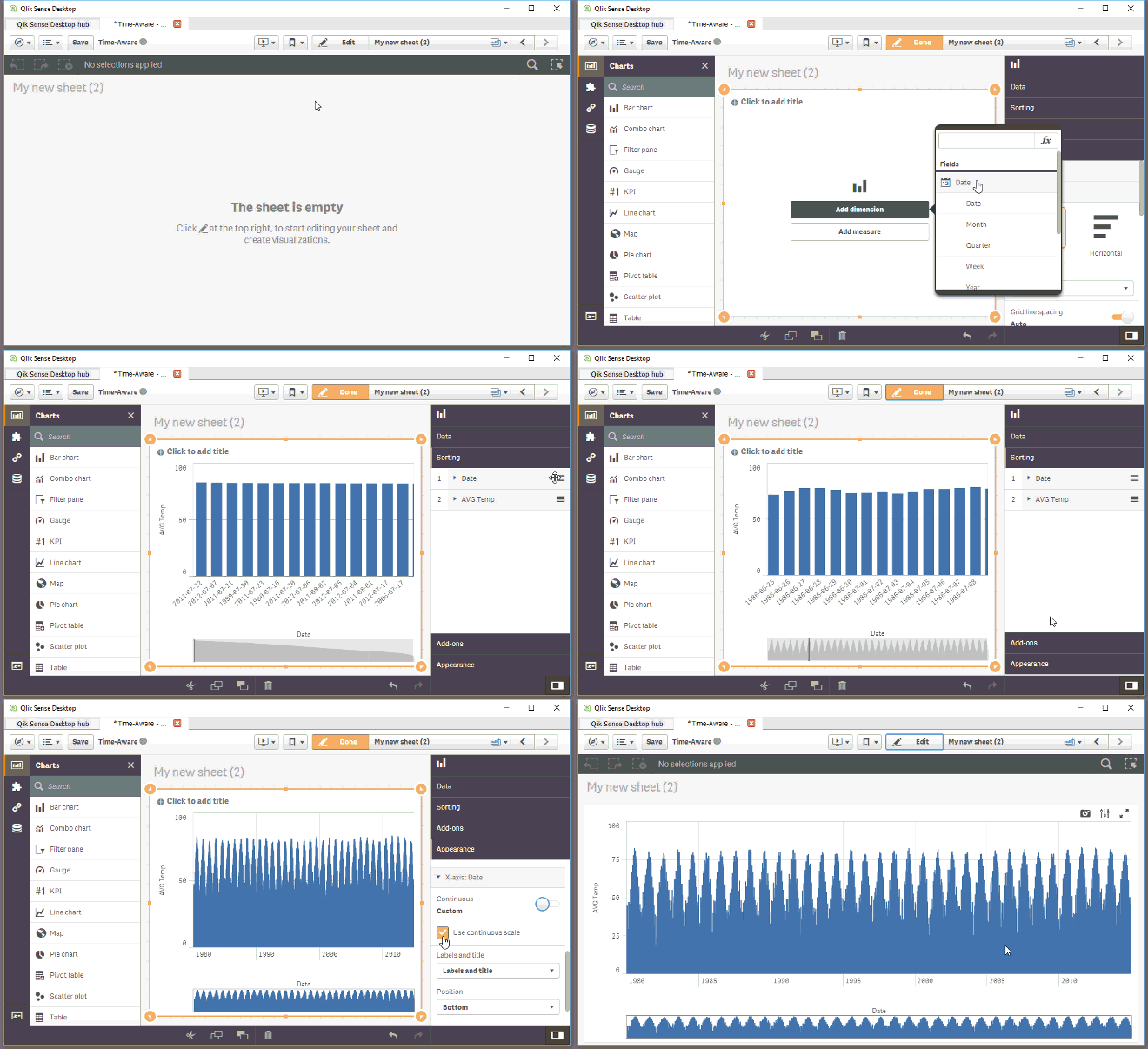
AMZ
-
The Pitfalls Of Learning On YouTube
When we need to know something right now, our first instinct these days is to grab our phone and look it up. Google breaks this type of behavior out ... Show More
When we need to know something right now, our first instinct these days is to grab our phone and look it up. Google breaks this type of behavior out into micro-moments: I-want-to-know, I-want-to-go, I-want-to-do, and I-want-to-buy moments.
And when we “want-to-do”, what do we do? We turn to YouTube. Searches related to “how-to” on YouTube are growing 70% year over year. YouTube is not supplementing traditional learning methods anymore, it’s replacing them altogether. And that’s not necessarily a good thing....
To read more visit the newest blog posted by the V.P of Education Services, Kevin Hanegans
http://global.qlik.com/us/blog/posts/kevin-hanegan/the-pitfalls-of-learning-on-youtube



