Unlock a world of possibilities! Login now and discover the exclusive benefits awaiting you.
- Qlik Community
- :
- All Forums
- :
- QlikView
- :
- break even analysis
- Subscribe to RSS Feed
- Mark Topic as New
- Mark Topic as Read
- Float this Topic for Current User
- Bookmark
- Subscribe
- Mute
- Printer Friendly Page
- Mark as New
- Bookmark
- Subscribe
- Mute
- Subscribe to RSS Feed
- Permalink
- Report Inappropriate Content
break even analysis
Hi All,
I can't figure this one out.
Just trying to create a simple line chart.
The x-axis should just be a numeric value, in this case representing units sold, each unit has a unique identifier but can appear more than once in the data, so I can count(distinct unit) to get the total value
Then I want to plot the average income per unit, which should just be a 45 degree line, increasing per unit sold
I can then add my fixed costs which are easy as this is just a straight horizontal line
and variable costs which start at the fixed cost on the y-axis and again increase per unit sold
The expressions I can figure, but how can I plot the x-axis?
- Mark as New
- Bookmark
- Subscribe
- Mute
- Subscribe to RSS Feed
- Permalink
- Report Inappropriate Content
I think you want to accumulate your y-values, so maybe enable the full accumulation option or use
something like
=Rangesum(Above( Count(DISTINCT unit),0,rowno() ))
- Mark as New
- Bookmark
- Subscribe
- Mute
- Subscribe to RSS Feed
- Permalink
- Report Inappropriate Content
Use that as a calculated dimension?
Its what I should use as the actual dimension which has me stumped in this case!
I'm just adding a rowno to my load script to see if I can use that as the dimension, not sure why I can;t sus this one, just having a total mental block
- Mark as New
- Bookmark
- Subscribe
- Mute
- Subscribe to RSS Feed
- Permalink
- Report Inappropriate Content
No, I was thinking about an expression that accumulates the count of units.
Maybe I am just not understanding what you are trying to achieve. Why is the average income per unit increasing with the number of units?
- Mark as New
- Bookmark
- Subscribe
- Mute
- Subscribe to RSS Feed
- Permalink
- Report Inappropriate Content
I'm not explaining myself very well, as I said... brain fail!
I think adding a rowno() to the load script is the best way to achieve what I want, just trying to figure out the best way to do it.
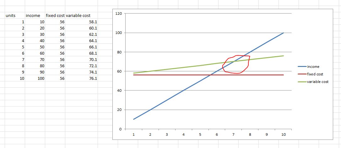
Probably easier if I show you what I intend to produce, the red ring is the break even point (appreciate I probably can't add the red ring to QV!)
- Mark as New
- Bookmark
- Subscribe
- Mute
- Subscribe to RSS Feed
- Permalink
- Report Inappropriate Content
If you manage to create your excel table in QlikSense in the data model, I think you are all set.
- Mark as New
- Bookmark
- Subscribe
- Mute
- Subscribe to RSS Feed
- Permalink
- Report Inappropriate Content
I'm trying this in desktop and I kind of need to work with the model as it is as its already 325,000,000 records and there is a whole dashboard already hanging off it.
I think once I can get the rowno() working correctly in the load script I should be grand though, it was an epiphany I had after posting this!