Unlock a world of possibilities! Login now and discover the exclusive benefits awaiting you.

Product Innovation
By reading the Product Innovation blog, you will learn about what's new across all of the products in our growing Qlik product portfolio.
Support Updates
The Support Updates blog delivers important and useful Qlik Support information about end-of-product support, new service releases, and general support topics.
Qlik Academic Program
This blog was created for professors and students using Qlik within academia.
Community News
Hear it from your Community Managers! The Community News blog provides updates about the Qlik Community Platform and other news and important announcements.
Qlik Digest
The Qlik Digest is your essential monthly low-down of the need-to-know product updates, events, and resources from Qlik.
Qlik Learning
The Qlik Learning blog offers information about the latest updates to our courses and programs, as well as insights from the Qlik Learning team.
Recent Blog Posts
-
Connector Factory – April 2023 releases
In the past few weeks, Connector Factory has released new generic connectors that will enable you to greatly expand the number of applications that can interact with Qlik Application Automation. Connector Factory is Qlik’s strategy to continually expand access to and delivery of data from hundreds of SaaS applications and data sources to fuel ever-evolving enterprise cloud analytics and data integration needs. -
Qlik announces the ability to transform data ingested by third parties or data-s...
Qlik Cloud Data Integration can now transform data ingested by third-party tools and data shared within a data warehouse or data lake. Transforming data in the cloud enables Qlik customers to leverage automated transformations and pushdown processing to deliver business value while reducing data ingestion costs. -
Welcome back Marisa Sanchez! - Qlik Educator Ambassador Class of 2023
This week we introduce one of our returning ambassadors, Marisa Sanchez from Bahía Blanca, Argentina. -
Qlik Data Visualization Showcase Re-Launches with New Visualizations and Resourc...
The popular Data Visualization Showcase re-launched this week. Updates include several new visualizations and tips, plus additional resources highlighting Qlik’s unique and powerful data visualization capabilities. -
NL Insights
The NL Insights object, found in the Qlik Dashboard bundle, allows app developers to add natural language generated insights to a sheet. The NL Insights object can be dragged to a sheet, just link other chart objects. Developers can use the NL Insights object to display an analytical summary of the data. This can accompany a single chart, a sheet, or the entire app. Once measures and/or dimensions are added to the object, narrative insights are ... Show MoreThe NL Insights object, found in the Qlik Dashboard bundle, allows app developers to add natural language generated insights to a sheet. The NL Insights object can be dragged to a sheet, just link other chart objects. Developers can use the NL Insights object to display an analytical summary of the data. This can accompany a single chart, a sheet, or the entire app. Once measures and/or dimensions are added to the object, narrative insights are automatically generated. The developer controls what data they would like to provide insights for based on their dimension and measure selections.
The image below is the Dashboard bundle.
Qlik Dashboard bundle
Properties window > Data section
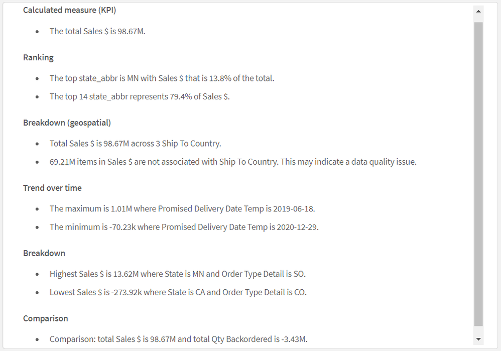
After adding the master measure Sales $ (as seen in the image on the left), the insights below are generated. This is an example of using the NL Insights object to provide overall insights for an app. By default, all appropriate analysis types are used to generate the insights based on the dimensions and/or measures selected, but the developer can modify these if they choose. Up to three dimensions and three measures can be added to a NL Insights object. If the combination of dimensions and/or measures does not return any insights, a message will be displayed.
In the properties window, the developer can deselect any of the analysis types that they would like to remove from the auto-generated list. For example, in the image below, the selected analysis types can be removed by clicking on the “x” image next to the analysis type.
Properties window > Appearance section > Analysis types
According to Qlik Help, NL Insights can offer the following analysis types:
- Calculated measure
- Ranking
- Ranking (grouped)
- Breakdown (geospatial)
- Breakdown
- Overview
- Relative importance
- Year to date
- Trend over time
- Comparison
- Correlation
- Process control (means)
Natural language insights can also be used to accompany a specific chart. In the example below, a NL Insights object has the same dimension and measure that the line chart has and is used to provide a narrative of the chart. This can be useful to highlight important information. In this example, the style is set to bullet points, but it can also be set to sentences. Developers also have the option to set the verbosity to full or brief to show all recommendations or just the top recommendations. This example has verbosity set to full. Like other objects, insights are updated when selections are made in the app.
Users can benefit from NL Insights – a native capability that provides AI generated insights to users. Developers can give users a narrative summary of a chart, a sheet, or an app, to supplement visualizations in an app. A few things to note about the NL Insights objects – you can have up to three NL Insight objects on a sheet and if you add a new master item to your app, you will need to refresh the app before the new master items can be used in the NL Insights object. Try the NL Insights object out in your next app. To learn more, check out this SaaS in 60 video and Qlik Help.
Thanks,
Jennell
-
Qlik App Backup Script Using PowerShell
Qlik App Backup Script Using PowerShell Cummins-Meritor This PowerShell script will create automated backups of all Qlik Sense Client Apps (not cloud). Organized per stream and user. Discoveries Fully automated backups of all your apps on the file server, without data in it. Organized per user and per stream. Any number of versions that you want, automatically deleting older versions. Impact In this way, you can keep a backup of ... Show MoreQlik App Backup Script Using PowerShellCummins-Meritor This PowerShell script will create automated backups of all Qlik Sense Client Apps (not cloud). Organized per stream and user.
Discoveries
Fully automated backups of all your apps on the file server, without data in it. Organized per user and per stream. Any number of versions that you want, automatically deleting older versions.
Impact
In this way, you can keep a backup of your apps in a safe place, without having to backup your whole server. Saving you time for managing backups and preventing the loss of hours of work.
Audience
Qlik Sense Client administrators. Qlik developers.
Data and advanced analytics
No data or analytics in this script.
-
【オンデマンド配信】大日本印刷(株)事例:Qlik Sense で個人のスキルを可視化!タレントマネジメントシステムの活用事例
企業のビジネス活動において、データはこれまで以上に必要不可欠な資産となっています。増え続けるデータを管理・統合・分析し、データでアクションを起こす必要性が増している現在、成功している企業はどのようなデータ戦略を実行しているのか?本 Web セミナーシリーズでは、Qlik でデータからアクションを起こすデータ主導のビジネスで成功しているお客様より、課題から導入の経緯、デモンストレーション、活用例などをご紹介します。 ※ 参加費無料。パソコン・タブレット・スマートフォンで、どこからでもご視聴いただけます。 オンデマンド配信:Qlik Sense で個人のスキルを可視化!タレントマネジメントシステムの活用事例 大日本印刷株式会社(DNP)では、営業・事務・生産部門など、さまざまな領域でデータの可視化と活用に取り組んでおり、2019年より全社的に Qlik を導入しています。その中でも、今回は営業事務部門におけるタレントマネジメントシステムとして Qlik を使用した事例を紹介いたします。個人の... Show More企業のビジネス活動において、データはこれまで以上に必要不可欠な資産となっています。増え続けるデータを管理・統合・分析し、データでアクションを起こす必要性が増している現在、成功している企業はどのようなデータ戦略を実行しているのか?
本 Web セミナーシリーズでは、Qlik でデータからアクションを起こすデータ主導のビジネスで成功しているお客様より、課題から導入の経緯、デモンストレーション、活用例などをご紹介します。※ 参加費無料。パソコン・タブレット・スマートフォンで、どこからでもご視聴いただけます。
オンデマンド配信:
Qlik Sense で個人のスキルを可視化!タレントマネジメントシステムの活用事例大日本印刷株式会社(DNP)では、営業・事務・生産部門など、さまざまな領域でデータの可視化と活用に取り組んでおり、2019年より全社的に Qlik を導入しています。
その中でも、今回は営業事務部門におけるタレントマネジメントシステムとして Qlik を使用した事例を紹介いたします。個人のスキルを可視化することで、管理職の業務差配にかかっていた負荷を軽減し、適材適所の業務差配を実現しました。また、社員一人ひとりの強みを一元管理し、人財育成のためのツールとして Qlik Sense を活用しています。 -
TV Shows (Gantt Multiple Milestones)
TV Shows (Gantt Multiple Milestones) AnyChart — QS Extensions Analyze the popularity of various TV shows by season and episode — with AnyChart's Gantt charts for Qlik Sense and the feature of multiple milestones in a single line. Discoveries Compare viewership on a per-episode basis and identify the most and least viewed episodes. Examine the first and last episodes. Get an overview of all seasons with color-coded bars based on the nu... Show MoreTV Shows (Gantt Multiple Milestones)AnyChart — QS ExtensionsAnalyze the popularity of various TV shows by season and episode — with AnyChart's Gantt charts for Qlik Sense and the feature of multiple milestones in a single line.Discoveries
Compare viewership on a per-episode basis and identify the most and least viewed episodes. Examine the first and last episodes. Get an overview of all seasons with color-coded bars based on the number of views.
Impact
Check out how AnyChart's Gantt charts with multiple milestones work and how they can help you explore TV show popularity or any other data with the same or similar structure and purpose.
Audience
Anyone who wants to analyze the popularity of TV shows and see an example of a Gantt chart with multiple milestones in Qlik Sense in action.
Data and advanced analytics
This application features Gantt charts built with AnyChart's extension for Qlik Sense. The data is taken from Bill Cruise’s datasets on Kaggle.
🔗 >> VIEW IT LIVE OR DOWNLOAD (.QVF) <<
-
Qlik World 2023 - Thinking Outside the Box
Qlik World 2023 - Thinking Outside the BoxCummins-MeritorThis app contains multiple solutions: 1. Smart way to show date periods without gaps when there is no data. 2. Smart way to use 1 chart, to compare 2 sets of data with slice and dice capabilities. 3. How to do Rolling Month Totals, when your fiscal months are not aligned with normal months.DiscoveriesSolving the problem of displaying date periods when there are no records in that period. Sh... Show MoreQlik World 2023 - Thinking Outside the BoxCummins-MeritorThis app contains multiple solutions: 1. Smart way to show date periods without gaps when there is no data. 2. Smart way to use 1 chart, to compare 2 sets of data with slice and dice capabilities. 3. How to do Rolling Month Totals, when your fiscal months are not aligned with normal months.Discoveries
Solving the problem of displaying date periods when there are no records in that period. Showing rolling totals when the date periods are not aligned with the normal calendar. Create one sheet with smart variables, so that you can compare data for endless data sets.
Impact
The generic solution for gaps in the date period, save developers a lot of time, creating these graphs. Getting rolling totals for our fiscal month, seemed impossible. This method makes it easy. Using this slice and dice sheet, allows us to compare data in so many ways. Just 1 sheet needed and many bookmarks for each comparison report.
Audience
Data Analysts, Qlik developers
Data and advanced analytics
Solved a generic problem for all developers. Provide users with a very flexible dashboard for comparing data.
-
Qlik Sense Load Task With Parameters
Qlik Sense Load Task With Parameters Cummins-Meritor This app, enables you to run a scheduled Qlik Sense load task multiple times, with different variable values. No need to have an individual copy for each load task. Discoveries Qlik Sense does not allow load tasks with variables. This method makes that possible in a different way. Impact This enabled us to run the same script to create the same QVD files for multiple data sourc... Show MoreQlik Sense Load Task With ParametersCummins-MeritorThis app, enables you to run a scheduled Qlik Sense load task multiple times, with different variable values. No need to have an individual copy for each load task.Discoveries
Qlik Sense does not allow load tasks with variables. This method makes that possible in a different way.
Impact
This enabled us to run the same script to create the same QVD files for multiple data sources. Because they run independently, we only needed 1 load script. And it does not matter if 1 load fails, it will continue running the rest, which was exactly what we needed.
Audience
Qlik developers. Qlik administrators.
Data and advanced analytics
No data used and no analytics.
-
It's April! Check out the latest updates to Qlik Community
Hello Qlik Community! It’s April! In the States, the weather is warming up, flowers are blooming, trees are foliating, and QlikWorld is coming... NEXT WEEK! Are you excited?! We cannot wait to meet and see all of you! Make sure to stop by our booth for a special surprise 😉 We had quite a few updates push out today, including some big changes with Ideation and the Downloads app. Introducing the Ideation App! Search and filter through existing I... Show MoreHello Qlik Community!
It’s April! In the States, the weather is warming up, flowers are blooming, trees are foliating, and QlikWorld is coming... NEXT WEEK! Are you excited?! We cannot wait to meet and see all of you! Make sure to stop by our booth for a special surprise 😉
We had quite a few updates push out today, including some big changes with Ideation and the Downloads app.
Introducing the Ideation App!
Search and filter through existing Ideas using Qlik Sense! Learn more about the coming changes to this area.
With this change, you will see that the’ Submit an Idea’ button has been grayed out until the new portal is ready.
Changes to the Downloads page
The Downloads page has moved in the navigation, from Support > Support > Product News to Support > Product Downloads. To make access easier for our users, it is now an open page and will appear in the navigation, even if you are not logged in. We have also removed the Trial Downloads page to simplify the experience for our users.
If you go to the page, and you are not logged in, you will be prompted to log in. Then some magic on the page will determine if you should see the available downloads or if you do not have the correct permissions. If you get a message that you do not have the correct permissions, please use the blue ‘Contact Support’ chat button in the bottom right to connect with an agent that can assist.
Use the Chat for faster answers
We all like our questions to be answered quickly, right? The chat can help! Use chat to connect to an agent for quicker service. A new green banner will pop up on the case portal chat to remind you.
Moved ‘Accept as Solution’ button in line
This request came from one of our users!
The ‘Accept as Solution’ button was previously in the body of the comment, reducing the amount of real estate for the comment. The button has now been moved in line with the ‘Like’ and ‘Reply’ buttons.
So, what do you think of all the changes? Let us know in the comments below! It's been a busy month but we are so happy to bring you these new features and streamline experiences.
We will see you at QlikWorld!
Kind regards,
Melissa, Sue, Jamie, and Nicole
-
Company Structure (Sunburst)
Company Structure (Sunburst) AnyChart — QS Extensions Explore company hierarchy with ease using a sunburst chart! Our newest demo app (QVF) visualizes a company's organizational structure with 800+ subdivisions, 12 levels deep. Discoveries Experience how easily you can explore your company's complete organizational hierarchy with a powerful sunburst chart. This app features one that reveals the structure of a fictional company, includ... Show MoreCompany Structure (Sunburst)AnyChart — QS ExtensionsExplore company hierarchy with ease using a sunburst chart! Our newest demo app (QVF) visualizes a company's organizational structure with 800+ subdivisions, 12 levels deep.Discoveries
Experience how easily you can explore your company's complete organizational hierarchy with a powerful sunburst chart. This app features one that reveals the structure of a fictional company, including over 800 subdivisions across 12 levels.
Impact
Navigate and analyze the organizational structure with ease, and drill down to explore specific division levels to gain a deeper understanding of the hierarchy.
Audience
Anyone who wants to analyze their company's hierarchy and see an example of a Sunburst Chart in Qlik Sense in action.
Data and advanced analytics
This application features a Sunburst Chart visualization built with AnyChart's extension for Qlik Sense. The data is fictional.
-
AnyChart Complex Demo
AnyChart Complex Demo AnyChart — QS Extensions Named best in data analytics and visualization in 2023, AnyChart offers innovative Qlik Sense extensions. Discover the power of the major ones in a quick demo overview and see how they can help you take your visual analytics in Qlik to the next level. Discoveries Check out the following charts/extensions in action: Decomposition Tree, Gantt Chart, Combo Chart, Circular Gauge, Bullseye Cha... Show MoreAnyChart Complex DemoAnyChart — QS ExtensionsNamed best in data analytics and visualization in 2023, AnyChart offers innovative Qlik Sense extensions. Discover the power of the major ones in a quick demo overview and see how they can help you take your visual analytics in Qlik to the next level.Discoveries
Check out the following charts/extensions in action: Decomposition Tree, Gantt Chart, Combo Chart, Circular Gauge, Bullseye Chart, Sunburst Chart, Timeline Chart, and Waterfall & Advanced Waterfall Chart.
Impact
Find out how to elevate your Qlik analytics experience with AnyChart's innovative extensions for Qlik Sense!
Audience
All Qlik Sense users.
Data and advanced analytics
This application features Decomposition Tree, Gantt Chart, Combo Chart, Circular Gauge, Bullseye Chart, Sunburst Chart, Timeline Chart, and Waterfall & Advanced Waterfall Chart visualizations built with AnyChart’s extensions for Qlik Sense. The data is fictional.
-
karima
karimauibpreparer un tableau de bordDiscoveriesazertyuioImpactazertyhujklAudienceokokoData and advanced analyticsokokok -
Worldwide Internet Speed
Worldwide Internet Speed AnyChart — QS Extensions Analyze internet speeds around the world using Ookla data that is visualized in stunning Circular Gauges created with AnyChart's intuitive Qlik Sense extension. Discoveries Begin with an at-a-glance overview of average fixed broadband and mobile (cellular) connection speeds in all countries. Then, find out the fastest and slowest internet speeds by type of network, on each continent an... Show MoreWorldwide Internet SpeedAnyChart — QS ExtensionsAnalyze internet speeds around the world using Ookla data that is visualized in stunning Circular Gauges created with AnyChart's intuitive Qlik Sense extension.Discoveries
Begin with an at-a-glance overview of average fixed broadband and mobile (cellular) connection speeds in all countries. Then, find out the fastest and slowest internet speeds by type of network, on each continent and globally. Lastly, compare the internet speeds of any two countries or continents.
Impact
Provides insights into internet speeds worldwide. Demonstrates a cool use case for flexible circular gauges in Qlik Sense.
Audience
Anyone interested in exploring internet speeds worldwide. Analysts. Qlik Sense users wondering how AnyChart's Circular Gauge extension for Qlik Sense can work.
Data and advanced analytics
This application features a Circular Gauge built with AnyChart's extension for Qlik Sense. The data is taken from the Internet Speed Dataset on Kaggle based on data collected from Ookla’s Speedtest apps.
-
Pie Charts and how to use them
A look at pie charts and how you can use them to visualize your data. -
Gartner® アナリティクス / BIプラットフォームの Magic Quadrant™ - 13 年連続でリーダーの 1 社に!(Qlik Blog 翻訳...
ブログ著者:Dan Sommer 本ブログは Gartner Magic Quadrant for Analytics and Business Intelligence - 13 years a leader! の翻訳になります。 最新の Gartner® Magic Quadrant™ レポートが発表されました。メーカーの立場からすると、このレポートでの自社の位置付けに、いつもヒヤヒヤしています。 このレポートは私たちの業界で最も参照されており、顧客や導入を検討している企業にとって重要な手引きとなっています。Qlik が 13 年連続でリーダーの 1 社に位置付けられたことをお知らせすることができ、嬉しく思います。このレポートを読みながら、なぜ Qlik がこの小さく独占的な位置に入れたのかを、私なりに考えてみたいと思います。高まる一貫性と実行力の重要性:この不透明な時代において、私たちを取り巻く世界も急速に変化しています。サプライチェーンの問題への迅速な対応、リスクモデルを活用し... Show Moreブログ著者:Dan Sommer
本ブログは Gartner Magic Quadrant for Analytics and Business Intelligence - 13 years a leader! の翻訳になります。最新の Gartner® Magic Quadrant™ レポートが発表されました。メーカーの立場からすると、このレポートでの自社の位置付けに、いつもヒヤヒヤしています。
このレポートは私たちの業界で最も参照されており、顧客や導入を検討している企業にとって重要な手引きとなっています。Qlik が 13 年連続でリーダーの 1 社に位置付けられたことをお知らせすることができ、嬉しく思います。このレポートを読みながら、なぜ Qlik がこの小さく独占的な位置に入れたのかを、私なりに考えてみたいと思います。
高まる一貫性と実行力の重要性:この不透明な時代において、私たちを取り巻く世界も急速に変化しています。サプライチェーンの問題への迅速な対応、リスクモデルを活用した信用力の低下予測、コスト管理の最適化、どれもデータと分析が必要不可欠です。現在は経営陣が導入に関与するケースが増えており、長期にわたって継続的に価値を提供できると実証されたプラットフォームが求められているのだと実感しています。Qlik が選ばれている理由は、実績があること、成長し続けていること、利益を上げていること、そして先進的な一連の機能を提供していることです。独立性:現在、多くの大規模なスタックがビジュアライゼーションやダッシュボードを提供し、独自のユーザーベースに売り込むことができますが、依存や選択肢の欠如という代償を払うことになる場合もあります。調査によると、単一のスタックだけで作業したいと考える企業は少数であることがわかっています。この結果は、地理的な制約や規制上の問題に対処するための必然を表しているかもしれません。Qlik は、ハイブリッドクラウドおよび分散型クラウドのスタックエコシステムを横断でき、グローバルで市場をリードする独立したデータ・分析・自動化の選択肢として、独自の地位を確立しています。Qlik は、GCS・AWS・Snowflake・Microsoft・Databricks といった企業と、最高のパートナーシップを結んでいます。
分析をレベルアップ:データと分析の重要性は、かつてないほど高まっています。多くの企業が、レベル 1 のレポート・ビジュアライゼーション・ダッシュボードを超えようとしており、ビジネスの実行に適したより優れたアプリケーションを求めています。自動化・拡張・機械学習・高度な分析をビジネスの深部に組み込んで、アクションにつなげることを望んでいます。そして、ほぼリアルタイムでデータが流れる俊敏なデータパイプラインの一部となることを望んでいます。構成可能な分析・アクティブインテリジェンス・アクションにつながる分析を展開すれば、従業員のスキルを向上し、飛躍的に高い価値を生み出すことができます。
融合:私は、「企業は一部のデータしか活用できていない」と、企業に伝え続けています。データ管理・統合・カタログ・分析・データサイエンス・自動化に対するサイロ化されたテクノロジーやアプローチは、データ漏えいを引き起こします。こうした分野を融合することで、相乗効果を引き出すことができます。Qlik は、データと分析・顧客をより大きな視点で捉えており、分析を重視しながら、分析にさらなる価値を提供することができます。
AI は始まりに過ぎない:2023年は、すべての人が AI を話題にするでしょう。Qlik は、最新のアプローチで幅広いユーザー層への分析の民主化に尽力し続けています。Qlik は、自然言語入力と自動化されたダッシュボードのレイアウトで、AI が生成したダッシュボードを作成する Augmented Authoring を提供しました。自動予測・クラスタリング・主要要因の分析など、より多くの従業員がデータサイエンティストや分析開発者となって謎を解明し、分析を強化できる機能を提供し続けていきます。
ぜひ、こちらのレポートをご確認ください。
GARTNER is a registered trademark and service mark of Gartner, Inc. and/or its affiliates in the U.S. and internationally, Magic Quadrant is a registered trademarks of Gartner, Inc. and/or its affiliates and are used herein with permission. All rights reserved.
Gartner, Magic Quadrant for Analytics and Business Intelligence Platforms, Kurt Schlegel, Julian Sun, David Pidsley, Anirudh Ganeshan, Fay Fei, Aura Popa, Radu Miclaus, Edgar Macari, Kevin Quinn, Christopher Long, 5 April 2023
-
Check out This Blog: QlikWorld – Where the Data and Analytics World Comes Togeth...
Here is the lineup of sustainable themed content that you will be able to find at QlikWorld this year: NGO partners Direct Relief, C40 Cities, and the United Nations will be sharing their best practices in various breakout sessions. Check out a great preview video from Prof. Sally Eaves here! Check out multiple demos of our SaaS CO2, UN Travel CO2, Events CO2 dashboards at our Sustainable expo hall booth, where you can also learn more about the ... Show MoreHere is the lineup of sustainable themed content that you will be able to find at QlikWorld this year:
- NGO partners Direct Relief, C40 Cities, and the United Nations will be sharing their best practices in various breakout sessions. Check out a great preview video from Prof. Sally Eaves here!
- Check out multiple demos of our SaaS CO2, UN Travel CO2, Events CO2 dashboards at our Sustainable expo hall booth, where you can also learn more about the MGM sustainability programs.
- QlikWorld week is the same week as Earth Week! As guests of QlikWorld, you will have the opportunity to join us in various activities including Meatless Monday, committing to zero plastic, pledging to recycle lanyards, and remembering to turn lights out in rooms when they leave – all of which will be shared through the event mobile app.
- Social Sustainability is important as well! On Wednesday, April 19th we will be hosting a DE&I breakfast at QlikWorld! Come stop by the Mandalay Bay Ballroom, Room Lagoon K and join us!
Learn more about our sustainability efforts and sustainability at QlikWorld 2023 here.
-
【新着レポート】Qlik、13 年連続で BI 市場のリーダーの 1 社に!
この度、「2023年 Gartner® アナリティクス / BI プラットフォームの Magic Quadrant™ 」が発表になりました。光栄なことに、Qlik は 13 年連続でリーダーの 1 社に位置付けられました。