Unlock a world of possibilities! Login now and discover the exclusive benefits awaiting you.

Analytics & AI
Forums for Qlik Analytic solutions. Ask questions, join discussions, find solutions, and access documentation and resources.
Data Integration & Quality
Forums for Qlik Data Integration solutions. Ask questions, join discussions, find solutions, and access documentation and resources
Explore Qlik Gallery
Qlik Gallery is meant to encourage Qlikkies everywhere to share their progress – from a first Qlik app – to a favorite Qlik app – and everything in-between.
Qlik Community
Get started on Qlik Community, find How-To documents, and join general non-product related discussions.
Qlik Resources
Direct links to other resources within the Qlik ecosystem. We suggest you bookmark this page.
Qlik Academic Program
Qlik gives qualified university students, educators, and researchers free Qlik software and resources to prepare students for the data-driven workplace.
Recent Blog Posts
-
Eliminate Data Misunderstandings with a Business Glossary - Now available in Qli...
REGISTER FOR MARCH 29 LIVE "DO MORE WITH QLIK" SESSION on BUSINESS GLOSSARY Can't see the video, YouTube blocked? View it here: SaaS in 60 - Busine... Show MoreREGISTER FOR MARCH 29 LIVE "DO MORE WITH QLIK" SESSION on BUSINESS GLOSSARY
Can't see the video, YouTube blocked? View it here: SaaS in 60 - Business Glossary
How does your company define “profit”? What about an “order” or a “customer”? While you may think that terms like these have only one common definition, we’ve found that different organizations can describe these terms quite differently. And even within a single company, different people may be defining the same term in multiple ways.
That’s why Qlik is pleased to announce the initial release of a business glossary which will be available to all Qlik Cloud Analytics customers as part of their existing subscription. Built upon the Cloud Catalog framework, users can now access a single, easily-accessible repository of business terms and descriptions. This ensures that everyone in the organization has the same understanding of key business terms.
When Data stewards are defining and managing these business terms, they can also categorize terms logically by business context, define relationships between terms, reference related apps & datasets as well as control which terms are accessible to users.
Having a business glossary helps ensure that everyone in the organization speaks the same language. It can streamline data-based decisions by eliminating misunderstandings due to competing terminologies or inconsistencies between technology definitions and business language. And a glossary can simplify regulatory compliance and serve as a crucial tool for data governance.
To learn more about Qlik’s business glossary, check out these two demo videos:
If YouTube is blocked - you can watch the video here:
This video shows how a data user would interact with the glossary.If YouTube is blocked - you can watch the video here:
And this video is focused on the data steward.REGISTER FOR MARCH 29 LIVE "DO MORE WITH QLIK" SESSION on BUSINESS GLOSSARY
-
【オンデマンド配信】1 時間で習得!2023年 Qlik Sense Business 入門ハンズオン Web セミナー
新世代のデータアナリティクスプラットフォーム、Qlik Sense Business の入門 Web セミナーです。Qlik Sense Business のセットアップから分析の実践・共有・コラボレーションまで、一通りの分析ワークロードを 1 時間ほどで体験いただき、基本的な機能や操作について理... Show More新世代のデータアナリティクスプラットフォーム、Qlik Sense Business の入門 Web セミナーです。Qlik Sense Business のセットアップから分析の実践・共有・コラボレーションまで、一通りの分析ワークロードを 1 時間ほどで体験いただき、基本的な機能や操作について理解いただける内容となっています。
この度、以下の内容を追加して新たに公開しました。ぜひ、ご視聴ください!
※ 参加費無料。パソコン・タブレット・スマートフォンで、どこからでもご視聴いただけます。
- Insight Advisor の新機能を使用
- ボタンや画像を使った本格的なダッシュボードの作成
- 連想技術による、さらに深い分析の実行
Qlik Sense Business はクラウド製品(SaaS)です。クレジットカード不要で 30 日間の無料トライアルにサインアップできますので、PC とインターネット環境とメールアドレスがあれば、Web セミナーの案内に従ってすぐに分析を開始できます。
- Insight Advisor の新機能を使用
-
Organization Overview (Gantt)
Organization Overview AnyChart — QS Extensions Check out a brilliant way to consolidate project management and decision-making in your company u... Show MoreOrganization OverviewAnyChart — QS Extensions Check out a brilliant way to consolidate project management and decision-making in your company using Gantt charts in Qlik Sense. Imagine you have scores of employees across multiple departments — and thousands of tasks across various projects. Now, enjoy a comprehensive overview of the entire work at a glance! With the ultimate effectiveness and efficiency, perform project planning and scheduling, and keep all processes on track.
Discoveries
Gantt charts in this app make it easy to plan, schedule, and track projects at different levels within an organization. The data is arranged into three major views: Executive, which provides a high-level overview of the overall performance of each division (department); Division, which offers an in-division view; and Assignee, which shows the tasks and progress of each employee.
Impact
Make data-driven decisions and improve overall performance. Organize complex projects and establish schedules. Encourage teamwork, maximize resources, manage integration, control costs, manage changes, and manage quality.
Audience
All levels of management — to bring teams together across your entire organization, providing visibility in a single location for the most effective project management and decision-making.
Data and advanced analytics
This application was built using AnyChart's Project Gantt Chart extension for Qlik Sense. The dataset is fictional, covering 6 divisions, 24 projects, 1000 tasks, and 80 assignees.
-
Variable Color Reverting
A definition for insanity is doing the same thing over and over expecting a different outcome. In this blog, I hope to save you, the reader, from goin... Show MoreA definition for insanity is doing the same thing over and over expecting a different outcome. In this blog, I hope to save you, the reader, from going through what I went through, maybe five minutes of reading, will save you from the hours of confusion that I had to endure.
Background: In case you don’t know me, I’m Matt Smart. I work on the demo team here at Qlik. I am currently in the process of updating some Qlik Sense apps. This can involve updating extensions that may not work properly, correcting expressions that are no longer functioning, or more cosmetic, such as refreshing the color schemes of an app. The latter is where my problem began.Situation: While updating an app titled ‘Overall Equipment Efficiency’, I wanted to change the color scheme of a sheet titled “Shift OEE”. This sheet used a burnt orange and gray color scheme to designate the differences between a ‘Morning’ and ‘Evening’ metric.
I wanted to change the colors, so I navigated to the properties panel and selected Appearance > Colors and Legend where I found the following expression: if(ShiftType='Afternoon', $(vAfternoonColour), $(vMorningColour)) . Great, the colors are controlled by an expression, this expression says “If the shift type is Afternoon, use the vAfternoonColour, otherwise, use vMorningColour. The ‘v’ in front of these parameters tells me that they are variables. Awesome, all I have to do is change the values of these variables, and I can change the colors to the new colors.
So I venture to ‘Variables’ at the bottom left-hand part of the ‘Edit sheet’ page.Within the list, I find the variables contained in the color expression, along with their definitions, RGB values to designate the colors attached to them.
Now all I have to do is change these values to whatever colors I want, and I am done. I go to edit, change the values and BAM! My colors are updated, and the app is looking good.
After being away from my computer for a bit, I return to resume editing the app and what do I find? The colors reverted back to their original values.
Maybe my changes didn’t save. No problem, I’ll just fix it again and continue working.
The next morning, I get on my computer again, load everything up and:Burnt orange and gray. Something is wrong. The other changes I made are still in place so it cannot be an issue in saving. I go back to variables and change the values back to Purple and Blue. “I’ll test it out.” I say to myself, completely exiting out of my browser and signing back into my tenant.
Finally. It saved. I can move on, and I do. Continuing to work on the app again until lunch time. A full belly later, and I reopen my tenant and:
“Witchcraft.” I mutter to myself. Why is this happening? There must be something I am missing. Why is it only this value that continues to revert? I ponder on it, changing it back, worried that the next time I open my tenant, I’ll see burnt orange and gray yet again. The next morning, orange and gray. What is happening?
The Solution: It is important to remember that here at Qlik, we’re all one big team, and I am lucky to be a part of an amazing subsection of this team, the Demo Team. I bring up my problem in the morning meeting, expressing that I am dumbfounded. I have tried everything that I can think of. When I am told, “Did you check the Data load editor”. I hadn’t. Sure enough, in the script for this app, we’d find colors and:
vMorningColour and vAfternoonColour. I change the values here and:
I eat lunch, I load up and:
Finally, success.
What was happening: What confused me originally was the time of the changes. It seemed to only happen after a certain amount of time had passed. This should have been my first clue. While I was changing the values in the variables section, these values would only stay for a certain period, that period being a data load. When the data would load again, my values would be rewritten and thus my bars would return to their former color. To put it simply: the data load trumped my edit in the variable section. That’s why it would only happen after a certain amount of time. It wasn’t a saving issue at all.
Conclusions: There is always a logical reason behind why something is happening. When you run into a problem, begin looking for a solution in a different place. My problem was I thought I knew what was happening, and I repeatedly tried the same solution hoping it would stick instead of investigating further. Additionally, different points of view can lead to different solutions.
Hopefully my pain can be a lesson to you, and this can help you on your Qlik journey.
PS: Don’t forget to check your Data load editor.
-
Qlik Academic Program and L&T Edutech enter into an MoU
L&T Edutech is the education arm of India's large diversified conglomerate, L&T. L&T Edutech aims to integrate academia and industry by enabling job... Show MoreL&T Edutech is the education arm of India's large diversified conglomerate, L&T.
L&T Edutech aims to integrate academia and industry by enabling job ready talent through world class application oriented learning and assessments, powered by L&T's decades long expertise in Engineering and Technology. The current focus is on offering industry relevant skills and knowledge to the graduating college students, thereby making them employment ready. Launched in Oct 2021, L&T Edutech has already partnered more than 50 colleges and institutions and strongly growing.
The Qlik Academic Program is an initiative of Qlik which offers real time data integration and analytics solutions. This program is a part of Qlik's vision of a data literate world. The academic program is meant for accredited universities and institutions and offers free resources including software, online training, qualifications and certifications etc. Professors and students are eligible to sign up for the program and after their application is successfully processed, they get access to these resources. To know more about the academic program, visit: qlik.com/academicprogram
Recently, L&T Edutech and the Qlik Academic Program entered into an MoU so that partner institutions part of the L&T Edutech network can benefit by leveraging the free analytics resources of the Qlik Academic Program.
Here is a link of this announcement: https://lntedutech.com/newsroom/collegeconnect/lnt-edutech-collaborates-with-csi-to-offer-real-world-technical-expertise-to-learners/
-
Contact Center Analytics with Natural Language Processing (NLP)
Contact Center Analytics with Natural Language Processing (NLP)ModzyThis application provides prescriptive and predictive analytics on Twitter data fo... Show MoreContact Center Analytics with Natural Language Processing (NLP)ModzyThis application provides prescriptive and predictive analytics on Twitter data for contact center use cases.
Discoveries
Placeholder
Impact
Placeholder
Audience
Placeholder
Data and advanced analytics
Placeholder
-
Welcome back Blerim Emruli - Qlik Educator Ambassador for 2023!
Blerim has been teaching since 2007, he is a Senior Lecturer at Lund University in Sweden teaching Decision Support Systems for BSc, as well as two M... Show MoreBlerim has been teaching since 2007, he is a Senior Lecturer at Lund University in Sweden teaching Decision Support Systems for BSc, as well as two MSc courses; Business Intelligence and Business and Artificial Intelligence. Throughout his time as an Educator Ambassador Blerim has done a lot to promote the program within his university, he has introduced many faculty members to Qlik which is now being used within the highly popular course MSc Data Analytics and Business Economics.
When talking about his courses Blerim says, “A distinctive feature of all these courses is that they help in addressing the need to educate a data and AI-literate generation (required by the business and public sector) by being grounded in solid theoretical foundations, addressing real-world projects and using practitioner-oriented tools.” This is one of the reasons why Blerim collaborates so closely with industry, students studying on his courses can expect to gain both theoretical knowledge and hands on experience with tools such as Qlik, “We use the Qlik software and online training on Qlik products, up-to-date demos, Qlik customer stories, and applicable self-paced courses. The latter allows me for a flipped classroom or blended learning format, which [was] immensely useful during the COVID-19 pandemic”.
Blerim found the Academic Program resources especially useful once he started teaching a blend of online and in person classes, and they helped him in moving towards a more modern way of teaching “Blended teaching and learning with flipped classroom methods should be here to stay. Students do not only learn in a classroom…Qlik provides us educators and students various resources for free, as well as short module-based courses. I could not have done the same here alone or even with a help of a colleague. We can be really cutting edge by embracing these new initiatives and connecting different elements in our courses in a form of guest lectures or industry-led ’learnathons’, not just by relying on textbooks of 20 years ago”.
One of the reasons Blerim does this is his belief that jobs and education go hand in hand: “Many of my students immediately or even before graduating are taking on roles in industry as BI analysts, developers etc. In particular, I'm very proud that many of the expat female course participants quickly get employed”.
When asked about the future of analytics and education Blerim believes that that future is in “Cloud-based and self-service platforms, such as Qlik sense Business, so that access to advanced analytics across organizations is democratized, this has dramatically increased the need for data literacy of students within higher education”.
Educators and students can get access to free Qlik software and training resources by applying to the Academic Program today: qlik.com/academic-program
-
UK MOT Results
UK MOT Results Quick Intelligence This application shows the results of the 40M MOT tests carried out in the UK in 2021. This can be useful for ... Show MoreUK MOT ResultsQuick IntelligenceThis application shows the results of the 40M MOT tests carried out in the UK in 2021. This can be useful for insurers, the motor trade or even individuals looking to choose their next vehicle.Discoveries
The application shows which makes and models have better pass rates in their MOT tests. This is broken down various ways and is colour coded throughout. Further metrics can be viewed, such as the average mileage per year and average vehicle age, so that the pass rate can be put into context. For instance, Mercedes drivers average over 10K miles per year but still have a pass rate of over 82%.
Impact
These data can be useful for many industries and purposes. Insurers might use it to see which makes of vehicle are likely to be driven further each year. The motor trade may use it to fine which models in their range tend to be more reliable. Individuals can even use the application, choosing which day of the week they book their car in for a test - as there is a significant difference in pass rate on different days.
Audience
The application has been built to demonstrate the power of the application framework that it is built in, and that of Qlik's SaaS offering. It could potentially have a very wide audience of people who have an interest in the motor industry or UK demographics.
Data and advanced analytics
The application has been built using freedom of information data and Quick Intelligence's Instant Sense Application. This application is free to download and allows you to upload your own data, along with a set of metadata, to have a working application in minutes and not hours or days. This is particularly useful for prototyping of applications, but can be used in production also.
See a live demo of the UK MOT application here:
https://www.quickintelligence.co.uk/sense/instantmot.html
Find out more about the Instant Sense Application and download it from here:
https://www.quickintelligence.co.uk/instant-qlik-sense-app/
-
Section Access in the Qlik Cloud Platform - now with support for Insight Advisor...
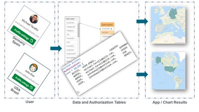
This video briefly demonstrates Section Access (Dynamic Data Reduction) in the Qlik Cloud Platform and introduces Section Access support for Qlik Sens... Show MoreThis video briefly demonstrates Section Access (Dynamic Data Reduction) in the Qlik Cloud Platform and introduces Section Access support for Qlik Sense Apps in Insight Advisor Chat.
NOTE: When using Section Access - I found that the field values you are restricting on must be in UPPER case.
Can't see the video? YouTube blocked by organization or region?
Use this link: https://videos.qlik.com/watch/5AeCZADbpd1jQhHDvqiFJB?
More on this topic here - Qlik Help - Section Access
-
【開催報告】2023年 第 1 回 Qlik Japan ユーザーミートアップ
まず初めに、本ミートアップのホストを務める Qlik プリセールスの中嶋より、Qlik として今年はオンライン配信の Qlik Japan Live!やデータソンのリアルでの開催、QlikWorld Tokyo、忘年会などユーザー様とのタッチポイントを定期的に作り、他社に負けない(?)活発なコミュニ... Show Moreまず初めに、本ミートアップのホストを務める Qlik プリセールスの中嶋より、Qlik として今年はオンライン配信の Qlik Japan Live!やデータソンのリアルでの開催、QlikWorld Tokyo、忘年会などユーザー様とのタッチポイントを定期的に作り、他社に負けない(?)活発なコミュニティを立ち上げていくことを表明させていただきました。
続いて、世界でわずか 50 人の Qlik Luminary のお一人であるセガ株式会社の萬様より、Qlik Luminary ならびに Qlik アドボケイトの概要と活動について、ご紹介がありました。Qlik アドボケイトは、「Qlik を通じてビジネスを変革し、その成果を社内外に幅広く発信されているトップユーザーを支援するプログラム」で、この日は会場にお越しいただいた多くの Qlik アドボケイトメンバーをご紹介いただきました。
続いて、皆さまが一番期待されていた事例のご紹介です。今回は、株式会社IHI、株式会社クレハ、大日本印刷株式会社、東亞合成株式会社のご担当者様より、各社における Qlik の活用方法と実際の業務でご利用されている Qlik アプリをご披露いただきました。経営・企画・調達・生産・品質・会計・人事・労務で活用されている、全 16 種のアプリをご紹介いただき、この貴重なお話を熱心にノートに書き留めている方々もいらっしゃいました。また、お客様の Qlik アプリを実際に拝見できるのは、Qlik 社員にとっても非常に貴重な機会となりました。
最後は、Qlik プリセールスの川畑が「これまで開催したユーザーミートアップで一番盛り上がったのではないかと思います。」と、ご登壇・ご参加の皆さまへ感謝を込めたご挨拶で締めくくりました。
ここからは、お集まりいただいた皆さまとの交流の場として、富士通株式会社の中川様による乾杯のご挨拶で懇親会がスタート。
ユーザー同士の情報交換やカジュアルトーク、事例の講演者に質問するなど、リラックスしてそれぞれのお時間をお楽しみいただきました。一方、懇親会中のステージでは、Qlik の鈴木・中嶋より、1月にシンガポールで開催された「Qlik 営業全体会議:Sales Kick Off」の様子や「2023年の Roadmap」 など、Qlik の最新情報をご紹介しました。そして、入場の際に選んでいただいた “I AM Happy Customer” “I LOVE Qlik Sense” “I will go to QlikWorld” などのキーワードを基に、全員もれなくプレゼントの Qlik ノベルティ抽選会がスタート。お帰りの際に、当たったノベルティをお持ち帰りいただきました。
歓談中、ご参加いただいた皆さまから
「非常に参考になる話を聞けて、参加して良かったです。」
「自社のアプリで活用できるか、早速検討してみたいです。」
「次回、機会をいただけたら自社の事例を紹介したいです。」といった嬉しいお言葉をいただきました。
盛りだくさんのユーザーミートアップとなり、Qlik 営業本部長の槙野から最後のご挨拶をさせていただき、盛況のもとに終了することができました。遅い時間にもかかわらず、最後まで多くの方が歓談を楽しまれていました。
今回ご紹介した内容が、皆さまの今後の取り組みのご参考となりましたら、大変嬉しく思います。Qlik は、今後もこのようなユーザー様同士の情報交換の機会を提供してまいります。ぜひ、ご期待ください!
-
Meet our Educator Ambassador César Brochero Castel!
Today, I would like to introduce César Brochero Castel, an Academic Program Educator Ambassador for 2023! César is our Educator Ambassador for the se... Show MoreToday, I would like to introduce César Brochero Castel, an Academic Program Educator Ambassador for 2023! César is our Educator Ambassador for the second year, having been also selected last year!
César lives in Argentina where he is an Educator and has been teaching for 8 years at both the Universidad de Palermo and the Universidad Católica. He was inspired to join the Academic Program after discussing with his colleague the difficulties he had using other analytics solutions. During his first several years he taught QlikView and then he migrated to Qlik Sense and has been using that ever since! In addition to Qlik Sense, he also incorporates the Data Literacy training he is provided as part of his membership. Throughout his course the students are required to develop an analytical application using Qlik Sense in which each student freely explores the data with the aim of finding insights and sharing it with others. To help them, they use the social network connector available in Qlik Sense and other resources to go beyond normal dashboard reporting. During his time teaching, César has seen several students decide to use Qlik Sense during their employment which gives him great satisfaction to know that he has helped them out in their professional careers.
César is the Founder of QuAlytics SpA Chile which provides analytics solutions to South American companies using Qlik Sense. In 2022, César also co-funded an EdTech startup called Jupi Digital (Jupidigital.com). The company helps people to re-convert their careers as data analysts. Jupi Digital trains people from diverse fields with all they need to work as data analytics professionals.
When asking César where he believes the industry is going, he replies “I feel that analytical skills are required today more than ever. Today's world requires people trained in data literacy to face the challenges that the world demands. The data is there today, but we must be able to understand it and get something good out of it. We must all go in that direction.”
When César is not teaching or building his business, he spends time with his family and baby Olivia!
Educators and students looking for free analytics software and training can apply to the Academic Program today by visiting qlik.com/us/company/academic-program
-
ObjectID & InObject Functions
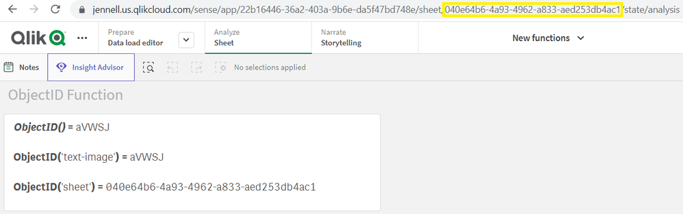
The ObjectID and InObject functions are system functions that can only be used in chart expressions. The ObjectID function has one optional parameter ... Show MoreThe ObjectID and InObject functions are system functions that can only be used in chart expressions. The ObjectID function has one optional parameter and is used to return the object ID of the object the expression is in or of the object type that is included in the parameter. A text & image object with ObjectID() in the expression returns the ID of the text & image object. ObjectID('text-image') also returns the ID of the text & image object. To determine the ID of the sheet the object is on, use the expression ObjectID('sheet'). This will return the ID of the sheet just as you see it in the URL of an app.
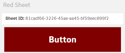
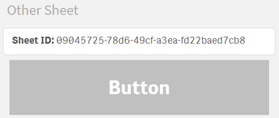
In the example below, there are 4 sheets and a button from the master items is on each sheet. An expression is used to color the background of the button based on the sheet it is on. In this expression, the ObjectID function is used to check the sheet ID before assigning the button color.
Here are the results:
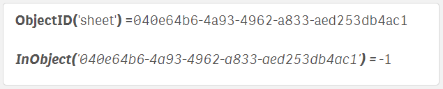
The InObject function takes one parameter, which is the ID of an object, and is used to determine if the current object, (where the expression is written), is contained in another object. In the text & image expression below, the InObject function is used to see if the text & image object is in the sheet with ID '040e64b6-4a93-4962-a833-aed253db4ac1'. In this case, the expression returned true (-1) because the text & image object is in the identified sheet. If the expression was false, 0 would have been returned.
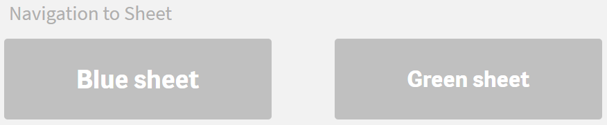
The InObject function can also be used to color buttons as done in the previous example. In this example, there are three sheets – a navigation sheet, a blue sheet, and a green sheet. On the navigation sheet there are two master buttons that will navigation the user to the respective sheet.
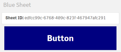
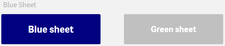
In the background color expression for the blue sheet, the InObject function is used to determine if the blue sheet button is in the blue sheet. If it is, then the button is colored blue, otherwise it is colored light gray. The parameter used in the InObject function is the sheet ID for the blue sheet.
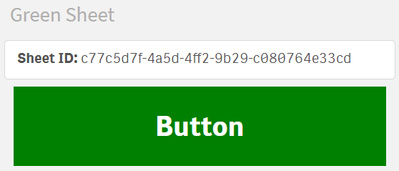
A similar expression is used for the background color expression of the green sheet button except in this expression, the parameter is the sheet ID for the green sheet.
When the blue sheet button is clicked, the user is directed to the blue sheet and the buttons looks like this:
When the green sheet button is clicked, the user is directed to the green sheet and the buttons looks like this:
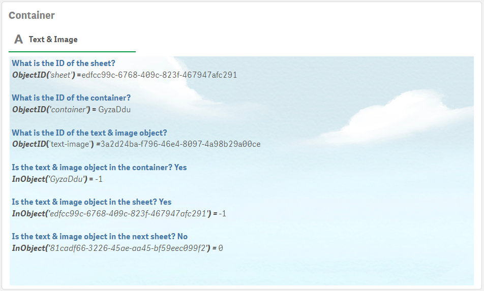
Below is another example of the InObject function with a few levels. There is a text & image object in a container object on a sheet. The first three expressions below use the ObjectID function to get the object IDs for the sheet, container, and text & image objects. The last three expressions use the InObject function to confirm that the text & image object is in the container, that the text & image object is in the sheet, and that the text & image object is not in the next sheet.
I would love to hear how you use the ObjectID and InObject functions – share in the comments.
Thanks,
Jennell
-
【オンデマンド配信】機械学習の力:「残り 90%」のユースケース対応で分析部門をサポート
機械学習モデルを容易に作成して予測的分析を実現 シンプルでコード不要のユーザーエクスペリエンスで、機械学習の力を引き出すには?ビジネスの世界では、データサイエンティストが対応できない「残り 90%」のユースケースに対応すべく、予測的分析の民主化が進行しています。次世代の AutoML ソリューショ... Show More機械学習モデルを容易に作成して予測的分析を実現
シンプルでコード不要のユーザーエクスペリエンスで、機械学習の力を引き出すには?
ビジネスの世界では、データサイエンティストが対応できない「残り 90%」のユースケースに対応すべく、予測的分析の民主化が進行しています。次世代の AutoML ソリューションは、履歴データから容易に事象の要因を特定したり、今後起こり得る結果を予測する機械学習モデルの作成を可能にします。これにより、ビジネスユーザーがシナリオを探索してテストができる強力な予測分析アプリケーションを構築することができます。
本 Web セミナーでは、TDWI 社と Qlik が次世代の拡張アナリティクス、AutoML 主導型の予測的分析がもたらすメリットをご紹介します。※ 参加費無料。パソコン・タブレット・スマートフォンで、どこからでもご視聴いただけます。日本語字幕付きでお届けします。
- 自動化された機械学習で、説明できる強力な予測的インサイトを生成
- 容易に予測を作成して分析アプリに組み込み、ビジネスユーザーの探索とアクションをサポート
- AutoML がもたらす、売上予測・解約率の低減・顧客生涯価値など、あらゆる「日常的」ユースケースに対するメリット
-
We're back in action! - February 2023 Enhancements
Hello Qlik Community! The team took some time at the beginning of the year to take a breath, reflect, and plan for the upcoming year. Great things are... Show MoreHello Qlik Community!
The team took some time at the beginning of the year to take a breath, reflect, and plan for the upcoming year. Great things are coming, and we could not be more thrilled! Our goals are simple for 2023: to connect with each of you more and make this Community even more helpful, informative, and full of life!
We have our plan, but what would you like to see this year? How can we make your experience even better? Drop a comment below or feel free to reach out to one of the admins via private message. We love hearing your feedback!
Now, on to the February enhancements…
‘Ditto – same here!’ button on Forum posts
Do you have the same question another user posted in the forums? Instead of asking the same question in a new post, let us know by clicking the new ‘Ditto – same here!’ button.
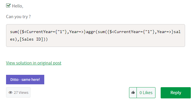
‘Ditto – same here!’ on Accepted Solutions
If you found that a solution was also helpful, hit the ‘Ditto – same here!’ button at the Accepted Solution level.
The 'Ditto - same here!' buttons will help us identify specific questions and issues that are occurring for our users - with the end goal of producing the content you need.
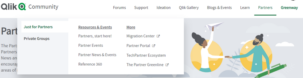
Partner Area Navigation
For Partners only - the Partner homepage has been added back (Partners, start here!) and the Private Groups have been moved out of the main navigation.
Your Qlik Community Admins,
Melissa, Sue, Jamie, and Nicole
-
Qlik Application Automation - the first release of the year includes new connect...
New Connectors Azure Purview Azure Purview is a cloud-based data governance service that helps you catalog, manage, and govern your on-premises, mul... Show MoreNew Connectors
Azure Purview
Azure Purview is a cloud-based data governance service that helps you catalog, manage, and govern your on-premises, multi-cloud, and software-as-a-service (SaaS) data. With Purview, you can create a holistic, up-to-date map of your data landscape and prepare this with automated data discovery, sensitive data classification, and end-to-end data lineage. This connector expands the number of metadata catalogs supported by Qlik Application Automation to encourage you to share and sync metadata between Azure Purview, Qlik Catalog, and Alation.
Read the following knowledge article, "Getting started with the Azure Purview Connector" to begin.
Microsoft Outlook 365 Connector
You've always been able to send email with Qlik Application Automaton via SMTP and other email services like SendGrid, but this release added a new connector for Microsoft Outlook 365. This new feature allows you to send mail with your own corporate email credentials via OAuth2 and the Microsoft Graph API. This differs from our mail connector because of the use of oAuth2, which will be more accepted in enterprise organizations.
To find out more read, "Getting started with Microsoft Outlook 365."
Apache Kafka
Apache Kafka is an open-source distributed event streaming platform used by thousands of companies for high-performance data pipelines, streaming analytics, data integration, and mission-critical applications. Many of you have asked for a connector to publish data to an existing topic for scenarios like synching data with warehouses, CRM or ERP systems.
Check out "Getting started with Apache Kafka" for more information.
Databricks
Databricks is a cloud-based collaborative data science, data engineering, and analytics platform that combines a data lake and warehouse into a single lakehouse architecture. Many Qlikkies incorporate Databricks jobs as a part of their analytical data pipelines and wanted a way to programmatically control those tasks as part of a larger workflow. Therefore we've added blocks such as create, stop, get pipeline updates, and more that let you manage Databricks tasks.
Unsurprisingly we've got a "Getting started with Databricks" article on the knowledge base, too.
New Features
Automation Monitoring
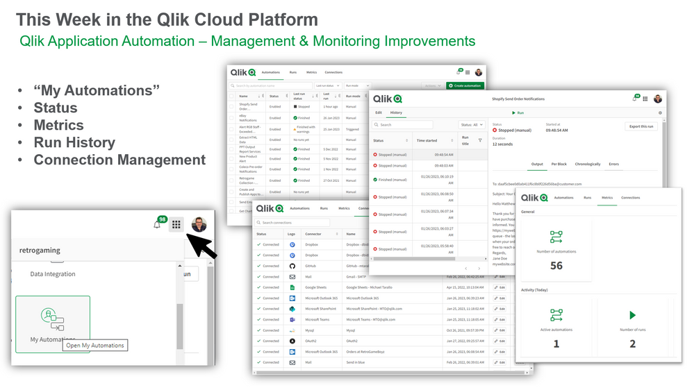
As you can imagine, we've received many requests to improve automation management and monitoring for users an tenant admins' alike. This is a complex and long-term roadmap category, but we've broken it into stages and will roll out improvements in subsequent releases. Therefore we begin this month by introducing an automations overview page that can be accessed from a new switcher menu item called "My Automations".
The automations overview page is a central place where each user can monitor their automations and runs. From here you'll be able to view basic usage metrics, a history view of a specific automations and a new connection management page. Basic usage metrics show your total automations, the number of active automations, the number of runs, the number of runs per context, and the total run duration for the last day or seven days.
The automation history list has also been improved to support rapid switching between different runs to support debugging and troubleshooting workflows more efficiently. Also, user experience improvements to the automation editor included new settings menu groups to enable and disable automations.
Finally, the connections summary page has been overhauled to cleanly provide the status of all the SaaS applications referenced in your automations.
I'm sure you'll agree that the Automation Overview page helps you understand which automations are running, and verify the status or context, which should go a long way to improving your automation governance. In summary, these improvements are part of a longer-term plan, so keep your eyes peeled in the coming months. We intend to improve monitoring features for tenant admins’, add new automation user roles and enhance automations for shared space. Stay tuned for losts to come.
New Templates
I also want to mention two new templates that I think Qlikkies will find extremely useful.
Slack Channel Notication of Jira Change
Most development teams live and die by collaboration driven by notifications. Consequently, we create a template to automate notifications between Jira and Slack. The new template creates a new Slack channel, invites the members, and sends a message to the channel along with the Jira ticket information when there is a change in the status of the Jira ticket. The template creates channels only for tickets with status changes from New to Committed, New to In Progress, or New to Designing. You can modify this template to trigger on different status changes, or use Microsoft Teams connector instead of the Slack connector.
Check out this knowledge article to see this template in action.
App Reload Optimization by Splitting QVDs
We’re always looking to increase the efficiency of our Qlik Apps, but one method to achieve a fast loading time is to split an app’s data into multiple QVDs. Consequently we’ve built an automation template to do just that. You’’ll find an extensive community article with detailed instructions and example apps here so go check it out.
Conclusion
If you've made it to the end, congratulations! You've seen that Qlik Application Automation continues to improve on all fronts, driven by requests from users like you. As always, we encourage you to explore using Qlik Application Automation to seek efficiencies in your daily data and analytics workflows.
-
Qdt-components 2020 Update
Almost two years ago, in February of 2018, the Qlik Demo Team (Qdt) publicly released qdt-components (GitHub, npm). We originally built Qdt-components... Show MoreAlmost two years ago, in February of 2018, the Qlik Demo Team (Qdt) publicly released qdt-components (GitHub, npm). We originally built Qdt-components as an internal library designed to help us create demos to showcase Qlik Sense Enterprise. We opened up the library to help others use the new Qlik APIs and create interesting mashups with their data. Since that initial release, we've written over a dozen blog posts to the Qlik Community Design Blog detailing how to use the various Qlik Sense and Picasso.js charts available via Qdt-components. In 2019, we hit 50 stars on GitHub, putting us in the top 1% of all open-source projects on GitHub. We've recently made some updates to our documentation and we wanted to re-introduce Qdt-components, show off our new logo, and highlight this powerful library's practical uses and recently added features.
Qdt-components is designed to be a library-agnostic method of connecting to Qlik Sense and displaying visualizations. Whether that is bringing in entire Qlik Sense charts and objects or building your own visualizations, Qdt-components is an easy-to-setup wrapper that can be used in a number of different ways. We've written in the past on this blog about the pros and cons of using the various APIs to connect to Qlik Sense (Getting Started with Qlik APIs, Integrating Qlik Sense into your Web App), an area that developers can easily get tripped up on. With Qdt-components, the question of whether to use the Capability API or incorporating Enigma.js has already been handled. You just need to answer one simple question: do I want to use charts and objects directly from my Qlik Sense app? If so, then you want access to the Visualization API; otherwise, the Engine API is sufficient.
Bringing in Qlik objects with the Visualization API means that it'll have the appearance you'd see in a Qlik Sense app. If you don't need to customize the look of your objects for your web app, then you can just build the charts / toolbars / etc. in Qlik Sense and bring them into your mashup using their object id's. If you want to skip all that, you can use our pre-built components by simply specifying the dimensions, measures, columns, etc. you need. Here are the available components as of 01/01/2020, the appropriate Qlik API required for the configuration object, and links to documentation to get you started:
QdtViz
These are used to bring in Qlik Sense objects exactly as they are in Qlik Sense. QdtViz components require the Visualization API (vizApi: true) and are one of the easiest to implement; you just need the object's id.
Visualization API: yesEngine API: noBlog Posts: qdt-components - A Components Library that can be used in simple Html, Angular 5 and ReactQdtCurrentSelections
Like QdtViz, QdtCurrentSelections requires the Visualization API and appears as it is from Qlik Sense. It can be used to show your user's current selections in the familiar, Qlik-styling. The only property you need to specify is its height.
Visualization API: yesEngine API: noQdtFilter
Using the Engine API, QdtFilter is a simple dropdown based on a column from your data.
Visualization API: noEngine API: yesQdtSelectionToolbar
This component displays a toolbar with the current app selections.
Visualization API: noEngine API: yesQdtPicasso
The QdtPicasso component actually comprises several Picasso.js charts; fifteen (15) as of January 10, 2020. Picasso.js is a charting library streamlined for building interactive visualizations for the Qlik product suites. With Qdt-components, connecting to and using Picasso.js is super easy because it's already built in...no need to import Picasso.js yourself.
Visualization API: noEngine API: yesBlog Posts: qdt-components - Horizontal Barchart by Picasso.js & Selection Toolbar, Qdt-components & Picasso.js - More Charts!, Qdt-components - custom charts with Qlik's Open Source picasso.js, Creating custom charts with qdt-components,QdtSearch
The QdtSearch component is a simple text input field that can be used to search a dimension of your data.
Visualization API: noEngine API: yesQdtMapBox
We've recently added our MapBox integration with the QdtMapBox component. You'll just need a MapBox API key and desired styling to create a map showcasing your data.
Visualization API: noEngine API: yesQdtTable
Build a sortable table of your data using QdtTable.
Visualization API: noEngine API: yesGetting started with Qdt-components is easy but we've created several templates to make it even easier:
- HTML / Vanilla JavaScript Template, HTML Documentation, Demo
- React Template, React Documentation, Demo
- Angular Template, Angular Documentation, Demo
And lastly, do you have an idea for a feature, bug fix, or chart to add? You can open an issue on GitHub or contribute!
-
Qlik Partner Engineering Team releases Qlik AWS Cost Explorer
Amazon Web Services (AWS) provides the Cost Explorer as the standard report tool for exploring costs related to an account. Using that service you can... Show MoreAmazon Web Services (AWS) provides the Cost Explorer as the standard report tool for exploring costs related to an account. Using that service you can see your consumption using pre-defined reports or customize one report for your needs.
But what if you want to be able to analyze your AWS spending based on different criteria that are not supported by the existing reports? What if there are multiple organizations worth of data and you would like to analyze based on different projects and users? Wouldn’t it be nice to have access to that data and combine it with data from other sources for some custom reports? Wouldn't be great if we had access to that information in a modern BI platform? Turns out that you can, using Qlik Sense in combination with the AWS Cost Explorer API! By bringing the AWS spend data into Qlik Sense, you can make it easy for a broader audience to consume that data and get access to insights that would be otherwise not available.
Two months ago Qlik Partner Engineering was asked separately by both a customer and our own IT Team for a better and more sophisticated solution for AWS spend management. One of the key questions was “Would it be possible to connect Qlik Sense to AWS and extract our spend data? We want to leverage the power of Qlik Sense to better analyze our AWS spend.”
The biggest challenge we faced was around figuring out how to perform the authentication. The highly secure authentication method that AWS uses for their API is just beyond what Qlik Sense can do using the regular REST connector. Thinking outside the box, I found a scripting solution to collect that spend data and then place the data into a location where Qlik Sense can easily read using an existing connector.
The Qlik AWS Spend solution consists of two parts:
- A script to extract spend data from AWS and land that data into an S3 bucket
- A Qlik Sense application that connects and reads the spend data from that S3 bucket
The best part? The solution is published on the Qlik Partner Engineering Github page (https://github.com/Qlik-PE/qlik-aws-cost-explorer) where you can download and use it for free.
Let me know your thoughts on how to improve this solution!
-
Deluxe Combo Chart Features
Deluxe Combo Chart Features AnyChart — Extensions for QS Combo charts for trend analysis can help you identify correlations that might exist bet... Show MoreDeluxe Combo Chart FeaturesAnyChart — Extensions for QSCombo charts for trend analysis can help you identify correlations that might exist between two values over a given period of time. Meet the unprecedentedly flexible combo charting in Qlik! With up to 3 dimensions to help analyze your data, error bars for statistical analysis at a glance, a wide variety of chart types available, and more. Explore all major features of the Deluxe Combo Chart Extension for Qlik Sense in this Qlik demo app.Discoveries
Visualizing how several metrics change over time or by category when they are different in scale, a combo chart lets you discover possible correlations. One of its most popular varieties is a Pareto chart, which consists of a line and bars. This app reveals how various chart types and features beyond Qlik's native implementation help make the most sense of data.
Impact
Explore all major features of the intuitive Deluxe Combo Chart Extension for Qlik Sense as you look into fictional business data. Surf through multiple available chart types and their combinations. See nested axes, error bars, stacking, rich visual settings, and much more demonstrated in action.
Audience
Data analysts and all levels of management across all industries. Also, all who want to see what kind of advanced combo charts are now available in Qlik Sense and how they work.
Data and advanced analytics
This application was built using AnyChart's Deluxe Combo Chart extension for Qlik Sense. The dataset is fictional.
-
Basics of data analytics and how it might be a great career choice
In a rather interesting article, the basics of data analytics are explained from a career perspective. The author sheds some light on various technolo... Show MoreIn a rather interesting article, the basics of data analytics are explained from a career perspective. The author sheds some light on various technologies that are setting up the landscape in the technology space and how data analytics will be an important piece among them. Further, he makes a point on the in-demand job roles in analytics and those which will continue to be in demand, in the future.
To read more about this article, follow this link: https://economictimes.indiatimes.com/news/how-to/what-is-data-analytics-and-how-it-may-help-in-your-career/articleshow/94698633.cms
-
Cloud版 Qlik Sense のロードスクリプトの履歴管理ができるようになりました。
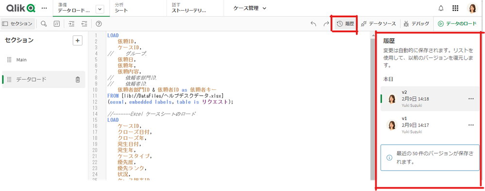
データロードエディタでロードスクリプトのバージョン管理ができるようになりました。 最新のスクリプトに名前をつけて履歴として保存することができ、これらの履歴を復元したりダウンロードしたりすることができます。 スクリプトの変更履歴を管理し、開発を効率化することができます。 詳しくはヘルプをご覧くだ... Show Moreデータロードエディタでロードスクリプトのバージョン管理ができるようになりました。
最新のスクリプトに名前をつけて履歴として保存することができ、これらの履歴を復元したりダウンロードしたりすることができます。
スクリプトの変更履歴を管理し、開発を効率化することができます。
詳しくはヘルプをご覧ください。