Unlock a world of possibilities! Login now and discover the exclusive benefits awaiting you.
Data Integration & Quality
Forums for Qlik Data Integration solutions. Ask questions, join discussions, find solutions, and access documentation and resources
Explore Qlik Gallery
Qlik Gallery is meant to encourage Qlikkies everywhere to share their progress – from a first Qlik app – to a favorite Qlik app – and everything in-between.
About Qlik Community
Get started on Qlik Community, find How-To documents, and join general non-product related discussions.
Qlik Resources
Direct links to other resources within the Qlik ecosystem. We suggest you bookmark this page.
Qlik Academic Program
Qlik gives qualified university students, educators, and researchers free Qlik software and resources to prepare students for the data-driven workplace.
Recent Blog Posts
-
Cyclic Dimension
Today I am going to blog about cyclic dimensions. A cyclic dimension is a group of dimensions that can be cycled through in a visualization. The dimen... Show MoreToday I am going to blog about cyclic dimensions. A cyclic dimension is a group of dimensions that can be cycled through in a visualization. The dimensions do not have to be related or have a hierarchical relationship. The dimensions only have to make sense with the measures used in the visualizations. Cyclic dimensions can be very useful when it is valuable to view a visualization across many dimensions. It becomes even more valuable if there are multiple visualizations on a sheet, or in an app, that use the same cyclic dimension. When a cyclic dimension is switched to the next field, all visualizations that use the cyclic dimension will be changed to the same field. This is a time saver. You may wonder if alternate dimensions can do the same thing. Alternate dimensions allow a user to change the dimension in a chart, but it only changes it for the specified chart whereas a cyclic dimension can change the dimension for multiple charts. Alternate dimensions can also be used in a visualization with a cyclic dimension.
Building a cyclic dimension is very easy and there are few ways to use them. You create a cyclic dimension the same as you do a single or drill-down dimension. From the Master items, create a new dimension. At the top select Cyclic dimension type, then add the fields to include. Give the cyclic dimension a name and save. Labels can be added to give the fields a different name and description. At least two fields need to be added to a cyclic dimension.
A cyclic dimension can be added to a visualization the same way a single dimension is added. Once they are added to a visualization a cycle icon will appear next to the field name as well as an arrow. By default, the first field in the cyclic dimension will be displayed. To change the dimension in the visualization, a user can click on the cycle icon or click on the label or down arrow and select another dimension.
Another way a user can cycle through the dimensions is to use a button. In the What’s New app, buttons have been created to cycle through the cyclic dimensions.
In all three buttons, the action is set to Step cyclic dimension and the Step is set to backward for the left arrow and forward for the right arrow and the cycle button in the middle.
Left arrow button
Right arrow & cycle buttons
In the What’s New app, you can also see how changing the cyclic dimension in one visualization, updates all the visualizations using the cyclic dimension. In the screenshot below, Category Name is the current cyclic dimension.
If I switch the dimension, using any of the ways I have described above, Country Code is the dimension. Notice that the dimension in all the visualizations have been updated to Country Code in the screenshot below.
Check out Qlik Help to learn more about cyclic dimensions and to be aware of the limitations. Also watch Michael Tarallo’s SaaS in 60 video on Cyclic Group Dimensions. Try them out in your next app.
Thanks,
Jennell
-
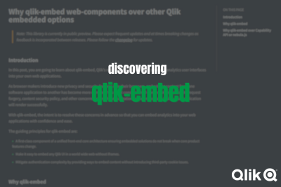
Discovering qlik-embed: Qlik’s new library for Embedding Qlik Sense in web apps
In previous posts on the Design blog, we've explored various ways for embedding Qlik Sense analytics. These have ranged from straightforward iFrames t... Show MoreIn previous posts on the Design blog, we've explored various ways for embedding Qlik Sense analytics. These have ranged from straightforward iFrames to more complex approaches like the Capabilities API, as well as more recent tools such as Nebula.js and Enigma.js.
Today, we’re going to be taking a quick look at a new library from Qlik called qlik-embed, but before diving into it, I would like to clarify that this library is currently in public preview and at the time of writing this blog, frequent updates as well as breaking changes are prone to happen (you can read more about that on qlik.dev or follow the Changelog for updated https://qlik.dev/changelog)
So what exactly is qlik-embed?
qlik-embed is a library for easily embedding data and analytics interfaces into your web apps while overcoming some of the concerns that usually arise when embedding content from one software application to another such as third-party cookies, cross-site request forgery, content security policy etc..
The library is designed to work with web apps from simple plain HTML ones to more modern frameworks like React etc.. That is in fact made easier since whichever qlik-embed flavor you use, the configuration options, the methods, and the properties will be similar.
If you are already embedding Qlik Sense content into your web applications, you can learn about the various reasons why qlik-embed would be a better solution on qlik.dev (https://qlik.dev/embed/qlik-embed/qlik-embed-introduction#why-qlik-embed-over-capability-api-or-nebulajs)
Web Components:
qlik-embed makes use of web components which are basically custom HTML elements in the form of <qlik-embed> </qlik-embed> HTML tags that allow you to configure properties of the content you’re embedding
You can find all supported web-components here:
How to quickly get started?
Before getting started, it’s worth noting that there are several ways to connect qlik-embed web components to Qlik.
More information about Auth can be found here:
- Connect qlik-embed: https://qlik.dev/embed/qlik-embed/connect-qlik-embed
- Best Practices: https://qlik.dev/embed/qlik-embed/qlik-embed-auth-best-practice
You can connect to qlik-embed in these ways:
- Qlik Cloud API keys (cookie-less)
- Qlik Cloud OAuth2 clients (cookie-less)
- Qlik Cloud interactive login (cookies)
- Qlik Sense Enterprise Client Managed interactive login (cookies)
- None (This is a more advanced option and requires handling authenticated requests using a custom authorization backend proxy - learn more about that here: https://qlik.dev/authenticate/jwt/jwt-proxy/)
In this post, we’re going to use OAuth2 Single-page-app from the Qlik Cloud tenant Management Console under oAuth:
Example using HTML Web Components:
Reference page: https://qlik.dev/embed/qlik-embed/qlik-embed-webcomponent-quickstartFirst thing we need to do is add a <script> element in the <head> tag to configure the call to the qlik-embed library and set up the attributes relevant to the connection we choose.
<script crossorigin="anonymous" type="application/javascript" src="https://cdn.jsdelivr.net/npm/@qlik/embed-web-components" data-host="<QLIK_TENANT_URL>" data-client-id="<QLIK_OAUTH2_CLIENT_ID>" data-redirect-uri="<WEB_APP_CALLBACK_URI>" data-access-token-storage="session" > </script>- data-host is the URL to your Qlik Cloud tenant. For example https://example.us.qlikcloud.com/
- data-client-id is the client ID for the single-page application OAuth2 client registered for this web application.
- data-redirect-uri is the location of the web page the OAuth2 client will call back to when authorization requests are made from your web application to your Qlik tenant. This web page should be added to your web application.
web-component:
<qlik-embed ui="classic/app" app-id="<APP_ID>"></qlik-embed>oauth-callback.html:
<!DOCTYPE html>
<html lang="en">
  <head>
    <meta charset="utf-8" />
    <script
      crossorigin="anonymous"
      type="application/javascript"
      data-host="<QLIK_TENANT_URL>"
      src="https://cdn.jsdelivr.net/npm/@qlik/embed-web-components/dist/oauth-callback.js"
    ></script>
  </head>
</html>
You can fork the full example here and change the “Tenant URL” and the rest of the attributes to your own tenant after creating the OAuth SPA config: https://replit.com/@ouadielim/qlik-embed-HTML-Web-Components#index.html
result:
Example using React:
In React, you can use qlik’s embed-react library package: npm install @qlik/embed-react (https://www.npmjs.com/package/@qlik/embed-react)
Then, you can import QlikEmbed and QlikEmbedConfig from @qlik/embed-react. React’s context is used to pass in the hostConfig that you configure to point to your Qlik Cloud Tenant (host) and use the OAuth 2 config (clientId). The redirect URI needs to point to a page which is similar to what we did above in HTML web components.
import { QlikEmbed, QlikEmbedConfig } from "@qlik/embed-react";

const hostConfig = {
  host: "<QLIK_CLOUD_TENANT>",
  clientId: "<CLIENT_ID>",
  redirectUri: "https://localhost:5173/oauth-callback.html",
  accessTokenStorage: "session",
  authType: "Oauth2",
};
const appId = "<APP_ID>";
const sheetId = ""; // sheet id or empty string

export default () => (
  <QlikEmbedConfig.Provider value={hostConfig}>
	<div className="container">
      <h1>Qlik Embed with React</h1>
	      <div className="selections-bar">
        <QlikEmbed ui="analytics/selections" appId={appId} />
      </div>
      <div className="viz">
        <QlikEmbed ui="classic/app" app={appId} sheet={sheetId} />
      </div>
      <div className="viz">
        <QlikEmbed ui="analytics/chart" appId={appId} objectId="hRZaKk" />
      </div>
	  </div>
  </QlikEmbedConfig.Provider>
);
You can clone the full React example here: https://github.com/ouadie-limouni/qlik-embed-react
result:
Limitations ?
There are a few limitations to qlik-embed as it continues to develop into a more stable and robust library - you can read more about those on qlik.dev: https://qlik.dev/embed/qlik-embed/qlik-embed-limitations
Like I mentioned at the very beginning, qlik-embed is new and evolving quickly, I invite you to test it to get familiar with it early and stay tuned for more updates and bug fixes as they come out using the Changelog page.
I hope you found this post helpful, please let me know in the comments below if you have any questions!
Thanks
- Ouadie -
Celebrating Summer Solstice with Streamlined Scripting
As we embrace the longest day of the year, the summer solstice, I am reminded of the importance of making the most of every moment. While the sun shin... Show MoreAs we embrace the longest day of the year, the summer solstice, I am reminded of the importance of making the most of every moment. While the sun shines brightly, we want our dedicated Qlik developers, consultants, and "Qlik script rock-stars" to enjoy the weather rather than spend countless hours in the script editor interface. That’s why we are excited to introduce our latest improvements, designed to enhance your scripting experience and give you more time to bask in the summer glow.
Keep reading to explore the enhancements we've made to the script and data load editors, ensuring a more efficient, consistent, and enjoyable user experience. Whether you're tackling data prep or loading data into a Qlik Sense app, these updates will streamline your workflow and promote best practices, allowing you to spend less time on scripts and more time soaking up the sunshine.
Fixing pain points in autocomplete
Autocomplete has been a persistent issue for many of you, often causing more frustration than convenience. Recognizing this, we released an update on February 15th, to make autocomplete less aggressive in both script and expression editors. This seemingly small bug fix has had a significant impact, earning praise from our developer community.
A few days ago on June 18th, we released an enhancement that allows you to enable or disable autocomplete according to your preference. This flexibility addresses one of the biggest pain points raised by our script writers, empowering you to work more efficiently.
For more details, check out the community discussion by Partner Ambassador – Ometis.
Consistent user experience across script editors
We are committed to providing a consistent user experience across our platforms. In November 2023, we released a standalone script editor for data prep use cases. This year, we’ve ensured that the functionality in the standalone script editor is mirrored in the Data Load Editor used by over 11k users for loading data into Qlik Sense apps.
Promoting good practices with reusable and modular code
We’ve also made strides in promoting good coding practices. We introduced QVS file support, allowing you to upload, preview, and include QVS files in your scripts. This feature, released on April 31st in the script editor and on May 21st in the Data Load Editor, supports the reuse of script parts and encourages modularity.
Stay tuned for future updates… because we are planning to take the current functionality of read only to the next level and include editable scripts within Qlik Cloud!
This enhancement not only promotes best practices but also helps with a smoother transition to Qlik Cloud for those heavily utilizing QVS files in client-managed deployments.
Explore community feedback:
Enhanced Data Load EditorThe Enhanced Data Load Editor, released on May 21st, brings a host of new functionalities aimed at improving usability. These include the ability to preview loaded data directly from the editor, the introduction of a STORE command wizard, and resizable panels. With these improvements the script coding experience is more intuitive and efficient, aligning it with the capabilities of the enhanced script editor in Qlik Cloud.
Key features include:
- Data preview with limited loading and table/profile previews for troubleshooting during development without switching between app sheets or data model viewer, allowing quick checks on script effects on a limited number of rows.
- Resizable panels for a customizable workspace
Note: These enhancements were previously introduced in the standalone script editor in November 2023 for data prep use cases. If you missed that update, catch up here:
Community reactions
The release of these improvements in the Data Load Editor has inspired positive reactions across the Qlik community. Here’s what some of our Partner Ambassadors and consultants had to say:
- Partner Ambassador Alex Walker - Ometis
- Partner Ambassador Cristof Schwarz - Databridge
- Consultant Paul Verkooijen - BZTRS Agency
Embracing a 'Cloud-First' approach
While we emphasize a cloud-first strategy, we understand the importance of supporting both cloud and client-managed environments. The standalone script editor and script object improvements are currently supported in Qlik Cloud. However, enhancements to the Data Load Editor and expression editor are also included in Qlik Sense client-managed, with major updates planned for the November 2024 release.
These updates, including enhanced Data Load Editor features and QVS file support, not only improve the current experience but also encourage a gradual move to Qlik Cloud.
Looking forward
As we continue to innovate and improve the Qlik scripting experience, your feedback remains invaluable. Be on the lookout for more updates, and let’s make the most of these long summer days together!
To learn more:
- What’s New in Qlik Cloud | Qlik Help
- Creating reusable load script with QVS files | Qlik Help
- Scripting to load or export data | Qlik Help
-
Sheet and Object-level Access Control in Qlik Cloud
Hey guys, it's been awhile since we had a guest blogger on, so today I am pleased to introduce you to Daniel Pilla. Daniel is a Master Principal Ana... Show MoreHey guys, it's been awhile since we had a guest blogger on, so today I am pleased to introduce you to Daniel Pilla. Daniel is a Master Principal Analytics Platform Architect at Qlik and is part of the Presales organization. He has been with Qlik for 8 years, and specializes in integration, architecture, embedding, and security. Take it away Dan!
Sheet and object-level access control in Qlik Cloud
This is a relatively common request, especially from customers coming from Qlik Sense Enterprise Client-Managed. The use case is when organizations want to show/hide specific assets in an application based on the group membership of the current user that is accessing the application. Note that this is in no way a strategy or solution for data security (which is handled with section access), but rather serves as a potential design pattern for custom tailoring apps for specific groups of users.
Example Scenario
Let’s assume a customer has a global sales application. That application contains sheets that are designed for specific product group sales that not every sales representative sells. The customer wants to show the product-specific sheets only to the sales representatives that sell those respective products. If the user contains the group “Product Group A” then they should see the “Product Group A Analysis” sheet, and likewise if the user contains the group “Product Group B” then they should contain the “Product Group B Analysis” sheet.
Solution
To achieve this in Qlik Cloud, we can use the Advanced Analytics connector, which in essence is a RESTful server-side extension. This connector offers the ability to connect to RESTful services in real-time from both the load script and from the front-end (charts and expressions). We can use this connector to connect directly to the Qlik Cloud APIs to fetch the groups of the current user, return those groups as a pipe-delimited string, and then use those groups in a show condition expression.
Setup
Prerequisites:
- The Advanced Analytics connector is going to be making API calls to Qlik Cloud on behalf of the logged in user. This means that you must have a user with the “Developer” role assigned as well as an API key issued to that user.
- The Creation of groups setting must be enabled in the Console under Settings > Feature control
- Ensure that there are groups available to the user that you are testing for in the tenant. To check this, you can enter the following into the browser, replacing {tenant} and {region} accordingly: https://{tenant}.{region}.qlikcloud.com/api/users/me -- There, you will find the assignedGroups array which contains the groups that are assigned to the logged in user.
Connector Setup:
- Import the sample application attached to this page.
- Open the application and navigate to the load script.
- Under Data connections, select Create new connection and select Advanced Analytics.
- For URL, fill in your own tenant for URL followed by ‘/api/v1/users’
- https://{tenant}.{region}.qlikcloud.com/api/v1/users
- Change the Method to GET.
- Under Query Parameters, add a parameter with the Name of ‘filter’ and the Value should resemble the following, where {subject} is an existing user subject for the filter so you can test whether the connection is operational:
- {subject co “{subject}”}
- In this example, the user I am using has a REALM value. Note that you will have to escape the backslash with an extra backslash, e.g., QLIK-POC\dpi needs to be QLIK-POC\\dpi
- Within Authorization, change the Authorization Method to Bearer Token.
- Under Token Scheme, select Bearer.
- For Bearer Token, enter in the API key mentioned as a prerequisite above.
- Within Response Table, for Name of Returned Table enter the value of ‘data’. Note that this value is only really relevant for the load script, but the field is required to be populated nonetheless.
- Under Table Path (JMESPath), enter in the value of ‘data’. Note that this is the name of the JSON object containing the data returned from `api/v1/users` and contains source of data that we require from the payload.
- Within Response Fields, deselect Load all available fields. This is so we can customize the value that is returned.
- Within Response Table, under Table Fields (JMESPath), enter a new Name value as ‘groups’, then enter the Value of ‘join(‘|’,assignedGroups[*].name)’. This will concatenate all of the values of the ‘assignedGroups’ array returned by the API into a pipe delimited string. This function is a part of the JMESPath query language that is supported by the Advanced Analytics connector. To learn more, you can refer to: https://jmespath.org/tutorial.html.
- Leave the remaining settings untouched.
- Set the Name of the connection as ‘Get Groups’. Note in this case this is important because the name of the connection is directly referenced in the expression of the accompanying sample app.
- Test the connection and ensure that it is operational.
Sample App Testing:
The sample application includes three sheets:
- Get Current User Groups – this sheet displays the current groups of the logged in user.
- Product Group A Analysis – this sheet has a commented out calculation condition to only show the sheet if the user contains the group ‘Product Group A’.
- Product Group B Analysis – this sheet has a commented out calculation condition to only show the sheet if the user contains the group ‘Product Group B’.
The application transforms the OsUser() result into the subject format, looks up the user, gets the groups, and returns them as a pipe-delimited string. You can find this process defined in the vUserSub and vUserGroups variables.
To test the application, first confirm that the first sheet returns your user groups. If it does, you can modify the sheet calculation conditions on the latter two sheets to your desired group names that you want to show based on.
Modify the expression by uncommenting it and adding in your desired group name (ensured it is enclosed by pipes so as to not partially match another group name):
In my example, I am a member of the group `Product Group A’ and not `Product Group B’, so while in edit mode, I see the following, confirming the ‘Product Group B Analysis’ is hidden from my view:
Exiting edit mode, I now see:
Additional Notes
- If users have edit-level access or greater to the application where this method is deployed, when in “Edit” mode, they will be able to see that the hidden sheet(s) exist. The user could then duplicate that sheet and remove/alter the show condition so that they could see the sheet. This is not a data security risk, as this technique only focuses on cosmetic app design, however it should be noted that if it is desired that the users cannot have access to these sheets then they must not have any roles that allow for edit-level access including “Can manage”, “Can contribute”, and “Can edit”.
- This solution relies on API calls being made by the owner of the API key.
- This user must:
- Continue to be exist
- Continue to have the “Developer” role
- Ensure that the API key does not expire and/or is rotated to prevent downtime
- This user must:
- As this solution is making calls on behalf of a single user as users are leverage the application, there is the potential for rate-limiting at the Users API. The current rate limit of the Users API is 1,000 calls per minute.
- The Advanced Analytics connector function call in the sample app leverages the "ShouldCache":"False" setting in the vUserGroups variable. This ensures that the user’s groups are not cached by the engine, however it makes more calls to the APIs. If you are experiencing or are concerned about rate limiting, this setting can be removed.

-
August Qlik Digest
Welcome to the August Qlik Digest, where you can find all Qlik’s latest updates. This month, we’ll discuss the official release of Qlik Answers, two ... Show MoreWelcome to the August Qlik Digest, where you can find all Qlik’s latest updates. This month, we’ll discuss the official release of Qlik Answers, two new and exciting customer stories, and more!
Unlock new opportunities with unstructured data using Qlik Answers!
Following it’s release at Qlik Connect, Qlik Answers was officially released on July 30th. Qlik Answers
is a Generative AI-powered Knowledge Assistant that provides users with personalized answers to questions sourced from the vast amount of unstructured content across organizations.
Visionary Voices Episode 4: Mid-Year AI Insights and Future Focus
Interested in what experts from around the world are saying about data and AI trends for the rest of 2024?
Tune in to Qlik’s exclusive mini-series “Visionary Voices in AI” to find out where they are placing their data and AI bets for the rest of the year on Visionary Voices Episode 4.
Are you still using Qlik on-prem?
Now is your chance to migrate to Qlik Cloud Analytics leveraging our limited time ‘Move to Cloud’ program. Talk to your account manager today or click here to learn more about Qlik Cloud Analytics.
Customer Success Stories
Reworld: Data-Driven Sustainability in Waste Management
Reworld, a leading waste management specialist, leveraged Qlik's data integration platform to create a centralized data hub, enabling data-driven decisions and cost optimization. This foundation also facilitated the integration of AI, opening new markets and enhancing sustainability solutions.
Van Oord: Protecting coastal ecosystems and communities
Van Oord prioritizes ocean health to foster a sustainable relationship between humanity and nature. Its Qlik-based Climate Risk Overview tool safeguards at-risk ecosystems and optimizes Van Oord's operations. The tool is gaining recognition, contributing to the UN Ocean Decade initiative, and engaging stakeholders at COP conferences from diverse sectors.
Limited Time Offer! Get Qlik Trained at Discounted Rates
Are you ready to take your Qlik skills to the next level? Then we have got exciting news for you!
Qlik offers a wide variety of courses and delivery methods to suit your learning needs. Take the training you need to achieve your learning goals with these recently released promotions:
- 30% off Public training courses
- 20% off Qlik Continuous Classroom Individual & Unlimited subscriptions
- 20% off Talend Academy Individual subscription
-
This is How You Enable Your Sales Team with Qlik Answers
In the past, Qlik, like other companies, has been challenged to get the right enablement materials into the hands of our sales team. People simply did... Show MoreIn the past, Qlik, like other companies, has been challenged to get the right enablement materials into the hands of our sales team. People simply didn’t know where to look to find the information they need. But now with Qlik Answers, the game has changed.
Resources:
SaaS in 60 - Qlik Answers: https://youtu.be/dKlStbslh6I
Quick Product Demo: https://youtu.be/VWrnxKHgDZY
Can't see the video? YouTube blocked by your region or organization? Click here:
-
The Document Locale
In the beginning of the load script you will find a number of Set statements defining the environment variables. These determine the date format, the ... Show MoreIn the beginning of the load script you will find a number of Set statements defining the environment variables. These determine the date format, the month names and a number of other things that pertain to the regional settings.
This is the Document Locale.
In other products or situations, there is usually a locale per computer or per user, but for Qlik Sense and QlikView the locale is per app. The reason is that the locale affects selections and set expressions internally in the Qlik logic, so it wouldn’t work with different locales for different users. Examples:
- The date format: Should {<Date={7/11/2022}>} refer to July 11th or to Nov 7th? The interpretation is different in different countries.
- The collation: Should {<Text={"*a*"}>} also match ‘å’, ’ä’, ‘ā’, or ’æ’? This is different in different countries.
Since we want a measure containing a set expression or a bookmark to return the same value for different users, we cannot have different locales for different users. Everyone within the same app must use the same locale. The solution is to have a document locale.If the set statements are organized a little, it becomes easier to see what they do. The following shows the locale I usually use:
First, you have some variables that pertain to numbers, decimal symbol, thousand separator, etc. These will be used for interpreting text as numbers when loading data, as well as for formatting the values. Then you have some variables that pertain to date and time. Also these are used for interpretation and formatting, but now of dates and timestamps.
Then you have some variables that pertain to calendars; names of months and week days, how the week numbers should be calculated etc.
All of the above variables are used internally by the Qlik functions, so if you change a variable, some functions will return a different value. For example, the WeekStart() function obviously uses the value of FirstWeekDay. Further, the month and day names are linked to format codes. For example, Date(Date,'MMMM') will always return one of the values in LongMonthNames.
Many functions have parameters that can override the environment variables, i.e. the variables define a default, but as a user you can change that. Example:
Date(Date) will use the date format of the variable DateFormat
Date(Date,'YYYY MMMM DD') will use the date format of the parameterThe week numbering is a chapter of its own: In some countries, the ISO week numbering is used: The week starts on a Monday, one week number may well span two years, and Jan 4th is always in week 1. This corresponds to
Set FirstWeekDay =0; // 0=Monday
Set BrokenWeeks =0;
Set ReferenceDay =4; // Jan 4th is always in week 1But in other countries, e.g. USA, a different system is used: The week starts on a Sunday, a week number never spans two years, and Jan 1st is always in week 1:
Set FirstWeekDay =6; // 6=Sunday
Set BrokenWeeks =1;
Set ReferenceDay =1; // Jan 1st is always in week 1We recently had a bug that caused some problems: The MakeWeekDate() function ignored the environment variables and instead always returned the ISO8601 values (the ISO standard assumes that Monday always is the first day of the week). This was an obvious error and was fixed, but unfortunately the fix caused negative effects for some customers, and we apologize for that. More info on the support blog.
Finally, the CollationLocale affects sort orders of text strings and searches: Which field values should be matched for a given search string.
Feel free to change these variables should you need to!
HIC
Read more about interpretation and formatting and about collation.

-
Natural Language Insights – Powerful AI on Dashboards
We have recently introduced a new, natural language object in Qlik Sense SaaS that can be added directly to dashboards and applications to deliver AI-... Show MoreWe have recently introduced a new, natural language object in Qlik Sense SaaS that can be added directly to dashboards and applications to deliver AI-generated insights. This capability extends our NLG capabilities beyond the Insight Advisor experience, allowing a much broader audience of Qlik Sense users to benefit from narrative interpretations and readouts when exploring in dashboards, boosting data literacy and delivering improved data storytelling.
Access to YouTube blocked? Watch on the Qlik site instead: SaaS in 60 - Natural Language Insights on Dashboards
App creators can configure the NLG object to produce narratives for any context by choosing dimensions, measures, and applicable analysis types – delivering insights for an overall sheet, describing a group of visualizations, or creating readouts for individual visualizations. It will automatically identify the appropriate analysis types based on the data selected, and the user can change what analysis types are included if they choose. Users have a variety of options for customizing the NLG, including generating paragraph format, bulleted format, and limiting the list (i.e. to the top recommendation per analysis type). And like all objects in Qlik Sense, our NLG is fully dynamic and responsive to selections, leveraging our associative engine to refresh with a new list of the most important insights after each click.
By utilizing AI to generate narrative insights and interpretations, we can effectively drive “in-product” data literacy for more users, especially those who may not be able to infer the best takeaways from a visualization or dashboard. This ability also provides a key ingredient for Data Storytelling, auto-generating the most relevant narrative insights which can be delivered in analytic data stories and reporting runs to PDF and PowerPoint.
NLG on a dashboard is another step in our journey to bring augmented analytics to all areas of our user experience, from a BI Developer working with data to a Business Analyst using AutoML and creating dashboards to a Business User interacting with apps and asking questions. In all these cases will be exploring best-in-class ways to surface AI and ML in our core analytics workflows targeted at automating and simplifying tasks, broadening and deepening insight, and expanding access and data literacy.
For now we would encourage you to take advantage of this new and exciting capability and make it part of all your apps. Learn more
-
Qlik Sense Enterprise on Windows: New Patches available for May 2024, February 2...
Hello all, The following patches for Qlik Sense Enterprise on Windows have been released today: May 2024 Patch 4 (Release Notes) February 2024 Patch ... Show MoreHello all,
The following patches for Qlik Sense Enterprise on Windows have been released today:
- May 2024 Patch 4 (Release Notes)
- February 2024 Patch 8 (Release Notes)
- and November 2023 Patch 11 (Release Notes)
All installation files are available on our Download site. Log in with your Qlik ID, apply your version's relevant filter, and download the new patch release.
Looking for product lifecycle information? See Qlik Sense Enterprise on Windows Product Lifecycle.
Wondering why we have not seen an August 2024 major release? See Release Cadence Update: Qlik Sense Enterprise Client-Managed.Thank you for choosing Qlik,
Qlik Support -
A Summer of Learning with the Qlik Academic Program
During the months of October to March we have our busiest time for the Academic Program and our support for universities in the UK and Europe, but lea... Show MoreDuring the months of October to March we have our busiest time for the Academic Program and our support for universities in the UK and Europe, but learning continues well into the summer for some schools. So far this summer we've had two sessions with universities to get students introduced to Qlik Sense and data analytics.
On 11th July the Academic Program gave a guest lecture to students at DHBW Mannheim in Germany, studying a dual study course in Digital Commerce Management. This session was lead by Lukas Lohmann, an alumni of DHBW Mannheim and a member of the DACH presales team here at Qlik. During this kick-off session we introduced them to Qlik and the Academic Program, before giving a demonstration of the software and talking about Qlik Sense use cases. In September we will return to the class to give an in depth, hands on workshop in Qlik Sense before setting the students an assignment. This is a collaboration that started last year to give students practical skills in data analytics to apply to their future career and it has received brilliant feedback from both students and educators. We are thrilled to continue supporting this course and if you'd like to learn more about how we can support your teaching, please reach out to us.
On July 26th the Academic Program conducted a hands-on Qlik Sense workshop with Masters students studying Controlling at the University of Maastricht, in the Netherlands. This module is lead by one of our very own Educator Ambassadors, Daniel O Leary from the University of Southern California. These students were all full time professionals already pursuing careers in business, some of them were aware of Qlik but many had never had the chance to learn about us and our software. After a short introduction from me about Qlik and the resources available through the Academic Program, Technical Product Marketing Manager, David Freschl, took students through an introduction to building their first app and creating visualizations. Each student completed the workshop in their own Qlik Sense Business tenant, accessed for free through the Qlik Academic Program. This was a short session of an hour and a half, to give students a taste of just how powerful Qlik Sense is.
Make the most of your time off this summer by upskilling with the Qlik Academic Program! To learn more visit qlik.com/academicprogram.
-
Australia is the new hub for a data analytics career
Australia is an attractive destination for Indian students considering a career in business analytics. The country offers high-quality educational pro... Show MoreAustralia is an attractive destination for Indian students considering a career in business analytics. The country offers high-quality educational programs, some of which are accredited by professional bodies such as the Australian Computer Society (ACS). These programs provide a comprehensive curriculum that blends theoretical knowledge with practical skills, ensuring graduates are well-prepared for the job market.
To read more on this article, visit: https://www.freepressjournal.in/study-abroad/emerging-trends-in-business-analytics-and-career-opportunities-for-indian-students-in-australia
To learn about how you can access free resources in data analytics if you are a student or professor, visit, qlik.com/academicprogram -
The Evolution of Insight Advisor – Continuing the path forward with Augmented An...
But in 2023, the arrival of ChatGPT and generative-AI changed the game. Qlik was quick to respond, but not in haste. We introduced a new AI new strat... Show MoreBut in 2023, the arrival of ChatGPT and generative-AI changed the game.
Qlik was quick to respond, but not in haste. We introduced a new AI new strategy coined Qlik Staige, which is comprised of three pillars – a trusted data foundation for AI, AI-enhanced analytics, and self-service AI solutions. The foundational aspect of our AI-enhanced analytics strategy is to take Insight Advisor to the next level, modernizing the architecture and language model to take advantage of the latest generative-AI capabilities. We are pleased to introduce the first step on that journey – LLM driven language generation.
Insight Advisor now features generative-AI driven language generation as a private preview feature, both in Insight Advisor Chat and in-app search experiences. Users will now get more "chat GPT like" answers when asking questions, with human sounding narrative for improved readability and a wider range of observations, summarizations, and additional insights. Qlik has partnered with Amazon Bedrock to utilize state of the art LLM technology, through a fully built-in solution that takes advantage of Qlik's security and governance. And of course, all analytical calculations are still generated by the trusted Qlik engine, with the LLM being utilized to enhance and improve output. Going forward, we will continue to modernize the language model in Insight Advisor, improving intent recognition and enhancing the overall capabilities and experience.
In addition, in the coming months we will be introducing automated authoring. Business analysts might be great at building visualizations, but it’s a time-consuming and complex process. Automated authoring is a new AI-driven creation experience that speeds and simplifies authoring in Qlik. With a wide variety of analysis types to choose from, you can now drag-and-drop AI-generated analyses directly onto your sheets, select applicable data from a list of suggestions, and let Qlik do the rest. In a few clicks you get a sophisticated analysis that would have taken far longer to build manually. This enables business analysts and authors who know what they want to gain efficiency, shorten time-to-value, and spend more of their effort actually analyzing the business.
Both of these exciting new features were demonstrated at our annual user conference, Qlik Connect, and received great feedback. The new LLM-driven language generation capability is now offered in private preview, and automated authoring will be generally available later this summer.
Stay tuned as we continue to lead the way in AI-powered analytics – lots more to come.
-
Conditional Show/Hide Dimensions and Measures in a Chart
Conditional show or hide is available in line and bar charts giving the user the ability to toggle dimensions or measures on or off in a single chart.... Show MoreConditional show or hide is available in line and bar charts giving the user the ability to toggle dimensions or measures on or off in a single chart. This allows developers to customize line and bar charts and save space by using one chart to show various metrics and dimensions. Let’s look at a simple way of using this feature to show or hide lines in a line chart. In the Overall Equipment Efficiency demo found on the Demo Site, there is a line chart accompanied by buttons that are used to toggle the lines on and off in the line chart.
This is done by using variables. When each button is clicked, the respective variable is toggled from 0 to 1 or 1 to 0 depending on its current value. See the value expression in the image below.
In the measure expression in the line chart, this variable is checked to determine if the expression should be evaluated and displayed or if the measure should be set to null.
This is a perfectly good way to toggle the lines, but with the ability to use conditional show and hide in line and bar charts, this process can be simplified. First, in the measure expression, we no longer need to use an if statement which can help reduce calculation time. We can simply use our normal expression and the “Show measure if” setting, with the respective variable, to evaluate if a line should be shown in the visualization or not.
The “Show measure if” and “Show dimension if” settings evaluate the expression and will show the line if the expression evaluates to true. In my example, vShowOEE will be either 1 or 0. If it is 1, the line will be displayed. If it is 0, then it will not be displayed. We can continue to use the buttons to toggle the respective variable (from 1 to 0 and vice versa) for each line.
My example is basic, but more complex expressions can be used as well. For example, you may want to show/hide lines based on a selection or a calculated value or you may want to use some business logic to determine which dimension or measure should be displayed. The expression can be as simple or complex as needed, as long as it returns a true or false value. Keep in mind, that this show setting is optional and can be left blank. When no expression is entered, the line (or bar) is displayed.
There are a few limitations of this new feature to be aware of: 1) Custom tooltips are disabled when using a conditional dimension, 2) Time series forecasting is not available when using conditional dimensions or measures. While the “Show measure if” and the “Show dimension if” can both be used in the same chart, it is recommended that you use only one at a time. Check out Qlik Help to learn more and test this new feature out in your next line or bar chart.
Thanks,
Jennell
-
Football Betting Dashboard
Football Betting Dashboard 2Foqus WHAT IF: you would bet €10 on your favorite sports team for every game?⚽ Would you end up with a profit by the... Show MoreFootball Betting Dashboard2Foqus WHAT IF: you would bet €10 on your favorite sports team for every game?⚽ Would you end up with a profit by the end of the season? Let's find out! What IF analysis in combination with Football Betting Data, visualized using the powerful Layout Container.
Discoveries
Flexibility and countless visualization possibilities with Layout Container in combination with a WHAT IF analysis
Impact
New ways to design dashboards using new visualization objects in this application
Audience
Primarily for Qlik developers, but also for any end users interested in exploring new possibilities with the tool.
Data and advanced analytics
Showcasing the power of WHAT IF analysis within Qlik
-
Social Media Report
Social Media Report Clay TechSystems Consulting Private Limited You can gather information on the reach, impressions, and visitors of your socia... Show MoreSocial Media ReportClay TechSystems Consulting Private LimitedYou can gather information on the reach, impressions, and visitors of your social media posts with this app. It provides analysis on a monthly and yearly basis, allowing you to prioritize your marketing efforts.Discoveries
We obtained more in-depth analysis of the data, allowing us to concentrate on areas that are currently not being targeted.
Impact
Data-driven insights can assist organizations in adopting a customer-centric approach by expanding the scope of targeted areas and enabling a focus on content preferred by audiences.
Audience
This social media post app is intended for business stakeholders, marketing teams, and business owners as its target audience.
Data and advanced analytics
By utilizing user-friendly dashboards, businesses can easily monitor their social media performance, enabling them to identify trends, patterns, and areas that need improvement. This valuable insight allows companies to personalize their marketing campaigns to better appeal to their target audience, resulting in increased engagement and heightened brand recognition.
-
LinkedIn Personal Data
LinkedIn Personal Data BriefCam LinkedIn provides data about your profile, such as your connections, post reactions, messages and a huge list of... Show MoreLinkedIn Personal DataBriefCamLinkedIn provides data about your profile, such as your connections, post reactions, messages and a huge list of other files you can analyze and get quick insights. Using Qlik I created an app that monitors my LinkedIn activity.Discoveries
Analyze personal usage in LinkedIn network
Impact
Get insights about your LinkedIn profile
Audience
LinkedIn users who want to explore their activity on LinkedIn
Data and advanced analytics
It encourages other LinkedIn users to request their own data and create a personal dashboard
-
Free access to Qlik Sense Desktop is ending
Hello Qlik Users,I hope everyone is doing well!Free access to Qlik Sense Desktop ends today, July 14, 2020. You will still be able to access your Qlik... Show MoreHello Qlik Users,
I hope everyone is doing well!
Free access to Qlik Sense Desktop ends today, July 14, 2020. You will still be able to access your Qlik Sense Apps via your local file system (default path is C:\Users\username\Documents\Qlik\Sense\Apps) and copy the files to other editions of Qlik Sense.
To continue working in Qlik Sense Desktop, you must authenticate against Qlik Sense Enterprise on Windows or SaaS editions of Qlik Sense. To authenticate against Qlik Sense Enterprise in Windows, a professional license is required.
If you’re a Qlik API Developer, please sign into Qlik Branch and go to your profile. You will find instructions unlock Qlik Sense Desktop. Please follow the instructions on the page and note that the unlock files are temporary and will have to be replaced every 60 days.
If you have any questions, please see the Desktop FAQ or let us know in the comments below. Be sure to subscribe to the Qlik Support Updates Blog by clicking the green Subscribe button to stay up-to-date. Please give this post a like if you found it helpful!
Thank you for choosing Qlik!
Kind regards,
Qlik Global Support
-
Date# Function vs. Date Function
What is the difference between the Date# function and the Date function? These two functions seem quite similar, but they have different purposes. It ... Show MoreWhat is the difference between the Date# function and the Date function? These two functions seem quite similar, but they have different purposes. It took me a while to understand when to use one over the other. Now that I have a handle on it, I thought I would share what I have learned. The Date# function is an interpretation function. According to Qlik Help, “Date# evaluates an expression as a date in the format specified in the second argument, if supplied.” I use the Date# function when I am loading a value that I want to be perceived as a date. For example, in the partial script below, I loaded “YR” from an Excel file and to ensure that the value was evaluated as a date with the year format ‘YYYY’, I used the Date# function.
The syntax of the Date# function is as follows:
Date#(text[, format])
The format parameter of the Date# and Date functions is optional. If it is not included in the expression, it uses the date format set in the system variables in the script. Using Date#() is an important step if the “Year” field is used later in the script to join data or to compare to data that has a date value. When evaluating 2 values, you want to ensure that they are formatted the same and that you are comparing apples to apples.
The Date function is a formatting function. According to Qlik Help, “Date() formats an expression as a date using the format set in the system variables in the data load script, or the operating system, or a format string, if supplied.” I use the Date function to format a date a specific way. For example, I may format a date as ‘YYYY’ if I only am interested in seeing the year. I could also format the date like this ‘M/D/YYYY’ to see the month, day and year.
The syntax for the Date function is as follows:
Date(text[, format])
In the example below, I am formatting the “Yr” field as a 4-digit year (i.e. 2021).
I can also format a date as seen below. This expression will return 09/17/2021.
On occasion, I have used both the Date# and the Date functions in the same expression. For example, if I am loading text with the format YYYYMM and I want to format it as MMM-YYYY, I cannot simply use the expression Date(text, ‘MMM-YYYY’) because it does not pick up that the text is a date. So, I need to first interpret the text as a date and then I can format it. This expression works:
Date(Date#(text, ‘YYYYMM’), ‘MMM-YYYY’)
The Date# function first identifies the text as a date and indicates the format the date is in (‘YYYYMM’). Then the Date function formats the text like this ‘MMM-YYYY’.
Both the Date# and Date functions can be used in script and chart functions. Date#() interprets the data as a date and Date() formats the date as specified. I hope this was helpful.
Thanks,
Jennell
-
Qlik Application Automation and Google Sheets connector: Scope change
Hello all, The Qlik Application Automation Google Sheets connector was modified to request a different set of scopes than it used to. This has an imp... Show More -
JOINS
JOINSBredenmasterVisually show and explain the main join that can be used in scriptDiscoverieseasily explain to people how relations between tables sh... Show MoreJOINSBredenmasterVisually show and explain the main join that can be used in scriptDiscoveries
easily explain to people how relations between tables should be done, and what it means for data
Impact
people easily can get and cross the right and confidence data, without thinking that you are affecting development
Audience
developers and analysts, during trainings and workshops
Data and advanced analytics
reliable data and optimal resources consumption