Unlock a world of possibilities! Login now and discover the exclusive benefits awaiting you.
Product Innovation
By reading the Product Innovation blog, you will learn about what's new across all of the products in our growing Qlik product portfolio.
Support Updates
The Support Updates blog delivers important and useful Qlik Support information about end-of-product support, new service releases, and general support topics.
Qlik Academic Program
This blog was created for professors and students using Qlik within academia.
Community News
Hear it from your Community Managers! The Community News blog provides updates about the Qlik Community Platform and other news and important announcements.
Qlik Digest
The Qlik Digest is your essential monthly low-down of the need-to-know product updates, events, and resources from Qlik.
Qlik Learning
The Qlik Learning blog offers information about the latest updates to our courses and programs, as well as insights from the Qlik Learning team.
Recent Blog Posts
-
Qlik Cloud Scheduled Maintenance May 11 / May 12 By Region
For continuous improvement to our Qlik Cloud platform, planned maintenance has been scheduled for next weekend, May 11th/12th. The maintenance windows will occur per region, during nonpeak hours and are expected to last 30 minutes. During these maintenance windows, customers will not have access to Qlik Cloud Tenants. Full access to Qlik Cloud will resume following the end of each region’s maintenance window. For Qlik Cloud tenants hosted in ... Show MoreFor continuous improvement to our Qlik Cloud platform, planned maintenance has been scheduled for next weekend, May 11th/12th. The maintenance windows will occur per region, during nonpeak hours and are expected to last 30 minutes.
During these maintenance windows, customers will not have access to Qlik Cloud Tenants. Full access to Qlik Cloud will resume following the end of each region’s maintenance window.
- For Qlik Cloud tenants hosted in the Sydney region:
- Planned maintenance is scheduled to start May 12, 2024 at 12:00 AM AEST and last approximately 30 minutes.
- For Qlik Cloud tenants hosted in the Singapore region:
- Planned maintenance is scheduled to start May 11, 2024 at 10:30 PM SST and last approximately 30 minutes.
- For Qlik Cloud tenants hosted in the Japan region:
- Planned maintenance is scheduled to start May 12, 2024 at 12:00 AM JST and last approximately 30 minutes.
- For Qlik Cloud tenants hosted in the UK region:
- Planned maintenance is scheduled to start May 11, 2024 at 04:30 PM BST and last approximately 30 minutes.
- For Qlik Cloud tenants hosted in the Europe region:
- Planned maintenance is scheduled to start May 11, 2024 at 06:00 PM CEST and last approximately 30 minutes.
- For Qlik Cloud tenants hosted in the DE region:
- Planned maintenance is scheduled to start May 11, 2024 at 06:30 PM CEST and last approximately 30 minutes.
- For Qlik Cloud tenants hosted in the Americas region:
- Planned maintenance is scheduled to start May 11, 2024 at 01:00 PM EDT and last approximately 30 minutes.
To track further updates during the scheduled Qlik Cloud Maintenance, please visit our Qlik Cloud Status page.
Thank you for choosing Qlik!
Qlik Global Support
- For Qlik Cloud tenants hosted in the Sydney region:
-
New Helpful Features
In this blog post, I will cover four Qlik Cloud features that you may not be aware of, but I find to be useful. They are: New navigation option for buttons. The ability to change the opacity of a background color. The ability to add links to straight and pivot tables. Placement of sheet navigation buttons with hidden sheet header. The first feature is the option to navigate to a specific chart using button actions and navigation. We have always... Show MoreIn this blog post, I will cover four Qlik Cloud features that you may not be aware of, but I find to be useful. They are:
- New navigation option for buttons.
- The ability to change the opacity of a background color.
- The ability to add links to straight and pivot tables.
- Placement of sheet navigation buttons with hidden sheet header.
The first feature is the option to navigate to a specific chart using button actions and navigation. We have always had the ability to navigate to a specified sheet but now, we can select a chart to highlight. In the Sales Analysis sheet below, there is a View Sales Details button on the bottom left that is used to navigate the user to the Details sheet and highlight the Sales Details table.
To implement this, the actions and navigation properties of the button need to be set to the Details sheet and the chart ID for the Details table, as seen below.
The Chart ID drop down will show all the IDs for charts on the selected sheet. (In this case, the Details sheet). To ensure you are selecting the correct chart, you can check or copy the chart ID by right clicking on the chart, clicking on …, selecting Share from the menu, then selecting Embed from the menu. These steps are illustrated below.
The Embed dialog window below will open and beneath the chart is its object ID. You can copy the object ID and paste it in the properties window for the button or note it and select it from the chart ID drop down list.
In this example, I used the “go to chart” to navigate between sheets but it can also be used on a single sheet. Now, when the user clicks on the View Sales Details button, they are navigated to the Details sheet and the Sales Details table, at the top of the sheet, is highlighted. Notice the blue colored box around it.
The second new feature is the ability to change the opacity of the background color. In the chart below, I have added a background color in the styling properties of the chart. After I select a color for the background, I can use the slider to adjust the opacity, if I choose. In this example, I set it to 60%. By default, it will set to 100% opacity.
The third new feature is the ability to add links to straight tables and pivot tables. Both tables are found in the Visualization bundle.
To add the link is easy. In the properties of the column (see image below), the Field should be the URL you would like for the link. In this example, the link is hard-coded, but you can also use a field value or expression to generate the link. The key to this working is setting Representation to Link (versus Text, which is the default).
The fourth, and last, new feature that I am going to cover in this blog is the new placement of the sheet navigation arrows when the sheet header is hidden. In a previous blog, I discussed how to toggle the sheet header and sheet toolbar. The sheet navigation arrows are in the sheet header as seen below and in the past when the sheet header was hidden, the navigation arrows were not available.
Now, when the sheet header is hidden, the sheet navigation arrows are moved up to the sheet toolbar. A small change, but quite helpful.
Now if you opt to hide the sheet toolbar as well, you may want to consider adding navigation to your sheet.
To wrap it up, this blog covers some small new features that you may find helpful. Users can now navigate to a visualization via button actions, the styling properties have been improved with the ability to set the opacity for a background color, URL links are available in straight and pivot tables and sheet navigation has become a little more flexible. Check out these new features next time you are developing an app.
Thanks,
Jennell
-
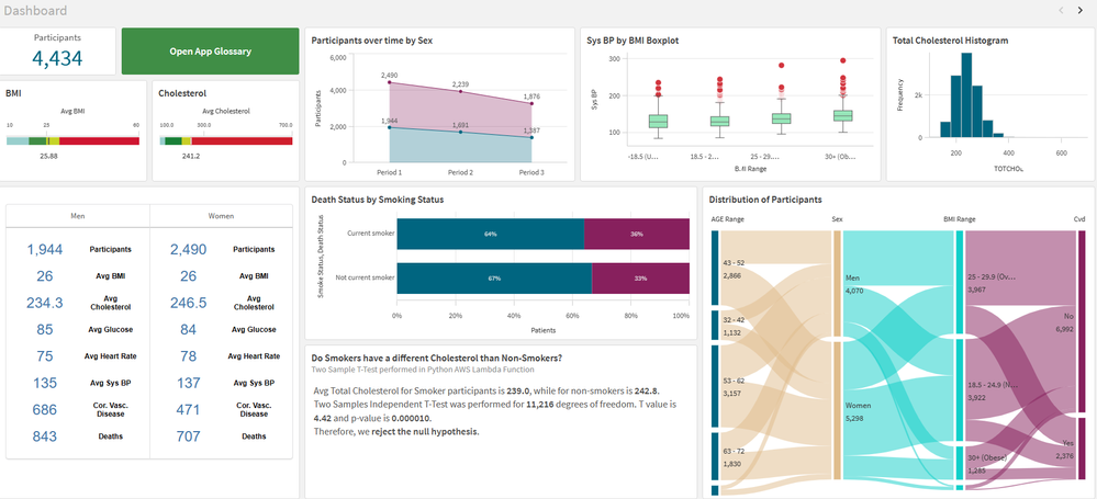
Framingham Heart Study
Framingham Heart StudyIPC GlobalIt shows the data for patients who volunteered to the Framingham Heart Study. I use it for training, demo and explore innovation.DiscoveriesI use this app to explore different features in the Qlik Cloud: hypothesis testing, integration with Python, AutoML, Glossary, Open AI using Rest API (before Qlik had the Open AI connector), AWS Lambda functions and more.ImpactI use this app for demo and training of my data sci... Show MoreFramingham Heart StudyIPC Global It shows the data for patients who volunteered to the Framingham Heart Study. I use it for training, demo and explore innovation.
Discoveries
I use this app to explore different features in the Qlik Cloud: hypothesis testing, integration with Python, AutoML, Glossary, Open AI using Rest API (before Qlik had the Open AI connector), AWS Lambda functions and more.
Impact
I use this app for demo and training of my data science and research team. We help healthcare customers in using Qlik for medical research and this app is how I prepare my team and the customer for this complex task.
Audience
People interested in science or medical research, healthcare or integration with different technologies.
Data and advanced analytics
The used is free for educational purposes. It is an anonymized sample of the Framingham Heart study. I also enrich the data with some extra information live CVD risk scores, which was calculated in Python and sent back to Qlik via Qlik API. I has almost all features available in the cloud.
-
-
DON’T WORRY, BE API
Qlik Cloud Data Integration + Qlik Application Automation can open up a wide range of use cases. Take advantage of the public APIs to make your DataOps worry-free. -
Welcome Daniel E. O ‘Leary-Qlik Educator Ambassador for 2024!
I feel pleased to introduce our new Educator Ambassador for 2024, Daniel E. O ‘Leary from the University of Southern California. He lives in the Los Angeles, California. Daniel O’Leary is a senior member of the faculty in the Leventhal School of Accounting, at the University of Southern California (USC). Dan is a full professor who teaches courses on data and analytics and accounting information systems. This is Dan’s first year as a Qlik Acade... Show MoreI feel pleased to introduce our new Educator Ambassador for 2024, Daniel E. O ‘Leary from the University of Southern California. He lives in the Los Angeles, California.
Daniel O’Leary is a senior member of the faculty in the Leventhal School of Accounting, at the University of Southern California (USC). Dan is a full professor who teaches courses on data and analytics and accounting information systems. This is Dan’s first year as a Qlik Academic Program Educator Ambassador.
Dan introduced Qlik into Leventhal’s curriculum as part of the addition of a new master’s degree in accounting focused on data and analytics, in the 2018 – 2019 school year. As part of that new degree, USC’s Leventhal School of Accounting worked with their different stakeholders to help determine the program’s content. Those stakeholders included one of the big 4 accounting firms, which asked that Qlik be included as one of the tools built into the coursework, because of its importance to them and their clients.
Dan created two new courses to get students the knowledge that they needed to be able to use data and analytics, including artificial intelligence, business intelligence, databases, enterprise resource planning systems, robots and text mining. The course innovation was not just content, but also includes substantial hands-on experiences, as Dan flips the classroom to engage the students.
After careful consideration, Dan elected to use Qlik in his class to capture the importance of cloud computing and cloud-based business intelligence (BI). Cloud computing also facilitates a classroom in which students have both windows-based and Apple Mac-based computing. Using cloud-based software eliminates the problems of finding software that not only works in both environments but also works the same way. With cloud-based software, students see things done the same way in both environments.
In Dan’s teaching, he works to integrate Qlik with different software. For example, in addition to Qlik, Dan uses other software, including RapidMiner and ChatGPT in his teaching. As part of his teaching focus, he teaches students to use other software, not only by using and understanding other software, but by integrating their understanding across different software. For example, projects using RapidMiner are expected to be integrated with Qlik. Similarly, when working with Qlik, students are encouraged to use ChatGPT to support their work with Qlik, providing insights for using Qlik and for data and analytics in general.
Perhaps most importantly, the students feel like they benefit from learning Qlik. As part of his teaching, Dan asks the students which assignments, tools and speakers that the students enjoyed the most and found the most important. This year, 60% of the students listed the classwork with Qlik. As noted by one student “I found the Qlik assignment the most rewarding.” Another student noted, “Qlik’s interface is user-friendly and easy to understand.” As noted by still another student, “I enjoyed Qlik … the most.”
Dan’s use of Qlik in the classroom also has paid off for students on the job market. This last term one of his students found an analyst job because of her classroom work with Qlik.
We hope to engage with Daniel during his journey as the Qlik Educator Ambassador and gain more insights about his use of Qlik at USC.
For more information about our Ambassador Program, please visit: qlik.com/us/company/academic-program/ambassadors
Educators and students looking for free analytics software and training can apply to the Academic Program by visiting qlik.com/us/company/academic-program
-
Basics for complex authorization
Authorization is about determining which data a user is allowed to see. QlikView has several different ways by which you can reduce the data so that the user only gets to see the data he is allowed to see.
-
April Qlik Digest
Welcome to the April Qlik Digest newsletter! We have some exciting news and updates this month, including the Qlik Connect 2024 Session Catalog, upcoming webinars, product updates, and more! -
Direct Query now available in Qlik Sense SaaS!
Extend your analytics capabilities with cloud databases using Direct Query! Qlik is excited to announce the release of Direct Query, a new capability that allows applications in Qlik Sense SaaS to directly query cloud databases using SQL pushdown as users interact with data through visualizations and user filtering. -
Release Notes > Product Filter
Hello Qlik Community, An issue has been identified with the ‘Product’ filter on the Release Notes page. The vendor is actively working on a fix. Until the issue is resolved, we have temporarily removed the ‘Product’ filter. In the meantime, please use the ‘Release’ filter to narrow down the list. We appreciate your patience as we work through the issue with the vendor. Please let us know if you have any questions or need any assistance finding... Show MoreHello Qlik Community,
An issue has been identified with the ‘Product’ filter on the Release Notes page. The vendor is actively working on a fix. Until the issue is resolved, we have temporarily removed the ‘Product’ filter.
In the meantime, please use the ‘Release’ filter to narrow down the list.
We appreciate your patience as we work through the issue with the vendor. Please let us know if you have any questions or need any assistance finding a specific release.
Have a great weekend!
Your Qlik Community Admins,
Melissa, Sue, Jamie and Nicole
@Melissa_Potvin @Sue_Macaluso @Jamie_Gregory @nicole_ulloa
-
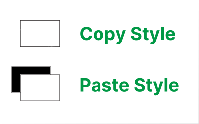
Copy & Paste Style
There have been new Qlik Sense features the past few months that I was excited to see. One of my favorites, which I am sure you are aware of, is the layout container. If you have not heard about it, check out Michael’s blog post here. Another favorite of mine is the copy and paste style feature which allows developers to copy and paste styles from one visualization to another. With all the styling options available in visualizations, being able t... Show MoreThere have been new Qlik Sense features the past few months that I was excited to see. One of my favorites, which I am sure you are aware of, is the layout container. If you have not heard about it, check out Michael’s blog post here. Another favorite of mine is the copy and paste style feature which allows developers to copy and paste styles from one visualization to another. With all the styling options available in visualizations, being able to copy and paste styles saves time and eliminates the need to go into the styling properties of each visualization and set all the styling options you would like to use.
Some of the latest charts that have been upgraded to the new styling property panel are the Grid, Funnel and Sankey, giving users the ability to customize the title, subtitle, footnote, and background of a chart as well as the style the axes, labels, legends, and values in a visualization. Borders and shadows can be added to these visualizations as well.
The Filter Pane now has font styling for the title, subtitle, footnote, and header as well as font header and content styling. Like the charts above, borders and shadows can be added as well. Developers can change the background color or use an image in the background and control the color of the selected state. Here are a few examples.
With all these styling options, it is awesome that developers can now copy and paste the style from one visualization to another. If you remember the QlikView days, you know how valuable this feature is. Assume I have an app with a theme applied and have made some styling changes to the Margin KPI (see image below). If I want to apply the same styling changes to the Margin %, I have two options. One option is to open the styling properties of the Margin % KPI and make the same changes to the background color, border color and shadowing.
The second option and the easiest option is to right click on the Margin KPI while in Edit mode, click on the three dots (…) and select Copy style.
Then right click on the Margin % KPI, click on the three dots (…) and select Paste style.
That is a lot easier than styling the KPI manually, especially if there are multiple visualizations to update.
There are a few limitations to using the copy and paste style - you cannot copy and paste the style in a map or a master visualization. New styling properties for visualizations are being add all the time, giving users many options to style and make their app stand out. The copy and paste functionality is a great addition to Qlik Sense and makes designing and styling apps easier.
Thanks,
Jennell
-
Connector Factory – April 2024 releases
This month, Connector Factory has released more connectors for data integration, data analytics and application automation. -
Recipe for a 4-4-5 Calendar
Calendars are used in most Qlik apps. In most cases, a standard Gregorian calendar is used, but in some cases a more complex calendar is needed. This post is about how to create a week-based fiscal calendar of a 4-4-5 type.
-
Welcome back Javier Leon - Qlik Educator Ambassador for 2024!
We feel very lucky to have Javier Leon back as an Academic Program Educator Ambassador for a fourth year. -
Traffic Accidents in Brazil
Traffic Accidents in Brazil Hyperscale This dashboard was developed with the aim of studying the new layout Container and design possibilities it offers. The data used originated from a survey of accidents on federal highways in Brazil. Discoveries Types of accidents most common on Brazilian highways, which highways are the most dangerous and require an action plan to reduce accidents, the times and days with the highest occurrence of... Show MoreTraffic Accidents in BrazilHyperscaleThis dashboard was developed with the aim of studying the new layout Container and design possibilities it offers. The data used originated from a survey of accidents on federal highways in Brazil.Discoveries
Types of accidents most common on Brazilian highways, which highways are the most dangerous and require an action plan to reduce accidents, the times and days with the highest occurrence of accidents.
Impact
Mapping the most dangerous highways for a future action plan to reduce accidents, monitoring the most critical times on the roads.
Audience
Traffic enforcement agencies, municipalities, and states
Data and advanced analytics
Ease of visibility of Brazilian highways and comparison between states and highways.
-
Welcome back Angelika Klidas - Qlik Educator Ambassador Class of 2024!
This week we would like to introduce Angelika Klidas, who happens to be a returning Educator Ambassador. We are excited to select Angelika as an Ambassador for the 3rd year in a row due to her continued enthusiasm for Qlik’s Academic Program and her efforts in 2023. Angelika’s journey with Qlik began in 2008 when she started out installing and managing a successful QlikView Competence Center as a team manager of the team for a Governmental Organ... Show MoreThis week we would like to introduce Angelika Klidas, who happens to be a returning Educator Ambassador. We are excited to select Angelika as an Ambassador for the 3rd year in a row due to her continued enthusiasm for Qlik’s Academic Program and her efforts in 2023.
Angelika’s journey with Qlik began in 2008 when she started out installing and managing a successful QlikView Competence Center as a team manager of the team for a Governmental Organization in the Netherlands. Since then, she has always been a huge Qlik Advocate in both her day job and her university teaching. Angelika works currently as an Advisor & Trainer and the Business Data Challengers and is responsible for the BDC Academy, sales and account management along with some innovative work! She also teaches Data and Analytics at the University of Applied Sciences in Amsterdam which is her part time role. She is a conceptual thinker who lives by the phrase “think big, act small, and scale fast” which she uses to inspire others to evolve in their use of data and analytics.
In 2022, Angelika began writing a book together with Qlik’s Chief Learning Officer Kevin Hanegan about Data Literacy. The book was formally launched on the 30th of November 2022 and is called “Data Literacy in Practice”. The book is available through Amazon.com and Packt.com.
Angelika applied to become a Educator Ambassador with the Qlik Academic Program as she is passionate about educating students in data analytics and championing the cause of Data & AI Literacy. Due to the change in situation in the field of education, she included new aspects in her teaching style which include setting up training materials “how to use Qlik Sense from an analysis perspective so that students know and understand the full power of Qlik Sense, using AHA Slides (to make the lectures more interactive) and the book “Data Literacy in Practice”. Her book is now also a mandatory book for the University. With the help of the techniques from the book and learning to work with Qlik Sense helps her students not only to analyze the data in a better manner but also how to help organizations form a data strategy, develop organizational KPI’s and build amazing dashboards & reports.
Angelika is proud of the fact that she is the Qlik Academic Program Ambassador and has included the Educator Ambassador badge, mentioned it on her resume and highlights it in her presentations! This year again she is presenting twice at Qlik Connect and is also a Panelist for around the topic ethical handling of data.
In Angelika’s words, “I love the power of grey, love the academic program and the great benefit that it gives to me and my students. My students can pursue their dreams when they would like to work in data and analytics .” She is excited about the fact that some of her students got a job in the data and analytics world, which is amazing! An interesting fact is that since 2008, 34% of her 295 students are working in the field of data and analytics. Her main goal for 2024 is to work on new training materials for Data & AI Literacy in Dutch and English. Angelika has developed several Generative AI trainings that help people (at school and in her commercial work field) to use the Gen AI tools, but also she trains them to question the outcome. Questioning the results, either from insights that we create or the results that we get from the Gen AI tools we use is mega important. Next to that Angelika has developed a “Serious Data Training” where she combines a the first basic concepts of Data & AI Literacy, a Data Escape Room and a session of reflecting on the soft skills that people need during the process of data informed decisions.
Angelika feels that more and more organizations are now emphasizing the importance of Data & AI Literacy. She loves to work with the four pillar system which should be the basis of every organizations journey towards “Active Intelligence” so they will be future ready!
In Angelika’s words, “I love the Qlik Academic Program, it helps the students in gaining analytics knowledge for my students. They can learn at their own pace and look for solutions through the learning platform, but also use the knowledge from the community and demos.qlik.com where they can find all kinds of cool solutions”
We are looking forward to working closely with Angelika during her tenure as an ambassador yet again and creating more links with Universities in the Netherlands.
For more information about our Ambassador Program, please visit: qlik.com/us/company/academic-program/ambassadors
-
Reporting Service Packaging Changes
Qlik Cloud Reporting packaging changes are here! We’ll be replacing the multiple tiers with simple ‘Small and Large Add-On Packs’, alongside standardized limits for easier management. Our new Standard, Premium and Enterprise customers using our Capacity Model, will have reporting entitlements included in their package. Customers on our User Based Model will have 1000 reports included and available to them. All customers can purchase our add-on p... Show MoreQlik Cloud Reporting packaging changes are here!
We’ll be replacing the multiple tiers with simple ‘Small and Large Add-On Packs’, alongside standardized limits for easier management.
Our new Standard, Premium and Enterprise customers using our Capacity Model, will have reporting entitlements included in their package. Customers on our User Based Model will have 1000 reports included and available to them.
All customers can purchase our add-on packages when needed.
See structure below:
Key: QSE = Qlik Sense Enterprise / QCA = Qlik Cloud Analytics
Items to Note:- Depending on your product package, you will be automatically placed in the standardized limits above. Those who already have paid tiers will continue-on their current tier until their contract ends.
- If you’re expecting to exceed your standard limit, be sure to contact sales to purchase our add-on packages to prevent future overages.
Additional Resources:Product Descriptions for Qlik Cloud Subscriptions | Qlik Resources
Reporting Services | Product Innovation Blog
Reporting from Qlik Cloud Analytics | Qlik Help Page
Tabular Reporting Corporate Blog -

-
-
Onyx DataDNA Feb 2024 Challenge
Onyx DataDNA Feb 2024 Challenge RICElectronic Product Reviews. Using data provided by OnyxDataDNA and building a application to look at reviews of products. Created NPS scores and Weighted values. This is to cater for manufacturers that have very few reviews compared to those that have many.DiscoveriesWeighted data makes data more accurate. NPS Classification is needed when looking at review data. Sentiment Analysis would be the next addition to ... Show MoreOnyx DataDNA Feb 2024 ChallengeRICElectronic Product Reviews. Using data provided by OnyxDataDNA and building a application to look at reviews of products. Created NPS scores and Weighted values. This is to cater for manufacturers that have very few reviews compared to those that have many.Discoveries
Weighted data makes data more accurate. NPS Classification is needed when looking at review data. Sentiment Analysis would be the next addition to make the data even more accurate.
Impact
Review data is tricky as the data from 1 to another differs in so many ways. Careful consideration is needed when making decisions. Weighted data makes data more accurate. NPS Classification is needed when looking at review data. Sentiment Analysis would be the next addition to make the data even more accurate.
Audience
Marketing and BI Developers
Data and advanced analytics
Weighted data makes data more accurate. NPS Classification is needed when looking at review data. Sentiment Analysis would be the next addition to make the data even more accurate.