Unlock a world of possibilities! Login now and discover the exclusive benefits awaiting you.
Analytics & AI
Forums for Qlik Analytic solutions. Ask questions, join discussions, find solutions, and access documentation and resources.
Data Integration & Quality
Forums for Qlik Data Integration solutions. Ask questions, join discussions, find solutions, and access documentation and resources
Explore Qlik Gallery
Qlik Gallery is meant to encourage Qlikkies everywhere to share their progress – from a first Qlik app – to a favorite Qlik app – and everything in-between.
Qlik Community
Get started on Qlik Community, find How-To documents, and join general non-product related discussions.
Qlik Resources
Direct links to other resources within the Qlik ecosystem. We suggest you bookmark this page.
Qlik Academic Program
Qlik gives qualified university students, educators, and researchers free Qlik software and resources to prepare students for the data-driven workplace.
Recent Blog Posts
-
Future-Proof Your Career: Top Skills and Tools to Master in 2025
As the job market rapidly evolves, professionals across industries are realizing the importance of upskilling to stay competitive. With technological ... Show MoreAs the job market rapidly evolves, professionals across industries are realizing the importance of upskilling to stay competitive. With technological advancements and economic changes reshaping the workforce, it's more important than ever to focus on acquiring in-demand skills like AI, data analytics, cloud computing, and cybersecurity. Among these, data analytics stands out due to its broad applications and ability to secure your career's future. A Forbes expert emphasizes that data analysis skills are becoming essential as companies increasingly rely on data to make strategic decisions and maintain a competitive edge. The rise of AI-powered analytics and sophisticated data visualization is transforming unstructured data into actionable insights.
For a deeper dive into “The Top 5 Skills to Learn in 2025,” check out the full article here.
The Qlik Academic Program offers the resources you need to thrive in the digital economy. With access to powerful analytics software and comprehensive training materials, Qlik equips students and educators with the practical skills needed to excel in the data-driven world. Whether you're a student aiming to boost your data expertise or an educator seeking to provide your students with the latest tools, the Qlik Academic Program is a valuable asset for preparing the next generation of data-savvy professionals.
Discover how to access free resources in data analytics as a student or educator by visiting the Qlik Academic Program.
-
Sn-table, Nebula.js' latest extension
In my previous articles I talked about Nebula.js and the use with the existing extensions on major frameworks like React, Svelte and Angular. Since th... Show MoreIn my previous articles I talked about Nebula.js and the use with the existing extensions on major frameworks like React, Svelte and Angular.
Since the last one, a new extension was added, sn-table. Here is how to use it.
First install it
npm install @nebula.js/sn-tableThen import it and add it into your configuration
import table from '@nebula.js/sn-table';... { name: 'table', load: () => Promise.resolve(table), }, ...If you have issues, you can view the entire configuration at https://observablehq.com/@yianni-ververis/nebula-js
Then, start adding dimensions and measures.
n.render({
    element: chartElement,
      type: 'table',
      properties: {
        qHyperCubeDef: {
          qDimensions: [
            { qDef: { qFieldDefs: ['Case Owner Group'] }, qNullSuppression: true, qLabel: 'Department' },
            { qDef: { qFieldDefs: ['Priority'] }, qNullSuppression: true },
          ],
          qMeasures: [
            { qDef: { qDef: 'Avg([Case Duration Time])', autoSort: false }, qSortBy: { qSortByNumeric: -1 }, qLabel: 'Avg Duration' },
          ],
          qInterColumnSortOrder: [2, 0, 1],
          qInitialDataFetch: [{
            qWidth: 3,
            qHeight: 3000,
          }],
        },
        showTitles: true,
        title: 'Table',
        subtitle: 'Sample supernova table',
        footnote: '',
        totals: {
          show: true,
        },
      },
  });
You should have something like this
View the entire example here
https://observablehq.com/@yianni-ververis/nebula-jshttps://observablehq.com/@yianni-ververis/nebula-js-table
Happy coding!
/Yianni
-
Welcome back Dr. K Kalaiselvi-Qlik Educator Ambassador for 2025!
With 16 years of experience in academia, Dr Kalaiselvi currently holds the position of Associate Professor Coordinator, Department of Computer Science... Show MoreWith 16 years of experience in academia, Dr Kalaiselvi currently holds the position of Associate Professor Coordinator, Department of Computer Science at Kristu Jayanti College. Her background includes roles as a J2EE developer with the Ministry of Electronics and Information Technology, Government of India, and Singapore Telecommunications, under the Government of Singapore.
Dr Kalaiselvi oversees courses in Data Analytics, specializing in Machine Learning, R and Python Programming, Data Visualization Technologies, and Process Mining Technologies, she manages specialized and certification courses for students, complementing the regular curriculum.
Since 2019, Dr Kalaiselvi has been associated with the Qlik Academic Program and has earned the Qlik Sense Business Analyst Qualification offered under this program.
By December 2023, around 300 students achieved the Qlik Sense Business Analyst Qualification and Data Literacy Certification from Kristu Jayanti College. Presently, 122 students are undergoing training under the Data Architect Qualification pathway. Dr Kalaiselvi is thrilled that her institution was recognized as a Centre of Excellence in Analytics of the Qlik Academic Program in 2023. Last year, a Qlik specific Datathon was organised to foster data-driven innovation and analytical problem-solving skills among participants. In 2024, 124 students completed their Data Architect Qualification that enabled students to perform seamless data integration, visualization, and decision-making by designing efficient, scalable data models and workflows.
When contemplating her interest in the Qlik Academic Program, Dr Kalaiselvi says that she was drawn by its reputation about the comprehensive resources offered and tools geared towards learning data analytics and visualization. Krsitu Jayanti College recognizes the growing importance of these skills in various industries, and she was eager to find an opportunity that would provide a hands-on experience with real-world tools. The Qlik Academic Program stood out due to its commitment in offering free access to their powerful data analytics software, Qlik Sense under the academic program.
Dr Kalaiselvi believes that the Qlik Academic Program's resources and learning materials will not only enhance our understanding of data analytics and visualization but also contribute significantly to students’ academic and professional growth. The opportunity to gain proficiency in using Qlik resources is one she finds both exciting and valuable, and she is enthusiastic about the potential it holds for students’ future endeavors.
“The future of this engagement appears promising to me”, according to Dr Kalaiselvi. She further adds, “As students continue to benefit from the training and certifications of the academic program, they are likely to graduate with desirable skills in data analytics and visualization. This in turn could lead to increased job placements in roles such as Business Analysts, Data Scientists, and Data Visualization Designers. With a growing network and a reputation for producing skilled professionals, the engagement could contribute positively to both student careers and industry advancement”.
Dr Kalaiselvi says that her journey with the Qlik Academic Program, especially after achieving the Qlik Sense Business Analyst Qualification, has deepened her understanding and appreciation for data literacy. She recognizes the critical role it plays in today's data-driven world and is eager to share this knowledge. Joining the program offered a structured platform to advocate for and elevate data literacy among students, preparing them for a future where data-informed decision-making is key. After becoming an Educator Ambassador, Dr Kalaiselvi aims to not only expand her own skills and understanding of Qlik technologies but also to stay at the forefront of BI and analytics innovations. It enables her to contribute to and learn from a like-minded community, further enriching the educational experiences she can offer and foster a collaborative spirit among students for global and cross-disciplinary projects.
At present, Dr Kalaiselvi is engaged in developing an AI chatbot project tailored specifically for adolescents, aimed at addressing their psychological, physical, and academic inquiries. In addition to her teaching responsibilities, she has embarked on collaborative ventures with universities across the Asia Pacific, concentrating on facilitating exchange programs and fostering project collaborations.
Dr Kalaiselvi says, “As a proud addition to our achievements, recently an industry visit to the Qlik office in Bangalore was organized as a part of the Faculty Development Programme, providing educators with valuable insights into cutting-edge data analytics and visualization technologies”
She feels thrilled and grateful to be involved in this collaboration, as it allows her to learn and grow alongside her students.
We are looking forward to working closely with Dr Kalaiselvi during her tenure as an ambassador yet again and creating more links with her education network.
For more information about our Ambassador Program, please visit: qlik.com/us/company/academic-program/ambassadors
-
【オンデマンド配信】Qlik Sense で拓く、データ活用による業務とサービス革新
企業のビジネス活動において、データはこれまで以上に必要不可欠な資産となっています。増え続けるデータを管理・統合・分析し、データでアクションを起こす必要性が増している現在、成功している企業はどのようなデータ戦略を実行しているのか?本 Web セミナーシリーズでは、Qlik でデータからアクションを起こ... Show More企業のビジネス活動において、データはこれまで以上に必要不可欠な資産となっています。増え続けるデータを管理・統合・分析し、データでアクションを起こす必要性が増している現在、成功している企業はどのようなデータ戦略を実行しているのか?
本 Web セミナーシリーズでは、Qlik でデータからアクションを起こすデータ主導のビジネスで成功しているお客様より、課題から導入の経緯、デモンストレーション、活用例などをご紹介します。※ 参加費無料。パソコン・タブレット・スマートフォンで、どこからでもご視聴いただけます。
【オンデマンド配信】
Qlik Sense で拓く、データ活用による業務とサービス革新ヒューマンアカデミー株式会社は、データ活用を軸にした教育 DX を推進し、学習体験の革新と教育機関の運営効率向上を実現しました。その中核を担うのが 統合データベース(DB) です。売上、反響、営業履歴、学習履歴や成績データを一元管理し、蓄積されたデータをもとに最適な教育サービスを提供する環境を構築しました。このデータ基盤を活用するために業務に BI を導入し、営業プロセスを可視化・最適化。人的リソースの最適配分や迅速な意思決定が可能になりました。また、サービスの BI により受講生の学習状況を把握でき、学習者ごとに適切なサポートを実施しています。
効率的な学務運営を可能にし、データドリブンなアプローチで次世代の教育サービスを実現した取り組みについて、デモを交えてご紹介します -
The Cost of Bad Data: How Data Quality and Trust Impact Business Outcomes
In this short, 5-part blog series, we will explore the crucial role that high-quality, trusted data plays in driving effective business outcomes. In t... Show MoreIn this short, 5-part blog series, we will explore the crucial role that high-quality, trusted data plays in driving effective business outcomes. In this first part, we will explore the cost of bad data quality
Bad data is expensive. According to Gartner, poor data quality costs organizations an average of $12.9 million annually. For individual businesses, the impacts ripple across every function:
- Decision-Making: Flawed data leads to misguided strategies. Imagine a sales team targeting the wrong demographics because customer records are outdated.
- Compliance: Regulatory fines escalate when data inaccuracies lead to reporting errors (e.g., GDPR or CCPA violations).
- Customer Satisfaction: Duplicate records or incorrect contact details frustrate customers. Imagine running a loyalty program with duplicate profiles, causing a 30% spike in marketing costs and customers receiving repetitive promotion offers.
- Market Efficiency: Supply chain delays, inventory mismanagement, and missed sales opportunities stem from unreliable data.
- Competitive Advantage: Companies with trusted data outpace rivals by acting on insights faster.
The bottom line - maintaining high standards for data quality and trust is crucial for building a reliable and successful business. Without trust in data, businesses operate in the dark—and the consequences are real.
Bad data isn’t just a nuisance—it’s a threat to survival. By decentralizing data quality and fostering a culture of trust, businesses can transform data into a driver of innovation and growth. With platforms like Qlik Talend Cloud, organizations don’t just manage data; they leverage it to stay ahead in a competitive landscape.
-
DIY your Qlik Answers Experience with the new KB and Assistants APIs
Qlik Answers transforms unstructured data into clear, AI-powered insights. Today, I'll show you how to integrate Qlik Answers directly into your web a... Show MoreQlik Answers transforms unstructured data into clear, AI-powered insights. Today, I'll show you how to integrate Qlik Answers directly into your web app using the newly released Knowledgebases API and Assistants API.
In this blog, we'll build a custom Football chat assistant from scratch powered by Qlik Answers.
We’ll leverage the Assistants API to power real-time Q&A while the knowledge base is already set up in Qlik Sense.
For those of you who prefer a ready-made solution, you can quickly embed the native Qlik Answers UI using qlik-embed:
<qlik-embed
  ui="ai/assistant"
  assistant-id="<assistant-id>"
></qlik-embed>
You can explore the ai/assistant parameters (and other UIs available in qlik-embed) on qlik.dev, or take a look at some of my previous blog posts here and here.
For full documentation on the Knowledgebases API and Assistants API, visit qlik.dev/apis/rest/assistants/ and qlik.dev/apis/rest/knowledgebases/.
Let’s dive in and see how you can take control of your Qlik Answers UI experience!
What Are Qlik Answers Assistants and Knowledgebases?
Before we start building our DIY solution, here’s a quick refresher:
-
Knowledgebases: Collections of individual data sources (like HTML, DOCX, TXT, PDFs) that power your Qlik Answers. (In our case, we built the KB in Qlik Sense!)
-
Assistants: The chat interface that interacts with users using retrieval-augmented generation (RAG). With generative AI in the mix, Qlik Answers delivers reliable, linked answers that help drive decision-making.
DIY the Qlik Answers Experience
Step 1: Get your data ready
Since we already created our knowledge base directly in Qlik Sense, we skip the Knowledgebases API. If you’d like to build one from scratch, check out the knowledgebases API documentation.
Step 2: Configure your assistant
With your knowledge base set, you create your assistant using the Assistants API. This is where the magic happens: you can manage conversation starters, customize follow-ups, and more. Visit the assistants API docs on qlik.dev. to learn more
Step 3: Build Your Custom UI
Now, let’s look at our custom chat UI code. We'll built a simple football-themed chat interface that lets users ask questions related to the NFL. The assistant’s answers stream in seamlessly to the interface.
HTML:
<!doctype html>
<html lang="en">
  <head>
    <meta charset="UTF-8" />
    <meta name="viewport" content="width=device-width, initial-scale=1.0" />
    <title>Football Assistant</title>
    <link rel="stylesheet" href="styles.css" />
  </head>
  <body>
    <div class="chat-container">
      <div class="chat-header">
        <h4>Let's talk Football</h4>
        <span class="header-span">You ask, Qlik answers.</span>
      </div>

      <div class="chat-body" id="chat-body">
        <div class="message assistant">
          <div class="bubble">
            <p>Hey there, champ! Ask me anything.</p>
          </div>
        </div>
      </div>
      <div class="chat-footer">
        <input
          type="text"
          id="chat-input"
          placeholder="Type your Football related question..."
        />
        <button id="send-btn">Send</button>
      </div>
    </div>
    <script src="scripts.js"></script>
  </body>
</html>
Frontend JS:
document.addEventListener("DOMContentLoaded", () => {
  const chatBody = document.getElementById("chat-body");
  const chatInput = document.getElementById("chat-input");
  const sendButton = document.getElementById("send-btn");

  // Append a user message immediately
  function appendUserMessage(message) {
    const messageDiv = document.createElement("div");
    messageDiv.classList.add("message", "user");
    const bubbleDiv = document.createElement("div");
    bubbleDiv.classList.add("bubble");
    bubbleDiv.innerHTML = `<p>${message}</p>`;
    messageDiv.appendChild(bubbleDiv);
    chatBody.appendChild(messageDiv);
    chatBody.scrollTop = chatBody.scrollHeight;
  }

  // Create an assistant bubble that we update with streaming text
  function createAssistantBubble() {
    const messageDiv = document.createElement("div");
    messageDiv.classList.add("message", "assistant");
    const bubbleDiv = document.createElement("div");
    bubbleDiv.classList.add("bubble");
    bubbleDiv.innerHTML = "<p></p>";
    messageDiv.appendChild(bubbleDiv);
    chatBody.appendChild(messageDiv);
    chatBody.scrollTop = chatBody.scrollHeight;
    return bubbleDiv.querySelector("p");
  }

  // Send the question to the backend and stream the answer
  function sendQuestion() {
    const question = chatInput.value.trim();
    if (!question) return;

    // Append the user's message
    appendUserMessage(question);
    chatInput.value = "";

    // Create an assistant bubble for the answer
    const assistantTextElement = createAssistantBubble();

    // Open a connection to stream the answer
    const eventSource = new EventSource(
      `/stream-answers?question=${encodeURIComponent(question)}`
    );

    eventSource.onmessage = function (event) {
      if (event.data === "[DONE]") {
        eventSource.close();
      } else {
        assistantTextElement.innerHTML += event.data;
        chatBody.scrollTop = chatBody.scrollHeight;
      }
    };

    eventSource.onerror = function (event) {
      console.error("EventSource error:", event);
      eventSource.close();
      assistantTextElement.innerHTML += " [Error receiving stream]";
    };
  }

  sendButton.addEventListener("click", sendQuestion);
  chatInput.addEventListener("keydown", (event) => {
    if (event.key === "Enter") {
      event.preventDefault();
      sendQuestion();
    }
  });
});
Backend node.js script:
import express from "express";
import fetch from "node-fetch";
import path from "path";
import { fileURLToPath } from "url";

// Setup __dirname for ES modules
const __filename = fileURLToPath(import.meta.url);
const __dirname = path.dirname(__filename);

// Define port and initialize Express app
const PORT = process.env.PORT || 3000;
const app = express();
app.use(express.static("public"));
app.use(express.json());

// Serve the frontend
app.get("/", (req, res) => {
  res.sendFile(path.join(__dirname, "public", "index.html"));
});

// Endpoint to stream Qlik Answers output
app.get("/stream-answers", async (req, res) => {
  const question = req.query.question;
  if (!question) {
    res.status(400).send("No question provided");
    return;
  }

  // Set headers for streaming response
  res.writeHead(200, {
    "Content-Type": "text/event-stream",
    "Cache-Control": "no-cache",
    Connection: "keep-alive",
  });

  const assistantId = "b82ae7a9-9911-4830-a4f3-f433e88496d2";
  const baseUrl = "https://sense-demo.us.qlikcloud.com/api/v1/assistants/";
  const bearerToken = process.env["apiKey"];

  try {
    // Create a new conversation thread
    const createThreadUrl = `${baseUrl}${assistantId}/threads`;
    const threadResponse = await fetch(createThreadUrl, {
      method: "POST",
      headers: {
        "Content-Type": "application/json",
        Authorization: `Bearer ${bearerToken}`,
      },
      body: JSON.stringify({
        name: `Conversation for question: ${question}`,
      }),
    });

    if (!threadResponse.ok) {
      const errorData = await threadResponse.text();
      res.write(`data: ${JSON.stringify({ error: errorData })}\n\n`);
      res.end();
      return;
    }

    const threadData = await threadResponse.json();
    const threadId = threadData.id;

    // Invoke the Qlik Answers streaming endpoint
    const streamUrl = `${baseUrl}${assistantId}/threads/${threadId}/actions/stream`;
    const invokeResponse = await fetch(streamUrl, {
      method: "POST",
      headers: {
        "Content-Type": "application/json",
        Authorization: `Bearer ${bearerToken}`,
      },
      body: JSON.stringify({
        input: {
          prompt: question,
          promptType: "thread",
          includeText: true,
        },
      }),
    });

    if (!invokeResponse.ok) {
      const errorData = await invokeResponse.text();
      res.write(`data: ${JSON.stringify({ error: errorData })}\n\n`);
      res.end();
      return;
    }

    // Process and stream the response text
    const decoder = new TextDecoder();
    for await (const chunk of invokeResponse.body) {
      let textChunk = decoder.decode(chunk);
      let parts = textChunk.split(/(?<=\})(?=\{)/);
      for (const part of parts) {
        let trimmedPart = part.trim();
        if (!trimmedPart) continue;
        try {
          const parsed = JSON.parse(trimmedPart);
          if (parsed.output && parsed.output.trim() !== "") {
            res.write(`data: ${parsed.output}\n\n`);
          }
        } catch (e) {
          if (trimmedPart && !trimmedPart.startsWith('{"sources"')) {
            res.write(`data: ${trimmedPart}\n\n`);
          }
        }
      }
    }
    res.write("data: [DONE]\n\n");
    res.end();
  } catch (error) {
    res.write(`data: ${JSON.stringify({ error: error.message })}\n\n`);
    res.end();
  }
});

// Start the backend server
app.listen(PORT, () => {
  console.log(`Backend running on port ${PORT}`);
});
Breaking It Down
Okay, that was a lot of code! Let’s break it down into bite-sized pieces so you can see exactly how our custom Qlik Answers chat interface works.
1. The HTML
Our index.html creates a custom chat UI. It sets up:
- A chat body where messages appear (initially with a friendly greeting from the assistant).
-
A chat footer with an input field and a send button for users to type their questions.
2. The Frontend JavaScript (scripts.js)
This script handles the user interaction:
-
Appending messages: When you type a question and hit send (or press Enter), your message is added to the chat window.
-
Creating chat bubbles: It creates separate message bubbles for you (the user) and the assistant.
-
Streaming the answer: It opens a connection to our backend so that as soon as the assistant’s response is ready, it streams into the assistant’s bubble. This gives you a live, real-time feel without any manual “typing” effect.
3. The Node.js Backend (index.js)
Our backend does the heavy lifting:
-
Creating a conversation thread: It uses the Assistants API to start a new thread for each question.
-
Invoking the streaming endpoint: It then sends your question to Qlik Answers and streams the response back.
-
Processing the stream: As chunks of text come in, the backend cleans them up—splitting any concatenated JSON and only sending the useful text to the frontend.
-
Closing the stream: Once the complete answer is sent, it signals the end so your chat bubble doesn’t wait indefinitely.
4. How It All Connects
When you send a question:
-
Your message is displayed immediately in your custom chat bubble.
-
The backend creates a thread and requests an answer from Qlik Answers.
-
The response is streamed back to your UI in real time, making it look like the assistant is typing out the answer as it arrives.
P.S: this is just a simple example to introduce you to the new Answers APIs and show you how to get started using them, you'll need to double check limitations and adhere to best practices when using the APIs in a production environment.
You can find the full code here:
https://replit.com/@ouadielimouni/QA-Test-APIs#public/index.htmlHappy coding - and, Go Birds 🦅!
-
-
Qlik Sense Enterprise for Windows - New Security Patches Available Now
Edited December 5th: identified upgrades leading to complications with extensionsEdited December 6th: added workaround for extension complicationEdite... Show MoreEdited December 5th: identified upgrades leading to complications with extensions
Edited December 6th: added workaround for extension complication
Edited December 10th: added CVEs (CVE-2024-55579 and CVE-2024-55580)
Edited December 12th, noon CET: added new patch versions and visualization and extension fix details; previous patches were removed from the download siteHello Qlik Users,
New patches have been made available and have replaced the original six releases. They include the original security fixes (CVE-2024-55579 and CVE-2024-55580) as well as QB-30633 to resolve the extension and visualization defect.
If you continue to experience issues with extensions or visualizations, see QB-30633: Visualizations and Extensions not loading after applying patch.
Security issues in Qlik Sense Enterprise for Windows have been identified, and patches have been made available. Details can be found in Security Bulletin High Severity Security fixes for Qlik Sense Enterprise for Windows (CVE-2024-55579 and CVE-2024-55580).
Today, we have released six service releases across the latest versions of Qlik Sense to patch the reported issue. All versions of Qlik Sense Enterprise for Windows prior to and including these releases are impacted:
- May 2024 Patch 9
- February 2024 Patch 13
- November 2023 Patch 15
- August 2023 Patch 15
- May 2023 Patch 17
- February 2023 Patch 14
No workarounds can be provided. Customers should upgrade Qlik Sense Enterprise for Windows to a version containing fixes for these issues. November 2024 IR, released on the 26th of November, contains the fix as well.
- November 2024 Initial Release
- May 2024 Patch 10 or 11 (both valid)
- February 2024 Patch 14 or 15 (both valid)
- November 2023 Patch 16 or 17 (both valid)
- August 2023 Patch 16 or 17 (both valid)
- May 2023 Patch 18 or 19 (both valid)
- February 2023 Patch 15 or 16 (both valid)
This issue only impacts Qlik Sense Enterprise for Windows. Other Qlik products including Qlik Cloud and QlikView are NOT impacted.
All Qlik software can be downloaded from our official Qlik Download page (customer login required). Follow best practices when upgrading Qlik Sense.
The information in this post and Security Bulletin High Severity Security fixes for Qlik Sense Enterprise for Windows (CVE-2024-55579 and CVE-2024-55580) are disclosed in accordance with our published Security and Vulnerability Policy.
The Security Notice label is used to notify customers about security patches and upgrades that require a customer’s action. Please subscribe to the ‘Security Notice’ label to be notified of future updates.
Thank you for choosing Qlik,
Qlik Global Support -
Recipe for a Pareto Analysis – Revisited
This type of question is common in all types of business intelligence. I say “type of question” since it appears in many different forms: Sometimes it... Show MoreThis type of question is common in all types of business intelligence. I say “type of question” since it appears in many different forms: Sometimes it concerns products, but it can just as well concern any dimension, e.g. customer, supplier, sales person, etc. Further, here the question was about turnover, but it can just as well be e.g. number of support cases, or number of defect deliveries, etc.
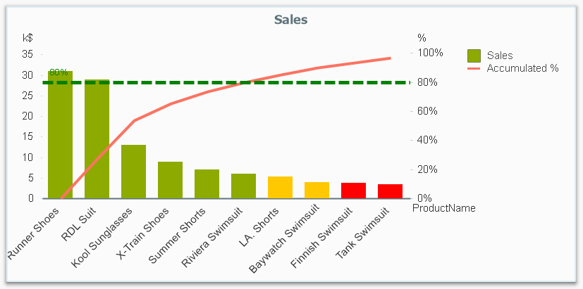
It is called Pareto analysis or ABC analysis and I have already written a blog post on this topic. However, in the previous post I only explained how to create a measure which showed the Pareto class. I never showed how to create a dimension based on a Pareto classification – simply because it wasn’t possible.
But now it is.
But first things first. The logic for a Pareto analysis is that you first sort the products according to their sales numbers, then accumulate the numbers, and finally calculate the accumulated measure as a percentage of the total. The products contributing to the first 80% are your best, your “A” products. The next 10% are your “B” products, and the last 10% are your “C” products. In the above graph, these classes are shown as colors on the bars.
The previous post shows how this can be done in a chart measure using the Above() function. However, if you use the same logic, but instead inside a sorted Aggr() function, you can achieve the same thing without relying on the chart sort order. The sorted Aggr() function is a fairly recent innovation, and you can read more about it here.
The sorting is needed to calculate the proper accumulated percentages, which will give you the Pareto classes. So if you want to classify your products, the new expression to use is
=Aggr(
If(Rangesum(Above(Sum({1} Sales)/Sum({1} total Sales),1,RowNo()))<0.8, 'A',
If(Rangesum(Above(Sum({1} Sales)/Sum({1} total Sales),1,RowNo()))<0.9, 'B',
'C')),
(Product,(=Sum({1} Sales),Desc))
)The first parameter of the Aggr() – the nested If()-functions – is in principle the same as the measure in the previous post. Look there for an explanation.
The second parameter of the Aggr(), the inner dimension, contains the magic of the sorted Aggr():
(Product,(=Sum({1} Sales),Desc))
This structured parameter specifies that the field Product should be used as dimension, and its values should be sorted descending according to Sum({1} Sales). Note the equals sign. This is necessary if you want to sort by expression.
So the Products inside the Aggr() will be sorted descending, and for each Product the accumulated relative sales in percent will be calculated, which in turn is used to determine the Pareto classes.
The set analysis {1} is necessary if you want the classification to be independent of the made selection. Without it, the classification will change every time the selection changes. But perhaps a better alternative is to use {$<Product= >}. Then a selection in Product (or in the Pareto class itself) will not affect the classification, but all other selections will.
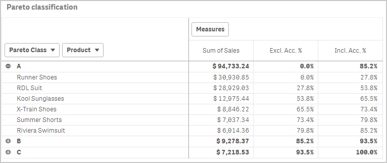
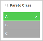
The expression can be used either as dimension in a chart, or in a list box. Below I have used the Pareto class as first dimension in a pivot table.
If you use this expression in a list box, you can directly select the Pareto class you want to look at.
The other measures in the pivot table are the exclusive and inclusive accumulated relative sales, respectively. I.e. the lower and upper bounds of the product sales share:
Exclusive accumulated relative sales (lower bound):
=Min(Aggr(
Rangesum(Above(Sum({1} Sales)/Sum({1} total Sales),1,RowNo())),
(Product,(=Sum({1} Sales),Desc))
))Inclusive accumulated relative sales (upper bound):
=Max(Aggr(
Rangesum(Above(Sum({1} Sales)/Sum({1} total Sales),0,RowNo())),
(Product,(=Sum({1} Sales),Desc))
))Good luck in creating your Pareto dimension!
Further reading related to this topic:

-
Get Ready. A New Qlik Learning Experience is Coming!
We are thrilled to announce that the new Qlik Learning will launch on February 17, 2025. What is coming? A new Qlik Learning experience, consolidati... Show MoreWe are thrilled to announce that the new Qlik Learning will launch on February 17, 2025.
What is coming?
- A new Qlik Learning experience, consolidating the current Qlik Continuous Classroom and Talend Academy into one integrated learning platform.
- An unlimited Qlik Learning subscription designed to energize your learning experience, accelerate your success, and help you grow your skills and expertise throughout your career.
What can you expect with the new Qlik Learning experience:
- Gain hands-on Qlik Analytics and Data Integration experience in one spot with a single sign-on.
- Discover easy-to-follow learning journeys that are designed for you.
- Attend live webinars delivered on a regular basis on a variety of advanced topics.
- Access an extensive library of Qlik Learning Shorts. These short videos show you exactly how and why to perform common tasks, so you get it right the first time, every time.
- Use Qlik Certification resources and earn digital badges to help further your career and set new records for continuous learning.
What do we recommend to get prepared?
While Qlik is excited about this transition, there are actions we recommend:
There will be downtime while we prepare the new Qlik Learning experience for you. Downtime window starts at 8:00am ET on February 14 and ends on February 16 at 7:00pm ET. During this time, access to the current platform will be unavailable.
Qlik Continuous Classroom users:
If you are in the middle of completing a course, we recommend you complete it ahead of the new Qlik Learning launch, so your completion data is transferred, and progress is not lost.
Any Achievement or qualifications badges for the 2019, 2020, and 2021 Business Analyst or Data Architect will not be migrated into the new Qlik Learning, so we recommend downloading and sharing these using your Badgr backpack; also see the Sharing Badges on Social Sites document.
Check out the Qlik Learning FAQ we’ve prepared for you.
Talend Academy users:
You will log into the new Qlik Learning with your Qlik account. Don’t have an account? Sign up for a Qlik Account ahead of the launch using the same email address you use on Talend Academy.
Check out the Qlik Learning FAQ we’ve prepared for you.
Reach out to Qlik Learning at education@qlik.com if you have any questions. We greatly appreciate your patience as we work to enrich your learning experience.
Stay tuned for exciting learning updates!
*Important note: While we are confident on the February 17, 2025, launch date, please note there is always a possibility of adjustments. We will keep you informed promptly should any changes occur.

-
The New Qlik Learning Is Here!
We are thrilled to announce that the new Qlik Learning is now live and ready for you! It is a single, integrated learning platform designed to enhance... Show MoreWe are thrilled to announce that the new Qlik Learning is now live and ready for you! It is a single, integrated learning platform designed to enhance your learning experience and help you get the most out of Qlik.
An Unlimited Qlik Learning subscription is designed to energize your learning experience, accelerate your success, and help you grow your skills and expertise throughout your career.
What can you expect with the new Qlik Learning experience?
- Gain hands-on analytics and data integration experience in one spot with a single sign-on.
- Discover easy-to-follow learning journeys that are designed for you.
- Earn badges to help further your career and set new records for continuous learning.
- Attend live webinars delivered by our expert instructors on a variety of advanced topics.
- Access an extensive library of Qlik Learning Shorts.
- Pursue the ultimate recognition of your expertise: Qlik Certification! Access the resources and practice exams to help you prepare.
How do you get started?
To get started, simply log in to Qlik Learning with your Qlik account (Don't have an account? Sign up) and complete the short Getting Started course. This will unlock the full range of opportunities available to you. Additionally, after finishing the course, you'll earn a digital badge that you can showcase within your network!
Check out the Qlik Learning FAQs we’ve prepared for you, and reach out to Qlik Learning at education@qlik.com if you have any additional questions.
We can’t wait to hear about your experiences and what you love most about the new Qlik Learning!
-
Qlik Application Automation and Slack: Breaking changes November 12, 2025
Slack has updated the deprecation date to November 12th, 2025 (originally March 11th). Starting November 12th, 2025, Slack will enforce changes in the... Show MoreSlack has updated the deprecation date to November 12th, 2025 (originally March 11th).
Starting November 12th, 2025, Slack will enforce changes in their APIs affecting file uploads. To accommodate these breaking changes, we have introduced new blocks in the Slack connector for Qlik Application Automation.
What blocks are affected?
- Upload File To Channel (new version)
- Send Text Based file (new version)
- Send Binary File (deprecated)
What exactly is changing for Qlik Application Automation?
The Send Binary File block will be deprecated. Instead, use the Upload File to Channel block to upload binary files. If you still want to send a base64 encoded string, use the Send Text Based File block and configure the encoding parameter to base64.
The Upload File To Channel block and Send Text Based File block need to be updated to a new version. To perform this update, replace existing blocks with new blocks by dragging the blocks from the block library.
What will I need to do to mitigate this?
Any automation using affected blocks needs to be updated.
See Breaking changes for file support in the Slack connector: new blocks introduced for steps and details.
Thank you for choosing Qlik,
Qlik Support -
India update: Data and AI related roles will dominate in 2025
Indian IT hiring landscape is at a pivotal juncture as it transitions from a year of decline towards a more hopeful future. The focus on specialised s... Show MoreIndian IT hiring landscape is at a pivotal juncture as it transitions from a year of decline towards a more hopeful future. The focus on specialised skills, particularly in AI and data science, combined with geographical shifts towards Tier 2 cities, indicates a transformation within the sector. While the IT hiring landscape in India in 2024 was marked by delayed onboarding and a decline in overall hiring activity, the outlook for 2025 appears promising with expectations of recovery and growth fuelled by improvements in economic conditions and technological advancements.
Read more on this article at:
https://economictimes.indiatimes.com/jobs/hr-policies-trends/indian-it-hiring-2025-promises-rebound-ai/data-science-roles-to-dominate-job-market/articleshow/116619527.cms?utm_source=contentofinterest&utm_medium=text&utm_campaign=cppstIf you are a student or an educator, looking to get skilled in data analytics, leverage resources of theQlik Academic Program and get training, software, qualifications and certifications completely free! -
Techspert Talks - Advanced Qlik Sense System Monitoring
Hi everyone, Want to stay a step ahead of important Qlik support issues? Then sign up for our monthly webinar series where you can get first-hand ins... Show MoreHi everyone,
Want to stay a step ahead of important Qlik support issues? Then sign up for our monthly webinar series where you can get first-hand insights from Qlik experts.The Techspert Talks session from February looked at Advanced Qlik Sense System Monitoring.
But wait, what is it exactly?
Techspert Talks is a free webinar held on a monthly basis, where you can hear directly from Qlik Techsperts on topics that are relevant to Customers and Partners today.In this session we will cover:
- What performance metrics can be measured
- How to setup the Zabbix tool
- Integration and extendibility

-
Another ValueList Use Case
Several years ago, I blogged about how creating a synthetic dimension using ValueList allowed us to color dimensions in a chart. ValueList is commonly... Show MoreSeveral years ago, I blogged about how creating a synthetic dimension using ValueList allowed us to color dimensions in a chart. ValueList is commonly used where there is not a dimension in the data model to use, thus creating a synthetic one with ValueList. You can read more about ValueList in myprevious blog post. In this blog post, I am going to share how I used ValueList to handle omitted dimension values in a chart.
I recently ran into a scenario when creating visualizations based on survey data. In the survey, the participant was asked for their age as well as their age group. The ages were grouped into the following buckets:
- Under 18
- 18-24
- 25-34
- 35-44
- 45-54
- 55-69
- 70+
Once I loaded the data, I realized that there were not participants for all the age groups, so my chart looked like the bar chart below. There was a bar and value for only the age groups that the participants fit in.
While I could leave the chart like this, I wanted to show all the age group buckets in the chart so that it was evident that there were no participants (0%) in the other age group buckets. In this example, the four age groups were consecutive, so it did not look odd to leave the chart as is but imagine if there were no participants in the 45-54 age bucket. The chart may look odd with the gap between 44 and 55.
I explored various ways to handle this. One way was to add rows to the respective table for the missing age group. This worked fine but I was not a fan of adding rows to the survey table that were not related to a specific participant. The option that I settled on was using ValueList to add the omitted age groups. While this option works well, it can lead to lengthy expressions for the measures. In this example, there were only seven age group buckets so it was manageable but if you had many dimensions values then it may not be the best option.
To update the bar chart using ValueList, I changed the dimension from
To
Then I changed the measure from
To
Using ValueList in the dimension created a synthetic dimension with each age group option that was included in the survey. Now I will see all the age buckets in the chart even if there were no participants that fell in the age group bucket. Since I am using ValueList for the dimension, I need to update the measure to use it as well. This is where a single line measure can become a lengthier measure because I need to create a measure for every value in the synthetic dimension, thus the nested if statement above. The result looks like this:
There are no gaps in the age buckets, and we can see all the age bucket options that were presented in the survey. I prefer this chart over the first bar chart I shared because I have a better understanding of the survey responses presented to the participants as well as the response they provided. I would be interested in hearing how others have handled similar scenarios.
Thanks,
Jennell
-
Qlik Talend Cloud Packaging and Pricing - A primer
Packaging: Qlik Talend Cloud brings together Qlik and Talend’s best of breed capabilities related to Data Integration, Quality and Governance into 4 ... Show MorePackaging: Qlik Talend Cloud brings together Qlik and Talend’s best of breed capabilities related to Data Integration, Quality and Governance into 4 simple use-case centric editions. These editions are designed to simplify the process of choosing the right solution and help customers focus on using the solution quickly to drive business results. With its broad range of best-in-class capabilities, Qlik Talend Cloud supports customer scenarios across every level of technical maturity; from ingestion of data in batches from SaaS applications into a cloud warehouse, to developing sophisticated data products with robust governance and everything in between. Depending on your business and technological needs at the moment, you can choose an edition today and smoothly transition to more advanced editions as needed over time without disruptions.
Pricing Model: A key facet of Qlik Talend Cloud’s development was the introduction of a usage capacity-based pricing model for all capabilities within the Qlik Talend Cloud portfolio. This pricing model enables organizations to more tightly align their investment in Qlik to the value that they realize in the solution. Capacity bands have been defined to provide a specific level of usage capacity for each edition. Customers can start with an initial capacity commitment and as they ramp up the use of the solution, flexibly add more capacity bands to meet their business needs. There also is a structured pricing incentive for higher levels of capacity commitment to support deployments at scale.
Pricing Metrics: To help customers plan their capacity commitment, Qlik Talend Cloud uses two simple types of capacity bands. One for Data movement and basic transformation, and another for more sophisticated data integration, quality needs. Lets look at them one by one.
Data Moved: This is a measure of total volume of data moved (in GB) in a given month.
- The Initial full data load of new tables or files is free and not counted towards the metric. Any changes to the data over time does accrue towards the metric.
- The data volume is calculated by multiplying the number of rows in dataset by the row size. Rose size is estimated by mapping data types to standardized Qlik Cloud data types and using default data sizes for each type. For a full list of default data sizes please refer to this documentation.
Job Executions: This is a measure of the total number of times each job (Artifact ID) is executed in a given month. (this metric is relevant for advanced data integration, quality needs)
- Batch job executions are counted upon successful conclusion in the given month
- Always-on job executions are counted once in each month that the job was running
Job Duration: This is a measure of total time taken (in hours) for executions of all jobs in a given month. (this metric is relevant for advanced data integration, quality needs)
- Batch job duration is counted upon successful conclusion in the given month
- For Always-on jobs, the actual duration is converted to a ‘chargeable duration’ using a progressive scale. Higher the number of always-on jobs, lower the effective chargeable duration.
Self-service usage Dashboards: In order to enable customers to analyze their usage, Qlik provides an intuitive and interactive self-service usage dashboard that provides granular insights into usage trends and underlying drivers. Customers frequently use this information for internal cost-allocation across different divisions or departments.
Estimating capacity needs: Please reach out to your Qlik account team who can work with you to understand the workload use inhouse capacity estimation tools to estimate your capacity needs for Data movement as well as Job executions and duration.
See below for a short video that summarizes the Qlik Talend Cloud packaging and pricing model. More details can be found on our pricing page here.
-
Introducing Qlik Trust Score: Elevating Data Trustworthiness in Qlik Talend Clou...
In today’s data-driven world, trust in data isn’t just important—it’s essential. Organizations depend on high-quality data to drive informed decisions... Show MoreIn today’s data-driven world, trust in data isn’t just important—it’s essential. Organizations depend on high-quality data to drive informed decisions, fuel innovation, and maintain a competitive edge. But data quality isn’t one-size-fits-all. In customer service, a missing address might be acceptable if the primary contact method is valid. However, an incomplete or incorrect address can lead to payment failures and operational inefficiencies in billing and invoicing.
To evaluate trust in data, organizations need a metric-driven, objective measure that can be tuned to meet their specific definitions of data quality. A flexible and transparent approach ensures organizations can adapt trust assessments to their unique operational data quality needs.
Qlik Trust Score in Qlik Talend Cloud evaluates a dataset’s trustworthiness by aggregating various data quality dimensions. It provides a holistic view to help organizations identify gaps and prioritize improvements, with a numeric score (ranging from 0 to 5) for a quick assessment of dataset reliability.
Here are the key dimensions used to evaluate dataset trustworthiness, along with examples:
- Validity – Measures the proportion of values that conform to expected data types and formats. The expected data types and formats are obtained using built-in semantic types. For example, a valid email address must contain "@" and a domain.
- Completeness – Assesses the proportion of non-empty values within a dataset. For instance, missing primary contact information in a customer database could impact outreach efforts.
- Discoverability – Evaluates how well a dataset is documented and incorporated into operational workflows. This includes checking whether the dataset has meaningful tags and descriptions and whether it is included in an activated data product. For example, a sales dataset with appropriate tags, descriptions and included in an activated data product would score higher than an undocumented, siloed dataset. This is because an activated data product in the data marketplace that includes the dataset would enhance visibility and accessibility for data consumers, increasing overall value.
So, how can you improve dataset discoverability? One quick way is by adding clear descriptions. With generative AI-based dataset description capabilities in Qlik Talend Cloud, you can effortlessly generate precise dataset descriptions, making them easier to find and understand. - Usage – Measures dataset utilization across dependencies such as analytics apps, and the number of times assets using the dataset has been viewed. This dimension reflects the dataset’s true importance and its relevance to specific use-cases. For example, a financial dataset embedded in an executive dashboard and accessed frequently by decision-makers would score higher than an isolated dataset with little visibility.
Overview of Qlik Trust Score for the Shipping Route Dataset from Snowflake
By evaluating datasets across multiple dimensions, Qlik Trust Score provides organizations with a clear, actionable view of data quality and reliability. To optimize performance and flexibility, it supports two processing methods. Pushdown processing, available exclusively for Snowflake datasets, triggers quality computations directly within Snowflake. This approach ensures efficient, in-data warehouse processing without data movement. Meanwhile, pull-up processing, available for all datasets, enables quality computations within Qlik Talend Cloud, enabling broader data quality assessments without relying on external processing resources.
Key Benefits of Qlik Trust Score
- Customizable Weighting – Organizations can tailor the Qlik Trust Score to align with their specific data priorities. By adjusting the percentage weights of each dimension, teams can emphasize what matters most—such as validity for regulatory compliance or discoverability for analytics adoption. Non-mandatory metrics (such as usage or discoverability) can be disabled, ensuring the score accurately reflects business needs.
Tunable dimension weights to align with organizational specific data quality priorities
- Actionable Insights – Qlik Trust Score goes beyond a single number by offering detailed insights into data quality. Using the “Data Preview” tab, users can drill down at a column level, such as invalid values or missing metadata, to pinpoint issues quickly.
- Transparency & Collaboration – Trust in data improves when teams can see where the data is coming from and how fresh the data source is. Dataset lineage provides this information, fostering an open culture of transparency and collaboration across data and analytics teams. Dataset freshness let's you see when the data source was last updated.
Conclusion
Qlik Trust Score is more than just a metric—it’s a powerful tool for building confidence and enhancing data trust. With customizable scoring, organizations can tailor data quality dimensions to align with their data priorities, focusing on the factors that matter most.
Available in Qlik Talend Cloud Enterprise Edition, Qlik Trust Score delivers robust, reliable data quality insights. For more details, visit the Qlik Trust Score documentation.
- Validity – Measures the proportion of values that conform to expected data types and formats. The expected data types and formats are obtained using built-in semantic types. For example, a valid email address must contain "@" and a domain.
-
DHBW Mannheim & Qlik: Empowering Future Leaders with Data Literacy
Imagine a world where data isn’t just numbers but a powerful tool for innovation. That’s exactly what DHBW Mannheim, the largest university in Baden-W... Show MoreImagine a world where data isn’t just numbers but a powerful tool for innovation. That’s exactly what DHBW Mannheim, the largest university in Baden-Württemberg, is achieving with the Qlik Academic Program!
In its Digital Commerce Management course, students don’t just learn about data—they experience it firsthand. Teaching data without hands-on practice? That’s like learning to drive without ever hitting the road!
By integrating Qlik Sense, students gain real-world skills in data management, visualization, and analysis, preparing them for a data-driven workforce. They tackle real datasets, build dynamic dashboards, and explore how data drives decisions in retail and services.
Why This Matters?
Industries are hungry for data-literate graduates who can analyze trends, optimize strategies, and innovate. Thanks to the Qlik Academic Program, DHBW students gain valuable qualifications that give them a competitive edge.
With Qlik Solutions Architect Lukas Lohmann’s support, students dive into hands-on projects—from streaming service comparisons to market trend analysis—gaining confidence in their data skills.
Ready to Learn More?
📖 Read the full success story here:
👉 German
👉 English🌟 Explore the Qlik Academic Program and how we’re transforming education: Qlik Academic Program
📩 Questions? Feel free to reach out at eliz.cayirli@qlik.com
Stay tuned for exciting updates!
-
Dynamic Engine: The New Standard for Distributed Data Processing in Qlik Talend
As the needs for data management evolve rapidly and the demand for large-scale processing increases, Qlik takes a bold step forward with the release o... Show MoreAs the needs for data management evolve rapidly and the demand for large-scale processing increases, Qlik takes a bold step forward with the release of its groundbreaking product: Dynamic Engine.
This processing engine, designed to integrate natively with Kubernetes (K8s), redefines the data processing architecture, offering a unified, scalable, and future-ready solution.
In this blog, we will explore the key features of Dynamic Engine and what sets it apart from existing processing solutions within the Qlik Talend Data Fabric.
Unifying and Scaling Data Processing at Large
Dynamic Engine introduces a unified processing platform that adapts seamlessly to any workload, whether deployed in on-premise, hybrid, or SaaS environments. This flexibility makes it the solution of choice for enterprises looking to migrate or manage their data pipelines across diverse infrastructure setups.
Here are the key advantages of Dynamic Engine:
- Natively Integrated with Kubernetes (K8s): By leveraging Kubernetes, Dynamic Engine processes jobs within pods, offering nearly unlimited horizontal scalability. Each project is isolated within its own environment (namespace-based), ensuring better resource management and enhanced security.
- Distributed Processing at Scale: Unlike traditional Talend engines, Dynamic Engine enables the deployment of Kubernetes clusters to execute tasks in parallel, maximizing performance for batch processing and real-time data flows.
- Seamless Migration from Remote Engines: For existing Remote Engine users, the migration to Dynamic Engine is designed to be smooth and painless. Dynamic Engine becomes the new standard, ensuring a seamless transition while benefiting from enhanced features.
- Unified Data Workflows: One of Dynamic Engine’s main goals is to unify data processing workflows across the entire Qlik Talend suite, whether it’s integration, transformation, or data quality management. The engine standardizes and automates these workflows, regardless of data sources or destinations.
Dynamic Engine enables businesses to orchestrate data integration tasks on customer-controlled infrastructure while benefiting from cloud-managed services. But what sets it apart from traditional engines like Talend’s Remote Engine?
Built-in Version Upgrade Mechanism
Dynamic Engine simplifies the process of keeping your environment up to date with the latest versions. With a built-in version upgrade mechanism, users will receive notifications via the TMC whenever an update is available. The versioning system ensures consistency between the Dynamic Engine and its related Dynamic Engine Environments, which makes managing upgrades across different environments a straightforward process.
This mechanism allows for easier updates, ensuring that users can always benefit from new features, security patches, and performance improvements without the manual effort typically required in version management.
Smooth Migration from Remote Engine
For those currently using Qlik Talend’s Remote Engine, the transition to Dynamic Engine is made seamless through TMC’s promotion-based migration path. This migration is designed to be as frictionless as possible, leveraging existing APIs and known workflows.
With a few steps, users can promote their existing Remote Engine setups to Dynamic Engine configurations, preserving the familiarity of the existing environment while taking advantage of the added flexibility and cloud-native capabilities of Dynamic Engine.
Scalability via Run Profiles
Dynamic Engine’s ability to scale dynamically is one of its strongest features. Using TMC’s Run Profiles, organizations can define how their data tasks are distributed across resources.
This level of customization provides businesses with the flexibility to optimize their resources, improve performance, and reduce costs—all directly managed through TMC.
Compatibility with Leading Cloud Providers and On-Prem Infrastructure
Dynamic Engine is designed to work across various cloud and on-prem infrastructures, making it a versatile choice for enterprises. It is currently compatible with:
- AWS EKS (Elastic Kubernetes Service)
- Azure AKS (Azure Kubernetes Service)
- On-premise environments like RKE2 and K3S
In the near future, compatibility will extend to Google GKE (Google Kubernetes Engine) and OpenShift, ensuring that Dynamic Engine can meet the needs of organizations across different platforms. This flexibility allows businesses to maintain a hybrid approach to cloud and on-prem infrastructure, aligning with their specific requirements.
Comparison with Remote Engines
Historically, Talend’s solutions relied on Remote Engines to execute jobs outside of the Cloud. These engines allowed enterprises to maintain control over their infrastructure while utilizing local processing capabilities. However, as scalability and flexibility demands grew, these engines faced some limitations. Dynamic Engine, on the other hand, positions itself as a modern and automated solution.
Remote Engine Dynamic Engine Limited Scalability: Remote Engines were constrained by the capacity of the machines they ran on. For large workloads, the infrastructure had to be manually adjusted constantly.
Automatic scalability powered by Kubernetes.
Fragmented Data Flows: Although highly performant, Remote Engines required specific configurations for each type of processing, leading to fragmented workflows.
More fluid orchestration of data flows, centrally controlled via the Talend Management Console (TMC).
Manual Environment Management: Each Remote Engine required a high level of manual management for scaling and resource optimization.
Optimized resource utilization through Kubernetes pods, which can be easily provisioned and managed dynamically.
How It Operates and Deploys Across Different Environments
Dynamic Engine is designed to be deployed seamlessly in various environments. Here’s a closer look at its operation:
- On-Premise (with Cloud Orchestration via TMC): Although Dynamic Engine can be deployed on a Kubernetes cluster located on an on-premise infrastructure, its management and orchestration are still handled through the Talend Management Console (TMC) in the Cloud. This means that enterprises with local infrastructures can leverage their existing resources while benefiting from Cloud flexibility and agility for job management, performance monitoring, and workload scaling. This hybrid approach allows businesses to retain control over their physical resources while centralizing environment management through the Cloud.
- Hybrid or SaaS (via Kube as a Service approach): For enterprises operating in hybrid or fully Cloud-based environments, Dynamic Engine integrates seamlessly via platforms such as Qlik Cloud or directly through TMC. This flexibility allows Kubernetes clusters to be deployed in the Cloud and jobs to be managed at scale without requiring local infrastructure, making deployment simpler and faster.
- Scalability through Kubernetes: One of Dynamic Engine’s major strengths is its ability to dynamically provision Kubernetes nodes based on processing needs. This ensures that data pipelines can automatically scale with workload variations, maximizing resource efficiency and reducing processing times.
Full documentation can be found here.
Conclusion: A Future-Ready Engine
With Dynamic Engine, Qlik offers a solution that not only addresses today’s challenges of large-scale data processing but also sets the standard for future data management needs. Whether enterprises are looking to scale their processing capacity, unify their data workflows, or automate environment management, Dynamic Engine stands out as the solution of choice.
Together with Talend Data Fabric, Dynamic Engine creates a complete ecosystem that transforms how data is integrated, processed, and leveraged across the organization.
-
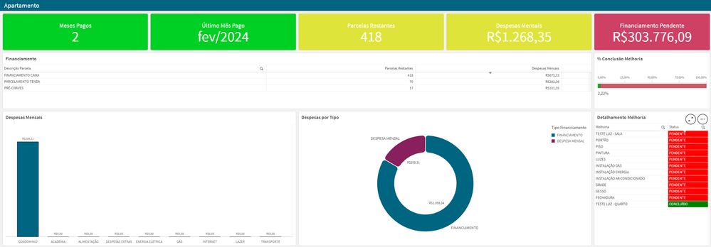
Financiamento Apartamento e Despesas
Financiamento Apartamento e DespesasPersonalApplication for financial organizationDiscoveriesSet AnalysisImpactOrganizationAudienceAdministratorData a... Show MoreFinanciamento Apartamento e DespesasPersonal Application for financial organization
Discoveries
Set Analysis
Impact
Organization
Audience
Administrator
Data and advanced analytics
Finanças
-
Exploring the new Navigation Menu object
The new Navigation Menu object in Qlik allows for a flexible and easy way to add a menu to your Qlik Sense apps. Whether you're designing an app in Ql... Show MoreThe new Navigation Menu object in Qlik allows for a flexible and easy way to add a menu to your Qlik Sense apps. Whether you're designing an app in Qlik Sense or embedding Qlik capabilities into a web platform, you should make this new object your go-to solution for organized and stylish navigation.
In this blog post, we'll explore into the new Navigation Menu object, its features, customization options, embedding capabilities, and key considerations for getting the most out of it. For a quick overview, check out the SaaS in 60 video below:
Navigation Menu in Qlik Sense Apps
Up until now, navigation in your apps has been limited to the following options:
- Navigating through the built in Sheets tab in the assets panel
- Custom built extensions
- Or, in-app, using existing objects:
- Using buttons:
- Using the layout container in addition to buttons to create custom sidebars:
- Using buttons:
The new Navigation Menu object enhances your Qlik Sense app usability and makes it easier to achieve similar results faster tailored to your needs
Key Features:- Sheet Organization: Automatically arranges sheets and groups into a hierarchy for intuitive navigation.
- Flexible Layouts: Choose from vertical, horizontal, or drawer-style menus, adapting to your app’s design needs.
- Custom Styling: Personalize fonts (family, size, weight, and color), background images, align items, and hover and highlight effects. You can also toggle icons or resize the buttons.
- Mobile-Optimized: Enable a list view for seamless navigation on mobile devices.
- Integration-Friendly: Pair with "sheet title off" and selection bar for a minimalistic yet functional design.
You can toggle the "App Navigation bar > Navigation" or "Sheet Header" option to OFF in the UI settings and have the Navigation Menu object replace your traditional Sheets for a more minimalistic look.
👀 You can see the Navigation Menu object in action on the What’s New App:
https://explore.qlik.com/app/4911b1af-2f3c-4d8a-9fd5-1de5b04d195cNavigation Menu embedded in your Web Apps
For developers looking to incorporate Qlik analytics into their web applications, the Navigation Menu object can save time when developing a custom sheet navigation. You can easily embed the navigation menu object and customize it to meet your needs. (Learn more here)
How to Embed the Navigation Menu
Here’s a simple example of embedding a horizontal navigation menu in your web app using Nebula.js.
You can read more about Embedding and access the full documentation on qlik.dev:
const nuked = window.stardust.embed(app, {
  context: { theme: "light" },
  types: [
    {
      name: "sn-nav-menu",
      load: () => Promise.resolve(window["sn-nav-menu"]),
    },
  ],
});

nuked.render({
  type: "sn-nav-menu",
  element: document.querySelector(".menu"),
  properties: {
    layoutOptions: {
      orientation: "horizontal",
      alignment: "top-center",
    },
  },
});
Advanced Customization
Using JSON properties, you can customize the navigation menu extensively:
- Adjust the orientation, alignment, and layout.
- Add drawer functionality for compact navigation.
- Style hover and highlight effects, font colors, and background images.
- Align menu items to the left, center, or right for a consistent look.
These capabilities make the Navigation Menu a versatile tool for developers working on embedded analytics projects.
nuked.render({
  type: "sn-nav-menu",
  element: document.querySelector(".menu"),
  properties: {
    "layoutOptions": {
      "drawerMode": false,
      "hideDrawerIcon": false,
      "orientation": "horizontal",
      "layout": "fill",
      "alignment": "top-center",
      "separateItems": false,
      "dividerColor": {
        "color": "rgba(0,0,0,0.12)",
        "index": -1
      },
      "largeItems": false,
      "showItemIcons": false
    },
    "components": [
      {
        "key": "general"
      },
      {
        "key": "theme",
        "content": {
          "fontSize": "18px",
          "fontStyle": {
            "bold": true,
            "italic": false,
            "underline": false,
            "normal": true
          },
          "defaultColor": {
            "index": 15,
            "color": "#000000",
            "alpha": 1
          },
          "defaultFontColor": {
            "color": "#ffffff",
            "alpha": 1
          },
          "highlightColor": {
            "index": -1,
            "color": "#3ba63b",
            "alpha": 1
          },
          "highlightFontColor": {
            "color": "#ffffff",
            "alpha": 1
          },
          "hoverColor": {
            "index": -1,
            "color": "#ffa82e",
            "alpha": 1
          },
          "borderRadius": "20px"
        }
      }
    ]
  },
  navigation: sheetObject.navigation,
});
Things to watch out for
While the Navigation Menu object is a fantastic addition, there are some key points to consider:
- Content Security Policy (CSP): If you use background images from external URLs, ensure their origins are added to your tenant’s CSP allowlist. This step is essential for compliance and functionality.
- Hierarchy Management: Group sheets effectively in your Qlik app to create a logical navigation structure.
- Mobile Responsiveness: Test the menu thoroughly on various devices to ensure an optimal user experience, especially when using the list view.
- Design Consistency: Align the menu’s styling with the rest of your app for a unified look and feel.
- Navigating through the built in Sheets tab in the assets panel