Unlock a world of possibilities! Login now and discover the exclusive benefits awaiting you.
Analytics & AI
Forums for Qlik Analytic solutions. Ask questions, join discussions, find solutions, and access documentation and resources.
Data Integration & Quality
Forums for Qlik Data Integration solutions. Ask questions, join discussions, find solutions, and access documentation and resources
Explore Qlik Gallery
Qlik Gallery is meant to encourage Qlikkies everywhere to share their progress – from a first Qlik app – to a favorite Qlik app – and everything in-between.
Qlik Community
Get started on Qlik Community, find How-To documents, and join general non-product related discussions.
Qlik Resources
Direct links to other resources within the Qlik ecosystem. We suggest you bookmark this page.
Qlik Academic Program
Qlik gives qualified university students, educators, and researchers free Qlik software and resources to prepare students for the data-driven workplace.
Recent Blog Posts
-
The As-Of Table
Last week I wrote about how the Above() function can be used for calculating rolling averages and other accumulations. There is however also an altern... Show MoreLast week I wrote about how the Above() function can be used for calculating rolling averages and other accumulations. There is however also an alternative method for doing the same thing:
The As-Of table.
When you use the Above() function, you fetch a number from other rows in a chart or Aggr() table. The As-Of table is slightly different in this respect: It is not a transient table created by an object or an expression – instead it is a real table in the data model.
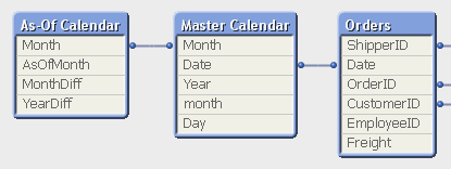
The idea is to create a secondary month field – the AsOfMonth - that links to multiple real months.
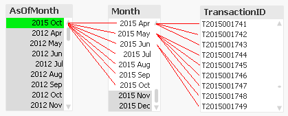
In the example above, you can see that ‘2015 Oct’ links to several preceding months, and each Month in turn links to several rows in a fact table. This means that a specific transaction will be linked to several AsOfMonths.
In the data model, the As-Of table should appear as a separate calendar table that links to the existing primary calendar table:
One way to create this table is the following:
First, make sure that you in your master calendar have a field “Month” that is defined as the first date of the month, e.g.
Date(MonthStart(Date),'YYYY MMM') as Month,
Then add the following lines at the end of the script:
// ======== Create a list of distinct Months ========
tmpAsOfCalendar:
Load distinct Month
Resident [Master Calendar] ;// ======== Cartesian product with itself ========
Join (tmpAsOfCalendar)
Load Month as AsOfMonth
Resident tmpAsOfCalendar ;// ======== Reload, filter and calculate additional fields ========
[As-Of Calendar]:
Load Month,
AsOfMonth,
Round((AsOfMonth-Month)*12/365.2425) as MonthDiff,
Year(AsOfMonth)-Year(Month) as YearDiff
Resident tmpAsOfCalendar
Where AsOfMonth >= Month;Drop Table tmpAsOfCalendar;
Once this table has been created, you can use the AsOfMonth as dimension in charts where you want rolling averages and accumulations.
If you as measure use
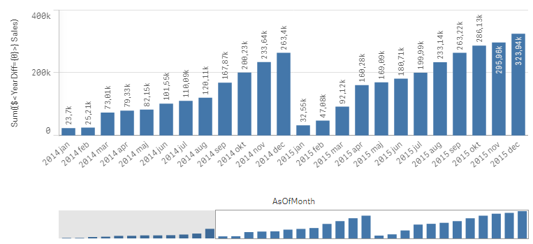
Sum({$<YearDiff={0}>} Sales)
you will get a yearly accumulation – year-to-date up until the day of the script run.
If you instead use
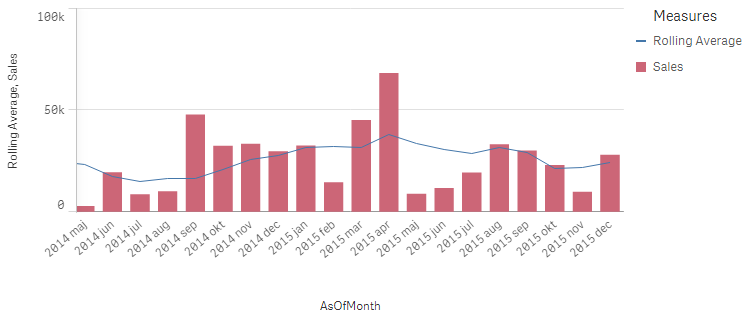
Sum({$<MonthDiff={"<6"}>} Sales) / Count(distinct {$<MonthDiff={"<6"}>} Month)
you will get a 6-month rolling average:
And finally, if you use
Sum({$<MonthDiff={0}>} Sales)
You will get the real, non-accumulated numbers.
I have made the Set Analysis expressions based on two fields: YearDiff and MonthDiff. However, for clarity it could be a good idea to add flags in the As-Of table, so that the Set Analysis expressions become even simpler, e.g.
If(MonthDiff=0,1,0) as IsSameMonth,
If(YearDiff=0,1,0) as IsSameYear,
If(MonthDiff<6,1,0) as IsRolling6,Summary: The As-Of table is a good way to calculate rolling averages and accumulations.
Further reading related to this topic:
Calculating rolling n-period totals, averages or other aggregations

-
Techspert Talks - Exploring Qlik Cloud Data Integration
Hi everyone, Want to stay a step ahead of important Qlik support issues? Then sign up for our monthly webinar series where you can get first-hand insi... Show MoreHi everyone,
Want to stay a step ahead of important Qlik support issues? Then sign up for our monthly webinar series where you can get first-hand insights from Qlik experts.The Techspert Talks session from May looked at Exploring Qlik Cloud Data Integration.
But wait, what is it exactly?
Techspert Talks is a free webinar held on a monthly basis, where you can hear directly from Qlik Techsperts on topics that are relevant to Customers and Partners today.In this session, we will cover:
- What it can do
- How it can be used
- Cloud Data Architecture
Click on this link to see the presentation

-
Anglia Ruskin University students boost employability skills with Qlik Academic ...
In 2021 Anglia Ruskin were looking to create an optional module for students that could be included in their Certificate for Professional Development ... Show MoreIn 2021 Anglia Ruskin were looking to create an optional module for students that could be included in their Certificate for Professional Development and give students robust training in data analytics. In our success story we hear from Lecturer Practitioner, Tina Jia and ARUCPD Program Lead, Kate Summally, about the demand for more analytics skills and how the Qlik Academic Program formed the basis of the module.
They are now in their second year of delivering this module having received 100% student satisfaction after the first year of implementation, with two students having secured employment thanks to their knowledge of data analytics. Read the full success story to learn more:
-
Will we see you at Qlik Connect? (+ May enhancements)
Hello Qlik Community! Less than a month until we see you all at Qlik Connect - we are SO excited to see everyone! Nicole and I will be working the reg... Show MoreHello Qlik Community!
Less than a month until we see you all at Qlik Connect - we are SO excited to see everyone! Nicole and I will be working the registration desk while Sue and Melissa will be at the Qlik Community booth. Make sure you stop by and say “Hi!”.
Here are your May enhancements for the Qlik Community:
Updated Social Icons
The Social icons in the footer have been updated.
Qlik Community Link in Footer
The Qlik Community link in the footer now points to the Water Cooler (previously went to the homepage). If you have any questions, meet us at the Water Cooler!
Events on Right Rail
The incorrect date was appearing on the right rail events. The logic has been fixed to display the correct date.
Reply Button Displays When Posting
When clicking ‘Reply’, the button to post also said ‘Reply’. This was confusing when replying to a comment where multiple ‘Reply’ buttons could display. The button now says ‘Post’. This was a member suggestion.
New Qlik Community Survey
There’s a new Qlik Community survey! We’ve disabled the old one where many people were receiving the pop up more frequently than they should have. The new one should appear once every 90 days (starting today), but let us know if you receive it more than that. The survey should take less than a minute to fill out! We genuinely love to hear your feedback and collect ideas on how to improve the Qlik Community from the survey.
Let us know what you think of the changes and if we will be seeing you at Qlik Connect in the comments below. There is so much happening and great content at Qlik Connect - amazing speakers, great sessions, certifications and announcements. Mike Capone also just announced the appreciation event - an evening at Universal Islands of Adventure! It will be an amazing few days! We hope you can join!
Your Qlik Community Admins,
Melissa, Sue, Jamie, Nicole and Caleb
@Melissa_Potvin @Sue_Macaluso @Jamie_Gregory
-
生成AI どう使う?ChatGPTの機能と限界と活用事例~ChatGPTは歯科医師国家試験に合格するのか?~
5月21日の無料Webセミナーのご案内です。今回は、いつもの TechTalk と違って、Qlik の長年のユーザーである九州歯科大学の守下准教授をお招きします。守下先生は、電子カルテシステムの運営・管理を手掛け、電子カルテ・医事会計システムなどの医療情報データを Qlik Senseで分析し、病院... Show More5月21日の無料Webセミナーのご案内です。
今回は、いつもの TechTalk と違って、Qlik の長年のユーザーである九州歯科大学の守下准教授をお招きします。守下先生は、電子カルテシステムの運営・管理を手掛け、電子カルテ・医事会計システムなどの医療情報データを Qlik Senseで分析し、病院経営に貢献されています。また学生の成績データをQlik Senseを通じて分析し、Institutional Research 活動も展開されています。当日はインタビュー形式で、生成AIの進化と機能、実用例についてお話をお伺いする予定です。Qlik と組み合わせた使用方法についてもお伺いしたいと思っています。
守下先生は、これまでに大学経営、教育、病院運営にデータを活用する試みを多く取り組まれてきましたが、特に最近の注目すべき点として、ChatGPTがどのようにして歯科医師国家試験に回答したか、その結果と教育現場への応用可能性に焦点を当て、実践的な課題と洞察も共有いたします。
是非みなさまご参加ください。
お申し込みはこちら

-
Qlik Cloud Scheduled Maintenance May 11 / May 12 By Region
For continuous improvement to our Qlik Cloud platform, planned maintenance has been scheduled for next weekend, May 11th/12th. The maintenance windows... Show MoreFor continuous improvement to our Qlik Cloud platform, planned maintenance has been scheduled for next weekend, May 11th/12th. The maintenance windows will occur per region, during nonpeak hours and are expected to last 30 minutes.
During these maintenance windows, customers will not have access to Qlik Cloud Tenants. Full access to Qlik Cloud will resume following the end of each region’s maintenance window.
- For Qlik Cloud tenants hosted in the Sydney region:
- Planned maintenance is scheduled to start May 12, 2024 at 12:00 AM AEST and last approximately 30 minutes.
- For Qlik Cloud tenants hosted in the Singapore region:
- Planned maintenance is scheduled to start May 11, 2024 at 10:30 PM SST and last approximately 30 minutes.
- For Qlik Cloud tenants hosted in the Japan region:
- Planned maintenance is scheduled to start May 12, 2024 at 12:00 AM JST and last approximately 30 minutes.
- For Qlik Cloud tenants hosted in the UK region:
- Planned maintenance is scheduled to start May 11, 2024 at 04:30 PM BST and last approximately 30 minutes.
- For Qlik Cloud tenants hosted in the Europe region:
- Planned maintenance is scheduled to start May 11, 2024 at 06:00 PM CEST and last approximately 30 minutes.
- For Qlik Cloud tenants hosted in the DE region:
- Planned maintenance is scheduled to start May 11, 2024 at 06:30 PM CEST and last approximately 30 minutes.
- For Qlik Cloud tenants hosted in the Americas region:
- Planned maintenance is scheduled to start May 11, 2024 at 01:00 PM EDT and last approximately 30 minutes.
To track further updates during the scheduled Qlik Cloud Maintenance, please visit our Qlik Cloud Status page.
Thank you for choosing Qlik!
Qlik Global Support
- For Qlik Cloud tenants hosted in the Sydney region:
-
New Helpful Features
In this blog post, I will cover four Qlik Cloud features that you may not be aware of, but I find to be useful. They are: New navigation option for b... Show MoreIn this blog post, I will cover four Qlik Cloud features that you may not be aware of, but I find to be useful. They are:
- New navigation option for buttons.
- The ability to change the opacity of a background color.
- The ability to add links to straight and pivot tables.
- Placement of sheet navigation buttons with hidden sheet header.
The first feature is the option to navigate to a specific chart using button actions and navigation. We have always had the ability to navigate to a specified sheet but now, we can select a chart to highlight. In the Sales Analysis sheet below, there is a View Sales Details button on the bottom left that is used to navigate the user to the Details sheet and highlight the Sales Details table.
To implement this, the actions and navigation properties of the button need to be set to the Details sheet and the chart ID for the Details table, as seen below.
The Chart ID drop down will show all the IDs for charts on the selected sheet. (In this case, the Details sheet). To ensure you are selecting the correct chart, you can check or copy the chart ID by right clicking on the chart, clicking on …, selecting Share from the menu, then selecting Embed from the menu. These steps are illustrated below.
The Embed dialog window below will open and beneath the chart is its object ID. You can copy the object ID and paste it in the properties window for the button or note it and select it from the chart ID drop down list.
In this example, I used the “go to chart” to navigate between sheets but it can also be used on a single sheet. Now, when the user clicks on the View Sales Details button, they are navigated to the Details sheet and the Sales Details table, at the top of the sheet, is highlighted. Notice the blue colored box around it.
The second new feature is the ability to change the opacity of the background color. In the chart below, I have added a background color in the styling properties of the chart. After I select a color for the background, I can use the slider to adjust the opacity, if I choose. In this example, I set it to 60%. By default, it will set to 100% opacity.
The third new feature is the ability to add links to straight tables and pivot tables. Both tables are found in the Visualization bundle.
To add the link is easy. In the properties of the column (see image below), the Field should be the URL you would like for the link. In this example, the link is hard-coded, but you can also use a field value or expression to generate the link. The key to this working is setting Representation to Link (versus Text, which is the default).
The fourth, and last, new feature that I am going to cover in this blog is the new placement of the sheet navigation arrows when the sheet header is hidden. In a previous blog, I discussed how to toggle the sheet header and sheet toolbar. The sheet navigation arrows are in the sheet header as seen below and in the past when the sheet header was hidden, the navigation arrows were not available.
Now, when the sheet header is hidden, the sheet navigation arrows are moved up to the sheet toolbar. A small change, but quite helpful.
Now if you opt to hide the sheet toolbar as well, you may want to consider adding navigation to your sheet.
To wrap it up, this blog covers some small new features that you may find helpful. Users can now navigate to a visualization via button actions, the styling properties have been improved with the ability to set the opacity for a background color, URL links are available in straight and pivot tables and sheet navigation has become a little more flexible. Check out these new features next time you are developing an app.
Thanks,
Jennell
-
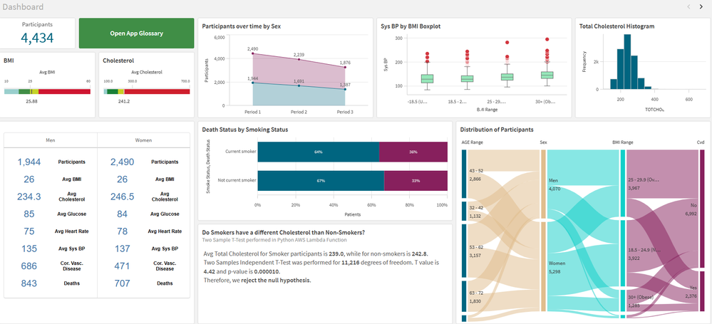
Framingham Heart Study
Framingham Heart StudyIPC GlobalIt shows the data for patients who volunteered to the Framingham Heart Study. I use it for training, demo and explore ... Show MoreFramingham Heart StudyIPC Global It shows the data for patients who volunteered to the Framingham Heart Study. I use it for training, demo and explore innovation.
Discoveries
I use this app to explore different features in the Qlik Cloud: hypothesis testing, integration with Python, AutoML, Glossary, Open AI using Rest API (before Qlik had the Open AI connector), AWS Lambda functions and more.
Impact
I use this app for demo and training of my data science and research team. We help healthcare customers in using Qlik for medical research and this app is how I prepare my team and the customer for this complex task.
Audience
People interested in science or medical research, healthcare or integration with different technologies.
Data and advanced analytics
The used is free for educational purposes. It is an anonymized sample of the Framingham Heart study. I also enrich the data with some extra information live CVD risk scores, which was calculated in Python and sent back to Qlik via Qlik API. I has almost all features available in the cloud.
-
Gaining Perspective with Pivot Tables
Pivot Table Update In previous blogs, I wrote on several visualizations throughout Qlik Sense, and our journey continues today. While in a previous... Show MorePivot Table Update
In previous blogs, I wrote on several visualizations throughout Qlik Sense, and our journey continues today. While in a previous blog we covered Buttons, Tables and KPIs, which can be found here, today we are going to look at a relative to the Table chart, Pivot Tables. In this blog we will be covering what puts the pivot in Pivot Tables, differences between Tables and Pivot Tables, and finally see how we can put Pivot Tables in action for your data.
What are Pivots? How are they different from Tables?
As we covered in my previous blog, Tables are a wonderful tool for visualizing your data, their simplistic nature allowing users to visualize a wide range of data easily. Tables are a wonderful tool for displaying and interacting with your raw data.
Pivot Tables provide another level of flexibility, offering users the ability to reorganize, or pivot, your data dynamically. But what does ‘Pivot’ mean? In Pivot Table, Pivot means users can interchange Dimensions to either side. In our chart, our first layer is the Year, with Product Type and Product Sub Group under all on the same side. With Pivot Tables, we can reorder our Dimensions, changing the focus of our chart.With a Pivot Table, users can drag a Dimension from one side, to the other, giving a different perspective of their data.
In the above example we have moved the Providing a Row and Column interaction between the Product Type and the Year, as opposed to a Column and Column collapse as before.
When and how should I use Pivot Tables?As said above, Pivot Tables are wonderful for getting a different perspective on your data. When working with Pivot Tables, remember their strengths are a change in perspective and organization. Below we have both a Table and Pivot Table with the exact same data shared between them, with the same Measures and Dimensions.
Both Table and Pivot Table visualizations serve a purpose. The Table display all of the data, all of the time, which can be useful in its own circumstances. The Pivot Tables shows a collapsed view, allowing users dynamically choose which data is shown to them. If we oversaw ordering for this company, we could quickly see which Product Type had the most Sales, Cost and Margins.
In our Pivot Table, we could drill down to see which Product Sub Groups are the highest in the Baking Goods Type. Drilling further, we can see the metrics for each year as well.
Perhaps the comparison between years is important to which products we will be ordering more of in the future. Using Pivot Tables, we can quickly ‘Pivot’ the Year Dimension to the other side of the chart to make comparison easier.
Now our chart has all three years on display, making it easy to compare the Sales, Cost and Margins of each year against each other. Additionally, we can move the Product Sub Group to the other side, to get views of each year, and the Sales, Cost and Margins of each Sub Group as well.
Again, the keys to the use of a Pivot Table are their ability to organize and their perspective changes, allowing you to view and use your data how you would like.
Conclusion
As you can see Pivot Tables by their very nature are extremely dynamic and flexible. How could you use Pivot Tables to visualize your data more effectively? Do you have any revelations that you’ve made because of Pivot Tables? If so, tell the community about it in the comments section below! -
DON’T WORRY, BE API
When Bobby McFerrin wrote his little song “Don't Worry, Be Happy” in 1988, he may not have been thinking about Application Programming Interfaces (API... Show MoreWhen Bobby McFerrin wrote his little song “Don't Worry, Be Happy” in 1988, he may not have been thinking about Application Programming Interfaces (APIs), but APIs can certainly help data operations or DataOps become worry-free.
An API is a handy method to access certain operations, features, or data within an application. They are useful in automating repetitive and time-consuming tasks. This leads in nicely with DataOps, which is essentially a set of best practices using processes and technologies to improve quality, speed, and collaboration on data with automation.
At Qlik, automation lies at the heart of our solutions across our entire end-to-end portfolio, from Data Integration to Data Analytics, which not only delivers actionable insights but also makes it possible to automate actions.
For example, let’s examine our cloud-native solutions, Qlik Cloud Data Integration and Qlik Application Automation.
Qlik Cloud Data Integration offers a pro-code/low-code approach to help you build automated replication pipelines and data transformation pipelines that deliver the freshest data. Our best-in-class change data capture (CDC) technology automatically delivers data whenever changes occur at the source.
Qlik Application Automation is our low-code solution for building integrated workflows between the most popular SaaS applications. You can choose from a host of blocks that automatically respond to business events and trigger from a myriad of SaaS applications and cloud-based platforms. This saves you from having to write hundreds of complex lines of code for all the APIs that you may want to use.
The blocks are all built on the public APIs for Qlik Cloud which are also published on the Qlik developer portal.
- Get Data Task Details
- List Projects on a given data space
- List data tasks within a given project
- Start and Stop Tasks
- Start data tasks and wait for completion (released mid May 2024)
As and when we release further APIs for Qlik Cloud, we will continue to improve and add to these blocks over time to help build out further use cases. A point in case is the 'Start data tasks and wait for completion' block, which was recently made available.
These automation blocks provide an additional layer of control and flexibility over your data integration payloads, allowing you to construct more complex orchestration workflows on top of your data pipelines.
For example, you can use them to orchestrate jobs you have running in Qlik Cloud and Talend Cloud jobs, Databricks notebooks or even DBT cloud.
There are many use cases for Qlik App Automation in Qlik Cloud Data Integration; here are just a few examples.
Data Gateway Management
You could automate gateway updates, which would stop a CDC task, update your data movement gateway and then restart the CDC task after the gateway has been successfully updated.
Automating Support Ticket Processes
Switch from reactive to proactive, for example, in the event a task fails, such as a network failure or a source dataset not being available. You could set up an automation workflow that would send a ServiceNow message should a failure occur.Optimize Workflows with Parallel Tasks
This is the latest capability we have added for Qlik Cloud Data Integration: the ability to start several tasks in parallel and wait for all of the tasks to be completed before the workflow continues to the next step.
To bring this last example to life, imagine we are an online retail fashion store that receives orders from our customers every day.
We’ve got some hot shoes in stock, and we are receiving orders hand over feet 😊 so every day we are getting more and more orders and in parallel to that we need to collect their customer details such as name, address credit status and so on.
In our system of records we have two different operational databases, one for sales, one for customer data.
We have created a project in Qlik Cloud Data Integration, which has a series of tasks set up for each of these databases, and the project is set to run on a fixed scheduled basis. (It's actually the project in the first screenshot)
The way it's currently handled in Qlik Cloud Data Integration by default is that any time either one of these storage tasks is completed, the data transformation process will then start to run, however it is possible that both of our operational databases are updated at different times in the day, at different frequencies, in addition the sales order table is a much larger dataset than the other, resulting in the storage task for that table taking much longer to complete than the customer dataset.
This is where Qlik Application Automation comes into play. It helps us get finer control over that orchestration and ensure that both tasks are completed before the transform can be run.
We can now set up a workflow in Qlik Application Automation and use the new block “Start Data Tasks And Wait For Completion,” which will update both of our storage tasks to ensure we have fresh data from both sales and customer data sources for our transformation tasks to work on.
All automations are set up with the 'Start' block and can be run on a schedule, as required. In this example, we have made a very simple automation that starts all storage tasks at the same time. The first step is to list out the data tasks in the project that we want to run. We can then utilize the best practice of creating variables for each of the storage tasks that we want the workflow to orchestrate, to cater for new storage tasks that may come up in the future.
The tasks are then used as inputs to the 'Start Data Tasks and Wait for Completion' blocks, which poll the tasks until they are finished and return their status results, such as failed, cancelled, or complete.
This status is then used in the 'Condition' block, which, depending on the status returned, will either start the TRANSFORM task if both STORAGE tasks are completed successfully or send a message via Slack to the DEV team notifying them to investigate.
There are also plenty of monitor capabilities within Qlik Cloud to help check status, like the 'History view' in Qlik Application Automation, which shows how your automations are operating.
We will add a new template to Qlik Application Automation that reproduces the above use case. It can be customized to your needs and helps you get started in minutes.
Check out this support article for the new Template, which is coming soon: "Start Data Integration tasks and wait for completion"
This is just one of many use cases for Qlik Application Automation, which brings an extra level of control to your Qlik Cloud Data Integration workflows and adds huge value to our customers.
If you have a Qlik Cloud Data Integration tenant, you can start using Qlik Application Automation today.
We would love to hear your use cases and what value it brings to your organization.
-
Welcome Daniel E. O ‘Leary-Qlik Educator Ambassador for 2024!
I feel pleased to introduce our new Educator Ambassador for 2024, Daniel E. O ‘Leary from the University of Southern California. He lives in the Los A... Show MoreI feel pleased to introduce our new Educator Ambassador for 2024, Daniel E. O ‘Leary from the University of Southern California. He lives in the Los Angeles, California.
Daniel O’Leary is a senior member of the faculty in the Leventhal School of Accounting, at the University of Southern California (USC). Dan is a full professor who teaches courses on data and analytics and accounting information systems. This is Dan’s first year as a Qlik Academic Program Educator Ambassador.
Dan introduced Qlik into Leventhal’s curriculum as part of the addition of a new master’s degree in accounting focused on data and analytics, in the 2018 – 2019 school year. As part of that new degree, USC’s Leventhal School of Accounting worked with their different stakeholders to help determine the program’s content. Those stakeholders included one of the big 4 accounting firms, which asked that Qlik be included as one of the tools built into the coursework, because of its importance to them and their clients.
Dan created two new courses to get students the knowledge that they needed to be able to use data and analytics, including artificial intelligence, business intelligence, databases, enterprise resource planning systems, robots and text mining. The course innovation was not just content, but also includes substantial hands-on experiences, as Dan flips the classroom to engage the students.
After careful consideration, Dan elected to use Qlik in his class to capture the importance of cloud computing and cloud-based business intelligence (BI). Cloud computing also facilitates a classroom in which students have both windows-based and Apple Mac-based computing. Using cloud-based software eliminates the problems of finding software that not only works in both environments but also works the same way. With cloud-based software, students see things done the same way in both environments.
In Dan’s teaching, he works to integrate Qlik with different software. For example, in addition to Qlik, Dan uses other software, including RapidMiner and ChatGPT in his teaching. As part of his teaching focus, he teaches students to use other software, not only by using and understanding other software, but by integrating their understanding across different software. For example, projects using RapidMiner are expected to be integrated with Qlik. Similarly, when working with Qlik, students are encouraged to use ChatGPT to support their work with Qlik, providing insights for using Qlik and for data and analytics in general.
Perhaps most importantly, the students feel like they benefit from learning Qlik. As part of his teaching, Dan asks the students which assignments, tools and speakers that the students enjoyed the most and found the most important. This year, 60% of the students listed the classwork with Qlik. As noted by one student “I found the Qlik assignment the most rewarding.” Another student noted, “Qlik’s interface is user-friendly and easy to understand.” As noted by still another student, “I enjoyed Qlik … the most.”
Dan’s use of Qlik in the classroom also has paid off for students on the job market. This last term one of his students found an analyst job because of her classroom work with Qlik.
We hope to engage with Daniel during his journey as the Qlik Educator Ambassador and gain more insights about his use of Qlik at USC.
For more information about our Ambassador Program, please visit: qlik.com/us/company/academic-program/ambassadors
Educators and students looking for free analytics software and training can apply to the Academic Program by visiting qlik.com/us/company/academic-program
-
Basics for complex authorization
In the simplest case, the authorization table defining who-gets-to-see-what is just a two column table linking user names to e.g. regions. But sometim... Show MoreIn the simplest case, the authorization table defining who-gets-to-see-what is just a two column table linking user names to e.g. regions. But sometimes you need a more complicated logic. It could be that you have users that are allowed to see all products but just within one region, and at the same time all regions but just for one product. In other words, you want to make the reduction in several fields with the possibility of OR-logic.
QlikView can do this and here’s how you do it:
- Create an authorization table by loading the authorization data into QlikView after concatenating the reducing fields into one single generic authorization key:
Load USER, REGION &'|'& PRODUCT as %AuthID From AuthTable ;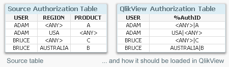
- Create an authorization key in the table with the most detailed transactions:
Load *, Region &'|'& Product as AuthID From OrderDetails ;
If you don’t have all the necessary keys in the table, you can fetch fields from other tables using Applymap. See more about Applymap here: - Create an authorization bridge table linking the two above tables. Since the %AuthID field can contain generic symbols such as '<ANY>', several load statements are needed to create the bridge table:
Load Region &'|'& Product as AuthID, Region &'|'& Product as %AuthID From OrderDetails ;
Load Region &'|'& Product as AuthID, Region &'|'&'<ANY>' as %AuthID From OrderDetails ;
Load Region &'|'& Product as AuthID, '<ANY>'&'|'& Product as %AuthID From OrderDetails ;
Load Region &'|'& Product as AuthID, '<ANY>'&'|'&'<ANY>' as %AuthID From OrderDetails ;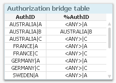
- Reduce the file on the USER field using either Section Access or QlikView Publisher.
Using the above method you can create quite complex security models. For instance, you can use generic symbols also for product groups. Read more about generic keys in this Technical Brief.
Good luck!
Further reading related to this topic:
- Create an authorization table by loading the authorization data into QlikView after concatenating the reducing fields into one single generic authorization key:
-
April Qlik Digest
Welcome to the April Qlik Digest newsletter! We have some exciting news and updates this month, including the Qlik Connect 2024 Session Catalog, upco... Show MoreWelcome to the April Qlik Digest newsletter! We have some exciting news and updates this month, including the Qlik Connect 2024 Session Catalog, upcoming webinars, product updates, and more!
Announcing the Qlik Connect 2024 Session Catalog!
Things are about to get hotter in Orlando with Qlik Connect 2024! We have just opened the session catalog, and it is spectacular.
From best practices and hands-on workshops to inspiring customer success stories and panel discussions, Qlik Connect registrants can now explore the catalog and customize a schedule that will take their knowledge and skills to the next level.
This year’s +100 breakout sessions will offer attendees an opportunity to participate in inspiring discussions spanning all things data, analytics and AI. Sessions fill up quickly; secure your spot today.
What’s more, the early bird special is available through May 3, which means there's still time for you to register at a discounted rate!
The Economic Impact of Cloud Analytics, with Forrester's Boris Evelson
Missed Qlik’s exclusive webinar on April 24th? Watch the recording of Qlik’s Brendan Grady, General Manager of Analytics, as he hosts an intimate conversation with Forrester Research’s Vice President and Principal Analyst, Boris Evelson and Mikkel Hansen, Head of BI at Nordisk Film A/S. It is designed to help you confidently move to Cloud Analytics.
Do More with Qlik: Data Edition – Delivering Real-Time, Analytics-Ready Data
Join us for the next Do More with Qlik webinar as we begin a series of webinars that focus on Qlik’s Data Integration & Quality solutions.
This first session will feature Qlik’s Adam Mayer, who will talk about how to cost-effectively manage data delivery across all major source and target platforms in near real-time. Understand how easy it is to configure, control, and monitor bulk loads and real-time updates with enterprise-class CDC. CDC (Change Data Capture) enables you to continuously replicate changed data without impacting the performance of the source. Critical for production systems.
Product release announcement!
To better align with customer expectations and increase awareness of our major product updates, Qlik Sense Enterprise Client-Managed will now have bi-annual release schedules. Stay caught up on the most recent feature improvements in Qlik Community.
Get ready...the new Qlik Learning is coming soon!
Qlik and Talend have joined forces to bring you the very best of both data analytics and data integration and we’re doing the same with your learning experience.
Bringing you a single, integrated learning platform that combines the best of both worlds. Get hands on experience, expertise and certified all in on place.
The new Qlik Learning will be available this summer. In the meantime, check out this sneak peek.
-
Direct Query now available in Qlik Sense SaaS!
Differing from our industry leading analytics engine, Direct Query generates SQL queries on the fly against the source and executes the query and comp... Show MoreDiffering from our industry leading analytics engine, Direct Query generates SQL queries on the fly against the source and executes the query and compute at the database level. From big data to near real time use cases, Direct Query empowers users of any level to easily explore and analyze the most recent data right from the database, increasing the speed to insight and decision-making.
Direct Query complements our best-in-class analytics engine and extends the range of consumption techniques for analyzing data from cloud databases. The first connector rolling out for Direct Query will be for Snowflake with Databricks next on the roadmap and others planned, so stay tuned.
Can't see this video? - View it on the Qlik Video Page - Direct Query Part 1 - Overview and Operation
Can't see this video? - View it on the Qlik Video Page - Direct Query Part 2 - Building Hybrid Analytic Solutions
How does Direct Query work?
Direct Query can be activated at the database connection level. So, using Snowflake as the example, when building a new application and starting with a data connection, you will have the option to use Direct Query versus our analytics engine.
The user can then select certain components of the source database –in the Snowflake connector users will see the options for role, database, and schema. Authentication for Direct Query is governed at the database level so users will only have access to what is granted from the source database.
The user can then select a single view or multiple tables with the option of choosing the type of relationship between the data sets like full outer join or inner join.
Once the relation is designated, an import live statement is inserted into the script in the load editor on the back-end and the visualizations can begin being built on the front-end. Since this is a SQL pushdown tool, users will need to use the function library of the underlying database. As of this blog, we will support the major 5 aggregations of sum, avg, min, max, and count. Also, some simple forms of set analysis will be available for filtering within measures of charts.
After the charts and objects have been built, users can filter and interact with data in real time as Direct Query generates SQL on the fly and pushes the query and compute down to the source database. Keep in mind that every selection or filter within the app from a user, results in a query pushed down to the database and compute.
Direct Query will also feature a seamless transition into our analytics engine for advanced interactivity and the full suite of capabilities. Check out Part 2 ‘Building Hybrid Solutions’ from the videos below.
To learn more, check out these two videos on Direct Query:
Part 1: Overview and Operation
Part 2: Building Hybrid Analytics Solutions with On Demand App Generation (ODAG)
To learn more about how Qlik and Snowflake together can optimize your investment into data and analytics, read our corporate blog here.
Join us for the webinar series, Do More with Qlik, on August 24th where our very talented Mike Tarallo will be showcasing Direct Query for Snowflake.
-
Release Notes > Product Filter
Hello Qlik Community, An issue has been identified with the ‘Product’ filter on the Release Notes page. The vendor is actively working on a fix. Until... Show MoreHello Qlik Community,
An issue has been identified with the ‘Product’ filter on the Release Notes page. The vendor is actively working on a fix. Until the issue is resolved, we have temporarily removed the ‘Product’ filter.
In the meantime, please use the ‘Release’ filter to narrow down the list.
We appreciate your patience as we work through the issue with the vendor. Please let us know if you have any questions or need any assistance finding a specific release.
Have a great weekend!
Your Qlik Community Admins,
Melissa, Sue, Jamie and Nicole
@Melissa_Potvin @Sue_Macaluso @Jamie_Gregory @nicole_ulloa
-
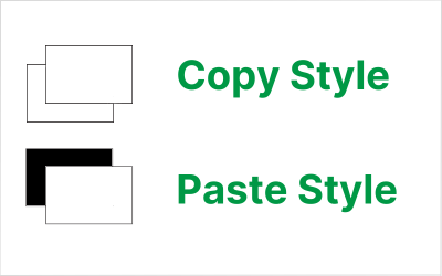
Copy & Paste Style
There have been new Qlik Sense features the past few months that I was excited to see. One of my favorites, which I am sure you are aware of, is the l... Show MoreThere have been new Qlik Sense features the past few months that I was excited to see. One of my favorites, which I am sure you are aware of, is the layout container. If you have not heard about it, check out Michael’s blog post here. Another favorite of mine is the copy and paste style feature which allows developers to copy and paste styles from one visualization to another. With all the styling options available in visualizations, being able to copy and paste styles saves time and eliminates the need to go into the styling properties of each visualization and set all the styling options you would like to use.
Some of the latest charts that have been upgraded to the new styling property panel are the Grid, Funnel and Sankey, giving users the ability to customize the title, subtitle, footnote, and background of a chart as well as the style the axes, labels, legends, and values in a visualization. Borders and shadows can be added to these visualizations as well.
The Filter Pane now has font styling for the title, subtitle, footnote, and header as well as font header and content styling. Like the charts above, borders and shadows can be added as well. Developers can change the background color or use an image in the background and control the color of the selected state. Here are a few examples.
With all these styling options, it is awesome that developers can now copy and paste the style from one visualization to another. If you remember the QlikView days, you know how valuable this feature is. Assume I have an app with a theme applied and have made some styling changes to the Margin KPI (see image below). If I want to apply the same styling changes to the Margin %, I have two options. One option is to open the styling properties of the Margin % KPI and make the same changes to the background color, border color and shadowing.
The second option and the easiest option is to right click on the Margin KPI while in Edit mode, click on the three dots (…) and select Copy style.
Then right click on the Margin % KPI, click on the three dots (…) and select Paste style.
That is a lot easier than styling the KPI manually, especially if there are multiple visualizations to update.
There are a few limitations to using the copy and paste style - you cannot copy and paste the style in a map or a master visualization. New styling properties for visualizations are being add all the time, giving users many options to style and make their app stand out. The copy and paste functionality is a great addition to Qlik Sense and makes designing and styling apps easier.
Thanks,
Jennell
-
Connector Factory – April 2024 releases
Qlik Data Integration New SAP ODP Connector We are continuing to expand our connectivity to the SAP Operational Data Provisioning (ODP) framework. L... Show MoreQlik Data Integration
New SAP ODP Connector
We are continuing to expand our connectivity to the SAP Operational Data Provisioning (ODP) framework. Last November, we released an SAP ODP Connector for our Qlik Data Integration Client-Managed product. Last month we added an SAP ODP Connector for Qlik Cloud Analytics.
This month, we’ve introduced an SAP ODP Connector for Qlik Cloud Data Integration.
All of these connectors provide many benefits to SAP users vs. previous, existing SAP connectors including:
- Simplified access to CDS Views and HANA Views
- Access to Extractors, without the use of standalone network service
- Usable with an SAP Runtime license
- Does not require any separate Qlik SAP Connector license
- No need for an SAP transport installation, particularly useful with an SAP managed cloud system
- Up to 25% faster performance vs. Qlik’s existing SAP connectors
Learn more about the latest SAP ODP connector here.
Additional SAP HANA Support
In addition to the SAP HANA connector, Qlik Cloud Data Integration now includes support for SAP HANA as the backend database for the SAP Application connector. This release also provides Add Business Group Management capabilities. Business groups allow SAP users to create groups of tables that are recognized by the Data Movement gateway, providing additional context when selecting data artifacts to be replicated.
Learn more about the SAP Application connector
Qlik Data Analytics
Access SAP ODP source via Direct Access gateway
The Qlik Data Gateway - Direct Access eliminates the need to open inbound firewall ports by operating behind your organization’s firewall. It allows Qlik Sense SaaS applications to securely access behind-the-firewall data, over a strictly outbound, encrypted, and mutually authenticated connection.
This month we released a new version of the gateway that includes the SAP ODP connector as an additional option to access an on-premises SAP system.
You can learn more about the Gateway here.
Qlik Application Automation
New Qlik Application Automation connectors for Qlik Cloud Government
Qlik Cloud Government now supports the following Qlik Application Automation connectors:
- Amazon SNS
- GitHub (including GitHub Government)
-
Recipe for a 4-4-5 Calendar
The 4-4-5 calendar is a week-based calendar, where the year is divided into 4 quarters, each with 3 months. The first month has 4 weeks, the second ha... Show MoreThe 4-4-5 calendar is a week-based calendar, where the year is divided into 4 quarters, each with 3 months. The first month has 4 weeks, the second has 4 weeks, and the last has 5 weeks. Occasionally the 12th month has an additional week.
However, these quarters and months have nothing in common with the standard months. First, they are not in sync with the Gregorian calendar. The 4-4-5 year can for example start in the last week of August. Further, the 4-4-5 months do not have the same lengths as the Gregorian months.
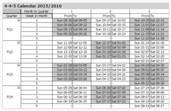
One major advantage over a regular calendar is that the end date of the period is always the same day of the week, which is useful in planning. Similarly, the beginning of the year, the quarters and the months are all on the same day of the week. This means that different years start on different dates. In the table below this is clearly visible. The end of the year is blue and the beginning of the new year is green.
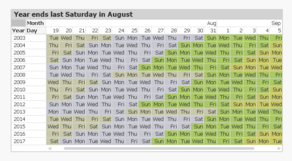
The definition of when the year starts is often described in a phrase like “the year ends on the last Saturday of August”. But this is the same as saying that
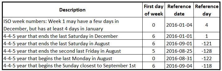
- All weeks start on Sundays.
- September 1st always belongs to week 1. This is the Reference Date.
These two bullets can be expressed as integer parameters, which can be used when generating the calendar in the Qlik script. For the first day of the week, 0 is used to denote Monday and 6 is used to denote Sunday. Further, the number of days between the reference date and the Dec 31st is used to define the beginning of the year.
Finding the reference day may sometimes take some thinking. To help you, I have compiled some examples:
Once the two parameters have been defined, a calendar can be created using e.g. the script that is found on Calendars. This script also creates some other calendars, e.g. 4-5-4, 5-4-4 and Broadcast calendars.
The logic in the script has many steps, but is still fairly straightforward. For each date, the script needs to
- Find the week start of the date
- Use the week start to find the reference date of the input date. Note that the relevant reference date sometimes is after the date itself.
- Use the reference date to find which fiscal year the date belongs to. The start date of the year is also calculated.
- Use the start of the year to calculate the day number within the year
- Finally, the day number of the year can be used to calculate the remaining fields.
Summary: It is possible to create a script that generates a correct 4-4-5 calendar. Don’t hesitate to download the script example and modify it, if you need a 4-4-5 calendar.
Further reading related to this topic:
-
Welcome back Javier Leon - Qlik Educator Ambassador for 2024!
Since we last spoke to Javier for our Academic Program blog he has successfully completed his PHD in data science and is now teaching at 5 universitie... Show MoreSince we last spoke to Javier for our Academic Program blog he has successfully completed his PHD in data science and is now teaching at 5 universities! Javier is an adjunct professor at Saint Joseph's University, Villanova University, Drexel University, Rowan University and Southern New Hampshire University.
In 2024, Javier aims to leverage his knowledge in data science, business intelligence, analytics, and data visualization to enhance students' professional competencies and readiness. One of his aims as an educator is to bridge the gap between theoretical knowledge and practical application, so that students develop the necessary skills to excel in the data driven business landscape. He is already putting this into practice in his Data visualization class at Drexel University:
“In that class I am having students create projects that leverage the capabilities of Qlik…..My teaching is currently focusing on practical, hands-on projects that mirror real-world business challenges, encouraging students to apply Qlik's powerful analytics and visualization features to derive actionable insights. In one of the projects, the students must identify relevant data sets to tell a story about a movie that they like. To do this, they must ensure that the data they find meets the criteria for quality data. Next, they must tell a story about the movie: how much it grossed, how it performed versus movies in the same year, in the same genre, etc.”
One of Javers significant achievement from the past year has been his role in the creation of an Academy called Bright Future Schools of Professional Development, “we have an entire course dedicated to Qlik’s Essentials. The idea is to help students understand the basics of data visualization with a user-friendly software that will enable them to grow professionally.”
Javier believes that I the most important thing happening on at the moment is the AI revolution, “I think it will significantly reshape the landscape of analytics and higher education. …AI technologies like machine learning and deep learning are augmenting human capabilities by automating routine tasks, providing insights from large datasets, and enhancing decision-making with predictive analytics. And what is most important, we are barely scratching the surface of AI capabilities. We can augment ourselves as professors, students, and professionals with the use of AI.”
Javier believes that AI may revolutionize the way educators teach and students learn, “For instance, AI can personalize learning experiences, adapt to individual learning paces, and provide real-time feedback, thereby enhancing student engagement and outcomes. The demand in higher education is shifting towards graduates who are not only proficient in analytics but also in the application of AI and its subset, machine learning, within analytics.”
Javier decided to apply for his fourth year as an educator ambassador because of the knowledge sharing and networking that the program offers, “It is a great way to be surrounded by excellent professionals who are dedicated and passionate about teaching and helping students achieve their academic and professional goals. Also, to be recognized by Qlik, a leading company in BI, offers credibility in an ever-changing and competitive industry. This in turn, can be used to reach more students and help them in their data literacy journey. Aside from all that, I believe in Qlik’s Mission of getting the most value out of data by revealing hidden patterns and addressing today and tomorrow’s complex challenges in the industry.”
To learn more about the Academic Program go to qlik.com/academicprogram.
-
Traffic Accidents in Brazil
Traffic Accidents in Brazil Hyperscale This dashboard was developed with the aim of studying the new layout Container and design possibilities i... Show MoreTraffic Accidents in BrazilHyperscaleThis dashboard was developed with the aim of studying the new layout Container and design possibilities it offers. The data used originated from a survey of accidents on federal highways in Brazil.Discoveries
Types of accidents most common on Brazilian highways, which highways are the most dangerous and require an action plan to reduce accidents, the times and days with the highest occurrence of accidents.
Impact
Mapping the most dangerous highways for a future action plan to reduce accidents, monitoring the most critical times on the roads.
Audience
Traffic enforcement agencies, municipalities, and states
Data and advanced analytics
Ease of visibility of Brazilian highways and comparison between states and highways.