Unlock a world of possibilities! Login now and discover the exclusive benefits awaiting you.

Analytics & AI
Forums for Qlik Analytic solutions. Ask questions, join discussions, find solutions, and access documentation and resources.
Data Integration & Quality
Forums for Qlik Data Integration solutions. Ask questions, join discussions, find solutions, and access documentation and resources
Explore Qlik Gallery
Qlik Gallery is meant to encourage Qlikkies everywhere to share their progress – from a first Qlik app – to a favorite Qlik app – and everything in-between.
Qlik Community
Get started on Qlik Community, find How-To documents, and join general non-product related discussions.
Qlik Resources
Direct links to other resources within the Qlik ecosystem. We suggest you bookmark this page.
Qlik Academic Program
Qlik gives qualified university students, educators, and researchers free Qlik software and resources to prepare students for the data-driven workplace.
Recent Blog Posts
-
Qlik Digest - February 2023
Qlik Ahead: Our Direction for 2023 In his first blog of the year, Qlik’s Chief Product Officer James Fisher unveils the product strategy and directio... Show MoreQlik Ahead: Our Direction for 2023
In his first blog of the year, Qlik’s Chief Product Officer James Fisher unveils the product strategy and direction for 2023.
QlikWorld: The Conference for Data Thrill-Seekers
From exciting innovations to spine-tingling keynote presentations and lots of peer networking, you'll discover how you and your data can help your business succeed. Learn more and register
Qlik Insider Webinar
Our next quarterly update on what’s new and what’s next across our data integration and analytics portfolio will take place on 22 February. Learn about our innovation approach and priorities for the new year. Register
The Business Case for Data Fabric
Join us on February 8 as we explore how data fabrics work, success factors to consider, and why data integration plays such a critical role in any successful implementation. Register
Love is in the air
Hear from renowned mathematician, Dr Hannah Fry on why humans and AI machines can be a dream match, and how there is a mathematical angle to almost everything, including love! Listen Now
ADDITIONAL FEATURED CONTENT
-
Toma de Decisiones Jhonathan Paucar
Toma de Decisiones Jhonathan PaucarUCETarea FinalDiscoveriesJhonathan PaucarImpactDashboard para la satisfacción del clienteAudienceRecursos HumanisDa... Show MoreToma de Decisiones Jhonathan PaucarUCE Tarea Final
Discoveries
Jhonathan Paucar
Impact
Dashboard para la satisfacción del cliente
Audience
Recursos Humanis
Data and advanced analytics
Datos de encuensta
-
Qlik Sense Custom Report
Four years ago, I wrote the Customizable Straight Table blog illustrating how you can build a custom table in QlikView. Last year, I wrote the Custom... Show MoreFour years ago, I wrote the Customizable Straight Table blog illustrating how you can build a custom table in QlikView. Last year, I wrote the Custom Report Extension blog that shows how to use the Climber Custom Report in Qlik Sense. Today, with the help of Patric Nordstrom and Jason Michaelides, I am going to blog about how you can build a custom report in Qlik Sense. With continued enhancements to the Qlik Sense table such as column show conditions and the ability to change the column order of a table, building a custom report in Qlik Sense is possible right out-of-the-box.
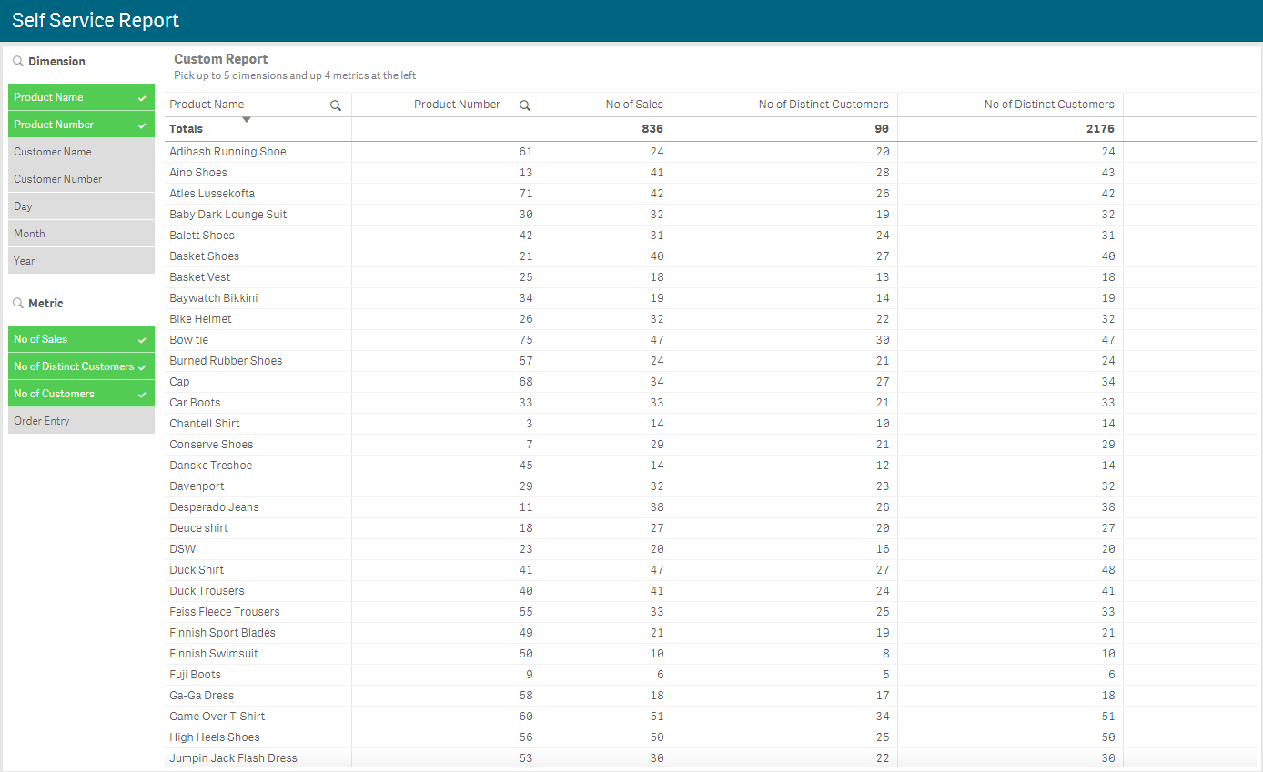
Patric built the attached Qlik Sense app that illustrates how to build a custom report in Qlik Sense. In this blog, I will review the steps needs to build your own report. Below is an example of how the report looks with some dimensions and metrics selected. On the left there are two filter panes, one for the dimensions and one for the metrics, that can be used to select the columns you would like to see in the report. Then there is the table which by default will be empty and will prompt the user to select the dimensions and metrics. In this example app, the user is encouraged to select no more than 5 dimensions and 4 metrics.
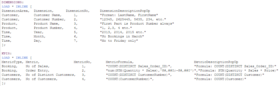
Let’s start by looking the script. You would load your data as usual but what you will need to add to the data model is a data island for the dimensions and for the metrics. In the script below, you can see how Patric did it, providing very clear details of each dimension and metric. The first field in each table is the dimension/metric grouping, the second field is the dimension/metric name as it will appear in the filter panes. The third field is a number to represent the default order of the dimension/metric columns in the report and the last field is description data about the dimension/metric. The KPIs table has a fourth field that shows the formulas for the metrics.
Once the app is loaded with the data islands, you can begin to build the custom report. You will need to add two filter panes and a table to your sheet. The Dimension filter pane uses the Dimension field and the Metric filter pane uses the Metric field. In the table, you will add 5 dimension columns and 4 measure columns since that is what is encouraged in this example. Now here is where Patric used Jason’s FirstSortedValue trick. For the first dimension, enter the text below in the Field.

And this in the Label:

So, you may be wondering what the expression is doing. Basically, the Dimension field is being sorted by the DimensionNo field and then, since the third rank parameter is being used, the expression returns the Dimension for the nth sorted value. In the report screenshot above, the dimensions Product Name and Product Number were selected. When you sort these by DimensionNo, Product Name comes before Product Number since 3 comes before 4 and when you rank these by their sorted value, Product Name is first and Product Number is second. This same idea was used in all the dimensions as you can see in the second dimension shown below.

The measures are done in the same manner. Below is the Field and Label for the first measure and the additional measure columns will follow the same concept as the dimension columns.
Field

Label

Now the last step is to add a conditional show to the columns. Basically, you only want the column to show if there is a dimension and/or metric selected to be displayed. For the first dimension column, you will set the “Show column if” property to:

For the second dimension, it will be the same except if greater than or equal to 2 and so on. The first measure will have the “Show column if” property set to:

Additional measure columns will follow the same format as described above for dimension columns.
Once all the columns are added and the properties are applied, the user can select the dimensions and metrics they would like to see in the report. By default, the column order will be based on the DimensionNo field but feel free to drag columns in the table to a new position. For more information on how Jason used FirstSortedValue, check out his document or Qlik Sense Help.
Thanks,
Jennell
-
Custom Narratives with Speech
Custom Narratives with SpeechCognizantThe app's goal is to describe how the simple narratives are derived without using expensive tools, but using the... Show MoreCustom Narratives with SpeechCognizantThe app's goal is to describe how the simple narratives are derived without using expensive tools, but using the Qlik variables and native functionalities like sort values, filter, etc.. Depending on the criteria given, the narratives offer insights on how different financial KPIs interact with one another. Additionally enabled the audio option to help people comprehend the insights.Discoveries
Simple custom narratives can be created using Qlik native methods rather than a costly third-party extension or plugin.
Impact
The use of narratives makes it easier to combine data, story, and visual insights. When using the third-party tools or extensions that are available, they typically talk about a visualisation. Developers must learn a new programming language in order to shift the narrative since there are either too many statistics or not enough data. However, this straightforward custom narrative makes use of core Qlik features, making it more affordable and flexible.
Audience
All the app developers who want to build narratives with available Qlik functions
Data and advanced analytics
The use of narratives makes it easier to combine data, story, and visual insights. When using the third-party tools or extensions that are available, they typically talk about a visualisation. Developers must learn a new programming language in order to shift the narrative since there are either too many statistics or not enough data. However, this straightforward custom narrative makes use of core Qlik features, making it more affordable and flexible.

-
Announcing the 2023 class of Qlik Academic Program Educator Ambassadors!
Academic Program Ambassadors are educators who champion the Qlik Academic Program at their universities and beyond, with a passion for preparing s... Show MoreAcademic Program Ambassadors are educators who champion the Qlik Academic Program at their universities and beyond, with a passion for preparing students for the data driven workplace. These individuals are some of our most active participants of the Qlik Academic Program who fully utilise the free software, training resources and qualifications that we provide to university students and educators. The members of our 2023 class are:
- Nassir Ibrahim
- Cesar Brochero Castel
- Blerim Emruli
- Javier Leon
- Sumitra Pundlik
- Dorina Kabakchieva
- Angelika Klidas
- Marisa Sánchez
- Angel Monjarás
- Michael Siek
Meet the Qlik Academic Program Professor Ambassadors for 2023
We are thrilled to be recognizing the efforts of these individuals to help the Qlik Academic Program to achieve its mission - to create a data literate world, one student at a time. Each ambassador has been selected through a self-nominated application process, where they were required to answer various questions covering their motivations for becoming an ambassador, and to evidence their passion for upskilling their students in analytics over the past 12 months. This year, we are excited to select another 10 ambassadors, 3 new ones and 7 returning ambassadors whose efforts continued to impress us. By way of thanks for their efforts our ambassadors will receive exclusive benefits such as webinars and discussion groups with Qlik leaders, opportunities to showcase their experience with the Qlik Academic Program and the chance to grow their network with other educators across various fields and geographies.
Throughout 2023 our ambassadors will continue their advocacy for the Qlik Academic Program and help us to reach even more students and educators with our free resources. Stay tuned over the coming months for more in-depth profiles on each of our ambassadors, and get to know who they are, what they teach and why they are so passionate about bridging the data literacy skills gap! Learn more about the program and how to apply for future classes.
-
Academic Program Builds Foundations for Career Success
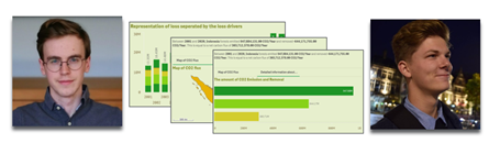
In 2022 Thomas De Dobbeleer and Rutger Mols were students at Thomas More University and were looking for a way to get some practical experience in ana... Show MoreIn 2022 Thomas De Dobbeleer and Rutger Mols were students at Thomas More University and were looking for a way to get some practical experience in analytics, using a real world tool. They wanted an opportunity to explore the potential of working with data and how to apply these skills to global use cases.
Through their studies they were introduced to the Qlik Academic Program and the free learning resources available to them through their membership. These resources helped them to discover the potential of Qlik Sense and start transforming their thoughts and ideas into visualizations. Eventually they found they were able to create something meaningful with the data in front of them.
Both students eventually pursued an internship with Qlik partner, Epic Data, and it was here that they first heard about the Qlik Academic Program datathon. The datathon challenge invited students to help develop solutions towards achieving three of the United Nations 17 Sustainable Development Goals: Goal 13 Climate Action, Goal 14 Life Below Water, and Goal 15 Life on Land. They eventually won the datathon challenge, setting in motion the steps for achieving full time BI consultancy jobs. To learn more about their journey, find the success story below.
If you're a university student or educator , sign up to the Qlik Academic Program for access to software, training, and the chance to obtain Qlik Sense qualifications and certificates to help boost your employability.
-
New and Trial Users - Getting Started with Qlik Cloud and so much more!
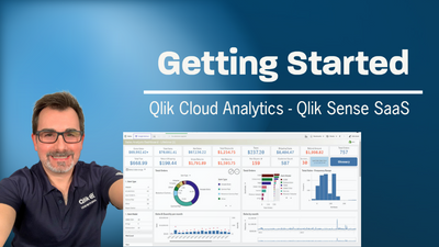
I have been recently asked by some members attending a webinar to create a video playslist on getting started with Qlik Cloud. This is video 1 in the ... Show MoreI have been recently asked by some members attending a webinar to create a video playslist on getting started with Qlik Cloud. This is video 1 in the list that will walk you through setting up a tenant and creating your first app. More videos to come - available in the YouTube Playlist:
https://www.youtube.com/playlist?list=PLW1uf5CQ_gSqF5bcmbBrk1q7Q4-h899V1
Don't forget our instructor lead training and tailored online learning experience at - learning.qlik.com

-
All you need to know about deploying the Qlik Sense Monitoring Applications
Today I will try to answer and clarify the following question you may have What and how many are they? How does the Reload work? Setup and configurat... Show MoreToday I will try to answer and clarify the following question you may have
What and how many are they?
How does the Reload work?
Setup and configuration
What and how many are they?
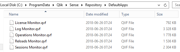
In total, and as of now, there are 5 monitoring applications. Yes 5! Two of them are already imported in Qlik Sense after the installation and three others waiting to be manually imported in C:\Programdata\Qlik\Sense\Repository\DefaultApps
Operation Monitor: Gives you a global overview of your environment’s healthiness. There you can find information about error and warning reported in the logs, task reloads, resource consumption, active users and more
License Monitor: Give you a global overview of your license usage helping you to manage license allocation more efficiently.
Log Monitor: An application going deep dive into your Qlik Sense logs to help you better understand what is happening in your environment.
Reloads Monitor: Will let you understand exactly how your applications are being reloaded, how often, how long, on which nodes and how successful those reloads are.
Session Monitor: Who is using your applications, when, where and how often. This application will also help you to understand which apps are popular or not in your environment.
How does the Reload work?
To display the relevant information, the Monitoring Applications are loading data from two data sources; The logs and the database.
As of Qlik Sense September 2017, it is now possible to store the logs into PostgreSQL database (Centralized logging) and/or files. If Centralized Logging has been configured in your environment, it will fetch the data from there. If it’s not configured or for some reason not accessible, it will load the data from the files.
Once loaded that information will be stored into a QVD file in C:\Programdata\Qlik\Sense\Log on the node doing the reload.
Each monitoring application is generating its own set of QVDs:
Operation Monitor: governance_date_time_ops_version.qvd, governance_time_range_ops_version.qvd
License Monitor: governanceLicenseLog_version.qvd and governanceSession_version.qvd
and governanceLogContent_version_file.qvd
Log Monitor: governanceLogMonitor_version.qvd
Reload Monitor: reloadsMonitorLogContent_version.qvd
Sessions Monitor: sessionsMonitorLogContent_version.qvd
In addition, for some of those QVD's you will see an extension _file or _db. and it depends from which source the monitoring applications are loading the data from. (Centralized logging or files)
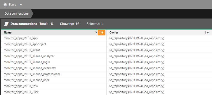
Finally, to load data from the database, the Monitoring Applications are using a set of Rest Connector data connections. Those are used to load different information such as users, applications, application objects, tasks, license, …
Setup and configuration
Depending if you are running a single or multi-node environment and using Centralized Logging or not there are several steps to ensure the Monitoring Applications will fetch all the data in your environment.
I would suggest following the steps described here. Please make sure to select the correct version at the top right
Once you have set up everything according to the link above depending on your environment, I’ll drive you through a couple of useful setting allowing you to customize your Monitoring Applications.
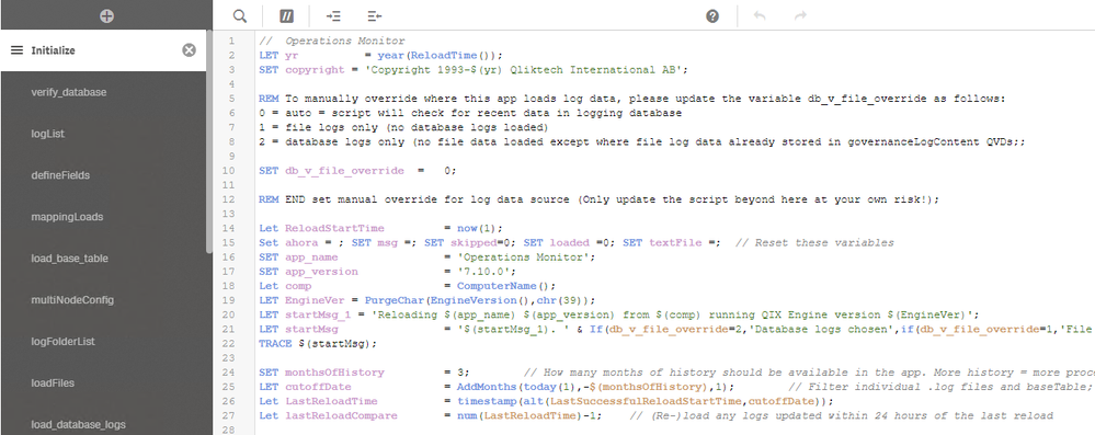
If you open the Script Load Editor for any of the Monitoring Applications (You will need to create an unpublish copy the application to do that)
In the first tab called Initialize, you will find two useful settings
SET db_v_file_override = 0; (line 10)
And
SET monthsOfHistory = 3; (line 24)
db_v_file_override: This variable defines which data source the application will use to loads its data. (Centralized Logging or Log files)
By default, this is set to 0 meaning that the application will check connectivity toward the Centralized Logging database and if it works it will load data from there. If it doesn’t then it will load from the log files.
By setting it to 1 you will force the application to load from log files and by setting it to 2 you will force it to load from the Centralized Logging.
monthsOfHistory: This variable control how much history will be available in the application. The default is 3 but you can increase/decrease it.
Keep in mind that more history available equal more data to load and process so it will increase time and resource consumption.
If you do any change in the script, don’t forget to publish the application again in the Monitoring Apps stream.
Finally, in a multi-node environment, by default, the Monitoring Apps will only be available on the Central Node.
This means that if you have a dedicated scheduler rim node or want to open those applications in the hub from a rim node, it won’t work.
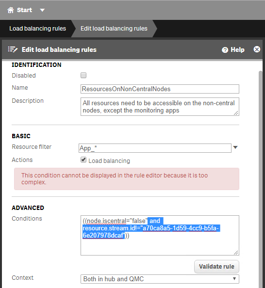
This is control by the load balancing rule called ResourcesOnNonCentralNodes.
Basically, this default rule says that every application will be accessible on every node, but the ones published in the Monitoring Apps stream.
To get rid of that you can, for instance, remove the highlighted text in the Conditions box which will make the Monitoring Applications available on every node or you can even custom the rule so that they are available on specific rim node(s) only.
Hope this will be clear and useful for hopefully many of you and don’t hesitate to like, comment and share (I will try to answer ALL your questions)
-
Vizlib Writeback Table
Vizlib Writeback TableVizlibWith the Vizlib Writeback Table, you can easily edit, update and comment on data points or entire rows directly in your da... Show MoreVizlib Writeback TableVizlibWith the Vizlib Writeback Table, you can easily edit, update and comment on data points or entire rows directly in your dashboards, while remaining in the analysis flow.Discoveries
Fully customizable, Vizlib Writeback Table lets you edit Qlik dimensions, measures and fields, and add new data using a wide variety of data types. It allows the business user to correct data, insert new information, adjust numbers and create new data segmentations.
Impact
Vizlib Writeback Table enables you to skip the error-prone manual steps required for maintaining multiple spreadsheets and work with your data directly in Qlik Sense.
Audience
Business analysts, Line of Business managers.
Data and advanced analytics
Reduction in spreadsheet risk, solves all your business case needs. More information at https://home.vizlib.com/vizlib-collaboration-for-qlik-sense/
-
Vizlib Input Form
Vizlib Input FormVizlibVizlib Input Form (included in Vizlib Collaboration) lets you capture user input and enter new data points into your published ... Show MoreVizlib Input FormVizlibVizlib Input Form (included in Vizlib Collaboration) lets you capture user input and enter new data points into your published Qlik Sense apps. Store the data to QVDs, CSVs, REST APIs, and more.Discoveries
Vizlib Input Form helps you to shape and manage the quality of form data quickly and efficiently. Entering data into an online form is one of the most common methods of collecting data from a user group. As more data is collected, you may decide to make changes to the form, or even create a new one. Vizlib Input Form gets you started quickly by using a layout wizard and templates, and it has a range of features for customizing format, color and layout.
Impact
Saves time, intuitive, additional customizations.
Audience
Business analysts.
Data and advanced analytics
Vizlib Input Form can send dynamic data to almost any business tool—from another system, like your CRM, to email or Slack or an output file (like .csv or .qvf). Using a range of classic data input types, you can design your own custom and fully branded data input form to blend in with your dashboards.
-
Vizlib Teamwork
Vizlib TeamworkVizlibVizlib Teamwork is part of Vizlib Collaboration, the most comprehensive full-cycle collaboration layer for your analytics solutio... Show MoreVizlib TeamworkVizlibVizlib Teamwork is part of Vizlib Collaboration, the most comprehensive full-cycle collaboration layer for your analytics solutions. It’s designed to support your entire insights-to-action journey in Qlik Sense: from team discussions and insight sharing in real-time to workflows and data adding and editing on the fly.Discoveries
Vizlib Teamwork is all about collective intelligence and bringing your team and data together in Qlik Sense. Users can easily kick-off discussions right in their dashboards, call attention to interesting data points with contextualised comments and share their view of data with other people on the team. With in-context communication and real-time conversations inside your dashboards, teams can ask and answer questions in minutes, saving time and making better decisions.
Impact
Vizlib Teamwork improves the process of communication around your data. It gives your team the ability to share insights, handle data confidently and converse, collaborate and share knowledge directly in Qlik Sense, powering their analysis and aiding with decision-making.
Audience
Business analysts, Line of Business team members from analyst to VP/Director.
Data and advanced analytics
With in-context communication and real-time conversations inside an organization's dashboards, teams can ask and answer questions in minutes, saving time and making better decisions.
-
TRUECHART for Qlik Sense
TRUECHART for Qlik SenseTRUECHARTTRUECHART reduces the time required both to prepare reports, and also for the consumer to review and understand the c... Show MoreTRUECHART for Qlik SenseTRUECHARTTRUECHART reduces the time required both to prepare reports, and also for the consumer to review and understand the content being presented by fully-enabling the International Business Communication Standards (IBCSà ®) in any corporate environment. Creating and displaying data using IBCSà ® within your BI results in uniform data visualizations that offer dynamic, meaningful reports giving your business a valuable strategic advantage. For business analysts, report authors and report developers. Consumed/used by any team member.Discoveries
Take advantage of TRUECHARTs key features - Charting Engine, Charting Wizard, Cross-Platform Charting Library, Report Annotation System - to extend your Business Intelligence and Analytics Platform. Explore TRUECHART and extend the possibilities of your Qlik Sense environment. With this extension, you will be able to go a step further and break out of the sheet layout. Building upon a grid-based layout, TRUECHART lets you design your reports and dashboards without boundaries. Choose from a variety of charting, commenting and layout functions. Once your design is finished, save it as a template and speed up the future design process throughout your company. Use the TRUECHART service to profit from an enterprise-wide standard that can be updated or altered by one click pushing the effect to all TRUECHART extensions. While being connected to the TRUECHART service, comments and collaboration functions will be user-specific, enhancing the data literacy bringing your Qlik Sense ecosystem to the next level.
Impact
Ability to choose from different visualizations while using one extension, use TRUECHART FO QLIK SENSE to make things more narrow, commenting in TRUECHART create tables with inline comments based on the values you choose.
Audience
Business Analysts, functional team members, report developers.
Data and advanced analytics
TRUECHART reduces the time required both to prepare reports, and also for the consumer to review and understand the content being presented by fully-enabling the International Business Communication Standards (IBCSà ®) in any corporate environment.
-
The Master Time Table
Often you should create a separate table for the Time dimension. To understand why, we need to look at the cardinality of the field used as key, i.... Show MoreOften you should create a separate table for the Time dimension. To understand why, we need to look at the cardinality of the field used as key, i.e. the number of possible values. If a date is used as key, there can be at most 366 unique values per year. Hence, the Master Calendar will have at most 366 records per year. This makes the Master Calendar a small, efficient dimension table.
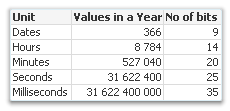
But if we instead use a timestamp as key, we have a different situation. A timestamp rounded to the nearest second will have over 30 million possible values per year. And if it has milliseconds too, it becomes even worse… A timestamp usually has almost the same number of unique values as the transaction table has records. It goes without saying that such a timestamp is inappropriate as dimension key. The dimension table would in many cases become just as big as the transaction table and nothing would be gained.
So, what should we instead do?
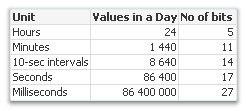
One good way is to convert the timestamp to two keys: Date and Time. The Date key needs to be truncated to the nearest integer so that no time information remains. For the Time key, it's the other way around: The integer part of the number needs to be removed so that no date information remains. In addition, it should be truncated - preferably to the nearest minute or 10-second interval - to keep the cardinality down.
These keys can be created through:
Date(Floor(Timestamp)) as Date
Time(Floor(Frac(Timestamp),1/24/60),'hh:mm') as TimeThis way you will be able to have two master tables, one with 366 records per year, and one with perhaps 1440 records – both tables small and efficient. The Master Time table can have fields for hours, minutes and e.g. work shifts and can easily be created from the above key.
However, you lose information when you remove the information about seconds and milliseconds. So, you need to ask yourself whether you need this information or not. If you do, the best option is often to keep the original timestamp in the transaction table, in addition to the created keys, so that it can be used to calculate different measures. If not, just don’t load the original timestamp.
Summary:
- Think of the cardinality when you create dimensions.
- Make sure that the key to the Master Calendar table is an integer (formatted as a date): Use the Floor() function to remove the time component.
- If you need hour and minute as fields, create a Master Time table.
- Make sure that the key to the Master Time table is the fractional part of the timestamp, truncated to e.g. the nearest minute: Use a combination of the Floor() and the Frac() functions to create it.

-
Looking for Qlik Opportunities?
Did you know that the Qlik Community has a Job Board? Yes, indeed, it does! The job board is available to help companies acquire candidates with Qlik... Show MoreDid you know that the Qlik Community has a Job Board? Yes, indeed, it does!
The job board is available to help companies acquire candidates with Qlik skills and offer a platform for people to post their own interest in obtaining positions using their Qlik skills! In addition, the job board offers an opportunity for companies to post internships and allows students to promote themselves for hire! It’s as easy as following the guideline and creating a post! Check it out today!
Tips for students- Join the Qlik Academic Program for access to software, training, and the chance to obtain a Qlik Sense certificate to help boost your employability.

-
【オンデマンド配信】2023年展望:データ統合における重要な一年
ここ数年、多くの企業が DX を実現してきましたが、真のイノベーターと呼べるのは、この先の道を切り開いていく企業です。 本 Web セミナーでは、Ventana Research 社と Qlik が、2023年のデータ統合市場に影響を及ぼす重要なアーキテクチャ・アプローチ・革新的な技術について、議... Show Moreここ数年、多くの企業が DX を実現してきましたが、真のイノベーターと呼べるのは、この先の道を切り開いていく企業です。
本 Web セミナーでは、Ventana Research 社と Qlik が、2023年のデータ統合市場に影響を及ぼす重要なアーキテクチャ・アプローチ・革新的な技術について、議論します。新たな成功を目指したデータ統合テクノロジーの導入とは?そのヒントをご紹介します。
※ 参加費無料。パソコン・タブレット・スマートフォンで、どこからでもご視聴いただけます。日本語字幕付きでお届けします。
- クラウドデータ統合と自動化の関連性
- 信頼性の高いリアルタイムデータで、アナリスト、データサイエンティスト、データスチュワードをサポートする方法
- 最新データスタックの構築と導入。データファブリックとデータメッシュの違い
- クラウドデータ統合と自動化の関連性
-
Fun facts about the Friday the 13th movie franchise
Here are some fun facts I discovered about the Friday the 13th movie franchise using Qlik Sense. The automatic data relationships and associations eve... Show MoreHere are some fun facts I discovered about the Friday the 13th movie franchise using Qlik Sense. The automatic data relationships and associations even pointed a few things I did not know. Enjoy!
Data scraped from: https://fridaythe13th.fandom.com/ - .qvf and Qlik Sense sample data attached
Can't see the video - check out Qlik's video host here
-
PowerKPI
PowerKPIRBC GroupPowerKPI trusted visualization extension allows you to visually design responsive and interactive user experience for Qlik Sense: fro... Show MorePowerKPIRBC GroupPowerKPI trusted visualization extension allows you to visually design responsive and interactive user experience for Qlik Sense: from simple KPI dashboards to interactive detailed table/list views.Discoveries
PowerKPI component allows developers to visually design stunning-looking, responsive and interactive dashboards using spreadsheet-like visual editor: from simple kpi to interactive fancy and stunning-looking "table-like" data views (with the ability to build custom multiline detailed row templates). For Qlik Sense developers.
Impact
Add more features to Qlik Sense applications, find out new ways of data visualization and makes the process of development faster and easier.
Audience
Business analysts, managers and Qlik Sense app developers.
Data and advanced analytics
Expand visualization capabilities in Qlik Sense for Pixel Perfect design, merge cells the same way as in Microsoft Excel, change the size of columns and rows, use various formatting styles - font, color, background, cell borders, text alignment in cells. Extend functionality and interoperability while designing dashboards in Qlik Sense due to action libraries. Manage data display by using visualization templates, conditionally or interactively. Use true mobile responsive design.
-
Inphinity Forms
Inphinity FormsInphinityInphinity Forms multiplies the value of your Qlik Sense investment by shifting your Qlik from data analytics to an actionable ... Show MoreInphinity FormsInphinityInphinity Forms multiplies the value of your Qlik Sense investment by shifting your Qlik from data analytics to an actionable and fully-collaborative platform. Inphinity Forms is a fully self-service extension ready to be used right after the installation. Thanks to its Qlik-style design, its management and usage are intuitive. For advanced users, there is comprehensive documentation available. For business analysts, Qlik application developers.Discoveries
List of all active users is truly revolutionary for Qlik-native extensions. Knowing who else is working with the same data as you are (especially when more of you can edit it) brings transparency, and entices users to use built-in collaboration. Autorefresh of the object whenever any change is saved. Locking row when editing. Whenever you start editing a row, it is locked for you. Because of the previous features, everyone else sees it immediately – the row is locked as well and by whom.
Impact
Inphinity Forms enables users to efficiently act upon data, collaborate and removes the need for spreadsheets. Natively integrated in Qlik Sense Inphinity Forms is the premium Qlik writeback extension.
Audience
business analysts, managers in line of business.
Data and advanced analytics
Zero coding, no time-consuming configuration, and a short learning curve. Just install the add-on, choose from dozens of ready-made models and templates, and you are all set.
-
Komment by ExtendBI
Komment by ExtendBI ExtendBI Komment is the writeback extension that is easy to install, easy to use and easy on your wallet. So easy to setup t... Show MoreKomment by ExtendBIExtendBIKomment is the writeback extension that is easy to install, easy to use and easy on your wallet. So easy to setup that you can start to write and edit data directly in your Qlik Sense apps in less than five minutes. It is so well-integrated with Qlik Sense that you feel like it is a native Qlik product.Discoveries
Komment has all the features to support your writeback use cases including the following: Data entry: Write comments directly in your Qlik Sense application. You can also create, delete or edit data points. Design: Select from a range of input options (Date, Select, Group, Text, Number, Check, Measure, Variable, and more) Use the data: Your data entries are immediately available to use in other charts and tables. Just press save and everybody is on the same page. Traceability: Out-of-the-box audit trail provides insight into what has been changed, by who, and when it was changed. Data storage: Your entries are saved into QVD files that you can manage and back-up as you do with any other data sources. If you need to store data in a MS SQL DB Komment can handle that as well.
Impact
Unbelievably simple. Configure a fully working writeback app in less than five minutes. No external services or databases are needed.
Audience
Business users - analysts, managers.
Data and advanced analytics
Easy to set up that you can start to write and edit data directly in your Qlik Sense apps in less than five minutes.
-
Qommentary Insights
Qommentary InsightsQommentaryManagement reporting and approval workflows are an extremely time consuming and manual process which has a direct impact ... Show MoreQommentary InsightsQommentaryManagement reporting and approval workflows are an extremely time consuming and manual process which has a direct impact on cost and wasted resources. Qommentary Insights allows teams to write governed and secured commentary, fire-up conversations, share insights or kick-off multi-step approval workflows - directly in Qlik Sense, always in context.Discoveries
Commentary global search - Get a holistic understanding of all commentaries shared across your entire Qlik Sense environment - in one single place. Integrated approval workflows - Moderate commentary with sensitive information for each stream, application or sheet. Enterprise grade security.
Impact
Easy install setup Qommentary in less than 5 minutes with our easy-to-use installer and start writing commentary straight away. No additional configuration required. Enterprise collaboration platform Enterprise collaboration platform Qommentary was built with enterprise-first design in mind. That's why all our extensions are jam-packed with rich collaboration features. Scalable architecture Qommentary scales with your organization's needs. Deploy to a single Qlik Sense environment within minutes or distribute across a multi-node cluster. All products All products, one license. Qommentary gives users access to all extensions with a single price point. And yes, read-only users are 100% free. For life.
Audience
Any business user working with Qlik Sense.
Data and advanced analytics
Cost reduction - Eliminate time wasted involved in collating feedback from multiple sources and running around seeking information. Process optimization - Remove the burden from manual reporting and focus your time where it matters the most. Increase Qlik ROI - Maximise user adoption in Qlik Sense by facilitating collaboration in your analytic process and inviting teams to share insights in context with data.