Unlock a world of possibilities! Login now and discover the exclusive benefits awaiting you.

Analytics & AI
Forums for Qlik Analytic solutions. Ask questions, join discussions, find solutions, and access documentation and resources.
Data Integration & Quality
Forums for Qlik Data Integration solutions. Ask questions, join discussions, find solutions, and access documentation and resources
Explore Qlik Gallery
Qlik Gallery is meant to encourage Qlikkies everywhere to share their progress – from a first Qlik app – to a favorite Qlik app – and everything in-between.
Qlik Community
Get started on Qlik Community, find How-To documents, and join general non-product related discussions.
Qlik Resources
Direct links to other resources within the Qlik ecosystem. We suggest you bookmark this page.
Qlik Academic Program
Qlik gives qualified university students, educators, and researchers free Qlik software and resources to prepare students for the data-driven workplace.
Recent Blog Posts
-
Item Usage Analysis
Each equipment is composed of many items. Through the analysis of the actual usage period compared to the available usage period for each item, items ... Show MoreEach equipment is composed of many items. Through the analysis of the actual usage period compared to the available usage period for each item, items that have passed the usage period and items that need to be replaced are found, and an item order is placed. This shortens the ordering time and reduces the defect rate.
-
Celebrate Women’s History Month and Choose To Challenge!
#ChooseToChallengeMarch kicks off Women’s History Month, an annual celebration to highlight the contributions of women throughout history and in conte... Show More#ChooseToChallenge
March kicks off Women’s History Month, an annual celebration to highlight the contributions of women throughout history and in contemporary society.
March 8 is dedicated as International Women’s Day (IWD), a global celebration of the achievements of women, with a call to action for accelerating gender parity.
The theme for 2021 is Choose to Challenge, which highlights the importance of challenging biases and misconceptions in the interest of creating a more inclusive and gender-equal world ♀️♂️➕
-
National University of Singapore includes data literacy as a part of its multi-d...
We are witnessing a rapid shift towards multi-disciplinary learning which includes a diverse range of subjects which were probably not included earlie... Show MoreWe are witnessing a rapid shift towards multi-disciplinary learning which includes a diverse range of subjects which were probably not included earlier. Although not an entirely new step, the need to include multi-disciplinary topics in formal curriculum is more prominent now than ever before. This breadth in interest often supports the theory that breakthrough ideas cannot be attributed to domain- specific expertise alone. Claude Shannon, the person behind the Information Age, studied philosophy during his learning at the University of Michigan. The basis behind inter-disciplinary education is the fact that to develop all round capabilities of a human being, his intellectual, physical, emotional, aesthetic, and moral senses must be shaped well. Ancient Indian education focused on learning, spiritual and physical development, thus being holistic in nature.
Students pursing engineering and design and environment at the National University of Singapore (NUS) from this year will take a new set of seven interdisciplinary modules from this year. The University feels that these modules would converge skills and knowledge required for work. Earlier NUS college of Humanities and Sciences included interdisciplinary modules in areas such as design thinking and scientific inquiry. The aim of the University is to expose students to knowledge and skills outside their specializations and prepare them for work and society. Among the six “pillars” that have been identified, data literacy is among these. Clearly, data literacy is gaining increasing prominence since the ability to read, work with, analyze and communicate with data is an important skill to possess. To read more about this article, visit: https://www.straitstimes.com/singapore/parenting-education/nus-introduces-common-curriculum-for-incoming-design-and-environment
To know how data literacy and data analytics learning can be a part of your curriculum, visit qlik.com/academicprogram
-
Updating a Public Sheet in Cloud Hub
How do you edit a public sheet in a shared app? In the Qlik Sense cloud hub, users can use a shared space to develop apps collaboratively. Depending o... Show MoreHow do you edit a public sheet in a shared app? In the Qlik Sense cloud hub, users can use a shared space to develop apps collaboratively. Depending on your license and space permission, users in a shared space can create and edit content in an app. According to Qlik Help, there are 4 permissions in a share space.
- Owner: You are the first administrator that can manage the space and its members as well as create content in the space.
- Is admin: You can manage the space and its members as well as create content in the space.
- Can edit: You can add and edit content in apps. You cannot manage the space and its membership.
- Can view: You can view apps in the space, but cannot create content or manage the space.
In this blog, I will share some ways to edit the public sheets in an app. I assume the app is in a shared space and you have create/edit permissions.
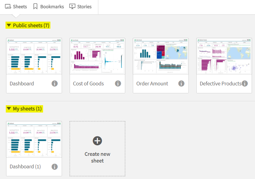
An app in a shared space can have sheets that are private or public. Private sheets are sheets in the My sheets section of the App overview and are visible only to you as the owner. Public sheets are in the Public sheets area and are visible to everyone who has permissions to the shared space. See the highlighted areas in the image below.
Sometimes, there may be the need to edit or delete a sheet that is already public or add a new sheet. Let’s cover how to do this.
- Update an existing public sheet – there are two options:
- The first option is to right-click on the sheet and select Duplicate. The duplicate sheet will appear in the My sheets section in the App overview. You are now the owner of the sheet and can edit as needed. Once edits are complete, right-click on the sheet and select Make public. Once the sheet is public, you are no longer the owner. Note that it does not overwrite the original sheet that was duplicated. Move the sheet to the appropriate location, if necessary. Now, you need to remove/delete the original sheet that was duplicated. To do this, right-click on the sheet and select Make private. This will move the sheet to the My sheets section of the App overview. From there, you can opt to leave the sheet since only you can see it, or you can right-click on it and select Delete to remove it from the app.
- The second option is to make the sheet you would like to edit private by right-clicking on it and selecting Make private. This will move the sheet to the My sheet section of the App overview. From there, you own the sheet and can edit it. Once the edits are complete, right-click on the sheet and select Make public. This will add the sheet back to the Public sheets section of the App overview. If necessary, move the sheet to the appropriate location.
The main difference between these two options is that in the first option, the sheet that is being edited is still visible to users while the edits are being done in a private copy of the sheet. Whereas in the second option, the sheet being edited is not visible to users until it is made public again.
- Delete a public sheet – To delete a public sheet from an app, right-click on it to Make private, then right-click on the now private sheet and select Delete.
- Add a new sheet to an existing app - Click on Create new sheet and open the sheet to add content. Once the sheet is ready to share, go to the App overview, right-click on the new sheet and select Make public.
Hopefully, you now know how you can update a public sheet in a shared space. It is easy and the key thing to remember is to make the sheet public once you are ready to share the sheet with others who have access to the shared space. 🙂
Thanks,
Jennell -
Student Datathon now open!
Join Qlik to build solutions for the United Nations 17 Sustainable Development Goals and transform our world! For details and registration visit Qli... Show MoreJoin Qlik to build solutions for the United Nations 17 Sustainable Development Goals and transform our world! For details and registration visit Qlik Academic Program Datathon: UN SDG Race to Achievement Challenge
Datathon questions can be submitted on the dedicated datathon community page

-
Learn about On Demand App Generation and Dynamic Views
What is On Demand App Generation ( ODAG ) , its concepts and use cases – summarized:Provides everyone simple, guided-access to valuable, large data as... Show More
What is On Demand App Generation ( ODAG ) , its concepts and use cases – summarized:- Provides everyone simple, guided-access to valuable, large data assets and relevant contextual information in a rapidly evolving big data landscape
- Uses a selection app of summarized large data – where user selects criteria (dimensional values) to reduce desired slice of data - and generates a new detail analysis app directly from the source (based off a template app) – for unrestricted search and exploration – this process can be managed and repeated as many times as needed
- Examples include – Analysis of telemetry data (think of IoT devices and large collections of anything mechanical), customer buying patterns (POS), telecommunications (Call Detail Records), hospital patient performance, anything with high volumes of large data
See an example of ODAG in action in 60 seconds!
What is a Dynamic View, what does It do, its concepts and use cases:
- Enables data refreshes in individual visualizations DIRECTLY FROM THE SOURCE TEMPLATE APP – WITHOUT a need to reload the main Qlik Sense APP
- THE DV is an object in the MAIN Qlik Sense app - configured from a template app that contains master visualizations. The main Qlik Sense app can be considered a Hybrid app as it works with data from the Qlik Engine and also has DVs which can be refreshed from the source app.
- The template DV app is based on the same ODAG technology and can be a simple template just to refresh the latest data – or can contain parameters from the main app to be passed to the Dynamic view.
- The template app for a Dynamic View is created in the exact same manner as an ODAG-based app.
- Help Topic: https://help.qlik.com/en-US/sense/November2020/Subsystems/Hub/Content/Sense_Hub/DynamicViews/creating-dynamic-views.htm
See an example of Dynamic Views in action:

- Provides everyone simple, guided-access to valuable, large data assets and relevant contextual information in a rapidly evolving big data landscape
-
Go beyond training with Qlik's new Applied Data Analytics using Qlik Sense Cours...
Qlik’s new course Applied Data Analytics Using Qlik Sense is an intensive 15-week blended learning course that presents best practices in data analyti... Show MoreQlik’s new course Applied Data Analytics Using Qlik Sense is an intensive 15-week blended learning course that presents best practices in data analytics, data literacy and data-informed decision making that help you make the most effective use of Qlik Sense. Not only will you learn how to design and build your best Qlik Sense apps and visualizations but you will also have a broader and richer view of what analytics can help you accomplish. Get the knowledge you need to become a leader in developing a data-driven culture in your organization.
Learn what and why as you learn how - Go beyond conventional product training.
- Leverage analytics best practices to get the most from Qlik Sense
- Ask the right questions to measure what really matters
- Discover and communicate the most important insights
Work as you learn - Apply skills and knowledge as you get your job done.
- Build apps to solve on-the-job problems with real data
- Bring your own data or use ours to complete job-related tasks
- Flexible learning to fit your workload and schedule
Get the credit - Advance your professional development.
- Be the go-to expert for analytic apps with high value and visibility
- Move toward certifications that advance your career
- Lead your organization’s drive toward data literacy
How to register for the Applied Data Analytics using Qlik Sense Course?
- Registration is open now and space is limited! Click here to Register
- Course Start - End Dates: 4/05/2021 – 7/16/2021
Find more information here and take a sneak peek into the course.
For questions, please email Education@qlik.com.

-
24 hours until the next Qlik Academic Program webinar
The session will last for approximately 40 minutes and will cover the following:An introduction to analytics company QlikAn introduction to our free Q... Show MoreThe session will last for approximately 40 minutes and will cover the following:
- An introduction to analytics company Qlik
- An introduction to our free Qlik Academic Program for University students and lecturers and a tour of our free resources (software, training and qualifications)
- An introduction to Qlik Sense- our analytics software, including demos
- An interview with Professor Martin Pohlmann of HTW Berlin to discuss his experience as an educator on the program
- Q&A
If you would like to join please register for the session via the below link:
https://qlik.zoom.us/webinar/register/WN_zAaozxxjRuyYk0rjXPCSJA
Please share the invitation with any university educators or students who may be interested in learning more- everyone is welcome! And remember, even if it’s not possible to attend on the day, you can still register for the event and the recording will be sent to you. Look forward to seeing you on the webinar!
-
Rank Function
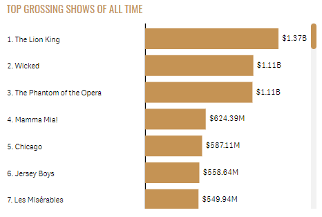
Over the years, I have seen the Rank function used in various expressions. Recently, I was working on a Broadway Shows project where we wanted to sho... Show MoreOver the years, I have seen the Rank function used in various expressions. Recently, I was working on a Broadway Shows project where we wanted to show the rank in a bar chart before the label adding a numeric indicator of how a show ranked. You can see what I am referring to in the bar charts used in the Broadway app. The bar chart below is an example of one of the charts. We added the rank before the show name on the y-axis label.
In this blog, I will discuss how the Rank arguments can be used to change how the rank is presented. To do so, I will use a simplified data set to illustrate how the rank can be displayed. Let’s start by defining the Rank function. The Rank function is a chart function and is defined in Qlik Sense Help as:
“Rank() evaluates the rows of the chart in the expression, and for each row, displays the relative position of the value of the dimension evaluated in the expression. When evaluating the expression, the function compares the result with the result of the other rows containing the current column segment and returns the ranking of the current row within the segment.
For charts other than tables, the current column segment is defined as it appears in the chart's straight table equivalent.
Syntax:
Rank([TOTAL] expr[, mode[, fmt]])”
Originally, I used the Rank function without any arguments. This will rank the products by their sales and display it before the product label.

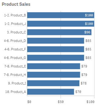
By default, with no arguments for mode and fmt, the Rank function will show the lowest and highest value displayed like a range as seen in the chart above. But what if you want to show a single number for the rank where Product_B and Product_J would show 1 as the rank for both projects since they both tied for first place. This can be accomplished by using the mode and fmt arguments. Mode can take values 0 – 4 and controls which rank is shown for each row for example show the lowest rank, the average rank or the highest rank. The fmt argument takes values 0 – 2 and controls how and where the rank is displayed. You can find the detailed description for each setting in Qlik Sense Help.
For the Broadway app, I set the mode to 4 and the fmt to 1. If I do this with this data set, I will get a chart like this:


The mode argument is 4. This will show the lowest rank on the first row, then increment by one for each row. The fmt argument is 1 and this will show the low value on all rows. When there is a tie, only the lowest rank will be displayed on the respective rows.
There are not always ties when using the Rank function but when there are, the Rank function provides options for how to handle the display of the rank. This was something I never had a need for until now but I found it to be very valuable so I thought I would share what I have learned. The next time you use the Rank function, try out the various arguments to find the display that works best for your app.
Thanks,
Jennell
-
Mashup Editor - Create a Bootstrap Drop Down selection menu
In many of my webpages that I've created using the Capabilities API, I had to create a custom menu and I always used Bootstrap's Dropdown component. I... Show MoreIn many of my webpages that I've created using the Capabilities API, I had to create a custom menu and I always used Bootstrap's Dropdown component. In this tutorial I will show how to do the same.
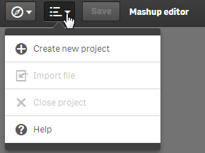
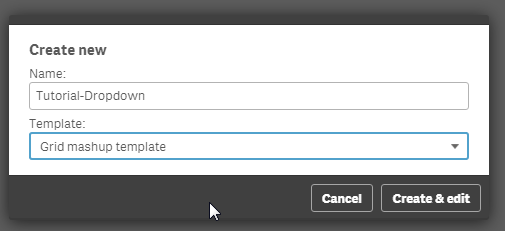
From the Mashup Editor, create a new project and give it a name, using "Grid Mashup Template". this will include bootstrap for you.
.
Select the app "Helpdesk Management.qvf".
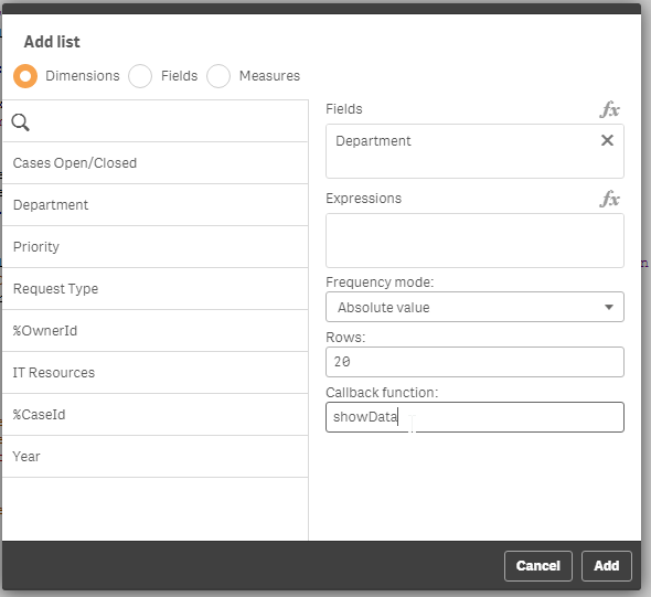
From the right hand side, create a list and select "Department" from the Dimensions. Make sure you add a callback function, since that is where we will put our code. Here, I named it showData.
Now, lets go to the html template and add the dropdown code.
In the div that has the id="QV01", add the following:
  <div class="col-sm-4 qvplaceholder" id="QV01">
   <div class="dropdown">
  <button class="btn btn-default dropdown-toggle" type="button" id="dropdownMenu1" data-toggle="dropdown" aria-haspopup="true" aria-expanded="true">
   Select Department
   <span class="caret"></span>
  </button>
  <ul class="dropdown-menu" aria-labelledby="dropdownMenu1">
  </ul>
   </div>
  </div>
In your javascript code, you will see a callback function created.
//callbacks -- inserted here --
function showData(reply, app){}
The reply has all of the data from the Dimension so we can create the list elements in the drop down. So, let's populate the drop down list elements.
function showData(reply, app){
     $('#QV01 .dropdown ul').empty()
     $.each(reply.qListObject.qDataPages[0].qMatrix, function(key, value) {
          if (typeof value[0].qText !== 'undefined') {
               $('#QV01 .dropdown ul').append('<li><a data-select="'+ value[0].qText+'" href="#">'+ value[0].qText+'</a></li>');
          }
     });
}
Notice that we empty the list first, otherwise every time we make a selection, the same elements will be added in the drop down.
Now, we have to add a jQuery on click event that will trigger the selection and change the button value.
$('body').on( "click", "[data-select]", function() {
     var value = $(this).data('select');
     app.field('Case Owner Group').selectValues([value], false, false);
     $('#QV01 .dropdown button').html(value + ' <span class="caret"></span>');
  });
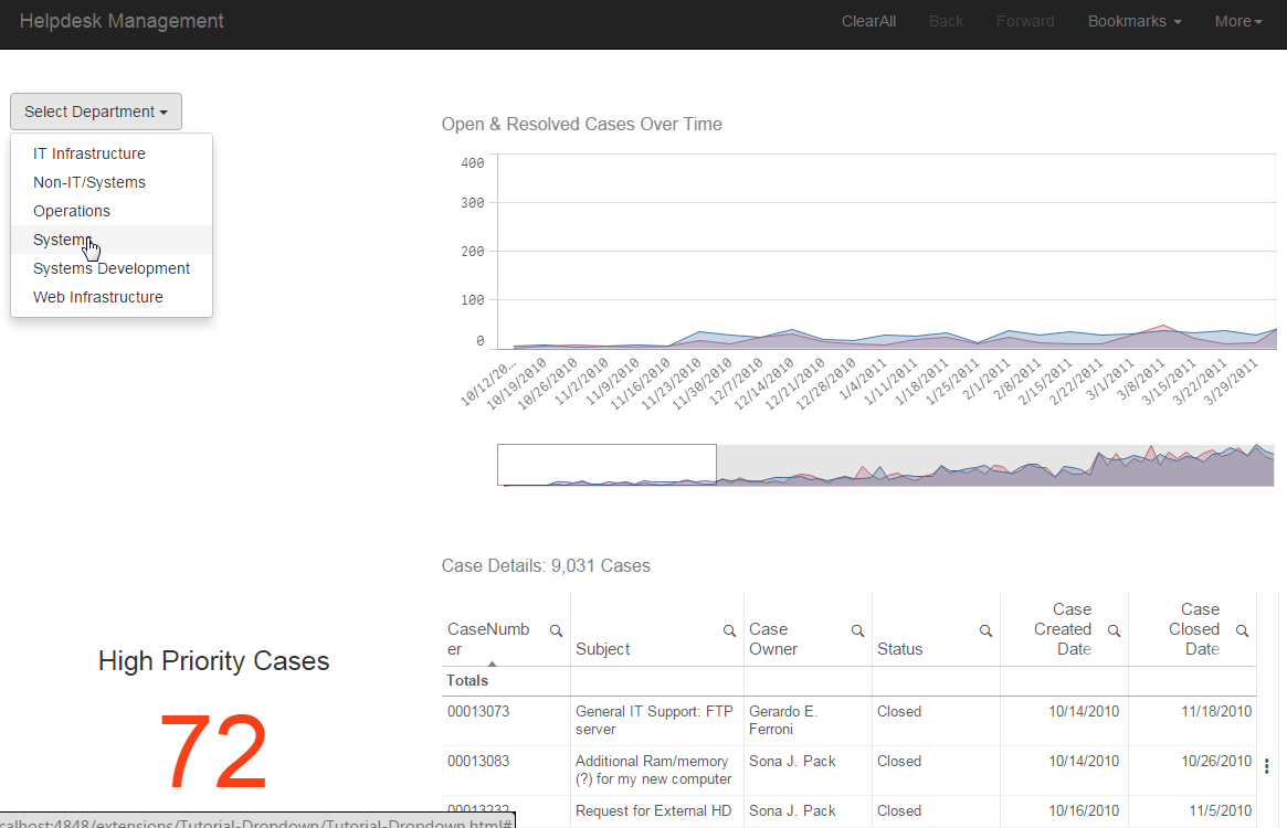
The selection drop down is ready. now lets add some more graphs to make it more interesting when we select a department. I added 'Open & resolved cases over time', the KPI 'High priority Cases' and 'Case Details'. So the final page should look like this:
Last, we must set the button to the original state after the user clicks on the "Clear All". We just add the following line in the code.
case 'clearAll':
     app.clearAll();
     $('#QV01 .dropdown button').html('Select Department <span class="caret"></span>');
     break;
-
COVID19 - Vaccination Italy
Based on the Open data from Public Health Goverment Service, progress in vaccination is shown in two dashboads.Differently from the official infograph... Show MoreBased on the Open data from Public Health Goverment Service, progress in vaccination is shown in two dashboads.
Differently from the official infographic (https://www.governo.it/it/cscovid19/report-vaccini/) in the QlikView app you can navigate data widely and more in depth.
Open data are drawn from Github via rest connector (https://github.com/italia/covid19-opendata-vaccini/)
dash1
dash2

-
Quotes in Set Analysis
When you use Set analysis, you can choose to have a condition in the form of a list of values in the Set expression, or you can choose to have a rule-... Show MoreWhen you use Set analysis, you can choose to have a condition in the form of a list of values in the Set expression, or you can choose to have a rule-based definition - a search for field values.
Examples of hard coded lists:
Sum( {$<Year = {2013,2014,2015}>} Sales)
Sum( {$<Country = {'Australia','Canada','France'}>} Sales)Examples of searches:
Sum( {$<Year = {">=2013"}>} Sales)
Sum( {$<Country = {"Austr*"}>} Sales)
Sum( {$<Customer = {"=Sum(Sales)>100000"}>} Sales)All the above constructions work today, and they will work correctly also after the bug fix.
Note the double quotes in the search expressions. These define the search strings, and between them you can write any search string – the same way as you would in a list box search.
However, you should not use single quotes to define a search string.
Single quotes are reserved for literals, i.e. exact matches. Hence they should be used when you want to make a list of valid field values, like the above list of explicit countries. But they should not be used for searches. Single quotes imply a case sensitive match with a single field value.
This difference between single and double quotes has been correctly described in the reference manual that states that searches are “always defined by the use of double quotes”. Also, all examples with literal field values in the documentation use single quotes.
Now to the bug: QlikView and Qlik Sense currently do not respect the above difference between single and double quotes. Instead, strings enclosed in single quotes are interpreted as search strings. As a consequence, it is not possible to make case sensitive matches with field values, something which you sometimes want to do.
This bug will be fixed in the coming November releases of Qlik Sense and QlikView. Then, wildcards in strings enclosed by single quotes will no longer be considered as wildcards. Instead, the strings will be interpreted as literals, i.e. the engine will try to match the string with a field value containing the ‘*’ character. The same logic will apply also to relational operators and equals signs.
Unfortunately, this bug has been incorrectly utilized by some developers: I have seen Set Analysis expressions with correct search strings, but erroneously enclosed in single quotes; for example
Sum( {$<Country = {'Austr*'}>} Sales)
This search should instead have been written
Sum( {$<Country = {"Austr*"}>} Sales)
Hence, there are documents with expressions that will not work in the corrected algorithm. However, the bug fix will be implemented in such a way that old documents will use the old logic, and new documents will use the new logic. In addition, it will be possible to force the new logic for all documents by using a parameter in Settings.ini.
You can of course also change the single quotes in existing search strings to double quotes, and the expression will continue to do what it always has done.
This post is mainly to give you a heads-up on a coming change, and give you a chance to make a quality control of your own documents. We will publish more information as we get closer to the release.
Further information related to Set Analysis and Searches:

-
Level up your Qlik skills with instructor-led training
Whether you are a beginner, or an advanced developer save time learning from our expert instructors. We have the perfect course just for you. Beginner... Show MoreWhether you are a beginner, or an advanced developer save time learning from our expert instructors. We have the perfect course just for you.
Beginner:
Create Visualizations with Qlik Sense
Advanced:
Advanced Scripting Capabilities
Advances Calculations and Expressions
Advanced Topics in Design and Development
System Administrator:
Deploy and Administer Qlik Sense
Web Developer:
Embed Analytics with Qlik Sense APIs
Additional class schedules include Create Report with Qlik NPrinting, Qlik GeoAnalytics, QlikView courses and of course do not forget our Data Literacy and Data Analytics courses too!
-
Announcing our first ever class of Qlik Academic Program Professor Ambassadors!
The Qlik Academic Program is proud to announce our inaugural class of Professor Ambassadors. These are educators who champion the Qlik Academic Progra... Show MoreThe Qlik Academic Program is proud to announce our inaugural class of Professor Ambassadors. These are educators who champion the Qlik Academic Program at their universities and beyond, with a passion for preparing students for the data driven workplace. These individuals are some of our most active participants of the Qlik Academic Program who fully utilise the free software, training resources and qualifications that we provide to university students and educators. The members of our inaugural class are:
- Richard Wilkinson, Senior Lecturer in Computing, University of Worcester, United Kingdom
- Jerry Roek, Adjunct Faculty in Statistics and Business Analytics, Oakland University, Texas A&M - San Antonio, United States
- Javier Leon, Adjunct Professor in Business Intelligence and Analytics, Saint Joseph's University, United States
- Angelika Klidas, Lecturer in Data and Analytics, University of Applied Sciences Amsterdam, Netherlands
- Blerim Emruli, Senior Lecturer in Informatics, Lund University, Sweden
- Sukanta Ghosh, Assistant Professor in Computer Applications, Lovely Professional University, India
- Josué Lima Romano, Research Professor in Economic and Social Sciences, Universidad de Congreso, Argentina
Meet the Qlik Academic Program Professor Ambassadors for 2021
We are thrilled to be recognising the efforts of these individuals to help the Qlik Academic Program to achieve its mission - to create a data literate world, one student at a time. Each ambassador has been selected through a self-nominated application process, where they were required to answer various questions covering their motivations for becoming an ambassador, and to evidence their passion for upskilling their students in analytics over the past 12 months. By way of thanks for their efforts our ambassadors will receive exclusive benefits such as webinars and discussion groups with Qlik leaders, opportunities to showcase their experience with the Qlik Academic Program and the chance to grow their network with other educators across various fields and geographies.
Throughout 2021 our ambassadors will continue their advocacy for the Qlik Academic Program and help us to reach even more students and educators with our free resources. Stay tuned over the coming months for more in-depth profiles on each of our ambassadors, and get to know who they are, what they teach and why they are so passionate about bridging the data literacy skills gap! Learn more about the program and how to apply for future classes.
-
Community Redesign - Phase 2
Community Members, I'd like to introduce you to our brand new Qlik Community! We hope you love it as much as we do! This article will tell you ever... Show MoreCommunity Members, I'd like to introduce you to our brand new Qlik Community! We hope you love it as much as we do! This article will tell you everything you need to know about what has changed.
First, let me provide some backdrop:
A month ago we kicked off our Community redesign efforts when we launched new banners sitewide and new promo cards addressing some of the inside components of our community. The design concept was born with the launch of Qlik Gallery and was later streamlined into many Qlik Community 2020 social campaigns:
This is one example of a new banner image:
You can read about the all changes that deployed last month here.
Today, you will notice even more changes:
#1. A newly redesigned home page
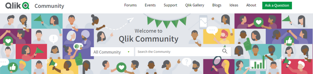
Meant to deliver a brand new look and feel, more modern in design yet playful and fun! When we launched to our new platform over 2 years ago we were 58K members strong. Today, we have 115K+ members and growing every single day. It was time for a change! Recreating the home page banner was no easy feat as we wanted it to convey the beautiful and magnificent spirit of all of you! We'd like to thank Qlik's Creative and Brand services team for their creativity and dedication to this massive undertaking! ( it was 10+ revisions - no joke ).It's pretty amazing when you look at the change side-by-side:
On the new home page you will notice new imagery throughout and also a refreshed use of icons:
From Left to Right
(a) Discussion (b) Document (c) Support-Authored Knowledge Article (d) Idea#2. Brand New Top Level Navigation
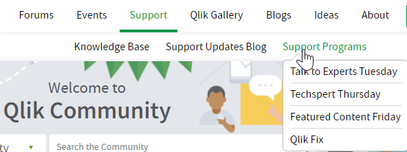
We have completed our shift to a Top Level Navigation. YAHOO! There are multiple tiers to the navigation structure ranging from 1 to 4 tiers. The hamburger menu will remain for our mobile device and tablet users.example of 2 Tiers:
example of 3 Tiers:
example of hamburger menu, with newly created icons, for our phone and tablet users.
We have also updated the Top Level Utility Bar by improving placement of the icons, and while we were at it we aligned those icons to match what you see on Qlik.com.
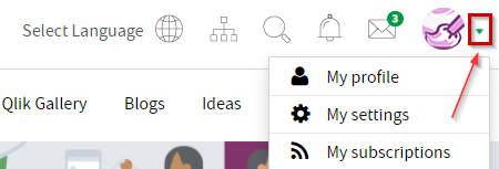
To get to your community settings select the little green arrow that sits next to your avatar.
One of our favorite new additions is the "Ask a Question" button. Meant for members that need to get a question answered and fast - we made it easier for you to do just that. This will be especially useful for newbies to our community who haven't figured out how to navigate to specific forums. YES!
3. Improvements to Search
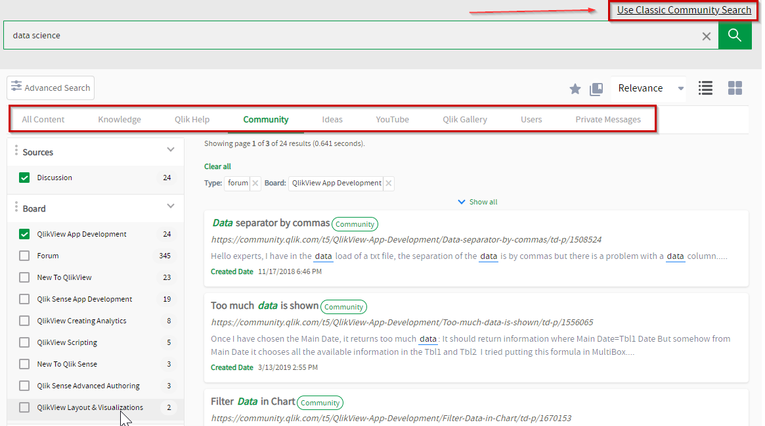
Incredibly excited to share with you that we now have Unified Search available to our members. Double YES!
Already in place today on our Qlik Support Portal, you will now have a consistent search experience across these two platforms. In case you prefer the old and familiar you can revert back to Classic Community Search at any time.
(and yes, we are discussing bringing Unified Search to other Qlik platforms as well - but I can't make any promises).On behalf of the Qlik Community Team we want to thank you for taking this journey with us and embracing change. To report any functional issues with the new design please go here --> https://community.qlik.com/t5/Getting-Started-and-How-To-s/January-2021-Redesign-Issue-Tracking-Post-Launch/ta-p/1772708.
We hope that you enjoy your new space. See you online!
Melissa and Sue
PS. What's coming next on Qlik Community:
- UI improvements for Blogs
- New forum for Application Automation
- Forum Consolidation - with focus on Qlik Sense and QlikView forums
- New Program for Community MVPs
- Top Secret new program. Stay tuned for the one thing I can share - the name - 'Qlik Greenway' !

-
Featured Content Friday – Novel ideas for developing applications
Hello Qlik Users!Happy Featured Content Friday!Today we are featuring a Chief Solutions Architect that has been using Qlik since QlikView 8.2 (which w... Show MoreHello Qlik Users!
Happy Featured Content Friday!
Today we are featuring a Chief Solutions Architect that has been using Qlik since QlikView 8.2 (which was 13 years ago)!
Michael of Axis Group!
What does Michael say his favorite thing about Qlik is?
Michael shared two posts from his blog with us:
Simplifying time period analysis for Qlik self-service users*
Please use this instead of Always One Selected or Pick/Match*
We loved how he wanted to make working with time periods easier for end users and how he offered up an alternative solution to using Always one selected value or pick/match. Michael shares the pros and cons of the solution or the maintenance impact so you get a well-rounded picture of using these approaches. He also has other blogs on his page so take a look!
*The information in this post is provided as-is and to be used at own discretion. Depending on tool(s) used, customization(s), and/or other factors ongoing support may not be provided by Qlik Support.
Do you want to be spotlighted in a future post? See our Featured Content Friday Revamp for more information on submitting your dashboards, screenshots, ideas, videos, workarounds, how-to’s and more!
Thank you for being a part of the Qlik Community and for choosing Qlik!
Kind regards,
Qlik Digital Support
-
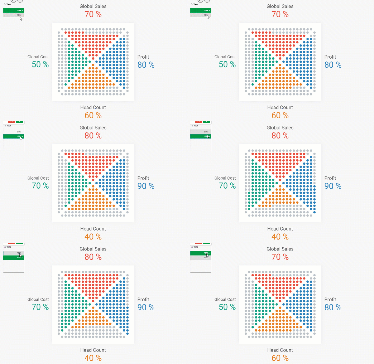
How to build a Dot Quadrant Chart in Qlik Sense
Our guest blogger Christophe Brault @christophebrault , will show you how to build a very different type of chart with Qlik Sense. A really smart addi... Show MoreOur guest blogger Christophe Brault @christophebrault , will show you how to build a very different type of chart with Qlik Sense. A really smart addition to Qlik's wide chart library that illustrates how standard charts have more to offer when we look at them with the right eyes. Check out Christophe's website for more interesting examples with Qlik https://www.qreatic.fr/
How to build a Quadrant Dot chart, step by step
Have you ever felt restrained with Qlik Sense graphic objects before? Personally, if I'm not careful, I feel like I'm doing the same Dashboard over and over again. Sometimes you want something different, surprising or striking. Those are the days when thinking out of the box gets especially important.
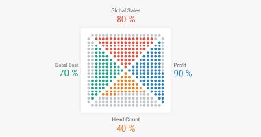
I found the Dot Quadrant chart online and I was curious about how could we achieve something like that in Qlik, so I tried.
In this article I will not discuss when or why to use this visualization, but I'll focus on a detailed guide on how to built it, and more generally, how to hijack basic graphics in Qlik.
Building our grid
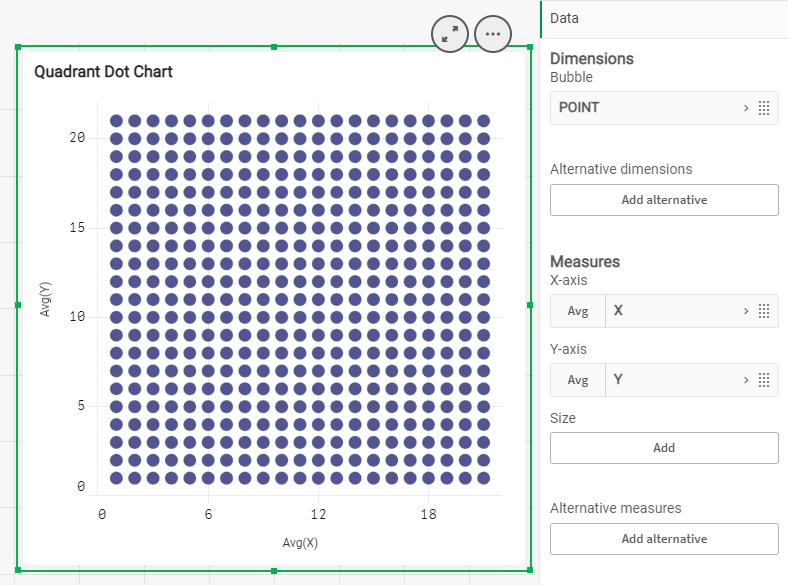
First, we need to create a grid that contains all the dots that will make the chart. We will use a Scatter Plot Chart to create a 21 x 21 grid. Notice how we are generating a 21 X 21 grid instead of a 20 by 20, since we need to delimit each sector.
Generate every point in the script
TMP:
LOAD RECNO() AS X AUTOGENERATE 21;
JOIN LOAD RECNO() AS Y AUTOGENERATE 21;
Prepare your data
DATA :
LOAD X &'|'& Y AS POINT,
X+Y AS TOTAL,
X,Y
RESIDENT TMP;
DROP TABLE TMP;
Create the Dot Quadrant chart using a scatter chart and filling dimension with the field called Point, and X Y as measures. Set the Range for both to Max with 22 and there is your grid.
Create triangles
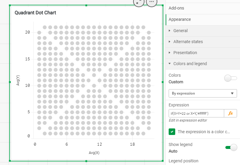
The first thing is to remove the points that separate our four sections. It’s easily done with X and Y. Use color "by Expression" in your chart to set the color to white so they disappear from view.
IF(X=Y OR X+Y=22, RGB(255,255,255))
To know what "triangle" each points belongs to you could use the conditions below
if(Total=22 or X=Y,'NONE',
 if(Total>=23 and Y>X,'TOP',
  if(Total<23 and Y>X,'LEFT',
   if(Total>=23 and Y<X,'RIGHT',
    if(Total<23 and Y<X,'BOTTOM')))))
Using those conditions you can generate a new field in your script called "POSITION" that will help you later on to target the right quarter of your Dot Quadrant Chart
Your loading script by now should look like the code below
TMP:
LOAD RECNO() AS X AUTOGENERATE 21;
JOIN
LOAD RECNO() AS Y AUTOGENERATE 21;

DATA:
// // DEFINE TRIANGLE POSITION
LOAD X,Y,TOTAL,POINT,
IF(TOTAL=22 OR X=Y,'NONE',
IF(TOTAL>=23 AND Y>X,'TOP',
IF(TOTAL<23 AND Y>X,'LEFT',
IF(TOTAL>=23 AND Y<X,'RIGHT',
IF(TOTAL<23 AND Y<X,'BOTTOM'))))) AS Position;

LOAD X&'|'&Y AS POINT,
X+Y AS TOTAL,
X,Y
RESIDENT TMP;

DROP TABLE TMP;
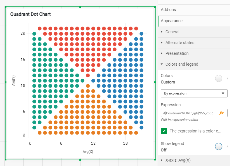
Once you know where each dot belongs to, is time to color each one of the quadrants. You can reuse the field "Position" in Color by Expression :
if(Position='NONE',rgb(255,255,255),
 if(Position='TOP',rgb(231, 76, 60),
  if(Position='RIGHT',rgb(41, 128, 185),
   if(Position='BOTTOM',rgb(230, 126, 34),
    if(Position='LEFT',rgb(22, 160, 133)
)))))
Displaying KPI in the grid
In my example, I have four metrics and one dimension, year, containing two values. Since each quarter is made up of 100 points, it is time to asing them a value from 1 to 100 starting from the center dot. This way you will be able to control how the sections will fill up. You want them to fill up starting from the center outwards.
In the load script, is time to create a new field called "NoPoint" as shown below
Top:
load Position,X,Y,RowNo() as NoPointT Resident Data
Where Position ='TOP'
Order by Y asc;

Right:
load Position,X,Y,rowno() as NoPointR Resident Data
Where Position ='RIGHT'
Order by X asc;

Bottom:
load Position,X,Y,RowNo() as NoPointB Resident Data
Where Position ='BOTTOM'
Order by Y desc;

Left:
load Position,X,Y,rowno() as NoPointL Resident Data
Where Position ='LEFT'
Order by X desc;


All:
LOAD Position,X,Y,NoPointT as NoPoint Resident Top;
Concatenate(All)
LOAD Position,X,Y,NoPointR as NoPoint Resident Right;
Concatenate(All)
LOAD Position,X,Y,NoPointB as NoPoint Resident Bottom;
Concatenate(All)
LOAD Position,X,Y,NoPointL as NoPoint Resident Left;

join(Data)
LOAD * resident All;

Drop tables All,Top,Right,Bottom,Left;
Finally, go back to the chart coloring properties panel and add each KPI like
Position='TOP' and Sum({$<Metric={'Sales'}>}Percentage)*100>=NoPointBy know, your color expression should be something like this
if(X+Y=22 or X=Y,'#ffffff',
 if(Position='TOP' and Sum({$<Metric={'Sales'}>}Percentage)*100>=NoPoint,'#e74c3c',
  if(Position='RIGHT' and Sum({$<Metric={'Profit'}>}Percentage)*100>=NoPoint,'#2980b9',
   if(Position='BOTTOM',
    if(Sum({$<Metric={'Headcount'}>}Percentage)*100>=NoPoint,'#e67e22','#bdc3c7'),
     if(Position='LEFT',
      if(Sum({$<Metric={'Cost'}>}Percentage)*100>=NoPoint,'#16a085','#bdc3c7')
,'#bdc3c7')
         )
        )
       )
      )
To complete your chart remember to hide what you don't need in there, the Labels and Titles for X and Y and Voila !
Thanks for reading and find more chart hijacking at https://www.qreatic.fr/dailyqlikchallenge/category/Charts+Hijacking
Christophe Brault
PS: Check Christophe's Dot Quadrant app attached

-
Deakin University students learn analytics from Qlik experts
Recently, Qlik experts Nabeel Asif and Aaron Young conducted a session on data analytics using Qlik Sense for students of Deakin University in Austral... Show MoreRecently, Qlik experts Nabeel Asif and Aaron Young conducted a session on data analytics using Qlik Sense for students of Deakin University in Australia.
Established in 1974, Deakin University is a multi-award winning and internationally recognized university in Victoria, Australia. They offer students an outstanding learning experience and host over 15,000 international students from 130 different countries. Deakin University consistently ranks highly in undergraduate student satisfaction; in the 2019 Student Experience Survey, Deakin had the fourth highest student satisfaction rating nationally and the highest student satisfaction rating out of all Victorian universities
Professor Kristijan Mirkovski from the University organised this session for his students pursuing their Bachelors in Business Analytics He felt the need to enlighten students with Qlik Sense since students would find it useful for their career. Data analytics is among the top skills and the Qlik Academic Program offers an up to date learning experience through its various offerings which are free for students and Professors.
The session began with providing an overview of the Qlik platform and a demo of Qlik Sense and Qlik Insight bot. Nabeel and Aaron educated students on how to use Qlik Sense by loading data, creating sheets and visualisations and creating apps. A considerable amount of time was also spent on introduction and demo of advanced analytics with Qlik. According to Krisitijan, students were most impressed by the hands-on exercises, which they found extremely useful
There are further plans to conduct similar sessions with Deakin University and also introduce the benefits of the analytics technologies developed by Qlik through the Qlik Academic Program
If you are keen to know about how you can learn and teach analytics in your University, visit: qlik.com/academicprogram or write into academicprogram@qlik.com
-
Celebrate Black History Month with Qlik
February is Black History Month and Qlik Qlik honors the transformative contributions that African Americans have made to shape our lives throughout h... Show MoreFebruary is Black History Month and Qlik Qlik honors the transformative contributions that African Americans have made to shape our lives throughout history.
Please join us in recognizing Black History Month all throughout February - and beyond - using the Zoom Backgrounds attached here.
Together, let's celebrate the accomplishments and contributions of Black people because we know the work is not finished.
-
Introducing Qlik GeoAnalytics
Add the Geographical Dimension to your Business DataHello Qlik Community! I know most of you never sleep, but some of us took some much needed time of... Show MoreAdd the Geographical Dimension to your Business Data
Hello Qlik Community! I know most of you never sleep, but some of us took some much needed time off. I welcome you back from your much deserved holiday and I wish you all a prosperous new year. Now, let's get back to work!
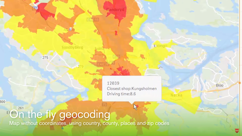
We are looking forward to a fantastic year @Qlik, and the greatness has already started to roll in. On January 4th we announced the acquisition of Idevio, a provider of geographical-related software and services, and a valued Sweden-based Qlik partner. This acquisition not only extends Qlik’s current mapping capabilities, but also moves its offerings beyond visualization with support for a broader range of advanced geoanalytic use cases. Users can now easily add maps to their apps with automatic geo-data lookup to reveal spatial information and then overlay it with different visualizations. You can drill down into information dense maps that contain millions of points, and with a local or cloud-based service, analyze geo-data in combination with non-geo data for use cases such as determining potential store locations, understanding customer distribution of sales by zip code, or calculating supply chain delivery times. IdevioMaps, which includes Idevio GeoAnalytics for QlikView and Qlik Sense, has been re-branded as Qlik GeoAnalytics and is available immediately in its current offering, with tighter integration in Qlik Sense planned for the second half of 2017. You can learn more about what Qlik GeoAnalytics has to offer in this brief introductory video.
Come visit the new Qlik GeoAnalytics Community to post your questions and join the conversation about Qlik GeoAnalytics.
- Note: For samples, examples, guides using Qlik GeoAnalytics visit here
- Primer on using Qlik GeoAnalytics with QlikView - Getting Started with GeoAnalytics
- Primer on using Qlik GeoAnalytics with Qlik Sense - Getting Started
My 2¢
I am very excited about this capability as part of the Qlik product portfolio. When I joined Qlik in 2012, I was always curious as to why there weren't any mapping visualizations with QlikView. Naturally, with Qlik's disruption to the traditional BI vendors, you would think we would have some sort of maps! Hey, everyone was doing it, why not Qlik? (I was so envious of those pretty maps!) I eventually realized that Qlik knew geospatial analytics required more than just dots on a map and was waiting for consumerization to catch up to mapping. But by the time that happened we were neck deep in developing our next generation data visualization platform "QlikView.Next" which lovingly became Qlik Sense. So that really kept us from bringing the strategic focus to bear that we needed to to build out our own mapping capabilities organically. (As some of you may recall, this gap was filled in QlikView with a technique that utilized a scatter plot with a Google Maps background.) At that time, our valuable partner network recognized this as an great opportunity and stepped in with a variety of mapping solutions and extensions designed for varying needs. Idevio maps was one of those partners. Just like many companies, Qilk invests in its existing resources where it can excel quickly and provide immediate value to its customers. As time allows, it will continue to grow its expert family and capabilities through acquisitions that will enhance that value to its customers. We have seen this with the acquisition of Expressor (data governance, data management), NComVA (advanced visualizations) Vizubi / NPrinting (creation, schedule, distribution of operational reports) and now Idevio. Hmmmm, I wonder what's next? Looking forward to a prosperous 2017. Stay well my friends!
Tell me what do you think. Leave your comments below.
Regards,
Michael Tarallo
Follow me: https://twitter.com/mtarallo
Qlik