Unlock a world of possibilities! Login now and discover the exclusive benefits awaiting you.
Data Integration & Quality
Forums for Qlik Data Integration solutions. Ask questions, join discussions, find solutions, and access documentation and resources
Explore Qlik Gallery
Qlik Gallery is meant to encourage Qlikkies everywhere to share their progress – from a first Qlik app – to a favorite Qlik app – and everything in-between.
About Qlik Community
Get started on Qlik Community, find How-To documents, and join general non-product related discussions.
Qlik Resources
Direct links to other resources within the Qlik ecosystem. We suggest you bookmark this page.
Qlik Academic Program
Qlik gives qualified university students, educators, and researchers free Qlik software and resources to prepare students for the data-driven workplace.
Recent Blog Posts
-
Roman Emperors and the Month Names
Our current month names come from the Roman calendar. The original Roman calendar had ten months: Martius, Aprilis, Maius, Junius, Quintillis, Sextil... Show More
Our current month names come from the Roman calendar. The original Roman calendar had ten months: Martius, Aprilis, Maius, Junius, Quintillis, Sextilis, September, October, November and December. The first four months were named after gods: Mars, Venus (Aphrodite in Greek and Apre in Etruscan), Maia and Juno. The origin of Aprilis is debated, but we know that the month was sacred to Venus because the Festum Veneris et Fortunae Virilis was held on its first day. The last six months are based on the latin words for five, six, seven, etc.
Each year started in March and ended in December, 304 days later. It was then followed by a period of festival between the years.
But the calendar was soon changed by the king Numa Pompilius around 700 BC, who added Januarius (after the god Janus) and Februarius (after the purification festival Februa). He also moved the beginning of the year to Januarius.
However, the year was still too short - only 355 days - so the Pontifices occasionally had to add an extra month to keep the calendar in sync with the seasons. This decision was political and was sometimes done just to extend the term of a particular public official. Or it wasn’t done at all, if the official was an opponent.
 By the 1st century BC, the calendar had become hopelessly confused, so in 46 BC, Julius Caesar initiated a reform that resulted in the establishment of a new calendar, the Julian, which was a vast improvement: Leap years were introduced and the year in the Julian calendar was on the average 365.25 days, so no extra intercalary month was needed. After Julius’ death, the month of Quintilis was renamed Julius in his honor, hence July.
Julius Caesar was succeeded by Augustus, and after his death the senate renamed Sextilis after him. At the same time, the senate also suggested that September be renamed after the reigning Caesar Tiberius. But Tiberius refused with the words: “And what will you do if there be thirteen Caesars?”
Today most countries use the Gregorian calendar, which is based on the Julian and still has the Roman month names from 2000 years ago.
In QlikView and in Qlik Sense, the abbreviated month names are defined in the environment variable MonthNames.
Set MonthNames = 'Jan;Feb;Mar;Apr;May;Jun;Jul;Aug;Sep;Oct;Nov;Dec';
This variable is used by several functions, e.g. Month() and Date(). The format code ‘MMM’ is always mapped against the content of this variable.
You can also create an environment variable for the long month names, corresponding to the format code ‘MMMM’:
Set LongMonthNames =
'January;February;March;April;May;June;July;August;September;October;November;December';If you have these variables, you can use the long format codes not only for formatting of date fields, but also for interpretation of fields, e.g.
Date(MonthStart(Date),'MMMM YYYY') as YearMonth, // Creates and formats YearMonth
Date#(Date,'MMMM DD, YYYY') as Date, // Interprets the Date='October 9, 2012' as a date
Dual(MonthTxt, Month(Date#(MonthTxt,'MMM'))) as Month, // Interprets the MonthTxt='Oct' as a monthBottom line: You should define fields for months in your master calendar and add an environment variable for long month names.
Further reading related to this topic:

-
Version 11 Service Release 2 Update 2 is now available for download
Hello everyone,We are pleased to announce that Version 11 SR2 Update 2 - build 11.00.11440 is now available. This Update replaces Update 1 (11.00.11... Show MoreHello everyone,
We are pleased to announce that Version 11 SR2 Update 2 - build 11.00.11440 is now available. This Update replaces Update 1 (11.00.11426). Unfortunately Update 1 contained two degrades which affected users of Windows XP and Windows Server 2008 (not Server 2008 R2).
We regret the inconvenience caused. You can download the installation files for Update 2 from http://www.qlik.com/download.
Please see attached release notes for further information.
regards,
Global Support Team

-
Tool vs. Toy
Back in 2001, with the release of the now cult-classic film Donnie Darko, there was a website that came out to accompany the film. The site was (and i... Show MoreBack in 2001, with the release of the now cult-classic film Donnie Darko, there was a website that came out to accompany the film. The site was (and is) as cryptic and vague as the movie. There is this quasi linear path through the site but at the same time no clearly delineated objective - you experience the site and you do so just for the sake of experiencing it. It doesn't need to tell you what theaters the movie was being released in, or when it was being released because you could get that information other places. This site was for enthusiasts, for die-hard fans. It was something to play with that added to the richness of the film by extending the experience of the film.
Now contrast this with a site that sells movie tickets. There is a clear objective. You use it to buy tickets online to save you from having to buy tickets in person. I go to these sites with a purpose, I complete my task, I leave. It's a tool to do a job.
The balance between creating a tool vs. creating a toy isn't always this clear. You want to create a pleasant experience, even something cool, but if the primary objective is to enable people to complete a task then you should focus on building a useful tool. Help your users do the thing they came here to do. In the case of QlikView this means building applications that focus on the user's needs, apps that clearly show the data, that help users explore their data and find new insights.
I've seen more than a few applications where people, with the best intentions, tried to create a fun environment but ended up adding too many pieces of unnecessary visual "flare." When considering a background, a chart, an animated logo, or a photograph you need to ask yourself: "is this going to help people use this application?" If the answer is no, then perhaps it is best left out. There are plenty of well designed applications that take a very minimalistic approach to design. The application should be well designed, but well designed this isn't synonymous with having a trendy aesthetic. You don't need to cram in all the design tricks you know.
Real design solves problems and the application you are building should be a tool to help people solve problems and complete tasks.

-
Tips and Tricks – Pixel Perfect or QlikVew Natural
Have you ever received a design and wonder how you were going to replicate it in QlikView? Well, I came across this challenge when creating the Socia... Show MoreHave you ever received a design and wonder how you were going to replicate it in QlikView? Well, I came across this challenge when creating the Social Media Data Analysis demo. Our UI designer designed a chart that that looked something like the image below:
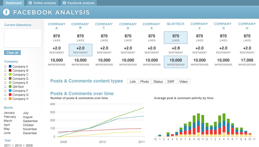
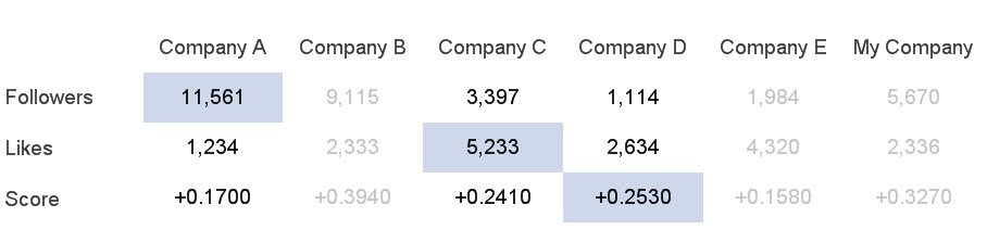
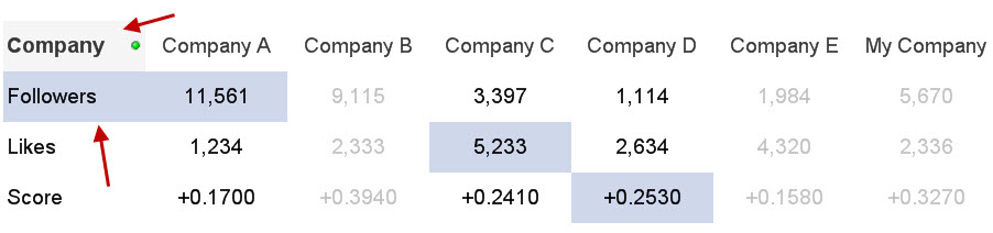
Now at first glance, you may consider designing this in QlikView using individual text objects for the labels and expressions. That was my first thought but then I realized that there would be a lot of text objects to maintain when changes were made to the expressions. So I tried to recreate this chart using a pivot table. While it was easy to add the dimension and the three expressions, it was a little more difficult to add the perks like a background color for the highest value but only for selected companies. For example, in the chart below, Company A, Company C and Company D are selected so I only want to see the highest values based on those selections.
There were also challenges like the dimension label and background color or the fact that the background color for Company A Followers extended to the left to the label. It was little things like this that made this chart a challenge.
But with the use of set analysis, background colors, text color and some carefully placed text objects, I was able to create a visualization that was not as pixel perfect as the Photoshop design but close to it using the basic features and functionality of QlikView. Read more about how I created this chart in this technical brief.
-
Version 11 Service Release 2 Update 1 is now available - build 11.00.11426
Hi everyone,We are pleased to announce that the latest Update release for version 11 is now available for download from http://www.qlik.com/download .... Show MoreHi everyone,
We are pleased to announce that the latest Update release for version 11 is now available for download from http://www.qlik.com/download .
Please refer to the release notes for details on fixes included in this Update. Always follow industry best practices when updating your software!
regards,
Global Support Team
-
Ancient Gods and Modern Days
The use of the seven-day week is ancient. Signs are found in the old Greek, Indian, Persian, Babylonian, Jewish, Akkadian and Sumerian cultures. Most ... Show More The use of the seven-day week is ancient. Signs are found in the old Greek, Indian, Persian, Babylonian, Jewish, Akkadian and Sumerian cultures. Most likely it was invented by the Sumerians around 4500 years ago.
The Sumerians named the week days after the celestial bodies: The sun, the moon and the five known planets. Since the planets had names after gods, some days were thus also named after gods. These names were then translated into Babylonian, then into ancient Greek. In both translations the corresponding local gods were used.
Set DayNames='Nanna;Gugalanna;Enki;Enlil;Inanna;Ninurta;Utu'; // Sumerian
Set DayNames='Sin;Nergal;Nabû;Marduk;Ishtar;Ninurta;Shamash'; // Babylonian
Set DayNames='Σελήνης;Ἄρεως;Ἑρμοῦ;Διός;Ἀφροδίτης;Κρόνου; Ἡλίου'; // Greek
Set DayNames='Moon;Ares;Hermes;Zeus;Aphrodite;Cronos;Sun'; // GreekThe Romans, however, did not initially use a seven-day week. But a decision by Emperor Constantine in AD 321 eventually established the seven-day week also for the Roman Empire. Once again the names of the gods were translated to their local counterparts:
Set DayNames='Lunae;Martis;Mercurii;Iovis;Veneris;Saturni;Solis'; // Latin
Hence, the Latin names of the gods were mostly translations of the Greek names, which in turn were translations of the Babylonian names, which go back to the Sumerians. The Latin names can still be recognized in most Romanic languages, e.g. in French:
Set DayNames='Lundi;Mardi;Mercredi;Jeudi;Vendredi;Samedi;Dimanche'; // French
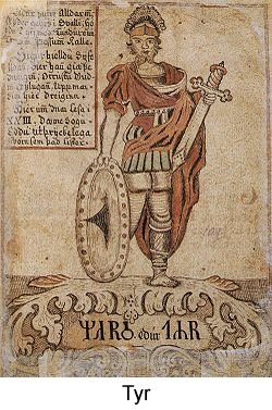 The Germanic tribes in northern Europe started to use the seven-day week long before they converted to Christianity, so the day names, except sun day and moon day, have the names of the old Germanic gods: Tyr/Tiw, Odin/Wotan, Thor/Donar and Freyja/Frige.
But for Saturday, the day was not translated. It is still “Saturn’s” day in e.g. both Dutch and English. And in all Nordic languages it is the “Washing day”. Because that is what you were supposed to do on Saturdays.
In QlikView, you can customize the day names by changing the variable DayNames as I have done above. These values will then be used by the WeekDay() function. Alternatively, you can create a new variable, e.g. vDays, and use this in the following field definition:
Dual(Subfield('$(vDays)',';',WeekDay(Date)+1),WeekDay(Date)) as WeekDay
But on which weekday does the week start? And which week is the first week of the year? The ISO 8601 defines these things clearly:
- The week starts on a Monday
- Week no 1 is the first week of the year with four days or more.

This means that if Jan 1st is a Friday, then week no 1 starts Monday Jan 4th, and the first three days of the year belong to the last week of previous year. It also means that if Jan 1st is a Thursday, week 1 starts Dec 29th. The ISO 8601 is used in many countries, among them most European ones.
But in North America and in the Middle East, different conventions are used. Often Sunday is considered the first day of the week. And Jan 1st is in some countries always part of week 1. As a consequence, the first and last week of the year are often fractional.
The QlikView week functions all use ISO 8601. If you want to define these entities in a different way, do the following: Introduce two variables that define your new week system:
Set vFirstWeekdayOfWeek = 6 ; // 0=Mon, 1=Tue, 2=Wed, ... , 6=Sun. (For the U.S. = 6)
Set vMinDaysInWeek = 1; // Minimal number of days in week no 1. (For the U.S. = 1)Then you can define your week fields as:
Load *,
Dual(WeekDay(Date),Mod(WeekDay(Date-$(vFirstWeekdayOfWeek)),7)) as WeekDay,
Ceil((Date-FirstDateOfWeekOne+1)/7) as WeekNumber,
Date(WeekStart(Date-$(vFirstWeekdayOfWeek))+$(vFirstWeekdayOfWeek)) as WeekStart;
Load *,
Date(
WeekStart(YearStart(Date)+$(vMinDaysInWeek)-$(vFirstWeekdayOfWeek)-1)
+$(vFirstWeekdayOfWeek)) as FirstDateOfWeekOne, …Bottom line: Define fields for week day and week number in your master calendar. And don't hesitate to change the environment variables if you want long day names or different day names.
Further reading related to this topic:
-
QlikView 11 Dimension Limit Functionality
One of the common business requirements when analyzing the data is limiting the dimension values on a chart. For instance, limiting the chart to the t... Show MoreOne of the common business requirements when analyzing the data is limiting the dimension values on a chart. For instance, limiting the chart to the top 10 sales people, or showing only the products that make up 80% of sales. QlikView 11 dimension limits functionality enables the business users to easily create these logics on the charts.
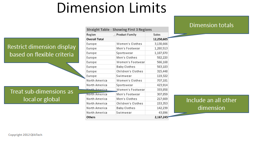
This functionality provides consistency across QlikView charts and more importantly better performance. Prior to QlikView 11, some charts in QlikView could display totals at the expression level, some can limit the number of dimension values to display and some can display an ‘OTHERS’ dimension value to catch those values omitted by the limits. With QlikView 11 dimension limits feature, these functionalities are consistent across chart types. Also, the conditions that are used on the dimension limits are calculated at the engine level, providing better performance and calculation time.
The functionality offers four main options:
- Limits: This option restricts the dimension values displayed on a chart based on flexible criteria. The criteria are evaluated with the first expression of the chart. It is possible to restrict the dimension values by the largest, smallest, first, greater than or less than an exact value or relative the total.
- Global Grouping Mode: With this option, it is possible to treat the dimension values as either ‘local’ to the current upper dimension level in the chart, or ‘global’ to be evaluated across all instance of the upper level dimensions. This option is only applicable to the second or lower level dimensions on a chart.
- Show Total: This option enables the display of subtotals at the dimension levels.
- Show Others: This option displays an ‘OTHERS’ dimension value to catch those values omitted by the limits.
Each option has a separate set of applications and can be used in different permutations.
QlikView 11 dimension limits functionality makes it easier for the business users to customize the QlikView apps based on their own analysis needs with just a few clicks!

-
End of Support for version 9 - 31 October 2012
Hi everyone,This is a reminder that support for version 9 ends on 31 October 2012.For customers who wish to extend support for version 9, please see ... Show MoreHi everyone,
This is a reminder that support for version 9 ends on 31 October 2012.
For customers who wish to extend support for version 9, please see Extended Update Support information in the QlikView Support brochure http://www.qlik.com/us/~/media/Files/resource-library/global-us/direct/datasheets/DS-QlikView-Support-Services-Brochure-EN.ashx
Extended Update Support is a paid for support extension, the cost of which can be found in the pricing page on our web site : http://www.qlik.com/us/explore/pricing.
Version 11 Service Release 2 is now available on our download site.
regards,
Global Support
-
Dashboard 101 - Creating a dashboard
If I say the word “Dashboard”, most readers probably think of a software tool that gives an overview of enterprise health, rather than of a control pa... Show MoreIf I say the word “Dashboard”, most readers probably think of a software tool that gives an overview of enterprise health, rather than of a control panel in front of the driver in a vehicle. One is in a computer, and the other is in a car, but they should play the same role; it should alert you when something is wrong. So where do we start when creating a dashboard for business users?
I follow a D-A-R concept: dashboard-analysis-report. The first QlikView tab, the dashboard, tells users what is good or bad. It’s the “what” sheet. The next batch of tabs is for analysis and has graphs and tables which tell users “how” or “why” things are good or bad. The last part, the report sheet, has more detailed information such as invoice details, order details, employees’ shifts and so on where users can identify the exact action item to act on. So when creating a dashboard, it’s important to highlight the “what” in it.
The first step is to identify the key metrics. The fewer the better. Don’t place 50 KPI’s to try to characterize the entire company in a dashboard, but rather the major ones that matter the most. Pick metrics that change every day if the dashboard is to be utilized daily.
Secondly, make sure all KPI’s have a comparison. Human beings are trained to compare everything 24/7. If your sales figure is 3 million dollars, then so what? Is it better than yesterday’s number? You need to place a comparison number to indicate whether it is better or worse.
Next, don’t use the color green when something is good. If you have 4 KPI’s (key performance indicators) and two of them are green and the other two are red, then people take it as 50% good, not 50% bad. You want users to focus on the ‘bad’ part so they can act on it. Only color-code what is bad, that is, red.
Compare with a dashboard in a car. It does not alert you when something is doing well, but it is designed to alert you on the bad things. Think about the fuel light. It’s not lit in green when your car has enough fuel. Instead it alerts you when fuel is critically low. Then it comes on in red and you notice it right away. It grabs your attention and personally I even get nervous when I see it.
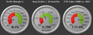
Think about a usage of gauges. A big number with a small red color indicator will do a better job to alert users than a round gauge with both green and red in it.
Bottom line: When designing a dashboard, make sure to keep it as simple as possible. When a user looks at it for 10 seconds and looks away, she or he should remember what was bad. Otherwise, it is not playing its fundamental role and is just pretty to look at.
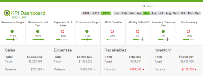
Executive Dashboard on demo.qlik.com.
Here is a technical brief on this topic.

-
Version 11 Service Release 2 is now available - 11.00.11414
Hi everyone,We are pleased to confirm that Version 11 Service Release 2 is now available on http://www.qlik.com/download.Service Release 2 contains th... Show MoreHi everyone,
We are pleased to confirm that Version 11 Service Release 2 is now available on http://www.qlik.com/download.
Service Release 2 contains the new QlikView Offline Capability [see page 20 in the release notes], 6 Design Corrections and over 200 bug fixes.
Please make sure you read the release notes before upgrading to this Service Release. Thank you to all the customers and partners who participated in beta testing Service Release 2.
kind regards
Global Support Team
-
Maps and Mazes: A Tale of Two Extensions
The highly respected (fictional) scientist, Ian Malcolm, once chastised a group of scientists for being “so preoccupied with whether or not they could... Show MoreThe highly respected (fictional) scientist, Ian Malcolm, once chastised a group of scientists for being “so preoccupied with whether or not they could that they didn't stop to think if they should.” Ignoring the fact that this statement was made in regard to ferocious dinosaurs that would soon terrorize mankind, there is truth held within for how we approach technology.
In this business we’ve all been guilty at one time or another of using the “more is more” approach in data visualization. All too often we marvel at something that dazzles without stepping back for a minute to consider the story that’s actually being told by the data. This is especially true with QlikView extensions.
There are a plethora of JavaScript libraries that display data in exciting and dynamic ways. It flies here and there, spins, zooms, explodes, and distracts attention for a bit before the viewer attempts to decipher the information loosely assembled in the chaos. With extensions we sometimes jump at the opportunity to cram a hot, buzzy technology into QlikView simply for the bragging rights. Sometimes what is needed is something much simpler.
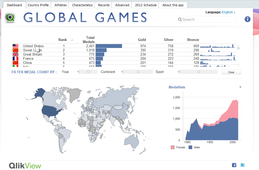 When I began working on an extension to visualize medal counts for the Olympic Games this past summer, it was assumed that I would use a slick mapping UI similar to Google Maps or OpenLayers. These powerful mapping tools allow developers to perform a wide variety of complex geospatial tasks, taking into account curvature of the earth, map projections, tessellation, and a variety of other things that will induce sleep in the average human being.
In order to achieve the effect of highlighting and coloring the different countries for this extension, it is not as simple as telling the Google Maps API to select country X and highlight it with color Y. These mapping tools do not have country or region boundaries prepackaged. Due to this fact, the actual longitude and latitude points for the boundaries of each and every country would need to be found and plotted as shapes on the map. Not only is this a LOT of data for JavaScript to handle, geographical data is not easy to come by.
So, let’s take a step back. The question that needs to be asked is how much additional detail will users need? The data we’re looking to visualize is not geographic in a technical sense. We only need to display the countries of the world as concepts and entities, not as precise geographic objects. In this case, the precision offered by the mapping tool is completely irrelevant, as is the map itself beneath the plotted shapes. Why repurpose a complex and powerful mapping tool to draw a picture? Instead, why don’t we just, you know, DRAW A PICTURE?
Fine, but how do we do that? Enter SVG. SVG (or Scalable Vector Graphics) is a form of vector imagery in XML format which draws shapes and lines as a series of paths. While this format is not supported by all browsers (ahem…Internet Explorer), fortunately there is a JavaScript library called Raphaël that will draw SVG paths in old and new browsers. Finding an SVG of the countries of the world was relatively easy, and from that point, I leveraged Raphaël in drawing the image.
Rather than explain further in great detail how I coded and created this extension, what’s more important is to emphasize the need to consider the goals of our data visualizations. Just because we’re showing a map, must we use a mapping tool? Clearly not, and by drawing the world map as SVG, we used the appropriate tool. Our visualizations should yield to the data. If the data is trying to tell a story, we should get out of the way and let it tell its tale.
For a more in depth and technical overview of the extension, please click here for a zip file containing the extension and a technical brief.

-
Actionable Metadata – with QlikView Expressor
Actionable DataIt should come as no surprise that in order for raw data to break free from its deluge and become truly actionable - it must go through... Show MoreActionable Data

It should come as no surprise that in order for raw data to break free from its deluge and become truly actionable - it must go through a number of steps before it is finally ready for decision makers. Steps can include various methods that access, combine and transform the data to make it meaningful for Business Discovery. Traditionally, methods that make data actionable can include a combination of data integration applications (ETL) and/or QlikView data-readiness procedures (QlikView Script). These methods in turn prime QlikView’s powerful associative in memory data layer used by all QlikView deployments. QlikView and knowledge workers are then responsible to turn that actionable data into useful information to help drive decisions.
Metadata in Action
With the introduction of QlikView Expressor, data provisioning for QlikView deployments has been redefined. Whether you are simply accessing data from a warehouse or combining data from disparate sources, QlikView Expressor will provide both actionable data along with actionable metadata as you develop. This makes managing data for QlikView more efficient, less prescriptive and will ensure a higher degree of data confidence and reuse across all QlikView applications.
Metadata is typically defined as data about data. Active metadata on the other hand, can be defined as "metadata in action". Traditional Business Intelligence metadata is mostly static and limited to only describing a few properties about the data it references - such as sources, data types, column names, length and format. QlikView Expressor metadata is not static, it’s active. It describes common properties about the data while also actively respecting rules that have been defined on its attributes.
Let’s take a simple example using a string column named ZIP used to store a 5 digit +4 zip code. Not only can the metadata describe the attribute using a common business term such as PostalCode, but it can also specify a minimum and maximum string length constraint to ensure the data length only falls within the specified range. Furthermore, it can provide a pattern match rule using a regular expression such as ^\d{5}-\d{4}$. This will ensure that the data flowing to QlikView will absolutely match the XXXXX-XXXX pattern. - What if the data fails the rules? A choice to set a corrective action to use a default value or even redirect the record to be captured is available, allowing more control on where and how the data is processed. Other examples can include using an allowable list of values, setting rounding / min / max / precision / scale / constraints on numeric values, date range validation, date formatting and string padding / truncation.
Using active metadata with QlikView Expressor is just one part of the overall QlikView Expressor solution. Combined with other key capabilities, you will discover how QlikView Expressor can help simplify your QlikView application development and create a reusable environment that reduces development time and speeds up your deployment efforts. Come back to this blog often as I will be covering these capabilities and much more in future articles.

Figure 1: Managing Active Metadata with QlikView Expressor
Mike Tarallo
Senior Product Marketing Manager
QlikView Expressor
-
Version 11 Service Release 2 Beta is now closed.
Hello QlikView users!A big thank you to all those customers and partners who downloaded the version 11 SR2 Beta.The Beta is now closed and we look for... Show MoreHello QlikView users!
A big thank you to all those customers and partners who downloaded the version 11 SR2 Beta.
The Beta is now closed and we look forward to shipping Service Release 2 soon.
Thank you for your help!
Global Support Team
-
A Historical Odyssey: QlikView 3
Oh, glorious were the days! Businesswise we were perhaps not yet so successful, but product maturity made giant leaps forward. QlikView 3 was a very... Show MoreOh, glorious were the days! Businesswise we were perhaps not yet so successful, but product maturity made giant leaps forward. QlikView 3 was a very good product packed with new features that made life easier. Both developers and users loved it. It was easier for prospects to evaluate it and it was easier for us to sell than previous versions.
QlikView 3 was released in the spring of 1997, in time for the yearly IT exhibition CeBIT in Hannover. In version 1 and 2 we had focused on the UI (user interface) – on presenting data in such a way that a user could explore it and learn from it. For QlikView 3, we had changed focus slightly. We now worked more on simplifying the data loading process and the development of the document. We also made it easier for people to try out the product by introducing a 15-day evaluation license. As a result, more and more people started developing applications with QlikView. And it became much easier to convince prospects and partners to join us on our journey.
One major change in QlikView 3 was the Automatic Outer Join. Already in QlikView 1 and 2, you could have a data model with several tables. But the associations between the tables were like inner joins and no analysis was possible for values that lacked corresponding records in a neighboring table. For instance, customers that had no orders in the Orders table were always grayed out. But with QlikView 3 it became possible to select such customers. This is a feature that we today take for granted, but it was not there in the beginning.
Another change in QlikView 3 was that the scripting language developed immensely. We introduced a number of new script constructs. Join, Concatenate, Crosstable, Intervalmatch, resident load, preceding load, Group by, Peek, Previous, and Variables the way we know them today, all arrived in QlikView 3 – as did the text file wizard and the possibility to load files over the internet. You could now make fairly complex data transformations right in the QlikView script.
We also introduced several new sheet objects in QlikView 3 (line chart, scatter chart, multi box, straight table and table box) as well as new property dialogs – one for user preferences, one for the sheet, and one for the document itself. And you could right-click on the sheet and get a float menu. It became a whole lot easier to navigate around all the product settings.
On top of all this, we released French and German language versions of QlikView, as well as a Macintosh edition. Yes, we had a Mac version of QlikView! However, we didn’t sell much of it and since it meant a lot of extra work for R&D, both in terms of development and test, we discontinued it one release later.
And – most importantly of all – QlikView 3 was extremely stable.
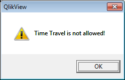
As a curiosity, QlikView 3 also had one of the best error messages ever: “Time Travel is not allowed!” Anyone can figure out when this was used?
Further reading on the Qlik history:
-
Why it is ok to scroll
A popular topic in interactive design is that of scrolling. When is it ok to scroll? Is it ok to scroll? Will people know they can scroll? What inform... Show MoreA popular topic in interactive design is that of scrolling. When is it ok to scroll? Is it ok to scroll? Will people know they can scroll? What information should be above the fold?
Above the fold
When web design began the designers were mostly trained print designers since interactive design was a new field and "web" designers didn't exist. The concept of "the fold" is one that print designers imported from newspaper design. The goal of designing "above the fold" was to keep the most important headlines and images in the top half of the newspaper so when it was folded in half at the newsstand the most enticing information would be visible and passers-by would stop and buy the paper.
With the internet the concept of designing web pages with the important information above the fold, keeping key information viewable without scrolling vertically, was met with a new challenge: monitor variety. When a publisher produces a newspaper every customer gets the same sized paper. The content that is above the fold for one reader is the same for every reader. With web design the variety of monitors, browser chromes, and resolutions is so diverse that there is no standard height for where the fold begins. The fold on my phone is alot different than the fold on my 27inch desktop monitor. The ipad has not one but two folds: one in portrait orientation but a shorter fold in landscape orientation.
Ignore the fold
People's fear is that important information will never be found if it is below the fold. That somehow people (not themselves of course) don't know how or when to scroll to find additional information so the solution must be to cram as much content at the top of a page as possible. This is ridiculous. Usability tests continue to prove that not only do users scroll but scrolling can actually improve the user experience. If people feel they are on the right track they will continue to scroll for content.
Advice:
- Design pages that are legible and attractive. If your application is well designed it encourages people to explore the document and they will scroll on their own.
- Vertical scrolling only. While users can scroll vertically as well as horizontally, generally speaking a page should do one or the other and people prefer vertical scrolling. Vertical scrolling is a more standard method of navigating content as well as the simple fact that most scroll wheels move vertically and not horizontally. Vertical scrolling is just easier.
- Monitor Resolution. To avoid horizontal scrolling you should know your intended audience. I use analytical data to find the largest number of users with the lowest common resolution and design for that. 1024x768 is still a decent standard size as well as being the resolution of the ipad in landscape orientation.
-
Ready, Set, Go with QlikView SAP Netweaver® Connector
Since we introduced the first version of the QlikView SAP connector 6 years ago, many of the QlikView customers leveraged the power of QlikView with t... Show MoreSince we introduced the first version of the QlikView SAP connector 6 years ago, many of the QlikView customers leveraged the power of QlikView with the SAP data. Through QlikView’s unique, in-memory associative technology, they are able to make SAP based business decisions with the speed of the business.
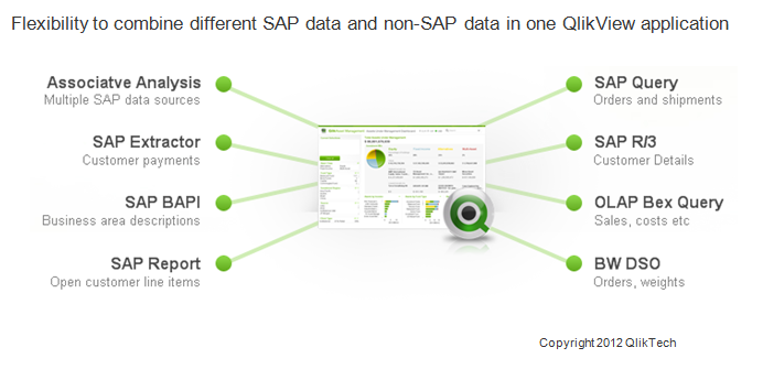
The key enabler of the solution is the certified QlikView SAP Netweaver® Connector, which can extract data from SAP® R/3®, mySAP™, SAP BW, and BEX queries into QlikView. The extracted data can be combined with non-SAP data in one QlikView application providing a 360 degree view of the business.
Let’s take a look at a business case and understand how the QlikView SAP Netweaver® Connector would help. Assume a company has various SAP Netweaver data stores and its users would like to do sales analysis across their business. With SAP Netweaver® Connector they can connect and extract data from;
- SAP BW/BI Business Explorer Query for sales information
- SAP Data Store Object (DSO) for additional order values and shipping weights
- An SAP Query to gain insight into sales organization detail metrics
- An SAP R/3 Table so they can integrate the company details into Google maps
- An SAP Extractor for customer items
- An SAP BAPI for business area lookups
- An SAP Report for customer payments
They can then create visual and flexible analysis with this data in one single QlikView application which can also integrate data from external non-SAP data sources.
QlikView provides pre-packaged QlikStart templates for SAP R/3 as well as QlikView SAP data dictionary and QlikView script builder applications. These apps would give a good head start for IT by delivering the background database information of how tables within SAP interact. It would also enable the business users to quickly realize their own data in ways they may not have envisioned before.
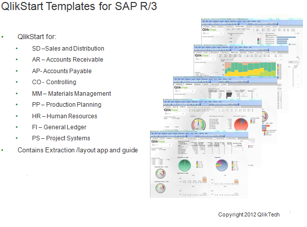
Last month we introduced a new version of the QlikView SAP Netweaver® Connector (SAP Netweaver version 5.7) with even more capabilities. If you would like to have a jump start to do Business Discovery with your SAP data, you can download the QlikStart templates from QlikCommunity.
-
Colour
Are you colourblind? Do you actually know if you’re colourblind? On the 3 occasions I have presented on this topic I have had a two male attendees ad... Show MoreAre you colourblind? Do you actually know if you’re colourblind? On the 3 occasions I have presented on this topic I have had a two male attendees admit to not knowing….. (until now...) that they were colourblind to some degree.
It is estimated that approximately 8% of men and 0.5% of women are colourblind. This large difference in probability is due to the fact that the genes that produce photopigments are carried on the X chromosome; if some of these genes are missing or damaged, color blindness will be expressed in males with a higher probability than in females because males only have one X chromosome, whereas women have two!
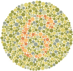
(http://en.wikipedia.org/wiki/Color_blindness)The most common way to determine level of colourblindness is to take an Ishihara test. The test consists of a number of plates that contain patterns of different coloured/shaded dots. These dots form to show numbers and shapes that you can…. or in the case of colour blind people…. can’t see.
Can you see a number in this plate…… I can’t…. I am actually colourblind, which is quite ironic considering I work with QlikView visualisations every day. A person with “normal” vision should see the number 6, colourblind people will see nothing.
You can take the tests online on a number of websites :
http://www.tedmontgomery.com/the_eye/colortst/colortst.html
http://colorvisiontesting.com/ishihara.htm
http://www.colour-blindness.com/colour-blindness-tests/ishihara-colour-test-plates/
One great example I found is the image below. I cannot see any difference between the two images due to me being Red-Green colourblind. People in the office who have perfect vision could see a massive difference in the colours.…
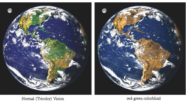
(Source: http://facweb.cs.depaul.edu/sgrais/colorvisiondefi.htm)
I often find that colour and the use of colour is something that is decided upon without much thought, hence me writing this. We have to be very careful when we decide on the colours we use in our charts and dashboards. In your QlikView objects, really think carefully about colours and the impact your choices will have on your users. Ensure you use colour blind friendly palettes, and avoid using colours that are “close” together in tone, next to each other in charts such as scatter and bar charts.
There are a number of resources on the web to help you choose friendly colour palettes..
http://jiminy.medialab.sciences-po.fr/tools/palettes/
So, choose your colours wisely, try not to use colours that are “close” together. Utilise the web resources to help determine your palette. If, like me, you are colour blind then these resources are a massive help!
Remember the number…. 8% of males are colourblind…this is a big number. This 8% could be the key decision makes or indeed the developers.
Wherever possible, colour should purvey meaning, not just used because it looks nice!
See more about this topic in this techincal brief Colour
ABY
-
Version 10 Service Release 5 is now available
Hello QlikView users,We are pleased to confirm that Version 10 Service Release 5 is now available on our download site http://eu.demo.qlik.com/downloa... Show MoreHello QlikView users,
We are pleased to confirm that Version 10 Service Release 5 is now available on our download site http://eu.demo.qlik.com/download/.
We encourage Version 10 users to move to Service Release 5, build 10.00.9516, which has undergone the longest testing and beta program of any Service Release. Release notes for Service Release 5 are attached. Always follow industry best practices when upgrading your software.
If you are using Version 9, remember support ends 31 October 2012.
Thank you for choosing QlikView!
Global Support Team
-
An Inside Look at Building QlikView Extensions
Have you ever wondered what it takes to create QlikView extensions? Here’s someone who knows: Brian Munz, QlikView extensions “imagineer,” as I think ... Show MoreHave you ever wondered what it takes to create QlikView extensions? Here’s someone who knows: Brian Munz, QlikView extensions “imagineer,” as I think of him. His official title is web technology lead on the demo and best practices team. Brian was the lead developer for the current version of demo.qlik.com and the version of AccessPoint that ships with QlikView Server in QlikView 11.
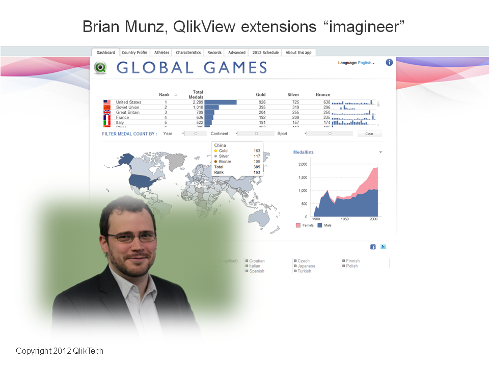
Since QlikView 10 (released October, 2010) QlikView has enabled customers and partners to create extensions; web developers can bring custom and third-party data functionality or visualizations into QlikView, where they become fully interactive just like native capabilities. “Some of the cooler extensions I’ve seen,” said Brian, “are very powerful in terms of utility. It’s not solely about custom visualizations. You can use extensions to connect on the back end to other products (like Google Analytics) or add a Twitter feed or button, or detect browsers and devices . . . those kinds of things.” Brian has built mapping extensions, which plot regions on map (colors and shades them) based on data points, using Google Maps and open source mapping tools. He also created a geolocation extension, which enables the app to find the user’s current location (check it out here).
I asked Brian what it takes to build QlikView extensions and here’s the way he put it: “A lot of work is around answering the question, ‘What am I trying to show?’ Once you figure that out, it’s about connecting to the data. Web developers often deal with SQL and MySQL — with databases with rows and columns. With a QlikView extension, the data comes into the extension the same way. Once you get the syntax right for pulling the data out of the source system, you say, ‘Oh, I know how to do this. I've done it a million times before.’ You then have to decide how the extension should communicate back to QlikView. A web developer who has worked with Ajax or JavaScript APIs can learn to do this without too much headache.”
To create extensions, you need some level of JavaScript coding proficiency. To create a fairly simple extension, you could search for code snippets and paste them together. If you want to do something more complicated, you need heavy-duty JavaScript coding skills. It also helps to have a general level of comfort with other Web technologies like CSS and HTML.
How long it takes to build a typical extension object? “There really isn't ‘typical,’” Brian said. “It depends what the extension object is. If it's enormously complicated it could take months. If it’s simple, like a marquee that scrolls across the top of the screen, showing KPIs, that could be done in an hour. Creating an extension that’s a map that has different regions of the country showing up in different colors takes longer, compared to just integrating with an existing JavaScript library.” Building QlikView extensions can take as little or long as any web project.
“The beauty of it,” Brian said, “is in the combination. Web technology is extremely powerful, and so is QlikView. Having them work together seamlessly increases the total full power of QlikView.”
-
Let the User Select
QlikView is about empowering the user. Allowing a user to freely choose what to look at and how to look at it is one of the cornerstones of Business D... Show MoreQlikView is about empowering the user. Allowing a user to freely choose what to look at and how to look at it is one of the cornerstones of Business Discovery. Another is about simplicity – which often translates into removing unnecessary technical obstacles so that the user can focus on the data and the information that lies hidden in it. This often leads to a situation where you have two different user roles: an application developer and a business user, where the application developer takes care of the data modeling aspects of the analysis and the user interacts with the data, asks questions and finds new areas of exploration.
In such a situation it is important that the developer treads carefully – he or she must remove technical obstacles without limiting the user. However, in an effort to simplify, application developers sometimes complicate things without realizing it. Let me give you a couple of examples.

Macros and Actions are features that unfortunately sometimes are used to “help” the user make the right selection. I have often seen developers create buttons that make selections and activate other sheets, or triggers that clear selections and make new selections when you leave a sheet. Such constructs are confusing for the user, who doesn’t understand why these new selections happen. Macros and Actions often obscure the QlikView logic and prevent the user from learning how to interact with data on their own.
Another area where the power to select can be taken away from the user is when Set Analysis is used. In set analysis, the developer can define a formula with an arbitrary selection that overrides the one made by the user. Often the new selection is based on the user selection. Set analysis is necessary for calculations that extend outside the user-made selection, e.g., if the user wants to make a year-to-date calculation for the time up to the selected month. Properly used, it is an extremely powerful tool that enhances the user's ability to find information in data. But I have seen cases where set analysis instead replaced the user's selection and limited the his ability to interact with data. To hard code the selection inside a formula is in some cases disrespecting the user’s intelligence!
My view is that navigation – choosing a sheet, activating sheet objects, expanding branches in pivot tables, and, most importantly, making selections – should be left to the user. Constructions that “help” the user in this area usually have the opposite effect. Instead of helping the user, they often complicate the interaction with data and confuse the user.
I am convinced that macros, actions and set analysis sometimes must be used, but these features should be used with caution. They should never be used for things that the user can do better. We live in an age of empowerment, and users want to be free to explore data in their own way and on their own.
QlikView should allow them to do just that.


