Unlock a world of possibilities! Login now and discover the exclusive benefits awaiting you.
Analytics & AI
Forums for Qlik Analytic solutions. Ask questions, join discussions, find solutions, and access documentation and resources.
Data Integration & Quality
Forums for Qlik Data Integration solutions. Ask questions, join discussions, find solutions, and access documentation and resources
Explore Qlik Gallery
Qlik Gallery is meant to encourage Qlikkies everywhere to share their progress – from a first Qlik app – to a favorite Qlik app – and everything in-between.
Qlik Community
Get started on Qlik Community, find How-To documents, and join general non-product related discussions.
Qlik Resources
Direct links to other resources within the Qlik ecosystem. We suggest you bookmark this page.
Qlik Academic Program
Qlik gives qualified university students, educators, and researchers free Qlik software and resources to prepare students for the data-driven workplace.
Recent Blog Posts
-
The Generic Load
Whenever you have a generic database, the Generic prefix can be used to transform the data and create the desired fields. A generic database is basica... Show MoreWhenever you have a generic database, the Generic prefix can be used to transform the data and create the desired fields. A generic database is basically a table where the second last column is an arbitrary attribute and the very last is the value of the attribute. In the input table below you have a three-column generic database.
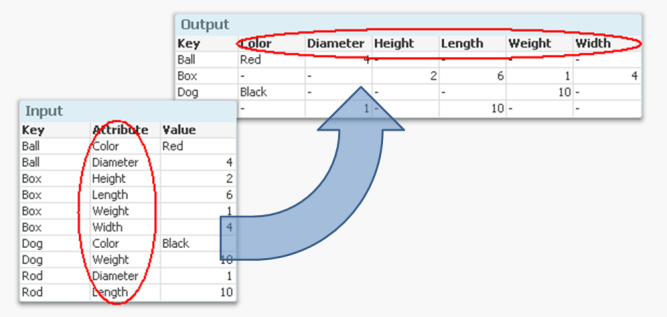
But if you want to analyze this data, it is much easier to have all attributes in separate fields so that you can make the appropriate selections. It is not very practical to have one single field for all attribute values, since you may want to make selections using different attributes at the same time.
Enter the Generic prefix.
It converts the data to a structure where each attribute is placed in a field of its own. Another way to express it is to say that it takes field values and converts these to field names. If you compare it to the Crosstable prefix, you will find that they in principle are each other’s inverses.
The syntax is
Generic Load Key, Attribute, Value From … ;
There are however a couple of things worth noting:
- Usually the input data has three columns: one qualifier field (Key in the above example), an Attribute and a Value. But you may also have several qualifying fields. If you have four or more columns, all columns except the two last will be treated as qualifying fields.
- The Generic prefix will create several tables; one table per attribute. This is normally not a problem. Rather, it is an advantage: It is the least memory-consuming way to store data if you have many attributes.
If you have more than one key, this means that you will get a composite key – a synthetic key – in the data model:
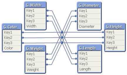
Although it looks ugly, this synthetic key is completely harmless. But it may still be a good idea to replace it with a manually created concatenated key:
Autonumber(Key1 & '|' & Key2 & '|' & Key3) as Key,
Finally, I have seen many examples on QlikCommunity where a For-Next loop is used to join together all tables created by the Generic prefix, e.g.:
Set vListOfTables = ;
For vTableNo = 0 to NoOfTables()
Let vTableName = TableName($(vTableNo)) ;
If Subfield(vTableName,'.',1)='GenericLabel' Then
Let vListOfTables = vListOfTables & If(Len(vListOfTables)>0,',') & Chr(39) & vTableName & Chr(39) ;
End If
Next vTableNo
CombinedGenericTable:
Load distinct Key From GenericDB;
For each vTableName in $(vListOfTables)
Left Join (CombinedGenericTable) Load * Resident [$(vTableName)];
Drop Table [$(vTableName)];
Next vTableName
The result is one big table that contains all attributes; a table that often is sparse (containing many NULL values) and much larger than the initial tables. And no performance has been gained… So I can only say:
You should not do this - unless you have a specific reason to.
The Generic prefix creates a set of tables that store the data in an optimal way. In most cases you should not change this. I realize, however, that there are cases where you want to transform the data further and need the data in one, unified table. Then the above scriptlet can be used.

-
Connector Factory – August 2023 Releases
Qlik Cloud Data Integration In July, we had the first major launch of connectors for Qlik Cloud Data Integration. This month, Connector Factory launc... Show MoreQlik Cloud Data Integration
In July, we had the first major launch of connectors for Qlik Cloud Data Integration. This month, Connector Factory launched more Qlik Cloud Data Integration connectors with an emphasis on health information technology and digital advertising applications:
- Epic
- Facebook Ads
- Facebook Pages
- Google Ads
- Instagram Ads
- Oracle Cerner
- Oracle OPERA
- Salesforce Pardot
- SAP Commerce Cloud
- UKG Pro
- Zendesk
Similar to last month’s release, these connectors are Generally Available (GA), covered by our standard support policies and are tagged as Preview. Contact your local support representative so we can activate the feature flag that enables all of these connectors in your tenant. The preview tag and feature flag are there because these connectors do not cover all use cases and we want to make sure you have the best experience possible.
Qlik Application Automation
We continue to add more connectors and capabilities to our no-code cloud service that streamlines workflows between SaaS applications and Qlik Cloud.
New Connector
Amazon KMS - To help you manage the lifecycle of cryptographic keys that are used to protect the data in your tenant
Updated Connectors
Qlik Cloud & Qlik Platform Ops connectors - New blocks have been added to support the automation of CMK encryption key lifecycle tasks using Qlik Cloud management APIs
Stitch connector - New blocks have been added to start a replication job and obtain logs from a replication job
Slack connector: The Raw API Request block has been depreciated.
Supported for Qlik Cloud Government
The following connectors can now additionally run within Qlik Cloud Government, which is an edition of Qlik Cloud that’s designed for government agencies who have additional required security protocols:
- Qlik Cloud Connector
- AWS KMS Connector
- Sugar CRM connector
- Pager Duty connector
- OpenAI connector
-
End of Perpetual License Sales
[Community Members, Please read this important announcement from our Chief Marketing Officer] To: Qlik CommunityRe: End of Perpetual License SalesDat... Show More
[Community Members, Please read this important announcement from our Chief Marketing Officer]To: Qlik Community
Re: End of Perpetual License Sales
Date: March 12, 2021As we’ve seen over the past several years, the market has shifted to a subscription economy with most consumer and business technology being offered under a subscription model. The vast majority of customers have embraced this new model as it enables them to align spend to ongoing operating budgets, close the gap between “expense” and “value,” and ensure suppliers are continuously delivering the value and experience to justify their technology spend. Businesses that build strong relationships with their customers, and give them the innovation and support they need, see expanded adoption and strong renewals.
Qlik® has been on this journey over the past three years. In 2020, more than 75% of our new license bookings were subscription based. As we expand our offerings in SaaS, the subscription model even more importantly reflects a close relationship between you and Qlik.
As we further align with market trends and strive to deliver ongoing value to our customers, we are making the following changes:
- As of April 1, 2021, Qlik will no longer offer perpetual licenses to new or existing customers. This includes Qlik Sense®, QlikView®, Qlik Data Integration and all add-on products.
- Customers on perpetual licenses may continue to renew their annual maintenance. Qlik is not actively forcing customers to move to a subscription model; however, customers who wish to expand must do so on a subscription basis.
- Qlik Sense customers may add subscription users to an existing perpetual Qlik Sense Enterprise site1. We support a mixed environment, but many of our customers decide to convert their entire environment to subscription for an optimal experience.
- To simplify product licensing, many customers are choosing to convert fully to subscription. We are implementing two easy conversion options:
- A Client-Managed subscription with a 3-year term
- A SaaS subscription with a 3-year term
- Token customers are encouraged to move to the Professional/Analyzers license model by maintenance renewal and we have added additional flexibility for customer that use Login Access.
- We are also making the move to subscription easier for QlikView® customers with the continuation of our popular Analytics Modernization Program (AMP). We have established this group in the Qlik Community where you can continue the conversation.
At Qlik, driving innovation to meet the needs of our customers has always been at the forefront of what we do. Moving fully to a subscription model for both client-managed and SaaS offerings will result in greater customer engagement, driving innovation and even greater value to our customers. Please see FAQ attached for additional details.
[1] Some conditions apply such a being on the current Professional/Analyzer license model with Qlik Sense April 2019 or later and using Qlik Licensing Service (QLS).

-
WoWizer Data Access Auditor
WoWizer Data Access Auditor Wowizer Qlik Sense offers a comprehensive approach to granting role-based access through streams, apps, sheets, and ... Show MoreWoWizer Data Access AuditorWowizer Qlik Sense offers a comprehensive approach to granting role-based access through streams, apps, sheets, and row and column-based section access. However, there is currently no way to verify what the user is seeing in real time, aside from asking them to share their screen. As a result, when a user experiences an issue, the Qlik champion is required to reset their access.
Discoveries
Access control and Governance is at the heart of any Enterprise BI software such as Qlik. Several times granular access control is the real deal breaker in the decision-making of software choice.
For example, ensuring that only the Sales Team can see the Revenue sheet,
The sales reps can see just their own sales numbers,
Sales managers can see for their team and Region heads can see for their region is critical.
Impact
WoWizer DAA empowers organizations to embrace proactive access validation and compliance within their Qlik deployments. Leveraging its cutting-edge capabilities, Wowizer DAA addresses the limitations of the existing system and brings a host of benefits to the table.
Audience
Developers, business leaders, and regulatory authorities alike can all find common ground in the value that Wowizer DAA brings to the table. Secure, compliant, and confident that's the new standard that Wowizer DAA sets for Qlik dashboard auditing.
Data and advanced analytics
Business leaders must ensure that development teams comprehend the requirements and deploy them correctly.
In large organizations with multiple hierarchies, there may be ambiguity regarding which rule will take precedence.
Qlik champions face challenges in verifying that what they have implemented is accurate and has been deployed in production.
Data Protection Officers require testing evidence to comply with regulations such as GDPR.
🔑 Explore Wowizer Data Access Auditor and enhance your data security today! Get started with a FREE and visit the official website for more information.
Demo
YouTube: Dive into Wowizer DAA
Website: WoWizer.com 🔗
Data Access Auditor FREE: Free Download 🆓
Github Page: https://wowizer.github.io/DAA 📚
-
Qlik Data Integration Newsletter - August 2023
Welcome to August's Qlik Data Integration newsletter. Each month, we cover one endpoint and share our top resources, best practices, release updates a... Show MoreWelcome to August's Qlik Data Integration newsletter. Each month, we cover one endpoint and share our top resources, best practices, release updates and upcoming webinars.
Subscribe to the Qlik Data Integration topic to be notified of future editions!
Index
- Resource Highlights
- Reminder! Qlik Replicate Endpoint Retirement
- Knowledgebase Article
- Endpoint Spotlight: Databricks
- New Issues Reported
- Tips!
- Release Updates
- Fixes
- Upcoming Enhancements
- Troubleshooting tips
- Analyze Qlik Replicate Logs
- Qlik Data Integration Product End of Life Versions
Resource Highlights
Reminder! Qlik Replicate Endpoint Retirement
As of July 31st, 2023, the following endpoints have been retired:
Source Endpoints:
- HP Non-Stop Source
- Open VMS RMS Source
- Hadoop Source
Target Endpoints:
- MapR Target
- MapR Streams Target
- MS APS PDW Target
- SAP Sybase IQ Target
- HP Vertica Target
- Actian Vector Target
- Netezza Target
- Pivotal Greenplum Target
See Retirement for Specific Qlik Replicate Endpoints for details.
Knowledgebase Article
Endpoint Spotlight: Databricks
Find our latest knowledge base articles for Databrick endpoints.
New Issues Reported
- Error SSL_connect: wrong version number when using Databricks Lakehouse (Delta) as target
- Performing operations in transactions apply mode is not supported with Databricks Lakehouse (Delta) as target
- The Apply Changes replication mode supports tables with a Primary Key only. For solutions see Qlik Replicate with Databricks Lakehouse (Delta) as target: Performing operations in transactions apply mode is not supported in log.
- Table is failing on full load when loading into Microsoft Azure Databricks Delta Target
- Qlik Replicate Server crashes when browsing databases in Microsoft Azure Databricks Target
- Clicking Browse in the database endpoint settings of a Microsoft Azure Databricks target crashes the Qlik Replicate server. Find the resolution in Qlik Replicate Server crashes when browsing databases in Microsoft Azure Databricks Target.
Tips!
- Qlik Replicate and Databrick Unity Catalog feature flag support
- Qlik Replicate added support for Databricks Unity Catalog using feature flag from 2022.11 SP02. See Qlik Replicate added support for Databricks Unity Catalog using feature flag from 2022.11 SP02 for details.
- Qlik Replicate: Databricks Operations per second is over the account limit
- Qlik Replicate tasks may fail with Operations per second is over the account limit errors. Find the resolution in Qlik Replicate: Databricks Operations per second is over the account limit.
- Best Practice: Qlik Replicate: Databricks Delta Wstring data type truncation
- Starting with Databricks Delta Driver version to 8.x and above, Varchar data type will be used for strings. Varchar data type is no longer limited by this character size so no truncation will occur when Wstring data type is used with limits higher than 255 characters.
Release Updates
Fixes
Qlik Replicate May 2023 patches
Component/Process: Databricks (Cloud Storage)
Description: When reconnecting after recoverable error on uploading file, the last file does not get uploaded, resulting in missing data.
Component/Process: Databricks Lakehouse (Delta)
Description: When using merge, if one of the columns in a Unique Index was NULL the changes would not be applied correctly. The issue was resolved using a Feature Flag at task and server level.
Upcoming Enhancements
Qlik Replicate August 2023 IR
- New Confluent Endpoint (based on Kafka)
- S3 authentication support with AWS IAM Roles Anywhere on S3/Redshift endpoints
- Ability to Set Isolation Level on ODBC with CDC (Ability to Set Isolation Level on ODBC with CDC)
Qlik Replicate November 2023 IR
- Expose stream buffer tuning parameters in task settings (Replicate & QEM - Expose stream buffer tuning parameters in task settings )
- Confluent Schema Register using BOTH authentication methods (Public Key + Username & password)
- Snowflake - Support Transactions in Upsert Mode
- Boolean Data Type support for PG sources and Bit support for SQL Server targets
- Google BigQuery - Secure current authentication (no longer have credential files on customer file system)
- Aurora PostgreSQL source - without the "superuser" role certification
- Azure Database for MySQL Flexible Server - Source & Target Certification
- MariaDB 10.6 to 10.11 versions on MySQL - certification
- MariaDB 10.6 version on Amazon RDS - certification
Troubleshooting tips
Analyze Qlik Replicate Logs
An evergreen pair of articles helps you read and analyze Qlik Replicate log files:
How to analyze a Qlik Replicate log
List of the error types in Qlik ReplicateQlik Data Integration Product End of Life Versions
Qlik Release Qlik Replicate / Enterprise Manager End of Support Date Qlik Compose End of Support Date February 2021 November 2020 SR1 November 2022 February 2021 February 2023 May 2021 May 2021 May 2023 May 2021 May 2023 August 2021 May 2021 SR1 May 2023 August 2021 August 2023 November 2021 November 2021 November 2023 November 2021 November 2023 For more information, see Qlik Product Lifecycles.
-
Working with the Qlik REST Connector, Pagination and Multiple JSON Schemas
Recently, I worked with a Qlik Community member to help them understand the Qlik REST Connector with Qlik Sense and QlikView. At first it appeared sim... Show More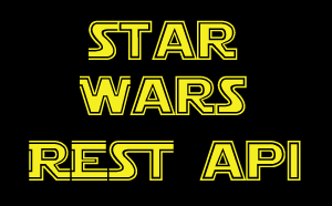 Recently, I worked with a Qlik Community member to help them understand the Qlik REST Connector with Qlik Sense and QlikView. At first it appeared simple, but then he soon realized he needed to understand a bit more about how the data came back (the response), what the pagination settings were (pages of data used to retrieve more rows) and finally how to link (join, associate) other attributes that came back from the results of multiple REST API endpoints / resources. We got it all working and the results were pleasing. Needless to say were able to perform text analytics from a barrage of Facebook comments. However, as I finalized all this in my head, I wanted to share what I've learned but in the simplest way possible. So I decided to find a very simple, publicly available RESTful service API in which I can demonstrate my findings easily. The below video presents those findings in a educational and entertaining way using the Star Wars API. Yes, that is correct, I said the Star Wars API. As a bonus, stick to the end of the video to see the Media Box Extension in action.
See this video on YouTube as well. Using the Qlik REST Connector - Pagination and Multiple JSON Schemas - YouTube

Do you know of other simple and fun, publicly available RESTful services? Share them with the Qlik Community in the comments below.
Regards,
Michael Tarallo (@mtarallo) | Twitter
Qlik
Special shout out to: Paul Hallett (@phalt_) | Twitter - for creating an awesome resource http://swapi.co/about that allowed me to easily demonstrate the Qlik Sense REST Connector.
Resources used in this video:
- Qlik Sense Desktop: Free Data Visualization Tool | Qlik Sense Desktop
- https://www.swapi.co/ - Star Wars Rest API
- Endpoint People:
http://swapi.co/api/people/ - Endpoint Species:
http://swapi.co/api/species/ - Qlik Branch - Media Box Extension
- Star Wars REST API - Qlik Sense App (attached below)
- Qlik Sense - Introduction to Extensions (video)
Other Resources:
If using Qlik Sense Desktop please copy .qvf file to your C:\Users\<user profile>\Documents\Qlik\Sense\Apps and refresh Qlik Sense Desktop with F5. If using Qlik Sense Enterprise Server please import .qvf into your apps using the QMC - Qlik Management Console.
Disclaimer: Star Wars, the Star Wars logo, all names and pictures of Star Wars characters, vehicles and any other Star Wars related items are registered trademarks and/or copyrights of Lucasfilm Ltd., or their respective trademark and copyright holders.

-
Qlik Cloud Analytics brings Capacity Model Pricing
We are pleased to announce new capacity model pricing for Qlik Analytics. The new pricing model is an extension of the capacity functionality we intro... Show MoreWe are pleased to announce new capacity model pricing for Qlik Analytics. The new pricing model is an extension of the capacity functionality we introduced earlier this year for data integration.
We believe this pricing model aligns with modern customer expectations and will:
- Provide more predictability as you plan deployments
- Make it easier to take advantage of available capabilities in Qlik Cloud
- Give more flexibility to organizations wanting to expand analytics usage
Today, we offer three capacity pricing tiers: Standard, Premium, and Enterprise.
You can find additional details on our website Qlik Cloud® Analytics Plans & Pricing
With the Qlik Cloud capacity model, the primary value meter is Data for Analysis or Data Moved, except for Qlik Cloud Analytics Standard where Full Users is the value meter.
See in detail what it means here: Subscription value meters
Additionally, we understand the importance of Qlik Cloud administrators to monitor their tenants' data consumption. Therefore, we are pleased to introduce:
- A monitoring dashboard
Located in the home pane of the Management Console, this overview provides a summary of user allocations, data capacity consumption, reports, and other capacity-based resources to understand your usage. - A specialized Qlik Sense Application
For more in-depth analysis, a detailed consumption report is delivered in a Qlik Sense Application allowing you to further understand how your organization uses Qlik Cloud.
For more information on how to deploy the report, please see our Qlik Help for details: Monitoring usage with detailed consumption reports.
Additional resources:
- Capacity Pricing and Usage Telemetry in Qlik Cloud available
- Qlik Cloud® Analytics Plans & Pricing
- Qlik Cloud Analytics specifications and capacity
- Subscription value meters
- Monitoring resource consumption
- Monitoring usage with detailed consumption reports
Thanks for choosing Qlik!
Qlik Global Support
-
The Crosstable Load
Whenever you have a crosstable of data, the Crosstable prefix can be used to transform the data and create the desired fields. A crosstable is basical... Show MoreWhenever you have a crosstable of data, the Crosstable prefix can be used to transform the data and create the desired fields. A crosstable is basically a matrix where one of the fields is displayed vertically and another is displayed horizontally. In the input table below you have one column per month and one row per product.
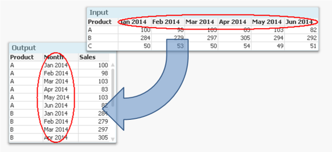
But if you want to analyze this data, it is much easier to have all numbers in one field and all months in another, i.e. in a three-column table. It is not very practical to have one column per month, since you want to use Month as dimension and Sum(Sales) as measure.
Enter the Crosstable prefix.
It converts the data to a table with one column for Month and another for Sales. Another way to express it is to say that it takes field names and converts these to field values. If you compare it to the Generic prefix, you will find that they in principle are each other’s inverses.
The syntax is
Crosstable (Month, Sales) Load Product, [Jan 2014], [Feb 2014], [Mar 2014], … From … ;
There are however a couple of things worth noting:
- Usually the input data has only one column as qualifier field; as internal key (Product in the above example). But you can have several. If so, all qualifying fields must be listed before the attribute fields, and the third parameter to the Crosstable prefix must be used to define the number of qualifying fields.
- It is not possible to have a preceding Load or a prefix in front of the Crosstable keyword. Auto-concatenate will however work.
- The numeric interpretation will not work for the attribute fields. This means that if you have months as column headers, these will not be automatically interpreted. The work-around is to use the crosstable prefix to create a temporary table, and to run a second pass through it to make the interpretations:
tmpData:
Crosstable (MonthText, Sales)
Load Product, [Jan 2014], [Feb 2014], … From Data;
Final:
Load Product,
Date(Date#(MonthText,'MMM YYYY'),'MMM YYYY') as Month,
Sales
Resident tmpData;
Drop Table tmpData;
Finally, if your source is a crosstable and you also want to display the data as a crosstable, it might be tempting to load the data as it is, without any transformation.
I strongly recommend that you don’t. A crosstable transformation simplifies everything and you can still display your data as a crosstable using a standard pivot table.
-
HR ANALYTICS
Goal Achieved for Hr department: Employee Data Compiling Salary Information Employee Performance Details on any disciplinary action taken against an ... Show MoreGoal Achieved for Hr department:
- Employee Data
- Compiling Salary Information
- Employee Performance
- Details on any disciplinary action taken against an employee
- Smooth Reporting experience across dashboard
Use Case:
Target Area :
- Display’s important HR metrics using interactive visualizations.
- It helps the HR department to improve recruiting processes, optimize the workplace management as well as to review the overall employee performance as per manager’s rating.
Requirement :
- Dashboard should be representation of key measures of human resource
- Employee achievements
- Productivity and other factors important to the organization
- Factors measured include hiring, performance management and employee attrition report
Solution & Benefits :
- In this dashboard we have showcased a basic dashboard with all employee details form their joining to performance/rating.
- HR Admin can add Employee who have applied for separation & can also retain the employee
- Custom extension is used to make the reports
- MIS report
- Performance / Rating report
- Input Form for adding data to database
Key KPI:
- Joinee/Separation Report
- Performance Report
- Employee Salary
- Employee Outgo
Highlight of this Application:
- Table/Report Extension
- Variance Bar Chart Extension
- Breadcrumb Extension
- Circular Gauge Extension
- Oval KPI Extension
- Image Color Fill Extension
- Custom Theme developed for this Application
- AdHoc report made using show/hide option in table object
-
A new look and feel is here!
Hello Qlik Community! It was time for a change - time to modernize and simplify. We are so excited and proud of the updates pushed out today to give Q... Show MoreHello Qlik Community!
It was time for a change - time to modernize and simplify. We are so excited and proud of the updates pushed out today to give Qlik Community a fresh look!
There are so many changes to share. So, sit back, relax, and grab a beverage of choice. This is going to be a long blog 😊
Sticky Navigation
The navigation will stay in place when you’re scrolling down the page.
Simplified banner with personalization
The banner went is now a solid color with two focal points: a welcome message that differs on whether you are logged in or not and the search bar.
We received feedback that the search bar blended too much with the background and agreed! It is now a prominent feature on the banner. We also rounded the edges to give it a modern feel. What do you think?
When not logged in, you will see ‘Welcome to Qlik Community! But when logged in (and we hope you are!), the message changes to ‘Hi, <username>’. Personalization has been on our radar for some time now and we are so happy it is finally live!
Announcement banner
The announcement banner went from Qlik purple to Qlik gray. Yes, the purple was more prominent, but it did not allow us to customize announcements. We were very limited in the colors that we could use. A gray banner will allow us to use different colors to call out the exciting things happening at Qlik.
New Homepage layout
Discussions are now at the top! You can keep track and of what your peers are asking and be a part of the conversation more easily!
The previous 3 cards and carousel have been condensed to one carousel on the right. Use this area to get started on Qlik Community and view upcoming events!
In lieu of the homepage cards, we added the Resources link back in the top left.
Updated Leaderboard
‘Leaderboard’ is now ‘Weekly Leaderboard’ because that is what it is! A kudo-based weekly leaderboard that gives everyone the opportunity to shine! Check it regularly to see if you make the Top 5! And who knows, you might one day end up as Sue’s Featured Member because of it 😉
Hear from our Customers
Read more about how our customers have been successful with Qlik!
Are you a Qlik customer and interested in sharing your story? Send your submission to reference@qlik.com, if selected, the team will get back to you.
I think that’s it for the Homepage. Now on to the rest!
Landing pages
The banner on the landing pages for forums, groups, Support, Ideation, Qlik Gallery, blogs, events, programs under Learn and the Partner area are the same color as the homepage. We kept the existing images and they really pop now!
Refreshing banner descriptions
We are updating the banner descriptions throughout Qlik Community to explain the area simply and concisely.
Post pages
We went the opposite with posts – we removed the top banner completely. It took up too much space and now it looks really crisp. Removing the banner will also help improve SEO by allowing your posts to be indexed properly. This will result in more relevant search results. This is a change for all types of posts: forum, release notes, support articles, etc.
I’ll also add that when you’re create a new post, you will still see the landing page banner. However, when you’re editing your post, it will look like the post page.
I’m interested in your thoughts about this change specifically. Are the post pages too simple or different? Do we need to add a slim banner back without any text? Let us know your thoughts in the comments.
Removed Ideation Breadcrumbs
The Ideation area has had a huge overhaul over the past few months. We removed the breadcrumbs from this area to lessen confusion.
New Featured Member Badge
Featured Members will receive a new badge along with their Community shoutout! This badge has been awarded retroactively as well.
WOW! That is so much change at one time! It’s one of our biggest updates since redesigning the navigation.
Accessibility has been top of mind with the redesign and we tried to make the color choices as accessible as possible. While most areas of change will meet or exceed WCAG compliance ratios for color contrast, some might be a tad below that ratio. We will continue to work on this as Qlik Community is for everyone.
Change can be hard. But we hope you enjoy these changes as much as we do. Please let us know any feedback in the comments below. We would love to hear from you.
Your Admins,
-
Focusing on Scatter Plots
Throughout my blog entries, we have taken a tour through the catalog of charts that Qlik has to offer. We have covered bar charts, line charts, pie an... Show MoreThroughout my blog entries, we have taken a tour through the catalog of charts that Qlik has to offer. We have covered bar charts, line charts, pie and Sankeys, today we’re going to be diving into one of the lesser known, but still powerful, charts: Scatter Plots.
Scatter plots are used to show the relationship between two quantitative variables. The scatter plot is usually made of three elements, the X axis, the Y axis, and a point to show a data point shared between the two axes. Additional information can be shown on the chart in the form of the size of the data points, in Qlik Sense these data points are called ‘bubbles'.
How can you use a Scatter plot chart to visualize your data?
To demonstrate the capabilities of a scatter plot, we’ll look to an example found in the CRM app. This app was developed to showcase data including sales, numbers of customers and opportunities. This app would help a manager of a company see what parts of their business are doing well, and which need improvement.
Above we have the scatter plot built for this app, as well as the view of the ‘Advanced options’ of the chart to give a clearer view of which data is being shown and how. Beginning with our X axis, # of Customers and the Y axis which is Opportunity Amount. With the interaction of these axes, we’re shown that the higher and more to the right that a data point would be, the better for the company that data point would be (more money, more customers), and the opposite for down and to the left (less money, less customers). Additionally, the name of the Sales Person is assigned to the ‘Bubbles’ in this chart. Finally, the size of the bubbles shows the Amount of Opportunities won.
What information can we gain from this example?A manager looking at this chart would quickly be able to determine who are the top and bottom performers and in which way. At a glance, the manager could see two outliers, Gonzalo Geary and Val Conforto, for two different reasons. According to our chart Gonzalo is adept at gaining customers, close to around 230 (double that of their closest competitor), with a larger number of opportunities won compared to his fellow salespeople. Val conversely shows that while she does not have as many customers as Gonzalo does, she makes the most out of the customers she does have, ranking highest in the amount of her opportunities.
That is the power of the scatter plot giving users insight into data points between two metrics. If the manager had only looked at Opportunity Amount, they might think Gonzalo as an average salesperson, while the same could be said for Val if looked at through the lens of # of Customers. Instead, the scatter plot allows for the manager to see how these individuals excel, and where they require additional assistance or training.
Hopefully this blog entry has led to a few ideas of how you can use scatter plots to visualize your own data. How can you use scatter plots to help you or your company? Is there something I might have missed? Leave it in a comment down below. -
【オンデマンド配信】Honda における “データドリブン型” 課題解決の進め方
企業のビジネス活動において、データはこれまで以上に必要不可欠な資産となっています。増え続けるデータを管理・統合・分析し、データでアクションを起こす必要性が増している現在、成功している企業はどのようなデータ戦略を実行しているのか?本 Web セミナーシリーズでは、Qlik でデータからアクションを起こ... Show More企業のビジネス活動において、データはこれまで以上に必要不可欠な資産となっています。増え続けるデータを管理・統合・分析し、データでアクションを起こす必要性が増している現在、成功している企業はどのようなデータ戦略を実行しているのか?
本 Web セミナーシリーズでは、Qlik でデータからアクションを起こすデータ主導のビジネスで成功しているお客様より、課題から導入の経緯、デモンストレーション、活用例などをご紹介します。※ 参加費無料。パソコン・タブレット・スマートフォンで、どこからでもご視聴いただけます。
オンデマンド配信:
Honda における “データドリブン型” 課題解決の進め方本田技研工業株式会社では、全社共通データ分析ツールとして Qlik sense を導入し 7,000 超のユーザーが日々利用しています。 本セッションでは、データ駆動型のビジネスを実行するための体制と、その考えに基づき実践した Qlik データソンでの取り組み事例を紹介いたします。 第 3 回 Qlik データソンにおいては、ユーザー部門で最優秀賞を受賞。5 時間という限られた時間の中でいかにして成果を出したのか、ビジネス課題を解決するためのデータ分析の取り組みと Qlik の活用についてお話しします。
-
Increase user adoption of your Qlik Apps with Custom Application Training
Now that you’ve created a new Qlik application, give your users the skills they need to realize new levels of insight through discovery. Benefit from ... Show MoreNow that you’ve created a new Qlik application, give your users the skills they need to realize new levels of insight through discovery. Benefit from our expertise and best practices to launch your application with maximum success.
Increase user adoption and your Qlik ROI with targeted Custom Application Training, specially designed for your users to learn your Qlik application.
We design training specifically for your business users. We deliver everything you need to ensure everyone gets up and running with Qlik as quickly and completely as possible. Increase your application adoption and the overall value of your investment in Qlik with Custom Application Training.
Custom videos designed specifically on your application will show your team what they might see in their own day-to-day work which will better promote adoption. As they make Qlik part of a regular decision-making process, your team will innovate and help your business stay competitive in the market.
- Learning consultant to identify your use cases and deliver learning resources for your team’s success
- Targeted self-paced learning developed by an Instructional Designer on your Qlik applications
- Additional introductory videos and reference materials to kick-start users
- Qlik launch plan with communication templates and best practices to successfully launch Qlik apps into your organization
Contact us at education@qlik.com if interested in learning more about Custom Application Training. Happy Learning!

-
Using Direct Query with MS Azure SQL - New Connectors for MS SQL, Azure SQL, Pos...
Direct Query is a new capability in Qlik Sense SaaS that enables analytics apps to generate SQL queries directly against cloud databases as the use... Show MoreDirect Query is a new capability in Qlik Sense SaaS that enables analytics apps to generate SQL queries directly against cloud databases as the user interacts with data through visualizations and dynamic filtering.
Resources:
Playlist: https://www.youtube.com/playlist?list=PLW1uf5CQ_gSqF5bcmbBrk1q7Q4-h899V1
Direct Query Part 1: https://youtu.be/gBADJQXcIgI
Direct Query Part 2: https://youtu.be/15uIcFY6DJc
-
Qlik Cloud Analytics will no longer function with outdated version of Microsoft ...
Starting from the week of August 14th 2023, Qlik Cloud Analytics will no longer be able to utilize non-supported Microsoft SQL data sources. This affe... Show MoreStarting from the week of August 14th 2023, Qlik Cloud Analytics will no longer be able to utilize non-supported Microsoft SQL data sources. This affects Microsoft SQL Server 2012 and earlier.
Microsoft SQL Server 2012 and earlier are not supported by Microsoft (see SQL Server lifecycle dates). If you are unclear which version of SQL Server you have, use one of the methods described in this Microsoft article.
Upcoming Changes
Qlik Cloud Analytics is performing a required security update in August 2023, resulting in no access to Microsoft SQL Server 2012 or earlier. This update will also result in no support for TLS version 1.1 and earlier as well as any deprecated cryptographic functions.
Additional Information
While client-managed and standalone web connectors are not directly affected by this change, they do not support outdated versions of Microsoft SQL Server, such as MS SQL 2012. See Supported Microsoft SQL Server versions.
For additional information, see Outdated, out of support versions of Microsoft SQL Server and Qlik Cloud Analytics.
Thanks for choosing Qlik!
Qlik Global Support
-
Head Back to School with Qlik Continuous Classroom
What better time to get started or refresh your Qlik skills, earn a qualification badge and more! Need a Recommendation on Getting Started? A great... Show MoreWhat better time to get started or refresh your Qlik skills, earn a qualification badge and more!
Need a Recommendation on Getting Started?
A great place to begin is with the Orientation to the Qlik Continuous Classroom course. This course leads you through how to make the most of the Qlik Continuous Classroom experience.
Join a live ‘Welcome to the Continuous Classroom’ webinar to get an introduction to all that the Qlik Continuous Classroom has to offer. Start with our targeted, prescriptive new user learning plans. We take the guesswork out of what to do next in your learning journey!
Maybe English isn’t Your First Language?
We’ve got You Covered with Machine Translations in 14 languages!
Select a language from the language dropdown on the top right-hand side of Qlik Learning Portal. Learn more on how you can enhance your learning with Machine translations!
Earn Achievement Badges!
Complete a series of courses in the Qlik Continuous Classroom and you can earn an Achievement badge to share to your social media.
Continue with Advanced Topics delivered by Expert Instructors
Register for an upcoming session. If you are unable to attend a session, be sure to register to access the on-demand recording after.
Happy Learning!
-
Decomposition Tree Features
Decomposition Tree Features AnyChart — Extensions for QS Discover the Decomposition Tree chart in Qlik! Explore all major features of the unique... Show MoreDecomposition Tree FeaturesAnyChart — Extensions for QSDiscover the Decomposition Tree chart in Qlik! Explore all major features of the unique Decomposition Tree Extension for Qlik Sense in this Qlik demo app.Discoveries
Efficiently visualizing data across multiple dimensions, a decomposition tree lets you easily disaggregate it and drill down into the dimensions in any order to find out what makes up a value.
Impact
Explore all major features of the Decomposition Tree Extension for Qlik Sense as you look into fictional business data. See working with negative values, different view modes, and more demonstrated in action.
Audience
Business analysts and all levels of management. Also, all who want to see how a decomposition tree works in Qlik Sense.
Data and advanced analytics
This application was built with the Decomposition Tree extension for Qlik Sense. The dataset is fictional.
-
Bullseye Chart Features
Bullseye Chart Features AnyChart — QS Extensions Bullseye charts are helpful in exploring product (drug) pipelines. Discover all major features ... Show MoreBullseye Chart FeaturesAnyChart — QS ExtensionsBullseye charts are helpful in exploring product (drug) pipelines. Discover all major features of the Bullseye Chart extension for Qlik Sense in this Qlik demo app.Discoveries
Explore all major features of the Bullseye Chart extension for Qlik Sense as you look at a fictional drug pipeline that graphically represents how clinical trials progress through phases. See flexible axes and grids, customizable labels and markers, conditional coloring, HTML tooltips, and much more demonstrated in action.
Impact
A bullseye chart, resembling a target, serves as a concise visual aid for tracking progress across multiple categories. Its intuitive design enables efficient data comparison, simplifying complex information presentation and facilitating quicker decision-making.
Audience
Business analysts, project managers, executives, and other stakeholders who need to track and understand progress across various factors in a clear and concise visual format. Anyone interested in exploring the capabilities of bullseye charts within Qlik Sense.
Data and advanced analytics
This application features a bullseye chart built with AnyChart's Bullseye Chart extension for Qlik Sense, utilizing fictional data to illustrate its capabilities.
🔗 >> VIEW IT LIVE OR DOWNLOAD (.QVF) <<
-
Now you can share Collaborative Notes with Control!
You will now be able to select who you share your note with. This is allowed with a named user list that can either View or Edit. If your note is in... Show MoreYou will now be able to select who you share your note with. This is allowed with a named user list that can either View or Edit. If your note is intended to be Public and visible to all space users the note share state can be updated to Public View or Public Edit.
This update will allow many of our customers to comfortably enable the Notes feature for broad user adoption. As you start to use the Notes capability to drive and enhance your collaborative analysis, we’d love to hear how Notes can continue to drive improved business decisions.
Check out a detailed overview from Andrew Kruger, Product Manager
Please reach out and share your Notes capability feedback on Qlik’s ideation platform
-
Calling all Admins who are new to Qlik Sense SaaS!
Welcome to Qlik, we’re excited to have you onboard and can’t wait to see how our solutions will help achieve your data and analytics goals. Ready to... Show MoreWelcome to Qlik, we’re excited to have you onboard and can’t wait to see how our solutions will help achieve your data and analytics goals.
Ready to take the first step? Start Here!
We’ve gathered the essential resources for you to follow and set up your own tenant along the way. With comprehensive implementation steps, a Go Live Checklist, and training recommendations for your end users, we’ll guide you through getting your environment up and running for your organization.
Log into Qlik Continuous Classroom with your Qlik Account to access this free, curated onboarding content for Qlik Cloud Admins.
If you need help as you get started, chat with our Support Engineers 24/5.
Happy learning!
Qlik Customer Success