Unlock a world of possibilities! Login now and discover the exclusive benefits awaiting you.
Analytics & AI
Forums for Qlik Analytic solutions. Ask questions, join discussions, find solutions, and access documentation and resources.
Data Integration & Quality
Forums for Qlik Data Integration solutions. Ask questions, join discussions, find solutions, and access documentation and resources
Explore Qlik Gallery
Qlik Gallery is meant to encourage Qlikkies everywhere to share their progress – from a first Qlik app – to a favorite Qlik app – and everything in-between.
Qlik Community
Get started on Qlik Community, find How-To documents, and join general non-product related discussions.
Qlik Resources
Direct links to other resources within the Qlik ecosystem. We suggest you bookmark this page.
Qlik Academic Program
Qlik gives qualified university students, educators, and researchers free Qlik software and resources to prepare students for the data-driven workplace.
Recent Blog Posts
-
Stacked Waterfall Chart Demo
Stacked Waterfall Chart Demo AnyChart — QS Extensions Discover the Stacked Waterfall Chart option! Stacked waterfalls are invaluable for visuali... Show MoreStacked Waterfall Chart DemoAnyChart — QS Extensions Discover the Stacked Waterfall Chart option! Stacked waterfalls are invaluable for visualizing cumulative data changes, simplifying the analysis of how values accumulate or deduct not only by categories but, notably, also by subcategories visualized as stacked sub-bars. They provide a clear view of data trends, aiding informed decision-making by highlighting the impact of these changes. Explore all major features of AnyChart's Advanced Waterfall Chart extension for Qlik Sense in this Qlik demo app.
Discoveries
* Cumulative Data Analysis: Understand the cumulative effect of added and subtracted values, categorized by both main and subcategories.
* Explore Major Features: Dive into visualizing sub-bars within main bars, different data modes, customizable labels, and more.
Impact
* Enhanced Data Insights: Gain precise, granular insights into data trends.
* Improved Decision-Making: Make informed decisions by understanding data effects over categories and subcategories.
Audience
This app is designed for data analysts, business professionals, and anyone interested in exploring the capabilities of advanced waterfall charting within Qlik Sense.
Data and advanced analytics
The application showcases stacked waterfall charts built with AnyChart's Advanced Waterfall Chart extension for Qlik Sense using a fictional dataset, providing a practical demonstration their capabilities for data analysis.
-
Now Live: Qlik Sense SaaS Simplified Authoring – Analytics Creation for Everyone
At Qlik, we continually look for ways to improve the user experience and make it easier for you and your organization to make data-driven decisions an... Show MoreAt Qlik, we continually look for ways to improve the user experience and make it easier for you and your organization to make data-driven decisions and take action. Feedback from customers like you combined with technology from our 2020 Knarr Analytics acquisition drove the features of Simplified Authoring, which include:
Assets Panel: Classifies field types and, when fields are expanded, shows values; also displays master items (dimensions and measures), which can be selected for your chart or visualization.
Properties Panel: Includes a Data area; Autochart, which provides more than 30 visualization choices; allows you to include or exclude dimension values by ticking boxes; and Presentation area, where you can choose sorting, coloring, labeling, styling, tooltips, and axis options.
SmartGrid: Acts as a placeholder for your visualizations, which automatically adjusts the size, so they fit within your sheet. You can easily add charts by clicking on “+” to the right and below the grid.
Data Table: Explore your data and inspect fields and values from tables loaded within Qlik Sense SaaS. Make selections within the table to pinpoint areas of interest and analysis.
If you prefer the classic look and feel or require the full set of properties for your use cases, simply click on the toggle in the upper right-hand corner for Advanced Authoring.
Check out the following Simplified Authoring resources for more information:
We will continue to build out more capabilities as we obtain additional feedback on Simplified Authoring.
-
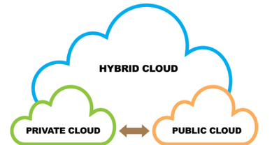
「ハイブリッドクラウド」とは?(Qlik Blog 抄訳)
ブログ著者:Adam Mayer (本ブログはLittle Fluffy Hybrid Clouds の抄訳です) 今日、マルチクラウドの導入、カスタマイズされたクラウドアーキテクチャ、クラウドプラットフォームとの連携など、様々なクラウドで溢れているようです。ところで、ハイブリッドクラウドの本当... Show Moreブログ著者:Adam Mayer (本ブログはLittle Fluffy Hybrid Clouds の抄訳です)
今日、マルチクラウドの導入、カスタマイズされたクラウドアーキテクチャ、クラウドプラットフォームとの連携など、様々なクラウドで溢れているようです。ところで、ハイブリッドクラウドの本当の意味とは何でしょうか?このブログでは「ハイブリッドクラウド」という言葉について考えてみます。
まず、パブリッククラウドとプライベートクラウドの違いについて理解する必要があります。クラウドのデプロイメントは、パブリックかプライベートのどちらかになる傾向があり、パブリッククラウドは基本的にマネージドサービスで、多くの組織によって共有されています。インフラからデータストレージ、Office 365 のようなアプリケーションまで、ベンダーが提供するすべてのサービスについて、あなたは目に見えないところで何が行われているかを知る必要はなく、クラウドがあなたのために機能していることを知るだけでいいのです。
プライベートクラウドは、通常は利用者が自分で管理する環境です。これはデータセンターであったり、インフラサービスであったりします。覚えておかなければならないのは、これらはその利用者にとってプライベートなものだということです。またクラウドベンダーはすべて、何らかの形でプライベートクラウドも提供しています。
ところで、これまでデータは石油や電気に例えられてきました。しかし、雨を降らせる「雲」もあれば、雪を降らせる「雲」もあることを考えると、私は以下の理由からデータを水に例えたいと思います。
- 組織は生き残るためにデータを消費する必要がある
- 水と同じように、データは継続的に流れている方が良い
- 非常に大量のデータを扱う場合、気をつけないと溺れる危険性があり、圧倒されることがある
- 海と同じように、適切な機器がないとその表面の底に眠っていることに気づかない未発見の宝物(「インサイト」と呼ぼう)が隠されている可能性が大量のデータにはある
データを水に喩えれば、水を手に入れる方法は2つあることに気づくでしょう。
- 自分の所有地にある井戸から。そこからどのように水を手に入れるかはあなた次第です。バケツで少しずつ水を汲むこともできるし、自分で配管インフラを構築し、それを維持することもできます。
- 水道会社が所有し維持管理している巨大なインフラから水が送られてくる水道の蛇口。あなたは水道会社に料金を支払えば、必要な時に蛇口を捻るだけで水を得られます。
最初の方法は、自分で管理するプライベートクラウドに近く、次の方法は、パブリッククラウドと同じ利点を持ちます。つまり、サービスがあなたに提供されるのです。
では、ハイブリッドクラウドはどこに当てはまるのでしょうか。実は、ハイブリッドクラウドは、クラウドベンダーが提供するサービスによって異なり、業界標準の定義がありません。一方、ハイブリッドクラウドは、2つのテクノロジーを統合し、シームレスに連携させたものであり、そのうちの少なくとも 1つはクラウド環境である、という点では共通しています。
ここでは、ImagineThat社という会社を想定して、いくつかの例をみてみましょう。
ハイブリッドクラウドの最も一般的な例は、オンプレミス(自社所有・管理)とクラウドが混在した環境です。ImagineThat社では、絶対に外に出すことができず、社内に留まらなければならないデータがあります。それ以外の機密性の低いデータについては、パブリッククラウドベンダーの計算能力(CPU パワー)とスケーラビリティ(必要なだけ使用できる)を活用します。
ハイブリッドクラウドのもう一つの例は、複数のクラウドベンダーにまたがる環境です(マルチクラウドとも呼ばれます)。ImagineThat社では、IT のほとんどでMicrosoftを利用しており、電子メールやファイル共有などの生産性アプリケーションには Office365 を使用していますが、データストレージには Google Cloud も使用しています。
最後の例は、両方の例をより複雑に組み合わせたもので、異なる国や地域にまたがっています。
ImagineThat社では、LeastExpected社と Well.i.Never社の2社を買収し、世界中にオフィスを展開していています。ImagineThat社と Well.i.Never社の両社は、オンプレミスとプライベートクラウドに、数カ国にまたがる独自のデータセンターを持っています。さらに、Well.i.Never社は Amazon AWS を使ってデータを保存し、LeastExpected社はMicrosoft Azure 上にデータストレージを構築している。これ以上のハイブリッド、マルチクラウドはないでしょう!
多くの場合、ハイブリッドクラウドのアプローチは、適切な戦略とツールによって、柔軟性をもたらし、すべてを同じベンダーに依存しなければならないというベンダーロックインの罠を回避し、利益をもたらすことができます。
しかし、一般的にハイブリッドクラウド戦略は移行期にとられるものです。重要なのは、レガシーな環境やシステム(多くの企業にとって難点となっている古いやり方を思い浮かべてください)から、以前よりも迅速な拡張とパフォーマンスが可能なアーキテクチャとデプロイメントのモダナイズへと移行し、あなたとあなたの組織のパフォーマンスを最大化することです。
ハイブリッドクラウドという用語について、少しはご理解いただけましたでしょうか。
ハイブリッドクラウドについてもっと知りたい方は、John Sands 氏と私がこのトピックについて詳しく解説したビデオをご覧ください。
-
Branching out with Treemaps
In our journey to explore the vast selection of chart options that Qlik has to offer we have covered most of the well-known offerings, but now we begi... Show MoreIn our journey to explore the vast selection of chart options that Qlik has to offer we have covered most of the well-known offerings, but now we begin to explore those that might be new to you. While these charts might be lesser known, they are still a powerful tool for users to display their data and create visualizations. Today we will be exploring the lesser known, Treemap charts.
What is a Treemap?
Treemaps show hierarchical data as a series of rectangles. Each data rectangle’s size is proportionate to the specific variable. Treemaps are wonderful for showing a vast amount of data without taking up much room in your sheet. Let’s take a look at a few examples to better understand.
What information do we gain from this example?
Here we have treemap chart from an app called Overall Equipment Efficiency. For context: the purpose of this app is to show performance and potential inefficiencies in a sheet metal manufacturing factory. The manufacturing process is divided into four stages, Tapping, Shaving, Forming and Rolling, all of which are displayed in our chart above. Each of these stages have various machines that handle that stage of the process. Our treemap is showing the efficiency of each of the machines and giving us a visual of which machines are most efficient and least efficient.In application
Let’s think of this from the viewpoint of a plant manager, why would this visualization be useful to us, and how could we use it? Quickly at a glance we’d notice the distribution of machines for each stage, Tapping being the biggest followed by Shaving, Forming then Rolling.
With this information we might concentrate on training operators, accordingly, assigning most to Tapping and the least to the specialization of Rolling. This information could be used when ordering replacement parts, ordering parts for the Tapping machines because the efficiency is so low on half of the machines in that area, while doing the same for Rolling. Even though there are less machines for Rolling, 1 of the 2 machines has a low efficiency, requiring repairs often. Additionally, we see that the Shaver, while having many machines, does not lose efficiency often, thus not requiring repairs often. We’re able to display this information in only a 12x6 portion of our sheet leaving room for additional visualizations.So that is treemaps and how you can use them. Do you have any ideas that I might have missed pertaining to treemaps? Can you think of a better way to use them? Have you been able to write an expression to get a treemap to achieve a certain idea of yours? If so, write it in a comment down below and share it with the community.
-
Connector Factory – September 2023 releases
Qlik Cloud Analytics New generic ODBC connector Qlik Cloud Analytics can now access any data repository that uses standard ODBC drivers. Using the ... Show MoreQlik Cloud Analytics
New generic ODBC connector
Qlik Cloud Analytics can now access any data repository that uses standard ODBC drivers. Using the Direct Access gateway, your apps can now utilize many more data stores in the cloud or on-premises. This is in addition to the many data source and web service connectors that are already available to Qlik Cloud Analytics. Simply select “ODBC (via Direct Access gateway)” from the list of connectors in the Qlik Sense Add data connection or Data load editor dialogs to begin adding a new connector.
Details on this connector can be found here.
Qlik Application Automation
Supported by Qlik Cloud Government
The following connectors can now additionally run within Qlik Cloud Government, which is an edition of Qlik Cloud that’s designed for government agencies who have additional required security protocols:
- Databricks Connector
- API Key connector
-
Totals in Charts
The total in a chart is not the sum of the individual rows of the chart.Instead, the total and the subtotals are calculated using the expression – but... Show MoreThe total in a chart is not the sum of the individual rows of the chart.
Instead, the total and the subtotals are calculated using the expression – but on a larger subset of the data than for the individual row.
Usually, the two methods result in the same numbers, but sometimes there is a huge difference. One example of this is if you use a non-linear function, e.g. Count(distinct …) as expression. The example below clearly shows this.
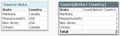
The source data to the left assigns a country to each state, and if you count the number of countries per state using a Count(distinct Country), you will get the chart to the right: Each state belongs to one country only, and the total number of countries is 2, also if the chart has four rows.
A second example is if you have a many-to-many relationship in the data. In the example below, you have three products, each with a sales amount. But since each product can belong to several product groups, the sales amounts per product group will not add up: The total will be smaller than the sum of the individual rows, since there is an overlap between the product groups. The summation will be made in the fact table.
Another way to describe it would be to say that a specific dollar belongs to both product groups, and would be counted twice if you just summed the rows.
In both cases, QlikView will show the correct number, given the data. To sum the rows would be incorrect.
So, how does this affect you as an application developer?
Normally not very much. But it is good to be aware of it, and I would suggest the following:
- When you write your expression, you should have the total line in mind. Usually, the expression will automatically be right also for the individual rows.
- Always use an aggregation function. This will ensure that QlikView is able to calculate the total correctly.
- If you want an average on the total line, you should most likely divide your expression with Count(distinct <Dim>). Then it will work both for the individual rows (where the count is 1) and the total lines. Example
Sum( Amount ) / Count( distinct Customer )
- For cases where you want to show something completely different in the total line, you should consider the Dimensionality() function, that returns 0, 1, 2, … depending on whether the evaluation takes place in a total, subtotal or row. Example:
If( Dimensionality() = 0, <Total line expression>, <Individual line expression> )
But If I want to show the sum of the individual rows? I don’t want the expression to be calculated over a larger data set. What do I do then?
There are two ways to do this. First, you can use an Aggr() function as expression:
Sum( Aggr( <Original expression> , <Dimension> ) )
This will work in all objects. Further, if you have a straight table, you have a setting on the Expressions tab where you can specify the Total mode.
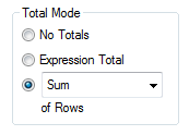
Setting this to Sum of Rows will change the chart behavior to show exactly this: The sum of the rows.

-
Engaging and fruitful visit to Hyderabad!
Last month, I had the opportunity to visit Hyderabad and meet some of the Academic Program Partner Universities there. Hyderabad, as a city in partic... Show MoreLast month, I had the opportunity to visit Hyderabad and meet some of the Academic Program Partner Universities there. Hyderabad, as a city in particular has been quite engaged towards the academic program. Its also where the first Centre of Excellence in Analytics of the Academic Program was set up in VJIT.
This time around plan was to visit VJIT, Anurag University, NMIMS Hyderabad and BVRIT.
After I landed at the airport, I headed straight to VJIT and like I said, this is a special relationship on account of the fact that the first CoE was set up and also we've had hundreds of students registering into the academic program and getting qualified as Qlik Sense Business Analysts and Data Architects from here. I met with the educators who are active in teaching students data analytics and related subjects and thereafter, addressed over 100 students in an auditorium
Thereafter, I proceeded towards the campus of NMIMS which is one of top private universities in India with multiple campuses across the country, including Hyderabad. A very special reason to visit NMIMS was Dr. Siddhartha Ghosh with whom the association began when he was with VJIT and instrumental in setting up the CoE and is now the Director of the NMIMS campus. After meeting him, it was nice to address a student crowd of around 100 who are pursuing their MBA studies. Various initiatives were discussed and the immediate one was to conduct a small hands on session on Qlik Sense for the students which is being organised on October 2nd. .
On the next day, I visited Anurag University and the Educators along with members of the Data Analytics Club. The University had organised a session with students to encourage their participation into the academic program. The Data Analytics Club which comprises of student members is a wonderful initiative to support the exchange of ideas in analytics and foster this subject among students. It was nice to address a large gathering of students and talk about various developments in analytics and also about the free resources of the academic program.
Next was a visit to BVRIT which is an all girls Engineering Institution. With BVRIT, we' ve had a special engagement due to the fact that a couple of years back, few students were recruited from the campus by a Qlik Partner, Diagonal. These students had completed the Qlik Sense Business Analyst Qualification and basis that, they were hired by Diagonal. During this visit, I interacted with the Director and other Educators and addressed a group of students. Most of them were learning data analytics as a specialised subject in their course.
Overall, an engaging and fruitful visit to Hyderabad! Look forward to embarking on the various initiatives discussed.
To know more about the Qlik Academic Program, visit qlik.com/academicprogram
-
Qlik Data Integration Newsletter - September 2023
Welcome to September's Qlik Data Integration newsletter. Each month, we cover one endpoint and share our top resources, best practices, release update... Show MoreWelcome to September's Qlik Data Integration newsletter. Each month, we cover one endpoint and share our top resources, best practices, release updates and upcoming webinars.
Subscribe to the Qlik Data Integration topic to be notified of future editions!
Index
- Webinar
- Resource Highlights
- Qlik Replicate November 2023 and FIPS
- Knowledgebase Article
- Endpoint Spotlight: DB2
- New Issues Reported
- Tips!
- Best Practice
- Release Updates
- Fixes
- Upcoming Enhancements
- Troubleshooting tips
- Analyze Qlik Replicate Logs
- Qlik Replicate End of Life Versions
Webinar
Book your calendar for the upcoming Q&A with Qlik: Qlik Replicate Sources and Targets Q&A session scheduled for October 24th at 10:00 AM EDT. It is a live Q&A session with a panel of Qlik experts. Bring your questions, and we do our best to answer them.
Resource Highlights
Qlik Replicate November 2023 and FIPS
The November 2023 release of Qlik Replicate is not yet FIPS compliant. If you require a compliant environment, remain on the already FIPS compatible versions. See Qlik Replicate November 2023 and FIPS: Release not yet FIPS compliant for details.
Knowledgebase Article
Endpoint Spotlight: DB2
Find our latest knowledge base articles for DB2 endpoints.
New Issues Reported
- Qlik Replicate and R4Z after upgrade to 2023.5 SP02: additional download required
The Qlik Replicate service pack 02 release for 2023.5 includes old R4Z installation files from the previous SP01 build.To upgrade the R4Z component, additional files need to be downloaded and installed. See Qlik Replicate and R4Z after upgrade to 2023.5 SP02: additional download required for details.
- SQL0551N The statement failed because the authorization ID does not have the required authorization or privilege to perform the operation.
Qlik Replicate with a DB2 z/OS source endpoint (using R4Z) displays authorization and privilege errors. See Qlik Replicate DB2 z/OS - [SOURCE_CAPTURE ]E: RetCode: SQL_ERROR SqlState: 42501 NativeError: -551 Message: [IBM][CLI Driver][DB2] SQL0551N for more information and how to resolve the issue.
Tips!
- R4Z Db2 mainframe install is completed but no Changes are coming through
Check that the Tables you wish to be performing CDC replication upon, have been "turned on" for capturing the changes from the DB2 z/OS Logs. See Qlik Replicate: R4Z DB2z No CDC coming through for details. - Qlik Replicate DB2 z/OS task may stop/fail with R4DB2: ALL CB ENTRIES ARE IN USE
This means that a task is trying to start, but the maximum number of R4Z Control Blocks (in the R4Z CDC service environment on the mainframe) is in use. Find the resolution in Qlik Replicate: DB2 z/OS R4Z [SOURCE_CAPTURE ]W: R4DB2: ALL CB ENTRIES ARE IN USE.
Best Practice
- Match R4Z and Qlik Replicate versions
The Qlik Replicate and R4Z versions you install must be part of the same release, which can either be an initial release or a patch/service release. This means that if you upgrade Qlik Replicate, you must also upgrade your R4Z installation (to the version that correlates with the Qlik Replicate release you are installing), unless it has the same build number as your currently installed R4Z. Note that despite being part of the same release, the Qlik Replicate and R4Z build numbers (reflected in their file names) might not be the same.
For example, Qlik Replicate May 2022 SR2 includes the following files:
- QlikReplicate_2022.5.0.499_X64.zip (the Replicate installer)
- QlikReplicate_2022.5.0.290_r4z.zip (the R4Z installer).
- How to avoid WLM tasks being cancelled due to Work Load Manager Policy settings
When installing and using the DB2 z/OS endpoint in Qlik Replicate, WLM tasks on the mainframe may get cancelled. There are multiple root causes for this, but a common one can be addressed by reviewing the execution priority (WLM settings).
See Qlik Replicate and R4Z: Best practice to ensure DB2 z/OS Workload Manager (WLM) tasks are not cancelled for details.
Release Updates
Fixes
Qlik Replicate May 2023 Patch 3
ID: RECOB-7408
Type: Issue
Component/Process: IBM DB2 for z/OS Source
Description: The capture process would not recover from a communication error in the metadata connection.ID: RECOB-7385
Type: Issue
Component/Process: IBM DB2 for z/OS Source
Description: The following ambiguous warning message would sometimes be issued when resuming a task:
Transaction <> was committed after the Full Load started and the BEGIN TRANSACTION statement was not captured.
ID: RECOB-7220
Type: Issue
Component/Process: DB2 z/OS Source
Description: DB2 would sometimes abend in a data sharing environment when tasks moved back and forth between LPARs.Qlik Replicate May 2023 Patch 2
ID: RECOB-7311
Type: Enhancement
Component/Process: IBM DB2 for z/OS Target
Description: Performance was improved when using the zload utility to load files.ID: RECOB-7146
Type: Issue
Component/Process: IBM DB2 for z/OS Target
Description: The task log would display the following incorrect warning when replicating from IBM DB2 on z/OS 13.1 (which is certified): Replicate has not been certified to work with DB2 z/OS version '13.01.0005', and therefore any issues you may encounter with this version are not covered by your license agreement.ID: RECOB-7114
Type: Issue
Component/Process: IBM DB2 for z/OS Target
Description: The R4Z DO4GRANT JCL was updated to grant the R4Z user permissions on the SYSIBM.SYSTABLEPART and SYSIBM.SYSPARMS tables.Upcoming Enhancements
Qlik Replicate November 2023 IR
- Expose stream buffer tuning parameters in task settings (Replicate & QEM - Expose stream buffer tuning parameters in task settings )
- Confluent Schema Register using BOTH authentication methods (Public Key + Username & password)
- Snowflake - Support Transactions in Upsert Mode
- Boolean Data Type support for PG sources and Bit support for SQL Server targets
- Google BigQuery - Secure current authentication (no longer have credential files on customer file system)
- Aurora PostgreSQL source - without the "superuser" role certification
- Azure Database for MySQL Flexible Server - Source & Target Certification
- MariaDB 10.6 to 10.11 versions on MySQL - certification
- MariaDB 10.6 version on Amazon RDS - certification
- Google Cloud SQL for MSSQL Source endpoint
- Databricks 12.2 LTS Certification
- Databricks Serverless SQL warehouse certification
Troubleshooting tips
Analyze Qlik Replicate Logs
An evergreen pair of articles helps you read and analyze Qlik Replicate log files:
How to analyze a Qlik Replicate log
List of the error types in Qlik ReplicateQlik Replicate End of Life Versions
Version Release Date End of Support Date Qlik Replicate May 2023 May 9, 2023 May 9, 2025 Qlik Replicate November 2022 November 8, 2022 November 8, 2024 Qlik Replicate May 2022 May 10, 2022 May 10, 2024 Qlik Replicate November 2021 November 8, 2021 November 8, 2023 Qlik Replicate May 2021 May 11, 2021 May 11, 2023 Qlik Replicate November 2020 November 10, 2020 November 30, 2022 Qlik Replicate April 2020 (6.6) April 16, 2020 April 30, 2022 Qlik Replicate 6.5 November 14, 2019 November 30, 2021 Qlik Replicate 6.4 April 1, 2019 April 14, 2021 Qlik Replicate 5.5 August 1, 2017 November 30, 2020 For more information, see Qlik Product Lifecycles.
-
【オンデマンド配信】QlikWorld Tokyo オンライン
データ・分析・AI の最新トレンドを一挙ご紹介! 去る 9月 12日 、毎年恒例の一大イベント「QlikWorld Tokyo」が開催され、盛況のもとに終了しました。多数のデータ愛好家の方々にご来場いただき、データ・分析・AI の最新トレンドや成功例に関するインサイトなど、データの可能性を最大化す... Show Moreデータ・分析・AI の最新トレンドを一挙ご紹介!
去る 9月 12日 、毎年恒例の一大イベント「QlikWorld Tokyo」が開催され、盛況のもとに終了しました。多数のデータ愛好家の方々にご来場いただき、データ・分析・AI の最新トレンドや成功例に関するインサイトなど、データの可能性を最大化するヒントをご紹介しました。
この度、同イベントでの一部の講演を Web セミナーにてお届けいたします。Qlik のビジネスおよびテクノロジーの方向性と最新情報のほか、2 社の日本企業の事例をご紹介します。※参加費無料。パソコン・タブレット・スマートフォンで、どこからでもご視聴いただけます。
-
"Dancin' in September" to share our latest Qlik Community Enhancements!
Hello Qlik Community! Happy Earth, Wind & Fire Day! Has anyone else been singing “September” all month long? Here are the September enhancements for Q... Show MoreHello Qlik Community!
Happy Earth, Wind & Fire Day! Has anyone else been singing “September” all month long?
Here are the September enhancements for Qlik Community:
Find inspiration with the Qlik Gallery
Walk through the Qlik Gallery to find inspiration! Enjoy our new 'gallery view' to get ideas and see what your fellow Qlik users are creating!
Chart your path with the Qlik Greenway
Want to be more involved in the Qlik ecosystem? Use the Greenway as your step-by-step guide to an epic journey at Qlik.
Earn Qlik Nation points
Are you a Qlik Nation member? You can now complete challenges within Qlik Community! Look for the challenge carousel on the Homepage, below the Featured Member.
Filter the Leaderboard
It’s now easier than ever to find out the leaders for daily. Weekly, All-Time and more! Use the green filter on the Leaderboard to adjust the time period.
Simplified Release Notes filters
We’ve removed the “version” filter since most release notes are for a monthly release or aggregate the initial release and patches for a specific version into one post.
Fixed issue with Table of Contents
There was an issue with the table of contents jumping under the sticky nav. Now when clicking on a TOC link, the page will jump and the header will be just below the navigation.
Let us know what you think in the comments below! And don’t forget to make the 21st night of September a night you remember 😊
Your Qlik Community Admins,
Melissa, Sue, Jamie, and Nicole
-
Qlik Digest - September 2023
Introducing Qlik Staige Confidently embrace the power of AI with an all-encompassing solution that brings better insights to your business, faster. En... Show MoreIntroducing Qlik Staige
Confidently embrace the power of AI with an all-encompassing solution that brings better insights to your business, faster.
Latest Qlik Sense Updates
Make an impression with the top recent data visualization enhancements available in Qlik Sense Cloud. Learn More
Not on Cloud yet? Check out the highlights from the August Client Managed release. Read Blog
Qlik Cloud Reporting Q&A
Join our live Q&A with Qlik Experts on 26 September. You'll be given solutions to common issues faced in Qlik Cloud Reporting, best practice guidance, and more. Register Now
New capacity pricing model and usage telemetry in Qlik Cloud
Discover what this new pricing model means for you and see a demo. Get empowered to better leverage your data sets and support more analytics use cases, with the use of AutoML and GenAI capabilities. Learn More
Deep dive into database-to-database synchronization
Check out the first in our blog series on 7 Data Integration and Data Quality Use Cases for Qlik and Talend. This first post focuses on database-to-database synchronization.
What do you think of the Qlik Digest?
We want to make to make sure the Qlik Digest is exactly what you’re looking for from a monthly newsletter. Take our 2-minute feedback survey and be in with the chance to win one of five exclusive Qlik swag packs. Take Survey
Build on your success with Qlik
Join Qlik Nation to learn about new features, influence the product roadmap, share expertise, and enhance your learning- all while having fun and earning rewards.
-
What's the difference between conversational AI and generative AI?
These are the two technologies that are changing how humans work and interact with computers and create content. Understanding what they are is key to... Show MoreThese are the two technologies that are changing how humans work and interact with computers and create content. Understanding what they are is key to understanding the impact they might have on your future career, since you may well be expected to use and interact with these technologies once you enter the workplace. According to World Economic Forum research, while AI could displace jobs it could potentially create up to 97 million jobs in fields ranging from big data and information security to digital marketing. As AI becomes more integrated into business practices there will also be a much higher demand for AI support roles, according to a McKinsey Report. In 2022, 39% of businesses reported hiring software engineers, and 35% hired data engineers for AI-related positions. It's clear that the use of AI in job roles could become the norm, therefore an understanding of how these technologies work will become a necessity.
Data science central have put together this useful guide for understanding the differences between conversational AI and generative AI. Key points are below, but to read the full article follow this link - A complete guide: Conversational AI vs. generative AI
User experience & human interaction
Conversational AI believes in meaningful conversations. Thus, provides quick, direct, crisp, and relevant answers. Generative AI does not engage directly but contributes to user experience by coming up with useful content like blogs, music, and visual art.
What does the future hold?
The trend we observe for conversational AI is more natural and context-aware interactions with emotional connections. Generative AI’s future is dependent on generating various forms of content like scripts to digitally advance context.
Use cases:
• Conversational AI is used in industries like healthcare, finance, and e-commerce where personalized assistance is provided to customers.
• Generative AI is mostly applied to creative domains like content creation, entertainment, design, etc.
To learn more about how you could get free access to analytics software and resources through the Qlik Academic Program, visit qlik.com/academicprogram . By making the most of our software and resources, you can gain future proof data analytics skills regardless of your degree course.
-
Slowly Changing Dimensions
As one creates QlikView applications one sometimes encounters a data modeling problem where a dimensional attribute varies over time. It could be that... Show MoreAs one creates QlikView applications one sometimes encounters a data modeling problem where a dimensional attribute varies over time. It could be that a salesperson changes department or a product is reclassified to belong to another class of products.
This problem is called Slowly Changing Dimensions and is a challenge for any Business Intelligence tool. Creating an application with static dimensions is simple enough, but when a salesperson is transferred from one department to another, you will have to ask yourself how you want this change to be reflected in your application. Should you use the current department for all transactions? Or should you try to attribute each transaction to the proper department?
First of all, a changed attribute must be recorded in a way that the historical information is preserved. If the old value is overwritten by the new attribute value, there is of course nothing QlikView can do to save the situation:
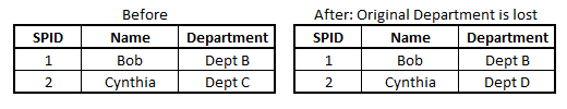
In such a case, the new attribute value will be used also for the old transactions and sales numbers will in some cases be attributed to the wrong department.
However, if the changes have been recorded in a way so that historical data persists, then QlikView can show the changes very well. Normally, historical data are stored by adding a new record in the database for each new situation, with a change date that defines the beginning of the validity period.
In the salesperson example, you may in such a case have four tables that need to be linked correctly: A transaction table, a dynamic salesperson dimension with the intervals and the corresponding departments, a static salesperson dimension and a department dimension. To link these tables, you need to match the transaction date against the intervals defined in the dynamic salesperson dimension.
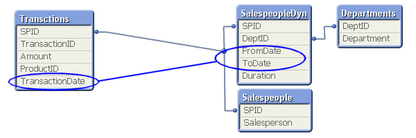
This is an intervalmatch. The solution is to create a bridge table between the transaction table and the dimension tables. And it should be the only link between them. This means that the link from the transaction table to the bridge table should be a composite key consisting of the salesperson ID (in the picture called SPID) and the transaction date.
It also means that the next link, the one from the bridge table to the dimension tables, should be a key that points to a specific salesperson interval, e.g. a composite key consisting of the salesperson ID and the beginning and end of the interval. Finally, the salesperson ID should only exist in the dimension tables and must hence be removed from the transaction table.
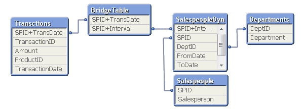
In most cases of slowly changing dimensions, a salesperson (or product, customer, etc.) can only belong to one department (or product group, region, etc.) at a time. In other words, the relationship between salesperson and interval is a many-to-one relationship. If so, you can store the interval key directly in the transaction table to simplify the data model, e.g. by joining the bridge table onto the transaction table.
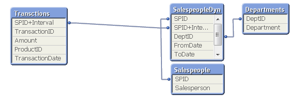
A word of caution: If a salesperson belongs to several departments at the same time, such a join may cause QlikView to make incorrect calculations. Bottom line: Double-check before you join.
For a more elaborate description of Slowly Changing Dimensions and some script examples, see the technical brief IntervalMatch and Slowly Changing Dimensions.
-
【開催報告】QlikWorld Tokyo 2023
9月12日 QlikWorld Tokyo が開催され、300名を超える方にご参加いただきました。当日は最新の Qlik & Talend ソリューションをご確認いただくと同時に、ユーザー同士の交流も活発に行われました。 ワイドサイズのスクリーンに圧巻のオープニング映像が映し出され、弊社カントリー... Show More9月12日 QlikWorld Tokyo が開催され、300名を超える方にご参加いただきました。当日は最新の Qlik & Talend ソリューションをご確認いただくと同時に、ユーザー同士の交流も活発に行われました。
ワイドサイズのスクリーンに圧巻のオープニング映像が映し出され、弊社カントリーマネージャー今井のご挨拶でスタートです。協賛パートナー10社様、ご登壇いただく7名のお客様、そして午前中のミートアップからご参加いただいた熱狂的なユーザーの皆様に感謝の意を述べ、Qlik + Talend の今後の方向性をご紹介しました。
続いて、技術本部長の濱野から最新の Qlik と Talend の製品情報をデモを交えてご紹介しました。
昨年までのゲストによる基調講演に代わり、今年は先進ユーザー企業であるホンダ、富士通、大日本印刷のキーマンによるパネルディスカッションを行いました。まずは各社の DX推進・データ活用の取り組みについての「これまで」をご紹介いただき、続いて「理想と現実」という観点からの各社の課題を議論いただきました。詳細はここでは書けませんが、「ここだけの」貴重なお話・気づきを多数いただきました。
実はこのパネルディスカッション、事前に2回ほど打ち合わせをしたのですが、その合計時間が本番の時間(45分)を大幅に超える4時間近くとなりました。まだまだお話足りないところや、まったく触れられなかったテーマなどもありました。今後も機会を設けて、お話いただける場を作っていきたいと思います。
休憩時間には、コーヒーを片手にスポンサー様の展示ブースに参加者の方にお立ち寄りいただきました。
後半はビジネスセッションとテクノロジーセッションのふたつのトラックです。ビジネスセッションでは、グローリー様、東亞合成様、日本製鉄様、千趣会様からそれぞれ事例講演をいただきました。なお、グローリー様、千趣会様については後日 QlikWorld Tokyo オンラインにて配信を予定しておりますので、お楽しみに。
テクノロジーセッションでは Qlik プリセールスチームから「データファブリック」「Talend」「Qlik Cloud」「AutoML」の4つのテーマで製品・技術情報を詳しくお伝えしました。
最後は恒例の懇親会です。今井の乾杯で始まり、パートナー、Qlik 社員がドリンクを片手に交流を深め、また Qlik & Talend グッズの当たる抽選会も行い、大いに盛り上がりました。最後は Talend ユーザーのお客様から一言いただき、無事に閉幕いたしました。
QlikWorld はこの後も Global Tour として各国を回ります。
日本でも引き続き、このモーメンタムを感じていただく場を作ってまいりますので、ご期待ください!
-
Gantt Charts for Project Management
Gantt Charts for Project Management AnyChart — QS Extensions Gantt charts are an essential project management tool. Explore all major features o... Show MoreGantt Charts for Project ManagementAnyChart — QS ExtensionsGantt charts are an essential project management tool. Explore all major features of AnyChart's Gantt Chart Extension for Qlik Sense in this Qlik demo application, including different data structures, customizable tables and timelines, flexible milestones, dependency connectors, fiscal year settings, coloring patterns, and much more demonstrated in action.Discoveries
Streamline your project management with insightful start-to-finish timelines. Plan, schedule, and keep projects on track and within your budget.
Impact
Track progress across stages to spot bottlenecks and optimize workflows. Identify task dependencies and key milestones to prioritize effectively.
Audience
Project managers, team leaders, and anyone involved in project planning and management. Anyone interested in exploring the capabilities of Gantt charts within Qlik Sense.
Data and advanced analytics
This application features Gantt charts built with AnyChart's Gantt Chart Extension for Qlik Sense, utilizing fictional data to illustrate its capabilities.
-
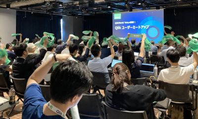
【開催報告】2023年 第2回 Qlik Japan ユーザーミートアップ - アプリ自慢大会!
9月12日、Qlik Japanユーザーミートアップを実施しました。今回は、QlikWorld Tokyoとのジョイント・イベントという形でQlikWorld Tokyoと同日・同会場で実施されました。 2023年Qlik Japanユーザーグループは、ハンズオンやデータソン、もくもく会、ライブ配... Show More9月12日、Qlik Japanユーザーミートアップを実施しました。今回は、QlikWorld Tokyoとのジョイント・イベントという形でQlikWorld Tokyoと同日・同会場で実施されました。
2023年Qlik Japanユーザーグループは、ハンズオンやデータソン、もくもく会、ライブ配信など、様々な形でユーザーイベントを実施してきましたが、今回のユーザーミートアップは2月に実施して参加者に大変好評だった「アプリ自慢大会」をメインコンテンツとしてお送りしました。
会場受付では、今回のミートアップ限定の「Qlikタオル」が配られました。冒頭の写真でも確認できますが、要所でタオルを掲げて盛り上がりました!
■イベントスタート!
司会進行を務めた学研の渕さんから全体のアジェンダについてご紹介があり、続いてOGIコンサルティングオフィス荻本さんに開会のご挨拶をいただきました。
(学研 渕さんによる司会進行。渕さんはユーザー会幹事でもあります!)
そして、セガの萬さんからQlikルミナリーとQlikアドボケイトのプログラムについてご紹介がありました。Qlikルミナリーはグローバルで、Qlikアドボケイトは国内で、それぞれQlikに関する情報発信などをするいわばエヴァンジェリストのようなプログラムです。ルミナリー・アドボケイト限定のイベントや特典もございますのでご興味ある方はぜひQlikにご相談ください。
(セガ 萬さんはグローバルで50名、日本からわずか3名しか選ばれていないQlikルミナリーのひとりです!)
■アプリ自慢大会!
続いて、アプリ自慢大会が始まりました。こちらのコンセプトは、「完全非公開!リアルな本番アプリをご紹介!」です。撮影や内容のSNS投稿は禁止する代わりに、誰もが知っている大手企業が実際に社内で使っている、リアルなBIアプリケーションを披露しました!今回は、セガ、学研、スズキ、富士通の4社に登壇いただきました。
登壇の様子を少しだけシェアします。ですが、コンセプトにもある通り内容は参加してのお楽しみということになります。毎回ユーザー様にとってすごい刺激になる発表ばかりですので、今回参加できなかったQlikユーザーは、ぜひ次回のイベントにお越しください!
・株式会社セガ 萬様、福山様
・株式会社学研ホールディングス 福田様、横尾様
・スズキ株式会社 仲江川様
・富士通株式会社 池田様
お見せできないのが本当に残念!それくらい、各社のビジネスにおける重要かつリアルなアプリが公開されていました。私自身も大変勉強になりましたね~。
■お楽しみ企画「Qlik Quiz」
さて、アプリ自慢大会の後は、お楽しみ企画「Qlik Quiz」。このパートは、Qlikのウェビナーでおなじみ、鈴木と中嶋(私)がMCを担当しました。
「Qlikのことをもっとよく知ってもらおう」という趣旨でQlikに関する2択クイズを10問出題しました。間違えた時点で脱落というサバイバル方式で、最後まで勝ち残った10名の方にQlikWorld Tokyo限定のQlik Tシャツをプレゼントいたしました!問題は意外と難しかったようです😅😅😅
(解答選択肢に応じてタオルか手を上げてもらう、というシンプルな方式。ここでもQlikタオルが大活躍!)
■フィナーレ
最後に、お知らせのコーナー。
なんと、これまで英語でしか受験できなかったQlikの認定資格「Qlik Senseビジネスアナリスト」がついに日本語で受験できるようになりました!ここで、Qlikアドボケイトである富士通の中川さんより、「これを機にみんなでQlik資格を取りましょう!」というメッセージもいただきました。
最後に、次回のミートアップ予定が発表されました。次回は、12月に大忘年会と称して、一年を振り返る会を実施します。日付やアジェンダはTECH PLAYのQlik Japan User Groupページから改めてご案内します。(グループのフォローもよろしくお願いします!)
それでは、次回大忘年会でお会いしましょう!
-
Inventario/ facturacion
Inventario/ facturacionRCDmuestra el inventario y facturacion emitida de terrenos Discoveriesla facturacion que no se emite en tiempoImpactun incremen... Show MoreInventario/ facturacionRCDmuestra el inventario y facturacion emitida de terrenosDiscoveries
la facturacion que no se emite en tiempo
Impact
un incremento en cobranza y emision de facturas
Audience
Genrentes y personal de CxC
Data and advanced analytics
para el departamento tener en una sola vista todo el reporte y poder revisar el saldo por cliente en especifico
-
Become a Data Leader!
Qlik Sense empowers your organization to make better decisions daily, turning raw data into remarkable outcomes. In mastering Qlik Sense, you learn ho... Show MoreQlik Sense empowers your organization to make better decisions daily, turning raw data into remarkable outcomes. In mastering Qlik Sense, you learn how to harness the power of industry-leading modern data analytics. But what if you could, at the same time, broaden your perspective on what data analytics can do to deliver the insights that transform organizations? What if you could apply what you are learning to the work you are doing right now?
A data-informed mindset is essential to deliver the insights and transform organizations.
When you base decisions on data, are you sure you are using the right data?
Are you sure you are asking the right questions of the data?
Are you confident in turning business questions into analytical questions?
Are you challenging assumptions you have with the data? Are you sure you have enough context from the data to ensure it is not telling you only part of the story?
Are you confident in using techniques to help mitigate any unconscious bias you may have when interpreting the data and insights?
With Qlik’s Analytics Expert Program “Applied Data Analytics using Qlik Sense”, you will not only learn data analytics best practices but also learn how to achieve a data-informed mindset that shifts you from just looking for data and information to looking for insights and knowledge.
You will learn best practices in data analytics, data literacy and data-informed decision making that help you make the most effective use of Qlik Sense. As you complete the course, you will get a chance to earn a badge you can share on your social sites and add to your email signature.
In addition, you will obtain the knowledge to be able to take the Qlik Sense Business Analyst Qualification, Data Analytics Certification and Data Literacy Certification.
Register Today to save your spot for the Spring Semester.
Looking for more details? Check out our Course Page to access Data Sheet, Sample course and all other details.
Happy Learning!

-
Do you have what it takes to be a Qlik Academic Program Educator Ambassador?
The Qlik Academic Program provides educators, students, and researchers from accredited universities with free Qlik software and learning resources to... Show MoreThe Qlik Academic Program provides educators, students, and researchers from accredited universities with free Qlik software and learning resources to educate and train the next generation of experts leading with data. Our Educator Ambassador Program aims to shine a spotlight on our most active educator members. Our ambassadors will champion our vision to make more students data literate and to prepare them for the data-driven workplace.
Are you a current educator member who is:
- Passionate about the Qlik Academic Program and the resources provided to students and educators.
- Passionate about educating students to be prepared for the data-driven workforce and to secure jobs?
- An active promotor of the Qlik Academic Program to academic peers as well as students?
- Willing to share your experience of the Qlik Academic Program at (virtual) events, in forums, on social media and in the press?
- A contributor to blogs, forums, university publications, professional journals, papers, or other materials that promote the Qlik Academic Program?
If you answered YES to one or more of the above, then we encourage you to apply to the Educator Ambassador Program! Learn more and apply now!
All current educator members are eligible to apply. If you have not already signed up for the Qlik Academic Program, you can do so at https://www.qlik.com/us/academicprogram and then check out our current 2023 Educator Ambassadors.
Application Deadline: The application deadline is November 17, 2023 and the new class of ambassadors will be announced in early 2024.
Ambassador Benefits:
If you are selected as a Qlik Academic Program Educator Ambassador, you will receive a host of benefits including:
- Insight: Exclusive webinars with Qlik leaders, covering the latest trends in analytics and other industry topics
- Credibility: A digital badge to certify ambassador status and a featured online profile
- Exposure: Outreach opportunities to showcase your experience with the Qlik Academic Program via Qlik marketing channels or speaking engagements
- Perks: Discounts on Qlik events and other exclusive rewards
- Community: Collaborate with other educators across various fields and geographies
- Opportunity: Potential to advance your career including meeting university requirements for scholarly contribution beyond the classroom
-
The Generic Load
Whenever you have a generic database, the Generic prefix can be used to transform the data and create the desired fields. A generic database is basica... Show MoreWhenever you have a generic database, the Generic prefix can be used to transform the data and create the desired fields. A generic database is basically a table where the second last column is an arbitrary attribute and the very last is the value of the attribute. In the input table below you have a three-column generic database.
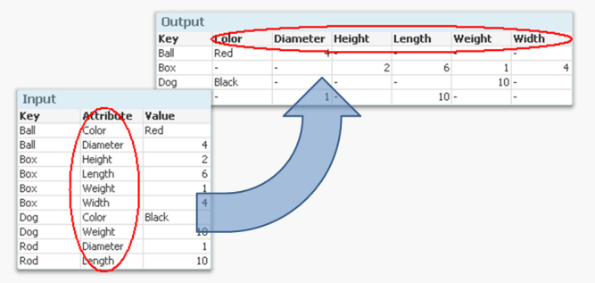
But if you want to analyze this data, it is much easier to have all attributes in separate fields so that you can make the appropriate selections. It is not very practical to have one single field for all attribute values, since you may want to make selections using different attributes at the same time.
Enter the Generic prefix.
It converts the data to a structure where each attribute is placed in a field of its own. Another way to express it is to say that it takes field values and converts these to field names. If you compare it to the Crosstable prefix, you will find that they in principle are each other’s inverses.
The syntax is
Generic Load Key, Attribute, Value From … ;
There are however a couple of things worth noting:
- Usually the input data has three columns: one qualifier field (Key in the above example), an Attribute and a Value. But you may also have several qualifying fields. If you have four or more columns, all columns except the two last will be treated as qualifying fields.
- The Generic prefix will create several tables; one table per attribute. This is normally not a problem. Rather, it is an advantage: It is the least memory-consuming way to store data if you have many attributes.
If you have more than one key, this means that you will get a composite key – a synthetic key – in the data model:
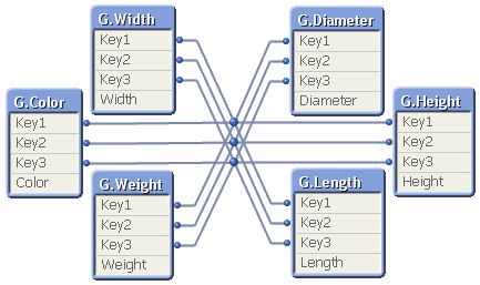
Although it looks ugly, this synthetic key is completely harmless. But it may still be a good idea to replace it with a manually created concatenated key:
Autonumber(Key1 & '|' & Key2 & '|' & Key3) as Key,
Finally, I have seen many examples on QlikCommunity where a For-Next loop is used to join together all tables created by the Generic prefix, e.g.:
Set vListOfTables = ;
For vTableNo = 0 to NoOfTables()
Let vTableName = TableName($(vTableNo)) ;
If Subfield(vTableName,'.',1)='GenericLabel' Then
Let vListOfTables = vListOfTables & If(Len(vListOfTables)>0,',') & Chr(39) & vTableName & Chr(39) ;
End If
Next vTableNo
CombinedGenericTable:
Load distinct Key From GenericDB;
For each vTableName in $(vListOfTables)
Left Join (CombinedGenericTable) Load * Resident [$(vTableName)];
Drop Table [$(vTableName)];
Next vTableName
The result is one big table that contains all attributes; a table that often is sparse (containing many NULL values) and much larger than the initial tables. And no performance has been gained… So I can only say:
You should not do this - unless you have a specific reason to.
The Generic prefix creates a set of tables that store the data in an optimal way. In most cases you should not change this. I realize, however, that there are cases where you want to transform the data further and need the data in one, unified table. Then the above scriptlet can be used.