Unlock a world of possibilities! Login now and discover the exclusive benefits awaiting you.
Analytics & AI
Forums for Qlik Analytic solutions. Ask questions, join discussions, find solutions, and access documentation and resources.
Data Integration & Quality
Forums for Qlik Data Integration solutions. Ask questions, join discussions, find solutions, and access documentation and resources
Explore Qlik Gallery
Qlik Gallery is meant to encourage Qlikkies everywhere to share their progress – from a first Qlik app – to a favorite Qlik app – and everything in-between.
Qlik Community
Get started on Qlik Community, find How-To documents, and join general non-product related discussions.
Qlik Resources
Direct links to other resources within the Qlik ecosystem. We suggest you bookmark this page.
Qlik Academic Program
Qlik gives qualified university students, educators, and researchers free Qlik software and resources to prepare students for the data-driven workplace.
Recent Blog Posts
-
Using Mapbox GL with Nebula.js
In the past I have talked about all of the existing cool extensions that we have available for nebula.js and can be used on your webpages.https://comm... Show MoreIn the past I have talked about all of the existing cool extensions that we have available for nebula.js and can be used on your webpages.
https://community.qlik.com/t5/Qlik-Design-Blog/Sn-table-Nebula-js-latest-extension/ba-p/1780153
Today, I will just create a custom one with Mapb GL and show how to do on the fly.
Lets get started and connect to our app with Enigma.js and the Engine API.
const config = {
  host: <your-server>,
  appId: <your-qlik-app-id>
};

const openQlikApp = async () => {
  const { senseUtilities, enigma } = window;
  const schemaResponse = await fetch('https://unpkg.com/enigma.js/schemas/12.34.11.json');
  const schema = await schemaResponse.json();
  const url = senseUtilities.buildUrl(config);
  const session = enigma.create({ schema, url });
  return await session.open().then((global) => global.openDoc(config.appId));
}
Now we can register the extension by naming it "sn-mapbox".
  const nebula = await stardust.embed(qlikApp, {
    types: [{
      name: 'sn-mapbox',
      load: () => snMapbox,
    }],
  });
And render it into the dom with 4-5 dimensions. The first 3 are mandatory for Mapbox to work. We need a unique ID, a Latitude and Longitude. Then we can have a couple of more properties to create layers with dots and assign colors or size based on those.
nebula.render({
  element: chartElement,
  type: 'sn-mapbox',
  fields: [ 'ID', 'lat', 'lon', 'gender', 'AgeBucket'],
});
Now, we can dive into the actual mapbox code. As per mapbox instructions, we must have a token and a style. If you do not have one, go ahead and register for a free limited one.
I am adding the default style and my personal testing token. I have also added the flyTo option for some entry animation.
const options = {
    accessToken: 'pk.eyJ1IjoieWlhbm5pLXZlcnZlcmlzIiwiYSI6ImNrcWF0azdnejBjdm4yd3M3ajBmb2hpeGkifQ.rl7QWaaMtqRYNJ-vMIMoOA', // Change this to your free personal token
    style: 'mapbox://styles/mapbox/streets-v11', // This is the default map style
    center: [-60, 20],
    zoom: 2,
    pitch: 0,
    bearing: 0,
    circleRadius: 8,
    circleOpacity: 1,
    // Custom tooltip that displays the last 2 dimensions / properties
    tooltip: (obj) => `
      <div>Gender: ${obj.gender}</div>
      <div>Age Bucket: ${obj.AgeBucket}</div>
    `,
    createLayers: true,
    // Add a flying point for entry animation
    flyTo: {
      center: [-74.50, 40],
      zoom: 4,
      speed: 0.3,
      curve: 1,
      easing(t) {
        return t;
      }
    },
    // The colors for the dots
    palette: [
      '#3399CC', // Light Blue
      '#CC6666', // Light Red
    ]
  };

const snMapbox = () => {
  return {
    // Define the Engine API HyperCube
    qae: {
      properties: {
        qHyperCubeDef: {
          qDimensions: [],
          qMeasures: [],
          qInitialDataFetch: [{ qWidth: 5, qHeight: 2000 }],
          qSuppressZero: true,
          qSuppressMissing: true,
        },
        showTitles: true,
        title: 'US Data',
        subtitle: 'Random gender / age buckets',
        footnote: 'Data is random, for this example only.',
      },
      data: {
        targets: [
          {
            path: '/qHyperCubeDef',
            dimensions: {
              min: 1,
              max: 5,
            },
            measures: {
              min: 0,
              max: 0,
            },
          },
        ],
      },
    },

    component() {
      const { stardust } = window;
      const element = stardust.useElement();
      const layout = stardust.useLayout();
      const qData = layout.qHyperCube?.qDataPages[0];
      const qMatrix = qData.qMatrix.filter(row => row.some(el => el.qNum !== "NaN"))
      const property = layout.qHyperCube?.qDimensionInfo[3]?.qFallbackTitle;
      const property2 = layout.qHyperCube?.qDimensionInfo[4]?.qFallbackTitle;
      const [instance, setInstance] = stardust.useState();
      let GeoJSON, map = null;
      let mapData = [];
      const propertyChildren = [...new Set(qMatrix.map((array) => array[3].qText))];
      const propertyChildrenWithColors = propertyChildren.reduce((r, e, i) => r.push(e, options.palette[i]) && r, []);

      // Create the Mapbox features based on our HyperCube data
      const buildFeatures = (obj) => {
        const featureObj = {
          type: 'Feature',
          properties: {
            count: 1,
            userID: obj.id,
            [property]: obj[property],
          },
          geometry: {
            type: 'Point',
            coordinates: [obj.lng, obj.lat],
          },
        };
        if (options.tooltip !== null) {
          featureObj.properties.description = options.tooltip(obj);
        }

        return featureObj;
      }

      // Convert our HyperCube data into a GeoJSON for Mapbox
      const buildGeoJSON = () => {
        const goodGeoJSON = {
          type: 'FeatureCollection',
          features: [],
        };
        qMatrix.map((array) => {
          if (typeof array[1].qNum !== 'number' || typeof array[2].qNum !== 'number') return false;
          const obj = {
            id: Number(array[0].qNum),
            lat: Number(array[1].qNum),
            lng: Number(array[2].qNum),
          };

          obj[property] = array[3].qText;
          obj[property2] = array[4].qText;

          const feature = buildFeatures(obj);
          goodGeoJSON.features.push(feature);
          return obj;
        });
        return goodGeoJSON;
      }

      // Create the layer that will hold the dots
      const buildLayer = () => {
        const match = ['match', ['get', property], ...propertyChildrenWithColors, '#FFF'];
        const layer = {
          id: 'dots',
          type: 'circle',
          source: 'hyperCubeData',
          paint: {
            'circle-stroke-width': 0,
            'circle-radius': options.circleRadius,
            'circle-color': match,
            'circle-opacity': options.circleOpacity,
          },
        };
        return layer;
      }

      // Create the map
      const buildMap = () => {
        // Add HyperCube data as GeoJSON
        map.addSource('hyperCubeData', {
          type: 'geojson',
          data: GeoJSON,
        });
        // Create the layer
        const layer = buildLayer();
        map.addLayer(layer);
        if (options.extraLayers && options.extraLayers.length) {
          options.extraLayers.map((_layer) => map.addLayer(_layer));
        }
        // Create Tooltips and the triggering events
        if (options.tooltip !== null) {
          const popup = new mapboxgl.Popup({
            closeButton: false,
            closeOnClick: false,
            className: 'sn-mapbox-tooltip',
          });
          map.on('mouseenter', 'dots', (e) => {
            map.getCanvas().style.cursor = 'pointer';
            const coordinates = e.features[0].geometry.coordinates.slice();
            const { description } = e.features[0].properties;
            while (Math.abs(e.lngLat.lng - coordinates[0]) > 180) {
              coordinates[0] += e.lngLat.lng > coordinates[0] ? 360 : -360;
            }
            popup
              .setLngLat(coordinates)
              .setHTML(description)
              .addTo(map);
          });
          map.on('mouseleave', 'dots', () => {
            map.getCanvas().style.cursor = '';
            popup.remove();
          });
        }
      };

      // Update layer data upon HyperCube change
      const updateLayers = () => {
        const nextChunk = qMatrix.map((array) => {
          const obj = {
            id: Number(array[0].qNum),
            lat: Number(array[1].qNum),
            lng: Number(array[2].qNum),
            [property]: array[3].qText,
          };

          return buildFeatures(obj);
        });
        if (GeoJSON) {
          GeoJSON = { ...GeoJSON, features: [...GeoJSON.features, ...nextChunk] };
          map.getSource('hyperCubeData').setData(GeoJSON);
        } else {
          GeoJSON = buildGeoJSON();
          buildMap();
        }
      };

      stardust.useEffect(() => {
        mapboxgl.accessToken = options.accessToken;
        if (!map) {
          // Initialize mapbox GL
          map = new mapboxgl.Map({
            container: element,
            ...options,
          });
          // Add layer with data
          map.on('load', () => {
            updateLayers(qData); // Draw the first set of data, in case we load all
            mapData = [...mapData, ...qMatrix];
          });
          // Add intro animation
          if (options.flyTo) {
            map.flyTo(options.flyTo);
          }
        }
      }, [layout]);

    },
  };
}

export default snMapbox;
This is the final result
You can view, fork and play with the above demo at
https://nebulajs-mapboxg-simple.glitch.me/
https://observablehq.com/@yianni-ververis/nebula-js-mapbox?collection=@yianni-ververis/nebula
/yianni
-
Reload all Apps
Admins can reload all their apps in Qlik Sense SaaS with a single button click. Setup: 1. create a new automation and import reload-all-apps.json... Show MoreAdmins can reload all their apps in Qlik Sense SaaS with a single button click.Setup:1. create a new automation and import reload-all-apps.json file2. create a new app and import Reload-all-Apps.qvf3. Assign buttons action to execute the automation

Discoveries
It saves you a lot of time if your DWH failed last night and you need to reload all your apps in Qlik Sense.
Impact
Saving time and effort
Audience
Admins
Data and advanced analytics
It enables us to faster recover after data loading has failed.
-
Distilling Qlik Cloud Analytics Data Visualization Updates
Styling We are in the process of rolling out a major chart styling overhaul, which is almost complete. The goal here is to boost your ability to custo... Show MoreStyling
We are in the process of rolling out a major chart styling overhaul, which is almost complete. The goal here is to boost your ability to customize the look and feel of your charts and objects to dramatically improve usability, flexibility, and visual appeal. A new Styling Panel has now been incorporated into almost all visualization components, extending your ability to customize per organization, department, or personal style standards and preferences.
You can tailor:
- Font size, color, and font family
- Covering titles, subtitles, footnotes, plus Axis and Value labels in your charts and objects
- Background image or color
We plan to complete the implementation of the Styling Panel for all native Qlik Cloud Analytics charts, tables, and objects in the coming months.
Backgrounds
Backgrounds can be used divide your dashboard into sections for clarity, to comply with your organization’s branding, or to simply beautify your visual presentation. Available for almost all charts, you can choose a single color, color by expression, or an image from a media library. Here you can find more information on Backgrounds.
Themes
Custom themes provide complete styling control, allowing you to alter color, images, spacing, plus the ability to define color palettes. This is supplemental to the current default themes available in Qlik Cloud Analytics: Classic, Focus, Breeze, and Horizon. More information on Themes can be found on Qlik Help.
Legend
New styling options for the Legend Object are now available, providing greater flexibility and customization. Legend styling is available for Line, Bar, Pie, Mekko, and Waterfall charts, plus Scatterplot and Distribution Plot. Options for Legend styling include font family, size, and color for Title and Labels.
Animations
The Animator is useful for enabling users iterate through dimension values over a period of time. They can iterate over any dimension and simulate selections through animations. Check out this video for information on creating an animation.
New Straight Table
The new Straight Table acts as a catch-all, which allows users to pick and choose which columns are presented without requiring them to go into edit mode. As a developer, you can add many fields simultaneously, alternate dimensions and measures, and define column width, including fill, auto, pixels and percentage options. Also store the layout as a bookmark and utilize pagination/virtual scroll. Plus, you can now leverage chart monitoring, snapshots, and download as image and PDF. The new Straight Table is currently available in the Visualization Bundle and will be available in native Qlik Cloud Analytics later. Information on the Straight Table can be found here.
New Filter Pane
The new Filter Pane is a highly requested feature improvement. Similar to the List Box from QlikView, the new Filter pane includes a grid layout, allowing you to choose the horizontal placement. It also provides several new capabilities, including grid mode, search mode (with wildcard option), checkbox mode, compact view, and histogram. More information on the Filter Pane can be found here.
Show/Hide Customization
New application styling settings in “App options” allow you to turn the Toolbar and Sheet Title on or off for all sheets. Turning the Toolbar and/or Sheet Title off provides more space for content and allows you to customize selections for titles and the navigation bar.
Show Conditions for the Bar Chart and Line Chart
In addition, new options for the Bar Chart and Line Chart allow application developers to enable toggling across different dimensions or measures within the same chart. The ability to add a simple toggle switch using the “show condition” expression gives developers more control, improves customization, and saves space. Users will appreciate significant time savings with the ability to toggle across the variables associated with their Bar and Line Chart data.
Granular Grid
The Qlik Sense canvas is based on a grid concept, which is frequent in web design, as it provides support to position images and account for padding. Options for the Qlik Cloud Analytics granular grid include wide, medium, and narrow, and now also custom (up to 42 grids wide). Qlik Help provides more information on the granular grid.
Data Points in Scatter Plot
One of the top requested improvements, the updated Scatter Plot in Qlik Cloud Analytics provides greater flexibility and customization, including an increased threshold to show more points at a time and heatmap mode. You can modify the threshold to render more plot points – zoom and pan adjusts for large volumes. Information on creating Scatter Plots can be found here.
(Selection, tooltip, and brushing is turned off on larger data point sets.)
Data Points in Line Chart
Likewise, based on customer feedback, we’ve extended the number of data points that can be shown on the Line Chart. This boosts the flexibility and scalability of the Line Chart. More information on Line Charts can be found on Qlik Help.
Chart Function
Working within the Qlik Engine object hierarchy, the new functions: ObjectID() and InObject() allow you to query and work with the ID of objects. This is a Qlik Sense variant of the QlikView function GetActiveSheetID(). For example, you can retrieve the current sheet ID in an expression. This simplifies the creation of custom navigation buttons, previously a tedious process. These chart functions were highly requested by customers. You can find more information here.
For more information on creating data visualizations in Qlik Cloud Analytics, check out Qlik Help. And for more on what’s new in data visualization, check out the Qlik Visualization Showcase.
- Font size, color, and font family
-
Applications to study computing up by 10%
The Universities and Colleges Admissions Service (UCAS) in the UK has said that applications to study computing courses are up by 10% on 2022. Nearly ... Show MoreThe Universities and Colleges Admissions Service (UCAS) in the UK has said that applications to study computing courses are up by 10% on 2022. Nearly 95,000 students applied for computing and AI related courses making it the seventh most popular area of higher education study. Medicine, social sciences, biological and sports sciences, and engineering and technology are still more popular however computing courses have seen an uptick in popularity every year since 2019.
This year the highest increase in applications was for software engineering courses, with a 16% increase on last year. Computer science saw 11% more applications, computer games and animation received a 2% increase in applications and artificial intelligence courses saw a 4% rise.
This increase could be related to the growing awareness and interest in artificial intelligence and the impact technology has on our day to day lives. Many students already understand that skills in information technology are future proof, AI may replace many jobs however it will also create them too.
Rashik Parmar, chief executive of BCS, The Chartered Institute for IT said: "Teenagers in the UK know that AI will change the world forever; it shouldn't surprise us to see this soaring demand for computing degrees".
To read more about this follow this link: https://www.bbc.com/news/technology-66178247
Go to qlik.com/academicprogram to learn more about how you could get free access to analytics software and resources through the Qlik Academic Program. By making the most of our software and resources, you can gain future proof data analytics skills regardless of your degree course.
-
Qlik もくもく会開催報告
Qlik もくもく会の第1回目は 7月に Qlik オフィスにて開催されました。「AutoML」がテーマで9名の方にご参加いただきました。 弊社中嶋より簡単に AutoML のご説明をした後、各参加者はもくもくとチュートリアルに取り組まれていました。わからないところはその場で質問したり、他の方と意見... Show MoreQlik もくもく会の第1回目は 7月に Qlik オフィスにて開催されました。「AutoML」がテーマで9名の方にご参加いただきました。
弊社中嶋より簡単に AutoML のご説明をした後、各参加者はもくもくとチュートリアルに取り組まれていました。わからないところはその場で質問したり、他の方と意見交換されており、「一人でやるよりも効率よく学習できた」というお声や、AutoML 環境(Qlik Cloud テナント)はQlik側で準備するので「使用する環境がなかったのでいい機会になった」というお声をいただきました。
第2回は今話題の「OpenAI」をテーマとしました。OpenAI をどう使っていくか、どう運用ルールを決めるか、ChatGPT でどう質問したらQlikで使えそうか、などの悩みを参加者で考える勉強会スタイルで、参加後は社内から「OpenAI の専門家」として見られるようになることを目的として開催しました。こちらも新しくリリースされた OpenAI コネクタのチュートリアルを交えながら、活発な意見交換が行われました。
どちらの回も、もくもく会終了後は懇親会を開催。絶品ピザとビールを楽しみながら、Qlik ユーザー同士の親交を深められていました。ご参加いただきましたみなさま、ありがとうございました!
このもくもく会は今後も定期的に開催する予定です。
「新しい技術にいち早く触れてみたい」「Qlik ユーザーと繋がりたい」「Qlik オフィスに行ってみたい」とお考えの方!ご参加をお待ちしています。また、気になるトピックなどありましたらぜひお知らせください!
-
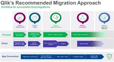
Simplify and Accelerate Your QlikView to Qlik Cloud Transition with Updated Migr...
Kick-off your transition journey by reviewing the key similarities and differences between QlikView and Qlik Cloud Analytics. Here you will find infor... Show MoreKick-off your transition journey by reviewing the key similarities and differences between QlikView and Qlik Cloud Analytics. Here you will find information on the following topics:
- Development and consumption
- Moving data from source to analysis
- Data connectors
- Script editing and syntax
- Document and content management
- The Management Console
- Application distribution
- Managing security
Next, plan your migration to Qlik Cloud. In this area, you’ll be able to determine your strategy by answering questions about your environment. Prepare for your implementation by understanding the migration workflow with tips on process and timing.
Following planning, the same area provides the steps to take to ensure security and governance. This includes authentication, roles and rules, and rationalizing your current Qlik deployment. Move on to assessing your applications and determining which are suitable for Qlik Cloud. Then, assess your data, including sources, connectors, and the approaches you can take. We also offer concepts and best practices, so you can better understand key considerations as well as how to use Qlik Sense Desktop as a conversion tool.
When you’re ready to deploy the Qlik Cloud tenant, we provide essential creation and configuration instructions. This includes naming, configuring your IP, assigning entitlements, and setting up your SMTP server.
Next, move on to the Qlik Cloud migration tools area, where you will be able to download the tools and learn when, why, and how to use them. Tools specifically related to QlikView include:
- QlikView to SaaS migration app
- Migration worksheet
- Migration scripts
You will also learn about the Qlik Lineage Connectors and how they’re used. We guide you on preparing for the migration, setting up the migration application, setting up user retrieval, and configuring migration scripts.
At this point, you’re ready to move on to migrating QlikView users and content. Here, we cover the following processes with step-by-step instructions:
- Migrating users, groups, roles, and related authorizations
- Migrating to spaces using the QlikView to SaaS Migration App and scripts
- Migrating data connections
- Migrating QlikView documents
We also recommend you take some time to check out the following examples:
- Using the QlikView Converter to move QlikView content to Qlik Sense
- Manually recreating QlikView content in Qlik Sense
We want you to maximize your Qlik Cloud Analytics experience while reducing the learning curve by minimizing friction to adoption for everyone. So, as you begin creating data visualizations using Qlik Cloud Analytics, be assured that we’ve made tremendous strides in this area over the past few years. Check out our latest blog post featuring many of the recent data visualization innovations.
Thank you for your loyalty to Qlik. We hope you found this information helpful and we wish you the best on your modernization journey to Qlik Cloud Analytics. We’d love your feedback on your experience so we can continue to make enhancements going forward.
-
Qlik Digest - August 2023
What’s New at Qlik? The Connector Factory has just introduced over 20 new cloud application source connectors for Qlik Cloud Data Integration! Learn M... Show MoreWhat’s New at Qlik?
The Connector Factory has just introduced over 20 new cloud application source connectors for Qlik Cloud Data Integration! Learn More
Introducing the Migration Center
Your go to place for tools to monitor, manage, and execute a migration from QlikView to Qlik Cloud Analytics is here. Learn More
Data’s role in the fight against climate change
With intense heatwaves hitting much of the planet recently, the impact of climate change is stark. See how Qlik and C40 Cities are helping to counteract climate change with data. Learn More
Win With Data Webinar
Join us on August 9 to learn how you can take advantage of the current generational shift in data integration, cloud infrastructures, and machine learning. Register Now
Product Release Webinar
Join us on August 23 for an exclusive session showcasing cutting-edge advancements in our portfolio. Discover the possibilities as we reveal our game-changing features for this quarter. Register
Workshop Wednesdays
Explore our weekly workshops to get hands-on experience with the Qlik Data Analytics and Data Integration Portfolio. From analytics basics to data integration services for snowflake, there’s something for everyone. View Sessions
Qlik Continuous Classroom – What’s on offer?
With 300+ courses, customized learning plans, qualifications and more, there’s a lot to discover! Join our webinar for a full tour and get your questions answered Register
-
The Path Forward (Series) – Fully Integrated AI and ML
Today, most organizations struggle to understand what is likely to happen in the future and why – unless they can invest in data scientists to create ... Show MoreToday, most organizations struggle to understand what is likely to happen in the future and why – unless they can invest in data scientists to create machine learning models and make predictions. Qlik AutoML brings AI generated models and predictive analytics capabilities directly to the larger community of analytics users and teams in a simple user experience, allowing them to apply this power to a wide range of “everyday” use cases.
In this first video, we introduce machine learning, describe the capabilities of Qlik AutoML and what makes it unique, and take a look at the many use-cases it can be applied to.
Can't see the video? Access to YouTube Blocked or Restricted? - Watch the video here.
With Qlik AutoML, business analysts and analytics teams can easily generate machine learning models, make predictions, and plan decisions – all within an intuitive, code-free user experience. It allows you to easily create ML experiments, identify key drivers in the dataset and generate models for training and refinement. You can then make future predictions on forward-looking data, complete with prediction influencer data (Shapley values) at the record-level. This allows you to understand not just what might happen, but why it might happen and what action can be taken to best affect outcomes. Predictive data can be easily published into Qlik Sense and other cloud platforms, and models can be integrated into Qlik Sense for real-time exploration and what-if scenario planning.
This next video provides a detailed demonstration of Qlik AutoML, including model training, generating predictions, and analyzing data in Qlik Sense.
Can't see the video? Access to YouTube Blocked or Restricted? - Watch the video here.
This concludes our blog and video series on AI and ML, but it’s only the beginning of our AI journey. With new advances such as generative AI transforming how we live and work, AI is positioned to become even more powerful in offering assistance and automation in analytics. We recently released our new suite of real-time connectors for OpenAI, allowing direct integration of generative AI content and capabilities into Qlik Sense apps and automations. This helps our users augment analytics, synthesize and combine data, and ask questions of generative AI to expand context and insight. Check it out here.
We hope you’ve enjoyed this blog series and stay tuned as we have many new and exciting AI-driven capabilities on the way.
AI & ML Path Forward Series:
Read Part 4 - Machine Learning Services for Augmented Analytics
Read Part 3 - Fully Integrated AI and ML
Read Part 2 - Automated Insights through Insight Advisor in Qlik Sense
Read Part 1 - Qlik's Fully Integrated AI and ML Capabilities -
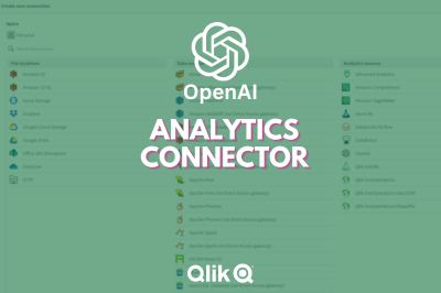
Introducing Qlik’s OpenAI Connectors - Delivering the power of Generative AI fo...
With this capability, users can take advantage of the rich content offered by generative AI in a variety of ways, such as augmenting analytics with na... Show MoreWith this capability, users can take advantage of the rich content offered by generative AI in a variety of ways, such as augmenting analytics with natural language insights from OpenAI, synthesizing and combining third-party data into existing data models, and allowing users to ask questions in real-time using data from Qlik.
These connectors represent the next evolution of our augmented analytics journey, which began in 2019 with the introduction of AI-driven insight generation and natural language interaction. We now natively support fully interactive search, chat, and NLG on internal data in 11 languages, and our Analysis Types capability offers a unique form of generative AI allowing users to create advanced analyses such as a clustering, forecasting, period-over-period, etc. in a few clicks – complete with AI generated visualizations and NLG. Now with the inclusion of generative AI, we continue to lead the way with augmented analytics that leverage the power of OpenAI to expand context, driver broader insight, and engage with more users.
Can't see the video? Go here
The analytics connector constructs and sends questions to OpenAI in real-time, which processes and returns narrative output and/or tabular data. Questions can be defined by the app developer using expressions in the load script or a sheet object, or entered by a user through the user interface, and can include data from the Qlik application as defined by selections. As opposed to large, expensive batch queries, our associative engine allows users to make selections and send small subsets of data to OpenAI in real-time, offering the most up-to-date, contextually relevant insights and answers and minimizing cost. And organizations can use this same power directly in their business process and automation workflows with our new OpenAI Connector blocks in Qlik Application Automation. The new Qlik Application Automation OpenAI Connector can be configured to send questions that return results and write back into business processes and/or source systems.
These connectors support a variety of use cases such as data ops, sales, marketing, customer support, and more. And this is only the beginning. With our open platform approach, we are providing customers and partners with the tools to innovate around generative AI, to take advantage of the many possibilities for driving even more value from our platform. And, our customers maintain complete governance and control over the relationship with OpenAI, including the data they send and how they choose to use it within our platform.
We look forward to hearing about how you’re utilizing these connectors to incorporate generative AI into your analytics experience. If you want to give us feedback or suggest new product capabilities, feel free to visit our new ideation portal.
Please check out these other companion videos to make yourself more familiar with how the OpenAI Analytics Connectors work with Qlik Cloud Analytics:
OpenAI Analytics Connector - Embed Generative AI Insights - Chart Expression - Part 1
Can't see the video? Go here
OpenAI Analytics Connector - Augment You Data Model with Generative AI - Part 2
Can't see the video? Go here
OpenAI Connector Blocks within Qlik Application Automation - Add Generative AI Insights to your Workflow
Can't see the video? Go here
-
How to read and use the new Qlik Sense Box Plot
Continuing with the description of the new charts available in the Qlik Sense June 2017 release, today is the Box plot’s turn. The American mathematic... Show MoreContinuing with the description of the new charts available in the Qlik Sense June 2017 release, today is the Box plot’s turn.
The American mathematician John W. Tukey introduced the box-and-whisker plot (called simply a box plot) in his 1977 book, "Exploratory Data Analysis".
Like the Distribution plot, the Box plot is a histogram-like method of displaying data and is appropriate to represent the degree of dispersion, skewness, and whether there are potential unusual observations in the data set. It’s particularly useful for comparing distributions between several sets of data, short of having several histograms close to each other so you can compare across them. The data center, spread and overall range are immediately apparent for each data set.
In my previous post about the distribution plot, I used an example data set containing data for 3 salespersons recording their monthly sales data. I'll reuse that data to illustrate how the box plot works.
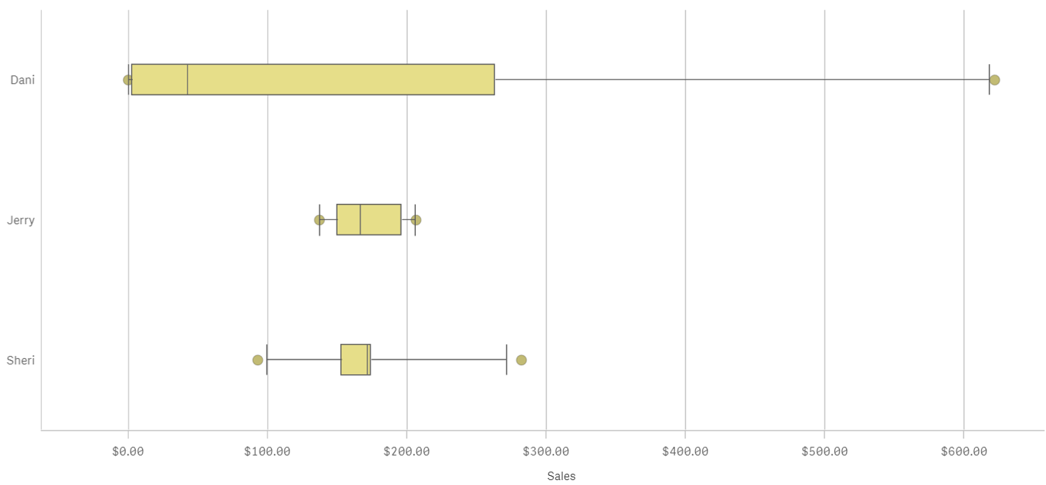
A Box plot will typically help us to visualize 5 numbers, the statistical median represented as a horizontal line inside the box, the box ends show the first and third quartiles values. The whiskers indicate the range of the data and they are represented as horizontal lines ending in a small vertical line. Whiskers extend to the farthest points that are not outliers. Depending on the box plot configuration you choose, a provision is made for the representation of extreme values, typically upper/bottom quartile range +/- 1 x interquartile range or IQR. Additionally, outliers or extreme values are represented with dots.
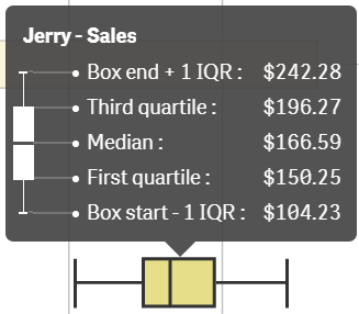
Some general observations about our salespersons’ box plots:
- The box plot is comparatively short – see Sheri. This suggests that overall monthly sales have a high level of similarity with each other.
- The box plot is comparatively tall – see Dani. This indicates Dani’s monthly sales are quite different across the year.
- The box plot is skewed – see Dani. There are more data points on the left/bottom (toward lower values), most of Dani's sales are small amount of sales.
To get the chart working in your Qlik Sense app it only requires one dimension (add a second dimension to compare across it) and one expression. Qlik Sense's new Box plot offers three standard presets, standard (Tukey), percentile-based, and standard deviation. For those of you with special needs or for those interested in learning more about fine tuning your chart, there’s a manual mode that give us full control over each one of the chart elements.

Enjoy it.
Arturo (@arturoqv)

-
Cloud Application Sources for Qlik Cloud Data Integration - A Connector Factory ...
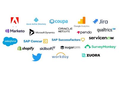
And now we’re excited to announce the first major launch of connectors for Qlik Cloud Data Integration. We’re introducing over 20 new connectors that... Show MoreAnd now we’re excited to announce the first major launch of connectors for Qlik Cloud Data Integration. We’re introducing over 20 new connectors that will enable Qlik Cloud Data Integration to gather both full and incremental data from these popular cloud applications:
Adobe Analytics Oracle Netsuite Shopify Coupa Pendo SuccessFactors Google 360 Analytics V4 Percipio (Skillsoft) Sugar CRM Jira Qualtrics SurveyMonkey Marketo Salesforce Twitter Microsoft Dynamic 365 CRM SAP Concur WorkDay Microsoft Azure Active Directory ServiceNow Zuora As there are an ever-growing number of cloud application sources, Qlik are creating these and any future SaaS application connectors using standard APIs and generative AI technology to streamline the development process. But rest assured that we followed the same guidelines as our existing connectors with regard to data integrity, security, and reliability. Another way we accelerated delivery was to start by building many of these connectors for a specific use case. Thus, while these connectors are Generally Available (GA) and covered by our standard support policies, we are initially tagging them as Preview. Once we expand the capabilities of these connectors to cover multiple use cases, we will remove the Preview label.
These connectors are available to all Qlik Cloud Data Integration customers. But we ask that you contact your local support representative to get these connectors turned on in your tenant. We are doing this to understand how you’ll be using these connectors so we can make sure you have the best experience possible.
To learn more about these connectors, check out these SaaS in 60 and Walkthrough videos below.
SaaS in 60
Walkthrough
-
Chart Label Enhancements
There have been many chart label enhancements made in Qlik Sense. In this blog, I will cover some of the new options available such as:All labels visi... Show MoreThere have been many chart label enhancements made in Qlik Sense. In this blog, I will cover some of the new options available such as:
- All labels visible
- Layered labels
- Line layer for labels
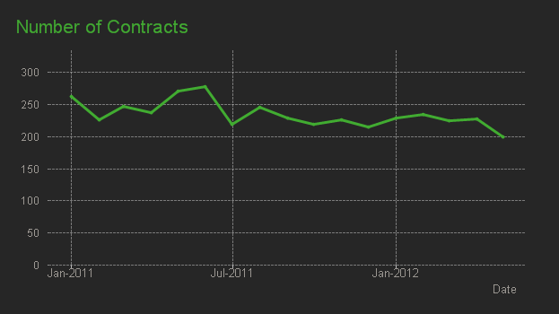
In the Appearance section of the Properties panel, if the “Show data point” checkbox is checked, there will be a drop down for Value labels as seen below. Selecting “All” will show all the data point labels in your charts.
In the chart above, all the data point labels are visible. This is a nice option when there are not too many data points or if the data points are spaced out. But if you find the labels overlapping as seen above, you may want to consider the “Auto” option. You always want the data to be readable, so if there are many data points that are close together to the point where the labels are not readable, switch to “Auto”. The “Auto” option has always been an available setting, but it is even better now. “Auto” displays labels based on the space available but it has been improved to display more labels. In the chart below, the Value labels is set to “Auto” and there is no overlap, and the labels are readable.
Another label enhancement is the ability to layer the labels on the x-axis. This property can be changed in the x axis section of the Properties panel as seen below (if the x-axis labels are set to be displayed in the chart).
We often see layers “Horizontal” or “Tilted” but now there is the “Layered” option which staggers the labels between two lines providing more space for the label text. I really like this option because it is clean, and most labels are fully visible.
The last label enhancement I will cover today is the line layer for labels. This makes use of the Dual function to create a white line layer along the x-axis which can be used as a label for a visualization. The chart below shows an example of two line layer labels – one for the month and one for the percent change.
Let’s take a closer look at how these labels were created. Since we are creating the labels for the x-axis, Labels and title for the x and y axis is set to “None.”
And the measure for the month and percent label is presented as a white line (which will not be visible since the background is also white).
The measure below is used to create the month label.
In this expression, the Dual function takes the month field and gives it a numeric value of -50. By using the Dual function, it allows the field to have a string representation that is displayed as the month and a numeric representation of -50 which we cannot see since the white line blends with the white background. The percent change label works the same way except in this expression, some additional formatting is added to show an indicator for an increase or decrease in sales since the previous month.
This is a cool trick that adds more value to your chart labels. You can learn more about the Dual function in Qlik Help and in one of my previous blogs.
Hopefully, you find these new label enhancements useful. All the examples shown here are available in the What’s New app which can be viewed and downloaded from the Demo Site.
Thanks,
Jennell
-
Creating Reference Dates for Intervals
Last week I wrote about how to create reference dates for exchange rates and warehouse balances: How to populate a sparsely populated field. There i... Show MoreLast week I wrote about how to create reference dates for exchange rates and warehouse balances: How to populate a sparsely populated field.
There is however also a second case where you want to create reference dates, but the data model is quite different. It is when you have a list of contracts with validity periods: Rental contracts, Insurances policies, Healthcare commitments, etc.
Each contract has a begin day and an end day. The analysts of an insurance company would probably want to ask the question: “How many valid insurance policies did we have on this specific day?” In other words, he wants to click on a reference date to see the count of policies that are associated with this date – even though this date doesn't exist in the source data.
The solution is to first load all policies in one table. Then load a second table that has one record per policy and date (Policies_x_Dates). This second table can in turn link to a master calendar.
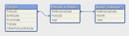
But the middle table does not exist in the source database. Instead, you must generate it using a While loop that loops over each record in the Policies table, i.e. each source record will be loaded several times. This way, you can load not only the “From” date and the “To” date, but also all dates in between:
Policies:
Load PolicyID, BirthDate, PolicyAmount, FromDate, ToDate, OtherPolicyAttribute
From Policies;Policies_x_Dates:
Load PolicyID,
Age( FromDate + IterNo() – 1, BirthDate ) as Age,
PolicyAmount / (ToDate - FromDate + 1) as DailyAmount,
Date( FromDate + IterNo() – 1 ) as ReferenceDate
Resident Policies
While IterNo() <= ToDate - FromDate + 1 ;Note that the Policies table has exactly one record per insurance policy, and the newly created Policies_x_Dates table has exactly one record per combination of policy and date. Note also that there are other fields that should be put in the Policies_x_Dates table, e.g., the age of the insured person, since this depends on the reference date. Further, it is possible to break up a cost or an income into daily amounts, which is useful when you want to show the correct amount distributed over the year.
The While loop is a very useful tool whenever you need to create additional tables in the data model. It is often a better option than the IntervalMatch.
Read more in Generating Missing Data In QlikView.

-
A look at the new OpenAI Analytics Connector
In today's data-driven world, where every byte of information matters, integrating artificial intelligence with analytical tools opens up a new realm ... Show MoreIn today's data-driven world, where every byte of information matters, integrating artificial intelligence with analytical tools opens up a new realm of possibilities. Following Qlik’s annoucement of its new OpenAI Connector, we will be trying it out in this post and seeing different ways it can be used to seamlessly bring generative AI content to augment your Qlik data.
The OpenAI connector serves as a bridge between your Qlik Sense apps and OpenAI's robust generative AI models, such as the ones powering ChatGPT.
With it, you can bring a new level of contextual understanding and analytical depth to your applications, enhancing the way you comprehend and utilize your data.
In the upcoming sections of this post, we will start by taking a look at how you can directly tap into OpenAI’s completion API using the simple REST connector, then we will jump into how to do the same in a much simpler way using the new OpenAI Analytics connector.
Before you start, you need to:
- Sign up for an OpenAI account: https://platform.openai.com/
- Create a new API key
- In Qlik Cloud Managment console, make sure to enable “Learning endpoints” under “Feature control” in the Settings section:
1/ Using the REST connector to call OpenAI’s completion API:
First, let’s prepare our data. After loading our customer reviews table, we need to prepare both our data and prompt so that we can send it as part of the request body to the completion API endpoint.
You can view all the details on the documentation: https://platform.openai.com/docs/api-reference/completions/create
But we basically need to first convert our data into JSON format, concatenate it with our prompt sentence, then inject it into the request body.
[Reviews]:
First 25
LOAD
    review_id,
    product_id,
    product_name,
    customer_id,
    customer_name,
    review_title,
    review_text,
    review_date,
    verified_purchase,
    recommend_product
FROM [lib://DataFiles/reviews-data.csv]
(txt, codepage is 28591, embedded labels, delimiter is ',', msq);

// turn data into json:
[InputField_JSON]:
Load
 'Reviews: [' & Concat( '{review_date: ' & review_date & ', review_title: ' & review_title & ', review_text: ' & review_text & ', product_name: ' & product_name & ', customer_name: ' & customer_name & ', recommend_product: ' & recommend_product & ' }', ',') & ']' as json
RESIDENT Reviews;
LET vDataInput = Peek('json');

// construct prompt
LET prompt = 'You are a data analyst, you will summarize the following data into the top products based on reviews and give the names of customers who made negative comments.';

TRACE vprompt = '$(prompt)';

// construct request body for openAI request
LET requestBody = '{
  "model": "text-davinci-003",
  "prompt": "$(prompt) Source: $(vDataInput)",
  "max_tokens": 2048,
  "temperature": 0
}';

LET requestBody = Replace(requestBody, '"', Chr(34)&Chr(34));

TRACE vRequestBody = '$(requestBody)';
In the above script, we turned the Reviews data into a JSON-formatted string and stored it in the “vDataInput” variable, we then created the prompt phrase asking the model to summarize the data and return top products based on the reviews as well as the names of customers who gave bad reviews.
Finally, we constructed the request body for the POST request that will be used in the REST API call below.
Notice that the model chosen is text-davinci-003, the prompt is the combination of our 2 variables, and max_tokens is set to a higher number to allow for a bigger response.
Next, we create the REST API connection and make sure to to check “Allow With Connection”:
Finally, Save the newly created connection, then click on “Select Data” under the connection name, choose Root and insert Script to get the following:
(P.S: I have edited the generated script to add the “WITH CONNECTION statement injecting the requestBody variable as the Body of the request”):LIB CONNECT TO 'REST OpenAI'; RestConnectorMasterTable: SQL SELECT "id", "object", "created", "model", "__KEY_root", (SELECT "text", "index", "logprobs", "finish_reason", "__FK_choices" FROM "choices" FK "__FK_choices"), (SELECT "prompt_tokens", "completion_tokens", "total_tokens", "__FK_usage" FROM "usage" FK "__FK_usage") FROM JSON (wrap on) "root" PK "__KEY_root" WITH CONNECTION (BODY "$(requestBody)" ); [OpenAI Response]: LOAD [text] AS response_openai, [finish_reason], [__FK_choices] AS [__KEY_root] RESIDENT RestConnectorMasterTable WHERE NOT IsNull([__FK_choices]); JOIN([OpenAI Response]) LOAD [prompt_tokens], [completion_tokens], [total_tokens], [__FK_usage] AS [__KEY_root] RESIDENT RestConnectorMasterTable WHERE NOT IsNull([__FK_usage]); DROP TABLE RestConnectorMasterTable;Once we hit “Load Data”, we can jump to a sheet to view the response:
Great, after inserting the “response_openai” field into a Text & Image object, we can see that the model returned the answers accuretly!
Keep in mind that you can use this method in Qlik Enterprise as well.
2/ Using the new OpenAI Connector:
There are 2 different configurations of this connector to send data to the endpoint service:
-
OpenAI Completions (GPT-3) and OpenAI Chat Completions (GPT-3.5, GPT-4) – Rows:
This will send each row of data as a question to the completion api and each response will be stored as text in a table with the same number of rows as the input.
-
OpenAI Completions (GPT-3) – JSON Tables: This will send a request on each row, where the response is expected to be a JSON list of data. The connector will convert the JSON table into a table of data in the Qlik Data Model.
2.1/ Rows:
First, we load the Reviews table into Qlik and include a new field for the prompt, where we ask the model to suggest actions to be taken in order to improve sales based on the reviews customers have left for each product.
[Reviews]:
First 25
LOAD
    review_id,
    product_id,
    product_name,
    customer_id,
    customer_name,
    review_title,
    review_text,
    review_date,
    verified_purchase,
    recommend_product,
    'Based on the review with title: '& review_title & ' about product ' & product_name & ' customer "' & customer_name & '" said ' & review_text & ', what action would you suggest based on this feedback to improve sales?' as prompt
FROM [lib://DataFiles/reviews-data.csv]
(txt, codepage is 28591, embedded labels, delimiter is ',', msq);
Then, we create a new OpenAI Data Connection:
Select OpenAI Completions (GPT-3) - Rows, insert your API Key, and make sure to increase the Max Tokens to a higher number to allow for a bigger response from the API.
We set the association field to “review_id” to connect the OpenAI generated data with our Reviews table.
We then use the Select Data wizard and enter “Reviews” as the Resident Table.
The Data Field is the prompt field we previously added to our table.
With that inserted, this is how the complete load script should look like:
[Reviews]:
First 25
LOAD
    review_id,
    product_id,
    product_name,
    customer_id,
    customer_name,
    review_title,
    review_text,
    review_date,
    verified_purchase,
    recommend_product,
    'Based on the review with title: '& review_title & ' about product ' & product_name & ' customer "' & customer_name & '" said ' & review_text & ', what action would you suggest based on this feedback to improve sales?' as prompt
FROM [lib://DataFiles/reviews-data.csv]
(txt, codepage is 28591, embedded labels, delimiter is ',', msq);

[openai]:
LOAD
	[id],
	[object],
	[created],
	[model],
	[prompt_tokens],
	[completion_tokens],
	[total_tokens],
	[choices.text],
	[choices.index],
	[choices.logprobs],
	[choices.finish_reason],
	[review_id]
EXTENSION endpoints.ScriptEval('{"RequestType":"endpoint", "endpoint":{"connectionname":"OpenAI"}}', Reviews{review_id,prompt});
Once the data is loaded, we can now inspect the data model and see the relation between the newly generated openai table and our Reviews table:
Finally, we create a sheet with our Reviews table fields in a table, and a Text & Image object where we put the [choices.text] field which contains the OpenAI response.
For instance:
when selecting a good Review:
when electing a bad Review:
Alternatively, you can call the connection directly from a chart and pass in the prompt.
For instance, here we add a Text & Image object, and add the ScriptAggrStr expression to ask the model to give a general sentiment on a product regarding its price and performance.
If(GetSelectedCount(product_name)>0,
endpoints.ScriptAggrStr('{"RequestType":"endpoint", "endpoint":{"connectionname":"OpenAI","column": "choices.text"}}', 'How do customers feel about ' & product_name & 'in regards to its price and performance')
,'Please select a product to see results')
2.2/ Rows with a JSON prompt
What if instead of sending each row data as a prompt to the completion API, we want to send the whole Reviews dataset and get a general insight based on that.
In this case we can re-use our data to JSON transformation we did in Section 1 of the post, and create and inline table with one row that contains our prompt along with this JSON formatted data, then simply use the “OpenAI Completions - Rows” config to get our response:
Here is how the load script looks like:
// Open AI - Rows call - JSON
[Reviews]:
First 25
LOAD
    review_id,
    product_id,
    product_name,
    customer_id,
    customer_name,
    review_title,
    review_text,
    review_date,
    verified_purchase,
    recommend_product
FROM [lib://DataFiles/reviews-data.csv]
(txt, codepage is 28591, embedded labels, delimiter is ',', msq);

// Turn Reviews Table into JSON

[InputField_JSON]:
Load
 '" {"Reviews" : [' & Concat( '{"review_date": "' & review_date & '", "review_title": "' & review_title & '", "review_text": "' & review_text & '", "product_name": "' & product_name & '", "customer_name": "' & customer_name & '", "recommend_product": "' & recommend_product & '" }', ',') & '] }"' as json
RESIDENT Reviews;

LET vDataInput = Peek('json');

// Build Prompt text

SET vPrompt = 'Based on the following dataset, what insights can you retrieve, what strategies could I implement to improve customer satisfaction, and which products should I focus on to improve their sales. Dataset: ';
SET vText = $(vPrompt) $(vDataInput);
TRACE vdata = $(vText);

// Load into table

[TableWithData]:
LOAD
	RowNo() as RowId,
  '$(vText)' as Text
AUTOGENERATE 1;


[openai]:
LOAD * EXTENSION endpoints.ScriptEval('{"RequestType":"endpoint", "endpoint":{"connectionname":"OpenAIJSONTables"}}', TableWithData{RowId,Text});
Notice once the data is loaded that all our dataset is sent as part of the prompt.
Once we load the data, we add a Text & Image object and insert the [choices.text] field to view the AI generated response:
2.3/ JSON Tables
Lastly, let’s explore how the JSON Tables config of the OpenAI Connector works to return a table of data:
First, we create the connection and choose the appropriate configuration (make sure to increase the Max Tokens)
The laod script is simple, we have an inline table with a Text field containing our prompt, followed by the OpenAI load statement generated through the Select Data wizard.
SourceTable:
NoConcatenate
LOAD
RowNo() as RowId,
Text
Inline
[Text
top 10 Countries by Population. Extract as JSON list];

[openai]:
LOAD * EXTENSION endpoints.ScriptEval('{"RequestType":"endpoint", "endpoint":{"connectionname":"OpenAI TABLES"}}', SourceTable{RowId,Text});
Once the data is loaded, we can check the Data model and preview the openai table.
Notice that we now have a table with the top 10 countries by population. This data can be used to generate analytics content without refering again to openai.
Attached, you will find the QVF of the example app. Within the Data Load Editor, each example is broken into its own section that ends with an EXIT SCRIPT. You can drag the section to the top to only load that specific example.
More things to consider:
- Using OpenAI connector inside Qlik Application Automation: https://community.qlik.com/t5/Official-Support-Articles/How-to-Getting-started-with-the-OpenAI-Connector-in-Qlik/ta-p/2077315
Useful Resources:
- https://www.youtube.com/watch?v=R9ScDzEU9DQ
- https://www.youtube.com/watch?v=XCaaRenozb8&t=502s
- https://www.youtube.com/watch?v=qfGWKXAAKNI
- https://help.qlik.com/en-US/cloud-services/Subsystems/Hub/Content/Sense_Hub/LoadData/ac-openai-use.htm
I hope you found this post useful and you were able to get a better understanding on how the new OpenAI Connector works to bring generative AI content to augment your existing Qlik Sense applications.
Thank you for reading.
-
Qlik Data Integration Newsletter - July 2023
This is our second monthly Qlik Data Integration newsletter. Each month, we cover one endpoint and share our top resources, best practices, release up... Show MoreThis is our second monthly Qlik Data Integration newsletter. Each month, we cover one endpoint and share our top resources, best practices, release updates and upcoming webinars.
Subscribe to the Qlik Data Integration topic to be notified of future editions!
Index
- Resource Highlights
- Webinars
- Knowledgebase Articles
- Retiring Qlik Replicate Endpoints
- Analyze Qlik Replicate Logs
- Endpoint Spotlight: SQL Server
- New Issues Reported
- Tips!
- Release Updates
- Fixes
- Enhancements
- New Releases
- Qlik Data Integration Product End of Life Versions
Resource Highlights
Webinars
(Update) Book your calendar for the upcoming Q&A with Qlik: New to Qlik Cloud Q&A session scheduled for August 15th at 10:00 AM EDT. It is a live Q&A session with a panel of Qlik experts. Bring your questions, and we do our best to answer them.
Explore Qlik Support's recorded Techspert webinar series on-demand or visit our YouTube Channel to discover more!
Knowledgebase Articles
Retiring Qlik Replicate Endpoints
As of July 31st, 2023, the following endpoints will be retired:
Source Endpoints:
- HP Non-Stop Source
- Open VMS RMS Source
- Hadoop Source
Target Endpoints:
- MapR Target
- MapR Streams Target
- MS APS PDW Target
- SAP Sybase IQ Target
- HP Vertica Target
- Actian Vector Target
- Netezza Target
- Pivotal Greenplum Target
See Retirement for Specific Qlik Replicate Endpoints for details.
Analyze Qlik Replicate Logs
An evergreen pair of articles helps you read and analyze Qlik Replicate log files:
How to analyze a Qlik Replicate log
List of the error types in Qlik Replicate
Endpoint Spotlight: SQL Server
Find our latest knowledge base articles for SQL Server endpoints.
New Issues Reported
- Qlik Replicate Task logs a warning: ]W: MS-REPLICATION is not enabled for table
- Find the resolution in Qlik Replicate Task logs a warning: ]W: MS-REPLICATION is not enabled for table.
- Qlik Replicate: [SQL Server]Login failed
- The behavior began after an upgrade to Qlik Replicate version 2022.11 or later. Find the resolution in Qlik Replicate: [SQL Server]Login failed after an upgrade to Qlik Replicate 2022.11 or later.
Tips!
- Qlik Replicate Red Hat 8 SQL Server Source fails TCP Provider: Error code 0x2746
- Qlik Replicate 2022.5 fails to connect to SQL Server Source Endpoint when connecting from Red Had Linux 8 using the libmsodbcsql-17.10.so.1.1 or libmsodbcsql-17.6.so.1.1. Qlik Replicate Red Hat 8 SQL Server Source fails TCP Provider: Error code 0x2746 for details.
- Qlik Replicate: SQL Server idle connections closed
- Inactive TCP/IP connections to SQL Server can sometimes be closed by your router or firewall. This will give your task a recoverable environmental error. Parameters in the Windows Registry can be set to send transmissions for the connection to keep it active. For more information, see Qlik Replicate: SQL Server idle connections force closed.
- Best Practice: Qlik Replicate: SQL replication jobs
- If you use a non-sysadmin account to replicate data from SQL Source, then the DBA must update the owner of all SQL Server jobs belonging to ‘REPL%’ category to the SA account.Qlik Replicate will not create or manage any of the SQL Agent jobs.
- Best Practice: SQL Server Source - Rebuild Index Best Practices and Recommendations
Release Updates
Fixes
Qlik Replicate May 2023 SP1
Type: Issue
Component/Process: Microsoft Azure SQL (MS-CDC) and Microsoft SQL Server (MS-CDC) targets
Description: The task would fail when DB_ID() returned a different value than database_id in sys.databases. The issue was resolved using an internal parameter.
Type: Issue
Component/Process: Microsoft SQL Server Source
Description: An online transaction log is read sometimes slow, add an internal property to control the number of rows being read in one request.
Type: Issue
Component/Process: SQL Server Source
Description: sp_repldone truncation prevention does not work with specific collation
Type: Issue
Component/Process: Transformation
Description: A transformation expression that separates keywords by a new line, cannot be executed causing SQLite errors.
Type: Issue
Component/Process: MySql Source
Description: When NOT NULL column is defined as AUTOINCREMENTED, it is exposes as NULLABLE.
Type: Issue
Component/Process: MySQL Source
Description: When replicating a high volume of data, starting the task or retrieving the table list would take an excessively long time or get stuck. The issue was resolved using an internal parameter.
Enhancements
Qlik Replicate August 2023 SR
- New Confluence Endpoint (based on Kafka)
Qlik Replicate November 2023 IR
- Expose stream buffer tuning parameters in task settings as per ideation request: Replicate & QEM - Expose stream buffer tuning parameters in task settings
- Confluent Schema Register using BOTH authentication methods (Public Key + Username & password)
- MariaDB new version certifications
New Releases
(Updated) Available on the Download Page
- Qlik Replicate 2022.11 SP06
- Qlik Enterprise Manager 2022.11 SP06
Qlik Data Integration Product End of Life Versions
Qlik Release Qlik Replicate / Enterprise Manager End of Support Date Qlik Compose End of Support Date February 2021 November 2020 SR1 November 2022 February 2021 February 2023 May 2021 May 2021 May 2023 May 2021 May 2023 August 2021 May 2021 SR1 May 2023 August 2021 August 2023 November 2021 November 2021 November 2023 November 2021 November 2023 For more information, see Qlik Product Lifecycles.
-
Qlik Academic Program and MIT ADT- A case study
Pune based MIT ADT University and the Qlik Academic Program have collaborated very well to bring value to students in data analytics. More than 2000 s... Show MorePune based MIT ADT University and the Qlik Academic Program have collaborated very well to bring value to students in data analytics. More than 2000 students from MIT ADT stand to benefit from this engagement. Many students have been trained using the academic program resources and also are qualified to build their careers. Prof Sumitra Mandlik who leads these initiatives at MIT ADT shares her thoughts on this partnership and how students are benefitting from the Qlik Academic Program. Sumitra is also the Educator Ambassador of the Academic Program for 2023.
To read more on this, visit: https://www.qlik.com/us/resource-library?searchResources=MIT+ADT&Customer+Story=on#searchResults
For free resources in data analytics including training, qualifications and certifications, visit: qlik.com/academicprogram
-
Thank You Sarah Miller - We Will Miss You - We Wish You All The Best!!!!
We are sad to announce that Sarah Miller (Qlik Academic Program lead for the Americas) is resigning from Qlik. Sarah will be so missed!! She has bee... Show MoreWe are sad to announce that Sarah Miller (Qlik Academic Program lead for the Americas) is resigning from Qlik. Sarah will be so missed!! She has been part of the Qlik Academic Program since the program started, and made such an impact to the program, to Qlik, and to all of the educators and students who have enrolled in the program all these years. During that time she has:
- Reviewed thousands of leads
- Processed thousands of applications
- Responded to thousands of emails in our program inbox
- Brought more than 875 universities into the program in the Americas
- Brought more than 700 educators into the program in the Americas
- Held more than 100 enablement sessions, webinars, and workshops
- Worked on the development of the Academic Program Curriculum courses, the Qlik Sense Qualifications, the Educator Toolkit, the Educator Ambassador Program...and SO MUCH more!!
- Given us more laughs and smiles than we could EVER count!
I know I speak for the entire Academic Program team, our Qlik Regional Champions, and our Educator Ambassadors (and really all of our program educators around the world) when I say we will absolutely miss you, but we wish you all the best!
Enjoy this next phase in your life!
-
【9/12(火)13:30 開催】QlikWorld Tokyo:データ愛好家が集結するビッグイベント!
データ・分析・AI の最新トレンドを一挙ご紹介! 来たる 9/12(火)、Qlik はデータ・分析・AI に関する新たな視野が広がるイベント「QlikWorld Tokyo」を開催します。 本イベントでは、データ・分析・AI の最新トレンドや成功例に関するインサイトをご紹介します。基調講演をはじめ... Show Moreデータ・分析・AI の最新トレンドを一挙ご紹介!
来たる 9/12(火)、Qlik はデータ・分析・AI に関する新たな視野が広がるイベント「QlikWorld Tokyo」を開催します。
本イベントでは、データ・分析・AI の最新トレンドや成功例に関するインサイトをご紹介します。基調講演をはじめ、ビジネス向けや技術向けの講演、Qlik およびパートナー企業の展示ブースなど、データの可能性を最大化するヒントが満載のイベントに、ぜひご参加ください。
- 貴社の成長と優位性を確保するデータ活用法
- データを管理 / 統合 / 分析し、データをアクションにつなげる Qlik ポートフォリオの最新イノベーション
- Qlik の顧客による注目の成功事例と成果
※ 内容は予告なく変更になる可能性があります。予めご了承ください。
※ 定員に達し次第、お申し込みを締め切らせていただきます。【開催概要】
日時:2023年 9月 12日(火)13:30(12:30 受付開始)
会場:東京ポートシティ竹芝 ポートホール / ポートスタジオ
〒105-7501 東京都港区海岸 1-7-1
会場地図はこちら参加費:無料
お問い合わせ:Marketingjp@qlik.com までお問い合わせください。 -
Qlik’s Response to Apache Log4j Vulnerabilities: CVE-2021-44228 / CVE-2021-45046...
Qlik has been diligently reviewing and testing our product suite since we’ve become aware of the Apache Log4j vulnerability mid-December. We want to ... Show MoreQlik has been diligently reviewing and testing our product suite since we’ve become aware of the Apache Log4j vulnerability mid-December. We want to ensure Qlik users that your security is our upmost priority. We have addressed multiple vulnerabilities through a series of product patches for supported affected versions and we recommend you update to the most recent releases available, shown in the chart below.
Log4j versions before v2.16 presented the highest threat and all exposed Qlik products have provided patches with at least v2.16 and will all be updated to v2.17.1 or later under the regular release schedule as we are not vulnerable to the CVEs related to 2.17.0
We’d like to direct you to our FAQ document to review should you have any further questions, and we encourage you to comment with any additional questions.
The following products are not affected:
- Qlik Sense Enterprise, all supported versions
- Qlik Sense Enterprise SaaS
- QlikView, all supported versions
- Nprinting, all supported versions
- Qlik Alerting, all supported versions
- Qlik Web Connectors, all supported versions
- Qlik RepliWeb and ARC, all supported versions
- AIS, including ARC, all supported version
- Nodegraph
- AutoML
- Qlik Catalog supported versions before May 2021 are not affected
- Blendr
- Qlik Data Transfer
- Salesforce and SAP Connectors are not affected
- Qlik Forts
- ODBC Connector Package
- REST Connectors
- Qlik Sense Business
The following products are under review:
- Attunity Visibility
The following products are affected. Qlik has provided patches linked here; customers are advised to install the patches at their earliest convenience.
Downloads can be accessed by visiting our new Downloads page on Qlik Community when signed in with your Qlik ID , then selecting the product then the latest release.
Affected Product Version
CVE-2021-44228
CVE-2021-45046
CVE-2021-45105
CVE-2021-44832
Recommended Action
Log4J Version included in patch
Compose 2021.8
Vulnerable, solved by patch
Vulnerable, solved by patch
Not vulnerable
Not vulnerable
Install 2021.8 SR01
Up to 2.16.0
Compose 2021.5
Vulnerable, solved by patch
Vulnerable, solved by patch
Not vulnerable
Not vulnerable
Install 2021.5 SR01
Up to 2.16.0
Compose 2021.2
Vulnerable, solved by patch
Vulnerable, solved by patch
Not vulnerable
Not vulnerable
Install 2021.2 SR01
Up to 2.16.0
C4DW 7.0
Vulnerable, solved by patch
Vulnerable, solved by patch
Not vulnerable
Not vulnerable
Install 7.0 2021 SR04
Up to 2.16.0
C4DW 6.6.1
Vulnerable, solved by patch
Vulnerable, solved by patch
Not vulnerable
Not vulnerable
Install 6.6.1 SR03
Up to 2.16.0
C4DW 6.6
Vulnerable, solved by patch
Vulnerable, solved by patch
Not vulnerable
Not vulnerable
Install 6.6.0 SR06
Up to 2.16.0
C4DL 6.6
Vulnerable, solved by patch
Vulnerable, solved by patch
Not vulnerable
Not vulnerable
Install 6.6.0 SR09
Up to 2.16.0
Replicate 2021.11
Vulnerable, solved by patch
Vulnerable, solved by patch
Not vulnerable
Not vulnerable
Install version published 22 Dec 2021
Up to 2.16.0
Replicate 2021.5
Vulnerable, solved by patch
Vulnerable, solved by patch
Not vulnerable
Not vulnerable
Install 2021.5 SR 05
Up to 2.16.0
Replicate 7.0
Vulnerable, solved by patch
Vulnerable, solved by patch
Not vulnerable
Not vulnerable
Install 7.0.0 SR05
Up to 2.16.0
Replicate 6.6
Vulnerable, solved by patch
Vulnerable, solved by patch
Not vulnerable
Not vulnerable
Install 6.6.0 SR06
Up to 2.16.0
QEM 2021.11
Vulnerable, solved by patch
Vulnerable, solved by patch
Not vulnerable
Not vulnerable
Install version published 22 Dec 2021
Up to 2.16.0
QEM 2021.5
Vulnerable, solved by patch
Vulnerable, solved by patch
Not vulnerable
Not vulnerable
Install 2021.5 SR05
Up to 2.16.0
QEM 7.0
Vulnerable, solved by patch
Vulnerable, solved by patch
Not vulnerable
Not vulnerable
Install 7.0.0 SR05
Up to 2.16.0
QEM 6.6
Vulnerable, solved by patch
Vulnerable, solved by patch
Not vulnerable
Not vulnerable
Install 6.6.0 SR03
Up to 2.16.0
Catalog 4.12.0, 4.12.1
Vulnerable, solved by patch
Vulnerable, solved by patch
Vulnerable, solved by patch
Not Vulnerable, JDBC Appender not configured
Install 4.12.2
Up to 2.17.0
Catalog 4.11.0, 4.11.1
Vulnerable, solved by patch
Vulnerable, solved by patch
Vulnerable, solved by patch
Not Vulnerable, JDBC Appender not configured
Install 4.11.2
Up to 2.17.0
Catalog 4.10.0, 4.10.1, 4.10.2
Vulnerable, solved by patch
Vulnerable, solved by patch
Vulnerable, solved by patch
Not Vulnerable, JDBC Appender not configured
Install 4.10.3
Up to 2.17.0
GeoAnalytics Server - 4.32.3 and 4.23.4
Vulnerable, solved by patch Vulnerable, solved by patch Vulnerable, solved by patch Vulnerable, solved by patch Install 4.32.5
Up to 2.17.1
GeoAnalytics Server - 4.27.3 - 4.19.1
Vulnerable, solved by patch Vulnerable, solved by patch Vulnerable, solved by patch Vulnerable, solved by patch Install 4.27.4 – 4.19.2
Up to 2.17.1
GeoAnalytics Plus - 5.31.1 and 5.31.2
Vulnerable, solved by patch
Vulnerable, solved by patch
Vulnerable, solved by patch
Vulnerable, solved by patch
Install 5.31.3
Up to 2.17.1
GeoAnalytics Plus - 5.30.1-5.29.4
Vulnerable, solved by patch
Vulnerable, solved by patch
Vulnerable, solved by patch
Vulnerable, solved by patch
Install 5.30.2 – 5.29.5
Up to 2.17.1
GeoAnalytics Plus - 5.28.2-5.27.5
Vulnerable, solved by patch
Vulnerable, solved by patch
Vulnerable, solved by patch
Vulnerable, solved by patch
Install 5.28.3 – 5.27.6
Up to 2.17.1
GeoAnalytics Plus - 5.26.5
Vulnerable, solved by patch
Vulnerable, solved by patch
Vulnerable, solved by patch
Vulnerable, solved by patch
Install 5.26.6
Up to 2.17.1
Please keep in mind that Qlik's on-premise (or client-managed) data integration products are intended to only be accessed on an internal network; therefore any potential impacts of CVE-2021-44228 should be mitigated by your internal network and access controls.
For information on supported versions, please visit the Product Support Lifecycle
Please subscribe to our Support Updates blog for continued updates.
Thank you for choosing Qlik,
Qlik Global Support
Change Log:
- Post Created Dec. 11, 2021
- Dec. 11, 2021 1:30pm EST: Updated article to specify which products were confirmed as not affected or still under evaluation
- Dec. 12, 2021 2:00pm EST: Updated to state that QCS was not affected; added additional products as under evaluation
-
Dec. 13, 2021 12:15pm EST: Updated to specify which versions applied to not affected products; added changelog.
-
Dec. 13, 2021 3:15pm EST: Updated to specify which versions are affected with steps to mitigate and which products we are still evaluating.
- Dec. 13, 2021 5:10pm EST: Added GeoAnalytics Plus mitigation, and expanded "not affected" section to further products. 5:55pm EST added AIS to not affected list.
-
Dec. 14, 2021 2:10pm EST: Added Qlik Catalog, Blendr, and Qlik Data Transfer to reviewed list. Added mitigation steps for Qlik Catalog.
- Dec. 14, 2021 2:45pm EST: Added JDBC, Salesforce and SAP Connectors to the not affected list.
- Dec. 15, 2021 3:05pm EST: Added Patch schedule, and the following items to NOT affected: Qlik Forts, ODBC Connector, REST connectors, and Qlik Sense Business.
-
Dec. 16, 2021 1:15pm EST: Updated Catalog version details in Patch schedule.
- Dec. 17, 2021: 3:25pm EST: Mitigation steps for Compose, Replicate, and QEM were updated
- Dec. 20, 2021 9:00am EST: Updated link to Catalog patches.
-
Dec. 20, 2021 1:15pm EST: Updated top post for status of CVE-2021-45105 and language around Catalog to be 'Hotfix' with full version patches in early Jan. 2022 in published.
-
Dec. 21, 2021 3:45pm EST: Updated Catalog to be 'Service Releases' with full version 2.17 published to downloads page.
- Dec. 22, 2021 8:30am EST: Compose 2021.8 released on Qlik Download pages
- Dec. 28, 2021 10:40am EST: Compose 2021.2 -- SR1, Replicate 2021.5 -- SR5, and QEM 2021.5 -- SR5 released on Qlik Download pages and marked as published. 12:00pm combined mitigation links with Patch release schedule chart.
- Dec. 30, 2021 11:00am EST: Patch Release published for C4DW 7.0 - 2021 -- SR4
- January 6, 2021 9:30am EST: Updated expected time for GeoAnalytics patches to "Early January".
- January 11, 2022 7:00am EST: Updated to reflect all GeoAnalytics patches as published.
- January 14, 2022 2:00pm EST: Marked the following patches as published: C4DW 6.6.0 -- SR06,C4DW 6.6.1 -- SR03, C4DL 6.6.0 -- SR09, Replicate 6.6.0 -- SR06, Replicate 7.0.0 -- SR05, QEM 6.6.0 -- SR03, QEM 7.0.0 -- SR05
- January 20, 2022 3:15pm EST: Clarified that there are two patches for GeoAnalytics November 2021. Patch 2 updates log4j to 2.17.0
-
February 15, 2022 4:00pm EST: Updated chart to breakout vulnerabilities per product, reflect the latest patch versions to upgrade to, changed post title, and clarified intro statement.
-
Introducing Cloud Application Sources for Qlik Cloud Data Integration
We are pleased to introduce the first major launch of over 20 connectors for Qlik Cloud Data Integration enabling you to leverage both full and increm... Show MoreWe are pleased to introduce the first major launch of over 20 connectors for Qlik Cloud Data Integration enabling you to leverage both full and incremental data load from these popular Cloud Application sources.
For this release you will find below connectors made available to you:
Adobe Analytics
Oracle Netsuite
Shopify
Coupa
Pendo
SuccessFactors
Google 360 Analytics V4
Percipio (Skillsoft)
Sugar CRM
Jira
Qualtrics
SurveyMonkey
Marketo
Salesforce
Twitter
Microsoft Dynamic 365 CRM
SAP Concur
WorkDay
Microsoft Azure Active Directory
ServiceNow
Zuora
How to start using the feature:
These connectors will be tagged as Preview and access will need to be requested via your Qlik Customer Success Manager or Qlik Support providing your tenant details and the connectors you are interested in using.
A requirement is to have set-up Data Gateway - Data Movement. For more information, see Qlik Data Gateway - Data Movement overview.
Once this is done you will need to:
- Connect to a SaaS application.
- Select your processing (Reload and Compare vs Change Data Capture).
- Scan the data for metadata generation.
- Add datasets to the metadata.
- Reload metadata
More detailed instructions are available on our help site.
Additional resources:
SaaS in 60 - New Cloud Application Sources in Qlik Cloud Data Integration (Video)
Walkthrough: Cloud Application Sources - Qlik Cloud Data Integration (Video)
Thanks for choosing Qlik!
Qlik Global Support


.png")