Unlock a world of possibilities! Login now and discover the exclusive benefits awaiting you.
Analytics & AI
Forums for Qlik Analytic solutions. Ask questions, join discussions, find solutions, and access documentation and resources.
Data Integration & Quality
Forums for Qlik Data Integration solutions. Ask questions, join discussions, find solutions, and access documentation and resources
Explore Qlik Gallery
Qlik Gallery is meant to encourage Qlikkies everywhere to share their progress – from a first Qlik app – to a favorite Qlik app – and everything in-between.
Qlik Community
Get started on Qlik Community, find How-To documents, and join general non-product related discussions.
Qlik Resources
Direct links to other resources within the Qlik ecosystem. We suggest you bookmark this page.
Qlik Academic Program
Qlik gives qualified university students, educators, and researchers free Qlik software and resources to prepare students for the data-driven workplace.
Recent Blog Posts
-
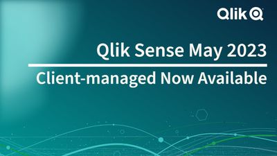
Qlik Sense May 2023 (Client-Managed) now available!
In this release, you will find the following new capabilities, many of which are already available in Qlik Cloud today: Visualizations & Dashboards... Show MoreIn this release, you will find the following new capabilities, many of which are already available in Qlik Cloud today:
Visualizations & Dashboards:
New Filter PaneThe new Filter Pane is a highly requested feature improvement. Like the List Box from QlikView, the new Filter pane includes a grid layout. It also provides several new capabilities, including grid mode, search mode (with wildcard option), checkbox mode, compact view, and histogram.
Table Exploration MenuOne of the most significant updates of the year, the new Straight Table significantly boosts self service capabilities with expanded exploratory analysis and reporting. It acts as a catch-all table, providing users with the flexibility to pick and choose how they would like their layout presented. Users can add many fields simultaneously, alternate dimensions and measures, customize column width, view the user field picker, choose pagination or virtual scroll, and store the layout in bookmarks.
New Background Options for ChartsWe continue to roll out additional capabilities that add flexibility and customization to Qlik Sense Saas visualizations, you can now include backgrounds in bar charts with the option to set an image or color.
Increased number of visible lines within line chart art
Based on customer feedback, we have extended the number of data points that can be shown on the Line Chart. This gives users more flexibility and scalability within the Line Chart.
New Styling Panels
Provides flexibility, allowing customers to conform to company, department, or personal style standards and preferences. The styling panel for Text and Image covers titles, subtitles, and footnotes, and includes options for font size, color, and family.
New Axis and Value Label Styling for select charts
Styling for Bar Chart, Pie Chart, Combo Chart, and Scatter Plot has been enhanced to include axis title, axis labels, and value labels. These improvements add flexibility for customers, allowing them to conform to company, department, or personal style standards and preferences.
New Chart Hover and Selection Menu DesignProviding better customization, we have re-designed the chart hover and selection, enhancing chart rendering with new visual styling options.
Advanced Authoring:
New Engine FunctionWorking within the Qlik Engine object hierarchy, the new GetObjectld() chart function allows you to set a variable with sheet ID and a sheet action, automating the retrieval of the current sheet ID. This simplifies the creation of custom navigation, currently a tedious process. This feature was highly requested by customers.
Connectivity:
OAuth support for Databricks via MS AzureThe Qlik Databricks connector in Qlik Sense now supports the OAuth authentication option. This option will allow a Qlik Sense user to authenticate with Data bricks in the most secure way using OAuth 2.0. The support for OAuth also allows single sign-on (SSO) to Data bricks with Qlik Sense Saas when using an identity provider. This release only supports OAuth authentication with Databricks on Azure, but we plan to expand this capability to the other cloud platforms we support with Databricks in the future.
Google Analytics 4 Connector
The Google Analytics 4 connector extracts traffic and engagement metrics from your Google Analytics 4- enabled websites and apps and loads that data into your Qlik Sense apps.
Google is replacing Universal Analytics with Google Analytics 4. For more information about this change, see Google Analytics Help.
New authentication methods for Azure SQL database and Azure Synapse Analytics connectors- The Azure SQL database and Azure Synapse Analytics connectors now support two new authentication methods:
- Azure OAuth: Allows single sign-on (SSO) when using an identity provider.
- Azure Active Directory: Protects user identity and simplifies the sign-in experience.
-
Qlik Digest - July 2023
What's New at Qlik? Introducing Qlik’s OpenAI Connectors Discover our new suite of connectors for OpenAI, allowing you to embed generative AI content... Show MoreWhat's New at Qlik?
Introducing Qlik’s OpenAI Connectors
Discover our new suite of connectors for OpenAI, allowing you to embed generative AI content in your analytics experience. Get augmented analytics with natural language insights from OpenAI, combine third-party data into your data models, and ask questions in real-time using data from Qlik. Learn More
Generative AI and the Fear of the Unknown
With so much uncertainty on how to leverage this transformative technology, we unpack why the journey begins with your data, and the best path forward for success. Read blog
Watch the OpenAI Connectors Demo
Join our webinar on August 2 for a deeper dive and demo into the new capabilities of our OpenAI connectors.
Qlik tips and tricks
Watch our series of shorts for quick and easy tips and tricks around Qlik features and capabilities. Watch videos
New data onboarding options - See the demo
Join our on-demand webinar to learn how you can leverage the transformation capabilities within Qlik Cloud Data Integration - from simple to advanced.
-
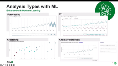
The Path Forward (Series) – Fully Integrated AI and ML
Analysis types in Qlik Sense allow the user to generate sophisticated automated insights, complete with multiple visualizations and NLG, in a few clic... Show MoreAnalysis types in Qlik Sense allow the user to generate sophisticated automated insights, complete with multiple visualizations and NLG, in a few clicks. Many of these take advantage of advanced analytics and machine learning under the hood. You will see several of these in action.
Next, we’ll demonstrate an exciting new feature you saw at Qlik World (that we are releasing soon) – key driver analysis. As a refresher, key driver analysis is the systematic identification of influencers on a target field, or simply put, identifying which values in your data set are driving the values of a metric that you have identified. Users may wish to know what factors are influencing sales in a particular region, or what is influencing a recent fluctuation in churn.
Using the AutoML engine under the hood, we can analyze the data using powerful ML techniques and generate this valuable insight for analytics users. The best part is you can do this directly in Qlik Sense, without even having to load a training data set or set up an ML experiment. This highlights our direction of surfacing our powerful foundational services in a number of different ways, making valuable insights more accessible to a wider range of users.
Video 4 – Machine Learning Services for Augmented Analytics
Can't see the video? Access to YouTube Blocked or Restricted? - Check out the playlist on the Qlik video page.
By analyzing vast amounts of data, machine learning algorithms can identify patterns, make predictions, and generate valuable insights that enable people gain a complete understanding and take the best action to affect future outcomes. With key driver analysis, our recent release of real-time connectors for OpenAI, and more features on the way, we are continuing to push the bar higher with new AI-driven capabilities for our users.
During this series, we describe our unique approach to AI and ML, demonstrate existing and new capabilities for Augmented Analytics in Qlik Sense, AutoML and Predictive Analytics, and offer a look at our future direction and what’s coming next. Stay tuned for the final two blogs in which we will be diving into our AutoML capability in full detail, starting with an explanation of AutoML and then a detailed demo.
AI & ML Path Forward Series:
Read Part 3 - Fully Integrated AI and ML
Read Part 2 - Automated Insights through Insight Advisor in Qlik Sense
Read Part 1 - Qlik's Fully Integrated AI and ML Capabilities -
How to add minicharts to Qlik Sense tables
A few days ago I stumbled upon one of those little tricks that we all love. Roland Vecera came up with a nice solution to bring minicharts to Qlik Se... Show MoreA few days ago I stumbled upon one of those little tricks that we all love. Roland Vecera came up with a nice solution to bring minicharts to Qlik Sense. It can help us to increase app data density and make our Qlik Sense tables sexy and informative again. Don't forget to add this to your bookmarks!
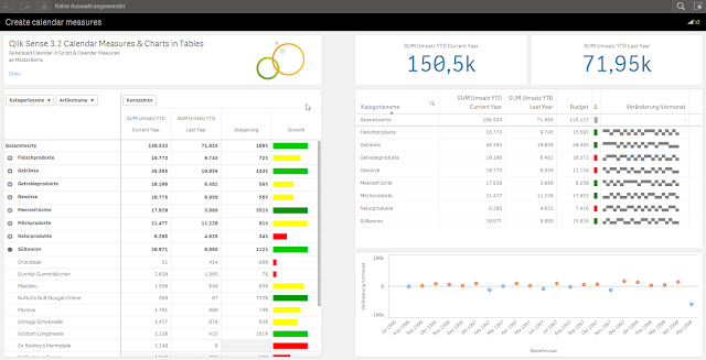
In Roland's blog post you will find instructions about how to build a linear gauge, a traffic light gauge, and even whiskers minicharts (right table in the image above),
I particularly like the linear gauge, with this technique we can now simulate small bars that goes along with each one of the table dimension items. The expression used to create the linear gauge 'bar chart' is actually reusable and very simple, looks like this:
repeat('█', rangemax(rangemin( ceil(((column(1)/column(2))-1)*10),10),1) )
The expression will paint a variable number of solid blocks █ based on a given calculation that is evaluated by row. By now you should have a nice grey bar from 1 to 10 blocks.
Next (optional) step is to apply color to it. You could add color based on any criteria you want, in the chosen example Roland is using color in the same way as he use size, both display Growth.
The text color expression looks like this in the example:
if(expression>2, argb(255,0,150,0),
if(expression>1, argb(255,0,200,0),
if(expression>0.5, yellow(),lightred())))
Where expression will be the same expression as in Growth column (Steigerung).
You can read more about minichars in tables trick at QlikView + Qlik Sense Blog von Heldendaten: Qlik Sense Calendar Measures & "Minicharts" in Tabellen
Hope you like it.
AMZ
PS: For those of you who can't read German and/or use Google translator, please check out this community doc Creating Mini Chart in Qlik Sense tables (it also contains some hacks to make this trick even more complete)

-
How cities can use data to track their climate goals
Since 1993 the city of Portland, Oregon, has been at the forefront of the fight against climate change with it's climate action pla... Show MoreSince 1993 the city of Portland, Oregon, has been at the forefront of the fight against climate change with it's climate action plan. This is a plan they continuously update, the newest version being the 2022 Climate Emergency Workplan. Portland had much success with implementing incentives and voluntary changes, but with many competing issues facing a city of its size, they needed the support of residents and local businesses when it came to prioritizing the climate.
The best way to evidence the need for climate action comes from data, so the city of Portland partnered with Qlik and C40 cities to shape their efforts with data driven solutions. “I think it's incredibly important for people everywhere to have access to good, reliable data because we need that in order to properly understand how grave and great and urgent a problem climate change is,” agrees Rachel Huxley, director of knowledge and research, C40 Cities, with whom Qlik have collaborated. “There's a huge amount of noise out there – good data helps cut through that to show where the real problems and solutions lie.”
With help from Qlik Sense, C40 cities has developed climate dashboards that can be used by cities like Portland to monitor engagement, document best practice and mentor other cities. The dashboard can help cities see how they measure up to key metrics and how they benchmark against other cities. Eventually this data can lead to the acceleration of local climate action and investment.
Portland understands that it is of the upmost importance to understand where cities can have the most impact, and this has lead them to look at their emissions data from a different angle. They now consider the consumption based emissions of their residents, something that is often forgotten about. Consumption based emissions are the emissions generated in the production of goods and services according to where they were consumed. Understanding these large sources of emissions is vital for managing and mitigating their impact, and doing so has helped Portland to greatly reduce local emissions.
There are nearly 100 C40 Cities following in the footsteps of Portland, to read more about this story follow this link to the full article - How cities can use data to track their climate goals.
For more information about our Qlik Academic Program, go to qlik.com/academicprogram.
-
Expanded Business Glossary Capabilities
We’ve now expanded these capabilities in terms of visibility and associated objects. Associate term with master measures & dimensions You can alrea... Show MoreWe’ve now expanded these capabilities in terms of visibility and associated objects.
Associate term with master measures & dimensions
You can already define which apps and datasets are related to a term in the business glossary. Now we’ve expanded this relationship-defining capability to master Items. When you create a new master measure or dimension, the user can now also define which terms relate to that master item.As you’ll see, having this connection can enable any analytic user to better understand the data they are looking at.
Pop-up term definition
If a chart uses a master item which has an associated business term, the user can now see the term’s definition when viewing the chart. A user just clicks on the information button (“i”) in the upper-right corner of the chart and the pop-up window will show any term definitions related to this chart.
This makes it easy for any user to better understand the data they are looking at. It also helps data stewards ensure that everyone in the organization is speaking the same “language”.
Glossary links within Lineage Summary View - Another way we’ve made it easier for users to better understand any business terms that are used in a chart is by enhancing the lineage summary view. This is an optional view, available with most chart types, that gives users an explanation of the data used within the chart along will links to the data’s lineage. A link has been added to this view for glossary terms that are used within the chart.
To learn more about these new business glossary capabilities, you can check out this demo video.
-
Your Friendly Master Items Library - What you Should Know!
If you want to use the Master Items Library effectively, I suggest you watch this video. Chapter index is in the description. Like what you see? Make... Show MoreIf you want to use the Master Items Library effectively, I suggest you watch this video. Chapter index is in the description. Like what you see? Make a suggestion on what you would like me to cover in the next Do More with Qlik - Tips and Tricks edition video.
Don't forget to see our extensive education catalog at learning.qlik.com
Sample Qlik Sense APP attached (used in video with complete Master Items library)
Sample Qlik Sense APP attached (used in video with complete Master Items library)

-
Qlik Data Visualization Tip-a-Day Recap
Revisit our 24 days of Visualizations ... 1. Use of titles: capture the visualization’s essence and dynamically adjust to selection changes2. ... Show MoreRevisit our 24 days of Visualizations ...
1. Use of titles: capture the visualization’s essence and dynamically adjust to selection changes
2. Compare with last year: simplify time series analysis by comparing with the prior year
3. Lollipop chart: visualize detail using combo chart settings to create lollipop chart
4. Activity in map point layer: add images to the map point layer to show direction and trends
5. Subtle or bright color: improve readability by coloring text in tables
6. Field overview: helpful with new datasets, display max, min, average, and count
7. Donut map layer: donuts with center labels in maps give you more detailed insights
8. Cartogram: create a stylized map in Qlik Sense to show a representation of locations
9. Second axis: provides more context to your data, including share of total and actual value
10. Parliament diagram: often tedious to build, automate creation using the map chart and point layer
11. Group similar values: grouping simplifies readability, making it easier to interpret data
12. Butterfly chart: augment a standard bar chart to differentiate between measures
13. Combo chart: flexibility allows color per measure/chart, easing creation of complex charts
14. Silent Legend: setup consistent coloring for the entire app, so charts are easier to understand
15. Rank Chart: show trends and changes over time
16. Radial Dendrogram: show possible outcomes radiating outward from the center
17. Sparklines: provide another dimension to your tables; can show additional context over time
18. App details in Container: add help and guidance to the chart, including definitions and source
19. Extra measures in Combo Chart: add context using the X-axis by including variance
20. Deviation Icicle Chart: show forecast vs actual, increasing your visibility into trends
21. Task grouping via Gantt Chart: group tasks with a horizontal time axis and color by measure
22. Table indicators: enrich visualizations with context, including rank, trend, and classification
23. SVG images: utilize SVG to create and scale or render mini charts, gauges, and other graphics
24. Custom tooltips: display an overview then details on-demand such as description, additional measures, or embedded master visualization
There is also an app with recipes for all tips.
To continue exploring Qlik Sense data visualization innovations, you can check out the Qlik Visualization Showcase. There, you will be able to not only view, but also interact with our latest and greatest Qlik Sense visualizations. And, for tips on avoiding common data visualization pitfalls, check out this eBook.
-
Buttons, Tables and KPIs
Throughout the blogs that I have written, I have covered various types of charts that Qlik offers and how to use them. Today we’re going to be looking... Show MoreThroughout the blogs that I have written, I have covered various types of charts that Qlik offers and how to use them. Today we’re going to be looking at not one, but three kinds of visualizations. While you might not be able to call these visualizations ‘charts’ they can still be found under the chart section of Qlik Sense and can be quite useful when visualizing your data.
Buttons
Buttons can be used in many ways such as: toggling a parameter on and off, applying a bookmark, clearing a selection and much more.
How can we use buttons in an app?
Let’s look at one example of how buttons can be used by exploring our Overall Equipment Efficiency app.
Within this app, we’ll find a line chart with various buttons beside it. Using these buttons, a user can select which lines they would like to view, clearing up the line chart to only show one line at a time, or multiple lines for the use of comparison. What these buttons are doing is toggling on and off the measures for the line chart using a variable. These variables are used with the chart to show or hide their OEE line. The text and color of the button can also be influenced by an expression, changing when clicked and dependent on the data being displayed as seen below.
These buttons allow non-author users to interact with the data to display their desired data. Using expressions there are so many ways that authors can make interactable elements using buttons with the only limit being their own creativity. For more information about buttons follow this link here:
https://help.qlik.com/en-US/sense/May2023/Subsystems/Hub/Content/Sense_Hub/Visualizations/Button/button.htm .Tables
Tables are wonderful for showing a lot of information in a concise, readable format. This medium is great for showing data with large ranges or differences of only a few decimals.
One of the benefits of tables is to display data in a raw, numerical form, but comes at the cost of a lack of visual appeal. Tables can allow for the filtering of data through an app, allowing a user to select a dimension or measure provided by the table and filter data through the app by that selection.
Tables can be a great way for non-authors to explore data. For example, below we have a table that displays the items in a large grocery store chain along with the Margins Per Item, Quantity, Margin, Cost and Sales for the various items.
How can we use tables in an app?
Let’s say that I work for this company as a merchandise manager. My responsibility would be providing this business with high margin products, while eliminating the low, or negative margin products. Starting with a visualization, I find there are some irregularities with the margins of some of our products. With a table, I can explore the data to begin learning what may be going on.
Through the table, I can see the ‘Best Choice Dried Apples’ is selling at a huge loss, $1713 with only 8 products sold. That’s not good.
Using our table, we can explore further, through a different dimension, this time through ‘Region’ we find a single sale of ‘Best Choice Dried Apples’ that the company has sold at a loss of $13749.60. Someone has some explaining to do. Is this fraud? Is it theft? An accounting error? A mistype when processing a refund? While our table can’t tell us the cause, we can begin to investigate, all thanks to our table.
Tables offer a clear, and concise view of your data, allowing for easy exploration and comparison. If you’d like to learn more about tables and how they can be used in your sheets follow this link: https://help.qlik.com/en-US/sense/May2023/Subsystems/Hub/Content/Sense_Hub/Visualizations/Table/table.htm
KPIs
KPI stands for Key Performance Indicator which in terms of Qlik Sense, means a visual way of monitoring a measure. KPIs are useful for when you need to know how a measure is trending, up or down. These visualizations can be customized to show measures as stated above, but also tie the conditions of these measures to certain colors or symbols.How can we use KPIs within an app?
Here we have an example of a KPI which displays the overall efficiency of a sheet metal manufacturing plant.
This KPI provides a lot of information in a very condensed area. Using only a 6x4 portion of the sheet, the KPI shows which weeks are being displayed, what our overall efficiency is compared to the week before, and which way this measure has gone, in this case down. The colors in this KPI provide us with visual feedback of the percentage. We’ve set any percentage below 70% to show as ‘bad’ or orange, this shows we need some improvement in our efficiency to get back to a satisfactory level.
These KPIs can be influenced by filter panes to display different data. With January selected, our KPI updates to show the correct weeks as well as the efficiency of those weeks.
Here we find that our percentages were higher but were still on a downward trend from the month before. This information could allow us to correct the influences of this downward trend, and we learned about it through a quick glance at our KPI.
So, there are three different assets that you can add to your sheets to make them more dynamic. Which of these assets are you most excited to use in your apps and sheets? What are some ways that you have used Buttons, Tables or KPIs in your own apps? Drop them down in the comments below and get the conversation going.
-
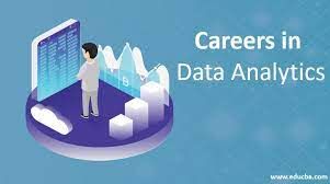
A career in data analytics is in demand!
In the increasingly digitalized era in which we live, technology and data are everywhere. Due to technology advancements, one of the important markets... Show MoreIn the increasingly digitalized era in which we live, technology and data are everywhere. Due to technology advancements, one of the important markets nowadays is data analytics. According to the India Brand Equity Foundation, the nation’s data analytics market would grow to $118.7 billion by 2026. As a result, it is true that Data Analytics is now a crucial component of enterprises across all industries. It provides in-depth market data together with useful insights into customer behaviour, offering companies a competitive edge. And because of this, data analytics is one of the modern-day courses that is steadily growing in popularity.
To read more about this article, visit: https://timesofindia.indiatimes.com/blogs/voices/who-should-do-the-data-analytics-course-and-how-it-may-help-in-your-career/
To learn about the Qlik Academic Program to get access to free training, certifications, qualifications and prepare yourself for a career in data analytics, visit: qlik.com/academicprogram
-
From Data to Wisdom. Unleashing the Power of Data
Data is often misunderstood, so understanding data literacy requires clarity on its true meaning. Oxford defines data as facts and statistics for anal... Show MoreData is often misunderstood, so understanding data literacy requires clarity on its true meaning. Oxford defines data as facts and statistics for analysis, but this definition doesn't capture its full potential. To comprehend data's essence, we must explore its journey from raw data to wisdom.
Read more about interesting insights shared by Qlik's Chief Learning Officer, Kevin Hanegan on: https://www.turningdataintowisdom.com/from-data-to-wisdom/For information on the Qlik Academic Program, visit: qlik.com/academicprogram and know about the free resources including training, qualifications and certifications.
-
Creating charts with enigma.js and Vega
If you don't already know, enigma.js is an open source library for communicating with Qlik Sense backend services. The QIX Service of enigma.js provid... Show MoreIf you don't already know, enigma.js is an open source library for communicating with Qlik Sense backend services. The QIX Service of enigma.js provides an API to communicate with a QIX Engine, giving you the ability to build applications powered by Qlik.
Vega calls itself a visualization grammar. It is a declarative language for creating visualizations. You just describe the appearance and behavior of the visualization you want to create, and Vega does the rest. And it can render with canvas, avoiding costly dom manipulations.
I'm going to demonstrate using enigma.js and Vega to create a simple bar chart. I'll be reusing the qApp.js module and qSessionObject class I introduced in Getting started with enigma.js, so check that out first if you haven't already.
Getting Setup
You can review Getting started with enigma.js, and follow the "Setup", "Connecting to an app", and "Creating Session Objects" sections. You'll also want to load jQuery and Vega (https://cdnjs.cloudflare.com/ajax/libs/vega/3.0.0-beta.25/vega.min.js).
Alternatively, you can download the getting-started.zip file below. The getting-started.zip file includes package.json and webpack.config.js files, the qApp.js and qSessionObject.js files, as well as an index.html file, and a main.js file. There's also a .qext file, in case you want to use Qlik Sense as your server for your static files.
For this demonstration, I'm using fields from the Helpdesk Management app, so make sure your qApp.js file is connecting to a copy of the Helpdesk Management app.
The Project
Now that you're setup, we can start the project. We'll do everything in main.js for this demonstration. So open up main.js. We'll need to import qSessionObject.js and create our session object.
import qSessionObject from "./qSessionObject";
let chartCube = new qSessionObject({
qInfo: {
qType: "visualization"
},
qHyperCubeDef: {
qDimensions: [{
qDef: {
qFieldDefs: ["[Case Owner Group]"]
},
qNullSuppression: true
}],
qMeasures: [{
qDef: {
qDef: "Avg([Case Duration Time])"
}
}],
qInitialDataFetch: [{
qWidth: 2,
qHeight: 1000
}]
}
});
Now that our qSessionObject has been created, let's define the Vega spec for our bar chart. The spec is roughly based on the spec from Vega's tutorial Vega: Let's Make A Bar Chart Tutorial, so feel free to check that out if you like. I simplified it a bit, and removed the data values so that we can stream the values in using data returned from enigma.js. It looks like this:
let barchartSpec = {
"$schema": "https://vega.github.io/schema/vega/v3.0.json",
"width": 400,
"height": 200,
"padding": 5,
"data": [
{
"name": "table"
}
],
"scales": [
{
"name": "xscale",
"type": "band",
"domain": {"data": "table", "field": "category"},
"range": "width"
},
{
"name": "yscale",
"domain": {"data": "table", "field": "amount"},
"nice": true,
"range": "height"
}
],
"axes": [
{
"orient": "bottom",
"scale": "xscale",
"encode": {
"labels": {
"update": {
"angle": {"value": -50},
"align": {"value": "right"},
"baseline": {"value": "middle"},
"radius": {"value": -2}
}
}
}
},
{
"orient": "left",
"scale": "yscale"
}
],
"marks": [
{
"type": "rect",
"from": {"data":"table"},
"encode": {
"enter": {
"x": {"scale": "xscale", "field": "category", "offset": 1},
"width": {"scale": "xscale", "band": 1, "offset": -1},
"y": {"scale": "yscale", "field": "amount"},
"y2": {"scale": "yscale", "value": 0}
},
"update": {
"fill": {"value": "steelblue"}
},
"hover": {
"fill": {"value": "red"}
}
}
}
]
}
With our qSessionObject and our bar chart spec created, we can create the bar chart. After the dom is ready, we'll initialize the Vega view (Vega: View API), open the qSessionObject, get the layout of the qSessionObject, reformat the matrix to work with Vega, insert the values into our Vega view, setup updating the Vega view when the qSessionObject changes, and add an event listener to the Vega view to enable selections. It all looks like this:
$(() => {
//initialize vega view
let view = new vega.View(vega.parse(barchartSpec))
.renderer('canvas')
.initialize('#view')
.hover();
//open cube
chartCube.open().then(() => {
//get object layout and insert data into vega view
chartCube.object.getLayout().then((layout) => {
let values = layout.qHyperCube.qDataPages[0].qMatrix.map((row) => {
return {"category": row[0].qText, "qElemNumber": row[0].qElemNumber, "amount": row[1].qNum}
});
view.insert('table', values).run();
});
//when object data changes, update data in vega view
chartCube.object.on("changed", function() {
chartCube.object.getLayout().then((layout) => {
let values = layout.qHyperCube.qDataPages[0].qMatrix.map((row) => {
return {"category": row[0].qText, "qElemNumber": row[0].qElemNumber, "amount": row[1].qNum}
});
view.remove('table', (d) => { return true; }).run();
view.insert('table', values).run();
});
});
//add event listener to make selections on hypercube when a bar is clicked
view.addEventListener('click', function(event, item) {
if(item){
chartCube.object.selectHyperCubeValues("/qHyperCubeDef", 0, [item.datum.qElemNumber], true);
}
});
});
});
And that's it. Don't forget npm run webpack, and check out the results. Here's what it should look like - Vega bar chart.
I've attached the full project in case you'd prefer to just download that and play around too.
-
Automating deployments of Qlik Sense with Terraform
Welcome to Tuesday's edition of the Qlik Design Blog. In this entry I have the pleasure of introducing some fine work created by Clint Carr, Principal... Show MoreWelcome to Tuesday's edition of the Qlik Design Blog. In this entry I have the pleasure of introducing some fine work created by Clint Carr, Principal Enterprise Architect at Qlik based in Melbourne Victoria Australia. Clint has shared a document he created that outlines the procedures to automating a Qlik Sense Enterprise deployment in the cloud. Using hosted services such as Microsoft Azure or Amazon Web Services.
Qlik Sense Enterprise is a superbly thorough and versatile analytics platform. So much so, that it is even possible to create automated
deployment scenarios using software such as HashiCorp Terraform and our Qlik Sense Enterprise software available from cloud marketplaces such as Microsoft Azure and Amazon Web Services. Terraform is an open source tool that enables you to create infrastructure (machines and applications) based on configuration files in a safe and predictable fashion. This approach ensures the same deployment is performed each time it is executed.
For an in depth look, see the attached PDF document for prerequisites and a step by step approach to setting up this type of configuration.
Some benefits of this approach include:
- Consistency and repeat-ability
- Reduce risk
- Knowledge is shared - the process is not owned by one individual
- Documented approach with source code to deploying Qlik Sense
- Quick and efficient installations - saving time and money
We'd like to thank Clint for this most valuable contribution. I will field comments questions and direct them to Clint where applicable, so please post them as you see fit. We'd love to hear from you.
About Clint Carr:
 Clint is an Enterprise Architect in the Global Enablement, Architecture and Research (GEAR) team at Qlik. GEAR is considered a pre-sales swat team of sorts, tasked with working on the largest of Qlik's prospective customers, performing enablement for the field (pre-sales and consulting) and creating tools and products that enable the field to be better equipped to deal with their day to day tasks. His current focus is on DevOps, integration and cloud native technologies. In the five years he has worked at Qlik Clint has held various roles. Starting as a presales architect then moving into a consulting role as a Technical Architect before joining the GEAR team. Clint has been involved in some of the largest of Qlik's customers both in Australia and internationally helping them to realize the value in the platform.
-
Introducing TKB Helpfulness
Hello Qlik Community! We are halfway through the year! In the States, kids are officially on summer break, and temperatures are rising. We are gearing... Show MoreHello Qlik Community!
We are halfway through the year! In the States, kids are officially on summer break, and temperatures are rising. We are gearing up for a long weekend to celebrate the 4th of July!
This week we added TKB Helpfulness to our Support Articles. TKB Helpfulness allows you to let us know if the article solved the issue or not with a simple ‘Yes’ or ‘No’.
Selecting ‘Yes’ will display a ‘Thank you for your feedback!’ message. Selecting ‘No’ will allow you to submit feedback on improving the article. The Qlik Support team will review the feedback.
The responses are also compiled into a rating displayed in the upper right-hand corner (above version history). You can use this information to see if the article helped your peers.
Until responses are collected, ‘No Rating’ will display.
The 5-star rating is still available and can now be found on the right side of the article. This area should be used to provide general feedback on the content, not limited to whether it solved your visit’s intent.
If you’re celebrating a holiday this weekend, enjoy and stay safe! We will see you soon with another Qlik Community update.
Your Admins,
Melissa, Sue, Jamie, and Nicole
-
New Qlik Cloud Admin Qlik Continuous Classroom Modules Launched!
New System Admin/Qlik Cloud Admin Qlik Continuous Classroom Modules have launched! Access System Administrator Course Library and sort by Newest fir... Show MoreNew System Admin/Qlik Cloud Admin Qlik Continuous Classroom Modules have launched!
Access System Administrator Course Library and sort by Newest first. Topics include:
- Administer and Allocate Space Roles in Qlik Cloud
-
Integrating an External Identity Provider with Qlik Cloud
-
How do I customize an Identity Provider login?
-
How do I configure an email server in Qlik Cloud?
-
Differentiate and Manage Qlik Cloud Spaces
Happy Learning!

-
Connector Factory – June 2023 releases
Qlik Application Automation Now that Qlik’s acquisition of Talend has been completed, we are starting to integrate and merge our products together. ... Show MoreQlik Application Automation
Now that Qlik’s acquisition of Talend has been completed, we are starting to integrate and merge our products together. As parts of this effort, Qlik Application Automation has released two related connectors:
The Stitch connector allows users to subscribe their automation to a completed data load event in Stitch. Stitch is used to connect to databases and SaaS applications, and then replicates that data to a destination of your choosing.
The automation will run each time new data lands in the user's data warehouse. If the run was successful, the automation can then evaluate the pipeline's status and start tasks in Talend or jobs in dbt.
You can learn more about the Stitch connector here.
The Talend Cloud connector can be used to orchestrate Talend tasks around data integration, data quality, and other Qlik Application Automation tasks. Talend Cloud provides online services through which you can access features and functions of the Talend Software to design, manage, and monitor integration capabilities.
This connector enables you to leverage automations in Qlik Cloud to streamline data pipelines and data governance needs across your organization. This connector is also available in Qlik Cloud Government.
You can learn more about the Talend Cloud connector here.
We’ve also just released three more Qlik Application Automation connectors:
As mentioned in our recent press release, the OpenAI Connector can help developers enhance their existing workflows with AI and large language model-generated content when creating expressions, commands, or scripts in Qlik Application Automation. Companies can leverage OpenAI to quickly and efficiently create and deliver additional value to use cases such as sentiment analysis for CRM applications and customer service teams, translating reviews, or product material. You can learn more about the OpenAI connector here.
The SugarCRM connector enables users to streamline sales operations by integrating sales ops, marketing, and account management seamlessly into their Qlik Cloud analytics environment, thus improving efficiency and collaboration. You can learn more about the SugarCRM connector here.
The PagerDuty connector can help companies combine PagerDuty’s capabilities around managing IT monitoring, incidents, and observability with Qlik Cloud to better support IT groups and data operations. You can learn more about the PagerDuty connector here.
Finally, we’ve updated the existing Mail connector in Qlik Application Automation to also run in Qlik Cloud Government. This connector allows you to send emails & attachments from within an automation workflow. Qlik Cloud Government is a slightly different edition of Qlik Cloud that is only available for the U.S. Public sector due to required security protocols.
Qlik Cloud Analytics
Qlik OpenAI Analytics Connector – Expanding Qlik’s robust set of native Artificial Intelligence (AI), Machine Learning (ML) and Natural Language Processing (NLP) capabilities, Qlik’s OpenAI Analytics connector enables users to securely integrate powerful natural language insights directly from OpenAI into analytics apps, synthesize and combine third-party data into existing data models, directly ask questions of ChatGPT augmented with data from Qlik, and much more. You can read more about the OpenAI Analytics Connector here.
Qlik also released a new standalone version of Qlik Web Connectors. In addition to general improvements and bug fixes, this release was expanded to include a Qlik Connector for Google Analytics 4.
And on a related note, we are encouraging all Qlik Analytic customers who have Google Analytics to upgrade to Google Analytics 4. Google has previously announced they will stop processing new hits against their Universal Analytics service on July 1, 2023 although customers will still be able to see their Universal Analytics reports after this date for an unspecified period. But new data will only flow into Google Analytics 4. You can find more out about this announcement here.
-
Data skills crucial to future of EU market success
At a recent event in Brussels, four think tanks from Italy, Spain, Greece and Portugal came together to examine the EU's Data Strategy with a focus o... Show MoreAt a recent event in Brussels, four think tanks from Italy, Spain, Greece and Portugal came together to examine the EU's Data Strategy with a focus on the health care sectors relationship with data. The event was planned to coincide with the release of a new paper by the think tank network PremethEUs. Those in attendance agreed that data skills are an area where these four countries must improve upon the most.
According to a paper published by the network of think tanks, the lack of adequate skills required “risks becoming an important barrier to data industry development and the adoption of data-driven innovation in the European Union”. With the attendees agreeing that a significant skills gap exists in Europe regarding the populations digital readiness and the specialized skills of professionals in the workforce. One of the key points made is that the skills gap is growing among data professionals with a big difference between the supply and demand of these capabilities. Many of the speakers highlighted that it is important to foster trust in data sharing in order to encourage uptake and participation in the data economy.
Initiatives such as the funding and creation of 'data spaces' would allow more people to access data and unlock its potential, with the idea being that an environment of trust is created where data can be shared. This would then encourage small business to make the most of data access and empower the EU's digital economy. However a key point that was agreed upon is that it is not all about systems and infrastructure, data skills must be improved in order to sustain the path to innovation and give people opportunities in the digital world. Read more about the event by following this link.
To make sure your students are leaving university with the skills needed for their careers in the data driven world, you can enroll in our free Qlik Academic Program to get access to free Qlik analytics software and training. You can use these in classes with your students, or encourage your students to register and study in their own time. For more information go to: qlik.com/academicprogram
-
Don't join - use Applymap instead
It is, in fact, one of my favorite functions and I do not seem to be alone in this choice. Several of the QlikView developers who regularly write on Q... Show MoreIt is, in fact, one of my favorite functions and I do not seem to be alone in this choice. Several of the QlikView developers who regularly write on QlikCommunity seem to share this preference and have written about this function, e.g., QlikView Notes, Quick Intelligence and QVApps.
So, what does the function do? Well, basically it is just a lookup function – it takes one value as input, checks if this value exists in a mapping table and returns the corresponding value from the second column in the mapping table. Think of it as a translation function where the translation is fetched from a pre-defined, two-column table. A simple translation function, but you can still do a lot with it...
What has this got to do with joins? Everything. A very common situation in data modeling is that you need to get a single field value (per record) from a different table than the current one. Then the standard way to do this is to use a join. However, in QlikView you can – and should – use Applymap() instead. The only time that you cannot use Applymap() instead of a join is if you want to fetch more than one single corresponding value (record) from the second table.
Let's look at an example of how to use Applymap(): In an ERP system, the customer table is the table where all information about the customer is stored, e.g. the name and country of the customer. Further, it could be that you need the customer’s country when making a calculation in the order table. This is a field that you don't have in the order table. In SQL you would join the two tables to get country into the order table.
In the QlikView script you would instead first define the mapping table that maps a customer ID to a customer country as follows:
MapCustomerIDtoCountry:
Mapping Load CustomerID, Country From Customers ;The second step is to use this information when reading the order table, such as:
Orders:
Load *,ApplyMap('MapCustomerIDtoCountry', CustomerID, null()) as Country
From Orders ;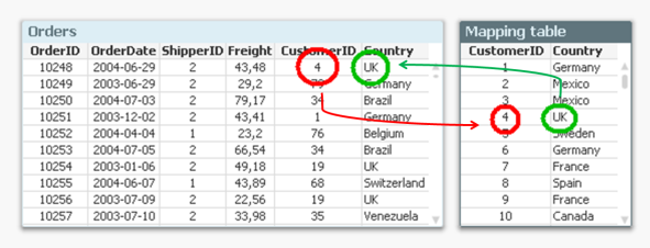
The "null()" as third parameter of the function defines what it should return when the customer ID isn't found in the mapping table.
And with this, you have joined the field Country with the order table – without using a join. And you have done it faster and with less chance of errors. Bottom line: Whenever you know that you just want to fetch one single value per record – don’t join. Use Applymap() instead.
See more in the Technical Brief on Joins and Lookups.

-
How to create a custom theme in Qlik Sense
Custom Themes is one of the new features shipped with February release so make sure you are updated before trying to come up with your own. To create ... Show MoreCustom Themes is one of the new features shipped with February release so make sure you are updated before trying to come up with your own.
To create a new theme, first we need to understand what exactly is a theme and what it can do for us. A custom theme is a collection of files stored in a folder, it must contain a definition (QEXT) file, a main JSON file, and optionally any other assets you might need to support the custom theme such as CSS files, custom font files, images, etc.
Custom themes let users to quickly apply different levels of customization to their apps, some of you might be interested in having your custom color palletes, while someone else might just need bigger font size, both can be achieved with Custom Themes. Theme authors can target individual visualization objects via JSON and/or use a custom CSS to modify the sheet styles.
From Qlik Help
The custom styles can be defined in two ways:
- In the JSON file you define the style for the individual visualization types, for example bar charts and line charts.
- CSS styling is more general and flexible. You can, for example, style sheets, visualizations and extensions.
Creating a simple custom theme
I'll be using Qlik Sense Desktop for this example, please check the help page for instructions on how to install a Custom Theme in Qlik Sense Server.
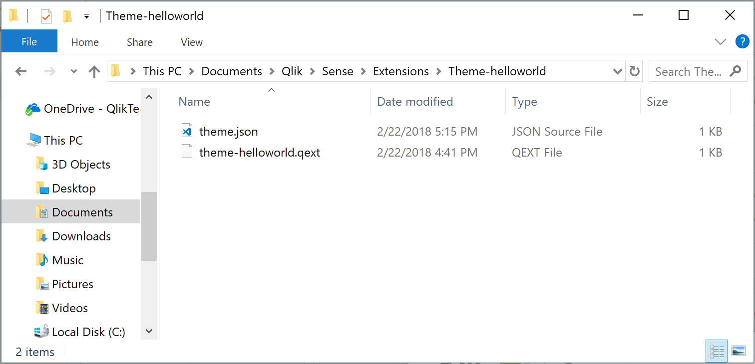
- Go to your extensions folder: C:\Users\[username]\Documents\Qlik\Sense\Extensions
- Create a new folder, I'll call mine theme-helloworld
- Create a new file and rename it to theme-helloworld.qext. The QEXT file is a definition file that contains a few lines, where only name and type are the only mandatory lines.
{ "name": "Hello World theme", "description": "My first custom theme", "type": "theme", "version": "1.0.0", "author": "Arturo Muñoz" }- Now, it's time for the JSON file. Create a new file, name it theme.json
- Edit the theme.json file with your favorite text/code editor
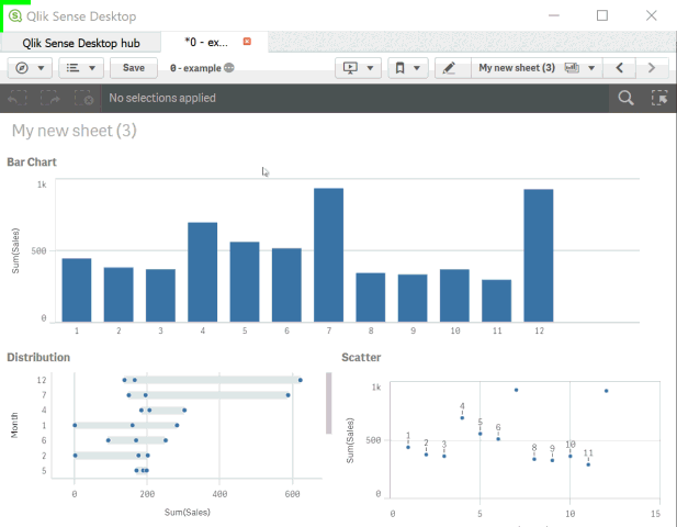
- My advice is to start your theme with the sample code you can find in Qlik Help so you can familiarize with JSON and it's properties:
{ "_inherit": true, "_variables" : { "@greenColor" : "#61a729", "@text": "#4c4c4c" }, "color": "@text", "fontSize": "12px", "object" : { "title": { "main": { "fontSize" : "16px" } } }, "dataColors": { "primaryColor": "@greenColor" } }- The JSON file will change the primary color of your charts from Qlik dark blue to the custom green as defined in the variable at line 4 and will also modify the charts title to a font size of 16 pixels.
This is a simple example but there are much more you can do with the JSON file, you could for example, define new color schemes for measures, change the axis', labels, legends font size and color and much more.
Actually you could even load your custom CSS through the JSON file so you can target and hack any predefined style within your app, so you could modify object paddings, change font family, and so forth.
If you've followed the steps above you should have something like:
How to activate a Custom Theme?
Check how to apply a Custom Theme to your app in the animation below
Tips from the expert... and theme sharing!
I've asked my colleague Nabeel Asif for some tips since he created the Custom Theme based on Color Brewer that we are sharing today (check the attachments). This is what he said:
All of our standard themes just give one sequential and one diverging gradient for measures, and two color schemes for dimensions. But you can actually define as many options as you like through the “scale” and “palettes” properties in the theme’s JSON.
For sequential and diverging gradients, Qlik uses seven colors to define a scheme. But you don’t actually need to specify all seven colors. Just define the two colors at the extremes, and Qlik does a nice job of calculating the rest. Of course, if you want very specific colors you can define them yourself.
Often apps will be designed with red representing something bad or dark colors representing higher values. To maintain this look as the user switches themes, you should follow these conventions in the JSON:
- Diverging scales should be ordered from reddish hues to bluish hues.
- Sequential scales should be ordered from dark to light.
Please don't forget to always check Qlik Help for the most recent specifications.
Enjoy
-
Tech Layoffs 2020–2023 (Decomposition Tree & More)
Tech Layoffs in 2020–2023 AnyChart — QS Extensions Explore tech layoffs in-depth using decomposition tree and other interactive visualizations p... Show MoreTech Layoffs in 2020–2023AnyChart — QS Extensions Explore tech layoffs in-depth using decomposition tree and other interactive visualizations powered by Qlik and AnyChart based on data from Layoffs.fyi by Roger Lee.
Discoveries
Identify which countries, industries, and companies have experienced the most job cuts and when they occurred. Compare the number of layoffs with funds raised and gain other insights into tech layoff statistics over the past few years.
Impact
Analyze layoffs in the technology sector worldwide since the COVID-19 pandemic with data from Layoffs.fyi.
Audience
Everyone who wants to know more about tech layoffs.
Data and advanced analytics
This app features charts built with AnyChart's Decomposition Tree and Combo Chart extensions for Qlik Sense. The data used in this analysis is from Layoffs.fyi.