Unlock a world of possibilities! Login now and discover the exclusive benefits awaiting you.
Analytics & AI
Forums for Qlik Analytic solutions. Ask questions, join discussions, find solutions, and access documentation and resources.
Data Integration & Quality
Forums for Qlik Data Integration solutions. Ask questions, join discussions, find solutions, and access documentation and resources
Explore Qlik Gallery
Qlik Gallery is meant to encourage Qlikkies everywhere to share their progress – from a first Qlik app – to a favorite Qlik app – and everything in-between.
Qlik Community
Get started on Qlik Community, find How-To documents, and join general non-product related discussions.
Qlik Resources
Direct links to other resources within the Qlik ecosystem. We suggest you bookmark this page.
Qlik Academic Program
Qlik gives qualified university students, educators, and researchers free Qlik software and resources to prepare students for the data-driven workplace.
Recent Blog Posts
-
【オンデマンド配信】大日本印刷(株)事例:Qlik Sense で個人のスキルを可視化!タレントマネジメントシステムの活用事例
企業のビジネス活動において、データはこれまで以上に必要不可欠な資産となっています。増え続けるデータを管理・統合・分析し、データでアクションを起こす必要性が増している現在、成功している企業はどのようなデータ戦略を実行しているのか?本 Web セミナーシリーズでは、Qlik でデータからアクションを起こ... Show More企業のビジネス活動において、データはこれまで以上に必要不可欠な資産となっています。増え続けるデータを管理・統合・分析し、データでアクションを起こす必要性が増している現在、成功している企業はどのようなデータ戦略を実行しているのか?
本 Web セミナーシリーズでは、Qlik でデータからアクションを起こすデータ主導のビジネスで成功しているお客様より、課題から導入の経緯、デモンストレーション、活用例などをご紹介します。※ 参加費無料。パソコン・タブレット・スマートフォンで、どこからでもご視聴いただけます。
オンデマンド配信:
Qlik Sense で個人のスキルを可視化!タレントマネジメントシステムの活用事例大日本印刷株式会社(DNP)では、営業・事務・生産部門など、さまざまな領域でデータの可視化と活用に取り組んでおり、2019年より全社的に Qlik を導入しています。
その中でも、今回は営業事務部門におけるタレントマネジメントシステムとして Qlik を使用した事例を紹介いたします。個人のスキルを可視化することで、管理職の業務差配にかかっていた負荷を軽減し、適材適所の業務差配を実現しました。また、社員一人ひとりの強みを一元管理し、人財育成のためのツールとして Qlik Sense を活用しています。 -
TV Shows (Gantt Multiple Milestones)
TV Shows (Gantt Multiple Milestones) AnyChart — QS Extensions Analyze the popularity of various TV shows by season and episode — with AnyChart's... Show MoreTV Shows (Gantt Multiple Milestones)AnyChart — QS Extensions Analyze the popularity of various TV shows by season and episode — with AnyChart's Gantt charts for Qlik Sense and the feature of multiple milestones in a single line.
Discoveries
Compare viewership on a per-episode basis and identify the most and least viewed episodes. Examine the first and last episodes. Get an overview of all seasons with color-coded bars based on the number of views.
Impact
Check out how AnyChart's Gantt charts with multiple milestones work and how they can help you explore TV show popularity or any other data with the same or similar structure and purpose.
Audience
Anyone who wants to analyze the popularity of TV shows and see an example of a Gantt chart with multiple milestones in Qlik Sense in action.
Data and advanced analytics
This application features Gantt charts built with AnyChart's extension for Qlik Sense. The data is taken from Bill Cruise’s datasets on Kaggle.
🔗 >> VIEW IT LIVE OR DOWNLOAD (.QVF) <<
-
Qlik World 2023 - Thinking Outside the Box
Qlik World 2023 - Thinking Outside the BoxCummins-MeritorThis app contains multiple solutions: 1. Smart way to show date periods without gaps when the... Show MoreQlik World 2023 - Thinking Outside the BoxCummins-MeritorThis app contains multiple solutions: 1. Smart way to show date periods without gaps when there is no data. 2. Smart way to use 1 chart, to compare 2 sets of data with slice and dice capabilities. 3. How to do Rolling Month Totals, when your fiscal months are not aligned with normal months.Discoveries
Solving the problem of displaying date periods when there are no records in that period. Showing rolling totals when the date periods are not aligned with the normal calendar. Create one sheet with smart variables, so that you can compare data for endless data sets.
Impact
The generic solution for gaps in the date period, save developers a lot of time, creating these graphs. Getting rolling totals for our fiscal month, seemed impossible. This method makes it easy. Using this slice and dice sheet, allows us to compare data in so many ways. Just 1 sheet needed and many bookmarks for each comparison report.
Audience
Data Analysts, Qlik developers
Data and advanced analytics
Solved a generic problem for all developers. Provide users with a very flexible dashboard for comparing data.
-
Qlik Sense Load Task With Parameters
Qlik Sense Load Task With Parameters Cummins-Meritor This app, enables you to run a scheduled Qlik Sense load task multiple times, with differen... Show MoreQlik Sense Load Task With ParametersCummins-MeritorThis app, enables you to run a scheduled Qlik Sense load task multiple times, with different variable values. No need to have an individual copy for each load task.Discoveries
Qlik Sense does not allow load tasks with variables. This method makes that possible in a different way.
Impact
This enabled us to run the same script to create the same QVD files for multiple data sources. Because they run independently, we only needed 1 load script. And it does not matter if 1 load fails, it will continue running the rest, which was exactly what we needed.
Audience
Qlik developers. Qlik administrators.
Data and advanced analytics
No data used and no analytics.
-
It's April! Check out the latest updates to Qlik Community
Hello Qlik Community! It’s April! In the States, the weather is warming up, flowers are blooming, trees are foliating, and QlikWorld is coming... NEXT... Show MoreHello Qlik Community!
It’s April! In the States, the weather is warming up, flowers are blooming, trees are foliating, and QlikWorld is coming... NEXT WEEK! Are you excited?! We cannot wait to meet and see all of you! Make sure to stop by our booth for a special surprise 😉
We had quite a few updates push out today, including some big changes with Ideation and the Downloads app.
Introducing the Ideation App!
Search and filter through existing Ideas using Qlik Sense! Learn more about the coming changes to this area.
With this change, you will see that the’ Submit an Idea’ button has been grayed out until the new portal is ready.
Changes to the Downloads page
The Downloads page has moved in the navigation, from Support > Support > Product News to Support > Product Downloads. To make access easier for our users, it is now an open page and will appear in the navigation, even if you are not logged in. We have also removed the Trial Downloads page to simplify the experience for our users.
If you go to the page, and you are not logged in, you will be prompted to log in. Then some magic on the page will determine if you should see the available downloads or if you do not have the correct permissions. If you get a message that you do not have the correct permissions, please use the blue ‘Contact Support’ chat button in the bottom right to connect with an agent that can assist.
Use the Chat for faster answers
We all like our questions to be answered quickly, right? The chat can help! Use chat to connect to an agent for quicker service. A new green banner will pop up on the case portal chat to remind you.
Moved ‘Accept as Solution’ button in line
This request came from one of our users!
The ‘Accept as Solution’ button was previously in the body of the comment, reducing the amount of real estate for the comment. The button has now been moved in line with the ‘Like’ and ‘Reply’ buttons.
So, what do you think of all the changes? Let us know in the comments below! It's been a busy month but we are so happy to bring you these new features and streamline experiences.
We will see you at QlikWorld!
Kind regards,
Melissa, Sue, Jamie, and Nicole
-
Company Structure (Sunburst)
Company Structure (Sunburst) AnyChart — QS Extensions Explore company hierarchy with ease using a sunburst chart! Our newest demo app (QVF) visu... Show MoreCompany Structure (Sunburst)AnyChart — QS ExtensionsExplore company hierarchy with ease using a sunburst chart! Our newest demo app (QVF) visualizes a company's organizational structure with 800+ subdivisions, 12 levels deep.Discoveries
Experience how easily you can explore your company's complete organizational hierarchy with a powerful sunburst chart. This app features one that reveals the structure of a fictional company, including over 800 subdivisions across 12 levels.
Impact
Navigate and analyze the organizational structure with ease, and drill down to explore specific division levels to gain a deeper understanding of the hierarchy.
Audience
Anyone who wants to analyze their company's hierarchy and see an example of a Sunburst Chart in Qlik Sense in action.
Data and advanced analytics
This application features a Sunburst Chart visualization built with AnyChart's extension for Qlik Sense. The data is fictional.
-
AnyChart Complex Demo
AnyChart Complex Demo AnyChart — QS Extensions Named best in data analytics and visualization in 2023, AnyChart offers innovative Qlik Sense ext... Show MoreAnyChart Complex DemoAnyChart — QS ExtensionsNamed best in data analytics and visualization in 2023, AnyChart offers innovative Qlik Sense extensions. Discover the power of the major ones in a quick demo overview and see how they can help you take your visual analytics in Qlik to the next level.Discoveries
Check out the following charts/extensions in action: Decomposition Tree, Gantt Chart, Combo Chart, Circular Gauge, Bullseye Chart, Sunburst Chart, Timeline Chart, and Waterfall & Advanced Waterfall Chart.
Impact
Find out how to elevate your Qlik analytics experience with AnyChart's innovative extensions for Qlik Sense!
Audience
All Qlik Sense users.
Data and advanced analytics
This application features Decomposition Tree, Gantt Chart, Combo Chart, Circular Gauge, Bullseye Chart, Sunburst Chart, Timeline Chart, and Waterfall & Advanced Waterfall Chart visualizations built with AnyChart’s extensions for Qlik Sense. The data is fictional.
-
Welcome to our new Educator Ambassador, Michael Siek!
We are pleased to welcome Michael Siek Ph.D as our new Educator Ambassador for 2023! Michael Siek works with Binus University International in Jakarta... Show MoreWe are pleased to welcome Michael Siek Ph.D as our new Educator Ambassador for 2023!
Michael Siek works with Binus University International in Jakarta, Indonesia, leading the Information System Program as part of the Faculty of Computing and Media.
Michael is not only using Qlik in his own teaching, but he has also encouraged other faculty members to teach Qlik by conducting team teaching sessions and spreading the word about the excellent features of the software. He has delivered a business intelligence workshop for wide audiences within the Nationwide University Network in Indonesia (NUNI), a group comprising 21 top Universities.
Michael says that, for his ongoing internal research he plans to use Qlik Sense to analyse various data sets. In addition to his research, he has delivered seminars and workshops on Business Intelligence using Qlik Sense to prospective students at the Binus University. As a part of teaching analytics in the class, he conducts forum discussions in analytics and delivers relevant content to his students.
According to Michael, the Qlik Academic Program has supported in easy ways to develop data analytics and business intelligence and most of the audience and students are really amazed by the excellent features of Qlik Sense.
He feels that as students acquire knowledge and develop their skills during the data analytics course where Qlik Sense is utilized, they stand a good chance to secure internship and employment in various global companies.
Michael plans to promote Qlik to broader audiences and help support the impact of the of the Qlik Academic Program. He would like to promote the excellent features of Qlik in the development of data analytics and business intelligence in many types of applications.
As part of the Business Information Systems Program at Binus University, students need to complete their assignments and their final project using Qlik. Michael says that they have embedded many of the resources provided by the Qlik Academic Program in their Data Analytics course.
We look forward to collaborating with Michael during this year.
For more information about the Qlik Academic Program and our various resources, visit: qlik.com/academicprogram
-
karima
karimauibpreparer un tableau de bordDiscoveriesazertyuioImpactazertyhujklAudienceokokoData and advanced analyticsokokok -
Worldwide Internet Speed
Worldwide Internet Speed AnyChart — QS Extensions Analyze internet speeds around the world using Ookla data that is visualized in stunning Circu... Show MoreWorldwide Internet SpeedAnyChart — QS ExtensionsAnalyze internet speeds around the world using Ookla data that is visualized in stunning Circular Gauges created with AnyChart's intuitive Qlik Sense extension.Discoveries
Begin with an at-a-glance overview of average fixed broadband and mobile (cellular) connection speeds in all countries. Then, find out the fastest and slowest internet speeds by type of network, on each continent and globally. Lastly, compare the internet speeds of any two countries or continents.
Impact
Provides insights into internet speeds worldwide. Demonstrates a cool use case for flexible circular gauges in Qlik Sense.
Audience
Anyone interested in exploring internet speeds worldwide. Analysts. Qlik Sense users wondering how AnyChart's Circular Gauge extension for Qlik Sense can work.
Data and advanced analytics
This application features a Circular Gauge built with AnyChart's extension for Qlik Sense. The data is taken from the Internet Speed Dataset on Kaggle based on data collected from Ookla’s Speedtest apps.
-
Pie Charts and how to use them
Charts. We love charts at Qlik. They help visualize our data, because what is data but just numbers and letters without a way to visualize it? In our ... Show MoreCharts. We love charts at Qlik. They help visualize our data, because what is data but just numbers and letters without a way to visualize it? In our last entries we covered bar and line charts, telling you why you should use those visualization methods over pie charts, but today is the day Pie charts shine.
According to Wikipedia a pie chart is a circular statistical graphic, which is divided into slices to illustrate numerical proportion. Put simply, a pie chart is a circle with slices, and each slice demonstrates how much one section is to the whole.
Currently in Qlik, we have two different styling options, pie, and donut. The difference between the two is that the pie style is a full circle, whereas the donut has the middle removed. Both options show the data in similar ways, the change is purely stylistic.
So how can we use these charts to visualize data? As stated above, pie charts are used to show portions of the whole. For example, let’s say you are the manager of a sales team, you lead a team under ten. With Qlik and a pie chart, you can create a pie chart with the slices representing your sales reps, which the pie angles being the total revenue, this would show you which reps are responsible for the most, or least amounts of revenue.From this chart, we can see that Austin Andzulis is bringing in the most revenue with 22% of the total, as such, his slice takes up almost a fourth of the pie chart, it’d be great to speak with Austin and see how he is succeeding by such a wide margin. On the opposite end of the chart, we find Johnny Tockey with only 5.3% of the chart. We might need to touch base with Johnny, get a better understanding of what he might be struggling with so we can get him back on track.
What else could we visualize with a pie chart? Maybe we’re the head of a company with many different opportunities and accounts, and we need to see which is our biggest upcoming opportunity so we can make sure that one is a win, pie charts to save the day. We make our slices ‘Opportunity Name’ and our angle as ‘Amount Open’. This will slice the pie of our open amounts into the opportunities they are worth.
How does a pie chart help us here? With this pie chart we can clearly see the Lenny Traycheff is a huge part of our open opportunities with Otto Moschetti coming in second. The pie chart allows us to quickly see that extra attention should be given to these opportunities as they are almost half of our open opportunities together.
Thank you for giving this blog a read, I hope that it helped you to better understand this type of chart so that you can better visualize your data. If you have any suggestions for charts you’d like to see covered in the future, feel free to leave them in a comment below.
-
Gartner® アナリティクス / BIプラットフォームの Magic Quadrant™ - 13 年連続でリーダーの 1 社に!(Qlik Blog 翻訳...
ブログ著者:Dan Sommer 本ブログは Gartner Magic Quadrant for Analytics and Business Intelligence - 13 years a leader! の翻訳になります。 最新の Gartner® Magic Quadrant™ レポート... Show Moreブログ著者:Dan Sommer
本ブログは Gartner Magic Quadrant for Analytics and Business Intelligence - 13 years a leader! の翻訳になります。最新の Gartner® Magic Quadrant™ レポートが発表されました。メーカーの立場からすると、このレポートでの自社の位置付けに、いつもヒヤヒヤしています。
このレポートは私たちの業界で最も参照されており、顧客や導入を検討している企業にとって重要な手引きとなっています。Qlik が 13 年連続でリーダーの 1 社に位置付けられたことをお知らせすることができ、嬉しく思います。このレポートを読みながら、なぜ Qlik がこの小さく独占的な位置に入れたのかを、私なりに考えてみたいと思います。
高まる一貫性と実行力の重要性:この不透明な時代において、私たちを取り巻く世界も急速に変化しています。サプライチェーンの問題への迅速な対応、リスクモデルを活用した信用力の低下予測、コスト管理の最適化、どれもデータと分析が必要不可欠です。現在は経営陣が導入に関与するケースが増えており、長期にわたって継続的に価値を提供できると実証されたプラットフォームが求められているのだと実感しています。Qlik が選ばれている理由は、実績があること、成長し続けていること、利益を上げていること、そして先進的な一連の機能を提供していることです。独立性:現在、多くの大規模なスタックがビジュアライゼーションやダッシュボードを提供し、独自のユーザーベースに売り込むことができますが、依存や選択肢の欠如という代償を払うことになる場合もあります。調査によると、単一のスタックだけで作業したいと考える企業は少数であることがわかっています。この結果は、地理的な制約や規制上の問題に対処するための必然を表しているかもしれません。Qlik は、ハイブリッドクラウドおよび分散型クラウドのスタックエコシステムを横断でき、グローバルで市場をリードする独立したデータ・分析・自動化の選択肢として、独自の地位を確立しています。Qlik は、GCS・AWS・Snowflake・Microsoft・Databricks といった企業と、最高のパートナーシップを結んでいます。
分析をレベルアップ:データと分析の重要性は、かつてないほど高まっています。多くの企業が、レベル 1 のレポート・ビジュアライゼーション・ダッシュボードを超えようとしており、ビジネスの実行に適したより優れたアプリケーションを求めています。自動化・拡張・機械学習・高度な分析をビジネスの深部に組み込んで、アクションにつなげることを望んでいます。そして、ほぼリアルタイムでデータが流れる俊敏なデータパイプラインの一部となることを望んでいます。構成可能な分析・アクティブインテリジェンス・アクションにつながる分析を展開すれば、従業員のスキルを向上し、飛躍的に高い価値を生み出すことができます。
融合:私は、「企業は一部のデータしか活用できていない」と、企業に伝え続けています。データ管理・統合・カタログ・分析・データサイエンス・自動化に対するサイロ化されたテクノロジーやアプローチは、データ漏えいを引き起こします。こうした分野を融合することで、相乗効果を引き出すことができます。Qlik は、データと分析・顧客をより大きな視点で捉えており、分析を重視しながら、分析にさらなる価値を提供することができます。
AI は始まりに過ぎない:2023年は、すべての人が AI を話題にするでしょう。Qlik は、最新のアプローチで幅広いユーザー層への分析の民主化に尽力し続けています。Qlik は、自然言語入力と自動化されたダッシュボードのレイアウトで、AI が生成したダッシュボードを作成する Augmented Authoring を提供しました。自動予測・クラスタリング・主要要因の分析など、より多くの従業員がデータサイエンティストや分析開発者となって謎を解明し、分析を強化できる機能を提供し続けていきます。
ぜひ、こちらのレポートをご確認ください。
GARTNER is a registered trademark and service mark of Gartner, Inc. and/or its affiliates in the U.S. and internationally, Magic Quadrant is a registered trademarks of Gartner, Inc. and/or its affiliates and are used herein with permission. All rights reserved.
Gartner, Magic Quadrant for Analytics and Business Intelligence Platforms, Kurt Schlegel, Julian Sun, David Pidsley, Anirudh Ganeshan, Fay Fei, Aura Popa, Radu Miclaus, Edgar Macari, Kevin Quinn, Christopher Long, 5 April 2023
-
Check out This Blog: QlikWorld – Where the Data and Analytics World Comes Togeth...
Here is the lineup of sustainable themed content that you will be able to find at QlikWorld this year: NGO partners Direct Relief, C40 Cities, and th... Show MoreHere is the lineup of sustainable themed content that you will be able to find at QlikWorld this year:
- NGO partners Direct Relief, C40 Cities, and the United Nations will be sharing their best practices in various breakout sessions. Check out a great preview video from Prof. Sally Eaves here!
- Check out multiple demos of our SaaS CO2, UN Travel CO2, Events CO2 dashboards at our Sustainable expo hall booth, where you can also learn more about the MGM sustainability programs.
- QlikWorld week is the same week as Earth Week! As guests of QlikWorld, you will have the opportunity to join us in various activities including Meatless Monday, committing to zero plastic, pledging to recycle lanyards, and remembering to turn lights out in rooms when they leave – all of which will be shared through the event mobile app.
- Social Sustainability is important as well! On Wednesday, April 19th we will be hosting a DE&I breakfast at QlikWorld! Come stop by the Mandalay Bay Ballroom, Room Lagoon K and join us!
Learn more about our sustainability efforts and sustainability at QlikWorld 2023 here.
-
【新着レポート】Qlik、13 年連続で BI 市場のリーダーの 1 社に!
本レポートでは、細部にわたる主要メーカーのレビューとともに、BI 市場全体の概要をご紹介しており、多くの企業から自社に適した BI ソリューションの比較検討に利用されています。 競合関係にあるテクノロジープロバイダーと、現在および将来的な貴社の要件に対する各社の適応力を一覧で把握 各テクノロジープ... Show More本レポートでは、細部にわたる主要メーカーのレビューとともに、BI 市場全体の概要をご紹介しており、多くの企業から自社に適した BI ソリューションの比較検討に利用されています。
- 競合関係にあるテクノロジープロバイダーと、現在および将来的な貴社の要件に対する各社の適応力を一覧で把握
- 各テクノロジープロバイダーの BI 市場における位置付け、貴社のビジネスを成功に導く戦略を把握
- 各テクノロジープロバイダーの強みと課題を特定のニーズと比較
「Gartner® アナリティクス / BI プラットフォームの Magic Quadrant™」で、Qlik が 13 年連続でリーダーの 1 社に位置付けられている理由とは?無料のレポートで、その理由と BI 市場の全容をご確認ください。
今すぐレポートを見る -
Welcome back Angel Monjarás! - Qlik Educator Ambassador Class of 2023
Angel is a professor of Business Intelligence at Instituto Tecnologico Autonomo De Mexico (ITAM), where he’s been using Qlik in his teaching for 6 yea... Show MoreAngel is a professor of Business Intelligence at Instituto Tecnologico Autonomo De Mexico (ITAM), where he’s been using Qlik in his teaching for 6 years.
While he’s always integrated Qlik software, this past year he started to integrate some of the learning exercises from the Qlik Academic Program, “Students perform various exercises and homework, including regression analysis, visualization best practices, common visualization pitfalls, and data quality. They also design a dashboard from scratch as part of a practical course-long BI project. We use some exercises taken from QCC and the Data Analytics Curriculum, since they provide good sample data.”
Angels’ passion for Qlik goes beyond his own classroom, last year he introduced a new educator from Universidad Nacional Autónoma de México to Qlik. Angel conducted an introductory workshop for the students as well as showing them how to create their own tenants. This educator is now using Qlik in their teaching in Mexico’s largest university. Angel plans to share his knowledge even further this year, by conducting open workshops for any student at his university to join.
When it comes to the future of analytics in the classroom Angel says, “my new classroom goal is to help students feel comfortable speaking about data, that will most certainly involve adding some Data Literacy topics. Analytics is once again being dominated by buzzwords and false promises; we need to help students stay grounded and focus on real issues and solutions, instead of jumping on the many bandwagons headed their way.”
In addition to teaching Angel also started a new role "I now have a new job at C40 Cities as Qlik Sense Developer and Administrator and will be speaking at QlikWorld in April. My session is: "Changing our world in meaningful ways with data"
For Angel, one of the most rewarding parts of teaching Qlik has been seeing his students leave university and get jobs, when asked what his most memorable moment of the past year is Angel says "A former student of mine has been invited to teach at ITAM as well; we are now colleagues!"
If you'd like access to the resources Angel is using in his teaching, apply to the Academic Program by visiting qlik.com/us/company/academic-program
-
Qlik Sense Governance Collector
Qlik Sense Governance Collector shenzhen zonefound technology Co LtdIt collects metadata from the Qlik Sense application, parses script logs to unders... Show MoreQlik Sense Governance Collectorshenzhen zonefound technology Co LtdIt collects metadata from the Qlik Sense application, parses script logs to understand lineage, and generates qvds for governance of the application. You can choose to use the included Qlik Sense Governance Dashboard or use the generated Qvds that contain rich metadata to build your own governance application.Discoveries
Collect metadata from Qlik Sense apps, parse script logs for lineage, and generate QVDS for governance apps. You can choose to build your own governance application using the included Qlik Sense Governance Dashboard or using the generated qvds with rich metadata.
Impact
Software developers only need to update the source code accordingly, without recompiling the entire process Code programs, in other words, by standardizing predefined interfaces, software developers extend software functionality accordingly. To achieve the update, you can retranslate and organize the whole The program will do.
Audience
Webmasters or owners: They need to use various plugins to manage and maintain the website, such as security plugins, backup plugins, SEO plugins, etc. Content creators: They may need to use various plugins to improve their content creation experience, such as typesetting plugins, additional media plugins, etc. Ecommerce managers: They may need to use various plugins to manage their online store, such as payment plugins, logistics plugins, marketing plugins, etc. Website visitors: They may see various plugins such as social sharing plugins, comment plugins, etc. to help them interact with the website and share content.
Data and advanced analytics
1、Metrics from the application. 2、Data lineage from data source to visualization. 3、Audit user clicks in the site.
-
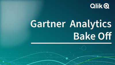
Qlik Brings Advanced Analytics to Flooding Solutions for the 2023 Gartner BI & A...
Qlik was selected to participate in the 2023 Gartner Modern Analytics and BI Bake-Off. This is Qlik’s 9th year in a row with involvement reserved fo... Show MoreQlik was selected to participate in the 2023 Gartner Modern Analytics and BI Bake-Off. This is Qlik’s 9th year in a row with involvement reserved for BI vendors distinguished as leaders in the Gartner Magic Quadrant for Analytics. We presented live for the North American event in Orlando and will be showcasing our solution in London for the EMEA Summit May 21st. Rocco Pecora is leading the showcase for both events.
The Bake-Off process followed the same format as previous years, with vendors showcasing a range of capabilities to provide a side-by-side view of their differences and strengths, based on a common data set and brief. This year’s dataset came from the National Oceanic and Atmospheric Administration (NOAA), Organization for Economic Co-operation and Development (OECD), and any additional data sets to expand the value of insights around flooding and its impact. These datasets included global weather station data, global and regional flooding metrics, and the effects of flooding through extreme weather events.
This year, Rocco Pecora showcased Qlik Cloud through the entire presentation and demonstrated a range of integrated and bundled capabilities on our SaaS platform, including:
- Data Integration including Data Catalog’s Lineage and Impact Analysis
- Natural Language Processing (NLP) and Generation (NLG)
- Direct Query and On Demand App Generation into in-memory
- Qlik AutoML for predictive modelling
- Insight Advisor and Analysis Types
- Application Automation for reporting
- Self-Service dashboard creation
- ChatGPT integrated across the development and discovery lifecycle
We presented a variety of solutions within around flooding such as a Direct Query application drilling down from a big data set of global weather station data (700million+ rows), a real-time flood gauge dashboard across the US, and a Hurricane Response app designed for a federal agency to direct state and local municipalities in preparation of a large weather event. The hurricane response app used AutoML to predict the wind speeds and leveraged application automation to distribute an Evacuation and Hospital Impact report for multiple states and provided reports to both internal and external users.
We also integrated ChatGPT into the Cool & Innovation section. We integrated ChatGPT across multiple areas of the development and data discovery lifecycle. ChatGPT first would fetch data for the Top 10 agricultural disasters by country, date, damages in USD and disaster type and load that as a dataset to be used for analysis. We also used ChatGPT to offer a description of that datasets, it would write set analysis syntax for the user to enable metric building, and also prescribe the best analysis types within Insight Advisor and finally it would offer background information on the analysis. We utilized our open web-based APIs to integrate with the trendy AI tool and displays Qlik Cloud’s robust API library to easily plug-in to emerging technologies.
During the demo we uncovered some great data stories and insights related to the agricultural value of crops and populations exposed to flooding:
- In the US alone, there’s $367 billion in agricultural commodities at risk to flooding in the US alone.
- There have been 338 weather events that have created over an excess of 1 billion dollars (USD) of damage, totaling to $24 trillion in damages altogether and averaging $71 billion of damages per weather event.
- For most coastal countries, climate change and flooding are critical topics of policy and development strategies. A large part of under-developed Asian countries ranging from Bangladesh to Vietnam are at high risk of flooding events.
It’s always a pleasure showcasing Qlik’s ability to produce real-life solutions to help analyze flooding, its impact, and highlighting the power of our end-to-end platform.
To learn more about Qlik’s entry at the Bake Off, watch this video using the link here.
-
Inauguration of the first Centre of Excellence in Analytics in Bangalore
On April 3rd, a Centre of Excellence (CoE) in Analytics was established in Kristu Jayanti College, Bangalore in association with the Qlik Academic Pro... Show MoreOn April 3rd, a Centre of Excellence (CoE) in Analytics was established in Kristu Jayanti College, Bangalore in association with the Qlik Academic Program. This is the first CoE of the Qlik Academic Program in Bangalore and the State of Karnataka. Overall, this is the fourth Centre of Excellence in India.
Kristu Jayanti College is one of the foremost educational institutions in Bangalore and enjoys a top grade from government bodies for its teaching quality. In the India Today - MDRA survey 2022, the college was ranked as the best Emerging College of the Century at National Level for Commerce, Science and Arts.
Qlik is one of the leading data analytics companies with a presence in more than 100 countries and more than 38000 active customers. The Qlik Academic Program offers free analytics resources including Qlik Sense Business software, online training, qualifications and certifications to students and professors.
The Centre of Excellence in Analytics is an important step to foster analytics in a city popularly known as the Silicon Valley of India, where many technology and software companies in India are based. There is a large requirement of trained data analytics talent in Bangalore and India and this CoE will act as a catalyst to fulfil this requirement besides being a hub to exchange ideas in data analytics.
The inauguration of the CoE was attended by more than 80 students and educators from Kristu Jayanti. Dignitaries from Kristu Jayanti included Fr. Dr. Augustine George Principal, Prof. Sevuga Pandian HOD, Prof. Nagendra Program Co-Ordinator, Dr. Kalaiselvi Qlik Academic Program Coordinator who were present during the formalities. Students from different batches made presentations using the Qlik Sense app on presented their findings by analyzing data sets.
Kristu Jayanti and the Qlik Academic Program have enjoyed a great engagement so far with many students being encouraged to get qualified from the academic program qualifications such as Qlik Sense Business Analyst and Qlik Sense Data Architect. Many of them have been successful in acquiring the qualifications by undergoing training and appearing for the exams. In the future, many activities are being planned to foster this relationship so that more students are able to benefit and enhance their career prospects in analytics through this CoE.
To know more about the Qlik Academic Program and its amazing resources, visit: qlik.com/academicprogram
-
QlikWorld Sneak Peek
Plan Ahead with Qlik’s 2023 Product Roadmap - A Sneak Peek of What’s to Come! Hear from our Chief Product Officer, James Fisher, VP Product Marketing... Show MorePlan Ahead with Qlik’s 2023 Product Roadmap - A Sneak Peek of What’s to Come!
Hear from our Chief Product Officer, James Fisher, VP Product Marketing, Josh Good, and team about the exciting upcoming product innovations in 2023.
Roadmap Review - What you’ve all been waiting for – Qlik Cloud, data integration and management, analytics and more…
Syngenta Group Success - The innovations behind one of our favorite success stories this year – Learn about the transformation of BI-Analytics modernization at Syngenta Group.
Top Favorites - Teamwork makes the dream work – our product team is breaking down their favorite innovations that they can’t wait for you to try.
Register now! See you in Vegas!
-
Customer Can’t Miss Sessions
Intuit. Nordisk Film. Vale. And more! Can’t miss sessions filled with the hottest tips and latest innovations. Check out these QlikWorld Data Integrat... Show MoreIntuit. Nordisk Film. Vale. And more!
Can’t miss sessions filled with the hottest tips and latest innovations. Check out these QlikWorld Data Integration sessions.
Great Customer Experience Through a Single Portal for Metrics and Dashboards
This session will outline how Intuit created a one-of-a-kind, company-wide, reporting platform using Qlik’s Embedded Analytics.Get inspired on the Qlik Cloud journey in Nordisk Film
Learn about the considerations when Nordisk Film moved from on-premise Qlik Sense Saas - a deep dive on the different considerations to move into cloud and the capabilities enabled by the move.Using Data Models to Save Lives
Vale S.A. details their journey to reducing the number of workplace fatalities through a new health and safety strategy - implementing a solution delivered by Qlik Replicate and shaped by Qlik Compose.And more: View online session guide
100+ Breakout Sessions. Hands-on workshops.
Valuable certifications. Return home with the knowledge
and inspiration to tackle any integration challenge.