Unlock a world of possibilities! Login now and discover the exclusive benefits awaiting you.
Analytics & AI
Forums for Qlik Analytic solutions. Ask questions, join discussions, find solutions, and access documentation and resources.
Data Integration & Quality
Forums for Qlik Data Integration solutions. Ask questions, join discussions, find solutions, and access documentation and resources
Explore Qlik Gallery
Qlik Gallery is meant to encourage Qlikkies everywhere to share their progress – from a first Qlik app – to a favorite Qlik app – and everything in-between.
Qlik Community
Get started on Qlik Community, find How-To documents, and join general non-product related discussions.
Qlik Resources
Direct links to other resources within the Qlik ecosystem. We suggest you bookmark this page.
Qlik Academic Program
Qlik gives qualified university students, educators, and researchers free Qlik software and resources to prepare students for the data-driven workplace.
Recent Blog Posts
-
Qlik reaches milestone with FedRAMP Moderate Authorization for Qlik Cloud Govern...
Qlik announced our authorization under the US Federal Risk and Authorization Management Program (FedRAMP) has been approved, with the sponsorship of t... Show MoreQlik announced our authorization under the US Federal Risk and Authorization Management Program (FedRAMP) has been approved, with the sponsorship of the US Environmental Protection Agency (EPA). This authorization allows US Federal, State, and local agencies to use Qlik Cloud Government safely and securely for data integration, analytics, machine learning, and more!
FedRAMP is a U.S. government program that approves cloud products and services for the U.S. Public sector. The goal of FedRAMP is to accelerate the adoption of cloud solutions for agencies and support their transition from older legacy infrastructures to mission-critical, secure, and cost-effective cloud-based technology.
“As federal agencies and organizations rapidly modernize and migrate to the cloud, they must ensure the transition is protected under the strictest secure protocols and authorizations,” said Andrew Churchill, Vice President of Federal at Qlik. “Achieving this FedRAMP milestone validates Qlik's ability and commitment to meet the unique and ever-changing needs of our government clients and equips them with greater access to state-of-the-art solutions to reach their mission goals.”
Qlik worked closely with their sponsoring agency, the EPA, who implemented Qlik Cloud Government to ignite innovation and evolve their current analytics program. The EPA leveraged Qlik Cloud Government to unlock more value out of their data in addition to improving operational efficiencies and reducing costs across the agency.
“Working with Qlik in their pursuit of FedRAMP authorization allowed EPA to shift resources to delivering analytics to protect human health and the environment rather than IT administration,” said Arthur Zuco, Program Manager at EPA. “Our world is moving to the cloud and, by adopting SaaS, we are setting ourselves up to take advantage of the kinds of new capabilities that will be delivered by the SaaS market in general for years to come.”
Federal, state, and local agencies worldwide trust Qlik for data integration and superior analytics capabilities through a state-of-the-art platform built to enable end-to-end data analytics pipelines that close the gaps between insights and action. Now our US Public Sector customers can take advantage of that vision in a FedRAMP-compliant cloud environment.
Qlik’s FedRAMP Moderate authorization is also recognized by the Department of Defense (DoD) at IL2 and has started uplift certification for IL4.
To read the press release, see here.
To learn more about Qlik Cloud Government, link here (already linked 2x above)
To speak with someone from our Public Sector team, click here.
-
Mini Charts
With the June 2020 release of Qlik Sense came many chart enhancements. My favorite is the addition of mini charts to a table. In a table, a measure c... Show MoreWith the June 2020 release of Qlik Sense came many chart enhancements. My favorite is the addition of mini charts to a table. In a table, a measure can be visualized via a mini chart as either bars, dots, sparklines, or positive/negative.
This enhancement not only makes a table more appealing to look at, but it can easily point out changes and trends in the data. To add a mini chart to a table, follow these simple steps:
- Add a measure to the table. In the example above, Sum(Sales) is the measure.
- In the Properties window of the table, change Representation to Mini chart.
- Select the dimension to indicate what data to view. In the table above, Month was the selected dimension.
- Select the Type of mini chart to add (bars, dots, sparklines or positive/negative).
That is it, the mini chart is added to the table. There are other options that can be adjusted to change the look and feel of the mini chart. In the Colors area, there is the option to select the color of the bar/dot/line as well as the option to select the color of the max value, min value, first value and last value. If showing a sparkline mini chart, you also have the option to show dots on the line for each data point of the selected dimension. The y-axis can also be adjusted for the mini chart. There is the option to use local or global so you can decide if the y-axis range is based on the specific row or all rows. There is also the choice to select auto, zero as baseline or zero as center for the y-axis. Read more about mini chart in Qlik Help.
Mini charts are eye candy for your table. Dress up the measures in your table with mini charts to provide another layer of information in an easy to digest manner. Learn more about the Qlik Sense June 2020 release by checking the links below:
- Qlik Sense App - What’s New App
- Video – What’s New – Qlik Sense June 2020
- Video – June 2020 Feature Demonstration
- Blog – Qlik Product Innovation Blog – Qlik Sense June 2020
Thanks,
Jennell
-
Qlik Digest - October 2022
What’s New at Qlik?Are you familiar with the many Lineage and Impact Analytics capabilities in Qlik Sense SaaS? If not, now’s a great time to check th... Show MoreWhat’s New at Qlik?
Are you familiar with the many Lineage and Impact Analytics capabilities in Qlik Sense SaaS? If not, now’s a great time to check them out as these features have been made available to all Qlik Sense Enterprise SaaS users. Learn More
Qlik Cloud Data Integration is coming soon! Designed to quickly deliver, transform, and unify enterprise data with automated and governed pipelines, our latest innovation is not to be missed. Stay tuned for more details!
Active Intelligence Executive Insights
The second issue of our Active Intelligence Executive Insights is now available. Learn from industry experts like Hannah Fry, on how we should rethink our approach to human vs machines and Sally Eaves, on how to inform smarter actions in a constantly changing world. Read Now
7 Habits of Highly Effective Data and Analytics Teams
Join Qlik's Josh Good and Joe DosSantos on October 26 as they discuss the findings from the new Transforming Data with Intelligence report and explore what highly effective organizations do to drive analytical success. Register Now
Your Feedback Matters
We take customer input seriously, and it factors into key business decisions we make. In October we will invite you to participate in Qlik’s Customer Survey. Please look out for an email invite from feedback@qlik.com, or a pop-up inside your Qlik Sense Hub.
Additional Featured Content
Check out our new blended learning – Instructor-led training that’s ready when you are!
How Qlik is helping SodaStream fight plastic pollution
Qlik Sense SaaS Simplified Authoring is now live
Workshop Wednesdays - Get a hands-on with our Data Analytics and Integration Portfolio
-
Penn State Great Valley Giving Society
This month the Qlik Academic Program was honored to be invited as a guest and sponsor of the Penn State Great Valley Giving Society . Every year the... Show MoreThis month the Qlik Academic Program was honored to be invited as a guest and sponsor of the Penn State Great Valley Giving Society . Every year the society's mission is to raise money to support graduate students attending the campus to obtain masters degrees ranging in studies from Business Administration to Software Engineering.
Many of the philanthropists that support Penn State Great Valley are former graduates but some include local businesses. In Qlik's case, we are considered a partner to the campus as we provide the students at the Big Data Lab with the opportunity to gain access to our software, training, certificates, and technical workshops at no charge. The campus considers this a gift in kind and as a result, we are acknowledged in their annual dinner.
It was a pleasure to attend the dinner and we look forward to many more years of supporting the students on campus!
Learn more about how the Qlik Academic Program can support you and apply today by visiting https://www.qlik.com/us/company/academic-program

-
【オンデマンド配信】いま企業に必要なクラウドデータ分析基盤とは
パンデミックや紛争、自然災害といった不透明な時代において、リアルタイムのデータ分析・将来の予測・俊敏な行動が求められています。また、働き方の変化や TCO 削減の観点からクラウドへの移行が増加し、クラウドで完結するデータ分析基盤が求められています。本 Web セミナーでは、データ分析やダッシュボード... Show Moreパンデミックや紛争、自然災害といった不透明な時代において、リアルタイムのデータ分析・将来の予測・俊敏な行動が求められています。また、働き方の変化や TCO 削減の観点からクラウドへの移行が増加し、クラウドで完結するデータ分析基盤が求められています。
本 Web セミナーでは、データ分析やダッシュボード超えた自動化を促進するクラウドアプリケーションとの連携、AI / 機械学習を駆使した予測分析、オンプレのデータをクラウド上で安全に利用できるデータ統合機能を備えた Qlik Cloud をデモを交えてご紹介します。※ 参加費無料。パソコン・タブレット・スマートフォンで、どこからでもご視聴いただけます。
-
Introducting Partner ID to Qlik SaaS offering
This feature can be found in My Qlik, another recently added tool that provides a single location for users to manage their Qlik identity and their Ql... Show MoreThis feature can be found in My Qlik, another recently added tool that provides a single location for users to manage their Qlik identity and their Qlik Sense subscriptions. As part of this management, users can now associate a Partner ID with their subscription.
The Partner ID is a six-digit number that uniquely identifies a partner to Qlik. To associate the Partner ID to your subscription, the first step is to talk to your Partner and ask them what number you should use. Once you have that number, you can log into My Qlik (https://myqlik.qlik.com/portal/). Then, by clicking on the Subscriptions tab, you will be able to see your subscriptions.
Within the subscription tile you can click on the edit button and add the Partner ID.
If a Partner ID has already been entered, you can also change it, or delete it entirely.
It’s all about improving your experience with Qlik! The My Qlik Portal is an area where Qlik Sense users will have the ability to digitally purchase and manage Qlik Sense Business Subscriptions and their own information among many other things.
More to come in the near future around the My Qlik Portal - stay tuned!
-
Qlik Academic Program workshop at Sunway University Malaysia
On October 5th, the Qlik Academic Program organized a workshop for students of Sunway University, Malaysia. Qlik's customer Ikano Insights supported t... Show MoreOn October 5th, the Qlik Academic Program organized a workshop for students of Sunway University, Malaysia. Qlik's customer Ikano Insights supported this event since they have an existing relationship with the University and they are encouraging students to learn from the academic program in view of potential internship and job opportunities at Ikano Insights for those trained in Qlik. In attendance was Mr ST Chua, Regional Director South East Asia at Ikano Insights who shared his thoughts on data analytics and the Qlik-Ikano relationship. Sunil Aman, Director Commercial Accounts, ASEAN, who manages the Ikano account at Qlik was also present and helped in answering queries of students.
Qlik's technical expert and Senior Solution Architect, Edy Tan conducted this workshop and explained the features of Qlik Sense Business. He guided students on using the features of Qlik Sense during his 2.5 hour session. Students had the opportunity to build dashboards and visualise data and get a first hand feel of analysing data. Close to 50 students attended this workshop and it was a truly engaging experience for the audience.
Apply to the program today, qlik.com/us/company/academic-program
-
Qvd Tracker
Qvd Tracker Team Computers It extracts all qvds from qvs file and fetches its reload time. Suitable for Backtracking activities. Discoveri... Show More
Qvd TrackerTeam Computers It extracts all qvds from qvs file and fetches its reload time. Suitable for Backtracking activities.
Discoveries
Saves time and manual intervention
Impact
Automated Backtracking, saved time, and Manual force.
Audience
BI Analyst, Tech Lead.
Data and advanced analytics
Saved Time and Increased efficiency by delivering accuracy in output.
-
Interacting with data using Enigma.js PT 2: Creating Filters with List Objects a...
On Part 1 of this blog post, we went through Generic Objects, learned about definitions of the ListObject and Hypercube structures, and explored some ... Show MoreOn Part 1 of this blog post, we went through Generic Objects, learned about definitions of the ListObject and Hypercube structures, and explored some of the settings that they offer in order to interact with data when communicating with the Qlik Associative Engine through Enigma.js.
In this second part, we will see actual implementations of ListObjects and Hypercubes and learn how they can be used as part of your next web application to create filters and charts.
Creating Filters with ListObjects
First, let’s create a filter that corresponds to a single field in our data model that we can use to make selections and filter in.
The ListObject structure is best suited in this case since it contains one dimension. It lists all the values in a single field and provides metadata about the current state of each field value (either selected, excluded, or possible)
In order to create a ListObject, we create a dynamic property for it in a generic object, we then add the appropriate JSON definition for a list object via the “qListObjectDef” property. The engine will know how to properly parse this definiton in order to produce a ListObject.
In our case, we define a list object for our “Region” field by using the dimension definition based on the field name via the “qDef/qFieldDefs” property.
All is left if to fetch the data, we do that by defining the “qInitialDataFetch” property to grab the initial data set. In our case, we have 1 column and we know that the number of rows to be pulled is less than 10. So, we define it with “qWidth” 1 and “qHeight” 10.
{
    "qInfo": {
        "qType": "filter"
    },
    "qListObjectDef": {
        "qDef": {
            "qFieldDefs": ["Region"]
        },
        "qInitialDataFetch": [
            {
                "qLeft": 0,
                "qWidth": 1,
                "qTop": 0,
                "qHeight": 10
            }
        ]
    }
}
After connecting to enigma and getting our app object, we create a session object and pass it the ListObject definition above. A session object is a generic object that is only active for the current session and is not persisted in the model.
const regionObj = await enigmaApp.createSessionObject(regionListDef);
const regionLayout = await regionObj.getLayout();

renderFilter(regionListElem, regionLayout, regionObj)
After getting the ListObject layout, we call the function below that takes care of retrieving the data we want to display on our filter via the “layout.qListObject.qDataPages[0].qMatrix” which consists of an array of arrays, each corresponding to 1 row of data.
The JSON object we get by looping through the "qMatrix" includes the following properties:
- qText: a text representation of the cell value
- qNum: a numeric representation of the cell value
- qElemNumber: a rank number of the cell value.
- qState: the selection state of the field value.
We use both qText and qState in our front end. First to display the value name, and to add a CSS class that will allows to differentiate between different states:
- S for selected
- X for excluded
- O for possible
We also listen to click events on the list and call “genericObject.selectListObjectValues("/qListObjectDef", [e[0].qElemNumber], true)” which is a Generic Object method. It takes the path that describes where our ListObject is defined in our Generic Object as a 1st parameter, and the Element Number that we want to select as the 2nd parameter. The 3rd argument is the toggle mode (whether a selection is added to an already existing set of selections or overrides them).
const renderFilter = (element, layout, genericObject) => {
    var titleDiv = element.querySelector(".filter-title");
    var ul = element.querySelector("ul");
    ul.innerHTML = "";

    // Get the data from the List Object
    var data = layout.qListObject.qDataPages[0].qMatrix;

    // Loop through the data and create the filter list
    data.forEach(function(e) {
        var li = document.createElement("li");
        li.innerHTML = e[0].qText;
        li.setAttribute("class", e[0].qState);

        // Click function to select
        li.addEventListener("click", function(evt) {
            genericObject.selectListObjectValues("/qListObjectDef", [e[0].qElemNumber], true);
        });

        ul.appendChild(li);
    });
};
Creating Charts with HyperCubes
When creating visualizations, we make use of Hypercubes which allow us to define a combination of both dimensions and measures in order to get a calculated data set.
Let’s create a Pie Chart that shows the Sum of Revenues by Region.
The Generic Object definition for this includes 1 Dimension and 1 Measure that we define via the “qHyperCubeDef” property
We then define the initial data fetch, in this case we need 2 columns (one for the Region, and one for the calculated Revenue) and we don’t expect to have more than 1000 rows. Thus we set “qWidth” 2 and “qHeight” 1000.
{
    "qInfo": {
        "qType": "chart"
    },
    "qHyperCubeDef": {
        "qDimensions": [
            {
                "qDef": {
                    "qFieldDefs": ["Region"],
                    "qSortCriterias": [
                        {
                            "qSortByNumeric": 1
                        }
                    ]
                },
                "qNullSuppression": true
            }
        ],
        "qMeasures": [
            {
                "qDef":{
                    "qDef": "=Sum([Sales Quantity]*[Sales Price])"
                }
            }
        ],
        "qInitialDataFetch": [
            {
                "qLeft": 0,
                "qWidth": 2,
                "qTop": 0,
                "qHeight": 1000
            }
        ]
    }
}
Similar to what we have done on the ListObject, we create a Generic Object (session object), and then get its layout. Next we call the “renderChart” method to create the Pie chart visualization.
const chartObj = await enigmaApp.createSessionObject(chartDef);
const chartLayout = await chartObj.getLayout();

renderChart(chartLayout);
Our function is simple, we start by accessing the qMatrix array which contains all of our rows which in turn contain a group of cells.
We refine this array using the map function to only grab a pair of values consisting of the Region (via the qText property of the 1st cell) and the Revenue (via the qNum property of the 2nd cell).
You can then render the chart using your visualization tool of choice. In this case, we use C3.js.
const renderChart = (layout) => {
    var qMatrix = layout.qHyperCube.qDataPages[0].qMatrix;

    // Map through qMatrix to format it as array of arrays: [[region1, revenue1], [region2, revenue2] ...]
    const columnsArray = qMatrix.map((arr) => [arr[0].qText, arr[1].qNum]);

    c3.generate({
      bindTo: "#chart",
      data: {
        columns: columnsArray,
        type: 'donut'
      },
      donut: {
          title: "Revenue by Region"
      }
    });
  }
I hope this post helps you further understand the notion of Generic Objects in the form of ListObjects and HyperCubes. Let me know how you are leveraging these concepts to build your custom solutions!
The full code can be found on my Github Repo.
-
Qlik Sense Incremental Load using Merge
Since the introduction of the new MERGE prefix (https://help.qlik.com/en-US/sense/May2022/Subsystems/Hub/Content/Sense_Hub/Scripting/ScriptPrefixes/M... Show MoreSince the introduction of the new MERGE prefix (https://help.qlik.com/en-US/sense/May2022/Subsystems/Hub/Content/Sense_Hub/Scripting/ScriptPrefixes/Merge.htm) has become much easier to create an incremental load using a Qlik script. This command receives a table with insert, update, and delete operations and can change a table already loaded in memory.
For the examples below we have two assumptions:
- OrderID is the table's primary key (if you have a composite key, you need to adjust it)
- update_dt stores the date/time of the last record insert/change
Let's see the examples:
1 -"Insert Only Case
QVDFile='lib://DataFiles/NW.Orders_InsertOnly.qvd';
if FileSize('$(QVDFile)') > 0 then //If there is already extracted data
[NW.Orders]:
Load
OrderID,
CustomerID,
EmployeeID,
OrderDate,
RequiredDate,
ShippedDate,
ShipVia,
Freight,
ShipName,
ShipAddress,
ShipCity,
ShipRegion,
ShipPostalCode,
ShipCountry
from [$(QVDFile)](qvd);
t:load Max(OrderID) as MaxOrderID Resident [NW.Orders];
LastOrderID=Peek('MaxOrderID'); // Retrieves the last OrderID
Drop Table t;
else
LastOrderID = '0';
[NW.Orders]:load null() as OrderID AutoGenerate 0; // fake table
endif

Merge(updated_dt) on OrderID Concatenate([NW.Orders])
Load If(Exists(OrderID),'U','I') as Operation, *; // New record? based on OrderID
SELECT
OrderID,
CustomerID,
EmployeeID,
OrderDate,
RequiredDate,
ShippedDate,
ShipVia,
Freight,
ShipName,
ShipAddress,
ShipCity,
ShipRegion,
ShipPostalCode,
ShipCountry,
updated_dt
FROM northwind.orders
Where OrderID > '$(LastOrderID)';

Store [NW.Orders] into [$(QVDFile)](qvd);
2 - "Insert" & "Update" Case
QVDFile='lib://DataFiles/NW.Orders_InsertUpdate.qvd';
if FileSize('$(QVDFile)') > 0 then //If there is already extracted data
[NW.Orders]:Load
OrderID,
CustomerID,
EmployeeID,
OrderDate,
RequiredDate,
ShippedDate,
ShipVia,
Freight,
ShipName,
ShipAddress,
ShipCity,
ShipRegion,
ShipPostalCode,
ShipCountry,
updated_dt
from [$(QVDFile)](qvd);
t:load Max(updated_dt) as updated_dt Resident [NW.Orders];
updated_dt=Timestamp(Peek('updated_dt'),'YYYY-MM-DD hh:mm:ss.fff'); // Retrieves the last udpate
Drop Table t;
else
updated_dt = '2000-01-01';
[NW.Orders]:load null() as OrderID AutoGenerate 0; // fake table
endif
Merge(updated_dt) on OrderID Concatenate([NW.Orders])
Load If(Exists(OrderID),'U','I') as Operation, *; // New record? based on OrderID
SELECT
OrderID,
CustomerID,
EmployeeID,
OrderDate,
RequiredDate,
ShippedDate,
ShipVia,
Freight,
ShipName,
ShipAddress,
ShipCity,
ShipRegion,
ShipPostalCode,
ShipCountry,
updated_dt
FROM northwind.orders
Where updated_dt > '$(updated_dt)';
Store [NW.Orders] into [$(QVDFile)](qvd);3 – Insert / Update / Delete Case
QVDFile='lib://DataFiles/NW.Orders_InsertUpdateDelete.qvd';
if FileSize('$(QVDFile)') > 0 then //If there is already extracted data
[NW.Orders]:Load
OrderID,
CustomerID,
EmployeeID,
OrderDate,
RequiredDate,
ShippedDate,
ShipVia,
Freight,
ShipName,
ShipAddress,
ShipCity,
ShipRegion,
ShipPostalCode,
ShipCountry,
updated_dt
from [$(QVDFile)](qvd);
t:load Max(updated_dt) as updated_dt Resident [NW.Orders];
updated_dt=Timestamp(Peek('updated_dt'),'YYYY-MM-DD hh:mm:ss.fff'); // Retrieves the last udpate
Drop Table t;
else
updated_dt = '2000-01-01';
[NW.Orders]:load null() as OrderID AutoGenerate 0; // fake table
endif
Merge(updated_dt) on OrderID Concatenate([NW.Orders])
Load If(Exists(OrderID),'U','I') as Operation, *; // New record? based on OrderID
SQL SELECT OrderID,
CustomerID,
EmployeeID,
OrderDate,
RequiredDate,
ShippedDate,
ShipVia,
Freight,
ShipName,
ShipAddress,
ShipCity,
ShipRegion,
ShipPostalCode,
ShipCountry,
updated_dt
FROM northwind.orders
Where updated_dt > '$(updated_dt)';
//Keeping only records which OrderID is still in database
Inner Keep([NW.Orders])
SQL SELECT DISTINCT OrderID
FROM northwind.orders;
Store [NW.Orders] into [$(QVDFile)](qvd); -
New Data Visualization Capabilities Now Live in Qlik Sense SaaS
At Qlik, we take customer feedback seriously and routinely incorporate customer recommendations into product delivery. The new features support both a... Show MoreAt Qlik, we take customer feedback seriously and routinely incorporate customer recommendations into product delivery. The new features support both analytics creators and consumers, with more customization options and improved usability to help you make data-driven decisions and take action in the business moment.
Application Chaining
Application developers can now connect applications together through a new navigation option on the action button. When the target application shares fields and current values with the source, utilize the button option to specify the app and sheet ID, and the selection will be applied to the target. Application Chaining makes it easier to split functionality across applications for faster load time, accelerated response time, and simplified governance.
Font Styling
An ongoing initiative of ours is to provide you with the most modern components to satisfy use cases and solve today’s business challenges. Over the past 18-months, we’ve worked toward modernizing visualization capabilities utilizing the Nebula framework. We recently launched font styling updates for Bar and Pie charts covering titles, subtitles, and footnotes, and including options for font size, color, and family. Within the next week, Map charts and Combo charts will offer those options, giving you more power and flexibility to customize as you wish or conform to your organization’s standards. Font styling will be added to more charts soon.
Note: Chart creation via Simplified Authoring, offers font styling on all charts.
Custom KPI Tooltip
Over the past year, we added custom tooltips as options to bar, combo and map charts. Now, the ability to create a custom tooltip for the KPI object is available with Qlik Sense SaaS. This is the first tooltip added to a dimension-less object. The tooltip is conveniently displayed upon hovering over the object, adding context to your KPIs.
Coming Soon: Set Analysis outer scoping
Together with the new Simplified Authoring in Qlik Sense SaaS, we are enhancing set analysis. Previously, you could only place set analysis expressions within another expression. Soon, you’ll be able to build compound statements and support Master Measures by placing the set analysis expression at the beginning of measures to provide outer set scoping. This is particularly helpful when working with complex master measures that come in different flavors of one base measure; and you will be able to set expressions to tweak the base master measure.
For example:
{<Year={2021}>} [Master Measure]
More information on this can be found here.
Join the “Do more with Qlik” webinar on October 26 to see these features and others in action.
-
A New Navigation for Qlik Community
Article Updated: Sept 27 4 AM ET [Qlik Community Navigation Refresh Complete] Most minor issues resolved. [resolved] Issue found with top search ico... Show MoreArticle Updated: Sept 27 4 AM ET [Qlik Community Navigation Refresh Complete]
Most minor issues resolved.
[resolved] Issue found with top search icon: nav disappears when click; refresh page for nav to reappear. Please use search on body of Community pages.
Please report any problems to QlikCommunityAdmins@qlik.com
---------
Article Updated: Sept 27 1 AM ET [Qlik Community Navigation Refresh Complete]
We are working thru a few minor issues, please report any problems to QlikCommunityAdmins@qlik.com---------
More details in this article: The New Qlik Community Header & Nav – What’s ChangedIt's been months in the making and required involvement from many parts of the business here at Qlik; we are happy to share that we have a brand new navigation here on Qlik Community.
It will feel different. It will look different. It will take some time to get used to the change.
The challenge: Navigation hover-over at the top level creates performance issues - a slowness I'm sure many of you have experienced. Not to mention, important pages buried too deep in the navigation require many painful clicks to finally reach your destination. Our data is clear as to the high traffic pages that you frequent and so we know with certainty what is important for new members as well repeat visitors.
The opportunity: To re-create the navigation so that we could:
- reduce navigation clutter
- add dynamic mega-menu functionality for more seamless wayfinding
- reorganize content within the community structure
Reduce navigation clutter
To reduce navigation clutter we started by removing the sitemap leaving only a top level navigation. It will be an intentional 'click' on your part to see what lies beneath each menu item. Removal of the hover-over afforded us significant improvements in site performance, speed and page load times.Unauthenticated view
Authenticated view (Partner)
Add Dynamic mega-menu functionality
The mega menu design can go multi-columns wide; allowing us opportunity to move things around as business needs demand. You will no longer lose your spot where your cursor was hovering (thank you for tolerating that as long as you did).Each link is intentionally placed with care and consideration for our members. The mega menu can be easily updated putting us in a good position to respond to user feedback (we read your survey responses - hint hint!)
Reorganize content within community structure
Our forums will be reorganized and in some cases renamed. Please take a few minutes to reacquaint yourself with all the updates. We have provided a few different ways for you to find a forum:
- Analytics
- Data Integration
- By Product (alphabetized)
(example 1)
(example 2)
We've made it obvious when you are leaving the site with our new external link indicator.
but wait there is more...
Learn how to move to Qlik Cloud will be a brand new space in Qlik Community.
Last but not least, take note of the reordering of mail, notification and search icons by your avatar. The 'ask a question' button will shift just a little bit.
For any issues or concerns post launch please leave a comment here or write to us at: QlikCommunityAdmins@qlik.com
We are here to help you in your journey with Qlik. The Qlik Community Team is grateful for your dedication and membership and mostly for your commitment to helping others in this wonderful space we call Qlik Community.
As always, we welcome your feedback.Qlik Community Team
@Melissa_Potvin @Sue_Macaluso @Jamie_Gregory @nicole_ulloa @emmaspickermanIssues we are working thru:
[RESOLVED] mobile device hamburger menu rendering in duplicate, under investigation
[RESOLVED] carousel on home page and throughout are not loading properly
[RESOLVED]bottom of home page / filters not displaying properly and cards appearing in duplicate[IN PROGRESS] fixing mobile display of header to include mail and bell notifications

-
Demonstrate the importance of analytics to your students with these customer sto...
Our Qlik Academic Program team is often asked by educators for real life use cases and customer stories for their students. Students will be much more... Show MoreOur Qlik Academic Program team is often asked by educators for real life use cases and customer stories for their students. Students will be much more motivated and focused if they can understand the bigger picture of what they are studying and how it will serve them in the future.
In this blog I have put together some customer stories related to different industries. Students may not know which industry they’d like to venture into, but the wide range of stories collected in this blog are an example of how nearly every industry, around the globe, needs to utilize and understand their data.
Food & Beverage
This customer story from Wicked Sister shows us that even your dessert contains traces of data. Wicked Sister had been using excel reports and were still using paper to calculate their profit/loss reports, leading to large opportunity for human error. Read their customer story here to find out how Qlik Sense has helped them to better manage their data and keep growing.
Retail
Urban Outfitters is a well-known creative lifestyle brand that students are likely to have at least passed by for a window shop. Time consuming, unclear reporting meant that store managers spent most of their time in the back office and not enough on the sales floor. Read their story to learn about how utilizing their data has helped empower workers and improve in store performance.
Media
Conde Nast is the home of iconic brands such Vogue, Vanity fair and GQ but it’s not fashion that keeps these brands running day to day, it’s the data team that supports every function and department. Read about how issues with data accessibility and quality meant that Conde Nast sought out Qlik Sense to keep them competitive.
Finance
Many students will have heard of HSBC and may well have an account with them. The amount of data produced and used by a company the size of HSBC comes with challenges. HSBC needed to know which data was actually relevant, and then try locate where that data was stored. Click here to learn about how Qlik helped HSBC to tackle these problems.
Charity/Non-profit
Direct relief is an international non-profit humanitarian organization providing emergency medical assistance and disaster relief. Watch this video to learn about how utilizing data and adopting Qlik has enabled them to help more people at a lower cost and much faster.
Life Sciences
Data is at the core of everything Novartis do, from patient research to drug development. It is also vital that Novartis stay on top of their data. This video will tell you about how Novartis use insights from data to stay competitive and develop new medicines.
More of these stories can be found on our Qlik customer stories website. IF you want to start training for free on the software that is making a difference to so many of these companies, follow this link to learn more about our Qlik Academic Program – qlik.com/academicprogram.
-
Working with Set Analysis and Set Expressions
Hello Qlik Users! If you are on the Qlik Sense App Development forum or the QlikView App Dev forum, you might see some very seasoned developers writin... Show MoreHello Qlik Users!
If you are on the Qlik Sense App Development forum or the QlikView App Dev forum, you might see some very seasoned developers writing line after line of code. You might be asking yourself, “what does all this mean!?” It can look intimidating.
One of the possibilities, is that the code is for Set Analysis.
Set analysis gives you a way to define a set or a group of values that is independent of any selections. It is commonly used for making comparisons (e.g. this year vs last year). With set analysis, you use set expressions to analyze data.
Set expressions are how you define the field values. A set expression must be used in an aggregation function (like sum) and it must be enclosed by braces, {}. The expression consists of operators, identifiers and modifiers.
Here are some suggestions on how to get started with Set Analysis and Set Expressions:
Keep it simple.
Play around with examples provided on Qlik Help*. Get familiar with the syntax and the structure of the expressions.
Take a self-paced class on our Learning portal.
We offer a few classes on set expressions and set analysis:
Review our video resources.
There are so many videos available on Set Analysis. Some of the videos are a little bit older, but they are still relevant. Here are a couple I recommend:
Search the Qlik Community.
There is so much content that has been created in the form of articles, Help documentation, Community posts and documents, YouTube videos, etc. One search will search all the available platforms so you do not have to scour the internet.
Ask your peers for help.
Use our Qlik Community forums (Qlik Sense App Development and QlikView App Dev) to get help from your peers. I love promoting our Community’s development resources. The developers out on Qlik Community are brilliant and eager to help.
Try out the Set Analysis Wizard for QlikView**
The Set Analysis Wizard for QlikView is not a Qlik tool but was created by an employee. It is also something we like to use in Qlik Support. Even though it says for QlikView, it still applies to Qlik Sense.
I hope these resources help you on your Set Analysis journey. If you have any suggestions or recommendations on materials that helped you learn Set Analysis, post them in the comments below.
Kind regards,
Qlik Digital Support
*The same document is also available for QlikView.
**The information in this post is provided as-is and to be used at own discretion. Depending on tool(s) used, customization(s), and/or other factors ongoing support may not be provided by Qlik Support.
-
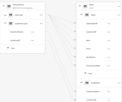
Now’s the time to take a look at field-level lineage and impact analysis
Note that Qlik makes a distinction between Lineage and Impact Analysis. Lineage is more focused on looking upstream (ex. “where did this data in the a... Show MoreNote that Qlik makes a distinction between Lineage and Impact Analysis. Lineage is more focused on looking upstream (ex. “where did this data in the app come from?”) while Impact Analysis is more about looking downstream (ex. “which apps are using this data field?”).
The field-level lineage capabilities within Qlik enables you to not only see data history by table but also the specific field within a table - starting with end-user applications all the way back to the original source.
If you’re also using the Qlik Lineage Connectors, you can additionally see field-level lineage for content within Qlik Sense Client-managed, QlikView, Tableau, PowerBI and various on-premise data repositories. Remember that any Qlik Sense SaaS customer can use the Qlik Lineage Connectors for free when connecting with Qlik-related sources.
There is also an option available within any chart that provides users with the ability to show a data lineage summary of the chart’s dimensions and measures.
And if you want to understand what the impact would be if a field value was modified, Impact Analysis shows which databases, apps, files or links are directly or indirectly linked to that field.
For more information, check out these available resources:
- Working with lineage and impact analysis (Qlik Help)
- Field-level lineage and Impact Analysis (Qlik Help videos)
-
Partner Engineering team releases a Qlik Cloud Rest Postman
Partner Engineering Team just released a Qlik SaaS Postman Collection to make easier for partners and customers to learn how to interact with Qlik Clo... Show MorePartner Engineering Team just released a Qlik SaaS Postman Collection to make easier for partners and customers to learn how to interact with Qlik Cloud REST API .If you need more samples, feel free to open a request, we are adding accordingly to your feedbackWe took the decision of decommission this repo because there is a such easier way to import one Qlik API as a collection in Postman
- Go to the API you want to test or use. Let´s say for example: https://qlik.dev/apis/rest/apps
- You are going to see a link "Download specification" just below the section title
- Download the JSON file and store it in you computer
- Open your Postman console and look for the "import" button
- Drag and drop your JSON file
- Check that your API was imported
- Configure your authentication at collection level, the easier way is to get one token from your tenant and pasting it here
- Add a variable called baseUrl (case sensitive) and configure it to your tenant address, example https://partner-engineering-saas.us.qlikcloud.com/api
That´s it, have fun!
-
Supply Chain Management Shifts from Cost to Risk
Recently Qlik's CK Tan (Senior Director, Solutions and Value Engineering) posted an interesting article regarding Supply Chain Management and the effe... Show MoreRecently Qlik's CK Tan (Senior Director, Solutions and Value Engineering) posted an interesting article regarding Supply Chain Management and the effect that crises such as COVID 19 caused. Going forward, companies must adjust the way they have done business and ensure they are better prepared for a world in which supply chain is no longer a given.
The article highlights several examples of large companies who faced supply chain issues all of which realized they needed to change the way they do business.
"These challenges are compelling supply chain executives to think differently. They have to act fast or risk slashing production, impacting sales and losing customers to competitors. After years of focusing on cost efficiencies or cost savings, 93% of supply chain executives now say they plan to increase the level of resilience across their supply chains."
Read the full article here supply chain cost to risk also, check out these demo examples of supply chain opportunities with Qlik Sense
University students studying supply chain management can take advantage of this shift by joining the @Anonymous #academicprogram for a year of Qlik Sense software, a subscription to the Qlik Learning Portal which includes analytics and data literacy training, certificate opportunities and more. Apply today by visiting https://www.qlik.com/us/company/academic-program
-
Cooler weather does not mean we're cooling down!
Hello Qlik Community! Here in Raleigh, the leaves are starting to change colors. The temperature is beginning to cool down in the morning (it’s still ... Show MoreHello Qlik Community!
Here in Raleigh, the leaves are starting to change colors. The temperature is beginning to cool down in the morning (it’s still 80-90 degrees F/26-32 degrees C in the afternoon). College football is in full swing. We are thisclose to saying, “It’s fall, y’all!” - one of my favorite sayings.
You would think we would be winding down with the end of the year only months away, but I can tell you some of the biggest updates are yet to come.
Here are the September enhancements:
Cloud Change Log on Product Innovation Blog
Keep track of the latest Cloud changes on the Product Innovation Blog with the new Cloud Change Log RSS feed.
Dynamic Topics Page
The topic page will now display the topic name in the banner and the breadcrumb.
‘Last Updated’ field on Support TKB
Questions on whether an article is still valid? Check the ‘Last Updated’ field! You can now find this field on the Knowledge page:
As well as the search results:
Don’t forget; it’s also on the article itself:
‘My Posts’ toggle added to Search
Are you looking for previous posts you have authored? Find all your posts easily with the flick of a switch!
Accessibility updates
@nicole_ulloa has been working hard to ensure Qlik Community meets accessibility requirements. Fixes went out for
- Entering Data in the “Search the Community” input field
- Textual Description for Sitemap image
- Empty link text for navigation links
Accessibility is an ongoing project – more updates to come!
‘Post a Question’ button renamed to ‘Create a Post’
Forums are used throughout Qlik Community, not only to post questions but to share opportunities and knowledge. So, the Forum page button has been renamed ‘Create a Post’ to accommodate all the reasons you may post to a forum.
I have a feeling we will have some big things happening in the next couple of weeks😉 Make sure you're subscribed so you know what's happening in the Qlik Community!
Your Qlik Community Admins,
Melissa, Sue, Jamie, Nicole and Emma
-
【オンデマンド配信】顧客成功例に見る、データアーキテクチャの刷新:米国最大の住宅ローン貸付会社
米国最大の住宅ローン貸付会社、United Wholesale Mortgage(UWM)社は、競合他社よりもスピーディに成約できるよう、金融テクノロジーでブローカーを支援しています。しかし、従来の ETL によるアプローチはエラーが発生しやすく、労力と時間を要することから、クラウド分析を可能にす... Show More米国最大の住宅ローン貸付会社、United Wholesale Mortgage(UWM)社は、競合他社よりもスピーディに成約できるよう、金融テクノロジーでブローカーを支援しています。しかし、従来の ETL によるアプローチはエラーが発生しやすく、労力と時間を要することから、クラウド分析を可能にするアーキテクチャの刷新を迫られていました。
同社は、比較的短期間でデータソースをライブデータストリームに変換し、データレイクを機械学習に活用することができました。これにより、顧客の融資状況を迅速に把握できるようになり、正確性・情報取得の利便性を大幅に向上。CPU 使用率やコンピューティングコストも削減することができました。
本 Web セミナーでは、Qlik、Confluent for Apache Kafka®、Microsoft® Azure Synapse を組み合わせてデータソースをライブデータストリームに変換する方法について、同社の担当者がご紹介します。
※ 参加費無料。パソコン・タブレット・スマートフォンで、どこからでもご視聴いただけます。日本語字幕付きでお届けします。
- 最新のストリーミング基盤の構築:
変更データキャプチャ(CDC) テクノロジーで、さまざまなソースからリアルタイムのデータを取得 - 移行中のデータを保持:
極めて重要な実稼働システムから継続的にデータをストリーミング - リアルタイム分析の実現:
分析データパイプラインを構築して、最新のデータを提供し、高度な分析のユースケースに対応 - ローコード / ノーコード:
継続的にデータをストリーミングするプロセスをハードコーディング不要で自動化
- 最新のストリーミング基盤の構築:
-
Qlik Management Console: Content
We are back in our third edition of our tour around the Qlik Management Console. In the first we edition we looked at a general overview, then in the ... Show MoreWe are back in our third edition of our tour around the Qlik Management Console. In the first we edition we looked at a general overview, then in the last edition, we looked at the Governance section. Today we will be looking at the Content section.
AppsThe Apps section of your Qlik Management Console will list the various apps in your tenant. This section contains great information on each app in your tenant, such as the name, owner, space that the app is in, the size and description if you have one. Here you can also change the owner, or the space the app is in, or just delete the app entirely. This section also allows you to view and manage the published and staged apps in your tenant.
Data Content
Data content shows the data connections and assets. For example, if you have connected to a database and your tenant is sourcing data from that database, that connection would be listed here. Users can view the Name, Owner, Space and Type of connection from this section. This section is great for viewing where your data is coming from and ensuring the right source is being used.
Automations
Automations are used to send messages to users and services. For example, if a certain threshold is met, users can set up an automated message to be sent to them. In this section, users can manage these automations, enabling, disabling, and deleting them. This section also provides information on the name of the automation, status, when it last happened, what mode it is in, the owner, description and if the automation has been completed or not.
AutoML
AutoML stands for Automated Machine Learning. AutoML generates machine learning models by using historical data to make predictions on current data. Put simply; AutoML looks at what has been done in the past, to do the same in the present. In this section, you will find the jobs that are running for AutoML experiment versions and predictions. Here you can see the Experiment name, when it was created, the user that created it, and the status of the experiment. If you have access rights, you can also cancel jobs.
Generic links
This section allows users to create links that make on-premises apps available in the cloud. Here you’ll be able to upload a CSV file to upload several links at the same time. The linked apps will be presented as the native apps but will be opened in their respective environments.
Extensions
Here you can manage the extensions that are used in your tenant. You’ll find information such as the name, description, and author of the extensions, among many others. Extensions can be used for a variety of reasons, giving additional features to Qlik Cloud.
Themes
Themes change the look of your Qlik Cloud apps. In this section you can upload new themes and view the authors of the themes. You can also check the description, when the theme was published and when the theme was uploaded to your tenant.
And that will cover the Content section of the Qlik Management Console. If you feel like I have missed anything, please leave a comment below. If you are enjoying this tour and would like to see more like it, leave a like on this post. In my next blog entry, I’ll be going over the Integration section.