Unlock a world of possibilities! Login now and discover the exclusive benefits awaiting you.
Analytics & AI
Forums for Qlik Analytic solutions. Ask questions, join discussions, find solutions, and access documentation and resources.
Data Integration & Quality
Forums for Qlik Data Integration solutions. Ask questions, join discussions, find solutions, and access documentation and resources
Explore Qlik Gallery
Qlik Gallery is meant to encourage Qlikkies everywhere to share their progress – from a first Qlik app – to a favorite Qlik app – and everything in-between.
Qlik Community
Get started on Qlik Community, find How-To documents, and join general non-product related discussions.
Qlik Resources
Direct links to other resources within the Qlik ecosystem. We suggest you bookmark this page.
Qlik Academic Program
Qlik gives qualified university students, educators, and researchers free Qlik software and resources to prepare students for the data-driven workplace.
Recent Blog Posts
-
Qlik Cloud Enhances Security and Compliance with IRAP & ISO
Embarking on a transformative journey into the cloud demands a partner who not only envisions a seamless passage, but prioritizes the safety and secur... Show MoreEmbarking on a transformative journey into the cloud demands a partner who not only envisions a seamless passage, but prioritizes the safety and security of your digital landscape.
At Qlik, our commitment is grounded in the belief that your move into the cloud should not be just a technological leap, but a confident stride towards a secure and trusted digital future. As we continuously strengthen our platform with the latest data protection standards, our dedication towards Qlik Cloud is to provide more than convenience—it's about empowering your organization with the safest and most reliable cloud experience.
John Carroll, who leads the Qlik Engagement team at the Department of Employment and Workplace Relations of Australia shared with us his experience moving into Qlik Cloud:
“We use Qlik’s data analytics platform every day to influence government policy, inform operational decisions, and support program management. This new classification further propels our move to the cloud, allowing us to future-proof our operations.”
To learn more about how Qlik Cloud's IRAP assessment builds a foundation for AI, read the Press Release here. To learn more about the recent enhancements Qlik Cloud has achieved, read further:
New Assessments and Certifications:
IRAP Protected
- IRAP stands for Information Security Registered Assessors Program, and it is the Australian Cyber Security Centre's (ACSC) program for standardization of security practices for information and communication technology (ICT) systems used by governmental organizations. The program involves the assessment of these systems by accredited independent IRAP assessors to ensure they meet the government's security standards. The assessments cover various aspects of information security, including confidentiality, integrity, and availability, and are particularly relevant for systems handling sensitive or classified information. If IRAP is an applicable standard for your agency, company, or organization and you are considering Qlik Cloud, please work via your Qlik Representative for more details. All three Qlik ISO Certifications are available for download on our Trust page. Please reference Qlik Trust & Privacy for information on Qlik’s commitment to Privacy.
ISO
While IRAP is an Australian focused security framework, ISO is a globally recognized standard. Many Qlik customers leverage ISO as their primary framework for evaluating security and compliance. Today Qlik is announcing that addition to our existing SOC 2 Type 2 + HITRUST accreditation, we recently achieved the ISO 27017 and 27018 Certifications for Cloud Security and Cloud Privacy, respectively.
- ISO 27017:2015
- Qlik meets the standards of ISO 27017 an information management security specification for information management systems (ISMS) covering cloud security controls for cloud service providers. ISO 27017 is an extension to the ISO 27001 ISMS framework.
- ISO 27018:2019
- Qlik meets the standards of ISO 27018, an information management security specification for information management systems (ISMS) covering cloud privacy requirements and security controls for cloud service providers. ISO 27018 is an extension to the ISO 27001 ISMS framework.
Updated Certifications:
- Qlik’s ISO 27001 certification has been updated to the most current version, ISO27001:2022.
Summary:
In conclusion, at Qlik, our unwavering commitment to your cloud journey extends far beyond mere convenience. We are proud to offer not just a seamless transition, but a fortified path supported by the latest data protection standards. Your safety and security are at the forefront of our mission, and as Qlik Cloud continues to grow, we remain dedicated to evolving and expanding into new markets, extending our robust support to an ever-growing community of customers.
-
New Data Literacy Qualification now available!
The Qlik Learning team have released a brand new qualification for you to demonstrate your Data Literacy skills. The new Data Literacy Qualification i... Show MoreThe Qlik Learning team have released a brand new qualification for you to demonstrate your Data Literacy skills. The new Data Literacy Qualification is a non-technical, product-agnostic exam, measuring an individual’s fundamental-level and applied understanding of skills and abilities to read, work with, analyze and communicate with data.
This exam is different to the pre-existing Data Literacy Certification. The Data Literacy Certification assesses mastery level competencies, it is more advanced and requires background and skills within data and analytics. The new Data Literacy Qualification does not require any background and can be taken by anyone. There are some suggested pre-requisites, but it is an exam that is much more accessible to those starting their journey in data and analytics.
The Data Literacy Qualification exam is a timed exam for which you have 1 hour to answer 30 multiple choice questions. If you would like more information on the exam topics covered and information on preparation resources, please go here.
To get started with the exam, visit the Qlik Learning Portal, then choose Assessments from the top navigation→ Qualifications → Data Literacy.
Once you have passed the exam you will receive a digital badge via Credly that you can share on you social channels to show off your skills! To access this exam, and an amazing range of both product-focused and product-agnostic learning resources, sign up to our Academic Program at qlik.com/academicprogram.
-
Building an advanced Visualization extension using Qlik's Nebula.js & D3.js.
In my last post, I discussed the robust capabilities of Qlik Sense(QS) APIs to build out-of-the-box visual metaphors and ways to integrate them withi... Show MoreIn my last post, I discussed the robust capabilities of Qlik Sense(QS) APIs to build out-of-the-box visual metaphors and ways to integrate them within Qlik’s ecosystem. A natural choice for developers while building QS extensions throughout the years has been the Extension API primarily using vanilla JavaScript, jQuery and AngularJS.
The Extension API consists of methods and properties used to create custom visualization extensions.
Enter… Qlik Sense’s Open Source Solution — Nebula.js!
Nebula.js is a collection of product and framework agnostic JavaScript libraries and APIs that helps developers integrate visualizations and mashups on top of the Qlik Associative Engine in QS Desktop, QS Enterprise on Windows, and SaaS editions of Qlik Sense. This tutorial specifically applies to the QS SaaS edition. Nebula.js offers developers an alternative to the 'Capability APIs' that have historically been used to create mashups. The tutorial will focus on developing a new visualization based on a user scenario using Nebula.js and the 3rd-party visualization library D3.js. Our target is to understand how we can leverage Nebula.js to build a QS extension object and bring in out-of-the-box visualization capabilities within the SaaS platform. This tutorial does not emphasize the D3.js programming part, but the motivation behind the visualization is discussed.
User scenario: An organization using Qlik Sense has a new requirement to develop a visual representation to understand high-dimensional mutlivariate dataset for their organization. Their dataset consists of numerical values, and they want to compare multiple features together to analyze the relationships between them. Based on these requirements, their Data Visualization Engineer presents to them the ‘Parallel Coordinate plot’.
So, what is a Parallel coordinate plot?
Parallel coordinate plots (PCP) have proved to be efficient in effectively visualizing high-dimensional multivariate datasets. In a parallel coordinate, each feature is represented as vertical bars and the values are plotted as a series of lines connected across each axis. Their advantage is that the vertical bars(features) can have their own scale, as each feature works off a different unit of measurement. PCP provides insights into specific hidden patterns in data like similarities, clusters, etc., and allows for more straightforward comparative analysis.
Based on the requirements, lets get started with building a QS extension using Nebula.js.
Prerequisites:
- Node.js(version 10 or newer)
- A terminal(for example, Git Bash on Windows or Terminal on Mac)
- An IDE of your choice, for example, VS Code.
- An existing web integration, or possibility to get one created in your tenant(this specifically applies to QS SaaS edition).
- A Qlik Sense app with data.
Step1: Use nebula.js CLI to import the necessary packages. The command scaffolds a project into the /hello folder with the following structure:
- /src
- index.js - Main entry point of this visualization
- object-properties.js - Object properties stored in the app
- data.js - Data configuration
- /test - Integration tests
- package.json
Command:npx @nebula.js/cli create hello --picasso none
Step 2: Start the development server by running:
cd hello
npm run start
The command starts a local development server and opens up http://localhost:8080 in your browser. The benefit of having the dev server with Nebula.js is that it provides an interactive way to test and edit your extension without the need to iteratively deploy in QS every time a new change is made.
Step 3: Configure the data structure.
Visualizations in QS are based on a hypercube definition(qHyperCubeDef ). Therefore, any new visual object we want to bring into the QS ecosystem needs to have the data structure defined. With Nebula.js, we have the object-properties.js file that allows defining the structure of our object.
const properties = {
  showTitles: true,
  qHyperCubeDef: {
    qInitialDataFetch: [{ qWidth: 30, qHeight: 200 }],
  }
}
We also need to set a data target in the data.js file so we refer to the right hypercube definition(important to note in case you have multiple qHyperCubeDef objects).
export default {
  targets: [
    {
      path:'/qHyperCubeDef',
    }
  ],
};
Step 4: Developing the visualization extension using Nebula.js and D3.js.
QS Nebula.js specific code:
Now that we have everything ready, we start developing our extension with the custom visualization object using the index.js file from our project.
Note that Nebula.js and its primary package @nebula.js/stardust is built on the concept of custom hooks. This might sound familiar to people working with React.js. Hooks is a concept that emphasizes reusable, composable functions rather than classical object-oriented classes and inheritance. The primary hooks that we are dependent on for developing our extension object are described below:
The method that helps us in rendering our visualization object is the component()function. The component() function is executed every time something related to the object rendering changes, for example, theme, data model, data selections, component state, etc. This function can be compared to the paint() function in the Extension API.
To render our data, we first need to access the layout through the useLayout hook and then use it in combination with the useEffect hook. The hypercube’s qDataPages[0].qMatrix contains all the data(dimension and measures) used in the QS environment, and we will need to pass this data to our D3.js-based visualization.
component() {
      const element = useElement();
      const layout = useLayout();
      useEffect(() => {
        var qMatrix = layout.qHyperCube.qDataPages[0].qMatrix;
      }
                }
To see the data values and understand the structure of the qHyperCube, it is always a good idea to do a console.log(layout). A snippet shows values specific to our use case. Every time a new dimension or measure is added to our extension object, qDataPages[0].qMatrix is updated with those values.
The required dimension values for our chart are then extracted from the hypercube using the qText property from qDataPages[0].qMatrix like below.
var data = qMatrix.map(function (d) {
          return {
            PetalLength: d[0].qText,
            PetalWidth: d[1].qText,
            SepalLength: d[2].qText,
            SepalWidth: d[3].qText,
            Species: d[4].qText,
          };
        });
Our next step is to define the width and height of the visualization object, and capture its id. We will use this id to bind it to our element object from the useLayout hook as shown below:
var width = 1000;
var height = 400;
var id = "container_" + layout.qInfo.qId;
const elem_new = `<div id=${id}></div>`;
element.innerHTML = elem_new;
Finally, we make a call to the D3.js function from within the useEffect hook.
viz(data, width, height, id);D3.js specific code:
The viz() function contains all of our D3.js code that allows us to draw a Parallel coordinate plot. First, we would need to append the SVG to the <div> that contains the id of our QS object, like below.
var svg = d3
          .select("#" + id)
          .append("svg")
          .attr("width", width + margin.left + margin.right)
          .attr("height", height + margin.top + margin.bottom)
          .append("g")
          .attr(
            "transform",
            "translate(" + margin.left + "," + margin.top + ")"
          );
We then get all of the dimensions except Species to build our x and y axes.
var dimensions = Object.keys(data[0]).filter(function (d) {
          return d != "Species";
        });

        var y = {};
        for (var i in dimensions) {
          var name_new = dimensions[i];
          y[name_new] = d3.scaleLinear().domain([0, 8]).range([height, 0]);
        }

        var x = d3.scalePoint().range([0, width]).domain(dimensions);
To draw the lines for our Parallel coordinate plot, we will need to build the path function that would take a row from our qHyperCube and return the x and y coordinates of the line.
function path(d) {
          return d3.line()(
            dimensions.map(function (p) {
              return [x(p), y[p](d[p])];
            })
          );
        }
And finally, we bind everything with our SVG like below:
svg
  .selectAll("myPath")
  .data(data)
  .enter()
  .append("path")
  .attr("class", function (d) {
    return "line " + d.Species;
  })
  .attr("d", path)
  .style("fill", "none")
  .style("stroke", function (d) {
    return color(d.Species);
  })
  .style("opacity", 0.5);
Step 5: Deploying the extension.
To build our project, we use the below command below to generates all QS readable files and puts them in a folder /hello-ext . This folder can then be compressed(.zip) and uploaded to the Extension section of SaaS console to be used within the QS environment.
npm run sense
Dashboard:
If you are just getting started with Nebula.js, https://qlik.dev is a great place to review the basics and drill-down on related functions.
This project’s source code is made available at: https://github.com/dipankarqlik/Nebula
-
The Reload Analyzer for Qlik Cloud Customers
“How can I monitor reloads across the tenant?” “How can I see what data connections and files are being used?” “How can I view reload concurrency ... Show More- “How can I monitor reloads across the tenant?”
- “How can I see what data connections and files are being used?”
- “How can I view reload concurrency and peak reload RAM over time?”
To help answer these questions, we are happy to share with you the capabilities of our Reload Analyzer for Qlik Sense SaaS!
The Reload Analyzer app provides insights on:
- Number of reloads by type (Scheduled, Hub, In App, API) and by user
- Data connections and used files of each app’s most recent reload
- Reload concurrency and peak reload RAM
- Reload tasks and their respective statuses
- And much more!
(Available sheets)
The Reload Analyzer uses Qlik’s RESTful APIs to fetch all the required data and stores the history in QVD files, allowing for efficient reloads and historical analysis.
A few things to note:
- This app is provided as-is and is not supported by Qlik Support.
- It is recommended to always use the latest app.
- Information is not collected by Qlik when using this app.
The app as well as the configuration guide are available via GitHub, linked below.
- QVF: https://github.com/qlik-oss/qlik-cloud-reload-analyzer/releases/latest/download/reload-analyzer.qvf
- Release Notes: https://github.com/qlik-oss/qlik-cloud-reload-analyzer/releases/latest
- Installation Guide: https://github.com/qlik-oss/qlik-cloud-monitoring-apps/releases/latest/download/qlik-cloud-monitoring-applications-installation-guide.pdf
Any issues or enhancement requests should be opened on the Issues page within the app’s GitHub repository.
Be sure to subscribe to the Qlik Support Updates Blog by clicking the green Subscribe button to stay up-to-date with the latest Qlik Support announcements. Please give this post a like if you found it helpful!
Kind regards,
Qlik Digital Support Team
Additional Resources:
Our other monitoring apps for Qlik Cloud can be found below.
- App Analyzer
- Entitlement Analyzer
- Access Evaluator
- OEM Dashboard (for OEM Partners and multi-cloud tenants)
-
Removal of support for P12 key file with the Google BigQuery Connector in Februa...
Edited 29th of January, 15:00 CET, added information on how to migrate to use a JSON key file, as well as updated the release date for on-premise from... Show MoreEdited 29th of January, 15:00 CET, added information on how to migrate to use a JSON key file, as well as updated the release date for on-premise from February to May 2024.
Edited 23rd of February, 15:10 CET, updated release date for Qlik Cloud release, which has been confirmed for the 6th of March 2024.Hello everyone,
An upcoming update of the Qlik Sense Google BigQuery Connector will no longer support the use of a p12 file as the Key File. This is currently supported while Service Authentication is used as the OAuth mechanism. If you are using a p12 key file in the definition with this connection scenario, you will have to migrate to a JSON key file instead.
Why is this change being made?
The latest version of OpenSSL, 3.0, has deprecated p12 as a legacy function. Therefore, while the new connector version will have a new driver supporting OpenSSL 3.0, it cannot support p12 key files anymore.
How do I migrate to use a JSON key file?
The easiest way to migrate is to create a new JSON key file in the Google Console. Then, the new key file can be used in the connection definition replacing a currently used p12 file. See Google Cloud documentation for more details on how to create and delete service account keys.
When will this change take effect?
The updated Connector will be rolled out in Qlik Sense Cloud on the 6th of March, and in the May 2024 release of Qlik Sense Enterprise on Windows.
Thank you for choosing Qlik,
Qlik Support -
Showcase your Data Literacy Skills!
Qlik Learning is excited to announce the release of our new Data Literacy Qualification Exam! Data Literacy Qualification Exam is a non-technical, p... Show MoreQlik Learning is excited to announce the release of our new Data Literacy Qualification Exam!
Data Literacy Qualification Exam is a non-technical, product-agnostic exam, measuring an individual’s fundamental-level and applied understanding of skills and abilities to read, work with, analyze and communicate with data. This is a timed, 1 hour, 30 question multiple-choice exam. See here to get more details on the exam topics and preparation resources.
To get started with the exam, visit the Qlik Learning Portal, then choose Assessments from the top navigation→ Qualifications → Data Literacy
Upon successfully passing the exam, you will earn a certificate of completion, a Credly digital badge for sharing on Social Sites and of course; bragging rights!
Questions? Feedback? Reach out to education@qlik.com
Happy Learning!

-
Marvel Hero's application - App Download Available
Marvel Hero's application - App Download Available RIC Showing the new Layout Container. Quick app - Total build time 1 hour- App Download Avail... Show MoreMarvel Hero's application - App Download AvailableRIC Showing the new Layout Container. Quick app - Total build time 1 hour- App Download Available
Discoveries
Marvel Heros
Impact
Amazing visuals using the new container
Audience
BI Developers
Data and advanced analytics
More a front end application
-
Street Fighter 6 and Layout Container
Street Fighter 6 and Layout ContainerJOIN DATAUsing Layout Container without limits!DiscoveriesTesting Layout Container withot limits!ImpactDesign and... Show MoreStreet Fighter 6 and Layout ContainerJOIN DATAUsing Layout Container without limits!Discoveries
Testing Layout Container withot limits!
Impact
Design and creativity
Audience
Developers
Data and advanced analytics
Design and creativity
-
Pokemon Qlik Sense
Pokemon Qlik Sense This is a Pokemon inspired application. Showcasing the new layout container Discoveries Abilities of the new layout co... Show More
Pokemon Qlik SenseThis is a Pokemon inspired application. Showcasing the new layout containerDiscoveries
Abilities of the new layout container, Thinking outside of the box
Impact
Visuals make everything pop! Interaction is key
Audience
Bi Developers CEO CIO Marketing Business Users
Data and advanced analytics
This is more a visual presentation of the application
-
Alternative State Use Cases
Alternate states in Qlik Sense allow users to make different selections on the same dimension throughout their app. This feature can be helpful when c... Show MoreAlternate states in Qlik Sense allow users to make different selections on the same dimension throughout their app. This feature can be helpful when comparing data or displaying only the selected information needed.
Recently, while working on my college football app, I found a need for using alternative states. In one sheet of the app, two teams are being pitted against each other, showing information based around the team’s stats. With alternative states, I was able to assign each a state of ‘Team 1’ and ‘Team 2’ so that users could select which teams will be displayed and compared.
In this example, we have created a few KPI’s to display the various data points that were found relevant to a team’s success. In the image above, we have chosen alternative states for Team 1 and Team 2 for each of the filter panes on either side of the sheet. Likewise, we have assigned those states to the KPIs as well. This allows the user to choose a team from each filter pane and receive the data relevant to only those teams.
Additionally, these states can be used in conjunction with expressions to calculate needed information. For example, our chances of winning are calculated by dividing Team1’s Overall Points by the sum of both teams. The Overall Team Points are automatically factored into the expression when selected in the filter panes.
In a different use case, we could take on the mindset of a high-level manager of a sales team. In this instance we have two salespersons being compared in various metrics. This could be used to see who is deficient in some areas, and who is leading in others. Maybe these two salespeople could help each other, assisting where one is thriving, where the other may need some help.
With a change in the filter pane field, we can do the same for a city, comparing two cities’ metrics against one another. In the mind of our sales team manager, the ability to compare cities could show how different geological factors affect sales trends. Maybe more camping equipment is sold in one area than another, so those products could be allocated there instead to further sales.
There are only a few use cases for alternative states, and there are many more that you can use within your own apps. How do you plan to use alternative states?
-
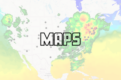
Working with Maps in Qlik Sense: Tips and Tricks
Qlik Sense Map charts are used to geographically display data related to countries, cities, states, regions, or particular geolocations (etc…). Maps o... Show MoreQlik Sense Map charts are used to geographically display data related to countries, cities, states, regions, or particular geolocations (etc…). Maps offer different ways to present your data by first setting a base layer, then adding multiple layers to the map which are specific locations highlighted in multiple ways including Area, Points, Lines, Density, boundaries etc..
You can add as many layers as you want. These layers are comprised of dimensions and measures that allow to efficiently present geographical distribution of values related to locations in order to display a data story.
Types of layers:
- Point Layer: composed of bubbles or markers (you can choose a shape) positioned in specific coordinates (Lat / Long)
- Area Layer: geographic shapes sized and placed on specific areas
- Line Layer: connect two fields containing point data or a field containing geometries.
- Heatmap Layer: uses color gradient to show data density (intensity is greater at the center and declines towards the outer perimeter)
Base Maps:
Using different base maps can enhance the way data is displayed and aid in analysis. You can choose from:
- Default: Good for when using only 1 or 2 simple layers
- Pale: great for when you add multiple layers with different colors which might be difficult to read if using the default base
- Dark: good for when you color layers with bright colors, this style can also be used when it matches the rest of your dark themed dashboard.
- Satellite: gives a more realistic look to your map
- None: in this case, you can add custom background layers (covered later in this post)
Best Practices when designing Maps:
- Make your maps Simple to read:
- Be sure to use colors purposefully (stick to the default palette or use something like this https://jarrettmeyer.com/2018/08/07/viridis-color-palette)
- Use tooltips when necessary to provide more context when your layers are hovered.
- Change fonts and font colors when necessary, think about contrast between your layer coloring and the overlapping text font color.
- Think about the data you are visualizing:
- Continuous vs Discrete
- If visualizing two or more variable, it’s better to use color and size
- For instance, in a point layer showing office locations, you can color the point based on number of employees and size the bubble based on the Sum of sales made.
Advanced Uses:
Multi-Layer Maps:
When including multiple layers in map chart, it might become hard to interpret data. In that case, you can address this by controlling at what zoom levels different layers appear or have layers that appear only if other values in a drill-down dimensions are selected. This allows to create multiple levels of detail as you make selections and zoom in and out or locations of interest on the map.
- Zoom-Dependent Layer Display
Let’s create a map that relies on Zoom to reveal different layers.
- We start by creating the first layer as an Area layer to represent Countries and we color using the Sum(Sales) aggregated measure.
- We choose the Pale base type in order for the data to stand out more.
- Next, we add two new Point Layers
- First, to represent cities. We choose to color by measure using the Sum(Sales) aggregation.
- Second, to represent Customers. We choose the shape of the point layer to be a Triangle, and we color by Sum(Sales)
- Lastly, we configure the Layers to only show at certain zoom levels. We do that by changing the Layer Display “Show in zoom levels” property from Auto to Custom.
- Country Area Layer will show up until 4x zoom
- City Point Layer will show from 4x to 9x zoom
- Customer Layer will show starting at 10x zoom
The result:
- Drill-Down Layer Display
Let’s create a map that uses a drill-down dimension to display layers based on selection. Keep in mind that Drill-down dimensions should have the fields in order of highest geographical are to smallest geographical area.
- First, we create a Drill-down master dimension that contains three levels:
- Sales Region
- State
- Sales office
- Next, we add out 3 layers:
- An Area Layer for Sales Region: Choose the created Master Dimension as the dimension of the layer, and choose Sales Region.Area as the location.
- An Area Layer for the states.
- A Point layer for Sales offices.
- To enable the drill-down functionality. For each layer, navigate to Layer Options > Display. And change the “Visible drill-down levels” property from Auto to Custom and un-select the non-relevant layers, for instance:
The result:
Tip:
If you load data and it appears incorrect like below:
Head to Location, switch off Scope for location from Auto to Custom.
Change Location Type to “Administrative Area (Level 1)” in our case. Then, change Country to your location, in our example it’s ‘US’Multiple Background Layers:
To use custom base maps beyond the types mentioned above, you can add different background layers.
Let’s create a map with multiple background layers using a TMS and two WMS.
- First, we need to set the Base Map to non under Map Settings.
- Next, we add the first layer as a Background Layer and choose Format to be TMS
- We include the appropriate URL and attribution
- For the second and third layers, we use WMS server URLs, set the version and Load the WMS.
Important:
Keep in mind that when using URLs for TMS and WMS formats for background layers, these URLs that contain resource requests to external resources must have its origins allowlisted in the Content Security Policy, else the resource will not be loaded. WMS resources must have both image-src and connect-src directives allowlisted. More Info here.- Finally, we add a Point Layer.
The Result:
The QVFs for all three advanced examples can be found below. You can load them to your Qlik Cloud tenant, investigate the chart settings, and tweak the configurations to practice these concepts.
-
Demo App & Webinar
Decomposition Tree in Qlik AnyChart Ever feel overwhelmed by complex datasets, endless sheets & constant requests from business users? The solut... Show MoreDecomposition Tree in QlikAnyChartEver feel overwhelmed by complex datasets, endless sheets & constant requests from business users? The solution's here: Meet the Decomposition Tree, a new rockstar chart in Qlik Sense worth a dozen! See the demo app & join the webinar on Feb 8th.Discoveries
Enabling users to slice & dice metrics as they please, this game-changing visualization unlocks root cause analysis & ad-hoc exploration of complex datasets on the spot.
Impact
Become a master at crafting smaller, yet more impactful dashboards that even non-techies can navigate intuitively. And while they explore & make decisions, just kick back, take a sip, and enjoy life.
Audience
BI Developers & Analysts; Managers & Heads of Visual Analytics & BI Solutions; Qlik Developers & Data Engineers; CIOs & IT Directors.
Data and advanced analytics
Elevate your data mastery & earn your business users' love for revolutionizing their data analysis journey!
🔗 > DOWNLOAD DEMO APP (.QVF) <
🔗 > JOIN WEBINAR: FEWER SHEETS, MORE INSIGHTS <
-
Announcing the 2024 class of Qlik Academic Program Educator Ambassadors!
These individuals are some of our most active participants of the Qlik Academic Program who fully utilise the free software, training resources and q... Show MoreThese individuals are some of our most active participants of the Qlik Academic Program who fully utilise the free software, training resources and qualifications that we provide to university students and educators. The members of our 2024 class are:
Dr Nassir Ibrahim
Marcin Stawarz
Blerim Emruli
Javier Leon, Adjunct Professor
Sumitra Purushottam Pundlik
Priscila de Jesus Papazissis Paolinelli
Jacek Harazin
Angelika Klidas
Dr K Kalaiselvi
Angel R Monjarás
Daniel E. O'Leary
Meet the Qlik Academic Program Professor Ambassadors for 2024
We are thrilled to be recognizing the efforts of these individuals to help the Qlik Academic Program to achieve its mission - to create a data literate world, one student at a time. Each ambassador has been selected through a self-nominated application process, where they were required to answer various questions covering their motivations for becoming an ambassador, and to evidence their passion for upskilling their students in analytics over the past 12 months. This year, we are excited to select another 11 ambassadors, 5 new ones and 6 returning ambassadors whose efforts continued to impress us. By way of thanks for their efforts our ambassadors will receive exclusive benefits such as webinars and discussion groups with Qlik leaders, opportunities to showcase their experience with the Qlik Academic Program and the chance to grow their network with other educators across various fields and geographies.
Throughout 2024 our ambassadors will continue their advocacy for the Qlik Academic Program and help us to reach even more students and educators with our free resources. Stay tuned over the coming months for more in-depth profiles on each of our ambassadors, and get to know who they are, what they teach and why they are so passionate about bridging the data literacy skills gap! Learn more about the program and how to apply for future classes.
-
【オンデマンド配信】信頼構築からのスタート!乗り越えて実現した業務データの活用
企業のビジネス活動において、データはこれまで以上に必要不可欠な資産となっています。増え続けるデータを管理・統合・分析し、データでアクションを起こす必要性が増している現在、成功している企業はどのようなデータ戦略を実行しているのか?本 Web セミナーシリーズでは、Qlik でデータからアクションを起こ... Show More企業のビジネス活動において、データはこれまで以上に必要不可欠な資産となっています。増え続けるデータを管理・統合・分析し、データでアクションを起こす必要性が増している現在、成功している企業はどのようなデータ戦略を実行しているのか?
本 Web セミナーシリーズでは、Qlik でデータからアクションを起こすデータ主導のビジネスで成功しているお客様より、課題から導入の経緯、デモンストレーション、活用例などをご紹介します。※ 参加費無料。パソコン・タブレット・スマートフォンで、どこからでもご視聴いただけます。
オンデマンド配信:
信頼構築からのスタート!乗り越えて実現した業務データの活用株式会社 QTnet では、Excel や Access で利用してきたデータ活用を 2010年から本格的に BI ツールである Qlik によるデータ活用へ移行しました。しかし、データ抽出が大半でデータの可視化や分析、活用は一向に進まない状況でした。2019年、Qlik Sense の導入を契機にシステム部門でデータ整備からアプリまで一貫した提案型の開発に挑戦しました。ところが、穏やかな船出とはいかず、業務部門との信頼関係を築くことからスタートしました。
今回は、ユーザと共に作り上げてきたアプリについて、その成果(自動化や可視化を達成)に関する具体例について、デモを交えて紹介します。 -
Connector Factory – January 2024 releases
Increased flexibility when accessing SaaS applications and file storage services Qlik has expanded the governance capabilities of Qlik Cloud Analytic... Show MoreIncreased flexibility when accessing SaaS applications and file storage services
Qlik has expanded the governance capabilities of Qlik Cloud Analytics by significantly increasing the number of connectors that can support user-defined credentials. Instead of a generic company ID, user-defined credentials help ensure that data access will be governed based on what has already been defined in the source system for each user.
Previously, Qlik Cloud Analytics only provided this option to some enterprise applications, such as Salesforce, and ODBC-based connectors (ex. Oracle). Now customers can define, on a connector-by-connector basis, whether user-specific credentials will be required to access many of their SaaS applications and file storage services.
User-defined credentials will work with all the relevant authentication options that are available in each connector (ex. OAuth, Access Key, Key File, etc.). And these personal credentials can be saved and used across multiple connection definitions for the same source.
This new capability has been added to the following connectors:
SaaS applications
- AYLIEN News
- Facebook Insights
- GitHub
- Google Ads
- Google Analytics 4
- Google Calendar
- Google Drive & Spreadsheets
- Google Search Console
- JIRA
- Mailbox IMAP
- MailChimp
- Meaning Cloud
- Microsoft Dynamics CRM
- Microsoft Outlook 365
- OData
- Qualtrics
- Slack
- SMTP
- Strava
- SugarCRM
- Survey Monkey
- Watson Natural Language
- YouTube Analytics
SaaS file storage services (including related metadata)
- Amazon S3
- Azure Storage
- Dropbox
- Google Cloud Storage
- Google Drive
- Microsoft Office 365 SharePoint
- Microsoft OneDrive
- SFTP
-
New Process for Submitting a Feature Request for All Talend Customers and Partne...
Effective October 2, 2023, all feature requests will be submitted via the Qlik Community. Requests are entered as an “Idea” and are evaluated by Produ... Show MoreEffective October 2, 2023, all feature requests will be submitted via the Qlik Community. Requests are entered as an “Idea” and are evaluated by Product Managers. Product Managers will communicate with you via the idea throughout the lifecycle. With this change, feature requests are no longer required to be submitted via the Talend Support Portal.
What you will need to do:
- Navigate to Qlik Community and Sign In
- If you are not a Qlik Community member, you will have to register first
- Once signed in to the Qlik Community, navigate to 'Support' and select 'Ideation' from the dropdown
- You can learn all about the ideation process by choosing “About Ideation”
- Learn how to submit an idea and browse existing ideas
- Check out the Process Overview so you will understand what to expect after your idea is submitted
If you have any questions about this new process, please comment below or email QlikCommunityAdmins@qlik.com.
-
Qlik Digest - January 2024
They say that January is a time for new beginnings, and we took that seriously this year! We have some exciting news and updates this month, including... Show MoreThey say that January is a time for new beginnings, and we took that seriously this year! We have some exciting news and updates this month, including…
Qlik Introduces a Bold New Look!
January 16th, 2024 marked a pivotal moment for Qlik as we launched our new brand and website to the world. This transformation reflects our story of growth, innovation, and change. But more importantly, it is an evolution of how you can experience Qlik: our shared values, our vision, and our expanded product portfolio to deliver real business value for you. It is also our commitment to you – to be the catalyst that empowers you to leverage data for substantial business outcomes.
Read our announcement blog to learn more about Qlik’s brand transformation.
Bridging the Trust Gap in Generative AI: The Big to Better Data Imperative
It’s finally here! On January 17th, Qlik released the top 10 trends in BI, Data, and AI for 2024. You can watch the full webinar here, or for a more personalized approach, explore each trend on its own through our Trends 2024 digital experience.
The Official AI Reference Guide
Getting caught in the hype around the potential of AI is understandable, but like many technologies, learning to walk before you can run is essential. To help, Qlik put together a conversation AI glossary…
Click here to explore nearly 50 key AI terms you need to know when working with data and analytics.
Join Us For Qlik Connect!
Now through February 15th, save $300 on your Qlik Connect registration. This is a valuable opportunity to enjoy a discount and be part of an event that will play a role in shaping the future of data.
Tips & Tricks of the Month: New Year, New Badge as Analytics Expert!
Join our upcoming spring cohort; a collaborative learning environment led by our expert instructors including shared experiences with other Qlik customers and get your digital badge in 15 weeks. Learn More & Register.
-
Make it your goal to upskill in 2024!
The report forecasts that between now and 2027, businesses predict that 44% of workers’ core skills will be disrupted, because technology is moving fa... Show MoreThe report forecasts that between now and 2027, businesses predict that 44% of workers’ core skills will be disrupted, because technology is moving faster than companies can design and scale up their training programs. Our Academic Program gives the students of today a chance to get to grips with our industry leading took Qlik Sense, so that they arrive in the workplace a step ahead of the rest and ready to thrive. By using the program to supplement their university courses, they can arrive with the skills needed in the modern-day workplace and save the time and cost of upskilling later. Students can train on the learning resources built by us and used by customers and partners to get themselves workplace ready.
When the World Economic Forum ran this survey in 2023, they created a list of the top 10 skills deemed to be the most important at the time of survey. These are a mix of cognitive skills, self-efficacy, management skills, technology skills and working with others. Number six on the list was technological literacy, however when they looked at skills on the rise in the next five years, technological literacy moved up to number three. This skill is the third fastest growing core skill, and it refers to the knowledge and ability required to effectively and responsibly use technology tools and resources. Many individuals at university are already learning to acquire and communicate information in a fully digital environment. But they will need to transfer these skills to a professional workplace and be expected to interpret this information into insights to inform business decisions. Most business are now using data solutions in order to support this process; students will need to go into the workplace with an understanding of how this technology works.
In addition to the need for candidates with technological literacy, the future workplace needs workers who are also skilled in AI and big data. Ranked number seventh for fastest growing skill, AI and big data will see a 60% growth in demand by 2027. As part of the Qlik academic program, members can start to train on Qlik Sense, our market leading tool for data analytics. By following some of the short training videos and learning about basic functionality, students can go into the workplace with an understanding of the benefits of data solutions and show their employers they have taken the initiative to upskill themselves in big data.
The Qlik academic program offers a fantastic opportunity for students to start their professional learning journey in data and technology and leave university in the next few years with the skills needed in the workplace. Our courses on data literacy support the hard and soft skills needed in the future workplace. Even if you are student pursuing a course outside of IT, taking a couple of free courses in data visualizations and data literacy could help you become more employable after university. If you’re unsure of where to start with your 2024 learning journey, then the best thing to do is to take our data literacy persona assessment, and then explore some of the courses that interest you. To start accessing these courses go to, qlik.com/academicprogram and apply to our free program.
-
RISE および SAP S/4HANA のマイグレーションコストと時間を節約する方法
多くの日本企業ではビジネス基盤として SAP ERP を導入しています。「AI活用」「データドリブン」などのビジネス環境の大きな変化に伴い、データ基盤のモダナイズが喫緊の課題となっています。こうした中で柔軟な運用とコストメリットを求めてシステム基盤をオンプレミスからクラウドへ移行する企業が増えていま... Show More多くの日本企業ではビジネス基盤として SAP ERP を導入しています。「AI活用」「データドリブン」などのビジネス環境の大きな変化に伴い、データ基盤のモダナイズが喫緊の課題となっています。こうした中で柔軟な運用とコストメリットを求めてシステム基盤をオンプレミスからクラウドへ移行する企業が増えています。特に SAP ユーザーは RISE with SAP により、クラウド化・モダナイズを進めています。これは、より効率的なシステム環境の構築によりコストと時間を節約する機会にもなります。
典型的な SAP 環境を見てみましょう。一般的に、ある Production 環境をリリースする際には、品質管理やトレーニングのために、そのサブセットとなるシステムを構築します。また同じデータセットは開発環境にも必要です。このように同じような環境を複数構築するにはコストと時間がかかります。
Qlik が提供する Gold Client はこのプロセスを効率化します。
Qlik Gold Client を使えば、基盤とデータのメンテナンスコストを削減し、開発、テスト、トレーニング環境を効果的、かつセキュアに構築できます。ビジネス継続性を損なうこともありません。
事例を一つご紹介します。顧客がデジタルトランスフォーメーションとエネルギー転換の課題に対応できるよう支援している Vinci Energies 社は Qlik Gold Client により SAP S/4HANA へのマイグレーションを非常に効率よく実現しました。戦略的なグローバルデジタルトランスフォーメーションを支援するために SAP S/4HANA への移行を希望していた同社は、本格的な移行を行う前に軽量なアーキテクチャでテストできるデータの小さなサブセットを作成するために Qlik Gold Client を使用しました。
同社は、DVP S/4 HANA のデータセット環境をゼロから作成し、3ヶ月分のデータと 20 の企業コードのデータ転送をわずか 8時間で行いました。Qlik Gold Client により、ゼロから手作業で行うことなく、変換済みの DVP システムを非常に迅速に作成することができたのです。SAP 環境間のデータ転送を検証したところ、すべてのオブジェクトと関連データが正しく転送されており、Qlik Gold Client は使い方が簡単で、高速かつ信頼性の高いツールであることが証明されました。
本事例はオンプレミスの事例ですが、もちろんクラウド移行の際にもご利用いただけます。ご興味をお持ちの方はぜひ Qlik へお問い合わせください。
-
Harness the Power of Outcomes: Solve Problems, Drive Success
Hey guys, I wanted to mix it up a bit and instead of focusing on direct features, functions and capabilities – I wanted to provide a demonstration tha... Show MoreHey guys, I wanted to mix it up a bit and instead of focusing on direct features, functions and capabilities – I wanted to provide a demonstration that focuses on outcomes. In other words, a solution to a particular business problem and how I could achieve it using Qlik.
Introduction
You will see how I use AI and conversational analytics to collaborate in real-time with my colleagues to get context to help me explore my business problem further and how I can take action on my findings immediately by notifying and integrating with my valued partners, all from one platform. I even use a little generative AI with Amazon Bedrock as a fun example to show you the art of the possible.
Summary
To recap we started by using Microsoft Teams integrated Qlik’s AI based conversational analytics to inquire about open orders that our reps are working on. While speaking with the rep, we discovered that we had 1 order with an excessive lead time because of a part shortage and could not complete the product. Another inquiry showed that other reps and orders are also effected by this part shortage. We dove deeper into the analytics application where we integrated the ability to place an order directly from the app to communicate with our parts vendor using Slack and Generative AI to generate the order notification. Obviously this is a simple and fun scenario but you can see how powerful the Qlik platform is and how it can integrate with other systems to produce results and take action where and how you work. I’d love to hear your stories.
Have you integrated multiple components of Qlik together to produce meaningful outcomes? Let me know in the comments.
Helpful Resources:


.png")